When John’s younger sister Carrie asked us to transform her new apartment in Philly on a strict budget we were happy to oblige. It’s amazing what a little rearranging and accessorizing can do for a big white box that’s bursting with potential. Here’s our fast and fabulous four hour $200 makeover.
Carrie’s big white room serves as the living area, dining area, and also houses the kitchen along one wall, so it really needed to be flexible and functional. And Carrie’s a stylish 22 year old with a penchant for a little punch of color, so we brought in some pattern, texture, and color to create a space that feels open and interesting to boot. One of the biggest challenges was finding the perfect furniture arrangement. When we arrived, the sofa was angled for easy tv viewing (even though it meant that you were greeted by the back of the couch upon entering the room):
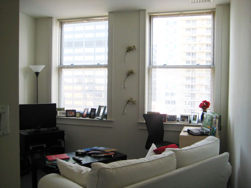
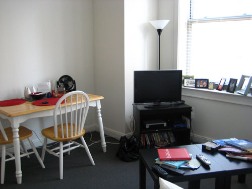
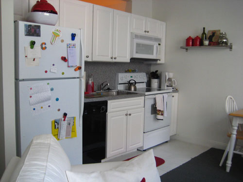
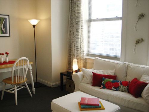
But after a bit of brainstorming (and John’s electrical assistance to extend the cable hookup across the room with a $6 cable extension cord) we were able to rearrange the living area with the couch centered under Carrie’s fabulous picture windows. Now when you enter the space you’re no longer greeted by the back of the sofa. Instead, you’re invited inside thanks to a more open and balanced arrangement:
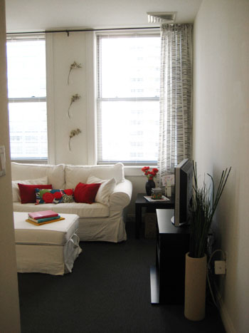
After we rearranged the room, we took inventory of a few accessories that would finish off the space (curtains, a few baskets, a new ottoman, and some wall art) and headed to Ikea with our 200 dollars burning a hole in our pocket. We returned a few hours later with everything on our list (and even a few pennies to spare). But there was no time for a victory dance. Instead, we got right to work hanging our $15 Ikea curtains (to frame the gorgeous city view and keep things airy and balanced). With tiny stripes in green and black, they bring in some color and texture (and even match the flowers that Carrie already had hanging in those cute teardrop vases on the wall between them).
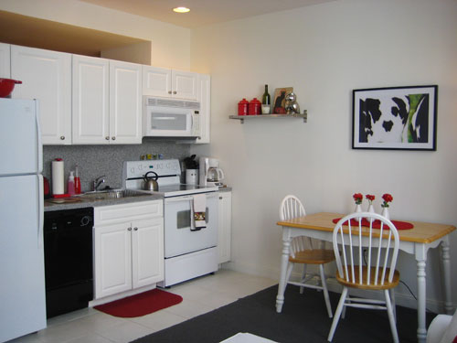
The dining area was a snap- just the addition of a $10 cow print from Ikea (in the same colors as the curtains) and some simple decluttering left the dining space looking as tasty as a Philly cheesesteak. We also did a little organizing and paring down in the kitchen for a cleaner look (and more counter space to boot).
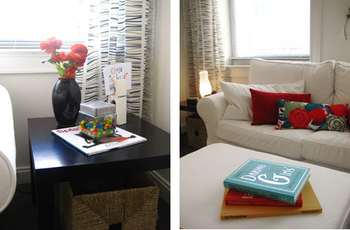
And of course we made sure that everything from the M&Ms to the reading material worked with our playful color palette. We were also conscious to provide a bevy of subtle storage options for Carrie (from the wicker baskets tucked under the side tables to the ottoman with a secret storage compartment under the lid):
As you can see, just rearranging and accessorizing can really change the look and feel of a room. And it only took us about four hours to successfully swankify Carrie’s space before hitting the pavement to explore Philly with the fam. Just for kicks, here’s our handy dandy cost breakdown for anyone who thinks we pulled a fast one and went over budget. We’re thrifty and proud of it.
Carrie’s Cost Breakdown:
- -25 foot cable extension cord (which enabled us to move the tv across the room): $6
- -Ikea cow print for the dining area: $10
- -Black Ikea Ribba frame for the cow print: $23
- -Patterned floor length curtain panels: $14.99 (for two)
- -Black Ikea curtain rod: $9.99
- -White Ektorp Bromma ottoman (with hidden storage): $100
- -2 rattan baskets to slide under Carrie’s side tables for even more storage: $34 (for two)
- -M&M’s (for a dash of color- and because decorating makes ya hungry): $1.29
GRAND TOTAL: $199.27
So what do you guys think? Isn’t Carrie’s new Philly nest cozy and cute? Do you have any simple and affordable decorating tricks up your sleeves for transforming a room on a dime? Share and share alike.

Amy A. says
I love it!
Katie says
Looks great – and I think you should include M&M’s in all your design dilemmas :)
katie
Emily says
I’m jealous of your IKEA finds – it’s trickier to do a $200 makeover without an IKEA in Colorado, but we do what we can. Looks so cozy and fun, nice job!
Jersey Girl in DC says
Very cute! And especially love it because it’s in my hometown area! :)
Just wondering… I notice that there are quite a few framed pics along the windowsill in the before pic, but not in the after. Did they get hung somewhere or moved to the bedroom maybe? I’m curious if you were able to rearrange these somehow in another spot in the apartment. I’m always unsure how best to display the tons of family photos we love.
– Jennifer
Brenna says
Fantastic! You guys do terrific work! Would you mind sharing the source for the flower pillow on the sofa?
Julie says
I’m so glad you featured this design dilemma! As fun as it is to dream about the joys of fixing up a house, young (broke) apartment dwellers shouldn’t feel left behind. Thanks for the shout out to those of us design lovers who haven’t made it to the mortgage part of life yet.
Sandy says
You guys hit it out of the park every time! Nice work!
Amanda says
I really love this one!
Jeni from Kansas says
This is a great re-do!!
Jaimee says
Love the curtains and cow print :)
Casey says
I love Carrie’s redesigned digs. As another young, broke, apartment dweller, it is great to know that there is hope for my white box of an apartment, too. Y’all do great work! :o)
Lauren says
This layout is much better than before! The style reflects the Asian guy in Trading Spaces from a few years ago (don’t remember his name). It’s similar with the symmetry and having accessories in threes.
Question: can you paint in this apartment? I know some apartments are strict with paint. If you can, What about painting the beam above the counter cabinets red to match the accessories? If you can’t paint, then possibly nailing a bunch of red square frames into that beam? It is a really neat part of the room, with the opening into the next room, that could draw up the eye to another height and make use of the recessed lighting.
Kimberly says
I really enjoyed this low cost makeover! It reminded me of FreeStyle, my favorite show that comes on HGTV Tuesday mornings (thank you, TIVO). I love before and after pictures. Maybe people in your area will start hiring you to do low cost/no cost makeovers that you can post!
hamiharri says
great re-do…why can I find one of those giant clothes pins??
YoungHouseLove says
Hey guys. Glad you’re digging out latest makeover. We’re dying to get our hands on more spaces (from studio apartments to single family homes) so stay tuned!
As for the source of the pillow on the couch, it’s from Pier 1 (Carrie purchased it prior to our arrival). The giant clothespin (also purchased beforehand) is from Pottery Barn. As for the frame question, we actually took them off the window ledge since they looked cluttered, but actually showed Carrie how to hang them asymmetrically to create a giant collection of frames on one of the bare walls in her bedroom (she needs to pick up a few more frames before the project is complete).
Generally, when it comes to displaying a large group of frames, it helps if all the frames are either all the same color or finish (all white or all silver for example) but the mixed and match thing can also look good assuming there are some parameters and it’s not a total random assortment (for example, all bronze, silver and gold only). Then for placement on a wall, cut out pieces of paper that are the same size as the frames and tape them to the wall and then hang the frames once you’ve found the perfect arrangement. Happy hammering!
Oh and Lauren, you must be referring to Vern Yip. He was one of our favorites back in the day. Funny that the redo reminded you of him. Painting’s not allowed, but we love the idea of adding some colored frames to the beam above the cabinets. We’ll be sure to pass the idea along to Carrie (or take matters into our own hands the next time we’re in Philly- tee hee).
xoxo,
Sherry
Lauren says
Hi Sherry– love the redo that you did! It looks great! Wish I knew you were in Philly, we could have met up for drinks (lol), I live there too. After this great makeover, my Ikea list has gotten a little longer!! Once again, great job! And I enjoyed what you did with her bathroom too!!
Amy A. says
Looking back on some of your design dilemas and getting some ideas for my space…where did this white, slip-covered couch come from?
YoungHouseLove says
Hey Amy A,
That white, slipcovered couch in Carrie’s apartment is the loveseat from Ikea’s Ektorp series. Hope that helps!
-John
Liz says
Hi Sherry and John –
I am an avid fan (turned on by a fellow Richmondian) and just moved back to Philly. I love what you did with Carrie’s space…and I’m currently apartment searching. I love the look of Carrie’s apt and I was wondering if you would let me know of the name of the building.
Thanks!
Liz Palmer
YoungHouseLove says
Hey Liz,
Good question! I actually don’t have a clue but I’ll put in an email to Carrie and pass that info along as soon as I hear back. Stay tuned…
xoxo,
Sherry
YoungHouseLove says
Here’s the info straight from the sister-in-law:
The building name is its address: 1930 Chestnut Street Apartments. It is owned by Turchi Properties and you can check out their website- http://www.turchiproperties.com. It is in Rittenhouse Square West; one block from the major businesses on Market Street and great shopping on Walnut.
Hope that helps!
xo,
s
Kate says
I noticed that there was formerly a small desk area in the corner. Was that work space completely eliminated in this makeover? Was it relocated to another room in the apartment? I think the removal of that definitely helped the room look more open, inviting, and spacious, but it’s not always practical to lose a desk.
YoungHouseLove says
Hey Kate,
You guessed it- the desk moved into the large bedroom to serve as a space where Carrie could still get work done without crowding her living, cooking and dining space (which already needed to serve enough functions as it was!). We’re all about balancing function with form, so when Carrie suggested we move her “office” into the bedroom we were totally game. It’s all about what works for the homeowner- or renter in this case! Hope it helps.
xo,
s
Casey says
Hey guys! Where can I get one of those extra large “paper clips” like Carrie has on her side table? I’d love one for my desk!
YoungHouseLove says
Good question! We remember seeing them at West Elm so that’s a good place to start. You might also want to try eBay or a discount store like TJ Maxx. Hope it helps!
xo,
s
Shelley J says
Man I miss ikea, but rumour has it they have started work on one in Winnipeg!!!!! It looks great!
RhodeyGirl says
Is this a RiverWest condo at 21st and Chestnut? It looks just like one of our investment properties there!
YoungHouseLove says
Nope, but good guess. I’m sure there a lot of places that look like this on the inside! Haha. But it’s really cute and perfect for Carrie (and Duncan too).
xo,
s
breaking bad season episode guide says
nice!
Jess says
Just stumbled on this post (and Carrie’s SECOND design dilemma) riiiight after I commented earlier. Awesome! Good inspiration for small-space apartment planning.