When we whipped up a custom mood board for Chantel (all the way up in Canada) a few months ago, we couldn’t wait to see how her living room turned out. Well she’s baaaack! And she sent us a few fabulous after pictures along with this lovely letter:
Thank you again for all your help with our living room in January. We followed all of your advice to the letter (except for the pillows because they wanted to charge me $200 to ship to Canada). I hope our replacements are up to your standards! We love the transformation, and everyone who’s visited has loved it, too. I don’t know how you did it, but you managed to make it feel like a beachy summer day in our living room, even though there’s two feet of snow outside! And we hope you’re up for another transformation. We’ll be sending you before shots and a plea for help for our master bedroom later this week. Thanks again! – Chantel
Aw shucks Chantel, we’re so pleased that you’re so pleased! First lets remember what the room looked like back in January before the big makeover:
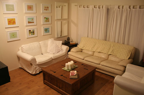
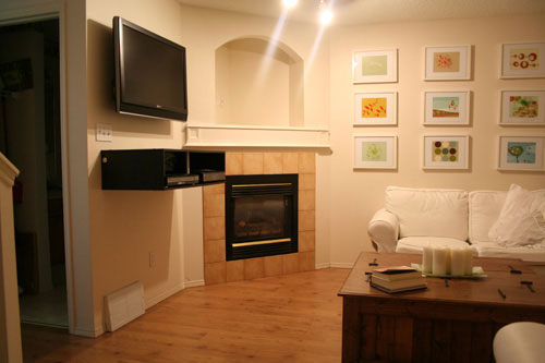
Chantel asked for “a beachy casual space” with pops of green and blue to work with a large work of art that she already had on hand for over the sofa. So here’s the mood board that we whipped up for her (see more details about it here):

And here’s her room after the big mood board makeover:
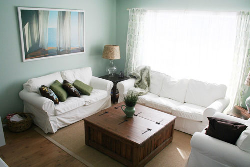
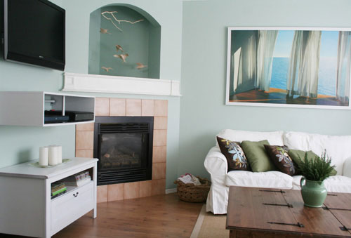
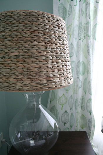
Sometimes a few simple changes can really make all the difference. Switching out Chatel’s old leather sofa for a slipcovered one from Ikea and painting the walls a serene blue hue took the entire space from white on white to beachy and light. Painting the TV component shelf white and introducing another white piece of furniture under it really made it appear more integrated and less invasive. And bringing in some texture in the rug, the sweet printed curtains, and even the woven table lamps that flank the sofa really added to the casual-chic vibe that Chantel so desired.
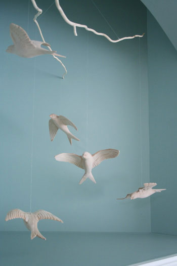
She even took our advice and painted the nook above her fireplace a slightly deeper tone of blue to accent the lovely little mobile we found for her which serves as a charming focal point in the space. Gotta love a 3D piece of art in an empty enclave just begging for an airy and ethereal accessory.
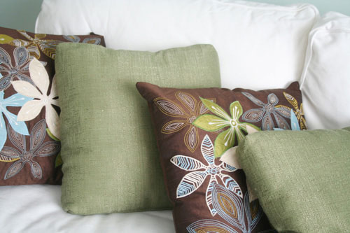
And of course we adore the pillows that Chantel picked up to finish everything off! They’re full of the same soothing tones that can be found around the rest of the space, and we love that the stitched look mimics the printed curtains that we picked out. Deeelicious.
Thanks so much for the fabulous after pictures, Chantel! You’d never know there was snow outside with an airy and inviting living room like that! What do you guys think of her transformation? Did she not do an utterly amazing job?! What’s your favorite part? I’m trying to decide between the mobile and those leafy curtains…
Update: We sadly can no longer find the time to take on client commissioned mood boards (we now whip up general inspiration boards instead) but if we ever reinstate them we’ll make a big announcement!

Lindsay says
The mobile is wonderful! The whole room turned out so well… great job!
Liz says
Wow, great job! The mobile is my favorite part – what a unique idea, and it really works perfectly in the space. I hope Chantel kept her fun grid of artwork that she had in the room “before” and used it elsewhere – I really liked it!
Sara says
Gorgeous! Absolutely amazing transformation.
CH says
This looks fantastic. I love, love the mobile!
sarah says
love it- this is so pretty!
Lauren says
I LOVE THIS ROOM! It feels so inviting and and calming. And it feels more like a beach house than a living room with a snowy view! And, I love that 3D Art. Simply amazing!
Denise T. says
I really like how the mobile and the artwork of curtains gently blowing in the breeze bring movement into the room.
Amber says
I love it! Especially the mobile…I live in a beachy, coastal area and I’m trying to transition my home to that feeling :)
Sandy says
Fab, fab, fab!
Lisa says
It’s an amazing transformation. GREAT JOB!
Chantel says
Oh, yay! I’m so glad others like it as much as we do. I’m sitting in the room right now, actually, gazing out my “painting” to convince myself it’s summer. I would chime in on my favorite part, but it changes every time I look around. The rug does an amazing job of unifying everything, though, and I never would’ve even thought to add one. Thanks again, Sherry & John!
Roeshel says
It’s stunning. I love every single element. That huge print over your sofa looks like a mirror – with a real ocean view. I love it!
Regina says
Great job, simple changes made such a huge impact!
heather s. says
They did a great job! The mobile has to be my favorite piece in the room with the lamp shades a close second.
Nicole Greene says
where are the white frames and the art from in the BEFORE photos?
Chantel says
Heh … ok, it looks like some of you are really into the “before” art! I’d originally planned to repurpose those prints, but I think I’ll reconsider and offer them up for sale (since they’re not fitting in anywhere else as we redecorate). We paid $18 per print, plus $12 for each frame. I’ll sell any of them for $20 each: [email protected].
Tam says
Sherry and John..just wanted to tell you guys that you do a wonderful job everyday! I also love the fact that you comment back to your readers which shows that you are involved and interested in what we have to say. Again…woooo hoooo..thanks yall!
Katie says
Definitely love the new couch…the new paint color…and the lamps…you would not be able to take my hands off those textural shades! Lovely!
jbhat says
It looks soooo good. Chantel, you took great pictures of the afters, too. Thanks for the close-ups. Nice job!
christy says
Wow I am so impressed – both with your mood board and with her end result! I love that mobile – I never would have thought to hang a mobile in that niche – brilliant!
Alicia says
Wow-another great transformation!
I really like the cabinet you chose for under the TV. Where’s it from???
Chantel says
The shelf is from Best Buy, and the cabinet is the Grevback TV bench from Ikea. They were both originally quite dark, so we used about 1500 cans of spray paint to get them to white. It actually didn’t work that well in the end … if I were to show you a close-up shot, you’d see the paint bubbling up all over the place. My dad (who helped us throughout the whole transformation) was set on spray paint because he said a brush or roller would hide the wood grain in both pieces, but we couldn’t stop the spray paint from bubbling up and kind of ruining the finish anyway. Sherry and John, maybe you guys have had experience with this? What do you think caused the bubbling?
YoungHouseLove says
Hey Chantel,
Hmm, spray paint can be a trickly little beast, and it sounds like those pieces weren’t solid wood (maybe they were laminate?) which can also have a lot to do with paint adhesion. I’m assuming your dad didn’t use a spray-primer to begin with, which might have helped with a smoother finish. We would definitely suggest using a spray primer (or even brushing on an oil-based primer) to create a good foundation for the whole project (not properly prepping the surface can result in bubbles and cracks).
The other key with spray paint is that it’s applied in thin, even layers. Three or four thin coats are always better than two goopy & drippy applications. And you always want the nozzle about 8 inches away from the piece (never right on top of it, which can rile up the paint and cause more of those dreaded bubbles). Hope it helps! Maybe you can sand ’em down and re-prime & paint if they really bother you? Either way they look just fabulous in the pictures and we never would have noticed! Maybe everyone will be so busy staring at the mobile and the lamps and the pillows and the curtains that they won’t even notice the less than perfect paint job. Here’s hoping!
xo,
Sherry
Natalie says
I looove the fireplace art! And the woven table lamp is gorgeous! :)
elizabeth says
Looks fabulous! Just curious…would the tv fit in the recess above the fireplace?
YoungHouseLove says
Hey Elizabeth,
The TV was already mounted with the TV component box below it when Chantel came to us for help, so we don’t know if it would fit in the niche (one of her requests was that the TV and TV box stay put) so we assume that it wouldn’t (or that the components would still have to be kept in a big box below it so they went for the area next to the TV instead). Hope it helps!
xo,
Sherry
Michelle says
Long time reader, first time poster!!! :)
Sherry & John, I love these before and afters!! It really makes the mood boards come to life.
Chantal, where did you get that really cool coffee table?! My husband and I are coffee table-less and waiting for the perfect one to reveal itself. It looks like you can store quite a bit inside, too! Please let me know where you found it!!
Chantel says
We might just strip it down and start all over with your tips. You guys are always full of good advice. Thanks!
GG says
My jaw dropped when I saw the “after” pictures! The mobile is a show-stopper for sure. Amazing transformation!
CottonColors says
It looks great! The colors are beautiful and the mood is so relaxing. Love it!
Kellie says
WHOA! It looks so great; I love that shade of blue (and I’m not normally a blue gal).
Jill says
OMG, what a great makeover! Kudos to Sherry and John for coming up with such super ideas and also to Chantel for implementing them. Great job!!
Kimberly says
Yay for after photos! Thanks so much for sending them in, Chantel! I love seeing Sherry and John’s moodboards come to life!
shannon says
I must know…Where did you get the mobile?? I love it!
YoungHouseLove says
Hey Shannon,
Part of the first sentence in the post above is actually a link to the original mood board that we whipped up for Chantel (so you can see where the mobile and almost everything else in the room comes from by clicking it)! Here’s the short cut link for your convenience:
https://www.younghouselove.com/2009/01/chantels-design-dilemma/
Hope it helps!
xo,
Sherry
Keri R. says
I also really love that coffee table/trunk! Where did you find that? Its a great piece!
Candied Fabrics says
Fabulous job. It’s so nice to see the whole process, beginning to end!
Chantel says
elizabeth,
The TV doesn’t fit in the nook, of course. Even if it did, I don’t think I’d want it there. I’m more of a “hide all the technology” girl, but my husband loves his gadgets, so we compromised.
Michelle and Keri,
The coffee table is from the farmer’s market, and yes, it holds a boat load of stuff! (Mostly baby toys, actually, but I like to pretend it’s full of treasures.)
Blayne says
Gorgeous! I love the shades of blue and LOVE LOVE LOVE the mobile!
Anna See says
very nice! i like the mobile and the lampshade the best! great job!
rebecca says
In general, this is a very pretty room, only marred by the TV. I hate those huge TVs though…so I am biased. Love the white couches! I am considering having covers made for my less then lovely but still serviceable couches and this definitely supports my idea.
Ann-Marie says
This is so pretty! What a soothing room. I’m glad to see she put another piece of furniture under the DVD shelf, though I’d be worried about lighting those candles!
michelle says
I think the mobile above the fireplace is my favorite part of the entire room.
YoungHouseLove says
Hey everyone,
So glad you’re digging our latest mood board makeover. Aren’t after pictures the best?! We just wanted to let you guys know how thrilled we are to hear such nice things about our design and about Chantel’s fabulous room, and we’re so happy to have such lovely and sweet commenters who never fail to make us smile. Smooches to every last one of ya!
xo,
Sherry (& John)
Sara says
Chantel,
You did a great job with your makeover! It looks like such a fun, inviting room! Congrats on the makeover!
Marelis says
Wow what an amazing transformation!! Great job :) LOVE the mobile…such a creative solution for an empty space!
Susie says
Love the room. Where did you find the mobile? I’ve been looking for one like that, to hang in front of my four-panel mirror screen. Thanks.
YoungHouseLove says
The mobile is from Anthropologie. If you click the link above the mood board it will take you to the post with all the shopping details. Hope it helps!
xo,
s
Katie C. says
The mobile is my favorite part, though I’m in love with the woven lamp too! GREAT advice on painting the console beneath the TV. In the before pictures, it looked so bulky and just ugly in the room, but now that it matches the color scheme it looks so much less invasive. Yay!
Becky says
I love the colors you chose for this one.