I recently found myself flipping through old copies of BHG and I came across one of my favorite little quote roundups ever in the February issue. It was actually an article all about “choosing, using, and loving color” and you know that paint is pretty much my BFF so it’s no surprise that I had earmarked the page and even circled a few of my favorite quotes. So when I recently rediscovered my earmarked and circled page o’ quotes, I thought I’d share the wealth and pass along all the great little tidbits that BHG amassed for that little article of yore (because frankly, we couldn’t agree more). They communicated so many things that we strive to explain in 1000+ character posts… all in just a sentence or two! And who doesn’t like a shortcut?

So without further ado, here are a bunch of BHG’s color-related musings that we just think are the bee’s knees (with little YHL sidenotes sprinkled throughout- you know, just to make things longer since that seems to be our M.O.):
1. “When you’ve found the right color on a paint card, go a step lighter. Colors look darker on the wall. The lightest two colors on a card deliver more punch than you expect. Unless you’re after drama, stick with them.”
*YHL Sidenote: If you’re going for a warm wheaty tone or even a rich chocolate hue, the first two swatches on the card won’t cut it. So we’d say that when it comes to colors like blue, green, red, pink, yellow, this rule rings true more than with neutrals like gray and brown (which can look surprisingly calming and not-too-dramatic, even when they’re applied in a rich saturated hue).
2. “Using different shades of color- such as various blues- is an easy way to pull a room together. To prevent monotony, vary the textures (play suede against silk) and add a pop of a different color in a pillow, throw, or vase.”
*YHL Sidenote: A colorful rug or even a not-white lampshade is another easy way to wake up a room.
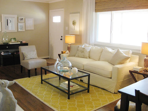
3. “Follow the rule of three. When you pick a color, use it at least three times in a room.”
*YHL Sidenote: This is a great “beginner’s tip” and it can really add balance and easy cohesion to a room- but we’ve seen many stunning Domino magazine rooms with one amazing shot of orange in the duvet while the rest of the room is all neutral and creamy tan to prove that this is one rule that’s meant to be broken.
4. “Think of hallways as palate cleansers- the sorbet that’s served before diving into the next course. Keeping them neutral allows you to branch into any color in rooms that flow off them.”
*YHL Sidenote: For the most part this is an amazingly simple concept that can really do you no wrong. In our own house we have the lightest cream tone in our entire palette relegated to our hallways and we love how it neutralizes and harmonizes all of the differently toned rooms that branch off of them. But again, we’ve seen our fair share of gorgeous and bold hallways and entryways, so if drama is the name of the game then throw this rule out the window and go for a deep eggplant, a royal blue, or even a lime green color.
5. “Look in your closet. You are your own best inspiration for color.”
*YHL Sidenote: I love this idea in theory, but since about 90% of my clothes are black it’s not a very workable approach for me. But the colors in my jewelry and even my shoes are pretty indicative of the tones that I lean towards when it comes to home decor: neutrals, animal prints, a few metallics, and some breezy greens and blues (see more of our closets right here).
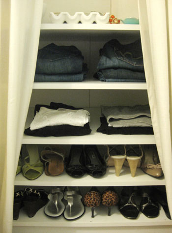
6. “Don’t sweat slight color variations between fabrics and walls. The best rooms are slightly off- stronger, lighter, softer, just not a spot-on match to a swatch.”
*YHL Sidenote: Amen! Matchy-matchy decor is the bane of our existence (read more about avoiding it here). Lots of colors “go” without being perfect matches, and you’ll end up with a room that’s textural, dimensional, and layered… which is so much more sophisticated than a flat and perfectly coordinated space.
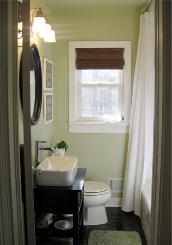
7. “When you’re spreading color around a room, think about proportion. If you’re using three colors, try a 70/20/10 distribution. For two colors, go 70/30.”
*YHL Sidenote: I’m no mathlete, but this sounds about right. So if your walls, sofa, and rug are varying shades of tan (in the mocha, cream, beige, sand, or wheat territory) that would make up about 70% of the space and then you could add 20% of another color (like a few white painted furnishings and breezy floor to ceiling curtains) and then bring in 10% of an accent color in the smaller accessories like pillows and art to liven things up (try a pop of yellow, aqua, amber, lime, lavender- the possibilities are endless). We like a lot of layering so three or more colors in a room appeals to us (some more concentrated than others so they don’t all fight for dominance) more than the two color 70/30 option mentioned above. For example, our newly renovated bathroom is roughly about 70% soft khaki green (on the walls, in the towels, in the bath mat, etc) and 20% brown (in the mirror, shade, flooring, vanity, art) and 10% crisp white (in the trim, shower curtain, sink, and small accessories).
8. “The back of a fabric, curtain, comforter, or area rug is sometimes more interesting- and toned down- than the front. If no telltale signs like hems will show, go ahead and flip it. Designers do it and so can you.”
*YHL Sidenote: Love it. I once picked up a leopard bedsheet on clearance, turned it inside out and made throw pillows since I loved the softer and more subdued pattern much better than the look-at-me-leopard version on the “right side.”
9. “Get out the digital camera. It’s amazing how a photo can point out problem spots. Add some colorful accessories, take a photo, and compare.”
*YHL Sidenote: So true. We often find it easier to evaluate rooms using photos than when we’re actually standing in them (things like balance, proportion and scale are so much more obvious- and it’s easy to see if a corner is feeling flat so you can amp it up with a quick tweak or two).
10. “In a small room, keep the walls the same color as the primary upholstered furniture. The room will seem twice the size.”
*YHL Sidenote: Again, so true. Of course you don’t have to take “same color” to the extreme since anything that’s a shade or two lighter or darker will work just as well. For example, you’ll notice that we have a cream sofa in our soft tan living room and a tan sofa in our creamy-hued den. Thanks to the slight-but-not-overly-jarring difference between the walls and the largest items of furniture, the room is a lot less “busy” or “full” looking.
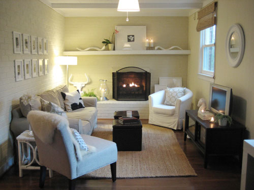
11. “The era of the bright white ceiling is over. Paint the ceiling a shade lighter than the walls to visually raise it and avoid a jarring start-stop. Go a shade darker to bring it down and add coziness.”
*YHL Sidenote: We wholeheartedly agree! In fact we’ve been slowly painting our white ceilings (we went a shade lighter in our bedroom, carried the wall color onto the ceiling in the bathroom, and went with a fun coordinating shade in the nursery) and we love the effect. Don’t ignore your room’s fifth wall!
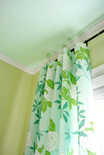
12. “Paint is the least expensive mistake you can make. Be brave. The worst-case scenario is that you’ll have to repaint.”
*YHL Sidenote: You’re preaching to the choir here BHG. We like to say that we have a Nike-esque philosophy when it comes to paint: just do it.
13. “To tell if a color has a pinkish, grayish, or greenish cast, look at similar swatches side by side. It’s all about comparison.”
*YHL Sidenote: This is how we have picked every single color in our house (and avoided a slew of “too-yellow” tans and “too pastel” greens and blues). Comparison is key- and be sure to check them at all times of the day so you can evaluate how changing sunlight effects the swatches.
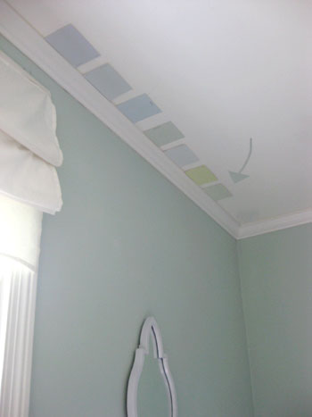
14. “Think of neutrals as peacemakers. They can help colors get along.”
*YHL Sidenote: Everyone can use a little peace in their house. And neutrals can be defined as so many things- not only are they tans and beiges and creams and grays and mochas- they’re also whites and even gray-blues, khaki-greens and all sorts of “muddy” colors that read as eye-pleasing neutral backdrops in a room.
15. “Wallpaper or paint the inside of a bookcase to set off what’s displayed. Use yellow wallpaper in a white-built-in and wrap the same paper around lamp shades.”
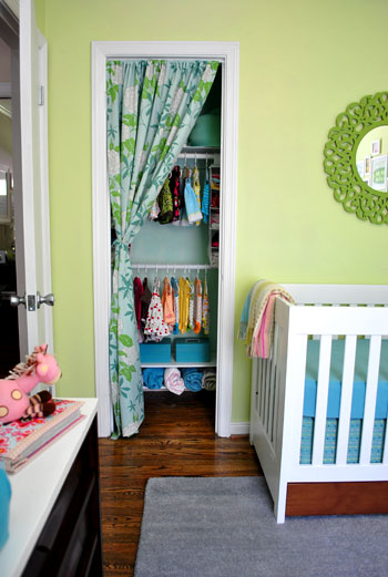
*YHL Sidenote: You can take this a step further by painting the inside of your closet a fun contrasting color (like we did in our nursery) and can even paint the inside of your kitchen cabinets to really spotlight your white china (which we also did a while back).
So there you have a whole slew of paint color picking advice and general hue suggestions to help you upgrade your home. What do you guys think? Are there any that ring especially true or inspire you to try something new? Do you have any color advice of your own you’d like to share? Spill the beans.
Psst- Looking for more paint color advice? Check out these posts for more ideas when it comes to pinning down a whole house color scheme and picking the perfect paint color.

Harinee says
Hey, great post, I especially love the tip about painting the ceiling – we have ceiling not taller than 9 feet and no moulding, do you think painting it a colour instead of white would work for this height?
Also I’ve been going through your ‘painting’ posts after looking at this and you mentioned re-painting a few rooms – do you strip the paint from the walls before re-painting or does the primer go over the old paint. It’s probably a dumb question but I’ve never painted before and I want to be sure!
YoungHouseLove says
Hey Harinee,
Absolutely, we have 8 foot ceilings thoughout our house and we’re in the process of painting them all! And as for the process of repainting, we just go right over them with new paint (no stripping or priming). Hope it helps!
xo,
s
jja says
In your living room there is a door with small window, it this door to the outside and the room is entry room or something similar?
Would like to seee some pics of your hallway.
YoungHouseLove says
Yup, that’s the front door that leads out to our front porch. And as for hallway pics, we have a project planned there that we’ll hopefully tackle soon. So stay tuned for pics!
xo,
s
Crystal says
I’m not sure if you already have a subscription to BHG, but if you don’t you can get it for only $2.99/year for up to 4 years through WOOT with promotional code: HOMES! I signed up for 4 years for only $11.96 total! This may only be available today, check it out here:
http://deals.woot.com/deals/details/14e5002a-96d7-4310-b8eb-c9e3cb1b92d0/better-homes-gardens-yearly-subscription#15
YoungHouseLove says
Hey Crystal,
Thanks so much for the tip! not only did we extend our subscription, but we got one for John’s mom as well. What an awesome (and inexpensive) gift!
xo,
s
Rachael Geiger says
We JUST finished painting the exterior of our home. The brick is a red/orangey color with beige mortar, and all the facia and eves which were formerly Almond are now Sherwin Williams “artichoke” – which we LOVE. Our problem now is that the front door, currently a dusty grey, totally blends in with the rest of the house. We want it to POP, and look much more welcoming than the current color implies – Any suggestions?
Here’s a link to a pic – http://www.facebook.com/photo.php?pid=31296552&id=79801417
Thanks so much – yours is the only blog I’ve ever subscribed to and I look forward to it every morning!!
YoungHouseLove says
What about a rich eggplant or plum color? That can look amazing with artichoke. You could also do a deep inky or navy blue or even fire engine red (we love our red door with red brick). Hope it helps!
xo,
s
candace @ thecandace.com says
I’m late on commenting for this post but it was SO very helpful! One day, I’ll have a new casa that I can’t wait to get started on repainting/decorating and I will keep these great tips in mind!
stacy says
I love this post! I have a quick question…we have 9 ft ceilings and thinking of updating our home from all tan walls (and ceilings…previous owners painted the whole house and ceiling the same color!!) We were thinking at least one room (we have a long linear floor plan) to be BM Ashen Tan…which coordinating ceiling color would you choose??
YoungHouseLove says
Hey Stacy,
We love Ashen Tan! And we would definitely go for a super soft blue tone on the ceiling to complement it without creating a big tan/beige box. It’s a polished and chic look that’ll earn you a ton of compliments! Good luck.
xo,
s
Laura says
Number 8 (using the “wrong” side of a fabric) sounds weird, but I am here to tell you that it can really work!
A couple of weeks ago I ordered some Waverly fabric online — it was on super-sale and I didn’t have time to get a swatch before the sale ended, so I just went ahead and ordered because it looked great on the screen. When it arrived, the fabric was great, but darker than I wanted on the “right” side.
After reading your post I had the confidence to go ahead and sew the drapes using the back side. They look just right! The pattern is still visible, but the color is less overwhelming, and without the “right” side visible as a contrast, no one can tell there’s anything unusual about them. Thanks Youngsters!
Jessica says
Hi, I am looking for a beige for my master bedroom and another color that goes well for my master bathroom. I have been drawn to Benjamin Moore Clay beige but I’m not sure where to use it. Do you recommend any colors that would mesh well?
Thanks!
YoungHouseLove says
I’d grab it on a paint swatch with lighter and darker tones on the same swatch and then just slide up or down for a lighter or darker color that’s guaranteed to coordinate. Otherwise you could do a pretty and soft blue-gray (always looks good with beige) like Quiet Moments. Hope it helps.
xo
s
Calli says
Thank you for posting this! I’m in the middle of renovating my 1970s ranch, and after they put down the tile I realized I had inadvertantly made the whole house brown! Wheat walls, tan couch, brown flooring. Now I’m struggling with what kind of rug and accessories to add to break it all up. I love the yellow rug you showed in the photo. What colors would you suggest to go with SW Beach House painted walls?
YoungHouseLove says
I would bring home a bunch of paint swatches and hold them up in the room and see which ones you like. Then you can choose 2-4 and use them for accessories to break up the room and add more color. Celery green and white and brown always look great together – often with teal or navy or soft beachy blue. Good luck!
xo
s