We’ve long disclaimered pictures of our kitchen with “oh, and we still need to add crown molding.” But that stops today! The unfinished edge where the wall/tile meets the ceiling…
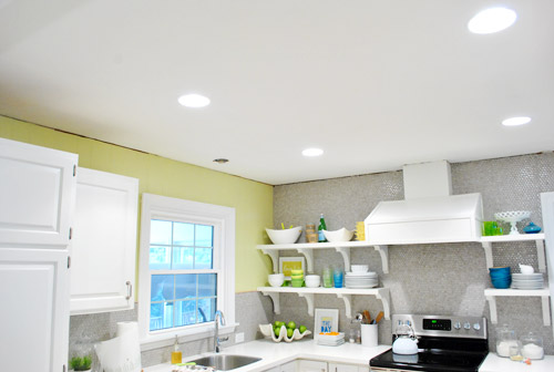
… is no more!
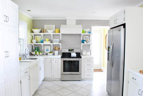
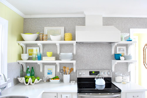
Let’s get a little closer…
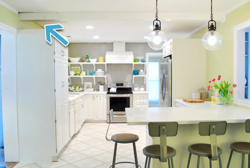
Wait, let’s rewind so I can attempt to tell you how we got there. For all of those who have been wondering about that dark line above our pantry (a few folks asked if the beam was sagging or if there was a hole) – it’s just another spot where we’ve been missing crown molding. Since there had originally been cabinets to the ceiling along that entire side of the kitchen (including one that wrapped around that beam), we’ve been stuck with a few crownless areas since we took those cabinets down in November. So they look dark and crag-y without trim to lend that finished look.
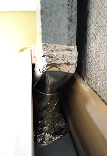
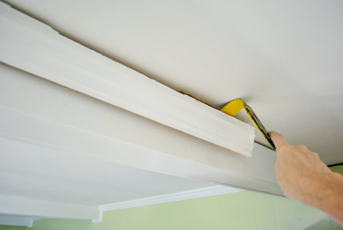
But before we could start installing crown molding, we had to make a quick fix to our hood. In a rush I had used some regular duct tape to seal up the vents on my hood. Hey, it’s called duct tape, it has to work in ducts, right? Wrong! A few smart commenters expanded my tape knowledge on my hanging post (and kept me from having some ventilation issues down the road) by reminding me that I needed to use the real metal foil tape stuff instead. So I took a moment to pry off a few pieces from my wood cover…
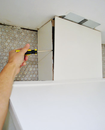
…and shimmied my hand in there enough to remove the bad duct tape and rewrap everything in the legit foil stuff.
But enough about tape. Let’s talk crown molding. This will be a bit hard to explain (and the fact that I took less-than-stellar pictures of this process won’t help me), so bear with me:
Our kitchen has three types of crown for some weird reason. There’s traditional crown around the perimeter of the room – except that it’s very very slightly smaller on the fireplace half of the room (nothing you’d ever notice with the naked eye unless you were literally holding them up next to each other, but thanks to the beams they never touch so we didn’t even detect this phenomenon until we tried to fill in a few crown-less areas and learned it was slightly different). Meanwhile, the beams just have a thin cove molding on them except for one side of one that randomly has thick crown running across it – so strange!
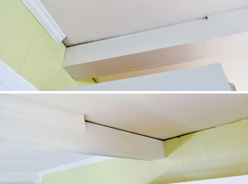
So our challenge was that we had to replace small bits of all three and remove the way-too-thick trim on that one mismatched beam. Because redoing the entire room from scratch would actually have been a big project and a pretty pricy undertaking since all the beams that would have to be trimmed out on each side would add up to the equivalent of about four rooms’ worth of trim.
Further complicating things – none of the molding seemed to be the standard stuff you can buy at Home Depot, so we couldn’t just fill in the gaps with fresh pieces from the store. The only thing saving me from having to re-crown the entire room? I had carefully saved every single piece of crown that we took down with the cabinets.

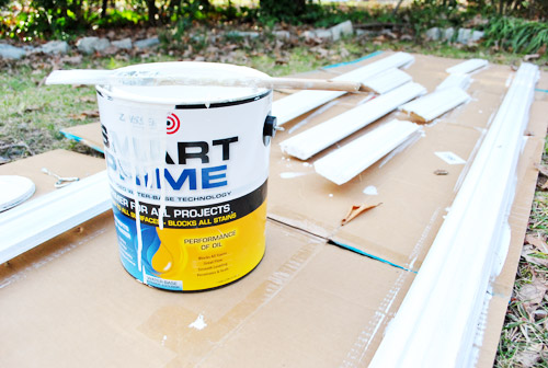
Of course it needed some primer and paint to keep flashbacks of our old woodsy kitchen at bay (we like Zinsser Smart Prime when it comes to painting wood trim since it can bleed through and ruin your paint-job if you don’t use a stain-blocking primer first). Then we followed that with a few coats of off-the-shelf white from Behr (the one with paint + primer in it, so it gave us great coverage with stain-blocking primer underneath it). Why did we use that paint? It was what we used for the rest of the trim in the kitchen back when we painted the paneling. It’s a really nice crisp white color that layers in nicely with our white Corian couners.
Now for the bad news: I was short a few pieces. Wop wop. My leftovers of this large sized crown weren’t enough to fill the gaps around that side of the room. Then I had a flash of brilliance (or used ordinary common sense that any human being would possess) and realized that the odd mismatched beam with the thick trim on one side was the right size for the job. So I could steal it from there and replace it with store-bought smaller trim (which exactly matched the stuff on the other beams- or was at least really close). Then the whole room would have trim that actually appears to make sense and I wouldn’t be short on trim to finish the job. Talk about lucky breaks. That weird mis-matched beam actually saved us from having to re-crown the entire kitchen.
So the good news was that I had another big, long piece of crown to use to fill in all the spots that needed filling in. And the bad news was that the kitchen was actually looking a lot uglier at this point:
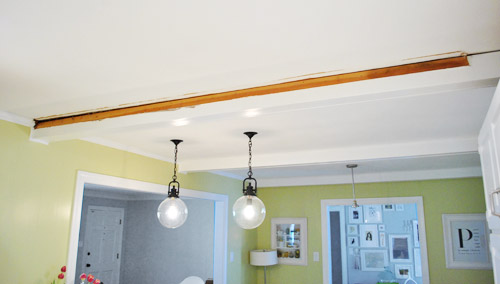
Now this is where my photos start to get terrible. I don’t know where my head was (actually I do – I was in a post-book photo shoot fog). So forgive me that this isn’t really a “how to install crown molding” post and more of “here are fleeting snippets of how we did it and some pics of the finished product.” Maybe next time I’ll be a better documentarian (we’ve always wanted to put crown in Clara’s room along with the other two bedrooms on that side of the house, so we promise to take better photos and actually share a step by step rundown when we do). And in the meantime, here are links to some of the tutorials that I learned from (since this was my first time and all). I read the ones here, here, here and here.
Cutting was interesting, to say the least. You have to cut crown at the same angle that it will sit against the ceiling – i.e. not laying flat. One of the tutorials suggested temporarily gluing a piece of guide wood to your saw table to help hold the piece of molding at the angle. I took a picture of myself starting to try this, but it never really worked for me (I didn’t want to use heavy duty glue and ruin my saw, and the lighter duty stuff I had wouldn’t cure thanks to the cold temps).
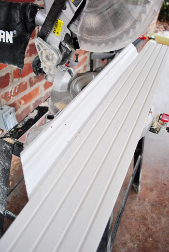
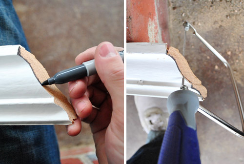
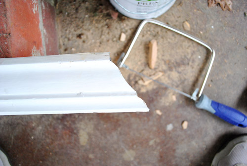
And even once I figured out how to make those cuts (just by holding things by hand), I still wasn’t done cutting. I still had to use a coping saw to get rid of some extra overhang that would prevent my corners from sitting flush. See that going on below? All of the tutorials suggested marking the edge with a darker marker to help ensure that I was cutting as close to the edge as possible. I guess it helped.
Being my first time, things went okay – but I’ll admit my cuts weren’t perfect. Nor was my ceiling perfectly flat (oh the joys of an older home). But everything was sufficient enough that a little caulk and paint ended up finishing it off really well. Whew. So here are my first few pieces in place (without caulk and paint yet, obviously).
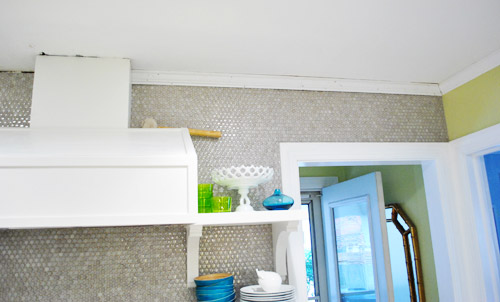
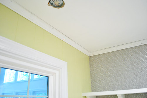
Despite having primed and painted all of the pieces, the general banging around that happened during the cutting / coping / hammering process got them fairly beat up.
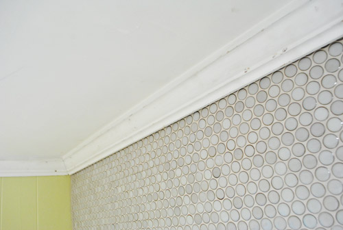
No biggie, I knew we’d have to break out the paint anyways for nail holes and more obvious spots (like where we would be replacing the big crown on that one beam with smaller cove molding).
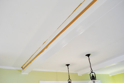
Speaking of cove molding, remember how I was missing just a small section on the other side of that beam? Well, I had hoped the new stuff that I got from the store would match… but I wasn’t so lucky. Turns out our existing stuff wasn’t a standard size. So that one whole of the beam ended up needing to be replaced with something slightly larger. Thankfully since each side of the beam runs into thicker crown around the perimeter (and doesn’t meet other beam trim on the other side) the difference isn’t detectible at all (it’s one of those you-can’t-tell-unless-they’re-next-to-each-other-things). So although it might sound annoying to replace one side of a beam for a small missing piece of not-standard cove trim, it was muuuuch better to replace the side of one beam instead of six sides of beams and ten perimeter pieces between each beam and around the rest of the room. In short: it could have been much much worse.
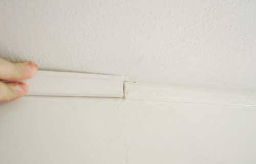
And I did get lucky when it came to the small section of missing crown on that side (remember how it’s slightly smaller than the rest of the crown in the room?). In a last ditch effort to keep from having to replace all of the crown on this half of the room, I found a single piece of matching molding in a trash bucket in the basement. I was never so happy to see old orange-y trim in my life.
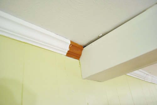
So here are those pieces installed and caulked over. The shot below sort of demonstrates how the thinner trim along the beams meets the thicker trim around the room, so I hope that makes sense now. And yes, this is the only picture that I ended up snagging of the whole caulking and painting process that Sherry and I tackled over the course of a few hours. Basically we just used white paintable Dap caulk and a caulk gun to run some beads wherever we need to fill things in, smoothed them with our finger, waited for it to dry, and painted it to keep it all looking seamless.
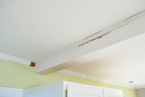
So let’s just fast forward to some afters, shall we?
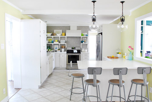
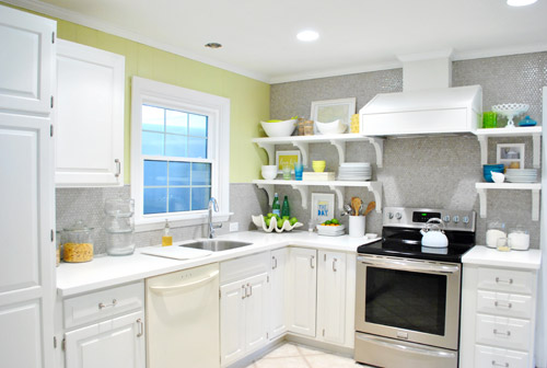
It’s a small change, but it makes a pretty noticeable difference in our opinion. Minus the empty fixture hole in the ceiling above the sink (and mismatched dishwasher) you could almost be tricked into thinking this was a finished room now. Although the real game-changer will definitely be those cork floors – which we’re more anxious than ever to get in there so we can call this kitchen done-zo. Slowly but surely.

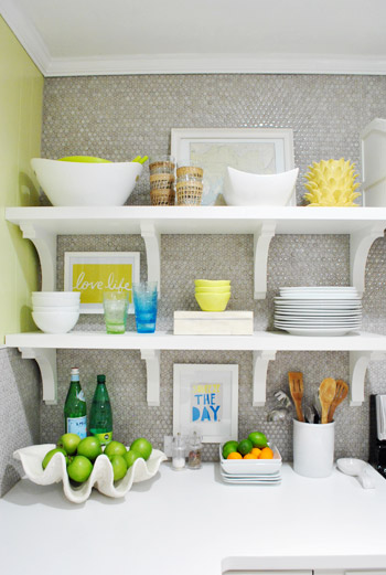
Oh yeah, and since everything came off the shelves when the trim went up, of course it didn’t all go back up in the same way. In other words: Sherry had a grand ol’ time playing around with a few things – like adding two more frames, eliminating some stuff that we realized we weren’t using very often, and just playing around because it’s her idea of a good time). As for a few of the frames that are actually hung, we used 3M removable picture hanging strips (which meant no holes in our tile and an easy-to-remove-whenever-we-want result).

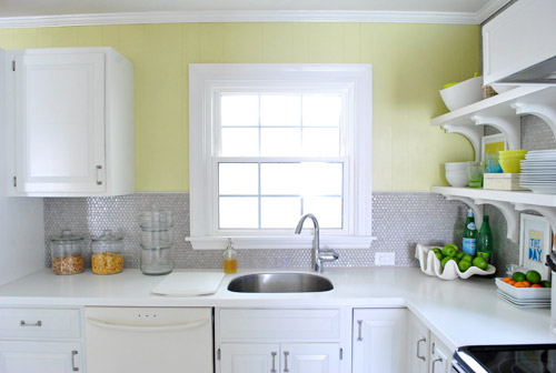
Oh and since some of you requested a photo of the window to see the slice of “breathing room” on each side that finally makes it looked balanced, here it is. Once we have a nice gleaming pendant light hanging down in front of the window it should be pretty darn charming. It’s a nice little airy spot since the wall of shelves is a pretty big focal point, so not filling up every square inch of every other wall feels like the way to go for us. We’re also toying with something on the window (roman shade or blind) so we’ll have to keep you posted.
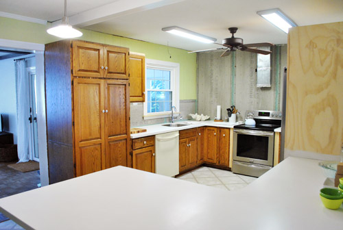
We’re thankful that it’s a far cry from the crazy off-centered deal that we had going on for a while before the tile and shelves went up to restore the balance:
Here’s another shot from a similar angle where you can see more of the crown.
And another:
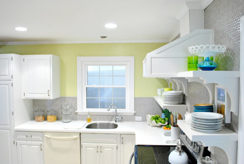
So that’s where we are. Next up: finding/hanging a pendant over the sink, finishing the peninsula with some decorative wood molding, installing the dishwasher, and finally adding those cork floors so we can call this 3.5 month marathon done! Oh yes, and doing something to the side of the pantry and possibly altering the stools is at the very end of the list (not sure how the cork will change things so we don’t want to jump the gun on either of those things).

What did you guys do this weekend? Any trim hunting/cutting/hanging? Or open-shelf tweaking? Or metal-foil-tape using?

diana says
Finally! Magazine ready. I can finally say without hesitation: I love it! Can’t wait for the floors and the dishwasher. T?hen the room will be grounded, and the stainless steel balanced on the three sides. VERY good job, S&J!
YoungHouseLove says
Aw thanks Diana! We can’t wait for those finishing touches either!
xo,
s
Crystal says
I am hoping you put up a giant chalk board (or paint it on) the pantry. I know whatever you do will be wonderful. Looks great! I am house hunting and keep comparing homes to yours!
Jonica Whitmore says
it looks amazing
Meg says
This is looking so fantastic! i love seeing the progress. Sheri – your accessory colors are so fun! I hung part of a message center in my kitchen this weekend with the 3M velcro strips – LOVE those things! (btw – I cannot wait for the cork floor transformation)
Kate says
The bright white crown against the hood really highlights the color of the cabinets. In other pictures, the cabs look bright white, but you can really see the contrast now. I bet in person the difference is very noticeable.
YoungHouseLove says
Yes, in person it’s sort of a soft layered look. We’re so happy everything isn’t all one shade!
xo,
s
Pesh says
Does the house feel cluttered when you walk in? Just asking because when you walk in, you can see 3 walls full of display items – dining room shelving, kitchen shelving, hallway gallery wall. Was wondering if there is anywhere “open” for your eye to rest?
YoungHouseLove says
Oh yes, it’s not going to make much sense until this room and the dining room comes together more and we get a video walking through the entire house, but there are lots of places for the eye to rest, and even where there’s a lot going on, the colors are muted so it’s not extremely high contrast (ex: frame wall full of all white frames, white shelves with lots of white objects on them, lots of windows and areas of wall with less art/more breathing room, etc). The house actually feels a lot less cluttered and overwhelming with the wall down between the dining room and the kitchen (so lots of light passes through) and with those heavy upper cabinets down (and lighter open shelving up instead!).
xo,
s
LARY says
I know it might sound crazy, but I might be a bit sad that the kitchen make over is coming to an end… I love lov elove these make over post HAHA Lookking forward to the book btw You guys are awesome :)
YoungHouseLove says
Aw, you’re sweet Lary! We still have tons more to do (three untouched bathrooms, a completely un-done sunroom and playroom, tons of other rooms that are half-baked, a carport to convert into a garage, tons of outside stuff to do, crown molding and wainscoting to add, building a walk-out deck, etc). So there are probably going to be a lot more “series” going on when it comes to other makeovers! Haha.
xo,
s
LARY says
That list made me smile! HAHA I’m a dork! Have an awesome week guys!
YoungHouseLove says
Thanks, you too!
xo,
s
DJ Sherry says
Beauty! Now I know why the crown didn’t happen right away…fitting all of those original pieces together is sooo slow! What patience you have. My cabinets are straight across the top like yours. I agree that crown is to fancy. Mine still feel unfinished somehow, so I am searching for a straight, plain molding to top mine to polish it off just a bit. Just haven’t quite found it yet. There is that fine line between too much and just right. Edit, edit, edit. :)
Jennifer S says
I love the way the kitchen is turning out. What about doing something like a chalk board on that cabinet near the door frame to the living room on the left? It seems like a great place for it. :)
YoungHouseLove says
Definitely a possibility!
xo,
s
Sam @ Leave the Nest Up to Me says
Looks fantastic! It’s amazing what a little crown moulding can do to change the look of a room. I’m digging the spiky yellow ceramic thingy too.
YoungHouseLove says
Thanks! That’s an artichoke planter from HomeGoods a few months ago!
xo,
s
tae says
the kitchen looks so amazing! it is worlds beyond where you started from! congratulations on everything you’ve acomplished so far!
have you considered painting the trim on the vent hood a contrasting color?
YoungHouseLove says
Never thought about that! Definitely something to think about!
xo,
s
Steph says
I was thinking that, too. I know it’s your kitchen, so if you like it as is, that’s great… but I think that’s what is throwing me off… it seems to blend into the wall too much and be sorta bland. A little color or something could be awesome.
Nichole C. says
It’s amazing what a little trim can do! What you two have done is SO great!
lina says
i truly love to read your blog! your kitchen is absolutely gorgeous.
do you plan to do a budget run-down of your kitchen transformation?
YoungHouseLove says
Yes! We’ll have the whole shebang in the full “we’re done!” post!
xo,
s
Katie says
Love the use of the word Done-zo! Gotta love a Parks and Rec reference. Here’s hoping Done-zo catches fire, just like Sherdog, am I right?! ;-) The kitchen is really coming together, looks so bright and beautiful. Can’t wait to see those floors! P.S. I am telepathically sending you all my spare energy, you guys seem stretched to the brink, hang in there!
YoungHouseLove says
Haha thanks Katie! We’re doing ok, really! Chocolate helps! Yay caffeine!
xo,
s
Krissy says
It looks AMAZING.
I have been trying (pleading/begging/etc) to convince my better half that our kitchen would look so great with white cabinets. So far, he is not on board. Saddd!!! We have orangey wood ones now. The house is 9 years old so the kitchen is fine and functional and what-not but I am so in love with the white cabinet look…
On the flip side, though, he IS agreeing to crown trim in the bedrooms. :-D
Excited to see the cork flooring!
Meg@ Green Motherhood says
It definitely finishes off the range hood. Looks wonderful.
I’m quite impressed if this is John’s first attempt with crown molding! It’s a difficult project.
Hubs first attempt was a bathroom with many corners. It did not go well, lots of cursing fom the garage. And my only intervention was to question the 2 inch gap of crown at the most obvious corner that he promised me he could fill with caulk and sand. It did not blend, at all! Ha! We still look back on that and laugh.
YoungHouseLove says
Aw, so glad you can look back and laugh! I think it’s the key to life! Haha.
xo,
s
andrea worley says
So crazy awesome all the things you’ve done to this kitchen!! It looks bright, cheery and so functional! Awesome job!
katie says
I’m always amazed by what a huge difference crown molding makes. We don’t have it in this rental that we’re in now – it’s a gorgeous space, and I just keep thinking it would be SO much more gorgeous if it had crown molding!!
erin says
love the crown molding! i’m jealous as to how beautiful your kitchen is turning out to be! have you thought about framing out a space on the side of the pantry and painting it with magnetic paint and chalk paint? then you could have a place to write grocery lists and clara would have a place to color with chalk and stick up alphabet magnets!!
i didn’t do what i wanted to this weekend, but i am currently trying to motivate myself to clean and paint my daughter’s room. it’s hard though when you are the only one doing it (because the hubs is @ work), you have a 2 year old to contend with, and you are 7 1/2 months pregnant with no nesting drive and plagued by exhaustion. but i am bound and determined to get it done!!!
YoungHouseLove says
That’s definitely one possibility that we have for that side of the pantry! We’ll have to keep you posted! And good luck with your daughter’s room! I know what you mean about being exhausted when you’re prego and can’t imagine it with a 2 year old running around! I’m rooting for ya!
xo,
s
Emily Scanlon says
Hi ya’ll!! (moved away from the south, and so glad to type that again…feels like an old friend) I’m a new reader. So happy to discover your blog. I have just begun my own foray into DIY because we are putting our house on the market soon. Thanks for your candid honesty about the ‘intimidation factor’ of DIY. I feel ya, sister! But so far, so good. Loving how I feel after I finish a project (big or small) and props to you guys for a successful weekend kitchen project. Its lookin’ fantastic!
YoungHouseLove says
Aw thanks Emily! Good luck with everything!
xo,
s
Melissa says
It is awesome how trim details finish the look off. My husband installed trim in our bathroom project this weekend. I haven’t photographed it or written about it yet. I’m amazed that you’re at 3.5 months; we’re sitting at 5 months on our tiny little bathroom, but we have those pesky jobs that get in the way of progress. You can see what we’ve done at http://www.msgfun.blogspot.com/. I’ll get a trim shot up this week, promise!
YoungHouseLove says
Looking good!
xo
s
Lauren says
I’m SO IMPRESSED! It’s such a bright, beautiful, airy kitchen now. (applause)
YoungHouseLove says
Aw thanks Lauren! You’re sweet.
xo,
s
Catherine M says
Nice job, everything looks beautiful. The rich chocolate of the cork floors will really ground everything and make the grey of the penny tile wall and various colors around the room pop!
I found a ton of awesome classic rock records at a Goodwill this weekend, most notably five Jimi Hendrix, Eric Clapton, and Santana albums! Check out my post on it: http://www.inspirebohemia.com/2012/02/goodwill-classic-rock-treasure-chest.html?utm_source=BP_recent
YoungHouseLove says
Awesome finds!
xo,
s
Hallie V. says
Kitchen is looking fab! So much better than before. What a dramatic before and after! Can’t wait to see the floor.
Have you guys thought about magnetic chalkboard paint for the end of the pantry. Just seems like the perfect place for grocery lists and Clara’s most recent artwork since magnets don’t work on stainless steel.
Looking good!
YoungHouseLove says
It’s definitely one possibility we’re considering!
xo,
s
Johnna says
i MUST know where the glass jars are from….they are new and cannot be snuck by me! lol!
xoxo
YoungHouseLove says
Haha, the glass jars of flour and sugar are old (from West Elm in 2007) and the ones with cereal are from Target a while back and the stacked glass containers from HomeGoods a while back (maybe a month?).
xo,
s
Dara says
I’ve been following you guys from the beginning of this kitchen renovation and the installation of the crown mold really does complete the room (even though I know you guys have a couple more things on the to-do list). I can’t wait to see the flooring go down!
Angela says
Unbelievable! What a transformation! You did amazing!
Leslie says
I love how your posts are so detailed and you use before and after photos a lot. I haven’t even started on my kitchen and I’ve lived with it for almost 10 years! I just haven’t had the fortitude, courage, support, or money. But it is getting to be time…….I cannot wait much longer. Thanks for providing inspiration and good advice.
YoungHouseLove says
Aw, you’re sweet Leslie. You’re welcome!
xo,
s
leah says
WOW – your kitchen looks amazing! AMAZING! What a transformation – you must be just bursting with pride. The colors, the penny tile – it is all coming together so beautifully – can’t wait for the cork floors to come in and ground it all. If you don’t mind, I do have a question re: one teeny, tiny little thing that just bothers me in the smallest, most “not a big deal” kind of way…
The cabinet pulls on the tall pantry cabinet to the left of the sink area – they just seem to be in a weird/wonky place on the doors. I realize that you probably reused the existing holes where the previous “eyeball” knobs were, but every time I see a shot of those pulls there, it just feels like they should be lower – positioned more like all of the other pulls relative to the raised panel detail on the doors. Looking at the smaller pair of doors above, it seems like the pulls on the tall doors should be in the same spot next to the bottom of the panel detail as above – a more natural place for your hand to grab. Just a little detail, and I know you always have thought everything through so well… it is probably exactly how you want it, silly me! It’s just one little nuance that gives me pause in a room of exuberant loveliness.
Thanks for the inspiration – keep it coming!
YoungHouseLove says
Aw thanks Leah! That’s actually a really natural place for our hand to grab (we tried lining them up with the lower drawers and it felt really odd to open the doors that low since they’re taller than me, and reaching so low just felt weird). Maybe we got used to them in that place but it seems standard for all pantry doors since we googled around, so we went with it!
xo,
s
Crystal says
I have to say, because I’ve been thinking of it for awhile now, I really think that you guys should keep the flooring as it is. (I actually really like the mostly monochromatic look that you’ve got going now.) I know that you want some nice, dark, contrasting flooring… but, could you do that with a large area rug? Or, maybe add dark window treatments and a few other dark accent pieces? I guess I haven’t read of a performance or quality issue that would warrant the replacement, so it seems like a waste to replace the current flooring if it isn’t necessary.
P.S. I’m 110% not trying to be snarky, as I LOVE your home and hard work… so basically, feel free to ignore my comment as it is your house after all! ;)
YoungHouseLove says
You’re so sweet! No worries at all! The current vinyl floor is actually in terrible shape (dings, dents, tears- and even missing in some areas like a square right next to the pantry). We also prefer dark floors and love when a whole house has a seamless look (like our first house which had all mocha wood flooring by the time we finished renovating) since it seems to help with flow (instead of walking into rooms that feel choppy from a white floor and then a dark floor). It’s definitely one of those personal preference things, but we don’t think old vinyl flooring really brings the whole update “down” since wood, or cork, or real tile seems like a better choice. And after weighing all those options we’re so excited about our dark cork!
xo,
s
Nicole says
What a difference trim makes! We are about to retrim our bathroom, and these tips helped me so much! Love the kitchen, it is beautiful.
Brenda says
I don’t usually notice things like crown molding, but it really looks great. It really completes the range hood and gives the whole room such a polished feel. I never would have known there was so much patching and craziness going on judging by the finished product. Great job!
Kelli says
You guys rock! I am so happy that all of your hard work and perseverance has resulted in a kitchen that makes you happy. It’s gorgeous! Gold star!
Jill says
Yea!!! I can finally relax…the lack of trim was getting to me ;-)
It looks FANTASTIC! Great job.
Sara says
The trim makes SUCH a difference! Really like how you styled the open shelves, the sheen on that penny tile, and those ORB pendants!!. Have you considered adding the same white brackets that are holding up the shelves to the one lonely upper cabinet beside the pantry? Just wondering what your thoughts are on this. Thanks!
YoungHouseLove says
We did try holding them up there, but it felt a little off. Just figured the wall of tile with a wall of shelving was a good “focal wall” for them, so we didn’t want to add them to that one other spot!
xo,
s
Jen D. says
Awesome! Looks great.
Helen says
It’s amazing what a difference the crown moulding makes! Nicely done. I can’t wait to see how everything looks with the cork floors.
I spent the weekend putting a bench where the closet used to be in my library/office (a bit like what Thrifty Decor Chick did, but bigger). By the time I’m done it will be a lovely cuddle/reading area! Meanwhile, I need to finish putting the…uh…finish….on the newly stained wood, and decide if I’m going to paint or wallpaper the walls in that little space.
YoungHouseLove says
Wahoo! Go Helen!
xo,
s
Katherine Elyse says
This may be an odd thing to point out, but have you considered somehow making the front of the range hood magnetic and using it for a recipe holder? The hood in our apartment is nothing to look at (and nothing we can change), but its magnetic powers sure are useful. I find it quite helpful to clip the recipe I’m working on right above my workspace. Now I’m not splashing things on it like when it was propped on the counter top; I’m also not stretching to read the next step during those times when I have to stir constantly. There are a lot of fun, colorful, and (for geeks like me) geektastic magnets out there that would add a pop of color when you needed them, but have the benefit of being 100% removable when you want those clean white lines back. (My lit-geek friend found some great ones at this Etsy shop: http://www.etsy.com/shop/beanforest?ref=pr_shop_more)
Just a random thoughtlet inspired by our own cooking space.
On a more relevant note: I love the huge difference that such a little detail made! The wall of floating shelves looked scrumptious before; now that they’re complimented by the crown molding, they’re twice as mouth-watering. (Seriously, the house-envy-drool that’s puddling on my desk may be complimentary, but it’s not at all attractive.)
Can’t wait to see the next step.
YoungHouseLove says
That could definitely be fun! They even sell magnetic paint in white so it could be secretly magnetic. Haha. Definitely something to think about!
xo,
s
Ryan says
“Talk about lucky breaks. That weird mis-matched beam actually saved us from having to re-crown the entire kitchen.”
Haha! That is great news. The kitchen is looking awesome : )
Jamie says
Wow! All I can say is it looks AmahZING (I’m trying to say it like Penny in Happy Endings)!!!!
-Jamie
YoungHouseLove says
Haha, thanks Jamie!
xo,
s
Robin says
The crown moulding is awesome – what a pain to cut and hang though! Y’all did a great job. I think for the window, you should do a natural bamboo roman shade to tie in the color in the cork floors. :). I love the look of natural materials w/ white and stainless in a kitchen. Plantation shutters would also be great! have fun! almost done!
YoungHouseLove says
That could be really pretty!
xo,
s
Emma says
Wonderful! OK – I’ve figured it out. You two are like the Bob Ross of kitchen renovators. Small incremental steps are taken at a good pace and magic happens before your eyes! Some people question Bob when he puts in another tree or mountain but it ALWAYS looks great at the end once the painting is done. Your kitchen is coming together beautifully! It’s amazing what a difference the trim made! (FYI: http://www.bobross.com/)
YoungHouseLove says
Haha- you’re so cute. I love Bob Ross.
xo,
s
Shirley says
What type caulk or grout did you use where your penny tile meets your counter? Everything looks so pretty!
YoungHouseLove says
We used caulk sold by The Tile Shop to perfectly match our grout, and used that along the seam between the counter and the tile/grout. I think it’s just their standard tile caulk (it comes in a bunch of colors so just match your grout). Good luck!
xo,
s
Carrie says
I can’t wait to see the dark floors in! Tell me we don’t have to wait too long and that project is up next!!!
YoungHouseLove says
It should be within the next few weeks for sure! We just have a few more things to do before we’re ready (we’re waiting for the team of photography folks leave before we dive in).
xo
s
Kelley C. says
Perhaps someone has already suggested this, or you’ve thought of it yourselves, but what about painting a chalkboard on the side of the pantry? You could frame it so it still looks sleek and refined, but wouldn’t Clara have fun playing with that? And you could magnetize it for those magnetic letters!
YoungHouseLove says
Always a possibility! We’re waiting to see if the cork will make chalkboard paint look too dark (in which case we might go with a lighter paint that’s still made to be a chalkboard and magnetic). We’ll keep you posted!
xo,
s
Lindsay @ A Walk in the Closet says
Wow, this is simply amazing!! I don’t even know where to begin!!
Lisa says
You continue to inspire and amaze. Wonderful job on everything – the redesign is fabulous.
YoungHouseLove says
Thanks Lisa!
xo,
s
Karen F says
looks awesome, guys! I cannot believe your patience with matching everything up – you’re very detail oriented, John! I think this would have been the project that put me over the edge if I was doing it…I got a little stressed out just reading about it! Glad it all worked out! :)
HeatherM says
You’re in post photo-shoot fog and almost done w/ the kitchen too? It sounds like you guys are due for a much deserved REAL vacation pretty soon. (and I seem to remember that was in your goals for the year too :)
YoungHouseLove says
Yes, we are going to MAKE THAT HAPPEN!
xo,
s
Wiggs says
So…I accidentally subscribed to receive an email when there are new comments on this post. And that’s what I’ve been doing all day. Instead of work. (I don’t know how you keep up with them so well!) Anyhoodles, did I miss the memo that you’re doing the dark cork floors throughout the whole house? For some reason I thought it was just the kitchen…but now I’m wondering WHY I thought that.
We just bought a new home in September and have dark floors, and I’m OBSESSED with how gorge they are. Even though they do show every little speck of dust (I doubt you’ll have as much of an issue with the cork flooring).
YoungHouseLove says
We’ll be doing the dark cork in the kitchen and the laundry room (the two rooms where the flooring is white) so the rest of the house will have hardwoods – which will be similar in tone and look to the cork, so it’ll be more seamless. Eventually we’d love to refinish the hardwoods in the same rich mocha color so they’ll all flow even better! And your floors sound gorgeous by the way!
xo,
s