My little stenciling project above the chair rail in the office has officially concluded. Woooo to the hooooo! It only took three 4.5 hour installments spread out over four days (so my hand-claws could turn back into hands between sessions). You can read all about my stenciling process here), but in short: it was well worth all that work and a bag of chips. Behold:
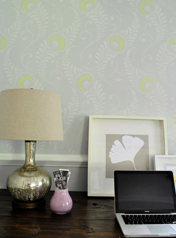
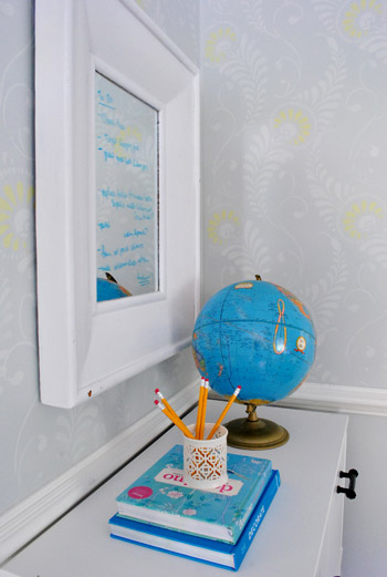
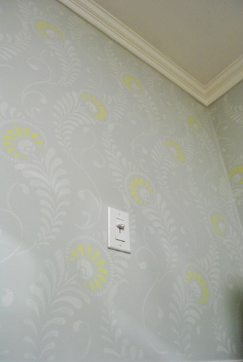
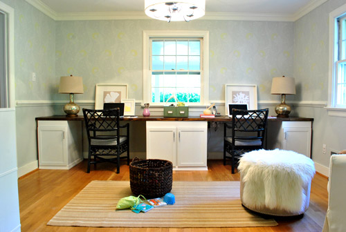
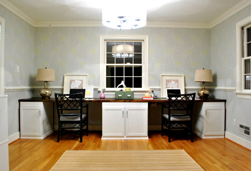
Of course since it’s a subtle tone-on-tone effect, the further away that you get the more – well, subtle – it gets. In person when you stand at the doorway to the office you see pretty feathery texture, but of course in photos it’s somehow MUCH harder to capture. Here’s a shot I snapped during the day (ignore the too-dark chairs, non-permanent lamps, bad leaning frames, too short rug, giant placeholder ottoman, random toy basket, lack of window treatments, etc):
And here’s one at night (again, avoid all the weird we’ll-change-that-later stuff going on). I wish the stencil were more obvious in photos, but in real life, yeah, it’s our favorite thing we’ve done so far. Maybe someday we’ll master the Nikon enough to truly do it justice on film.
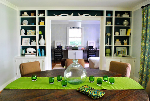
Here’s the much requested shot from the dining room, where in person you can still see a soft & pretty tone-on-tone texture (you’d swear it was wallpaper from this distance). But again, in photos it’s nearly impossible to capture. It’s a nice amount of subtle interest beyond the bold teal built-ins and colorful textiles in the dining room. And hopefully when we hang some art and add window treatments in the office it’ll be a good balance between those two rooms.
But let’s get closer again. It’s more fun.
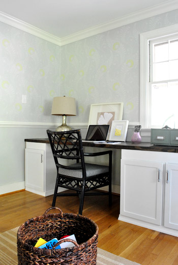
Even closer…
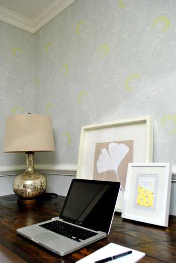
Oh yeah, that’s the stuff.
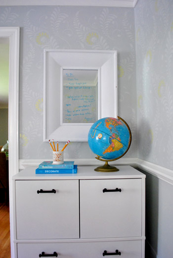
The writing on the mirrors is our weird to-do list madness. Ignore that too.
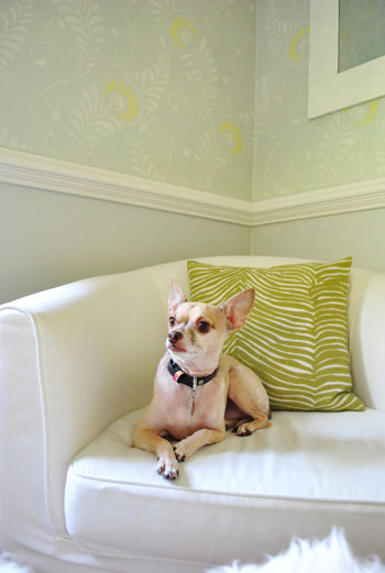
But don’t ignore this sweet faced chihuahua who just turned five (five days ago, actually). Burger is always my favorite accessory (tied with the bean of course).
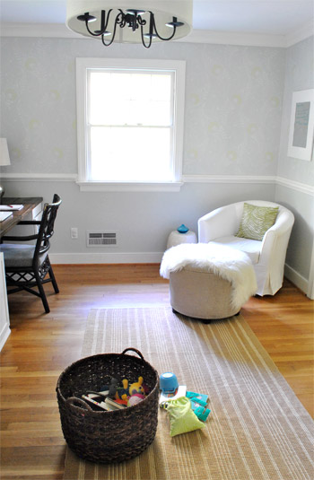
But let’s go back to ignoring stuff. Like the just-for-now chair and too-big ottoman (borrowed from the living room) along with the too small rug. Just figured you guys might appreciate seeing the room from a few different angles (even though the only “finished” things in here are really the light, the desk, and the stencil):
As for the wall color under the chair rail (Moonshine by Benjamin Moore color matched to Olympic no-VOC paint in satin), we’re toying with the idea of going a smidge darker to ground the stenciled upper part and add a tiny tiny bit of dimension (don’t want too much contrast since that might look crazy from the dining room beyond the built-ins). Of course we’ll keep ya posted if we make any changes! The nice thing about stenciling is that any other regular painting project feels like a cake walk by comparison. Haha. I actually wish you guys could all come over and see it in person – it’s so much better than these photos! Who’s down for a quick visit?
Oh but before I go back to staring at the walls with the same expression that I reserve for Eric from True Blood, let’s get into the paint color details, how we did it, and the budget breakdown. As for those paint details, here you go:
- Gray paint for stencil: half tint of Moonshine by Benjamin Moore color matched to Olympic no-VOC paint in a satin finish
- Grellow paint for stencil: Sesame by Benjamin Moore color matched to Olympic no-VOC paint in a semi-gloss finish
Oh and how about a time breakdown? It took 13.5 hours over three evening sessions. Definitely not a quick project, but one that makes you especially proud/excited/relieved/amazed when it’s actually done. As for all of our stenciling tips and techniques, click here for a nice long post all about applying the stencil. Now here’s that budget breakdown for ya:
- Stencil (from here): $54
- Martha Stewart Stencil Adhesive (from Michael’s): $2.99 (with 50% off coupon)
- Foam brushes (from Michael’s): $2.50 (with 50% off coupon)
- Quart of gray paint* for stencil (half tint of Moonshine from Lowe’s): $11
- Grellow paint* for stencil: $0 (leftover from kitchen, but would be $3 for a test pot)
- TOTAL: $70.49
I’ll admit it, it’s definitely not a super cheap-o paint project (which normally run us about $15-30. But to wallpaper the entire room above the chair rail could easily have been five hundred beans or more. And the effect is so amazing that – dare I admit it? – I probably would have paid $150 to get ‘er done. But not a penny more. Haha.
And true to form, we we still have about ten million things on the ol’ to-do list in here (one project at a time = sanity, glorious sanity). So we’ll definitely be tackling these things over time:
- adding window treatments
- painting and reupholstering our desk chairs
- hanging art on the walls (no, the oddly small leaning frames aren’t for keeps)
- finding a more permanent armchair, ottoman, rug, etc (there are lots of placeholders goin’ on)
- replacing the lamps (or reupholstering the shades, not sure yet – but we’ll keep you posted)
Anyone else do any stenciling lately? Or make any home office updates in general? Do you have a special expression that you reserve for Eric (or some other celebrity)? Oh yeah, let’s talk about that. Who’s your famous man (or lady) crush? Any Jake Gyllenhaal ladies here? Matt Damon? Team Edward? Team Angie? When I met John he totally had a Britney Spears calendar… and she was wearing leather bodysuits with sneakers. Le yikes.
Psst – You can read all about my stenciling process & the paint colors that I used here (there’s even an application video).
Update – Wanna know where we got something in our house or what paint color we used? Just click on this button:


Mackenzie says
Helloooo, Ryan Gosling ;)
P.S. I’m glad to see Sherry has a bag-o-chips thing going on too!
Megan says
I’m loving it!! It’s kinda got a modern-countryish look to it! LOVE!!
threadbndr says
This turned out SO nice! I love the little ‘pop’ of color in the blooms. I agree that going a shade darker under the chair rail make make it more polished.
I can’t wait to see what fabric choices you make for the roman shades and the rug.
Are you still planning on installing French doors between the office and the dining room?
YoungHouseLove says
Yes, we’d love to do that down the line (not quite in the budget yet but we’re saving our pennies…)
xo,
s
sommer ledbetter says
Absolutely love it! Great job!
Donna says
Looks beautiful! So worth your temporary arthritis! BTW, the pulls on your cabinets would really pop with a little ORB! :)
houseofearnest says
It looks absolutely fabulous! I would like to do something similar, but in geometric… but the mix of a geo pattern in an uber old house with crooked ceilings and walls will be a recipe for disaster!
I agree with the Eric from True Blood comment. He is on my ‘top 5’ list for sure…
Jen says
Love it!
Jessica Z. says
Let me take a minute to wipe the drool from my mouth: a double dose of absolutely fabulous walls and mention of Eric from TB … This may also be my favorite thing you guys have done so far! Totally love it and wish I had your patience to make it through this project. Kudos!
Renee says
I LOVE IT….LOVE, Love, LoVe it! Did I say how much I love it? I want to do this in my dining room now. My walls are a pretty rough textured plaster though, so I’m not sure how well it would transfer. (I know I could sand, but I’m dealing with an old house with lead paint under the newer layers of paint.)
I will have to think about it.
Newness says
I think the stenciling looks great! I especially love the subtle pop of color with the greenllow, or however you spelled it. (too lazy to scroll up but not too lazy to keep typing what’s between these parentheses) :-|
SushiMama says
Definitely check out Lightroom- I was all, “I don’t need it because I have (and love) Photoshop”, but it is AMAZING, and lets you do stuff in 5 seconds that would take me forever in Photoshop, plus stuff that I don’t know how to do in Photoshop. Especially since you shared that you take LOTS of photos. You can download a 30 day trial from Adobe to see if you like it- I did that and bought it the same day. Lurve.
And also, awesome job on the stencil- looks fantastic and I know it had to be one of those will it ever end projects!
YoungHouseLove says
Thanks so much for the suggestions guys!
xo,
s
SingleMama says
Love the pop of yellow, looks AWESOME!
Jenn L says
oh. my. gosh!!!!!! It looks awesome! Stencilling is 100% the new wallpaper but oh man did it take a long time! You guys are troopers! I want to do an accent wall sometime soon but I can barely hold still long enough to paint my nails and toes so i’m worried i’ll crack under pressure! should make for an interesting post though ;) haha!
great job kids!
xoXOxo
Jenn @ Peas and Crayons
Roeshel says
I think it’s beautiful! Subtle and so pretty! It does take a while (I just revealed our painted/stenciled floor and guest room today) but so rewarding and worth the work. I love the stencil you used and the soft colors! Great job!
Kelly @ Corner of Main says
Looks Ahhhhmazing!! I love the two toned stencil. Great idea! I hope to put a stencil in our 1/2 bath…I will have to check out that website where you got the stencil =)
Alisa says
Ahhhhhhh I’m in love! It looks fabulous! And now I’m mentally thanking my husband for recently texturing all the walls I would have tried this in- my carpal tunnel and tendinitis are thanking him as well.
John Krasinski and Eric are my loves. mmmhmmm.
Amy G. says
One of the best things you guys have done. I love it!
Cari says
It turned out great! The other day I was reading my blog roll and someone posted this fabric:
I thought it looked so familiar and then I realized how similar it was to your wallpaper! Thought any of these might be a nice option for you to recover your chairs!
Cari says
Oh, looks like your posts won’t accept images. Here’s the link for the new additions to the Wavery Modern Essentials line (strangly enough, I could not find this on the Waverly website…
YoungHouseLove says
So cute!!!
xo,
s
Nancy V says
Just a suggestion… which may have been suggested, but hey – I’m not going to read thousands of comments, hehe….
As far as the kitchen layout – why not lose the doorway into hallway? Since you are going to open up the wall to the front dining room, you could close in the hallway wall and then – think of the possibilities!! Just sayin’….
YoungHouseLove says
From the other side (the hallway) it would be a long dark alley without that opening to the kitchen, so the doorway stays (plus we love looking in on our frame gallery)! But it’s definitely one of those personal choices not everyone would make!
xo,
s
renee says
my celeb crush?
Thanks to YHL, it’s Mr. Dexter Morgan ;)
YoungHouseLove says
Yessss! Go Dexter.
xo,
s
jeannette says
1. happy burfday, dear burger, and many happy returns. you are our little man.
2. i agree with you that this is your most fabulous project yet. it is elegant and witty and handmade and subtle and very, very beautiful. sue is kvelling, i can hear her from the DR table, and she is so very proud of the color scheme, of which she is clearly the progenitor. wow. great job, guys.
YoungHouseLove says
Haha, you’re cracking us up. Ten points for the use of progenitor!
xo,
s
Tae says
Love it so much – really looks fantastic! The little bit of grellow really makes a big diff too! Is there a particular stencil size you’d recommend if I tackle my own stencil project?
You guys are the best – thank you for your fun ideas!
YoungHouseLove says
I liked that this one was jumbo (since it helped it go faster because I didn’t have to reposition it every second), but I think the pattern/stencil size should stay proportionate to what you’re stenciling. So if you’re doing the top of a dresser, something smaller might work better, but if it’s a big wall you might appreciate something large like this!
xo,
s
Laura says
AGH!!! the wall looks fantastic! I love it!!! I’m thinking about doing a stenciling project somewher in my house, just can’t decide where!
I was cruising IKEA today and this made me think of you and your map obsession. http://www.ikea.com/us/en/catalog/products/20217126/
=D
YoungHouseLove says
Cute!
xo,
s
Sandy says
That IS cute! We have a nautical theme in our living room with a great big framed french map of the atlantic, and bordering continents, dated 1786 (reproduction). Thanks for sharing that pillow!
Sandy says
I want to stencil along the top of my bathroom wall, but don’t fancy standing hunched over on the sink for hours on end. Has anyone heard of blank wallpaper border that I can stencil on and then hang?
Leslie Ann says
DEFINITELY agree with going darker under the chair rail. I had that on my mind before you ever mentioned it! I love the effect on top, but it feels a bit off-balanced with the light color underneath.
Megan says
This look awesome (as always)!!Totally random question, when painting, say a table, what kind of NO-VOC finish would you recommend? or is there such a thing? I thought I have read it on here before that you have used it, but I can’t really recall. I plan on painting the said table and then putting a topcoat on it to seal it. Any thoughts? Thanks so much!!
Janene says
You mentioned you are going to change out the dark chairs. I love the dark chairs! I think they add contrast and interest to the white cabinets. You know what they say — every room needs a little black. :) Haha — just what you need, another opinion! Love the stencil — everything looks great. Good job!
Caity says
Looks great!! I am seriously giving you high fives, claw style!
At the moment, Michael C. Hall (who plays Dexter) is my celeb crush. My husband and I started watching that show this weekend…watched the first 2 seasons in 2 days! You just can’t stop watching it! In season 3 now and loving it.
Sandy says
Gorgeous! Divine! Breathtaking!
Becca says
I LOVE that you guys have Pepperberry advertising on your site :)
Ami says
That is really beautiful Sheri. I’m not a grey person but that is really beautiful. GREAT job!
Rachel says
Burtiful! It’s just burtiful! Lol. (my vote is yes for the darker paint on bottom)
Lara says
Wow! Great job, Sheri!
I also LOVE the idea of going a little darker below the chair rail.
toni from says
Awesome stenciling $her-dog. Well worth the time, effort, and hand troubles. I hope your hands are feeling perky now. I love the stencil, it is so amazing looking, even with the photos that I am sure do not give it justice. I like the idea of making the lower part of the wall a shade darker, maybe two just to make it pop more, but not so dark that it competes with your built ins in the dining room.
As for celebrities-yup Dempsey all the way, Patrick Dempsey to be exact. For us 30-somethings out there he is the cat’s meow/ dog’s woof, or whatever strikes your fancy. Dark, wavy hair, blue eyes, trim body, total sex appeal. Even a little gray and crinkly and dang on him it makes him look even hotter. I also have a thing for Ashton Kutcher, he is very adorable and has a great bod.
Until next time mon ami.
tones
Nancy says
It’s simply beautiful. I believe it was well worth your effort and claw. I got the idea to stencil a tone on tone in our half bath a few months back. I even enlisted a friend to help me with it. But when you said you were going to stencil, I thought this was my chance to sit back and see how it goes before I got wedged into that small space with my friend who blindly agreed to help me. I have to say, seeing how great yours turned out is only encouraging me to go ahead with ours.
LaTonya says
Hmm. There are several posts suggesting that you go darker on the walls below the chair rail. I really like it as is or would even suggest going a little lighter; perhaps the same color as the stencil. I feel like if you go darker, you’ll lose the amazing contrast you have going on between the wall and the stained desktop. I love how that desktop pops against all of the lighter elements surrounding it. Great job!
GreenInOC says
With the first post I thought (to myself!), that’s a lot of buck for not much bang. Boy was I wrong! That’s a whole lot of bang for your buck!!
Where the heck did you get that cute pencil cup that’s now on top of the books which are on top of the Ikea filing cabinet? I noticed it for the first time the other day and I am in love and I totally want one of me own!! (<—- "me own" like Popeye would say!).
My brother went to Canada 2 weeks ago and posted a picture of the home that my Dad was born in – literally. As soon as I saw it I KNEW what I was going to do thanks to you! I ordered one for each of us from Cat's Meow. I am SO excited and a hearty thank you because without your blog I would have NEVER known about this company.
Lauren @ our big fat farm wedding says
Happy belated birthday, Burger! My little hot mess of a chihuahua just turned five this past month too. She, like the Burgster is named after a food. A bit healthier one, though. Apple. But not after Gwyneth Paltrow’s first born. And yes, you can see pictures of her and brother’s cuteness on our blog. Ha! PS–is Burger ever going go start blogging again?
Abby C. says
Oh, it’s SO gorgeous! I admit, I’ve always wanted to stencil a wall, it has all the gorgeousness and more of wallpaper, without the PITA part to get rid of. And cheaper too, though you have shown it is not labor-free!
sara says
I LOVE the splash of yellow! We thought about a stencil in our front hall way, but came to the conclusion it would take too long. So, we used some lovely Frog tape and measured out some diamonds and a wonderful geo pattern we got. :)
Monica F says
Love the stencil work. Don’t think I would ever have the patience to do that or I would for sure mess it up. Oh, and happy late birthday to Burger. Cricket, my yorkie, turned 5 on September 28. =)
YoungHouseLove says
Aw happy birthday back atcha for Cricket!
xo,
s
Sarah @ thatspeachykeen says
you must have the patience of a saint! I want to wave a magic wand and have the floors in my daughters attic bedroom stenciled…but that’s a lot of hours! yikes! Looks so amazing though!:)
Serina says
AH-MA-ZING!!!
Brooke @ Tales of A Bride-To-Be says
Love the stencil! That looks fantabulous! Your furry tan accessory is pretty cute too ;-)
Jessica M. says
All I can say is A-MAZING!! It is gorgeous! I think it’s one of my fave projects so far. Very subtle yet pure perfection :D Nicely done! Hope the claw-hands have recovered.
Nicole says
Would gray be too dark of a color to paint walls with if I’m already having an issue with trying to lighten things?
I just had my home inspection on Saturday and the place is so darn dark (cherry wood cabinets, red brick fireplace, black stable island counter-thing-y, slate floors in living room…..)!
Here’s a few pics from my blog:
http://www.dranrab.net/2011/10/adventures-in-home-buying-house.html
Any ideas how to brighten this joint up?
Reader dilemma! : )
YoungHouseLove says
I love soft platinum gray like the one we used in our office! It’s so pretty with crisp white trim- and definitely can lighten things up! You could also try a very light celery green or gray blue or buttery cream! Good luck!
xo,
s
Vanessa says
The stenciling looks amazing! You have crazy patience! My celeb crush has been Leonardo DiCaprio since I was oh, about ten years old, when Titanic came out. Love me some of that.
YoungHouseLove says
Oh yeah. Leo is dreamy.
xo,
s
Emily says
Loooooove this project! I’ve been thinking about taking on some stenciling in my living room…this might be enough to push me into actually doing it!
Lauren says
This stencilling is amazing! I have thought about doing a wall of wall paper in our guest room but maybe stencilling is an option too. How did you choose the colours? I am not sure where to begin with a vibrant green/sage-ish colour.
YoungHouseLove says
I just did a half-tint of the wall color so I knew it would be subtle. And just used the grellow paint I had leftover from the kitchen to tie that room in (and save money- haha).
xo,
s