My little stenciling project above the chair rail in the office has officially concluded. Woooo to the hooooo! It only took three 4.5 hour installments spread out over four days (so my hand-claws could turn back into hands between sessions). You can read all about my stenciling process here), but in short: it was well worth all that work and a bag of chips. Behold:
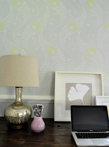
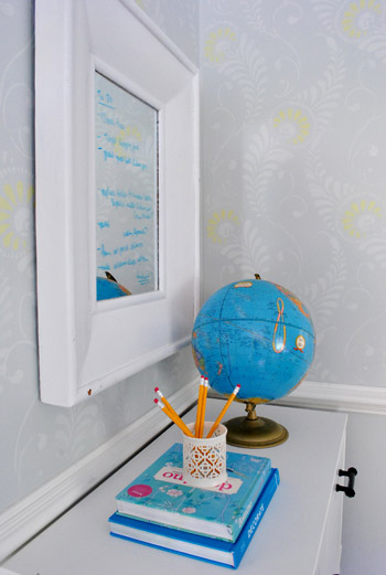
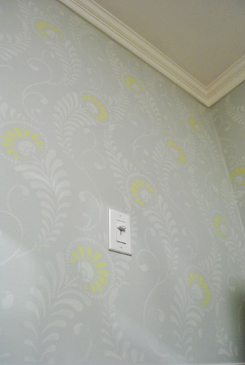
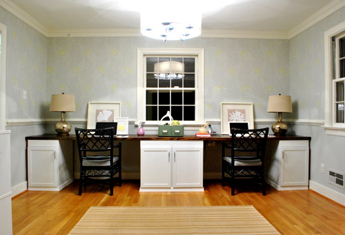
Of course since it’s a subtle tone-on-tone effect, the further away that you get the more – well, subtle – it gets. In person when you stand at the doorway to the office you see pretty feathery texture, but of course in photos it’s somehow MUCH harder to capture. Here’s a shot I snapped during the day (ignore the too-dark chairs, non-permanent lamps, bad leaning frames, too short rug, giant placeholder ottoman, random toy basket, lack of window treatments, etc):
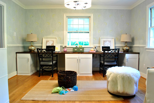
And here’s one at night (again, avoid all the weird we’ll-change-that-later stuff going on). I wish the stencil were more obvious in photos, but in real life, yeah, it’s our favorite thing we’ve done so far. Maybe someday we’ll master the Nikon enough to truly do it justice on film.
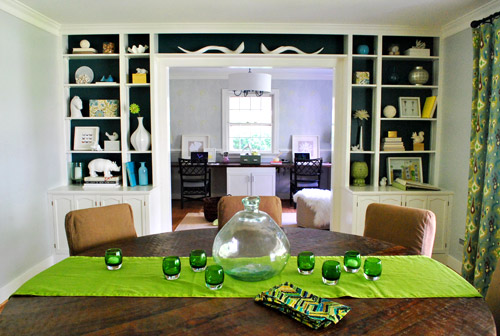
Here’s the much requested shot from the dining room, where in person you can still see a soft & pretty tone-on-tone texture (you’d swear it was wallpaper from this distance). But again, in photos it’s nearly impossible to capture. It’s a nice amount of subtle interest beyond the bold teal built-ins and colorful textiles in the dining room. And hopefully when we hang some art and add window treatments in the office it’ll be a good balance between those two rooms.
But let’s get closer again. It’s more fun.
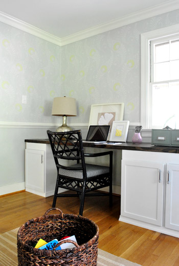
Even closer…
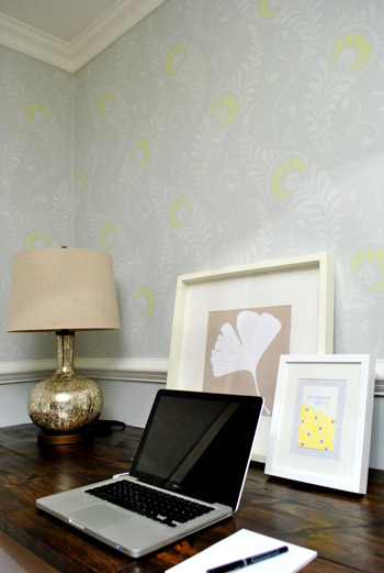
Oh yeah, that’s the stuff.
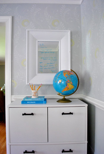
The writing on the mirrors is our weird to-do list madness. Ignore that too.
But don’t ignore this sweet faced chihuahua who just turned five (five days ago, actually). Burger is always my favorite accessory (tied with the bean of course).
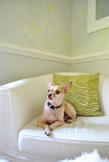
But let’s go back to ignoring stuff. Like the just-for-now chair and too-big ottoman (borrowed from the living room) along with the too small rug. Just figured you guys might appreciate seeing the room from a few different angles (even though the only “finished” things in here are really the light, the desk, and the stencil):
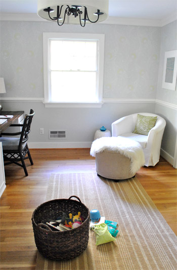
As for the wall color under the chair rail (Moonshine by Benjamin Moore color matched to Olympic no-VOC paint in satin), we’re toying with the idea of going a smidge darker to ground the stenciled upper part and add a tiny tiny bit of dimension (don’t want too much contrast since that might look crazy from the dining room beyond the built-ins). Of course we’ll keep ya posted if we make any changes! The nice thing about stenciling is that any other regular painting project feels like a cake walk by comparison. Haha. I actually wish you guys could all come over and see it in person – it’s so much better than these photos! Who’s down for a quick visit?
Oh but before I go back to staring at the walls with the same expression that I reserve for Eric from True Blood, let’s get into the paint color details, how we did it, and the budget breakdown. As for those paint details, here you go:
- Gray paint for stencil: half tint of Moonshine by Benjamin Moore color matched to Olympic no-VOC paint in a satin finish
- Grellow paint for stencil: Sesame by Benjamin Moore color matched to Olympic no-VOC paint in a semi-gloss finish
Oh and how about a time breakdown? It took 13.5 hours over three evening sessions. Definitely not a quick project, but one that makes you especially proud/excited/relieved/amazed when it’s actually done. As for all of our stenciling tips and techniques, click here for a nice long post all about applying the stencil. Now here’s that budget breakdown for ya:
- Stencil (from here): $54
- Martha Stewart Stencil Adhesive (from Michael’s): $2.99 (with 50% off coupon)
- Foam brushes (from Michael’s): $2.50 (with 50% off coupon)
- Quart of gray paint* for stencil (half tint of Moonshine from Lowe’s): $11
- Grellow paint* for stencil: $0 (leftover from kitchen, but would be $3 for a test pot)
- TOTAL: $70.49
I’ll admit it, it’s definitely not a super cheap-o paint project (which normally run us about $15-30. But to wallpaper the entire room above the chair rail could easily have been five hundred beans or more. And the effect is so amazing that – dare I admit it? – I probably would have paid $150 to get ‘er done. But not a penny more. Haha.
And true to form, we we still have about ten million things on the ol’ to-do list in here (one project at a time = sanity, glorious sanity). So we’ll definitely be tackling these things over time:
- adding window treatments
- painting and reupholstering our desk chairs
- hanging art on the walls (no, the oddly small leaning frames aren’t for keeps)
- finding a more permanent armchair, ottoman, rug, etc (there are lots of placeholders goin’ on)
- replacing the lamps (or reupholstering the shades, not sure yet – but we’ll keep you posted)
Anyone else do any stenciling lately? Or make any home office updates in general? Do you have a special expression that you reserve for Eric (or some other celebrity)? Oh yeah, let’s talk about that. Who’s your famous man (or lady) crush? Any Jake Gyllenhaal ladies here? Matt Damon? Team Edward? Team Angie? When I met John he totally had a Britney Spears calendar… and she was wearing leather bodysuits with sneakers. Le yikes.
Psst – You can read all about my stenciling process & the paint colors that I used here (there’s even an application video).
Update – Wanna know where we got something in our house or what paint color we used? Just click on this button:


Tara says
The walls look AMAZING! I give you so much credit for sticking with it. On another note…saw this website and thought of you (paint chip projects):
http://www.ohdeedoh.com/ohdeedoh/roundup/even-more-paint-chip-projects-roundup-157364
YoungHouseLove says
Love it!!!
xo,
s
Molly says
Your office is looking great! I LOVE the stenciling! You mentioned that you’re thinking about recovering your lamp shades. I see your lamp shades are tapered drums. I have lamp shades that are that shape as well and have been considering recovering them. But the tapered shape is what keeps tripping me up. Do you know of DIY instructions or have any suggestions for recovering a tapered drum shade?
YoungHouseLove says
I haven’t come across any yet. Maybe try making a paper template (use a paper bag or roll of butcher paper to trace the shape that you’d need in fabric and then use that to cut the fabric)? Hope it helps!
xo,
s
Jenny says
I love love love it! Great job!!!!!
The only thing I disagree with — you mentioned the chairs were too dark, but I think they look pretty fantastic (especially with those fab pulls on the ikea file unit). Then again, doing them the colour of the chandelier could be fun…..
This makes me miss our home office. It is now a nursery since our place is only 1000 square feet. For now, I’ll live vicariously through blogs like yours.
Jenny
http://www.simcoestreet.blogspot.com
Ly says
You’ve inspired me to try a stencil effect in the powder room of our next home, I was gonna go the easy route and use wallpaper but stenciling might be the way to go! Question, did you already mention what color the chairs will be? Please tell me your going the “grellow” route with those, I think it will the perfect finishing accent to the room:)
YoungHouseLove says
Haha, that’s definitely one of the many colors we’re debating!
xo,
s
seansmom says
Excellent job on the stencil!! Your room looks GREAT!!! Stenciling can be a bit tedious, but the finished product is always worth the effort! You done good!!
Russell Crowe does it for me…He’s welcome to come and have coffee any day of the week!! :>)
Kate says
I have always HATED stencils, but that looks flipping gorgeous. Love, love, love it.
Laura says
oh man..i have the hugest celebrity crush on ryan gosling. something about his style just really does it for me. and his tendency towards sweet romances doesn’t hurt either i guess..
lauren says
Eric Northman makes me drooool. I am slightly obsessed with the Jesse Pinkman character from Breaking Bad (actor named Aaron Paul), as well as Ben from Parks and Recreation. I don’t know why i have a soft spot for Adam Scott.
I love the pops of grellow. Yellow and Grey is one of my fave color combos.
YoungHouseLove says
I love Ben from Parks & Rec! He’s totally the best character on that whole show!
xo,
s
Christine B says
We have not done anythign to our office in awhile but we did do a huge makeover on it. We added wood to the wall! http://form2form.wordpress.com/2010/09/20/open-for-business
we had it painted dark but becasue the room is so dark we decided to paint it lighter gray.
http://form2form.wordpress.com/2011/04/11/goodbye-gray/
It was def. a more time cosuming activity and permanet but we love it.
YoungHouseLove says
So pretty! I love the interest that it adds!
xo,
s
Amy @ Croquet & Cocktails says
Oh my goodness. It looks absolutely amazing. My brain can’t handle it looking better in person. Impossible. But yet I get it. I’m glad you can’t capture it in all it’s glory, though. My walls are all textured and the jealousy might just kill me.
Wentworth Miller. Dreamy and brilliant. (And an English major–be still my heart.) He’s my crush. I heart him.
Kate says
The stencil looks awesome, and i’m definitely inspired to try it myself someday (when i’m not renting anymore!) But on to more important things…Eric? I’m not really into the pale/blonde thing. I have a soft spot for Sam. I think I just like guys with darker hair and eyes, slightly rugged. Like Gerard Butler. now HE’s to die for!
Jenna says
It looks SOOO great! And, sure, I’d love to swing by and check it out in person, but considering it’d take me as long to get there as it did for you to paint the room…I just don’t see that happening. :)
And I like the idea of darker under the chair rail. Can’t wait to see what else you guys do with this space!
Rosemary says
Love the stencil! If I wasn’t in a rental, I’d start becoming a claw-hand myself!
Also, re: lampshades – I bought a lamp at IKEA this weekend but couldn’t find a lampshade I loved. So I bought a white one and painted it sunny yellow with craft paint. It turned out better than I thought. A little ribbon on the top and bottom and I’m in love.
YoungHouseLove says
Cute idea!
xo,
s
Mary Ann says
Hi guys… Sherry, the stencil is fantastic. Kudos on your patience : ) Can I mention something?! The symmetry in yalls home… I’ve seen every angle posted, but more and more I notice the theme of symmetry (excluding the frame wall). Mix it up! (I mean that so kindly… the house if fabulous). Yall have a great week!
~MA
YoungHouseLove says
Yup, I think that’s because so many of our rooms are only 20% done or so, and generally I like to start with a base of “symmetry” and then mix it up when we’re closer to the end. Probably makes no sense, but I guess straying from symmetry so early on in the room derails me, so I like keeping things balanced for a while and then using finishing details and touches at the end (art, accessories, etc) to throw caution into the wind! Haha.
xo,
s
Jill says
The room looks gorgeous, Sherry!
I’m also a huge Alexander Skarsgard/Eric fan! So dreamy! My husband usually mocks me when we watch True Blood, but he loves Deborah Ann Woll who plays Jessica, so he gets it right back!
My other celebrity crush is and always will be Derek Jeter though (and I think my husband agrees with me on that – haha)! Go Yankees!
YoungHouseLove says
Oh yeah, Jessica is totally the cutest girl on that show. Good choice on your hubby’s part. Haha.
xo,
s
Amy says
Wow, that is SO cool!!!
Jill says
So elegant! I wonder if it would look right in my house, but I love it so much I’d love to try it. I like the idea of a darker color below the chair rail.
Angela says
Wow! I hope you got a major massage. It looks incredible.
Jillian (MOSS Floral Design) says
tWo quick points…i love the fact that you write your to do list on the mirror ~ and ~ isn’t Eric the real reason anyone watches True Blood ;)
YoungHouseLove says
Yes! I believe you’re right. The best reason!
xo,
s
Jenny says
It looks awesome!!!!
Justin says
Amazing, adds so much depth to the room. Don’t know that I would have the patience for that. Kuddos!
Natalie says
You did a FABULOUS job on the stencil! It looks like uber glam wallpaper. Subtle and chic ~ well done! :)
Cheryl says
Stencil looks amazing! Can’t wait to see what you do with the chairs! I have been haunting the local Habitat for Humanity/ReStore looking for a similar good cabinet deal! Hopes are high!
Totally going with you on Eric, here. I’d totally bite that. Also, AS was amazing in Generation Kill (and who can pass up a chance to ogle him in uniform?).
Cheryl says
Ps. Love the little pink vase with that soft cool wall color!
Destiny says
Oh my, it’s GORG!
Emily says
oh wow! this is not how i remembered stenciling. growing up, our house had roosters, cows, and other farm-ish things stenciled on the walls. not so classy.
you did such a beautiful job and wow what great dedication! did you mess up at all? if so, how easy were you able to fix it?
YoungHouseLove says
I definitely wasn’t perfect but the stencil was really forgiving! I actually didn’t have to touch anything up though, because it was such a subtle tone on tone look, and it’s such an organic shape – so unlike a less forgiving geometric pattern, imperfections were really nicely blended in!
xo,
s
Allison B says
oooohhhhh, LOVE LOVE LOVE!!! I want to try to tackle a stencil project…but on a smaller scale – my foyer or powder room. These results are such great inspiration!!!
Melissa says
Hi, I love your site. You have great taste! Question; how did you attach the drum shade to your chandelier? I have a chandelier that I want to do that with but don’t know how to do it; I figured it would be way cheaper than buying a new fixture and when I saw yours I loved it. Thanks!
YoungHouseLove says
You can read all about that project here, Melissa: https://www.younghouselove.com/2011/09/the-updated-light-fixture-blues/ Enjoy!
-John
Carla says
Revisiting the photos I’m starting to feel that the chair rails are limiting design options in such a small space. It’s like an abrupt line cutting through your office and dwarfing all furnishings. But on another note, that stencil would look lovely in your daughters room using a barely tinted white that’s several shades lighter than her walls.
Anyway, the stenciling looks just super!!!
Beth C says
Stunning!
Heidi P. says
Yay!! Good job! I love how subtle it is, especially from the dining room.
I have a diy question. I want to stain our back porch (a 6×12′ space w/ stairs and rails, etc), but it’s currently sporting a reddish brown paint. I have a hand sander, which I tried, but it didn’t do a lot to take off the paint – just smoothed things a bit. Do I need to buy a heavier grit sand paper? Or rent a heaveir duty sander?? Also, one of the boards needs to be replaced, so I know the old boards and the new board will take the stain differently. Anything I can do about that? or should I just paint instead of stain?
Thanks for your help!!
YoungHouseLove says
Hmm, we haven’t tackled that yet. Maybe try asking what they recommend at the home improvement store? Good luck!
xo
s
Tess says
Fantastic job!!! Looks awesome. :) Where did you get those pretty silver lamps? I am looking for something just like those for our bedside tables. :)
Thanks!
YoungHouseLove says
Those were from HomeGoods- we just returned them last night though. Just didn’t work on that desk and we didn’t have another place for them! Haha. Maybe you’ll end up with ours if you’re local.
xo,
s
Shannon {aka}|design says
Love the effect of two colours! We just did the RDS Springtime In Paris stencil in the dining room: http://akadesign.ca/?p=5255. Definitely with you on the stencil vs. wallpaper in the easy to undo department!
xo,
Shannon
YoungHouseLove says
So beautiful!!!
xo,
s
Ashly Coggins says
ADORE!!! It is def. my favorite thing so far. Runner up: painting the wall behind the built-ins, which I’ve done myself in our house before and have always gotten tons of compliments on. But the stenciling is my absolute favorite because I would never have considered doing it before seeing your room. I especially like the pop of color. I think that’s what really makes it. Keep up the good work :)
p.s. on another note, I’ve been playing around with Sketch-Up and was wondering about John’s statement that it didn’t do 2-D and I was a little confused… I’m assuming he was trying to do a floor plan, but I was able to do one- I just drew the dimensions and then didn’t push them out. But maybe I missed what he was saying. I found this tutorial espcially helpful: http://www.apartmenttherapy.com/ny/how-to/how-to-make-a-digital-floorplan-with-sketchup-112560
YoungHouseLove says
Thanks so much for the tip Ashly! So smart!
xo,
s
Mary A says
I think this is my favorite thing you’ve ever done. I’ve ordered the same stencil in both large and small sizes, and I’m going to use greens with a pop of pink.
YoungHouseLove says
That sounds so pretty! Send pics when you’re done if you can!
xo,
s
Becky says
rando question… where did you end up putting the recovered rocking chair?
YoungHouseLove says
That’s actually sitting in the corner of the office now (since the white chair is back in the cozy kitchen nook). I’m not sure if the rocker’s a keeper in the office though, since the legs are dark brown it’s sort of heavy in that corner (and the white filing cabinet in the other corner feels nicer and more compatible with the built-ins for some reason. Who knows where we’ll end up though!
xo,
s
Katrina says
The stencil in your office turned out so nice!! Love how subtle the tone looks and the ‘grellow’ really makes it look like wallpaper.
I have a stencil I bought ages ago for our bedroom, but we ended up not using it, I would love to see it used elsewhere maybe our bathroom instead
Great work!
Andrea says
Your stencil project turned out nothing short of amazing! You guys do a wonderful job at whatever you do.
I follow your blog daily :)
I do have one question, that I cannot find the answer for…..where did you get the curtains in the diningroom (the blue/green/yellow ones?)
I love them!
YoungHouseLove says
I actually made those with discounted fabric. Here’s that post for ya: https://www.younghouselove.com/2011/06/my-babies/
xo,
s
Lori says
Wow – I don’t normally comment on stuff, but this one REQUIRED a comment. It is beautiful! And since the pictures don’t do it justice, I can’t imagine how gorgeous it looks in person. Well done. The little yellow (grellow) highlight in it is perfect.
ToTheMoonandBack says
wow! I absolutely love it:)
Alison says
I’m so impressed, great job! Not sure if anyone has suggested this, but I think you could bring out the stenciling more in post-processing. If you haven’t already done this, try opening one of the images in Camera Raw (even if it’s a JPEG, this will still work) and increase the sharpening and clarity. Then, open it up into PS… there are many adjustment layers you could try, here are a few: 1) duplicate the background layer and change the mode to soft light; adjust opacity down; 2) add an S curves layer for contrast; adjust opacity down (lots of online tutorials on how to do this), 3) add a brightness/contrast layer and bump up the contrast slider a tad; 4) add a vibrance layer and bump up the vibrance and saturation layers; 5) add a color balance layer or selective color layer and play around with the sliders to bring out the colors.
YoungHouseLove says
Wow- thanks so much for the tips! We’ll have to see if we can figure out how to do that!
xo,
s
Gavin S. says
I’m so glad you’re thinking about painting the wall under the chair rail a slightly darker shade. I love, love, LOVE the finished stencil effect but that was my one reservation. Also, I’ve totally been crushing on Jim Sturgess ever since Across the Universe. Isn’t he delish?!
YoungHouseLove says
Now I have to go google him! Haha. Can’t picture him.
xo,
s
Hollie @ I'm Busy Procrastinating says
It’s dreamy! You made great choices on the stencil design and the paint colors. I do agree that a very slightly darker color below the chair rail would ground the room a bit, too. Looking forward to more office updates!
Wom-mom Ethne says
Team Edward for sure, and definitely Eric from TB going on in my household – at least on the estrogen side of the marriage. Might possibly take screen shots of the t.v. when they’re up. You shoulda taken a picture of the claw tho.
JoDi says
That came out great! I definitely think making the bottom a little darker will make it look finished. For some reason, with the top and bottom both being the same color it looks like the bottom is just waiting to be stenciled.
Kelli Dahl says
I’m tired just looking at that gorgeous wall! Really – its amazing!
Oh and I just have to say, I think you have the cutest dog on the internet (and thats only because my weiner dogs arent on the internet! :-) – Burger has made me a chihuahua fan! And don’t even get me started on your sweet Clara – adorable! I sooooo enjoy “visiting with you” every day!
Tracy says
Absolutely gorgeous!
Deirdre says
The stenciling looks great, but it is sad that the part of this post I latched on to was the hot guy reference? :) David Boreanaz is pretty high on my list (from Bones). Not sure he’s a great guy in real life, but on screen…smile. My hubby had a Shania Twain poster on his wall in college.
Steph @ Birdhouse says
Looks gorgeous! What a great space to work in!
shar y says
Looks great. As a part-time decorative painter, I can tell you that we would not have done that job for less than $1,000. So, you scored big time on doing it yourself!! Looks totally pro!
YoungHouseLove says
WOW! That makes me feel awesome. Thanks so much!
xo,
s