Big day, big day, BIG. DAY. Not only are we gonna give you a tour of both completed duplex kitchens, we also FINALLY got our Airbnb listings up and running. Phew! So keep reading for all the photos & the details on how you can book a week there if you wanna check out Cape Charles for yourself (we think it’s the best summer vacation ever – but we might be a little biased).
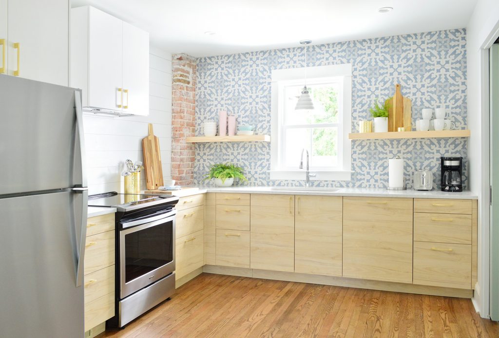
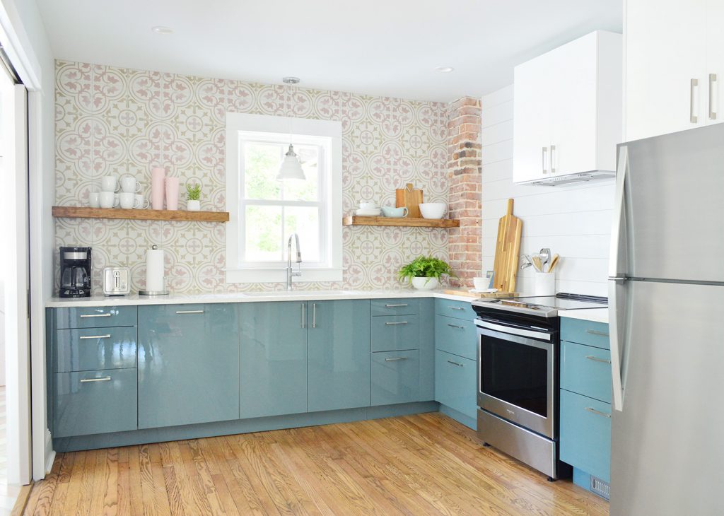
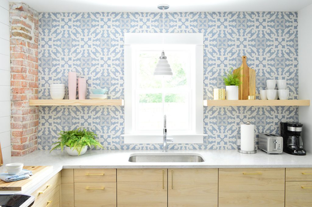
So the picture above is obviously the kitchen with the blue tile & wood cabinets on the right side of the duplex (which you’ve seen bits of already in our post about installing the Ikea cabinets and tiling the backsplashes) but I’m actually going to pop over to the other side – the kitchen with the pink tile & blue cabinets (seen below) for the first part of this post.
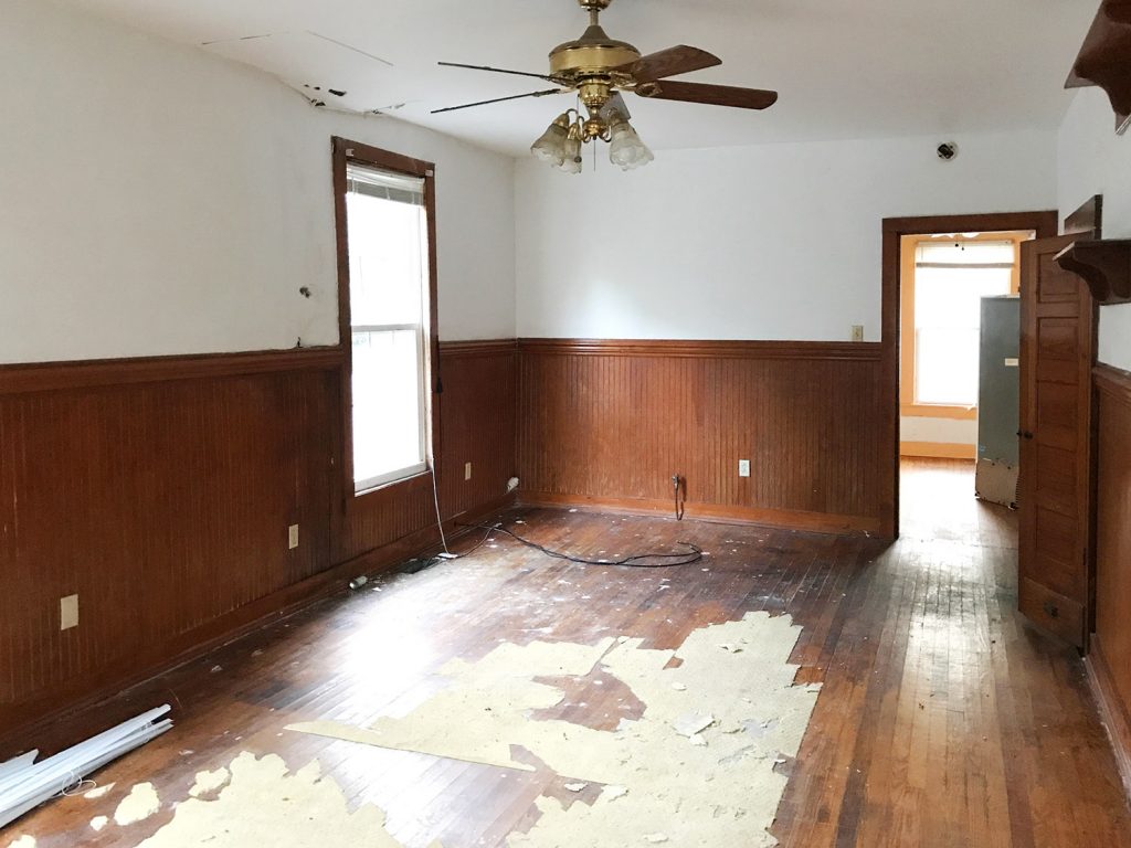
We’ve got so much to show you, but I want to start off by rewinding to the state of things when we first bought the duplex in 2017. This was the view from the living room towards the now-kitchen (see that orange trim through the doorway?).
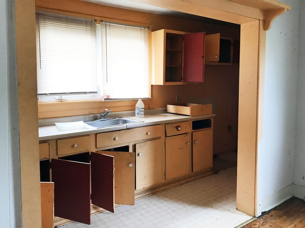
And the previous (clearly not original) kitchen had been shoved into a former side porch to the left of that orange trimmed window above, which didn’t exactly feel like the right spot for it.
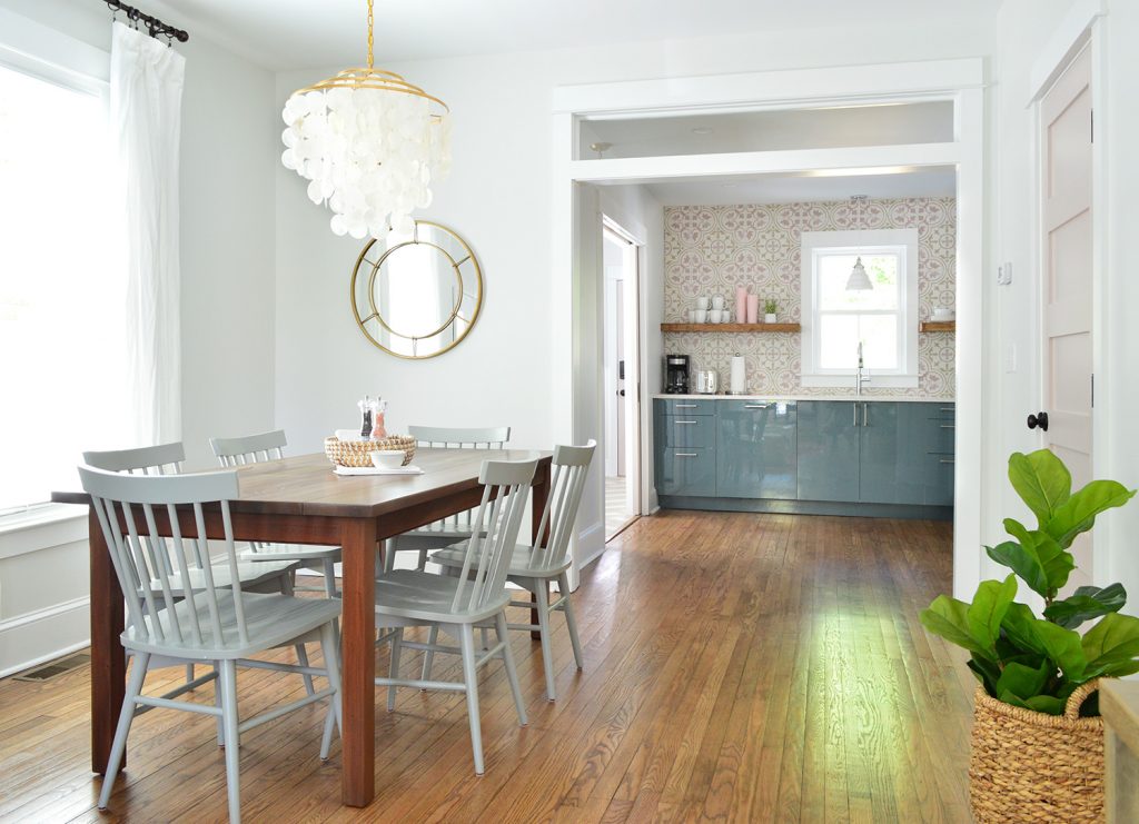
Here’s a comparative “after” shot to the one I shared two photos up. Obviously one huge improvement was widening the doorway (and adding a transom!) to connect these two spaces and maximize flow and light. Plus, now you can see our wall of tile all the way from the front door.
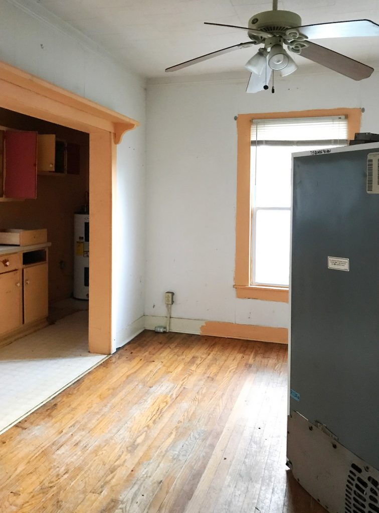
The now-kitchen was actually a dining room of sorts before. We think. Although an old fridge was inexplicably floating in the middle of it. But clearly this bigger room was begging to be the new kitchen. At least that’s what the two-toned trim is saying to me in this picture.
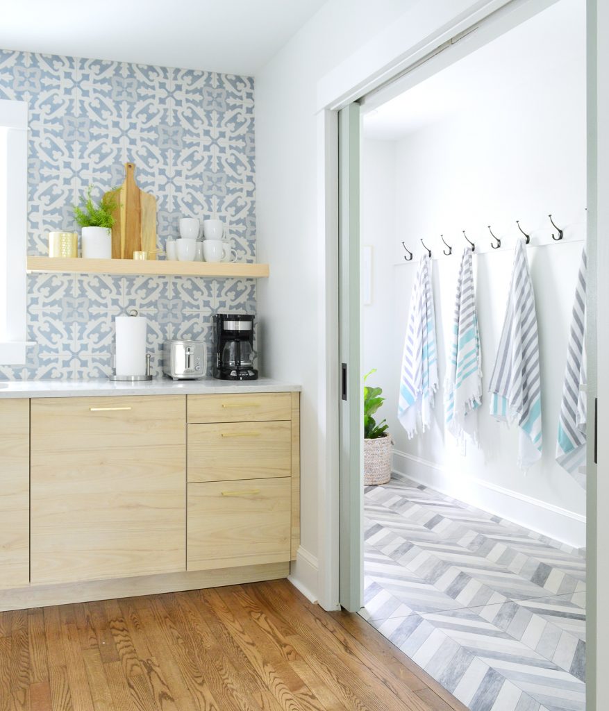
Here’s a similar view of this area now. We raised the base of the window so we could run cabinetry across that wall and added pocket doors so the laundry can be closed off if it’s too loud while it’s running for anyone cooking or eating or watching TV.
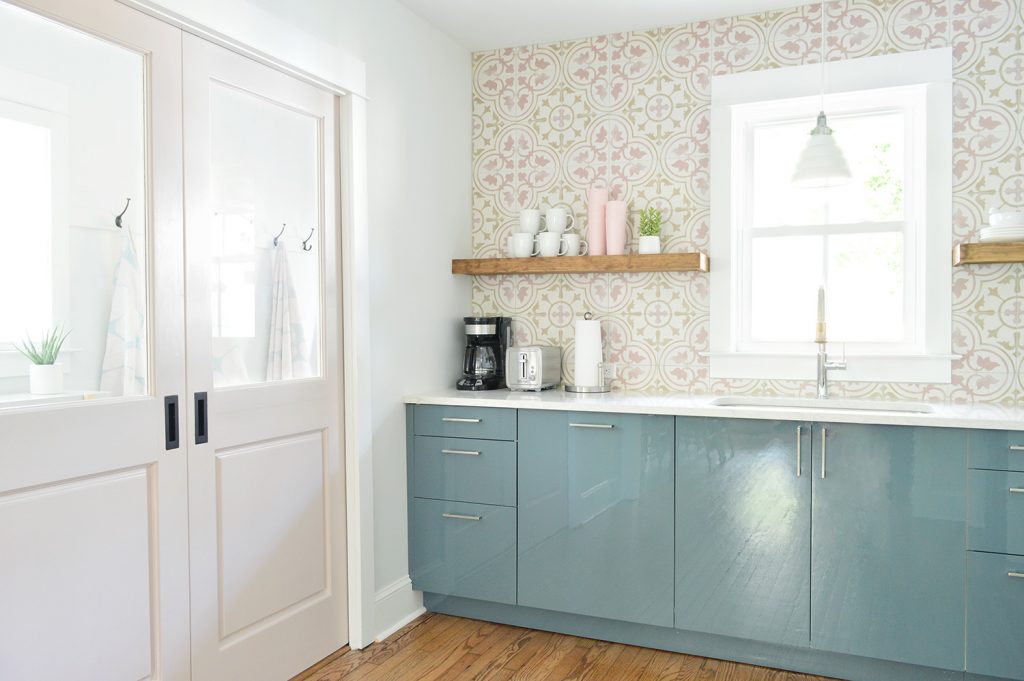
One big update since you’ve last seen these rooms is that they’re actually stocked with stuff now. Blenders, toasters, coffee makers, pots & pans, knives, silverware, serving bowls, plates, cups, wine glasses, mugs, microwaves, even tupperware and salt & pepper are all ready for renters. And yes, there is a cheese grater on each side too. Along with wine openers and chip clips.
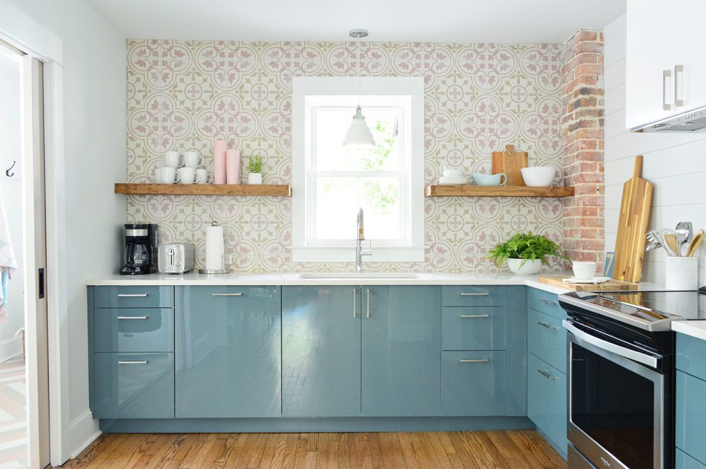
We mentioned in our backsplash post that we opted for a different treatment on the stove wall because it felt too chaotic to continue our patterned tile on that side too (we leaned it up to see how it looked and it felt too crazy on two walls). So we went for something subtle yet wipeable and easy to maintain. Note: We could have done the accent tile on the stove wall, but the back wall’s visible from the front door and has that nice centered window, so we wanted to make that wall the star, and cast the side wall as more of a “supporting character.”
Ok, but back to our “subtle yet wipeable solution.” Some call it planking, some call it horizontal paneling, and some call it faux shiplap (real shiplap interlocks), but we were inspired to jump on the bandwagon after long admiring how Shea McGee works it into her beachy/modern home designs, as well as loving Chris & Julia’s TV wall in their family room. Our verdict: what took us so long?! (Also, where do I pick up my Fixer Upper merit badge?)
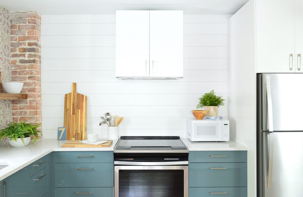
I’ll share a photo tutorial of it soon, but it’s basically just thin pieces of plywood we cut down to planks, nailed to the wall with small spacers, and painted with durable and easy-to-wipe semi-gloss paint (we color-matched it to the the cabinets so everything blends). We think it’ll provide a more durable and stain-proof surface than plain painted drywall – like how people add beadboard backsplashes – and it was so cheap & easy to do.
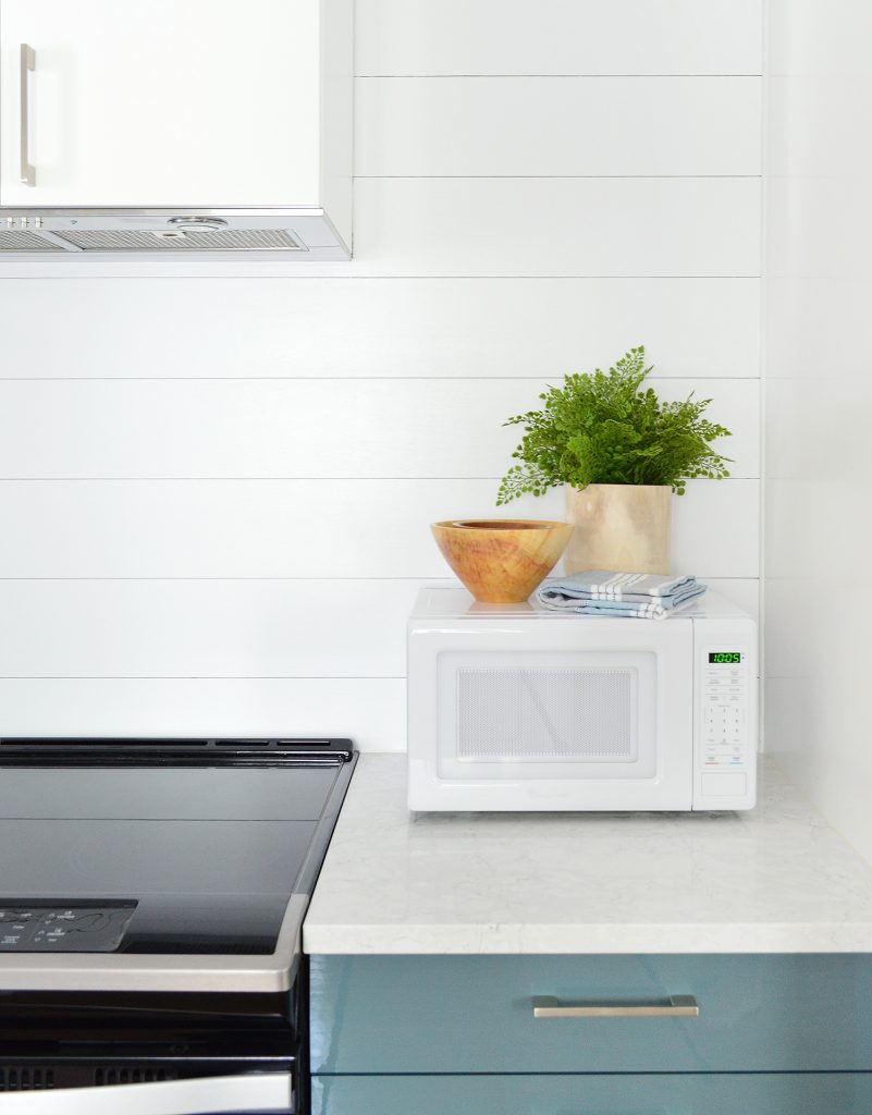
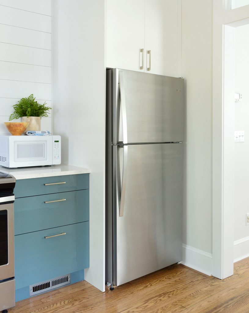
And while we’re looking at the appliances, you can see how we chose stainless for the slide-in range and refrigerator, but went with a white countertop microwave so it blended right into the white wall behind it.
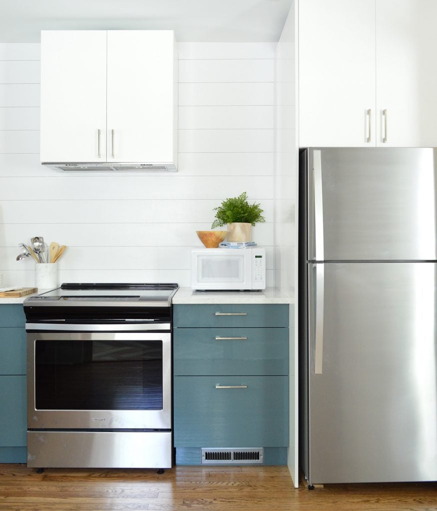
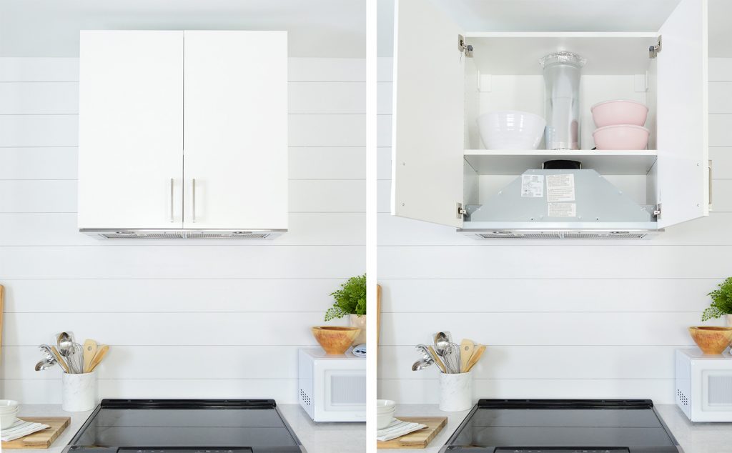
I know some people have been curious about the exhaust hood over the range so here are the details. We decided to give one of Ikea’s range hoods a try because we wanted something that looked completely built-in like cabinetry. So the hood is just an insert they sell that automatically comes with all of the materials and instructions to build it into a standard Ikea cabinet.
The only thing you need to figure out is how it vents. Since we can’t vent outside (due to the central firewall required in a duplex) we chose their option to add charcoal filters that clean & recirculate the air. That’s the reason we left the tiny gap above the cabinet instead of adding crown up there. The charcoal filter traps the greasy stuff at the bottom of the hood, but the clean air still needs a spot to escape, hence that little crack up top.
For the fridge we chose a not too fancy but still nice looking top freezer model. It’s not quite counter depth, but we were able to build it in with a side panel so it looks nice and unobtrusive. We were also sure not to buy one with an ice maker or water dispenser because both of those can break or cause leaks (when we lose power in Richmond our ice maker leaks onto our wood floors – ACK! So we don’t want to worry about that in a house that’s vacant in the off season). It may seem minor, but we’re trying to minimize/eliminate maintenance issues wherever we can – even the little ones. And we’ll leave ice in the freezer and a Brita filter in the fridge for renters, so they’ll have cold water & ice on hand.
If you were scratching your head wondering where the dishwasher is, well well well, look what we have here: a built-in, cabinet-fronted dishwasher! The first we have ever done! And we love it. We really didn’t want to interrupt that line of cabinets against that back focal wall, so we crossed our fingers that this would work – and it did. Our plumber installed the dishwasher but we added the cabinet panel & hardware ourselves, which really wasn’t hard at all. It does take some careful measuring (they provide a helpful paper template to eliminate the guesswork) but overall it was very straightforward.
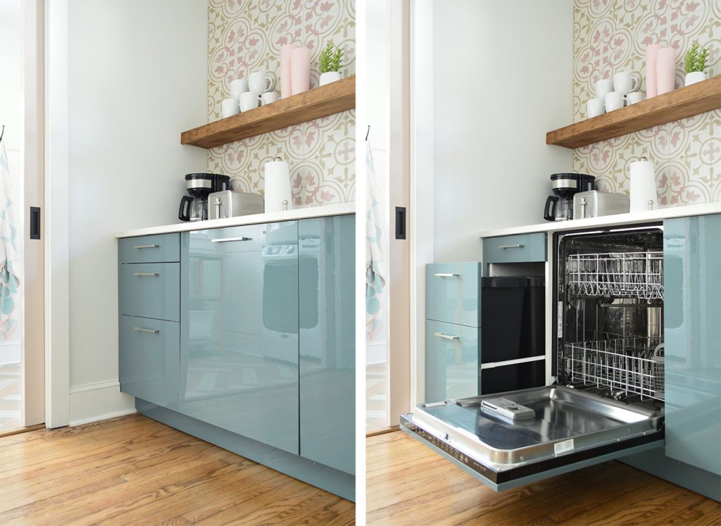
We also have built-in trash cans on the far end of that back wall. Ikea allows you to customize these, so we were able to match the look of all of the other 3-drawer cabinets in the room, but the bottom two are actually one big pull-out.
The floating shelves are another thing you haven’t seen yet, and another thing that I’ll write a tutorial for in a future post – including how we drilled through the tile without disaster (it. was. nervewracking.) along with how we built them ourselves to custom-fit the space. We pretty much followed the same technique that we used for these floating shelves in our bonus room, but they’re a little thicker and more heavy duty so they can support tons of bowls and mugs and cups.
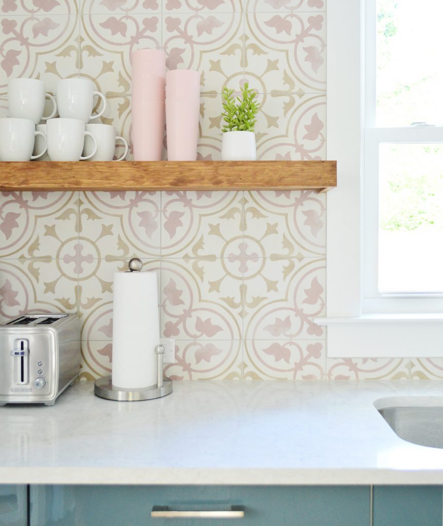
Sherry stained them “Special Walnut” by Minwax, which is the same color we used for the floors throughout the house, so they tie in nicely and add some warmth and sort of an older/original vibe with the shiny new cabinets.
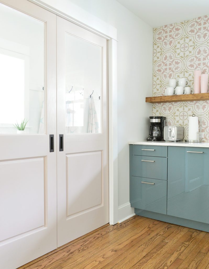
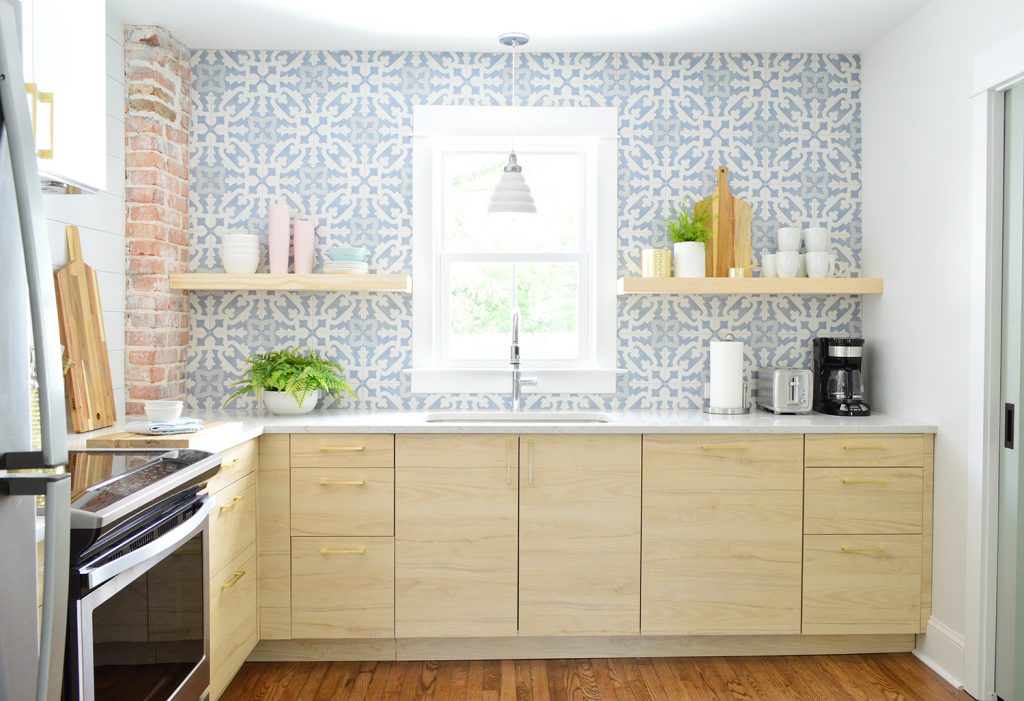
Okay, so now we’re back on the other side (the side with the green-y blue doors throughout). The kitchen layout is exactly the same on this side, just flipped, but the finishes and colors are different. So for example we have brass hardware in here, the shelves are a different color, the cabinets and backsplash are different, etc).
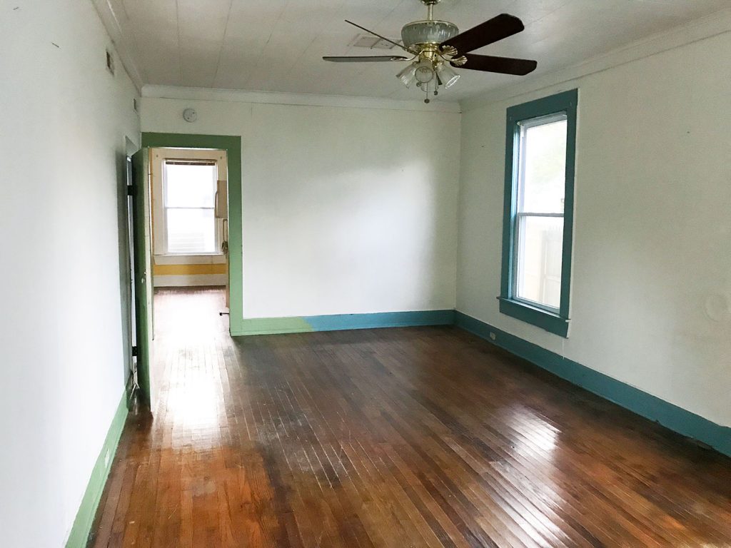
This is what this side looked like before, as seen from the living room. That window in the way back is the one that now sits over the sink.
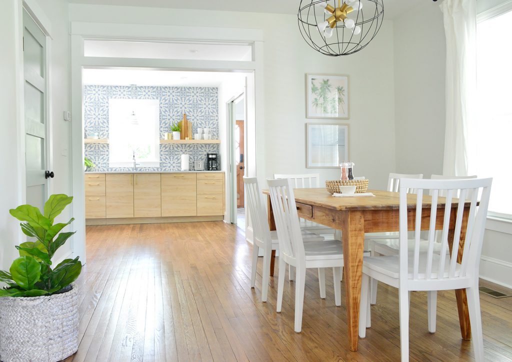
Once again, widening that doorway and adding the transom really opened up this space in a major way. That kitchen window gets some of the best light on the first floor, so in person you can really appreciate how good it feels to have these rooms more open to each other.
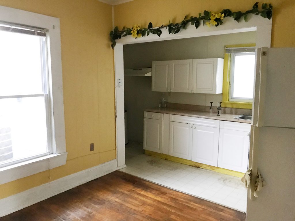
This is the best before photo I could find of the now-kitchen itself. Apparently we were so distracted by the former kitchen (again, now the mudroom/laundry room) to take any good shots of the adjacent space. But it was basically just a big yellow room with a rando fridge in the middle of it. And some faux greenery… which I’m not knocking because faux greenery is basically our love language these days. #Foreshadowing
And here is a similar view today. You can see that we actually shifted/narrowed the opening to our now mudroom/laundry room a little (and added those pocket doors) in order to create some wall space for the cabinets to terminate into.
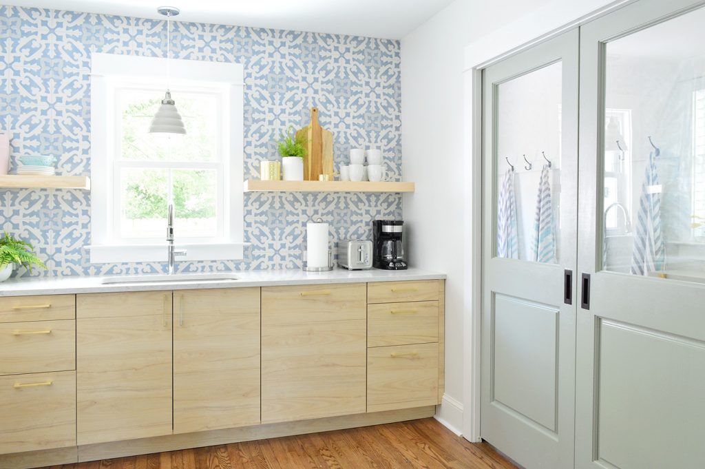
When I was talking about how we built our shelves, I should have mentioned that we designed them to be 8″ deep, which is intentionally too narrow for heavy items like large plates or bowls. We know some people don’t love the idea of open shelves because they worry the items might get dusty, so most of the actual serving stuff (bowls, wine glasses, plates, etc) are still stored in the cabinets. These are just a nice place for smaller overflow things like measuring cups and cutting boards and tea mugs that are often kept out on a rack or a counter anyway – along with some decorative things like vases/plants.
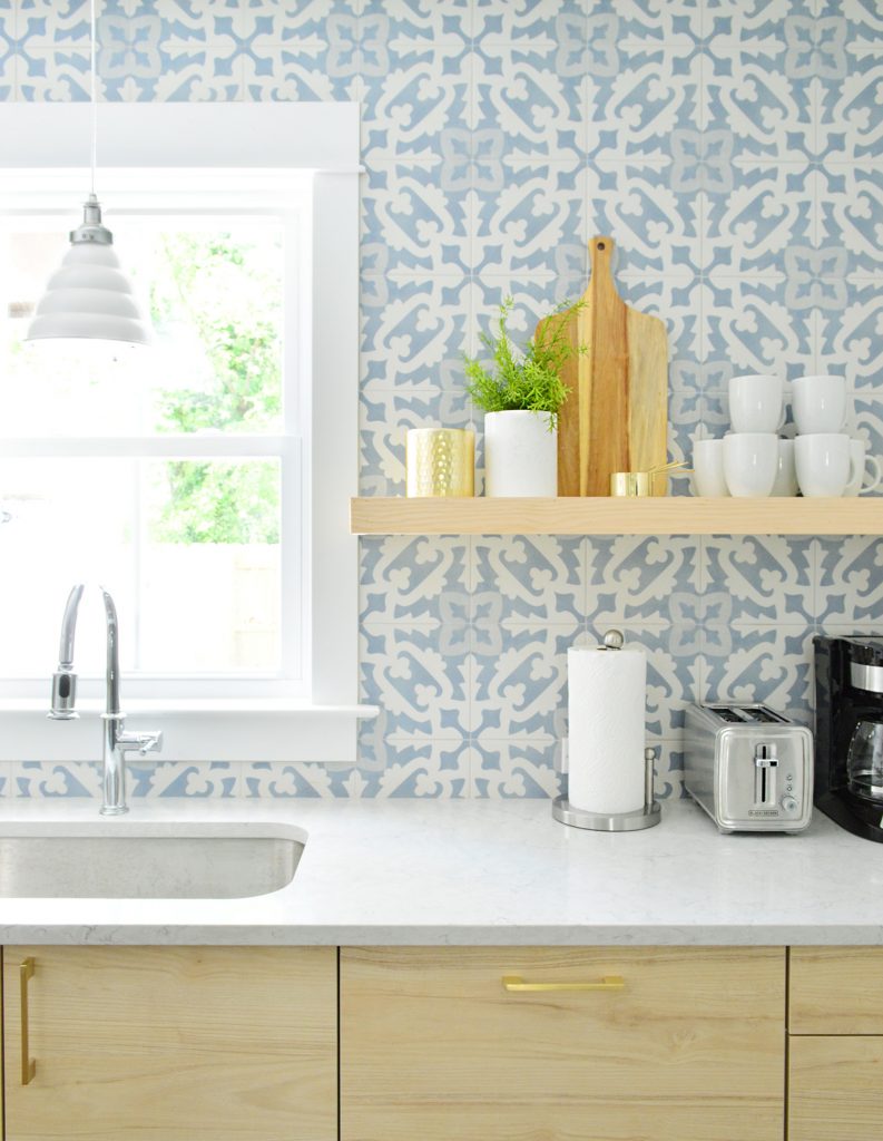
We lucked out that the pine we purchased to build these shelves was VERY similar in color to the Ikea cabinets that we chose. So instead of staining them, we just clear-sealed these so they’d echo the blonde cabinet color. In these pictures they don’t look as identical as they do in person (when you look at them in real life, they’re so similar it feels like they were sold as a matching set).
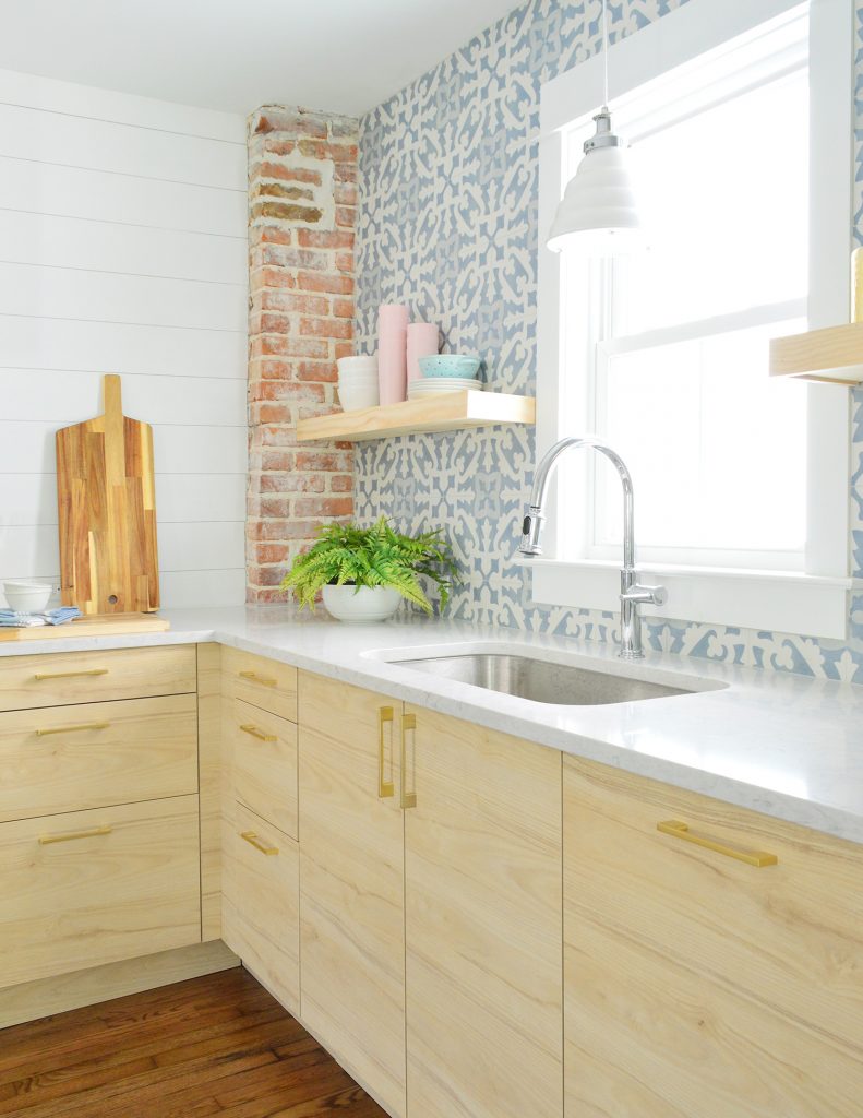
As for what else is in the cabinets, we’re thinking we’ll film some sort of “cabinet tour” once we’ve got everything fully moved in an organized. We ended up with a similar number of cabinets to our beach house kitchen, so we’re going to mimic a lot of the systems in there. Plates and flatware will go in the cabinet next to the sink. The drawers flanking the stove will get pots, pans, and other cooking stuff & servingware. The lesser used storage items will go in the upper cabinets, and we’ve got pantry storage in the adjacent mudroom/laundry room.
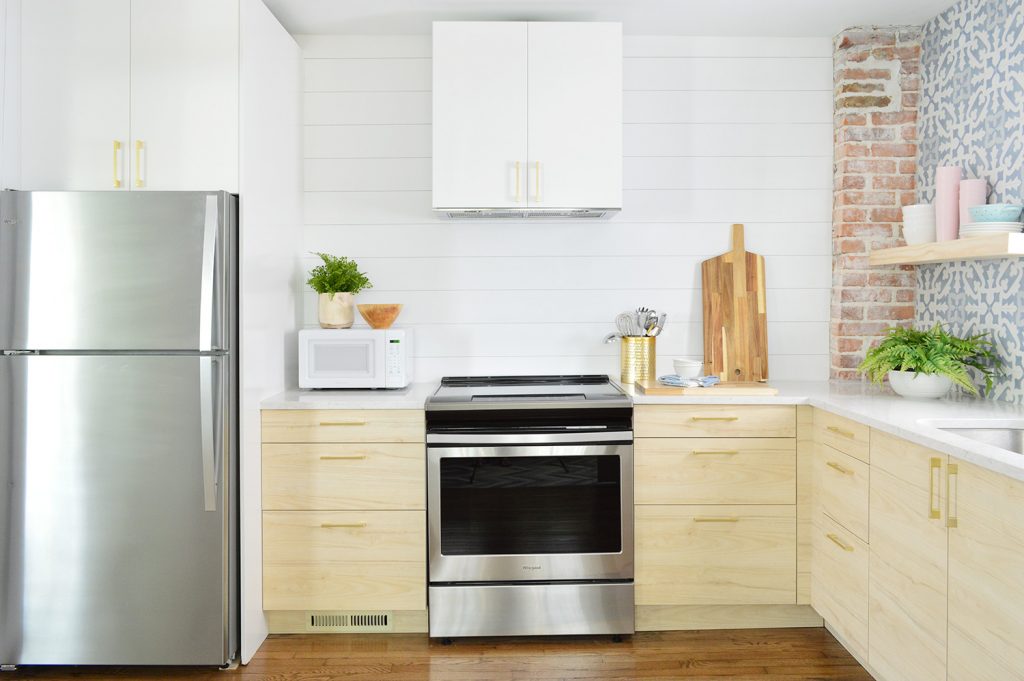
The smaller number of cabinets in here might not fit every possible gadget that someone might want to have in their full time home (especially a super chef-y person), but we love knowing that we have all of the basics covered with THREE CABINETS/DRAWERS TO SPARE. It’s nice to know there’s room to grow if we forgot something – but there’s already a ton of stuff in here (including things like ziplock bags, cooking oil, pyrex, a spaghetti strainer, soap & cleaning stuff, a vegetable peeler, an ice cream scooper, etc, etc, etc).
We’re hopeful that next week we’ll have photos of both fully finished mudroom/laundry rooms for you – plus give a peek at how our little twin bed sleeping nooks turned out. And by that point I think you’ll have pretty much seen everything except the backyard, which is still in progress.
And if you’re someone who has been thinking about renting the duplex, we’ve listed each side separately so here’s the info for ya.
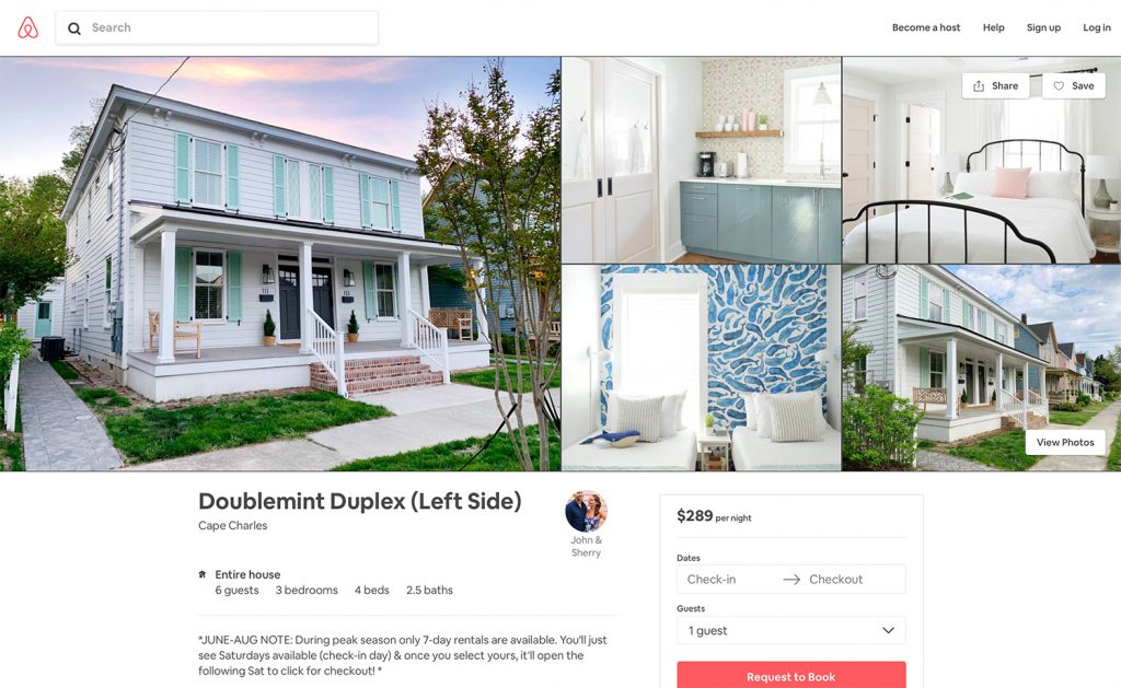
So here’s the link to the Left Side (with the pink doors) and the link to the Right Side (with the blue doors). Each side sleeps up to 6 people (plus one baby – pack ‘n play & sheet provided!). If you’re interested in booking both sides at one time, just check the availability and book each of them for the same dates and the whole house is yours!
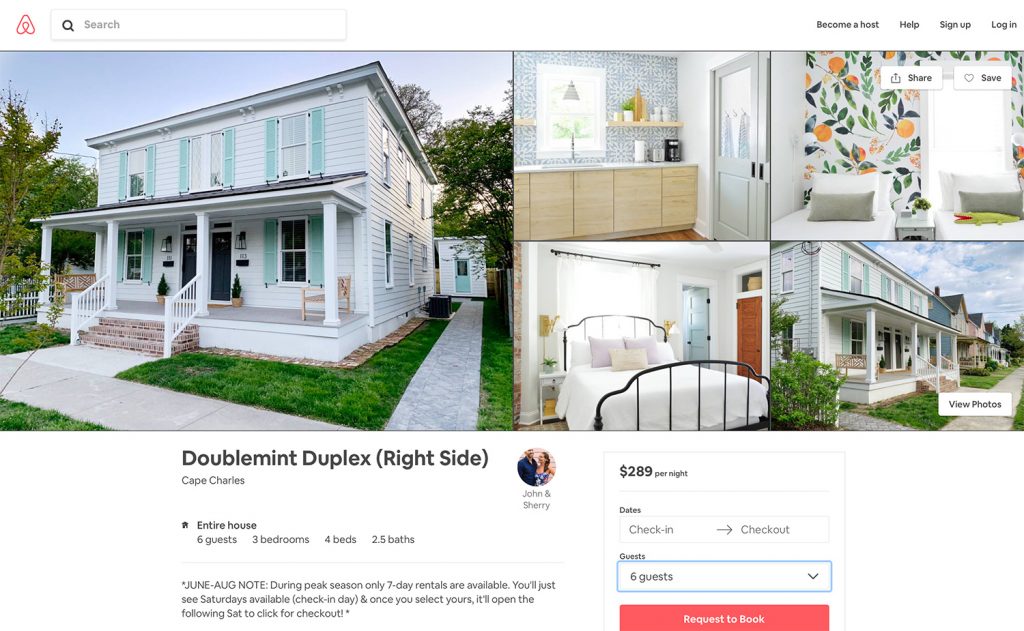
Right now we’re only offering weekly rentals for the peak summer season ((Saturday to Saturday, late June through August). If you’re looking for something shorter than a week this summer, places like Hotel Cape Charles, The Northampton Hotel, and Bay Haven Inn offer nightly rooms for around $220-260. And as much as we love our dog, these rentals won’t be pet-friendly. We’re just trying to be extra sensitive to allergies and noise, especially considering that this is two homes with a shared wall.
Update: It’s almost all booked up! Holy cow! There are just two more weeks available on the right side (click the black Saturday date you want and it’ll highlight the week in blue and then you can click the following Saturday to request to book that week). We’re planning to offer shorter off-season rentals in the spring/fall too, but we’re warming up by renting for the summer season first (since we’ll be nearby at the pink house if an issue pops up). But we’ll make a big announcement after off-season bookings when those are available.
It’s exciting (and nerve-wracking!) to finally open this sweet house up for reservations, so please bear with us as we work out any kinks during our first go at a short-term vacation rental. You know we’ll tell you everything we learn. And oh boy do we expect there to be a learning curve!
You can also check out our Cape Charles Travel Guide that we posted last year if you’re curious about what there is to do/eat there. Since we’ve written that, more shops have popped up – like a few new bakeries and even an escape room that’s coming!
P.S. You can see all of the other finished rooms of the duplex that we’ve already revealed along with how we tiled the bathrooms, planned the layout, and screamed into a pillow when the review board denied an architectural change we were dying to make here in our duplex category.
*This post contains affiliate links*
