We’re THRILLED TO PIECES to be finished with the entire front half of the entire duplex – which means we’re revealing the open living room & dining room on each side at this very moment. Right now. It’s ON.
This is what you see when you walk into the left side of the duplex and pivot towards the living area. With the exception of still having to steam and hem the curtains, we are ready to stick a fork in this baby!
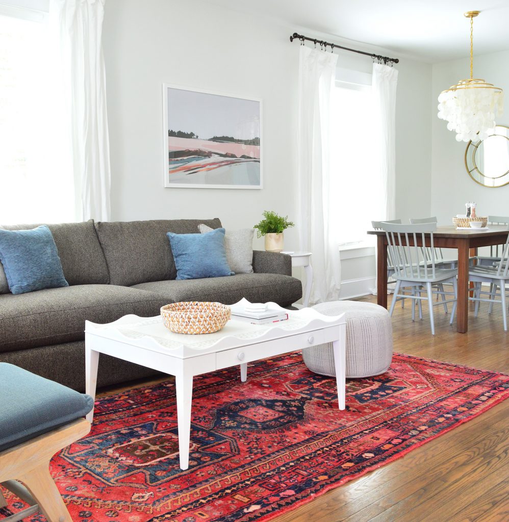
One of our favorite secondhand rugs that I bought ages ago from New England Loom on Instagram found a home in the living area with our favorite Crate & Barrel sofa to add cushy and durable seating. We love this sofa so much that after we bought it around two years ago for our own living room in the Taft Steel color, we decided to buy it again times two for the duplex in the Taft Truffle color (which we think will hopefully stand up to all the use these houses are gonna get). Our kids and pooch have road tested our sofa at home for the past few years and we couldn’t be happier with it. Zero issues. Super comfy. We bought it three times, I feel like that says it all.
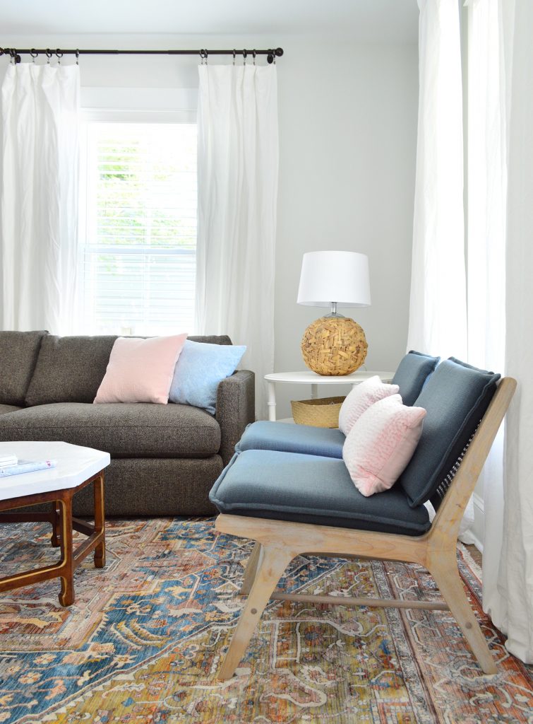
It’s hard to see in the shot above, but we also have two armchairs facing the crisp white coffee table (they don’t sell the armchairs in the blue color anymore but they have a deep gray that looks great too). We also added a little pouf ottoman to round things out in the living zone (found at HomeGoods, but here’s a similar one).
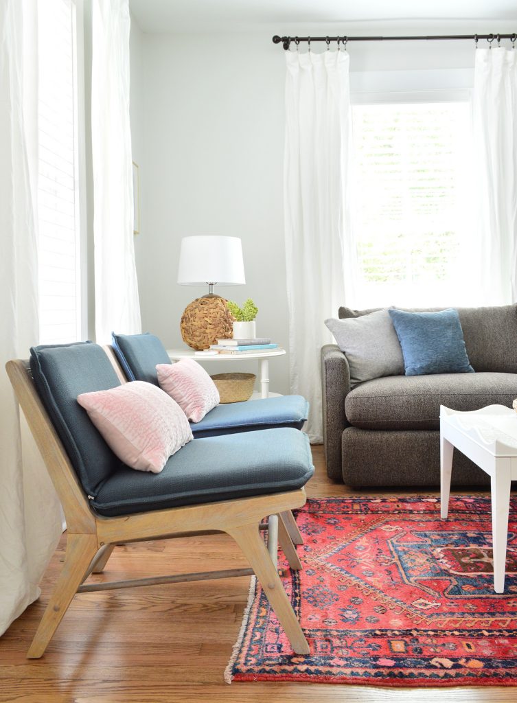
Here’s a better shot of the chairs, which we also have at home in our living room in the natural color. Notice a theme here? We are trying to diminish the risk of making bad furniture buys when we know we have a love something that’s durable and functional. So since we’ve been really happy with them at home (they’re going on two years old), we got them in a darker color for the duplex (again, the blue is gone but they have them in dark gray now). Then we just added some cute pink bolsters to the back, which is the key to making them extra comfy since they feel a bit reclined without the added pillows.
We also brought in one of our favorite quartz-topped tables (it’s over 50% off right now on Amazon!). Hooray for not having to worry about juice or wine stains while getting that shiny marble look. And how perfect is that large art print on the wall behind the sofa? This is the side of the duplex with the blue cabinets and the pink tile and TRUST ME WHEN I SAY THAT ART WAS MADE FOR THIS ROOM.
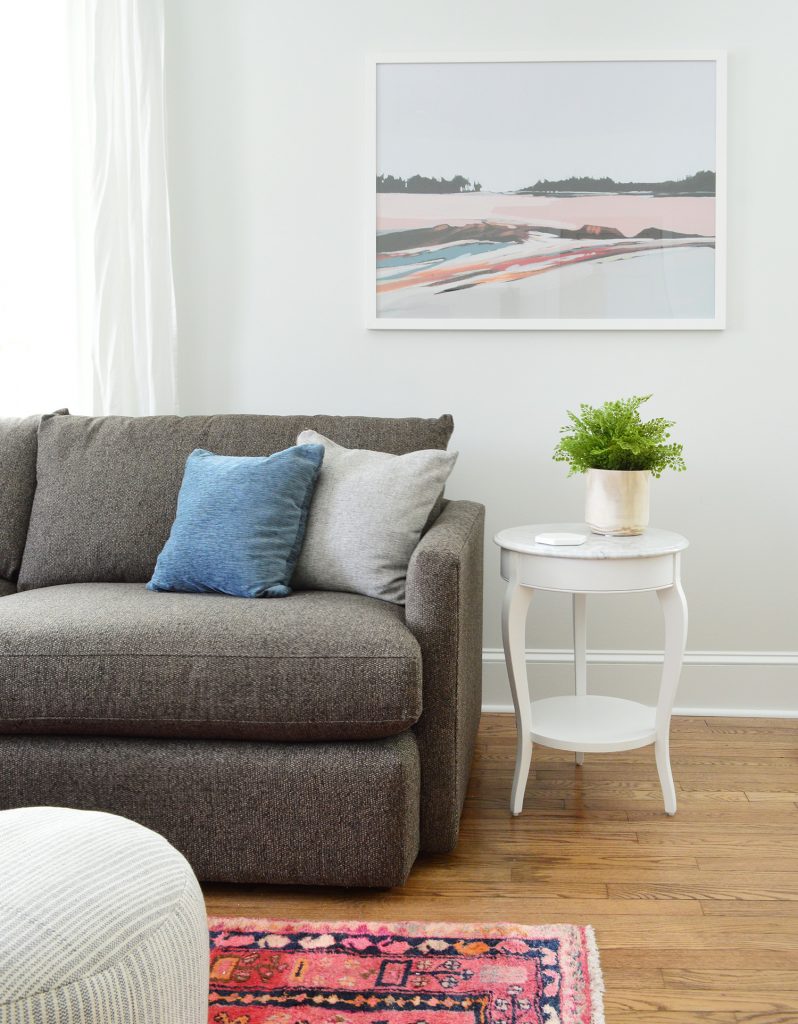
When we finally finish the kitchen and do a video walk-through you’ll see what I mean, but the exact same tones in the kitchen – which is just beyond the dining area – are also in the art. It’s magical. Our good friend Jenny Komenda’s Juniper Print Shop is the best – and we bought two of Sarah Madeira Day’s prints for the beach house a few months ago, so this art feels meant to be on so many levels.
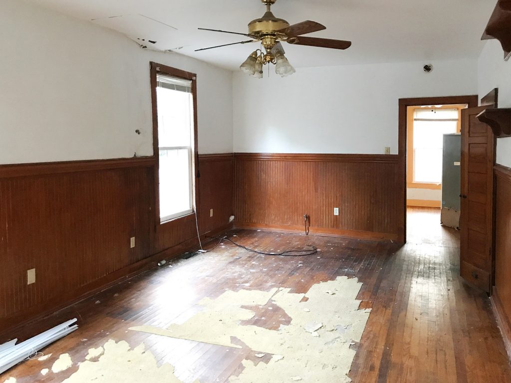
Let’s rewind to really appreciate where we came from in here. This was the room as it looked when we bought it, complete with sections of the ceiling collapsing from water damage to reveal black mold underneath. All of the paneling was fake plastic paneling (again, to cover up damage in the walls) and a rug pad had been removed but the backing was stuck all over the floors. Oh and see that one gorgeous thing in here!? The fan! Just kidding, that five paneled door on the right wall. Remember we rescued it and reused the two of them up in the bedrooms as closet doors? You can see them here – we LOVE how they came out!
This house reno went all the way down to the studs (literally you could stand in the house and put your arm outside) but here’s a shot when the new plywood was put up along the old studs (a lot of which were reinforced with new framing). I remember standing in there and thinking… someday it’ll come together again. This was easily taken over a year ago.
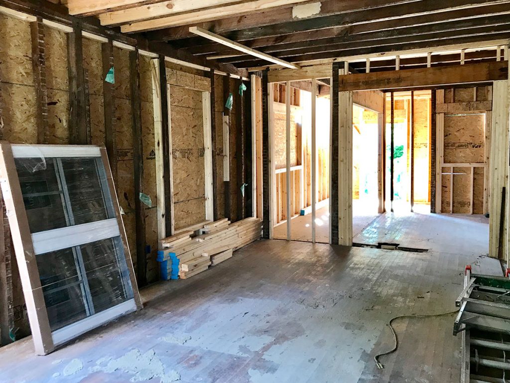
Also, we added that interior transom a little while after framing in the doorway above. See how it originally was lower (see above pic) and then we realized “wait, we can put a long cool transom window in there and it’ll let in more light and feel original and so cool!” So we reframed the doorway opening to be higher, which you can see below:
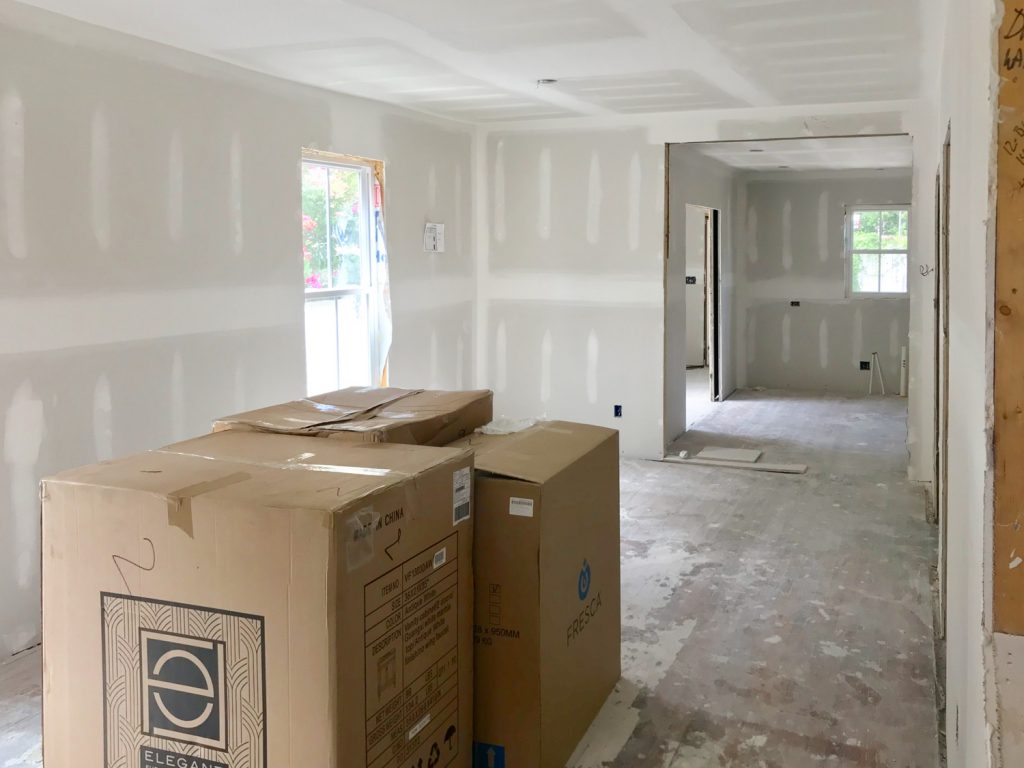
Fast forward a little bit more and… ta-da!! Transom! Isn’t she lovely? All of the solid five panel doors that we added, along with that transom and the pocket doors that we added on the laundry room/mudroom (which you can sort of make out in the photo below) are some of my favorite “inspired-by-original” things that we brought back to this house. Especially since there were only a few original things that we could salvage (like the brick chimneys that we exposed, the hardwoods that we refinished, and the diamond windows & front doors).
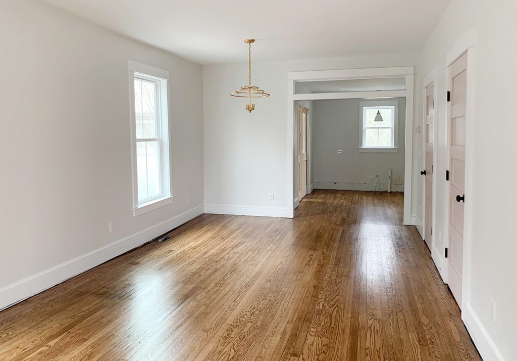
And here it is now – although we’ll show you more of the kitchen next week when it’s actually done (along with the mudroom/laundry room if we can get that knocked out and photographed too!). We both felt extremely lucky that the placement for the dining room light on each side of the house was perfect since we had to pick that spot months before drywall & floor refinishing.
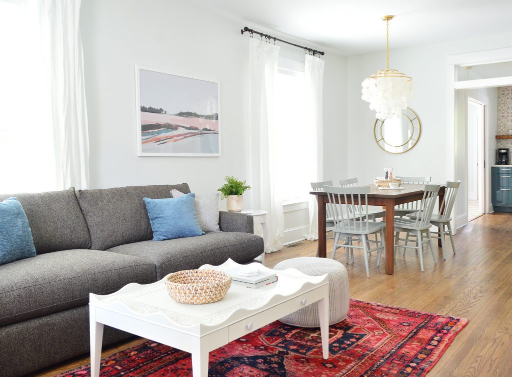
The way we planned it was just to tape out the table placement on the floor and figure out what we thought would work with room to pull out all the chairs and then hope for the best. We knew our table measurements because this is a secondhand table that we have had for ages (it used to live in our own dining room!) and we refinished it to look like new!). John’s actually working on a post for you guys with steps for refinishing an old table since we did two of them for the duplex and they came out really well.
Here’s the before from the other side. Look at my lovely beautiful perfect old wood doors (remember you can see them here in the upstairs bedroom).
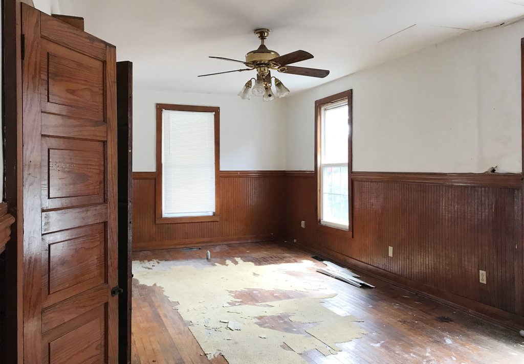
One other remarkable thing about this room that’s easy to see, even in the before shots, are the size of the windows in here. The downstairs of the duplex has 9′ ceilings and all of the windows start about a foot off the ground and go about 8″ shy of the ceiling. So yes, it means they’re all OVER 6 FEET TALL! These windows are taller than John. Like if he stood on the windowsill, the top of the window frame would still be inches above his head. They let in tons of light, and definitely add presence to this otherwise nondescript rectangular room.
So here we are back in the present. You can see from this angle that it’s all nice and open, but we made sense of the long room by giving it both a living and a dining function. If you have a long open space like this, one tip would be to use area rugs and hanging lights to define different zones so it doesn’t look like one long bowling alley of a space. Floating furniture around the rug to make a living room “zone” at one end, and then hanging a pendant to define the dining area so we could center a table and chairs beneath that chandelier were two good ways to keep the room from feeling like a big amorphous blob.
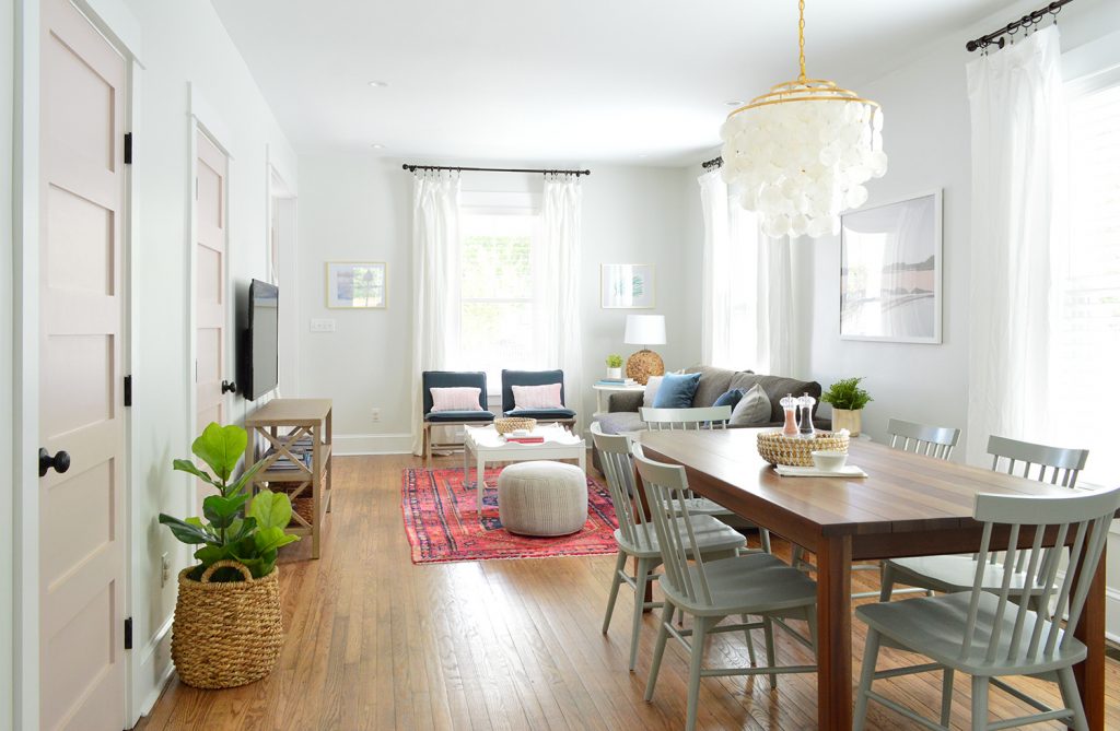
Thanks to all of those aforementioned extra tall windows, we didn’t have a lot of empty wall space, so there was literally just one spot that made sense for the TV, which was this wall space across from the sofa. We actually love how the room’s layout panned out because the TV is the very last thing you see when you walk into the room since you enter and see the rug and the sofa and the coffee table. Plus we used a nice thin console table and mounted the television on the wall so it feels clean and easily allows for passage throughout the room.
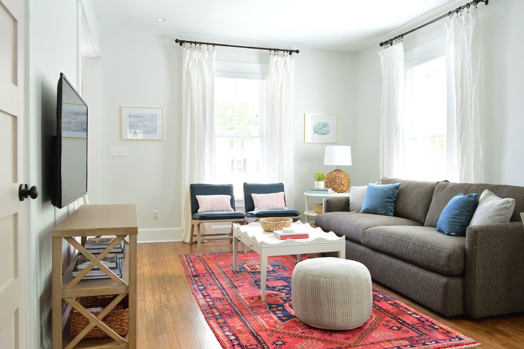
A deeper more solid looking TV table would definitely have left the room feeling cramped and awkward, so if you have that issue: 1) mount a TV on the wall (we’ve used this awesome $19 mount four times and it’s always great) and 2) add a narrow open feeling table under it (like this), which allows for a much more spacious feeling.
Plus if your TV is a smart one (we bought two of these for the duplex living rooms after loving the one we have in our house so much) you can ditch the cable box and literally just have one wire that runs down the wall to plug the tv in, which we covered with a white cord cover. Just one cord instead of 10 snaking out from the tv?! Without any black boxes and stuff to hide?! We are living in the future!! (Note: if you want to know more about cutting the cord and still getting all your channels without a cable box, which also saves us tons of money – here’s a detailed post with more info).?
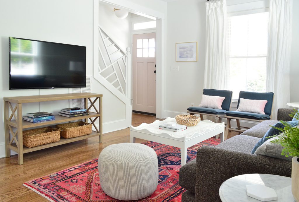
We actually debated running the cord cover along the side of that vent that you see on the right which would have been even more invisible, but because of where the outlet is placed on the wall it would have to cut across a lot at the bottom to snake back to the outlet so we just went straight down with it. I think once we have more board games and puzzles and stuff on each console it’ll be even less noticeable (oh heck yes, our duplex is gonna have GAMES! You know us ;)
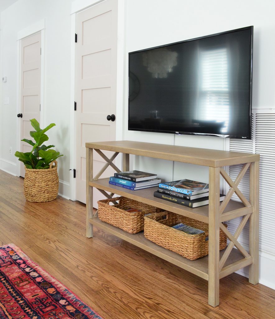
The door next to the TV will be our locked owners closet, but the one next to that is the powder room. This area was originally just a big closet, so it was a huge functional improvement to create a bathroom downstairs (there wasn’t one down here before!).
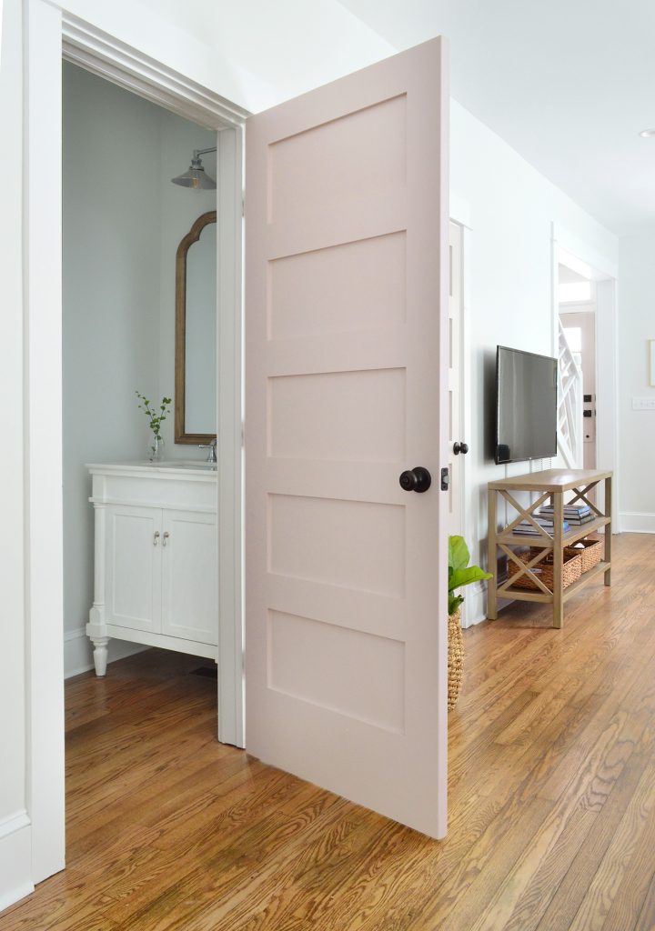
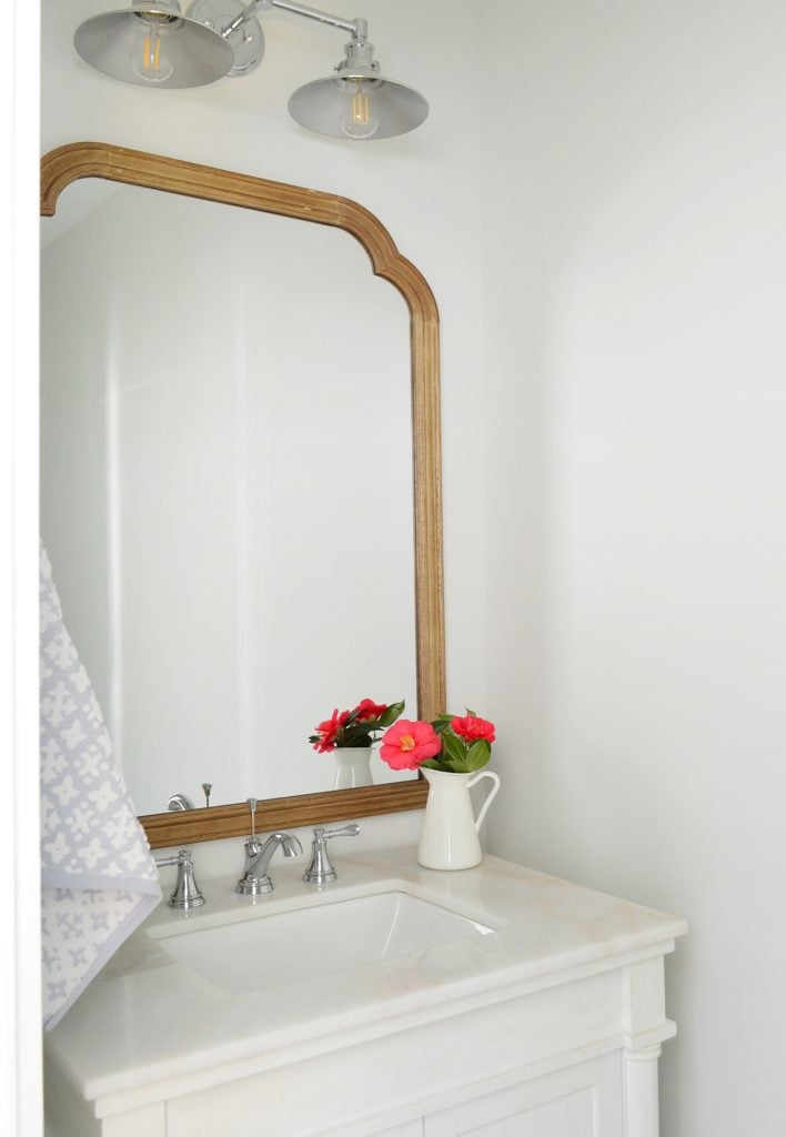
It’s impossible to photograph this space, but here’s a closer peek (this is the other side – it’s identical). It’s a room we’d like to do more to eventually – like add wainscotting with wallpaper running around the top or some fun rich color to make it a little jewel box in there. We’ll most likely get to that in the off-season next year, but for now we’re loving the vanity (it’s so pretty guys! Those legs! That shiny top!) and the mirror above it (it’s my FAVORITE budget mirror that looks so much more expensive than it is). And the toilet on the other side is, well, pretty much just a nice white toilet. And now you can do your business without walking upstairs. Like a boss.
If we duck back out into the living/dining room, you can see that we went with some brass (in the chandelier and the mirror on the wall behind it) as well as some oil rubbed bronze (in all of the curtain rods, all the door handles and hinges in the entire house, etc). So if you’re wondering how to mix metals, I always just say to make each of them appear a few times in a space and then it looks intentional and layered.

The tone of the the dark TV is basically the same color as the curtain rods and doorknobs, and we hung a few simple gold frames on either side of the front window to bring some of that brass tone over to that area too. You really don’t have to think too hard about mixing metals – just go for it. And if you’re worried about tiring of something that might feel trendy (ex: rose gold or copper for example) you can just add it with smaller items (frames, a table lamp, even a bowl on the coffee table for remotes or odds & ends).
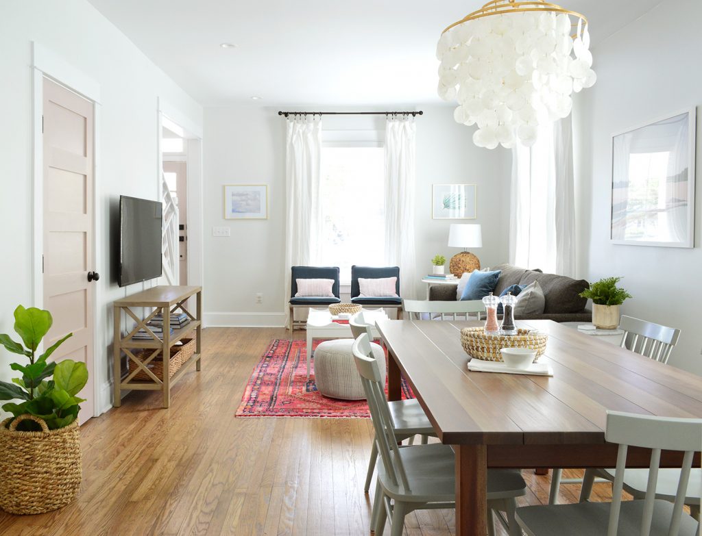
Ok, so that’s the left side with the pink doors – let’s move over to the right side with the greeny-gray doors. Although the floor plan is a mirror image of the left side, the before looked a little different:
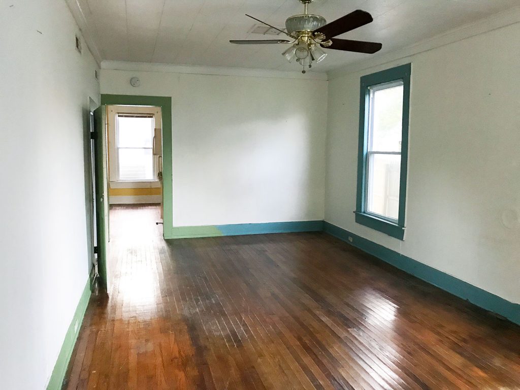
This side had less mold and rot (unfortunately not none – but the walls hadn’t been covered as much, although that is a drop ceiling you see that was added to hide some other water damage). And the two-toned trim that changes mid-wall is pretty… unusual…? But the floors on this side were lovely (we still refinished them all so they match) and we could see the potential even more when we walked in the door.
Here’s that space as it looks today (again, we’ll share all the kitchen details in our next post when it’s done).
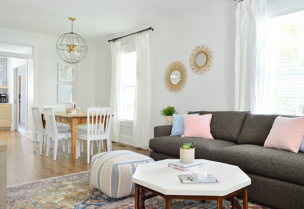
We kept the same basic elements in this living room (same sofa, same armchairs, a secondhand wood dining table, a light colored coffee table and a simple pouf for bonus seating), but we mixed things up and chose some different items as well, like a different rug, dining chairs, lighting, etc. It’s really fun to have two identical rooms so you can change up a few of the elements and basically see it two totally different ways… (but warning, it’s expensive – furnishing two houses (and filling two kitchens!) pretty much equals that emoji of the money with wings. But at least we had fun while all our benjamins were flying away.
The vibe for this side all started with this rug, which is a bit more chill than the bright pink turkish one on the other side. The same sofa and marble end table are in here, but we reused our coffee table that we topped with concrete (remember that from our beach house living room) and just added some soft pillows and a woven lamp I’ve had for like 6 years in the attic (its mate is on the other side of the duplex, which you probably noticed in the other pics).
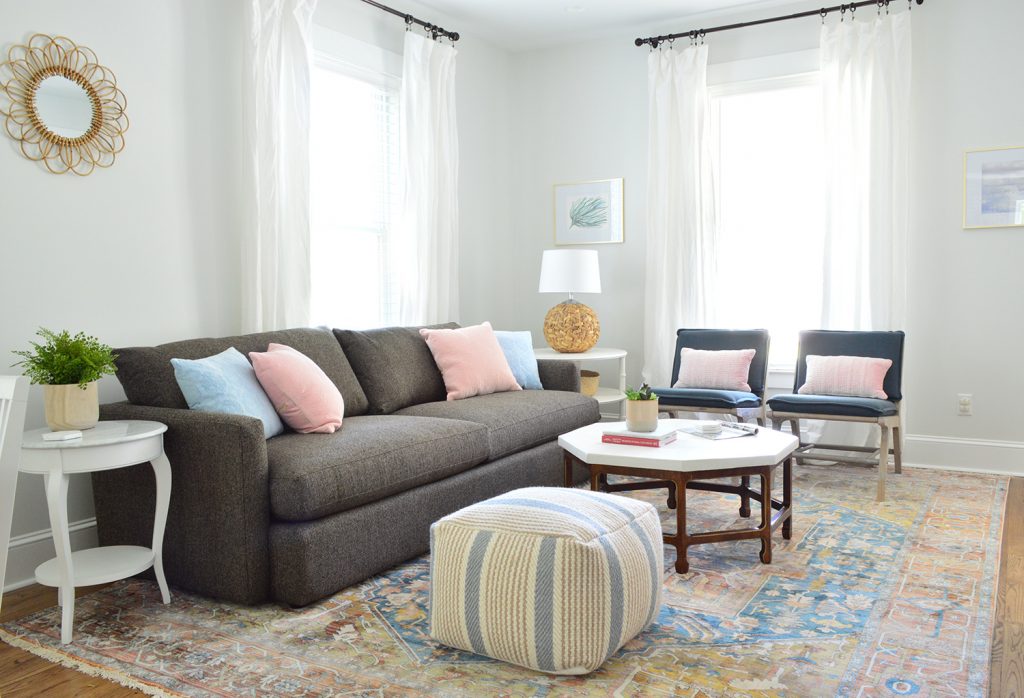
Oh and I should have mentioned that we also tried to keep the furniture pretty low so it wasn’t sticking up and awkwardly blocking too much of our huge windows, so those two dark blue armchairs were nice for that wall for that reason. More light flows in through the glass on the front door and the original transom above that too!
The un-ironed curtains are killing me, but other than that this room is looking so fresh and finished. Also this rug is great and such a bargain for the size. Extremely well rated, soft, and durable (when I shared some sneak peeks on Instagram, people with lots of kids & dogs told me they’ve had it for years and it’s holding up perfectly – so I have high hopes for it being a good choice for a vacation rental).
The dining table in here is another secondhand one that we sanded down and refinished – so we’ll share the tutorial soon. It’s such a worthwhile DIY (wait until you see the before shots of them!) and it’s extremely inexpensive to do! We saved hundreds and maybe even a cool grand by not having to buy two new dining tables – and a secondhand table is always nice since dining tables take such a beating (it’s good to know these two have already stood the test of time).
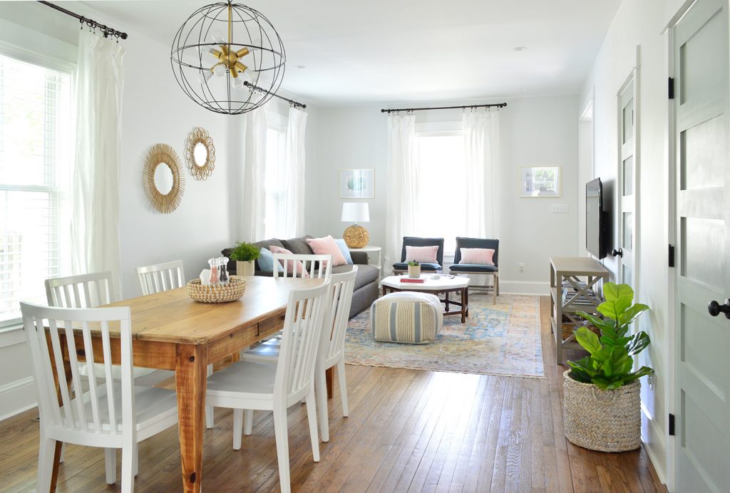
Oh and we’ve had those rattan mirrors that we hung on the left wall for years as well – but they still sell the same set that we got. They’re pretty great for hanging all together on a giant wall, or spreading around in a few places. The texture = so good.
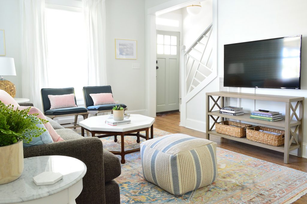
And last but not least, here’s a shot from the front door looking into the living and dining room. The railing opens things up so much, and we love the architecture it adds (it looks crazy tall here but it’s just the angle – we had the camera really low for this shot). And everything from the round rattan mirrors to the big brass & bronze light fixture feels so welcoming and warm. P.S. Another way to mix metals even more easily is to buy a fixture or some other item (like a coffee table) that mixes both – and then just add a few more hits of each one to the room and you’re golden.
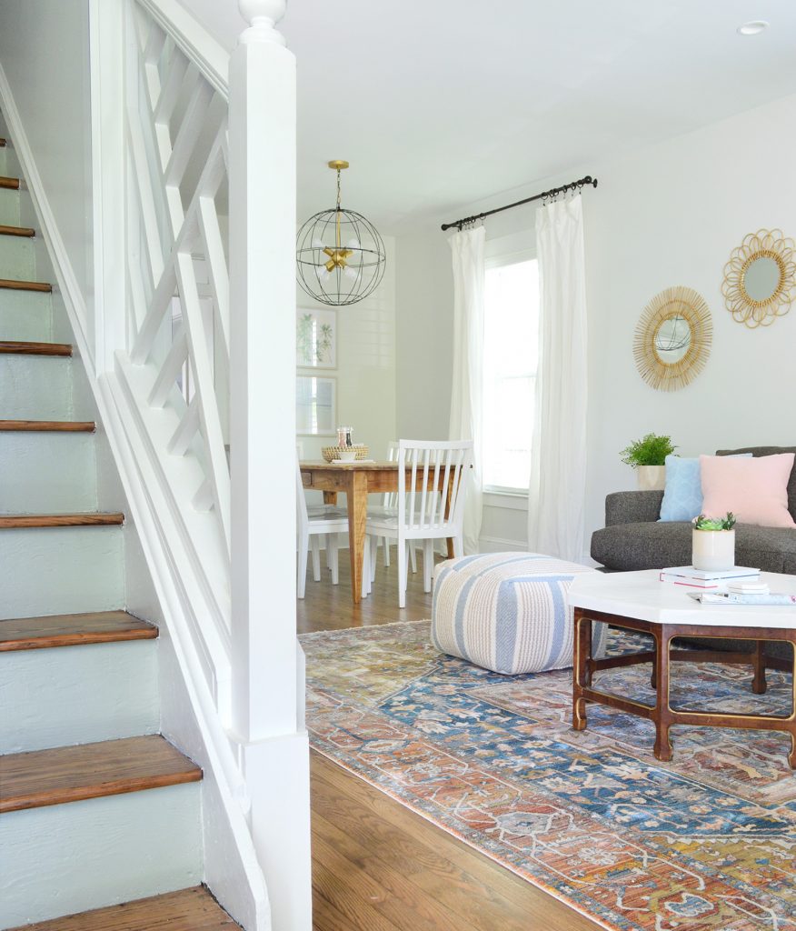
Oh and see those cute stair risers that are the same color as the greeny-gray doors on this side? We did each side’s interior steps in their own door color, and when the front doors are thrown open you see these cute pink risers on one side and these soft green ones on the other. I can’t even tell you how charming it is (you can see a peek of them both here in this post).
But enough talking, we have two kitchens and two laundry rooms to finish to hopefully share with you by next week! And the back patio, and landscaping, and about a hundred curtains to iron and hem. Just call me Sheron Petersik, heir to the IRON throne. Get it? No? Is anyone laughing? Hello?
P.S. You can see the entire process of bringing the duplex back to life hereFrom buying it and planning the layout to screaming into a pillow over a sad setback, it’s thorough.
Oh and the chandeliers in each living room are from our lighting collection with Shades of Light! You can check out our entire collection here on their site.
*This post contains affiliate links*
