We showed you our beach house style inspiration while the pink house was barely starting to come back together. And now that the duplex is at that same stage, we wanted to share our “vision” for its design – from materials and color ideas to specific room functions or features we’re thinking about incorporating.
It’s never too early to start making the 10,000 decisions that a major house reno like this requires because your brain will practically start to smoke if you attempt to pick everything all at once. So from the moment we offered on the duplex, I’ve been keeping a huge Pinterest board to catalog all of the ideas that have popped up and grabbed me over the months.
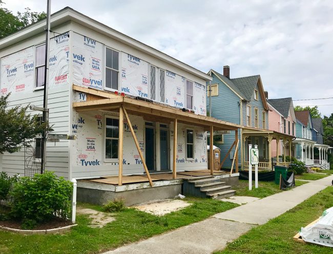
John and I have been sifting through them all lately in an effort to pinpoint our favorite ideas (so we can avoid that last-minute brain-burn when it’s time to finalize colors, counters, tile, lights, rugs, and BASICALLY ALL THE THINGS). Is everything perfectly crystal clear now? Nope! But we’re feeling a whole lot more focused than we did when we started collecting ideas months ago. So we wanted to share what we’re loving most for the duplex’s primary inspiration.
The Overall Plan
Like the pink house, we want the general vibe of the duplex to be relaxed, uncomplicated, comfortable, and old-meets-new. We definitely want to resist the urge to overfill or overdecorate the house, since it’s meant to feel easy and light (and less stuff = fewer things for renters to damage). Plus, it’s an old home, and we LOVE keeping original details like doors, floors, and my beloved diamond grille windows. We even uncovered an old brick chimney that passes through both sides of the duplex that we will be exposing and using to create a little niche with shelves within each side’s main bedroom.
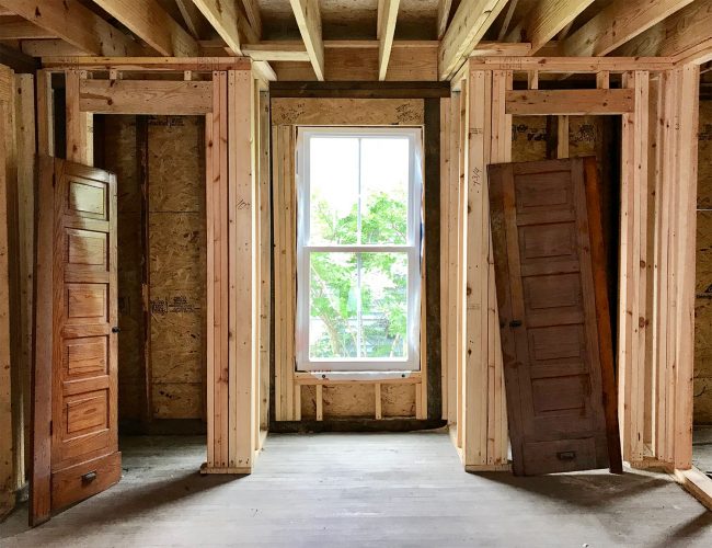
We also want it to feel beachy, fresh, and coastal. This house has fewer historic details inside that we can emphasize and use for interest. A lot was stripped out over years of being a rental (whereas the pink house sort of froze in time and has things like the curved wall, the back staircase, the stained glass windows, old trim, an antique milk-glass pendant, and the grand front railing). So we’re going to use that as an excuse to go “beachier” with the duplex than we did at the pink house. We’re definitely still going to use old doors and refinish the original floors, but we’re also planning to play a lot with relaxed colors (mint, pistachio, soft pink, blue-gray, aquamarine, etc) and pair them with crisp white and coastal warm wood tones.
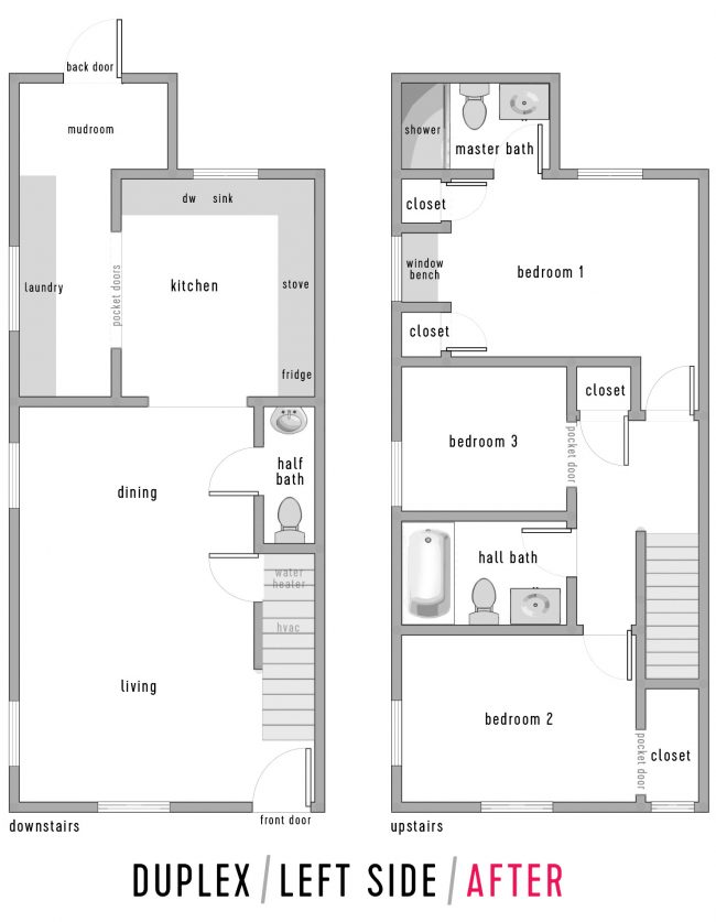
Since the duplex is two separate residences, it means we have double the rooms to plan – two living rooms, two kitchens, two dining areas, two laundry/mudrooms, and a whopping six bedrooms and six bathrooms (four full, two half). We’re not planning to decorate each side identically – more like cousins than twins – so picture both of the powder rooms on each side having the same type of tile, but maybe in a different colorway. I think it’ll fun to have two “alter-ego” houses with mirrored floor plans, yet different colors, materials, and decor.
As a refresher, below is an updated floor plan of what one side will look like (the other is the same, just mirrored). You can read more about our floor plan in this post. There’s a video tour in there too if that helps:
So that’s the overall plan, but let’s get a little more specific and show how that will come to life in specific areas around the duplex.
The Exterior
Since the home is in a historic district, the outside will generally look like a fixed-up version of the before: it will still have shutters, corbels, and – of course – no dormer on the roof (womp-womp). We’re keeping the siding color white, but replacing the rotting wood with more durable HardiePlank siding in their stock Arctic White color – but don’t worry that it’ll look too much like this before shot. We have a few ways we’re planning to amp things up and add a lot more curb appeal.
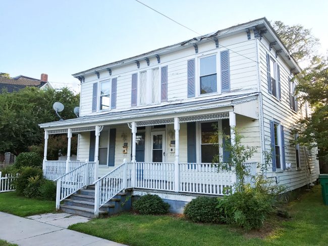
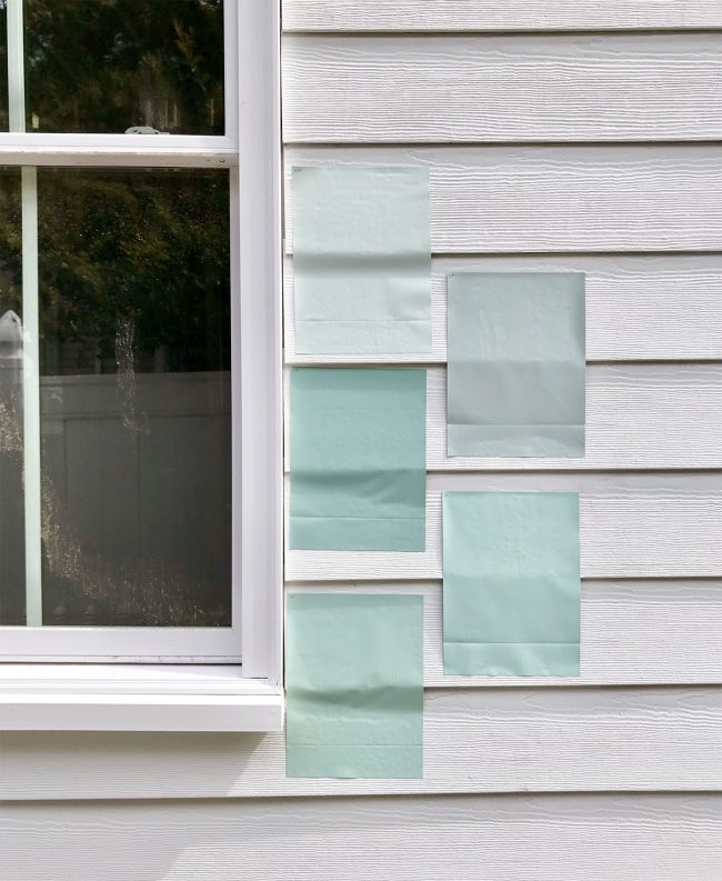
To inject more beachiness into the exterior, we’re going to add mint green shutters (operable ones that will look so great compared to the thin plastic ones above!) along with painting the two original front doors the same mint color. We think it’ll be such a charming and colorful addition to our street. There’s lots of blue – and now pink, thanks to us – but not much green at all. And since there is so much “shutter coverage” on the front of the house, it will still make the house feel very colorful overall (it won’t really read like a white house – more like a green one). We also like the idea of doing a soft pink porch ceiling to subtly reference our pink house – just one house away – since the pink house’s porch ceiling is a minty green-blue color (winking right back atcha, duplex!).
We actually started testing some mint paint colors this past weekend using some removable paint decals. We think we have a favorite, but we’re going to paint one of the doors first to make sure we like it before committing to putting it on all of the shutters.
The Transom Window
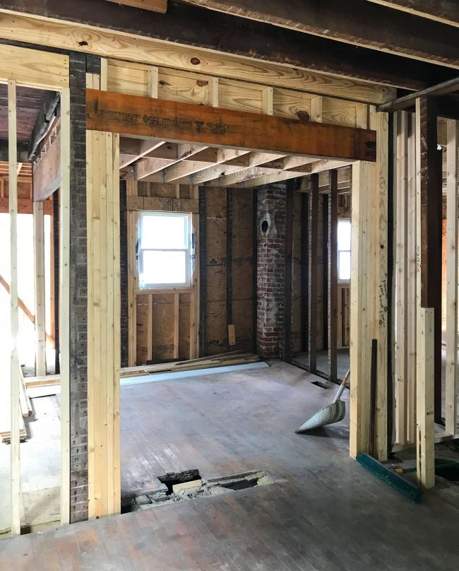
One exciting more recent development is that we decided to add an interior transom window above the opening between the kitchen and the main living area. We already had the opening framed wider, and Sean our contractor thinks he can easily rework the header to raise it and make room for the transom. People will see it from the second they step in the front door, and it’ll be another one of those cool “old details” that will add some original-feeling charm back to this house, since so much of that has been stripped out over the years.
We’ve had trouble finding images to represent what we’re thinking (I’m debating if we can do something with diamonds to tie into our diamond windows in the front and the old diamond door we tracked down for the mudroom). But these show you how much a nice high transom window can add to a doorway – especially one as wide as ours is going to be. Prediction: this addition will be one of our favorite things about the duplex when we’re done.
The Kitchen
We’d love to do something with color in the kitchen, so our first option is to add it to the cabinets. Maybe one side gets soft blue fronts while the other goes mint? It will only have one window so we’ll still probably keep the majority of the room white so it feels bright, but the colorful cabinets will help it feel fun while the brick chimney we’ve exposed in one corner (like the one in the bottom right image) will add texture and history to the room.
We’re also trying to be realistic that buying two kitchens-worth of custom painted cabinets could get pricey, and DIYing it could be time intensive. So another option we’re floating around is injecting the color in the backsplash tile instead, then keeping the cabinets a stock white or wood color. Again, we could pick slightly different patterns or colors for each side so they each feel distinct.
The Stair Railing
Since we opened up the formerly closed in stairs on each side of the duplex, we now will have an exposed railing on each side.
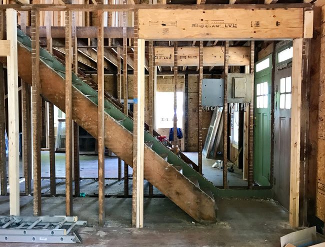
While a wood newel post and railing are historic and pretty, we also don’t feel like every single detail needs to feel old. In fact, it might be cool to balance out the old touches in the home with some new additions that feel fresh and coastal – like a metal railing. We have the original wood railing at the pink house and LOVE it, so it feels like we have done that – and since we opened up the stairway wall at the duplex, there’s no original railing to save. So it inspires us to try something a little different…
We’re leaning towards some sort of horizontal railing but we haven’t priced anything out quite yet (and that could change our tune on metal entirely!). We know a local metal worker in Cape Charles (he forged a small support bracket for the stairs in the pink house) so it feels like something that’s worth exploring.
The Main Living Area
As you saw in the floor plan, the largest room downstairs (which looked like this when we bought it) will be home to both the living area and a dining space at the far end.
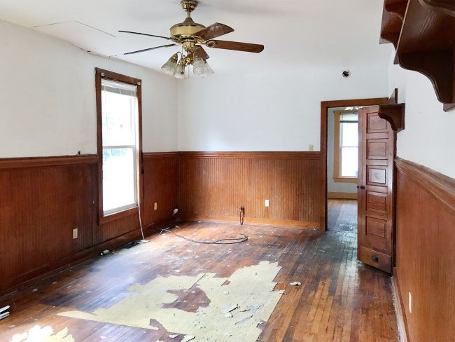
We like the idea of doing some sort of molding treatment on the walls (or ceiling!) just to keep the room from feeling too long and bare. Do we dare to finally jump on the shiplap bandwagon? Only time will tell.
The Powder Room
Since there’s just a downstairs powder room in each side of the duplex (along with an outdoor shower for getting the sand off – not to worry!), we think we can play a little bit more with some colorful wallpaper or some sort of wall treatment that makes that little nook of a bathroom under the stairs feel more like a lovely little hideaway. It’s going to be small, and will most likely have the same hardwood floors that run through the rest of the first floor (except for the mudroom, which will be tiled), so we can go a little nuts on the walls. Plus, we can also do some wall molding to save money on wallpaper and tie in whatever treatment we do in the adjacent living area.
The Full Bathrooms
The upstairs bathrooms in this house aren’t huge, so we think we can do something fun with tile to make the most of the small spaces. We LOVE the idea of playing with shapes (subtle stripes or colorful zig-zags) by using the same tiles in two different colorways (or four or five!). Our tile budget is always tight, so it’ll be a challenge to see what we can find without ordering anything too fancy (or high maintenance – this tile needs to be super durable). But again, the fact that they’re small and won’t require much tile may allow us to splurge a bit.
I realize that’s not every single space or idea (bedrooms! backyard! laundry!) but I figured this was enough to give you a sense of the overall vision for the duplex. One thing’s for sure… there will be beachy colors! And cool old pocket doors! And interior transoms! And original wood floors! And tiling projects that take us days and days to complete! Ha!
Also, are you on our free email list? We send out quick & fun weekly emails full of bonus details, design tips, random style thoughts, and other house-related musings. Click here to join the fun. And thanks to everyone who has jumped on board – we love putting these together for ya!
