We’re in the midst of two room redos right now and I couldn’t be more excited about them! One is our bathroom reno that we shared last week, and the other is a much lighter and less dusty one, which involves zero demo or wall moving, but a whole lot of function that we’ll be gaining (plus a wall treatment + wallpaper, which thrills me to no end). We’re “reconfiguring” the middle bedroom at our beach house, which used to look like this. Yes, it’s a very small room that was basically all bed:
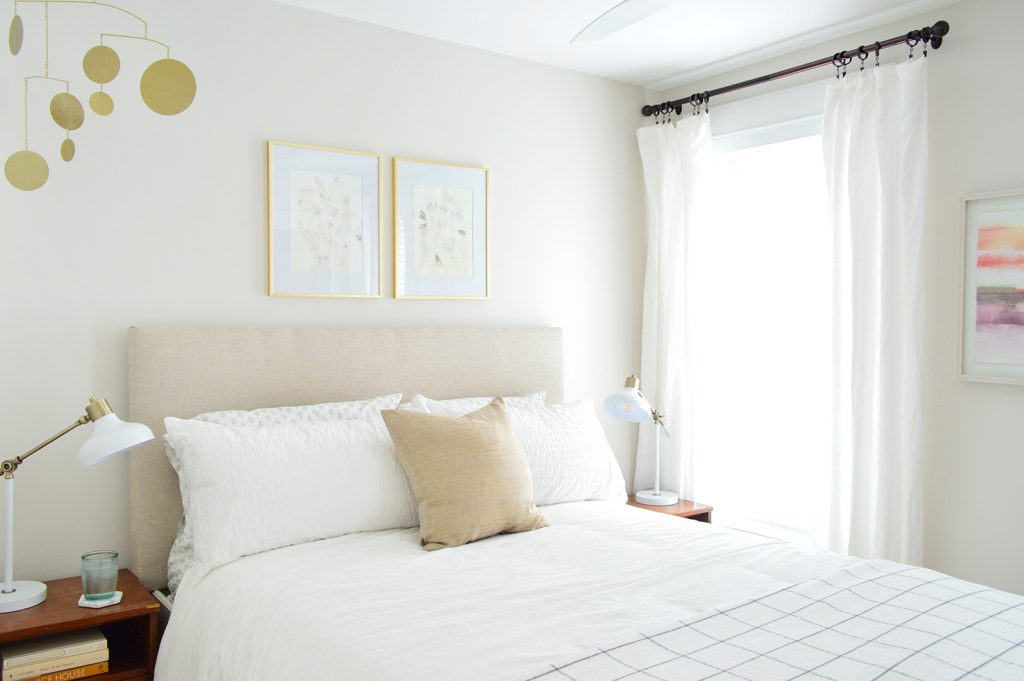
Having a lighter room redo running in the background while we wait for orders like our bathroom tub & vanity to arrive and finalize our tile selections is actually really fun. And thankfully we left our bathroom fully functional when we knocked out those walls last week, which means we can still use the space while we wait on that stuff to arrive and get deeper into that project.
But back to the middle bedroom. I realized while we were planning this room update that I have some easy tips that I think might come in handy for you guys if you’re planning any sort of room makeover (doesn’t have to be a bedroom), so I’m laying them all out right here, along with getting you all caught up on our progress in there. While there are lots of high tech ways to plan a room makeover – think 3D planning software, Photoshop mood boards, or even the trick I shared on Instagram last week – we’ve taken a decidedly low-tech approach to this room, and it has been so helpful as we attempt to picture everything & make confident decisions during each step of this room’s update.
So for anyone else who’s intimidated by fancy design software or just prefers to see things in real life (raises both hands!), we wanted to share 4 things we’ve done in this room to visualize things as we go, and they’re super effective when it comes to confirming that you’re on the right path! I don’t want to skip too far ahead, but the space is already so much more functional for us! Here’s a peek:
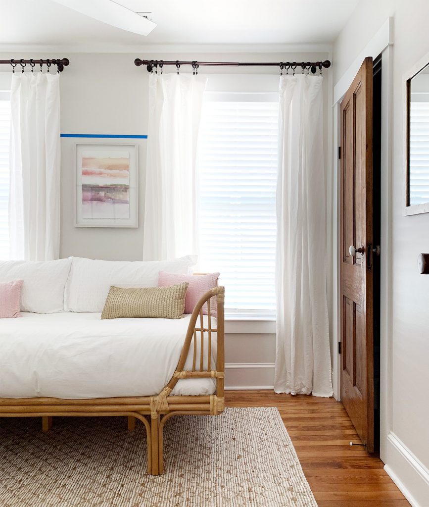
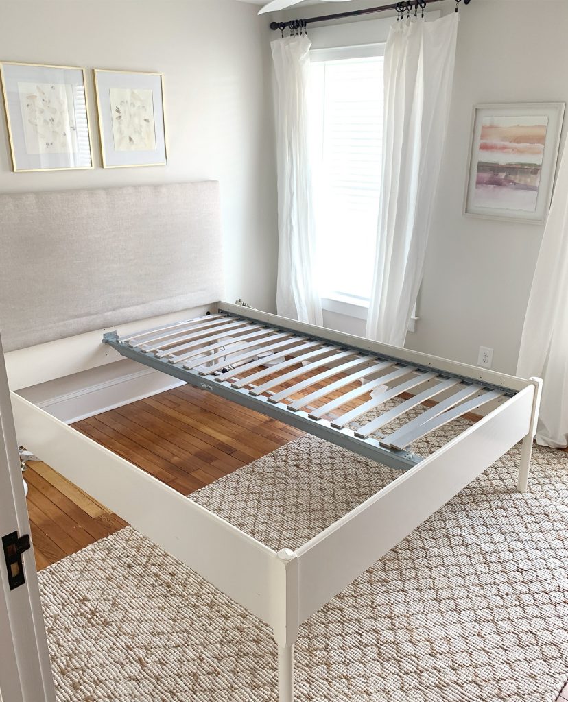
But back to our starting point. For the past 2 years, this room has served as a guest bedroom with a queen sized bed in it (seen below). But since most of our guests use the larger front bedroom, this one pretty much never got used. At most, we’ve had one guest sleep in it (always a kid since the grown ups take the front bedroom) and literally have never had two people share this bed ever. And it has been here for 2 solid years!

So last month we finally faced the music and decided this space should work a lot harder for us instead of just housing a big bed that takes up space, so we held the bed and the nightstands in our hands and thanked them for their faithful service (Marie Kondo, anyone?) and then sold them to some friends. They’re both leftovers from our second house that we’ve had for over 9 years so they had a good run (you were so good to us, Ed!).
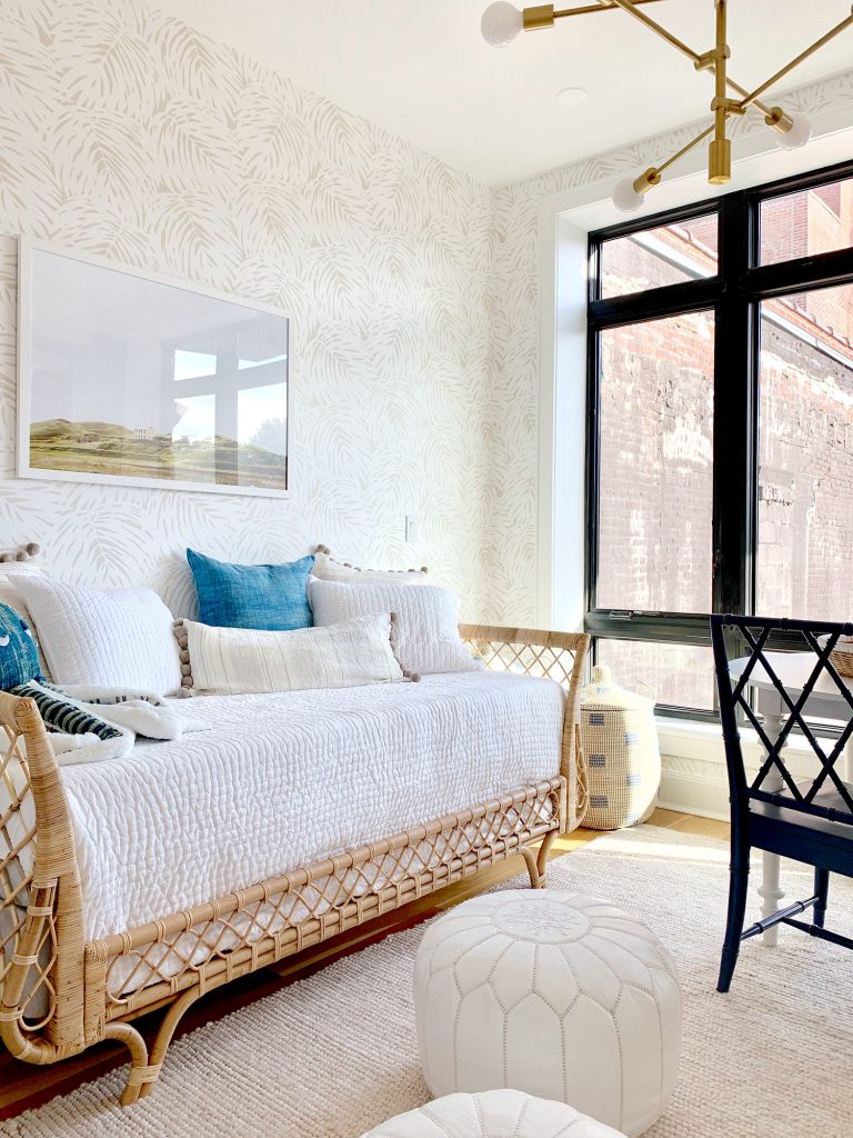
The goal now is to make it a more multi-functional space. We still want to be able to sleep guests (just in a twin bed, not a queen – since so far it has only been one child staying in there at a time) and with more floor space it means a second kid could sleep in there on a sleeping bag or air mattress if the need arises, but it also means that our own children can hang out and do puzzles and art in there – so it won’t be used just a few times a year anymore and suddenly becomes a lot more functional!
In some ways, it’s kind of similar to the space that we designed for Real Simple with the single bed guest room + playroom function they were looking for. In fact, we liked that woven daybed so much (more on that here) that I jumped at the chance to use a look-for-less woven daybed in our beach house! You’ll see more of that in a second though.
Let’s get back to the four low-tech ways that we used to plan this space which… I should also point out, is still VERY much a work in progress! But I couldn’t wait to catch you up on everything that’s going on in there.
1. Bring In Your Anchor Pieces
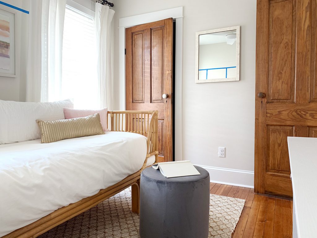
This probably goes without saying, but if there are pieces you already own or you already know are “definites” for the room, get them into the space as soon as you can. Every decision afterward will be easier & clearer if your “known constants” are in there for you to visualize around. For us, this meant the rug (which we already owned and loved) and this beachy woven daybed, which was the launching point for our new room layout (we also started with the daybed in our Real Simple room design – a nice large piece of furniture is a great place to start).
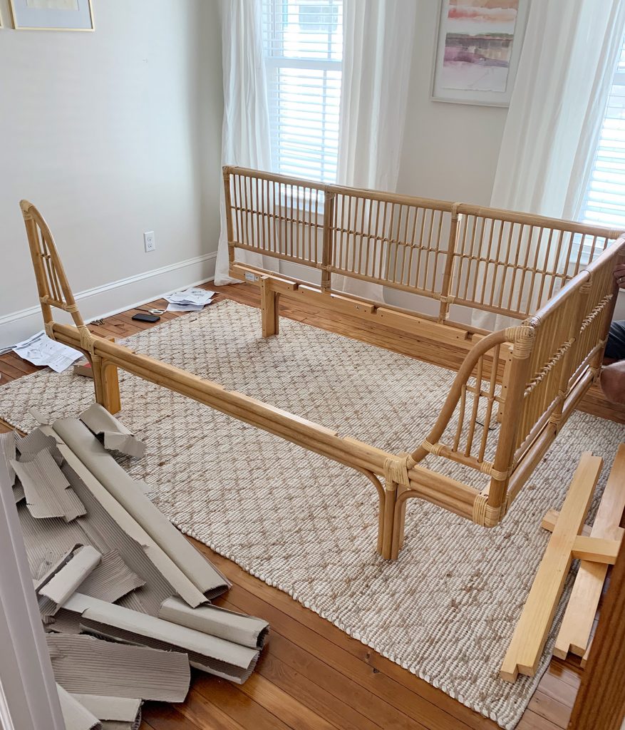
We love a daybed in a dual-function room like this because it can double as a couch or a lounge area when it’s not actually being used for sleeping. Almost like the more grown-up version of a futon. The kids can lay on it and read. Heck we can lay on it and read! People can sit in there and chat while the kids draw or play a game at the desk (more on that in a second). Suddenly this room has so much promise!

Actually getting the daybed into the room was a HUGE leap forward in better understanding how the rest of the space would be arranged. One big tip would be: don’t order other elements like the table or desk or whatever until you see your anchor piece in the room if you have the option to do things in that staggered order. We tried the bed in a couple of spots, including the back wall where the old bed had been, but ultimately putting it in front of the windows gave us the most usable wall space for other functions across the room. And then we could decide what would fit best across from it, since we had the daybed’s final placement set.
2. Tape Things Out
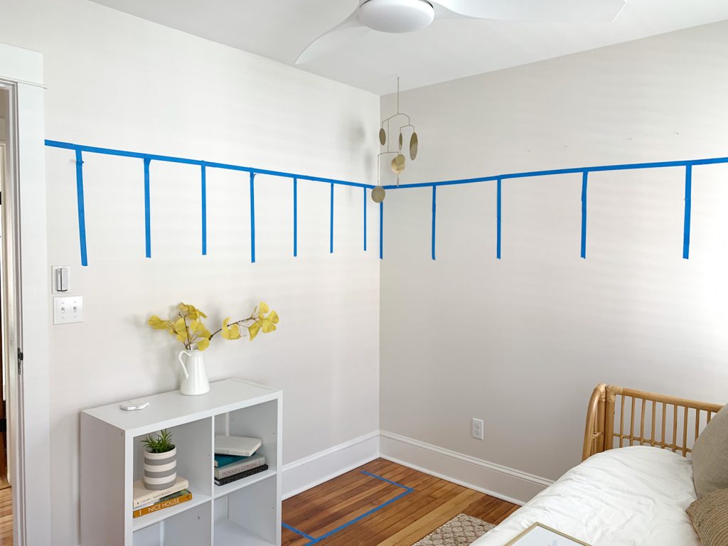
Painters tape has probably been the hero of this process so far (which is why it’s also the star of most of the photos you’ll see today). Most noticeably, we used it to map out some board & batten molding that we’re planning for the room. We wanted to try something higher than our previous iterations of this project (like this $57 version in our last hallway, and this “fancy” version in our current house). More on why we’re into the idea of some extra height in a minute, but for now you can see how we used tape to help visualize it with two different spacing options:
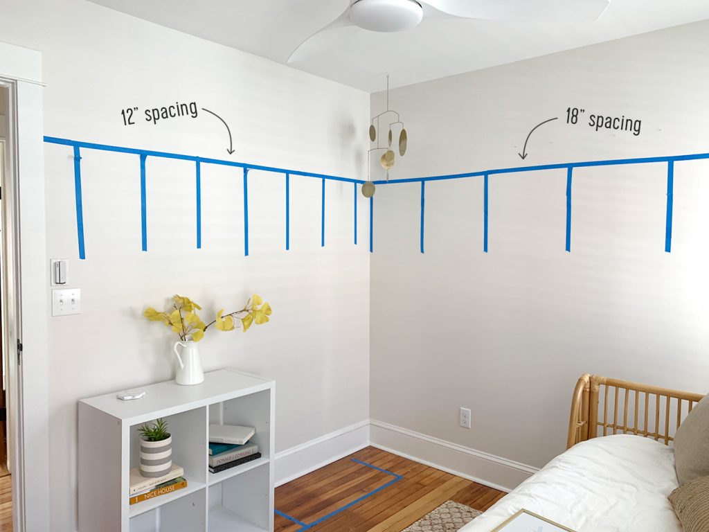
Not only did taping things out give us a gut check on the height, but we also were able to easily see which spacing option we preferred. We landed on the wider 18″ spacing since we think it will help the room feel bigger in the end – plus it’s more affordable! So it was definitely well worth the 10 minutes it took to test things out with tape.
You may also notice some tape on the FLOOR of that photo and this one below…
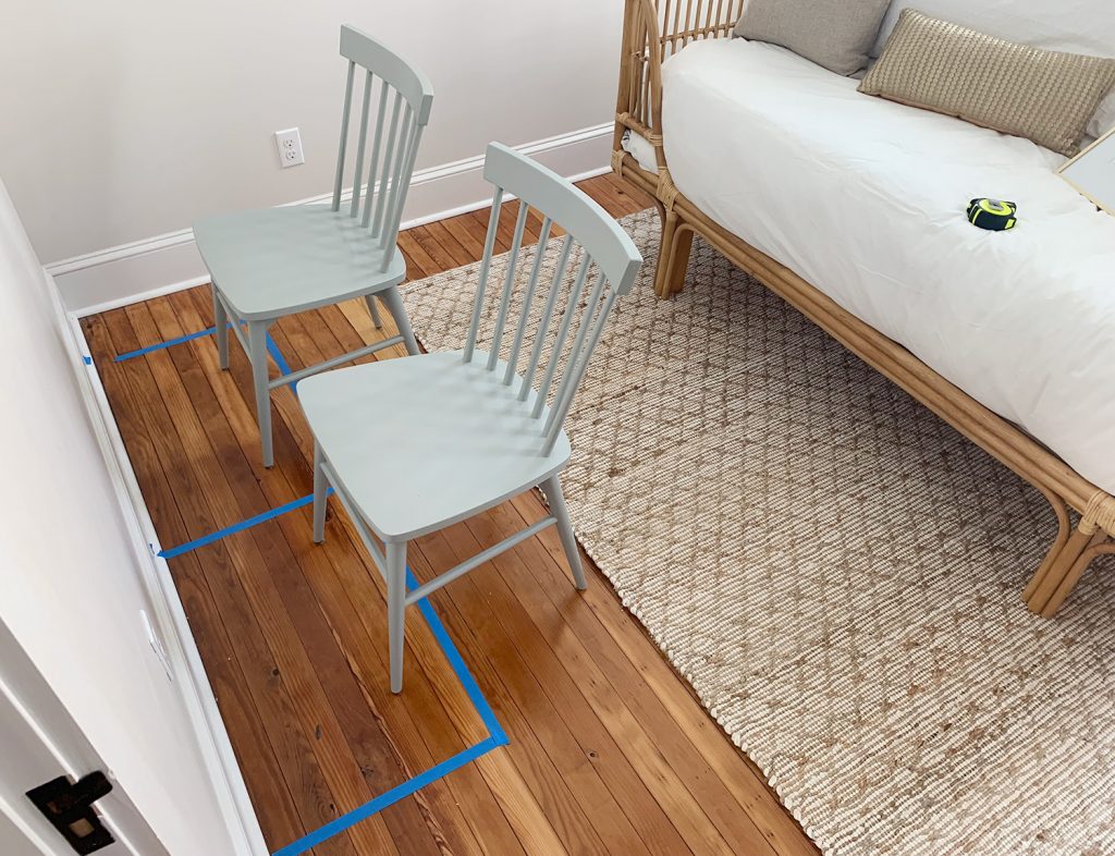
That was us trying to figure out the desk situation in the space, since one big goal of this room refresh was to squeeze in an art space for our kids (so we could keep the dining table more cleared & meal-ready downstairs since it had basically turned into their default art surface). Having a designated art area is going to be completely game-changing, and we were excited to see that two of these 30″ white metal desks would fit nicely… but the chairs looked crazy and closed everything in the second we added them to the room, which brings me to our next tip.
3. Bring In Placeholder Furniture
The chairs in that photo above were just borrowed from the dining room to help us picture things. THIS STEP IS HUGE – DON’T SKIP THIS! Lugging them upstairs briefly just to look at things was invaluable because it made us realize that chairs with a back were not the best idea. They made the room feel and look so much more crowded – almost like the back of the chairs were a fence separating the desk from the daybed and making everything feel more cramped.
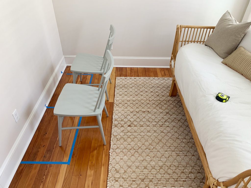
It was at this point that I started to doubt this plan. Maybe a double desk was asking too much of this room? But since nothing had been ordered yet, John and I decided to keep employing some low-tech planning methods to see if we could salvage the idea… which leads me to a slight variation of this placeholder furniture idea, which I will call:
3b. Bring in Placeholder ANYTHING
I thought maybe the desk wouldn’t be so bad if the chairs were backless – you know, maybe a stool or ottoman or pouf of some sort (the kids had been doing art at our dining table for the last two years, which has bench seating, so it’s backless too). We debated a bench for in here too, but thought the idea of a nice cushy stool or ottoman might be even more comfy, and would still give the kids a place to sit & draw, but without the whole fenced off feeling that the chairs were giving off. But we didn’t have any stools or ottomans around to help us confirm this hunch… so I found myself doing this…
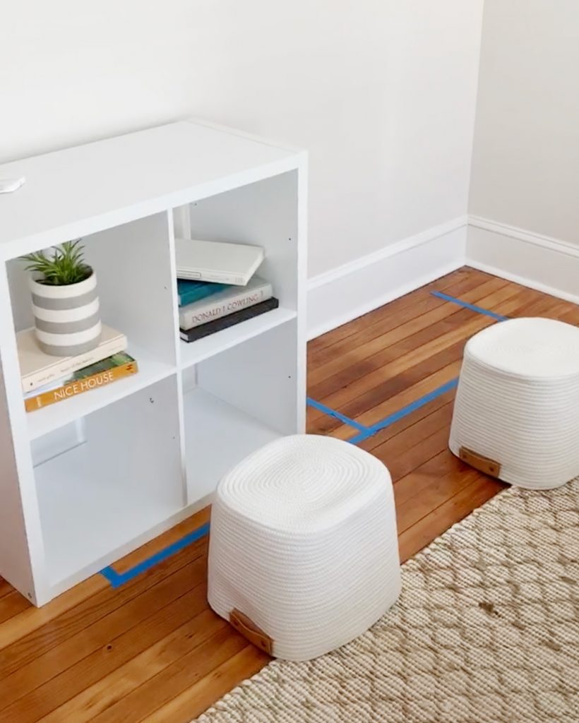
Yes, those upside-down baskets that are playing the role of “stools.” And yes, that cube organizer shelf is playing the role of “desk.” Neither of them were exactly the right size, but what they did is basically convince us not to give up on the desk idea. Because it confirmed that something backless like a cushy ottoman or stool would do just the trick. They wouldn’t visually crowd the room like the chairs had – and as we thought about it more, they could even tuck away entirely under the desk to essentially disappear when maximum floor space was needed. OR THEY COULD BE PULLED OUT AS CUTE LITTLE COFFEE TABLE ALTERNATIVES FOR THE DAYBED! SO FLEXIBLE! SO FUNCTIONAL! (I know, it’s extremely exciting. That’s why I used all caps).
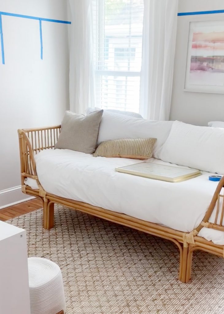
And that, my friends, is how we ended up at this “still very much a midpoint but it’s progress” stage right here:
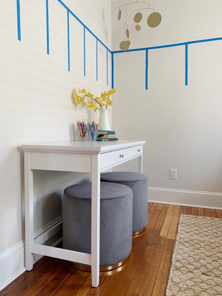
We ordered these two plush stool ottomans because they were the perfect size (and light enough for the kids to move them easily). I also liked that the gold band on the bottom picked up on some of the other brass accents we plan to keep in the room. We also opted for this single desk instead of the two metal desks we were originally envisioning. Not only is it wider and it has two drawers (three cheers to stashing art and pens/markers away when guests come) but it also kinda looks like a cute little console table setup, which is nice in a guest room.
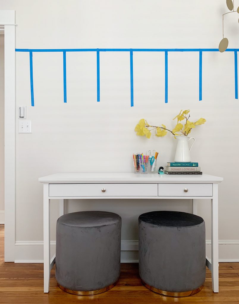
It’s not the largest art desk in the world, but it’s actually bigger than the one they share at home in our home office so they’re thrilled (plus a bonus space to do something fun like crafts in a house that didn’t formerly have one = all the squealing and excitement). We let them test it out last weekend while we were there and so far they’re giving it four marker-covered thumbs up.
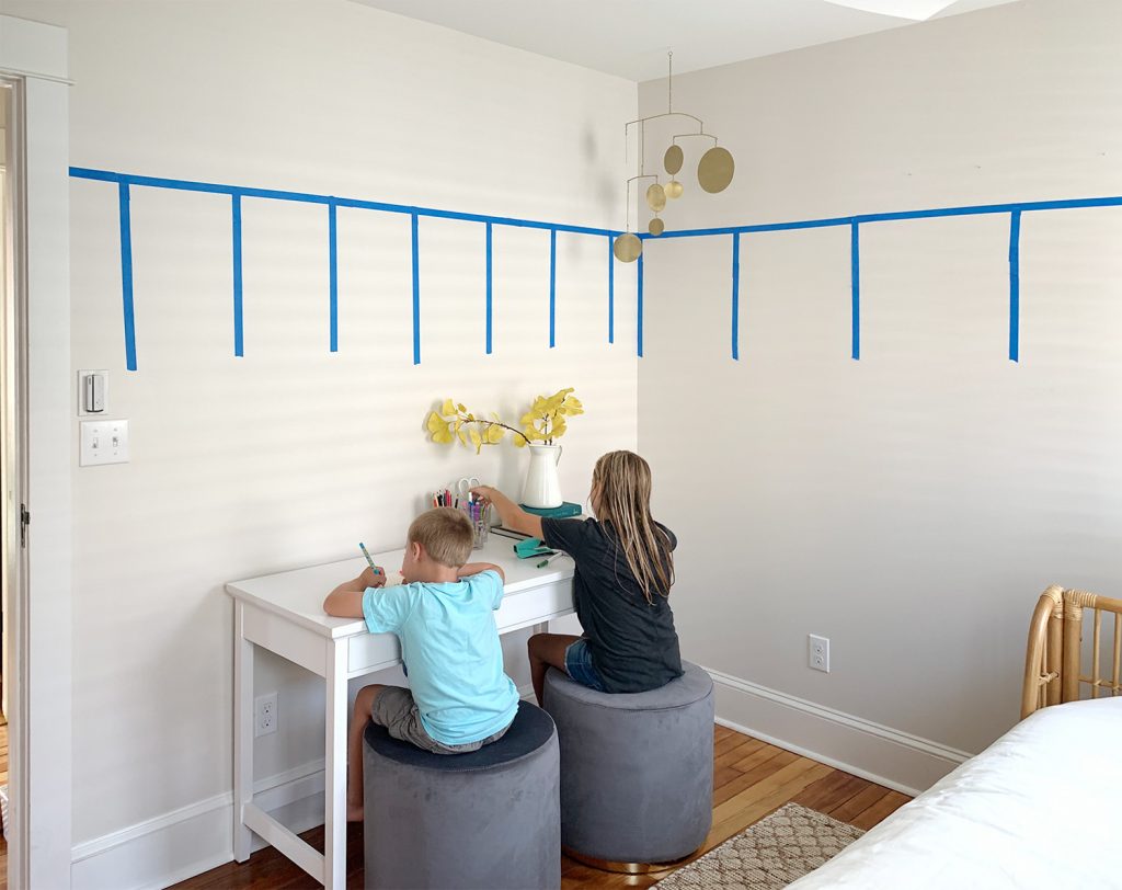
And remember my caps lock screaming about the flexibility of those ottomans? They didn’t let me down. I love how they work as footstools or mini coffee tables when someone’s using the daybed as a lounge or reading space. This realization alone made me SO HAPPY that we went through the exercise of figuring out this room in person, rather than trying to lay it out on the computer or in an app or on graph paper (all of which may not have caught the closed-in feeling backs of the chairs and steered us towards ottomans).
But that actually leads me to the last thing we did… which was a smidge more high tech. Emphasis on “smidge.”
4. Hold The Phone
I promised I’d explain more about why we want to do the board & batten molding higher than usual in here. Partly it’s just because we think it will help the room feel beachier and more relaxed, but it’s also partly because we want to add some fun and colorful wallpaper above it. Between the sleeping nooks at the duplex (remember those wall murals?!) and the Real Simple room (remember that wallpaper!?), we’re both hot and heavy for wallpaper (ok, maybe John wouldn’t describe himself with those exact words), but we both were talking about wanting to wallpaper our dining room back at home with something tone-on-tone and soft yet interesting.
And we thought this would be a great room for something even more colorful and bold – so the idea of adding that above a white-painted wainscotting will keep the room feeling relaxed and not too overwhelmed with pattern. Plus we’d save money by not doing each wall floor-to-ceiling (that’s a whole lotta paper).
After a ton of searching online, I had narrowed it down to these two wallpapers from Anthropologie (Alpine and Synchronized). They were pretty different in style, but the 20″ repeat on each would mean we could do the whole room with just 2 rolls, as long as the space above the wainscot was less than 20″ (another way that taping off and planning helped us!).

Unfortunately, Anthropologie doesn’t sell samples (boo!) so naturally, I did the next best thing and I opened up one pattern on John’s phone as large as I could and did the other on mine. Then we stood in the doorway, held both phones up in front of us, and squinted.
I know this sounds extremely dumb, but it did exactly what I needed it to. It gave us a better idea of how each option would read in the room, and it immediately became clear that the larger scale of the Synchronized one (on the right) would work better with our existing rug. We really loved the one on the left, but that stand and squint with your phone exercise really helped me see that the smaller scale was extremely similar to the scale of the rug’s pattern, so they competed in an odd way (ideally one accent with a pattern would be a different scale than another in the room so they don’t feel like they’re fighting). That little activity helped us see that Synchronized was The One, and we placed an order that same day.
Had we been at home near our computer or printer I probably would’ve been tempted to photoshop it in or print out my own approximation of a sample, but I didn’t and – guess what – I’m still THRILLED with the outcome and completely confident that we picked the right one. The only thing I’m not so thrilled out is that the wallpaper is on backorder until the end of October. Boo. It hurts to type that.
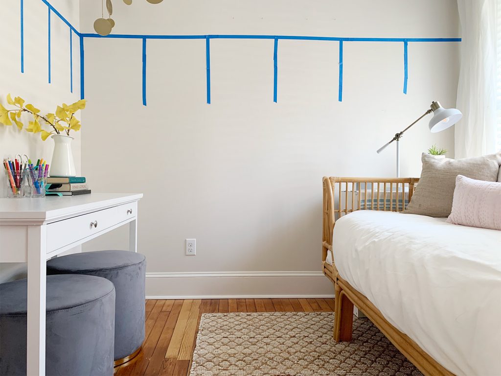
But clearly we still have lots to do in here before we get to the wallpaper anyway, including adding the board and batten – which I think is next up on our list. And since we’re back to just going there every other weekend or so, the late October arrival of the wallpaper may be perfectly timed after all.
P.S. Want more posts about planning a room makeover? We got plenty! Here’s a whole category devoted to that (good planning is basically the entire key to a space you love!).
*This post contains affiliate links*
