Beige gets a bad rap in the design world. It’s synonymous with bland, boring, colorless and therefore lifeless. “Nobody’s favorite color is beige,” is something we recently heard. Heck, we’ve probably snubbed it ourselves, defensively saying “oh no, this is a warm gray – or a light sand color – certainly not beige.” We even make ourselves feel better by calling it greige instead.
But if we’re being honest, some of our favorite paint colors probably fall under the beige umbrella. Particularly Benjamin Moore’s Edgecomb Gray, which is slowly taking over our house, room-by-room. Ever since we first used it in our foyer, we’ve fallen hard for how it dances the line between gray and tan. Staying neutral, not too cold, and not too yellow. Light enough to feel airy, but dark enough to make that white trim pop. In a word: it’s a paint color unicorn (ok, that’s five words).
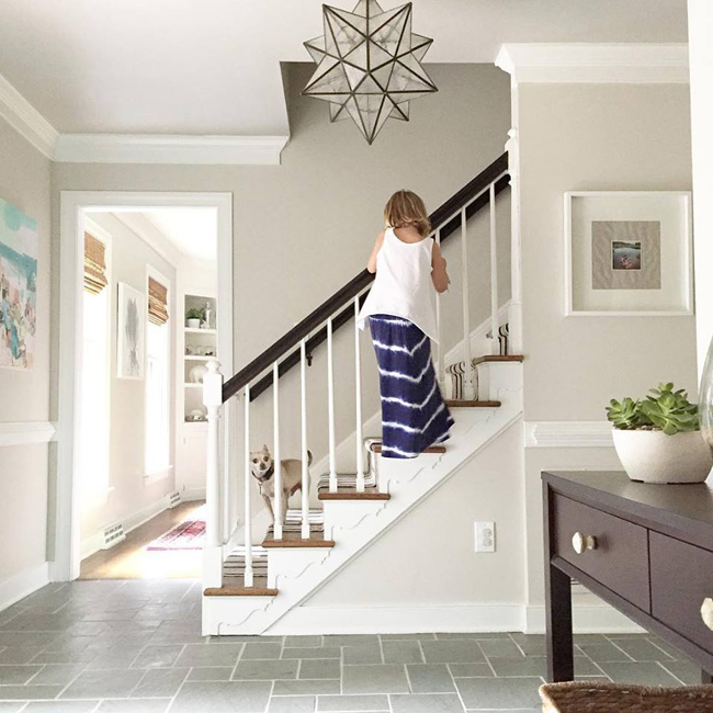
Some of you have noticed on Instagram that we repainted our office Edgecomb Gray a while ago (you can also see it in the background of this year’s April Fools Day post).
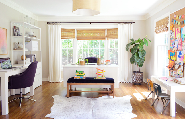
It had been a light, minty blue color (BM’s Palest Pistachio), which we liked, but over time we noticed that it sort of broke up the flow from the adjacent foyer (there’s an extra wide doorway connecting those two spaces).
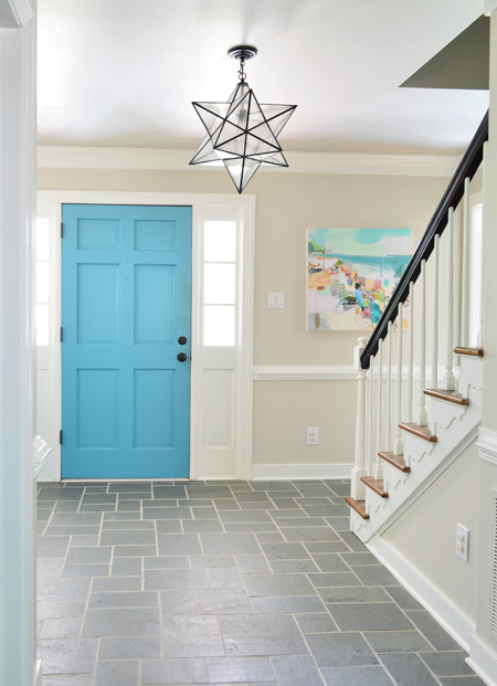
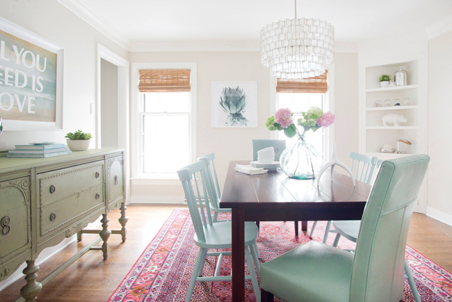
Now the entire front half of our first floor – from the dining room, through the foyer, and into the office – is painted this same soft neutral color. It has flow like woah. The wall color definitely isn’t “the star” of each room, but it’s a great supporting character. In other words, it falls back and lets other things take center stage.
We also gave our master bedroom the Edgecomb Gray overhaul. You probably last remember it with Benjamin Moore’s Black Pepper on the walls:
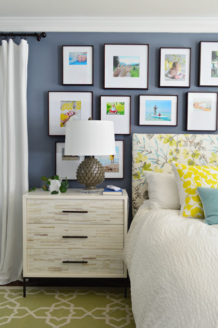
At first we felt a little sheepish about going from a rich, deep blue to a quiet beige.
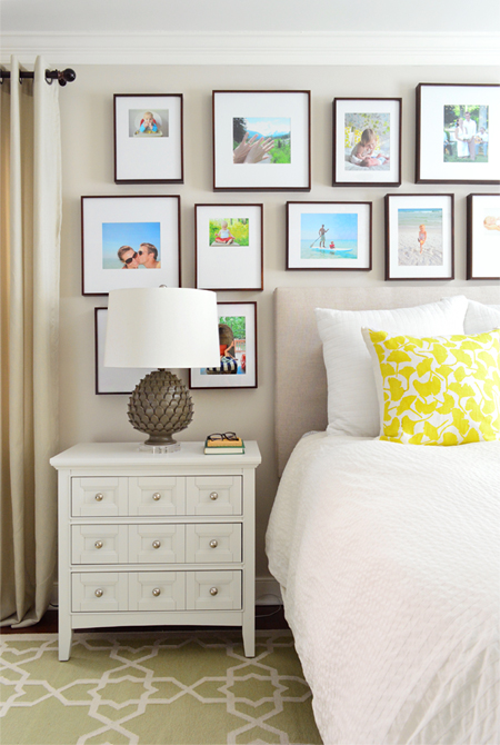
Note: our pretty inlay dresser now lives across from the bed – and since people always ask, the frames are from Michael’s, and here’s where to find our yellow pillows and our side tables.
This whole bedroom color change perfectly encapsulates a subtle shift that our house has taken over the last few years, especially since we stepped back from blogging full-time. Now that we’ve quieted the subconscious filter of “how will this be received online?” I think we’ve found it a lot easier to follow our instincts and not really worry about what everyone else will think… which has (duh!) made it a lot easier to hone in on our “true style” as opposed to chasing that ever-elusive “what everyone on the internet will hopefully like.”
And surprise surprise, we’ve realized that our style preferences seem to land closer to the layered neutrals of our first house (which, not coincidentally, is the house that we decorated largely without a lot of eyeballs on us) rather than the brighter colors and patterns that we experimented with in our second house.
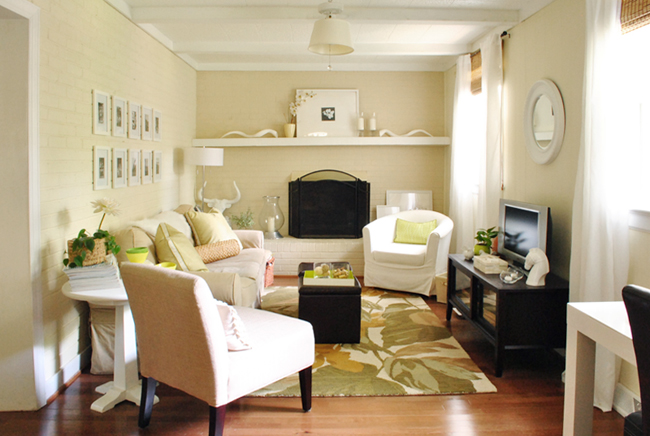
Don’t get me wrong – we loved stretching ourselves to see what we liked and didn’t like in that sweet second house (pinning down what you don’t like – so you can stop buying/doing it! – is just as valuable as nailing down the things that you love). Experimenting with bright colors on everything from the curtains to the walls clearly helped us see over time where we appreciate bold colors and patterns most (on rugs, art, and pillows for example) and where we like to keep things more neutral and airy (like curtains and bedding). How could we know without trying? Color still plays an important role in our home… maybe just not on our walls quite as much.
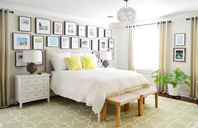
Sources: chandelier | curtains | similar bed | similar bench
We love a room that’s cheerful and bright, but it slowly dawned on us that we wanted our bedroom to be calming and to feel like (cliché alert!) a soft and peaceful retreat. Hence also covering the headboard in a neutral fabric, which you saw in our book and way back on Instagram. Don’t worry, the flowers are still under there if we ever want to switch back.
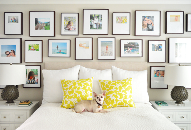
Does the new lighter paint color and a more neutral headboard photograph as well? Probably not. Will we hear from people who much preferred the blue wall color? Most definitely. Do we like it better in person now? Yes, yes, yes. Is that what matters most? Heck yes.
It feels nice and soft in the morning when we’re waking up, airy and alive when the sun is shining in the afternoon, and moody and quiet in the evening when only the bedside lamps are glowing before we go to sleep. Maybe it’s more generic. Maybe it’s less “pinnable.” But frankly we’re happy to have taken the room down a notch or two.
And I think that’s how we feel about the “beige-ification” of our house over the past few years. We don’t feel like we need to inject our rooms with bright colors or bold patterns just in the hopes that they’ll shout a little louder and grab someone’s attention as they scroll through their Instagram or Pinterest feeds. In fact, we’re kind of in a stage where we want our home to do the exact opposite (#rebellion). We want it to be the soft, comforting, peaceful background to all the colorful characters who live here. A foil to this buzzing house full of kids, pets, DIY dust, legos, and random cheerio crumbs in the weirdest places (seriously how do they get upstairs?!). We’re happy to let the walls whisper and leave the shouting up to the kids. Believe me, they’re great at it.
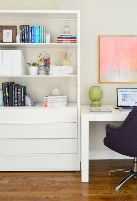
Sure, our style pendulum could swing the other way at any moment. We may tire of neutral walls or colorful art or patterned rugs or soft breezy curtains at some point. And I’m sure we’ll keep moving frames, benches, pillows, and lamps from room to room (we joke that our furniture and accessories live the nomadic life around here). So it’s certainly possible that we may crave more energy, loudness, and pattern in our home in a few months or years or decades. Or we could end up craving even less and going even more muted. Who the heck knows. But for now, we’re oddly happy to just sit back and embrace the beige.
MORE PAINT COLORS WE LOVE
You can check out more of our favorite go-to paint colors by touring our homes in the menu at the top of our blog. We’ve also written these detailed deep-dive posts about our favorite paints:
- The 12 Best White Paint Colors
- The 9 Best Greige Paint Colors
- The Best “Haint Blue” Paint Colors
- Benjamin Moore Simply White
- Sherwin-Williams Pure White
- Sherwin-Williams Extra White
Psst- If you’re wondering where we got something in our house (or about the rest of our home’s paint colors), check out our Shop Our House page. From our bedding to our office chairs and light fixtures, it’s thorough.
*This post contains affiliate links
