Update: Holy cow, you guys are full of so many fun ideas today! I’m having trouble keeping up with comments since they’re rolling in so furiously, but please know I’m reading them all and loving all the suggestions!
Happy Friday! We’ve been all over the place this week, painting the walls/trim/ceiling in the bathroom & closet, diving into some basket craftiness, de-wallpapering our biggest room yet (the 21′ long kitchen), and now we have a little Clara-room update along with some photoshop percolating as we plot our next move in there. But first, here’s the tiny (and twinkly) addition:
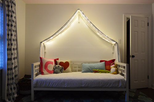
Things just got a little brighter in here…
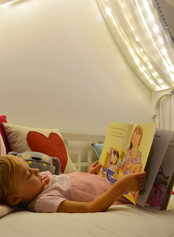
Ever since we hung her canopy, we’ve thought about adding lights to it. Both for the magic of it (Clara loves them) and also for the function of it being a well-lit place for bedtime stories. We feared traditional Christmas lights would be too heavy and make the fabric sag in weird ways (plus, they could look a little messy when they were off) so after some hunting online, we came across what are often dubbed “Fairy Lights.”
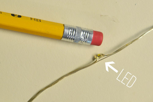
They’re basically small LEDs (check out this picture for scale – they’re tiny) that are strung on a thin wire. The particular set that we bought was 33 feet long and sold for $14 on Amazon. They’re not longer available but here’s an affiliate link for something similar.
The wire itself is extremely light and pretty moldable, so it was easy to weave it back and forth across the 18″ corbels that the fabric rests on. And by some luck of the draw, 33 feet was just about the perfect length to go back and forth four times on each side of the peak to the side brackets and secure them at each turn with white tape, so they’re not something Clara easily unwind and swing around like a lasso – but they will easily release under her weight, so she couldn’t strangle on them.
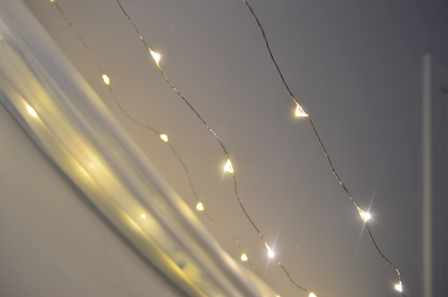
The next step was just draping the canopy back over them. The LEDs are so small that they tuck into the folds and are barely visible when they’re off. And when they’re on, well, you can see how they twinkle below. And since they’re LEDs, they’re completely cool to the touch – so we don’t have any fear of them being against fabric. I also love that they’re small resin-ish glowing dots instead of larger glass bulbs that could shatter.
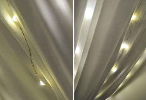
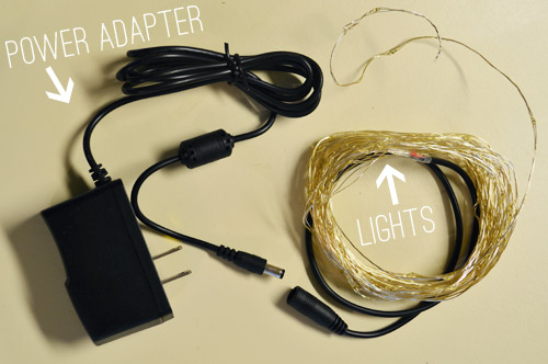
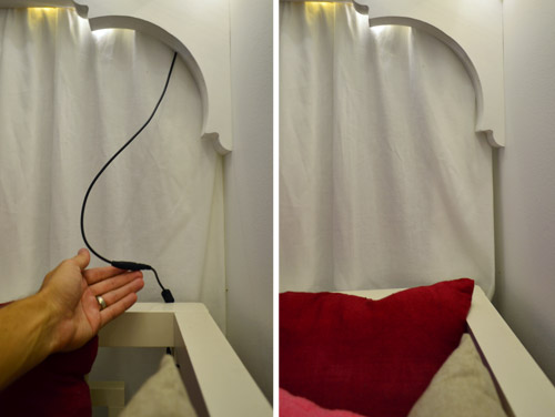
I wish the part that plugs in weren’t big and black, but we were able to plug it in behind the bed and wrap the cord around the bed in a way that it’s able to be hidden behind the canopy most of the time, but easily accessed when it’s time to connect the cords to the power adapter. See how you can see it on the left, but it’s tucked away and invisible on the right? Thank you John, hand model of the ages.
Clara LOVES them. Partly because they’re called “Fairy Lights” but mostly because she feels very special having her own set of secret lights above the bed. We intended just to put them on for story time at night or other special play times, but they actually put off a fair amount of light, so we’ve found ourselves putting them on just about any time we’re in the room and the sun isn’t fully out.
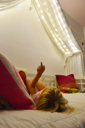
We’ve had them up there for a week or two (didn’t want to sing their praises too soon only to have them burn out or something weird) and so far they have been awesome for our gentle girl. She hasn’t touched them once, but loves gazing up at them. Meanwhile, my best friend’s four year old daughter is nothing short of an acrobat, so we laughed about how she’d probably scale the canopy and hang from the fabric like she was Pink in concert.

But even with the addition of the lights, the canopy is still definitely missing something above it. There’s still so much white on white on white that we’ve been brainstorming which way we want to go. We’ve debated painting just that peaked area under the canopy for a while and then adding something else in there (like a hanging paper lantern or mobile or even a cute little animal head or something). So here are a few ideas, thanks to our good friend Photoshop.
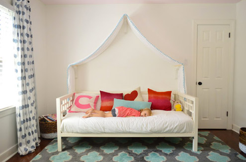
Idea #1: A gray tone on the walls to add drama and a little dreaminess to the canopy, inspired by this wallpaper by Osborne And Little.
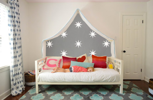
Idea #2: Maybe I could freehand some sort of imperfect painterly-ish mural, inspired by this awesome fabric covered lamp shade?
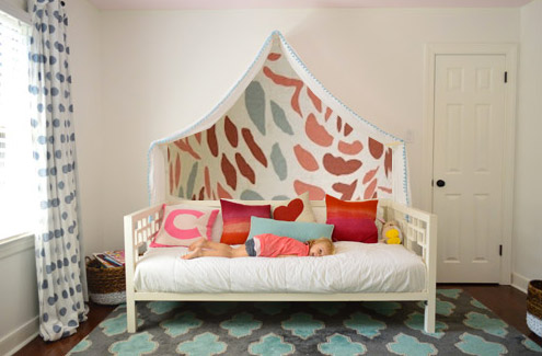
Idea #3: Another hand painted mural possibility could be something like this cluster of colorful raindrops in a variety of colors (inspired by this amazing but sadly sold out print).
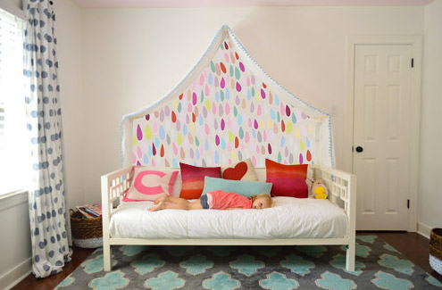
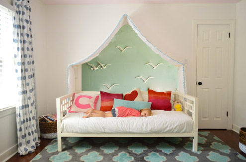
Idea #4: Then I saw this picture of a pretty blue-green wall with little birds on it and thought that could be fun.
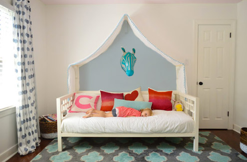
Idea #5: Since Clara’s quite the animal lover, we thought maybe a friendly giraffe or zebra (like this one from Dwell Studio) peering down at her while she sleeps could be fun with a blue-gray wall.
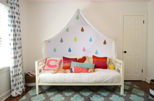
Idea #6: These little teardrops in a few different colors had my mind spinning with possibilities too.
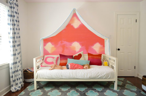
Idea #7: Then I thought about a colorful fabric hung along that back wall, perhaps something with the same large-scale boldness of this pink and red wall coverings that Jenny shared here.
Idea #8: And then there was the possibility of even darker charcoal paint on the walls and some asymmetrical handmade banners in a few colors like these (which were actually a super cool photo background for this party). Update: since this one looks chalkboard-ish there have been a lot of suggestions to do that so Clara can doodle away, but we worry that chalk dust over her bed might not be the best call (there are chalk markers but they’re not as charming, so we’ll have to see where we end up).
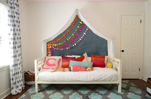
What do you guys think? Any favorites? Or combos? I think we’re leaning towards the gray background tone in Idea #1 or the dark charcoal color in Idea #8, but we’re not sure if we’ll stencil stars or something else – and we might just combine it with something 3D (like a little felt circle bunting or a hanging paper lantern or something). We’d love for Clara to weigh in on things too, and then I’m hoping to work on it this weekend (along with stenciling the bathroom floor and helping John finish that sunroom tile). What are you guys up to this weekend?
Update: Clara weighed in on these photoshopped pics as well as some more that we made based on people’s suggestions and then we made one last photoshopped picture for her, since she wanted to combine a few ideas (we even video-taped her reaction, which was pretty funny). Can’t wait to get it done and share what she liked best!

Hayley says
Ok, here’s my idea. Paint the rest of just that wall, probably a dark moody color, blue or grey. Leave the under the canopy the color it is, this will fill up some of the voids on that wall while keeping her canopy a special little hidey place! Photoshop it up! I think it would look awesome
Hayley
Helene says
I vote for the birds, dreamy and sweet.
Meghan says
So. Fun.
I haven’t read all the comments, but I just wanted to back you up on the chalkboard mess- markers or not. I work with dry erase markers all day, and the marker “dust” (crumbs?) makes about half as much mess as chalk dust- which is still a lot of mess. I haven’t used chalk markers, but I’d worry it’s similar.
But you have so many other awesome ideas! Can’t wait to see how it all turns out! And I’d love a video of Clara trying to choose. I might have paralysis by analysis, but I get the sense that she’s a girl who knows what she likes and would have an adorable reason why.
Pre says
Have you thought about painting it with dry erase paint http://www.ideapaint.com
On an unrelated note – Sherry, you must be psyched that Domino mag is coming back!
YoungHouseLove says
Yes! I’m excited although I hear mixed reviews… hope it’s as good as it was before!
xo
s
Melinda says
First of all, props on the fairy lights! What a great find! I think #2 is my least favorite and I like the other readers’ suggestion of painting the whole wall one color. There was a really cute contact paper tutorial on Oh Joy! That maybe you could take ideas from for decorating the wall: http://ohjoy.blogs.com/my_weblog/2013/10/make-it-a-door-able.html
Plus, what girl wouldn’t love gold? ;)
YoungHouseLove says
Fun! Thanks for all the links and ideas you guys have shared today!
xo
s
Sara says
I like #1 the best, could you maybe paint/stencil half of the stars with a glow-in-the-dark paint so when all the lights are off, that glows a little? My girls would love something like that!!
Rachael says
I’m also in the accent wall camp, and then have the birds under the canopy. I LOVE the birds. The zebra head, not so much. All I can see with that is one little head impaled on zebra ears…but then, all 4 of my children were bed bouncers!
Georgia says
I just had to say that “Fairy lights” is what Australians call all small sparkling lights…Christmas lights included. We also call cotton candy “Fairy Floss”. Not sure what our obsession with fairies is.
Have you thought about investigating those decal things that you stick on the wall? I personally LOVE the idea of raindrops or even stars, but it also might be fun to be able to change them around. My daughter covered her room in big coloured spots and loved it. I’ve seen tutorials for making your own decals… It would be fun to have snowflake ones, or raindrop (I envisage rain like your tear one) or stars depending on Clara’s mood or age. Then you could paint the wall one colour but switch out the design.
YoungHouseLove says
Haha, I love the fairy/Aussie connection! And thanks so much for all the suggestions guys! You’re full of awesome ideas and we can’t wait to see what Clara likes the most and dive in!
xo
s
Ann says
Paint the room. There are wayyyy too many comments to read through to see if anyone agrees. I’m telling you paint the walls. The white trim blends too much with the wall so hint, hint, paint the room. ;)
annie says
I love #1! Also thought it might be cool to paint a woodsy scene w fairies as the canopy looks like you’re peering through a tent. And hang a fairy from the top wood support of the canopy?
Sarah says
I think I would apply the KISS theory…keep it simple. Color is what you need, fabric on the wall or paint. Canopy, lights, color. Seems good to me. What about tiny glow in the dark stick on stars…even after the lights are off, the show quietly continues. What does Clara want? Probably something simple.
YoungHouseLove says
Oh yes, we’re asking Clara her opinion tomorrow and showing her all the photoshop pics and sharing a bunch of other ideas you guys have left in the comments so we’ll have to see what she wants! I’m hoping to make a video of her telling me, haha!
xo
s
Mary Jane Moder says
I love the first photo. Those stars with the new lights = the perfect spot for sweet dreams.
acp says
#3 and #8 are my faves! I have a little question about Clara’s big girl bed – is she sleeping in it yet? With #2 on the way are you planning to have her in it in the next 6 months or so? Our little guy (2.5) has the same AWESOME crib (upon seeing Clara’s nursery way back) and he just adores it. He has no interest in a bed really, which is cool but it would be great for his little sister to have it. She’s almost 7 months, so we may be a bit overdue haha but ice never wanted him to feel ousted by her. Love to hear your strategy :)
YoungHouseLove says
Yes, she’s in the middle of transitioning so not quite fully there but close I think! Hopefully with lots of time to spare for #2 to get the crib! I actually think doing special things for the bed like the canopy and the lights have helped her feel like it’s a fun and cozy place, so maybe ask your son if he wants to pick out pillows or something? Sort of like how letting kids pick out special underwear before potty training can get them excited, haha!
xo
s
Sarah says
They are all fun! Do you still have Clara’s mobile from her nursery? I’m a bit of a minimalist and would leave the wall white and just hang it in the middle bringing the color down from the ceiling. I apologize if someone already mentioned this, I tried to scan through before I posted.
In defense of the animals, I made a wire moose head that was in our room before we moved. It’s so light there is no fear of it falling or hurting someone. It can be done :)
YoungHouseLove says
Love the mobile idea! They’re still in the closet and I’d love to break them out somehow!
xo
s
Julie says
I like the idea of a grey or patterned background but I wouldn’t paint it on. The edge would be hard to align with the fabric. Can you cut fabric to that shape and sew it to the back of the canopy? Then you’ve got something kind of like a tent that’s open in front.
YoungHouseLove says
Love all the ideas guys! Thanks again for sharing them with us!
xo
s
saundra says
Love the grey with stars. Other thoughts…
Gray with metallic stars
Eggshell grey with gloss grey stars (same color, but the gloss paint would be picked up by the fairy lights… Cool!)
Laurien says
LOVE the fairy lights! I want to try that : ) I think something like this would be cool:
http://www.pinterest.com/pin/132504414007493227/
I think it’s actually wallpaper, but if it’s done right and just under the canopy I think it would look dreamy.
YoungHouseLove says
Ooh that’s fun too!
xo
s
Hannah Rose says
LOVE #1 – I think it goes so well with what is happening in the room already. My second favorite is #8.
Tanya says
Gotta get my vote in before the polls close! :) #1
Daisy says
Super cute ideas! love them!
Megan says
http://youtu.be/a5DpfFCVNNc
Ok if this doesn’t make you reconsider the horse sized duck fight nothin will!!!!!!! Hahaha just saw this on YouTube and instantly decided I would rather take on a bunch of duck sized horses!!!!
YoungHouseLove says
Oh my gosh! Mind changed.
xo
s
Bev says
Love love love the birds/gulls.
Nadia says
I just got some awesome star decals from “walls need love” that are replicas of the stars of that coronata star wallpaper. I’m planning on putting them up on the ceiling to mimic the look of the wallpaper without the hassle of wallpaper ;-) could also work on that wall though?? Ps..LOVE the photoshop renditions…it’s like before and afters times 10! Keep ’em coming!
Ashley says
I’m sure someone already mentioned it but I have a three year old and we just hung something like window boxes but more narrow above his bed to store all his favorite stories. Now we can actually store the ones we aren’t using under the bed and then rotate them out. He LOVES it! Doing something like that might be fun and paint the boxes in a funky way?
Best,
Ashley
YoungHouseLove says
That could be fun too! Love all the suggestions guys! I think it’ll be so much fun to see what Clara thinks tomorrow!
xo
s
Julianne says
…had another thought after reading through some posts. Which one does Clara like best? Perhaps ask her what ideas she has. She’s becoming quite the interior decorator with her fantastic colour & fabric choices!
YoungHouseLove says
Oh yes we mentioned that’s in our weekend plans! Can’t wait to see what she likes!
xo
s
Lorien Q says
I like the charcoal wall with the banners, myself. Everything else seems to take away from the lightness and simplicity of the scene. Plus you could swap out banners to suit different situations or colour schemes.
bran says
for sure #1! sooo adorable!
jacinda says
definitely #8! so cute!
Nadia says
How about the Julia rothman bird wallpaper??? To. Die. For!
YoungHouseLove says
Love all the ideas guys! Seriously, so much good stuff!
xo
s
Pre says
With all the talk of canopy, princess bed, fairy lights… I keep thinking of this image that I LOVE from the movie Tangled: http://www.pushing-pixels.org/wp-content/uploads/2011/05/clairekeane7.jpg
Have you thought about doing something like that? The lanterns are like the star theme, plus it combines the princess theme so you’re getting a bit of both worlds. You can definitely pull in the charcoal or navy paints you wanted with it, too. If you do a google search there are some cool paintings/murals people have done based on this image that can give you some more inspiration, too.
becca bermingham says
What about doing a felt board? You could get charcoal or some other color felt for the background and cut out all kinds of shapes/people/things out of other colored felt. My mom is a preschool teacher and her kids LOVE their felt board. It would be just an additional creative outlet for Clara that wouldn’t leave a mess on her bed!
I hope this hasn’t already been suggested a million times.. I haven’t read through all the comments!
J says
The entire wall looks a bit blank. I think some super thick stripes would look awesome. Maybe a dark pink and a light pink or whatever colour scheme suits.
Seaweed & Raine says
Hmm. I think having a zebra peering down on me at night would scare the socks off me! The stars are kinda cool… Or you could just drape some fabric down the back in whatever colour/pattern Clara likes.
Sheree
Heidi says
I like option 1 the best. Love the stars and it seems to kind of match the idea of the fairly lights since real stars are twinkly in the night sky.
Mary T says
What about a combo of my favorites: gray tone from idea 1 with colorful raindrops from idea 6? The colorful raindrops are sooooo pretty, but that wall could definitely use some oomph from the contrast of the gray. First time commenter (besides the old-style giveaways), but longte reader. Love your blog!
Louise says
So so cool. Clara’s very lucky! I think #6 or #1 however…I actually think painting the surrounding wall would look better. Regardless of the door. I don’t think it would matter if it remained white. Whatever you choose it’s going to look amazing, well done!
Claudia says
How about some simple colorful fabric bunting coming down from the canopy? Not too busy, not too simple. It’d be perfect in my mind. I did that for my Eleanor’s curtain-less-blinds-only window and it added a lot to the room but staying very clean and simple, just like I like it. :)
Gail says
I love #1. The grey is dramatic but calm. The little stars are great – maybe glow in the dark? I think hanging stars would be great too but I know you’re worried that Clara might jump up and hit them. I think Clara would love that her bed is the center of attention and the addition of the fairy lights is just too cool! I want them!
Pam Groom says
I would choose a background color or pattern that didn’t contrast to heavily with the light walls and then add a simple white paper lantern or a Morracan metal lantern with LED insert which can be turn on and off with a remote. Pier 1 has the LED lantern insert and remote. The remote even has a 2 and 4 hour timer in case Clara forgets to shut it off or falls asleep.
YoungHouseLove says
Great tip!
xo
s
Carly says
What about something like this, but maybe not rainbow colors, just selected colors used in her room? You could easily buy several colors of sheer fabrics and that would add texture, color, and eliminate painting alltogether. Plus if you wanted to you could get more fairy lights to hang behind that part of the canopy.
http://www.pinterest.com/pin/310537336776873152/
YoungHouseLove says
Sweet! Another possibility for sure! Thanks for all the links and tips!
xo
s
Sarah says
#1 is my vote! love the contrast and addition of stars, seems appropriate for above the bed :)
Jo says
I love the fairy lights, so magical :)
I’m also a fan of the raindrops outside the canopy idea, with some clouds, and maybe a bright umbrella or handmade parasol hanging from the ceiling in the corner?
I haven’t read through every single comment, but from what I have read, I appear to be the only person here with OCD about Clara’s bed position. I can’t keep my eyes off the fact that’s it’s not centred on the whole wall (door included) or centred between the door frame and the window. Oh man, that would bug me so much in real life! I think maybe I need to get a life LOL
YoungHouseLove says
Oh yeah we tried centering it both ways (on the full wall or just the space between the door) and liked it better when it wasn’t cramping the door. It felt too close to the closet the other way.
xo
s
Annie says
I love how Clara stayed so still while you put up the wallpaper samples for each picture! She’s so disciplined!
[read: heavily sarcastic and trying to be funny]
YoungHouseLove says
Haha!
xo
s
Emily says
#1 is definitely my fave! Calming but sparkly. #8 is second place — a little grey sophistication, a little sweet playful garland goodness. I liked to look at #7, but it’s a bit strong for all the time, to me anyway. LOVE #1.
Therese says
Hello! I wouldn’t paint. I would use plastic film and cut out hearts, or snowflakes, stars, or whatever Clara currently likes and they can be changed whenever they get dull and boring. You can also buy commercial ones – pooh, disney princesses, forest animals, etc.
Stacy Grogan says
Love the first one and the birds!
Marilyn says
I haven’t read all the comments to this point so my suggestion may be a repeat but just in case, I wanted to share an idea: I like the idea of blue skies with some dimensional clouds to give the illusion of depth and openess behind the bed. Then you could put add colorful butterflies – either on the wall or suspended from the canopy. When our daughter was little – before the days of blogging – we put blue skies wallpaper on one wall and I painted on outdoor scene in front and added fun 3 dimensional features and her room looked twice as big because the perspective drew the eye beyond the wall.
Natalie says
I vote for Idea #1! It’s fun & pretty without being overstimulating.
Claudia says
Special breed of crazy, yes, but that little princess is well a princess! What else would a little princess want? A princess chandy of course…one of those lights that is a star and sends out starlights all over the room.
YoungHouseLove says
Love all the ideas guys! Thanks!
xo
s
Carole says
Hi there, This is unrelated to the post, but i wanted to ask why i can no longer see your initial comments with the instagram pics on the right hand side. I used to be able to see to see your comment directly below the picture.
YoungHouseLove says
We have no idea why that happened! It’s a plug-in so maybe they just changed their formatting?
xo
s