Update: Holy cow, you guys are full of so many fun ideas today! I’m having trouble keeping up with comments since they’re rolling in so furiously, but please know I’m reading them all and loving all the suggestions!
Happy Friday! We’ve been all over the place this week, painting the walls/trim/ceiling in the bathroom & closet, diving into some basket craftiness, de-wallpapering our biggest room yet (the 21′ long kitchen), and now we have a little Clara-room update along with some photoshop percolating as we plot our next move in there. But first, here’s the tiny (and twinkly) addition:
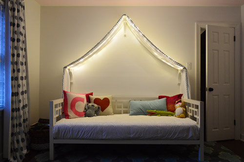
Things just got a little brighter in here…
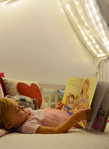
Ever since we hung her canopy, we’ve thought about adding lights to it. Both for the magic of it (Clara loves them) and also for the function of it being a well-lit place for bedtime stories. We feared traditional Christmas lights would be too heavy and make the fabric sag in weird ways (plus, they could look a little messy when they were off) so after some hunting online, we came across what are often dubbed “Fairy Lights.”
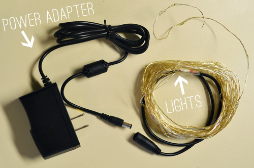
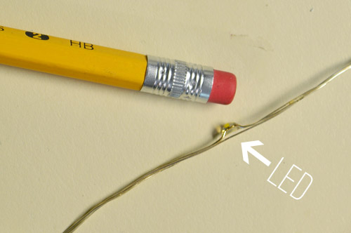
They’re basically small LEDs (check out this picture for scale – they’re tiny) that are strung on a thin wire. The particular set that we bought was 33 feet long and sold for $14 on Amazon. They’re not longer available but here’s an affiliate link for something similar.
The wire itself is extremely light and pretty moldable, so it was easy to weave it back and forth across the 18″ corbels that the fabric rests on. And by some luck of the draw, 33 feet was just about the perfect length to go back and forth four times on each side of the peak to the side brackets and secure them at each turn with white tape, so they’re not something Clara easily unwind and swing around like a lasso – but they will easily release under her weight, so she couldn’t strangle on them.
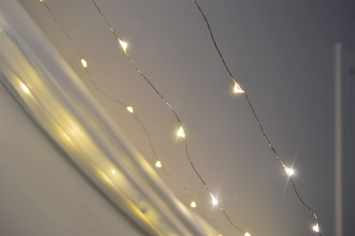
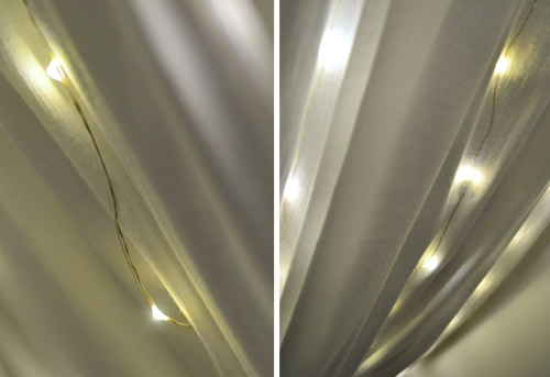
The next step was just draping the canopy back over them. The LEDs are so small that they tuck into the folds and are barely visible when they’re off. And when they’re on, well, you can see how they twinkle below. And since they’re LEDs, they’re completely cool to the touch – so we don’t have any fear of them being against fabric. I also love that they’re small resin-ish glowing dots instead of larger glass bulbs that could shatter.
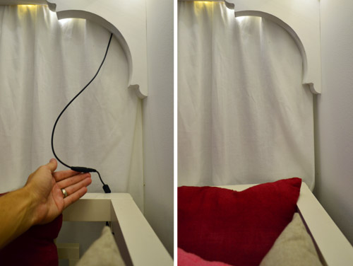
I wish the part that plugs in weren’t big and black, but we were able to plug it in behind the bed and wrap the cord around the bed in a way that it’s able to be hidden behind the canopy most of the time, but easily accessed when it’s time to connect the cords to the power adapter. See how you can see it on the left, but it’s tucked away and invisible on the right? Thank you John, hand model of the ages.
Clara LOVES them. Partly because they’re called “Fairy Lights” but mostly because she feels very special having her own set of secret lights above the bed. We intended just to put them on for story time at night or other special play times, but they actually put off a fair amount of light, so we’ve found ourselves putting them on just about any time we’re in the room and the sun isn’t fully out.
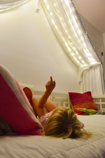
We’ve had them up there for a week or two (didn’t want to sing their praises too soon only to have them burn out or something weird) and so far they have been awesome for our gentle girl. She hasn’t touched them once, but loves gazing up at them. Meanwhile, my best friend’s four year old daughter is nothing short of an acrobat, so we laughed about how she’d probably scale the canopy and hang from the fabric like she was Pink in concert.

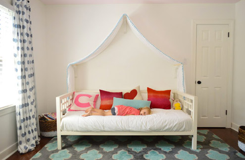
But even with the addition of the lights, the canopy is still definitely missing something above it. There’s still so much white on white on white that we’ve been brainstorming which way we want to go. We’ve debated painting just that peaked area under the canopy for a while and then adding something else in there (like a hanging paper lantern or mobile or even a cute little animal head or something). So here are a few ideas, thanks to our good friend Photoshop.
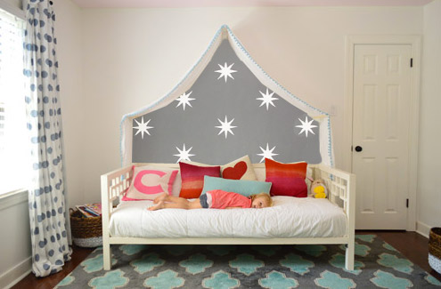
Idea #1: A gray tone on the walls to add drama and a little dreaminess to the canopy, inspired by this wallpaper by Osborne And Little.
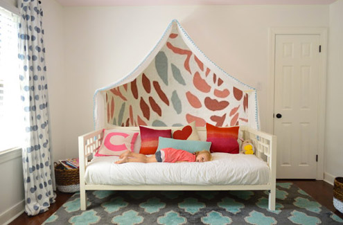
Idea #2: Maybe I could freehand some sort of imperfect painterly-ish mural, inspired by this awesome fabric covered lamp shade?
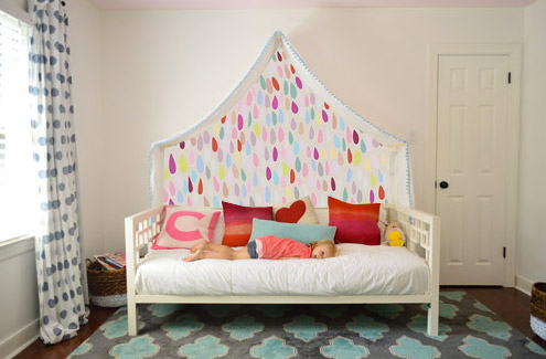
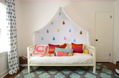
Idea #3: Another hand painted mural possibility could be something like this cluster of colorful raindrops in a variety of colors (inspired by this amazing but sadly sold out print).
Idea #4: Then I saw this picture of a pretty blue-green wall with little birds on it and thought that could be fun.
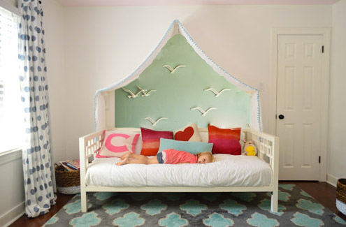
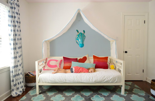
Idea #5: Since Clara’s quite the animal lover, we thought maybe a friendly giraffe or zebra (like this one from Dwell Studio) peering down at her while she sleeps could be fun with a blue-gray wall.
Idea #6: These little teardrops in a few different colors had my mind spinning with possibilities too.
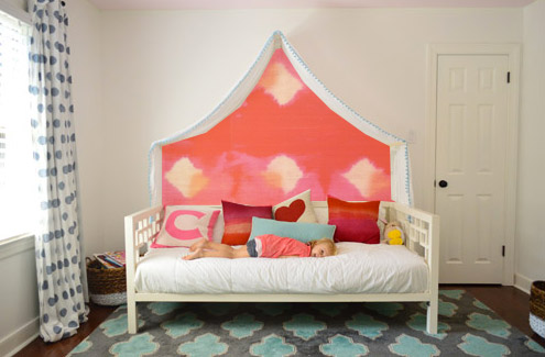
Idea #7: Then I thought about a colorful fabric hung along that back wall, perhaps something with the same large-scale boldness of this pink and red wall coverings that Jenny shared here.
Idea #8: And then there was the possibility of even darker charcoal paint on the walls and some asymmetrical handmade banners in a few colors like these (which were actually a super cool photo background for this party). Update: since this one looks chalkboard-ish there have been a lot of suggestions to do that so Clara can doodle away, but we worry that chalk dust over her bed might not be the best call (there are chalk markers but they’re not as charming, so we’ll have to see where we end up).
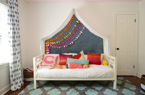
What do you guys think? Any favorites? Or combos? I think we’re leaning towards the gray background tone in Idea #1 or the dark charcoal color in Idea #8, but we’re not sure if we’ll stencil stars or something else – and we might just combine it with something 3D (like a little felt circle bunting or a hanging paper lantern or something). We’d love for Clara to weigh in on things too, and then I’m hoping to work on it this weekend (along with stenciling the bathroom floor and helping John finish that sunroom tile). What are you guys up to this weekend?
Update: Clara weighed in on these photoshopped pics as well as some more that we made based on people’s suggestions and then we made one last photoshopped picture for her, since she wanted to combine a few ideas (we even video-taped her reaction, which was pretty funny). Can’t wait to get it done and share what she liked best!

lana says
So creative! So many ideas!
We’ve installed lights similar to that in our daughter’s room, and she loves it!
How about an option #8 charcoal/gray with white birds as in option #4? I think that would be fun!
Lisa says
Love the idea of the stars!!! Might be cute to hang some sort of bright coloured paper lantern from the center too! One with a light in it :-)
Gwyn says
This is already so wonderful as it is! But I do love ideas #4, #7, and #8–in that order!
Ali says
What about using a magnetic paint? I love those cute daisies you used to have up in home (#1?) office. Could put up felt alpha letters, spell Good Night Clara, Sweet Dreams, Sleep Til 8:30 Cause It Is Saturday…you ge the idea!
Nupur says
I like Ideas #7 and #3.
In case you’re looking for other ideas, how about a tree mural painted on the wall behind the bed, so that the bed is a little tent in the woods?
Kerin says
I think I’m voting for the white stars on the gray background (1st option).
Louise says
Have you not thought of hanging some embroidery hoops in the middle of the canopy with diddle rent fabric in each one. X x
YoungHouseLove says
That could be fun too! Love all the ideas you guys! There must be over 250 different ones in the comments! Thanks for tossing them out for us – we’re reading each and every one!
xo
s
Molly says
I love your mock-ups! Have you thought about painting the bed the same color as the background on the wall? I think that would make it seem like more of a unit and also really pop off the neutral walls. I’m feeling #8 and #1, too! And the lights are so dreamy!
YoungHouseLove says
Never even thought about that!
xo
s
Rebecca says
I REALLY like number 4 with the blue and the birds, it goes very well. Number 7 and 8 are also very charming and fit in better than the other options.
Just a note on your note about chalkboard markers – they don’t work very well with chalkboard paint, they stain it and even after you’ve erased what was there it stays just a wee bit.
YoungHouseLove says
Thanks for the tip Rebecca!
xo
s
pam in illinois says
i love the fairy lights. A little girl’s dream.
I like # 1 the best.
Sorry, but I don’t care for 2 and 3 with the drapes.
Kara says
#1 and #8 were my favorites too, but I’ve got another idea for you. Use the blue from the rug to paint on the wall… maybe add some wispy clouds, and then fold some origami paper cranes out of fun bright patterned papers that tie into the reds/pinks/oranges etc. that you’ve got going in the pillows. Hung with some fishing line they could hang down from the canopy at a variety of heights/depths/locations.
Amy says
How about a colorful collection of wall stickers, stencils or photos showing special letters, numbers or phrases that Clara could point out as she is learning to read and write? My 3 year old gets so excited to see words he knows and call them out to us.
Ginger Bell says
I love the option with the birds. It sort of looks like a window to another world (did I just say that?), in a good way of course :)
Cecilia says
Love the lights and #1 the best. The giraffe head made me laugh out loud and it reminded me of the Simpsons episode where Homer builds Bart a clown bed: “Can’t sleep, clown’ll eat me”. LOL! :D
YoungHouseLove says
Hahah!
xo
s
Carrie M. says
My pick would be #1! It would pull the room together more with the color, and the stars would tie in with the fairy lights. Super cute! The others all seemed too busy to me with all those many colors fighting with the rug/curtains and I’d be scared anything hanging down like a lantern or an animal head would detract from the twinkly lights (which are awesome btw, totally thinking I need some for my room haha!)
Kate says
Has anyone else been having trouble getting the photos in YHL blog posts to load when viewing in Feedly and/or Google Chrome? Help! I can’t see the purdy pictures! :P
YoungHouseLove says
Oh no! Anyone else having an issue? Maybe it’s a virus blocking software that’s holding them on your computer for some reason? Like Avast or Norton or McAfee?
xo
s
Brittany says
I love number 3 and the last one! so adorable, I am sure anything y’all do will be cute though!
Christine says
GUYS, that is so awesome looking! Personally, I love idea #2, but I am really into grays right now, plus I love the stars playing of the twinkly lights in the canopy.
Christine says
I like the raindrop idea but inverted. Scattered raindrops on the background but none under the canopy as if it is sheltering her from the storm. Whatever you choose will be wonderful, I love the lights and the coziness of it all.
Rhonda says
I like #1 the best, but after seeing the other options with brighter colors,I’m wondering what it would look like with a brighter background color. I like the gray, but just curious about another color with the stars. Love the lights!
Erin says
Girl, you are too creative. How fun!
I love 2, 3, 4, 6 and 7 with their pops of color. Save the gray for when Clara grows up and becomes “trendy” and “chic.” :)
Erin says
My favorite two options for under the canopy are definitely the last two. The dark charcoal one might even be more fun if it was chalkboard paint so Clara could add in her own doodles. I suggest that but have strayed from painting any walls in my house with that chalkboard paint for fear of giving my kids too many ideas about writing on the walls.
Carol says
I like 6. I wonder if it would be hard to match the outline of a colored background exactly to the drape of the fabric, which may change over time. How do you switch the lights on and off- just by unplugging?
YoungHouseLove says
Yes, by connecting them and disconnecting them at that little span of black wire that hides behind the canopy.
xo
s
heather says
i love 1, 3 and 8. what if you got a bunting that said something like her name or “sweet dreams”? i have been wanting a crocheted bunting over my bed too- and i’m much older than clara! lol.
Averil says
Apologies if this has already been suggested, but what about a bunch of colourful hot air balloons of different sizes on a sky blue background?
If not, my vote is for the multi-coloured raindrops. That’s too cute!
YoungHouseLove says
Love that idea too! Oh my gosh, every comment is full of great ideas! Wish I could reply to you all, but I’m reading every one!
xo
s
Sarah says
I LOVE idea #1! What if you took the background color from #1, then did the big raindrops from #6?? Then you would have the nice gray backdrop, with some fun colors as well!
Mary says
Not sure if anyone has suggested this already but Anthro has an identical animal head to the one you linked by Dwell Studio. AND its a bit cheaper
http://www.anthropologie.com/anthro/product/search/970121.jsp?cm_vc=SEARCH_RESULTS
Different color (the Anthro one if black and white) but thought I’d share. Maybe it’ll jog some more ideas :)
YoungHouseLove says
Great tip Mary!
xo
s
Lauren says
I’m not sure if anyone commented on this yet, but I figured I needed to let you know: Chalk markers on chalk painted walls are permanent! It’d be a cute way to add permanent artwork up there though!
YoungHouseLove says
Thanks for the tip Lauren!
xo
s
kim says
“Pick #3, my lord, pick #3.” Its from shrek. And hey it works here!
Angela Cannon says
I love the dark colors the best but what about doing it out of felt and then you can add in whatever (stars, birds, seasonal things) that you want out of felt too. It would be easy to switch up since felt sticks to felt.
Love the lights!
Stefani says
#8 looks like kite tail streamers and I LOVE the colors brought in from the pillows!
Sarah says
LOVE the fairy lights, might have to look into those for my daughters room. So MAGICAL!
This idea might have already been said (to many comments to read through!)
What about using Clara’s artwork (giving her colours you would like used) made into fabric for the wall like you’ve done of previous photo backgrounds? I bet she would be so proud to see it there :-)
YoungHouseLove says
Love that too!
xo
s
Paige says
Love #8 – pretty sure that dustless chalk exists!
Jayme says
I LOVE #8!!!
Patty B. says
Clara is a very lucky young lady. I love #1, maybe you could incorporate fairies as well, like Tinkerbell using some glitter paint so she reflects the light. Whatever you and Clara decide, it will be perfect for her. Can’t wait to see the finished product.
Lucy says
I like 3 and 6 the best. I think a smaller-scale pattern will go better with the lights, and you could hang a brightly colored lantern from the peak. I have doubts about a dark-colored background – how hard will it be to get the edges to match up with the canopy? Will you be able to see the edge through the fabric? If the fabric sags a little, and the edges don’t match up, wouldn’t that drive you crazy?
YoungHouseLove says
So far the canopy hasn’t moved an inch (we also thought we could add velcro to keep it in place against the wall if it did) but we’ll have to see how it goes and where we end up!
xo
s
Lili M says
I like the stars and the birds (put a bird on it!)
Susan says
You can tell that you have been blogging for a while because you answered all the safety concerns in the post ahead of time. :)
Have you thought about using one of Clara’s backdrop fabrics or letting her design some fabric again?
YoungHouseLove says
That could be fun too! Love all the suggestions everyone! Thanks for sharing them!
xo
s
sara says
I like the last one the best; the gray is cozy and the pendants are bright with warm colours and the asymmetrical design is most fun!
AnaMaria says
I love idea number one. The stars would be such a beautiful addition to the fairy lights. I also love anything that has a fairytale look to it. :) The color gray that was in the background also looks great, it ties in with the carpet.
Idea number two is my second favorite, but I agree that chalk is not safe to have there. If the design was done with just a regular paint in a dark color plus the flags/banner. That would be cute. I can’t wait to see the final decision/look! :) :)
emma says
Love them all! My first thought was “clara” big in cursive in a bright pink. After seeing #8 it made me think of Clara’s 1st birthday fabric with her name painted over the charcoal color in the shape of the banners. Like strings of “claraclaraclaraclara”. Might be tricky to free hand the curvy clara on the wall but also a nice “hidden” meaning which you guys are so known for.
YoungHouseLove says
That’s such a fun idea too! You’re all geniuses.
xo
s
Megan says
I adore the last banner option! So bright and cheerful and just the mix of color to break up the white. I love this update, and would’ve loved it so much as a kid!!
Jessica G. says
My favorite is #3. You can never have too much color in a little girl’s room! I like the stars in #1 but not the gray… it just seems too dull.
Laurel G says
Have you guys considered getting a remote light switch so you wont have to plug/unplug to turn the lights on & off?
My husband & I have 2 of these in our home for rooms that do not have ceiling lights so we hooked the switches up to table lamps.
This is the model we use – http://www.amazon.com/Westek-RFK100LC-Mounted-Switch-Receiver/dp/B000HJBE68/ref=sr_1_2?s=hi&ie=UTF8&qid=1382108183&sr=1-2&keywords=remote+light+switch
YoungHouseLove says
LOVE that idea! And robot-loving John will adore it even more. Thanks Laurel!
xo
s
Terri fisher says
House is coming together. Love it Love the big girl room. First pick is 1 the gray with stars. wow. Second is 8. Have fun. Wonder if my husband would go for a canopy with lights. Totally jealous Terri
Patti says
I’m thinking color outside of the tent shape (not just inside the tent shape) could look nice…maybe not the entire wall, but somehow around it (like a square or a cloud?). Or maybe little birds painted on the wall outside the tent shape seemingly holding up the fabric where it comes to a point near the brackets (like the bluebirds that help make Cinderalla’s dress). As you can probably tell I only have boys! I’m sure whatever you come up with will be amazing. Have fun with it!
Teresa Turner says
Thanks for the inspiration!! Just ordered 2 sets for the top of my kitchen cabinets…will be lovely with my new crystal pendant light over the kitchen sink!! Love your blog!!
Meg Saunders says
Tooooo cute! #8 for sure! :)
Janine says
1 & 8 are my favorite
Catherine says
I really like it as-is, too. It looks very simple and elegant. Maybe hang something in the middle or add some decal stickers near the bed, but I think painting inside the canopy draws too much attention to that space. Right now, it’s like a very fun lamp, and since they’re LEDs, you could leave them on during the day when she’s in there, too.