Work continues on the deck (looks like we’ll have an update for you on Monday barring any unforeseen disasters inspection failures!) so to end this week with a dad-worthy bang, I thought I’d share something that a bunch of you have been requesting: a belated Father’s Day recap (like last year’s) – especially since the day included a few home related activities and presents.

The day started off much like any normal Father’s Day might. We went out to one of our favorite brunch spots (deLux) and enjoyed some french toast in their open-air back room (we also enjoyed an impromptu walk beforehand because we accidentally arrived 20 minutes before they opened – oops).

Our day kind of got derailed from there because we found out just the night before that a New York Times photographer was coming by at noon to shoot our kitchen (!!!). Cue the sweaty palms. We’d already been interviewed for the article (about people who use online floor-planning software to guide home renovations) a couple of weeks before, but it literally wasn’t until 10:30pm on Saturday that we heard they needed someone to come over about twelve hours later on Father’s Day to snap the photos. Check out the big cameras he brought…
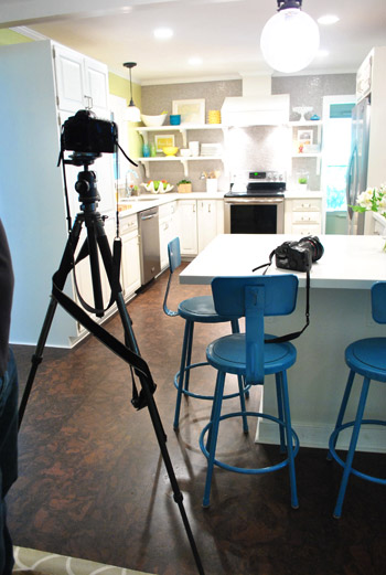
The article actually came out last Thursday while we were at Haven. We’ll admit we’re not head-over-heels for how it turned out since we feel like we sound a little anti-architect, which definitely isn’t the case (we even have a close friend who’s an architect!). During the interview they asked Sherry about kitchen designers (not architects) and how they might help, and Sherry said something like “a designer might tell you onyx is in or help you define what you like if you don’t know, which can be really helpful” but somehow a shortened version of that was used as our quote about architects (who do a heckova lot more than talk about onyx, as do kitchen designers!). You can read the article here if you’d like. I guess there’s always a risk that a story may shape up differently than it was originally pitched to you (we heard it was more about the software itself, kind of like this post that we wrote about the pros & cons of certain programs). But at least the photo of us came out ok. No closed eyes or spinach in the teeth. High five.
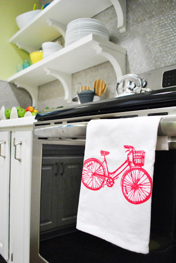
The photographer was pretty speedy (and extremely nice!), but between getting home quickly to clean up the house for his arrival (both our kitchen and ourselves) and then with him shooting photos until Clara’s nap, we didn’t really get a chance to squeeze in any more Father’s Day activities (since we were also working on blog projects to get ahead before our trip to the Haven Conference and practicing our little presentation). But Sherry, Clara, and Burger did treat me to some nice Father’s Day gifts – like this addition to our kitchen that sports my favorite thing (she got it from Joss & Main). Am I the only dad to get excited about a dishtowel? Perhaps. But put a bird bike on it and I’m sold.
Knowing that I have a thing for cool art, Sherry also found this fun “Twenty Northern Friends” print that not only is a subtle nod to our Alaskan honeymoon, but also includes lots of geek-y trivia about lesser-known animals.
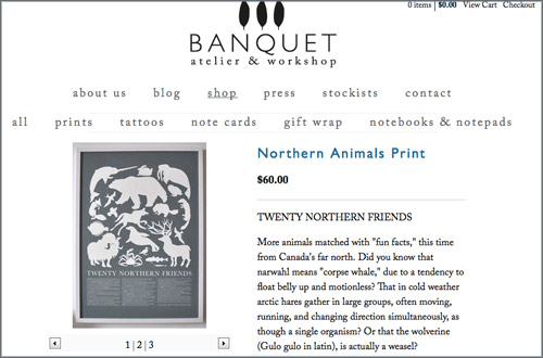
Like, did you know a Snowy Owl can eat close to 2,000 lemmings in a single year? I’d say that’s about 2,000 more lemmings than I’ve eaten in my entire lifetime.
We’re thinking the print will go here in our living room, but we’ve gotta get a frame for it first (fortunately Target sells a size that should fit, so we’ll keep you posted). We think it’ll play nicely off the dark gray beams in there.
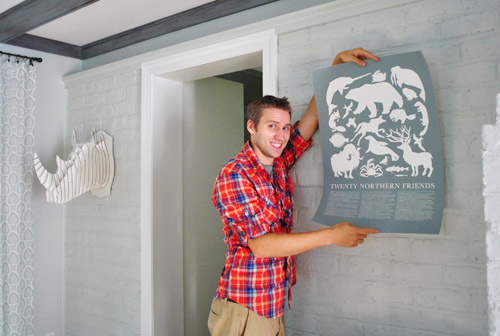
Speaking of keeping you posted, that picture reminded us that we’re guilty of sharing pictures of an unframed print and saying “we need to hang this and share the pics later” and then we hang it but never actually share the pics. So, let’s tie up some of those loose ends, shall we?
Come on into our frame hallway and make yourself comfortable…
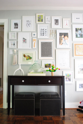
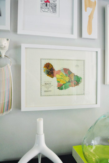
That’s where the map of Maui (which we bought on our Hawaiian vacation back in March) ended up.

We were lucky that it fit in a frame that we found at Target (the mat’s opening was pretty much exactly the size of the map – huzzah for standard sizes!). And we actually had this empty spot on our wall since its previous occupant (an old map of Richmond) now lives on our kitchen shelves. Yup, things like frames and pillows definitely get around in our house.
And speaking of our trip out west, the wooden letterpress print that we got in Portland…

…also ended up in the hallway, just on a different wall. You can see it here on the bottom right:
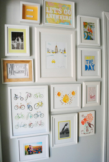
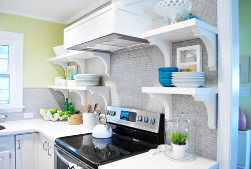
I wish I could remember what was there before, but so much got moved around while shooting the book in January that I think it’s been empty for a while. Oh wait, I know – it was the other frame that we moved into the kitchen after the shelves were built since it had some images of food in it (it was actually an old $12 poster from allposters.com that Sherry cut up a few years back for our first kitchen).
Who knew this Father’s Day recap would include miscellaneous art updates? Oh the twists and turns of blogging. As for Father’s Day, I’m thankful that I got to spend the day with my two favorite girls and my one favorite chihuahua (and a random, but very nice, photographer). How was your Father’s Day? Can you think that far back? I know I had trouble! Anyone have new art to hang? Or old project updates that they have yet to blog about? Why are those little updates so hard to remember to share?

Erin M says
Hmmm…I can see why you thought the NYT article, or at least that quote, was disappointing. But I think it was the writer rather than you being snarky, and hopefully he’ll take note of your opinion and change in the future. Your DIY art prints have inspired me to make some of my own to hang in the nursery…now to get them framed and hung.
heather says
I have *plenty* of old posts I need to blog on, but I’m having trouble keeping up with the current ones between working full time, soap making/selling and job searching haha so for now it’s current as is! There are plenty of “draft” retro posts though.
Also, I went to a social media breakfast this morning in Portland and it was *amazing*. For any other bloggers who don’t do it quite as good as you guys, I highly recommend them if they are in your area. I went for my company but I learned a ton for my blog and my own company!
heather says
P.S. Bummer on that article not turning out like you thought it might. I was a little bummed Andy’s quote got cut because of his professional background, but at the same time you never really do quite know how it will come out. Double edged sword sometimes I guess.
YoungHouseLove says
Yeah! I thought about you guys getting cut and wondered if it was a blessing in disguise!
xo,
s
YoungHouseLove says
Aw, that breakfast sounds like so much fun!
xo,
s
Devon @ Green House, Good Life says
I totally understand about twisting your words in the article. (The quote didn’t sound like you when I read it, so it makes sense that it wasn’t really what you said.) A few years ago I got a call from a journalist asking about seller’s disclosure laws regarding a murder in a house being sold (!), and my answer was that Texas doesn’t have a statute specifically addressing that situation but that you have to “read between the lines” of the more general seller’s disclosure law…, and somehow that appeared in the article as “read BEHIND the lines” — which I think means reading the other side of the page? : )
Heather W. says
Speaking of frames, what do you guys do if you have a print that isn’t standard-sized? We got this cool print as a gift and it’s 27 and 1/8″ by 18 and 3/4″. The quote we got for a custom frame job was insaaaanely expensive! Know of any cheaper-but-still-quality custom places online, or any other suggestions?
YoungHouseLove says
We usually go to a bunch of places like Target, yard, sales and Ikea knowing the measurement of what could work (not exactly, just with some art to put paper behind it to act like a mat, you know?). So we’ve been known to trim things down to fit or use a giant piece of watercolor paper or mat board from Michael’s if the frame is a smidge bigger- it just looks like a mat!
xo,
s
Jennifer says
Hi Heather,
an option is to just get a custom mat cut. They can cut the inner dimensions to fit your print, and make the outer dimensions “regular” to fit a standard frame.
Sometimes they have to make the mat size bigger in order to do this and keep it looking balanced (i.e. if your print was 4×5, then your outer dimensions of the mat (and frame size) would probably be at LEAST 8×10, not 5×7).
Then you can just use a standard store-bought frame!
YoungHouseLove says
Oh yes that’s a great idea! We do that sometimes too! Just go to a local frame shop (we got someone to do it for $5 once!) and ask!
xo,
s
rcwillman says
Press interviews ARE ALWAYS TRICKY! I think you came across totally reasonable. Maybe since the article has included corrections it’s not too late to ask for a blog link?
As someone who has worked (four house renovations we are certifiable) with both architects and kitchen designers at best, like any relationship, there needs to be mutual respect.
I love how your home reflects where you are as well as where you’ve been! visiting your site often makes my day!
YoungHouseLove says
Aw thanks!
xo,
s
Koliti says
Thanks for sharing such SWEET pics of John & Clara! (I applaude you for not sharing them right away – they’re your personal treasures to hold close to your hearts and enjoy some private-time with.)
Congrats on your NY Times article.
The author of the article OBVIOUSLY has his own slant/agenda that he tried to “cut-and-paste” everyone’s quotes to fit his needs. He probably didn’t even represent himself well to you on what his intentions were – otherwise you probably would have declined.
What I gathered from the entire article is…
these software programs are a TOOL and regardless of what your experience is you need to research your UNIQUE situation and know your limitations.
Lisa in Seattle says
Happy belated Father’s Day, John! Excellent haul. The only thing that has stopped me from getting that print (or the Bold & Noble stuff) is that the colors aren’t right for our place. My favorite t-shirt has a similar feeling.
I think some writers are always looking for that touch of controversy to spice up their articles, which is sad, because what you had to say could have stood on its own just fine. Let’s hope we don’t get a sudden influx of comments from aggrieved architects looking to “set you straight.”
Maggie Rose says
I wouldn’t feel too bad about the article – I find that the NYT tends to misconstrue quotes a lot and/or flavor a seemingly innocent quote with their lead-in. They relish in pitting people against each other, I think!
Christina M. says
I’m an architect and I don’t mind the push for kitchen specialists. There’s pros and cons for both, and sometimes kitchen specialists are more flexible with budgets. They usually have their finger on the pulse as far as latest and greatest products too. Heck – sometimes we use them in our profession as a consultant. If I wasn’t an architect I would probably hire one to do our kitchen for us!
Christina M. says
whoops. misread the entry. nix the kitchen consultant. if you know what you want, online software is just another tool / service available. again there are pros and cons for architect vs. software. if your renovations aren’t super extensive or you’re comfortable with DIY why not do that layout yourself?
eileen marie says
Btwn your gallery walls/open shelving, you never have an excuse not to get a print you love! I also love your anniv. pic wall. I hope to create a gallery wall (& maybe even open shelving) when we move (eventually). Right now, we have at least 2 pieces of art (a print) & an original 1975 Rolling Stone w/ Mick & Keith on the cover.
Kristan says
How cool that you guys honeymooned in Alaska! Being from AK (and still live here) it’s always fun to read about peoples adventures around here. You tend to take it for granted until you see it through someone else’s eyes :)
Tara says
Wow – I just read the article and it is terrible. I feel bad that they twisted your words like that. You’re right they have made you sound completely anti-architect. I’m sorry that it came out so biased – that is not good reporting. Thumbs down.
Jillian@TheHumbleGourmet says
I so enjoy your gallery wall. My husband and I just bought our first home (moving in Monday!) and we have an little entryway that I think would be perfect for a gallery wall.
Crystal @ 29 Rue House says
I realized last night I still have not posted about Father’s Day (which was very low key) on our family blog. Everytime I see anything bicycle I always think of John!
Teri says
The NY Times article really did get it twisted, but lucky for you, you have this great blog and you are able to set the record straight, and the bright side is that a totally adorable pic of the two of you is in the NY Times, not to mention a great pic of your kitchen. I don’t think the misquote sounded bad at all. Congrats on being in the Times. :)
YoungHouseLove says
Aw thanks Teri!
xo,
s
Julie M. says
This post came at the perfect time. I was just about to try doing some space planning for our kitchen/dining/great room and wanted to give it a shot myself before talking to a designer. Hoping I can come up with a layout that I like and can implement with our contractor. Thanks!
Annie Swift says
I’m wanting to blame my monitor for it – but can’t because in no other pictures do you guys look so orange…I think the person who edited that photo needs to take some tips from you guys :s – I can’t help but be rude and say that they have made you both look older…
…Naturally, you being the nicest people in the Northern Hemisphere you won’t be passing judgement on it…
Otherwise, I love this post – That poster is abolutely stunning x
Elena says
Snarktastic NYT paragraph! Jerks. Love the print and towel! I check Joss and Main every day (thanks to you) but have yet to purchase something. I’m looking forward to the day that changes …
Crystal @ 29 Rue House says
Elena – I’d been eyeing J&M and OKL daily since starting this blog too and I just made my first purchase this week! Very exciting stuff. I actually bought something from both sites this week (a rug and a mirror). It was so worth the wait for something perfect to come along!
YoungHouseLove says
Wahoo! So excited for you. Send pics!
xo,
s
Crystal @ 29 Rue House says
Haha – the rug might look a little familiar to you! ;) I wasn’t intentionally trying to steal your living room rug, it just was the first one that came along that I loved and the time/price was right. I’ll send pics – can’t wait to get it!
Speaking of your rug – have you ever noticed in the design of the living room rug that there are block style hearts – just like your blog background!
YoungHouseLove says
Yay- can’t wait to see the pics! And that’s so funny about the hearts! I always see the big Moroccan star in the middle!
xo,
s
Crystal @ 29 Rue House says
Okay so I got the rug and love it but it’s kind of scratchy to me. (80% wool 20% cotton) Am I just being a little picky or do you think so too (I know you guys like natural rugs)? We spend a lot of time on the floor with the kids (plus one is still crawling) and it is the only thing I’m unsure of. Does it get softer?
YoungHouseLove says
I think generally we love 100% cotton and 100% wool rugs (I don’t know that we have ever had something that’s a mix, although I could be forgetting something). Usually with wool I look for tufted to be the softest (although we do have a dhurrie in the living room, I know that the lower profile means less plushness, so I was prepared). As for cotton, usually they’re thinner but still soft- sort of like a dish towel. Adding a thick rug pad always helps. Dash and Albert makes a ton of high end 100% cotton rugs and they’re awesome and soft. I wouldn’t say all rugs get softer over time (maybe jute ones do a bit), so if it’s scratchy and you really don’t like how it feels maybe try returning it (or selling it on craigslist if you can’t return it or find a spot for it that works – maybe in a guest room or a space that gets less crawling kiddos?). Generally we like to live with things a little while, since sometimes you think something might feel rough and then you sit on it for an hour playing with the kiddo and it’s fine! Sometimes as long as no one is naked rolling all over it, it’s not too bad (Clara plays on our braided jute rug for hours – but she usually isn’t on it bare – just wearing clothes and sitting on her bottom or dancing around on it). Haha. Hope it helps!
xo,
s
Crystal @ 29 Rue House says
Thanks Sherry! I’m not giving up hope yet – I love it too much. I also thought a thicker rug pad would help soften it so I’m off to kind on this weekend (the one from Target is pretty thin).
YoungHouseLove says
Good luck! That definitely can help!
xo,
s
rachael says
Am I the only one who thinks its weird that they call you in the article Ms. Petersik, when you refer to yourself as $herdog on the blog??
YoungHouseLove says
Haha, maybe I should insist that I’m referred to as $herdog from here on out?
xo,
s
Laura says
NYT does that with every female they interview. A lot of women (myself included) prefer Ms. to Mrs. as a way to not identify if they are married or not. “Mr.” doesn’t identify if a male is married, so it’s nice to have a similar option for women. Hooray, equality!
On the note of the NYT article, I found the snide comment the author made at the end about onyx to be such an odd jab. YHL has such a wonderful fan base that respects you, don’t sweat this one article!
YoungHouseLove says
Aw thanks Laura!
xo,
s
molly says
Sherry! Sherdog. Has anyone ever told you that you look like the lovely amazing Emilia Clarke aka Dani from GOT?
Also, you guys inspired me to revamp my rocking chair…
http://mollyswoons.blogspot.com/2012/06/rocking-chair-revamping.html
You guys are rad! Mad love for YH<3.
YoungHouseLove says
Yes, I get that a lot. We just started watching Game Of Thrones and I even see it! As for that rocking chair- love it! And the use of rad. Haha. High fives!
xo,
s
dana says
holy crap, i had to google her with brown hair to see if i noticed it and i’m like “that’s weird, sherry’s picture is actually mixed into her google images.” i’m still not convinced this picture isn’t sherry..
http://1.bp.blogspot.com/-4Bikce4Wvwk/T8owYJV2LiI/AAAAAAAAG_A/d6ihuLuXOXs/s1600/439152-emilia_clarke_02_super.jpg
Kara J says
How funny! I just posted about father’s day today too! This year was my husband’s first.
YoungHouseLove says
Aw congrats!
xo,
s
Robyn in Chicago says
Not sure if you remember, but a few posts back I asked how you liked the IBert seat for Clara on John’s bike – well, after you gave me the green light, I went and bought my husband a bike, the IBert, and 2 helmets for Father’s Day. He was working at night, so after our 1 year old daughter went to sleep, I rolled the bike in her room (which my friend dropped off after work – he’s the manager at an REI). In the morning I gave him a card and meat thermometer for Father’s Day and then told him Everly had something in her room for him. He was SO EXCITED to see the bike complete w/ baby seat and helmets. :)
YoungHouseLove says
THAT’S SO CUTE! So glad he loved it! We are getting a lot of use out of ours!
xo,
s
Autumn says
First off, Happy Father’s Day (late) to you John. Seriously one of my favorite things in the world to see is a Daddy that really gets involved with his little ones. Good job. :) Our Father’s Day was spent having our 3rd baby dedicated at church, then having both of our families over for lunch. It was a great day. :)
Also, I love your gallery wall! I have been contemplating for quite some time where I can do this in my own home!
Naomi says
I love all of your photos! The frame wall is amazing :)
-Naomi {Starry Eyes + Coffee Cups}
Holly P. says
As to the NY Times mistake – that’s something you should call them on directly. I’ve worked as a journalist for the past few years, and though I’m moving into the tech writing field, I know that you should have had your voice used in a 100% accurate quote and reference. I would call or email the managing editor of that section and tell them that the quote they used was a quote in direct answer to a question about kitchen designers, not architects, and that if they’d like information about architects, you’d be willing to answer more questions so that they can update the article appropriately. It’s not OK to misrepresent what someone said, no matter how trivial others may think it is. Especially if you’re the NY Times!!
YoungHouseLove says
Aw thanks Holly, you’re so sweet!
xo,
s
Sarah R. says
The article is hilarious! It does not sound like your voice at all (that last line about onyx made me laugh). Seriously, you guys should feel proud of your ability to write posts that come across as sincere and well thought out. This is why YHL is daily reading for me!
YoungHouseLove says
Aw thanks Sarah!
xo,
s
Alison says
I have to agree that although that broken up quote does make you guys sound a little snarky about architects, the remaining quotes rebound nicely. Don’t worry, you’re good!
Caroline says
I’m in love with the print with lots of bicycles in your gallery hallway! Where’s that from
Emma says
Yalls have some great walls now. I love the stuff you guys find. Have a great weekend!
melissa*320 sycamore says
I can’t believe they called that morning and wanted a photo shoot that afternoon!! The article sounds so formal after hearing you at Haven :) Love the prints, especially the 20 Northern Friends…I think it would be perfect in my boys’ room! You stay cool working on the deck in this HEAT!
Mirela says
Hi John and Sherry!
Remember me?No?Never mind:). I just find it funny (but in a good way) that i really can’t see any difference between Sherry’s writing and yours. I mean, you have different styles, but you’re still on the same page, you know what I mean? I guess I just wanted to say that I think it’s awesome that you are both equally involved in creating this blog and that I really enjoy reading both sides of the story!!!Yes, I’m a fan!
Best,
M
YoungHouseLove says
Aw thanks Mirela! We hear from readers who make a game of it and don’t look who’s writing and then try to guess. Apparently sometimes it’s really easy and sometimes we make it tricky! Haha.
xo,
s
Cindy says
I am so inspired by your picture wall. On the last picture of your picture wall, can you tell me what print that is in the centre, it looks like buildings with a car in the centre, right below the Lets go anywhere print and also where did you get the Lets go anywhere print? I love them both.
Thanks
YoungHouseLove says
It’s an Etsy print of NYC with a little taxi cab in front (since that’s where John and I lived when we met).
xo,
s
Cindy says
Any chance you can send me a link to the Etsy store? Also the Lets Go Anywhere Print? Thanks
YoungHouseLove says
This post has all the links for the prints for ya. Hope it helps!
https://www.younghouselove.com/2011/03/the-big-two-nine/
xo,
s
Katie says
Just found your blog ( I am also located in Richmond (well Midlothian) Virginia and love all the renovations, it leaves me feeling like i need to get cracking and work on my house. love love love the chairs in your kitchen and what a great idea to use the science stools. Keep up the great work!
Ruth says
I love the where you fit in your new art!
Sherry, I saw this today and thought of you instantly:
http://www.etsy.com/listing/82829744/honey-bee-notes-printable-pdf
I have the eggy stationary set from that shop and I was just going back to find a link for a friend when I saw that and knew you would like it. Not that I actually write any notes, but I love it anyway, haha. I mostly print cards & envelopes (on some leftover cardstock we never used for wedding invites) and given them away to other people (who probably also never write notes).
YoungHouseLove says
So sweet!
xo
s
Anna says
OMG you guys! My husband and I were on our honeymoon in Richmond on Father’s day (because Virginia is for lovers!), and I kept running into places you had described on your blog. It was a bit surreal.
But the most surreal thing is that while you were at deLux, we were having brunch literally a block away at Fresca (and we were staying a block away from deLux as well).
By the way, we loved Richmond! And your blog is mostly responsible for us choosing to go there in the first place, so thank you!
YoungHouseLove says
So glad you had a great visit in our city! Too bad we didn’t bump into you guys!
-John
Kim @ Yellow Brick Home says
I love, love, love that Northern Animals print! I pinned it a long time ago (can’t remember what site I landed on that was selling it) as an idea for Scott – I thought he’d get a kick out of it! Glad to know you got it as a gift for John, too :)
YoungHouseLove says
So funny! What a small world!
xo,
s
Jan Thompson says
So random question; what kind of bulbs do you use in your recessed lights in your kitchen. I have some in but they don’t seem to put off the same amount of light that you guys get. Thanks for your help! :)
YoungHouseLove says
Those are Halogena bulbs from Home Depot. We tried a bunch and liked them best since they’re energy efficient but still put off lots of light!
xo,
s
Brittany Allen says
I like the photo shoot photo they used.
The article really took your words out of context. I don’t think it is written well in the first place, so I guess it’s just par for the course on that one!
Riva says
I looked at the article, and I actually read the last line about onyx as the author trying to be funny, because people really will spend that much extra on a renovation to find out something as simple as how stylish onyx is. You are part of a revolution changing that. I perceive the author’s intent as trying to show examples of how people use new architectural computer tools to save money and DIY in revolutionary new ways, and the part about onyx as a specific example rather than making it sound like you being negative to others.
It seems to me like the author must have really liked talking to you, or at least found what you had to say more interesting and quote-worthy than the other people in the article. You were referenced/quoted more often in that article than anyone else. Or maybe he just knew that you guys are really famous and wanted to see what kind of boost the NYT website would see when all your followers click over to read the story.
YoungHouseLove says
Aw thanks Riva! It’s so interesting to hear everyone’s takes on it. You’re all so sweet!
xo,
s
Ami says
I just saw this on 9gag and it made me think of John and his bike love. :) http://9gag.com/gag/4631294
YoungHouseLove says
So sweet!!
xo
s
Jessalyn says
Just wanted to let you know I caught the Portlandia reference…the skill with which you are executing your puns and pop culture references almost rivals Gilmore Girls! Keep it up!
YoungHouseLove says
Thanks!
-John
Amy says
I felt the way that article was written was rather disingenuous. :( The readers know better, people who know how to read between the lines will, but someone who is perhaps not a writer or close reader might think it implies more than it does by chopping up the quotes that way. But don’t worry too much… I thought Sherry’s quote at the bottom was great.
My dad was county counsel so anytime something political was happening with country property when I was growing up, our lil’ ol’ newspaper would call him and try to pin him down on an issue. One day, when I was like eight, I answered the phone and had to tell the reporter that my dad wasn’t home. He asked when he would be home and then asked me if I had any comments about the story. I remember saying in a very loud voice: “Mister I am EIGHT YEARS OLD!!! Do you really want my opinion???” LOL.
YoungHouseLove says
Hahahahaha, that’s hilarious!
xo,
s
Valentina says
Your kitchen looks fabulous: clean and airy, unique and sophisticated. What I have never noticed before, though, is your kitchen floor. It seems to fall out of the common color scheme. The rest of the kitchen features a light and cool-toned palette, while the dark and warm-hued floor seems to be in conflict with everything else. Do you feel the same way and plan any changes with the floor, or is this intentional and you like it this way? Btw, I don’t want to sound critical or anything, just wondering about your view. Please treat it as a constructive inquiry. I love what you’ve done in your house.
YoungHouseLove says
It warms things up. We love a dark mocha floor. We had them throughout our first house too. It felt really stark when the old floor was nearly white with all the white in the cabinets and the counters- but it’s definitely a personal preference thing! Lots of people might prefer light tile, we just fell hard for dark cork. And we have some nice wood cutting boards on the counter that tie into it nicely in person. Hope it helps!
xo,
s
Colleen says
I read the NYT article, and as an interior designer who does a lot of kitchens, felt that it was mostly balanced in explaining that these software programs offer some value to home owners while showing the limitations that are possible, i.e. not understanding potential issues with structural limitations and material performance. Obviously qualified, educated professional designers have knowledge beyond selecting finishes for their appearance, helping clients understand how they will perform in a space (such as families with high usage kitchens might not like how marble ages and prefer a low maintenance man made quartz countertop). I could tell you understood that from the article.
I guess the part that bothered me was the quote that your $7,000 kitchen remodel would have cost $30,000- $40,000 if you had worked with a designer. Having closely studied your remodel, I don’t see how you would have spent that much working with a professional. I agree that you saved significantly on both materials and labor throughout your project and did a great job. But I’ve remodeled similarly sized kitchens from head to toe with all new cabinetry, flooring, lighting, tile, appliances, etc. using licenses contractors and the entire project was $40,000 including my design fees. I realize designers charge at different rates, materials come in all price points, and it’s certainly possible to pay $40,000 to $70,000 for what can look like the same kitchen. It just felt like the average reader might interpret that quote as you would be paying those extra thousands of dollars to a designer just so they could tell you which material to use, and then they would have giant mark ups on everything. I know that wasn’t your intent, but it’s still frustrating to have things like that out there for people to misinterpret about these professions.
Great work on all your projects, keep it up! Press is always a benefit and challenge :)
YoungHouseLove says
Sorry if that quote wasn’t clear! We feel like there are a ton of things we would clarify if we could. Haha. He just asked what our kitchen could have cost with a pro (including materials and labor, not just fees to architects or designers) and we said “this is a total guess but our estimate might be 30-40.” That was just based on what a few friends in the industry told us it could have cost (including a dear friend who is actually a kitchen designer here in Richmond). We actually paid nearly 20K for our first very tiny kitchen through a kitchen designer, so it made sense to us that a room double the size with double the cabinets/counters, penny tile to the ceiling, all new appliances, custom shelves, 350 square feet of cork floors, and a lot more lighting (and a new giant doorway added where a wall had been) could cost that much if we went “all pro” and included all the labor. I didn’t really even think they’d use that quote since I hedged it with “this is a total guess” but we learned that you never know what they’ll put in (without those words ahead of it – haha).
xo,
s
Traci says
Since you talked about your ever-moving art, I was wondering how you hang your pictures on your walls? Since they get moved do you use nails?
Thanks! :)
YoungHouseLove says
We do usually use small picture nails for light frames (and 3M Velcro to hang things on the wall of tile in the kitchen). Hope that helps!
xo,
s
Christine Witt (Brush Dance) says
Love the photo of the two of you, but it’s a bummer that they took what you said and split it into two edited sound bites.
Monique says
Unfortunately I think part of being interviewed by newspapers or tv stations is that they can totally omit words, which in turn makes sentences sound completely different than you meant them to.
Jess @ life, happily ever after says
Happy Father’s Day John!
Also this is COMPLETELY random, but I was on Pinterest this evening and I saw this tile painting tutorial. I totally thought of your guest bathroom (in the guest room) with the Yellow tile. I don’t know what your plans are, but I didn’t know if you maybe thought about painting the tile.
Anyhoo, thought I would share. http://www.property24.com/articles/how-to-paint-bathroom-tiles/14951
YoungHouseLove says
So cool- thanks for the link!
xo,
s
Jules says
First: Happy belated Father’s Day! Second: Congrats on the NY Times mention!
It’s too bad the reporter chose to take your words out of context, but I suppose it gave him the architect antagonist he needed to make the issue debatable. He even says you did a major renovation, which I don’t think you did? I consider major renovations to include moving walls, replumbing/rewiring, and sobbing gently into cupped hands for 3-6 months. Oh well. You can still say you were mentioned in the NY Times, which is awesomesauce. :)
YoungHouseLove says
Hahaha, I like your positive spin Jules.
xo,
s
Rachel says
What do you guys do if you get a print that doesn’t fit in any standard size frame you can find? Do you shell out the big bucks to get it custom framed? I seem to be cursed with a bunch of art that doesn’t even come CLOSE to fitting any frame at IKEA or similar low-cost shops! BAH!
YoungHouseLove says
There’s a great thread on this in the comment section of this post so feel free to just scroll back. Hope it helps!
xo,
s