Remember yesterday when our shelves looked like this?
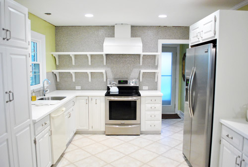
Well, then I had fun doing this (if you’re at work, you can watch this without sound and totally get the gist):
If you check out the video you can see that I can actually reach everything up on those top shelves except for the stuff in the corner by the window, but it’s easy enough to sit on the counter to grab it.
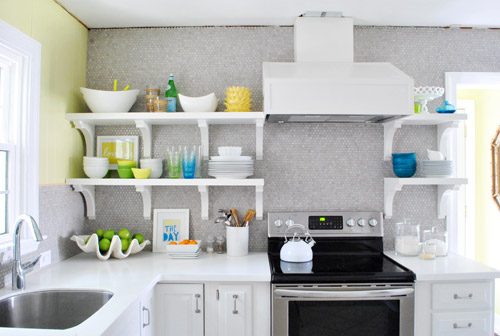
Who knew I’d be able to reach all that stuff? I totally expected to have to scream “Joooooohn” whenever I needed something up there (he’s the chef of the family so that probably wouldn’t have happened very often anyway). Or use a step stool if he’s missing/outside/hiding and I’m really desperate. Haha.
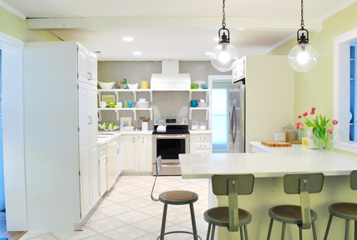
So now our shelves are chock full o’ stuff, and are most definitely still a work in progress, but mighty cheerful and functional all the same…
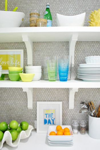
It’s not necessarily where things will stay – just a first pass for sure. I actually have since re-stacked some of the bowls – and plates & dishes have gotten used so things are constantly changing. It really is a completely rotating display. The funny thing is that it’s kind of crazy to “perfectly style” kitchen shelves anyway since it’s all supposed to be used and is always being picked up or washed or put back so I have already declared that I WILL NOT BE CRAZY. And John is holding me to it. Hah. So since nothing is glued down or expected to remain exactly where I placed it OR ELSE, consider this to be just one “take” of many when it comes to our open shelves. I’m sure ceramic animals will worm their way in there somewhere. And I’m sure as we add crown molding and patch the ceiling (at which point everything has to come back down from the shelves) things might get switched up. But that’s half the fun when you’re me.
As you can see from the video, I didn’t give anything too much thought. Sometimes over-thinking can be the bane of your existence when you’re loading up shelves or a bookcase. So it was all sort of first-thought. So for anyone wondering about my method… I actually consciously tried not to think too much and just moved stuff around and stepped back and tried to focus on what I wanted to be easiest to grab and grouping things that made sense (like all the items for setting the dinner table and dessert stuff). I’m sure it’ll evolve and change – and most likely get better and more functional – over time. Here’s hoping, anyway! And you know I’ll take pictures. Lots and lots of pictures.
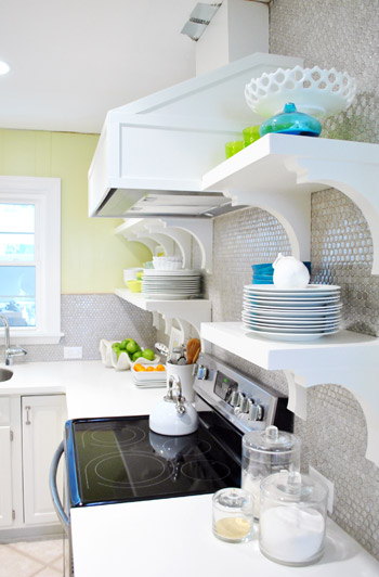
Oh and you can see from the shot above how shallow the brackets are and how deep our 12″ shelves are, so there’s plenty of room for stuff and the brackets don’t interfere with storage or anything. Whew.
But back to filling up those shelves. I tried hard not to think too hard (say that three times fast) but I did think about one thing the whole time I was at it: function. For example, I put our dessert bowls and dessert plates on the bottom right shelf and all of our large dinner dishes and cups and cereal bowls on the bottom left shelf. So those are closest at hand (and just a step or two away from the dishwasher with no cabinet doors to open, so that should be pretty convenient). Then the top shelves got things that we may use less often, but that still might sit out on counters in a kitchen anyway (ex: a cute cake stand, some bigger serving bowls, a vase, a bottle of my mom’s favorite bubbly drink, etc). We figure that even when those items sit in cabinets for a while they can get dusty, so it should be the same difference (a quick rinse and they’re ready to go). We’ll keep you posted on how it all works for sure.
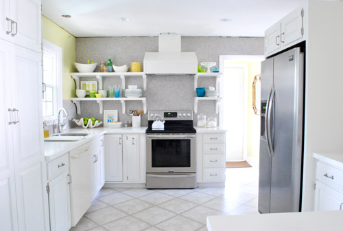
Here’s how the room now looks from the office doorway. Such a difference. Although the not-stainless dishwasher still kills us, but soon enough we should have the new one installed. Oh and I meant to take a shot of the window straight on to show the balance of the shelves that are spaced 14″ from the right of it and the cabinet that’s spaced 14″ to the left of it… but I had a brain fart. Epic picture-taking fail. So that shot’s to come.
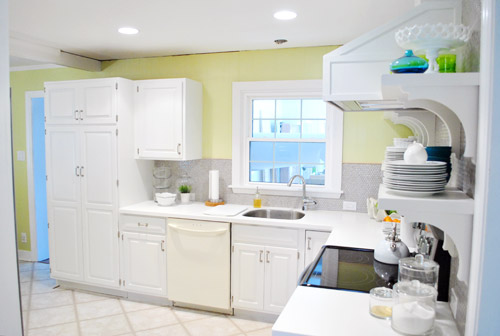
Memory lane time? Sure. The room used to look like this from the office doorway. Kinda crazy, right? I’m totally standing in the exact same spot – not any closer (see the counter cutting off at the bottom of each picture at nearly the same spot?). Isn’t it crazy how much closer the window feels in the picture below?
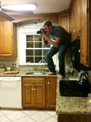
But let’s get back to the present. Do you hear a harp softly playing in the background or is it just me? Picture me twirling around with my arms out while orchestral music swells and birds come and fly around me holding ribbons in their beaks. Only less graceful and more awkward. And maybe the birds are just Burger and Clara holding toilet paper and spinning around beside me while I grin up at the can lights.
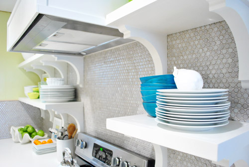
Oh and someone pointed out that we have lots of subtle curves going on with our brackets and our round penny tile and our round pendants. I love happy accidents like that! With more angular things like the range hood and the peninsula, it’s nice to have some softer shapes to complement them. High five for happy accidents.
Now that we have our pretty glass cups out in front of the boring clear ones we actually use them more. And I get to stare at them. Wait, that sounds creepy. I get to gaze at them. Better?
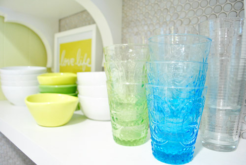
We think the random pops of blue, green, and yellow along with those two frames I stuck up there are fun. It’s definitely not a “magazine after” or anything – more like a gathering of all the stuff we actually use with some pretty decorative things tossed in there for fun. If a magazine blew in I think they’d probably add “more pretty” (flowers, lacquered boxes, candlesticks, etc) in exchange for “less function” (translation: I would love it and John would roll his eyes and say “um, where are all our plates and bowls and cups?”).
Oh and a bunch of folks asked if we considered a third row of shelves up top, but we figured once we loaded up those second shelves the stuff on them would balance with the top of the doorway, so anything above that might have been too heavy/cluttered for us. Plus that stuff would be really hard to reach/use.

And as for where we put the brackets, we wanted them all to be equally spaced on both sides (we looked at three on the left side but they didn’t feel as balanced with the ones on the right as four of them did). And that preferred layout thankfully worked with our studs (nearly all of our screws aligned perfectly and they feel really strong!), so after looking at a few different hanging options/bracket placements (and taping things off to help picture them) we just pulled the trigger and went with our favorite – which we thankfully love just as much in real life!
In short: we are so very happy with our wall o’ tile complete with glorious bracketed shelves full of sunshine and rainbows. Literally, the art actually says “Love Life” (it was the cover of a book that John got me, which I framed) and “Squeeze The Day” (a favorite flier from an old Boden catalog that came in the mail). We know open shelves (or these brackets/wall color/tile/pendants/stools/accessories) might not be everyone’s cup of tea, but we dig it. And the whole photography crew for the book is being very cute about stroking and gazing right along with us (full disclosure: this is one of those things that looks better in person, and even the video completely fails to capture it) so you’ll all just have to come over when we’re done with all of the crazy book chaos. Haha. You can even pour yourself a drink since you know where we keep the cups…

In other news: oh happy day – the tulips are still alive! I keep meaning to drop a penny in the water while Clara’s around so we can watch them perk up. Thanks for all the flower tips guys!
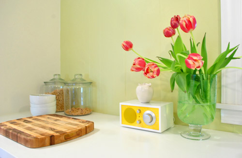
Here’s another shot sans crown molding and a patched ceiling. Oh and there will soon be a pendant hanging down over the sink too. We’re trying to tackle that, just so we don’t have to stare at torn up ceilings for much longer. So yes, it’s definitely a work in progress, but we’re jazz-hands-crazy about how our little “refurbished” kitchen is shaping up. And we’re definitely even more impatient than you guys about the cork floors! Can’t wait to get there and call this turkey done. Hah.
And just because I’m nuts, here’s what I did while playing around in photoshop.
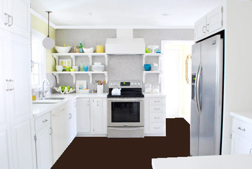
Flat brown paint dumped on the “floor” via photoshop hardly captures all the amazing texture that our marbled cork floors will bring, and the white paint dumped to replicate crown molding hardly looks real (nor does my crazy little made-up pendant over the sink, which will probably be a lot lighter looking and made of clear glass) but it was fun. And if you squint and hum the Dexter theme song, you can almoooooost see it (sidenote: John changed his ringtone from Dexter to the Parks & Recreation song, which saddened me for a nanosecond and then I realized how hilarious the Parks & Rec song is – we even set it to be our alarm tone too, just because it makes waking up extra early for book stuff almost pleasurable tolerable).
So spill it. Who is completely surprised that 5’2″ me can reach nearly everything on those upper shelves? That was a total unexpected bonus. Oh and for those wondering why there isn’t a crew of lovely book photoshoot people wandering in and out of the time lapse video, they have to set up lights for certain shots that take a while so they were shooting in the back bedrooms (and I gave them one of those “I’ll be back in thirty minutes, so hold tight and scream if you need me” things). Thankfully only John wandered in for a sec, so there were no photoshoot emergencies in the middle of my shelf-y fun (I even ducked out to answer some comment questions and take a call about our upcoming Portland gig). So as Martha would say, that’s a good thing. In summary: yay shelves. What have you guys been hanging/filling up with plates and bowls/filming in time lapse lately?
Psst- And now for a post about donuts.
UPDATE: We couldn’t love our open cabinets more. Check out a bracket tweak that we made here and an update post about how they function here here.

Drew @ Epicfinances.com says
I also think you need crown molding.
YoungHouseLove says
Oh yes, that’s next on the list! It’s why we added it in our photoshop rendering on the bottom of this post- can’t wait!
xo,
s
Elizabeth says
AMAZING! I just wanted to let everyone know if you watch it on YouTube on full screen it literally feels like you’re in their kitchen and you can really see how beautiful it is. The tiles are so pretty and shiny! LOVE THIS! :)
YoungHouseLove says
Haha- I love it! Now I want to go watch it on full screen. Is that weird when I can just get up and walk into the kitchen and see them in real life?
xo,
s
Michelle W. says
Just watched it on full screen, you’re right… it’s like you’re literally there! One of my favorite videos yet! Can’t wait to see what you come up with next!!!
YoungHouseLove says
Aw thanks Michelle!
xo,
s
jennie says
omg, they are absolute, complete and total perfection! love them!
YoungHouseLove says
Aw thanks Jennie!
xo,
s
Michelle W. says
Love love love the shelves!!! I also love love love the music selection! How do you come up with the songs for your videos?
YoungHouseLove says
That’s all John! He searches for artists who don’t mind folks using their music in exchange for a credit on sites like creativecommons.org. He’s my favorite video DJ ever! Haha.
xo,
s
Katalina says
love it! I wish it was my kitchen..also wish I had your creative vision, spunk, nerve and know-how to transform my own builder oak cabinets!
and just because everyone has their 2 cents ….here is mine!
I am thinking dark teal bar stools (like inside of your bookcase)–can even dip the legs in another color or even orb the bottom couple of inches.
you would have saved 500 posts if you had a photo with links to where you bought everything on those beautiful professionally styled shelves!
Alysha says
Wow…I’m with you on the brackets. It would be way too cold without them. =) Good Call. I just can’t imagine my cupboards that naked. lol I have too much junk to hide. ;)
Trisha says
Love how zippy your video was! The shelves are looking great. When I put up some new display (mantel, side table, etc.) I end up changing it 675,475 times before I love it, looking forward to the never ending progression.
Karen says
I love your open shelves and think they bring a lot of personality to your kitchen. Jarvis would look great in the top left corner!
I was wondering if you thought of displaying cookbooks or bulk foods in glass jars on the shelves. I ask this because I keep these items on my pantry shelves and it’s worked out well-they’re convienient and I think the various dried beans, rice and pastas look kinda neat.
YoungHouseLove says
Love those ideas! Always possibilities as things evolve!
xo,
s
Karen says
p.s. I totally love the clamshell!
Kelley says
I am dying to know what the name of the song is in the video! I listened to the previews on iTunes and none of the songs they have available sound like this one! It’s killing me! Help??
:) thanks!
Kelley.
YoungHouseLove says
It’s called Brand New Love – John linked to it in the comments somewhere- hope it helps!
xo,
s
Ashley says
I had a tough time finding the song on iTunes also, but I finally found it after searching for “Neon NiteClub” and NOT Neon “NightClub”. Make sure you use the correct spelling of NITE in your iTunes search. (: “Brand New Love” by Neon NiteClub
YoungHouseLove says
Thanks for the tip Ashley! John will update that video so it’s right at the end soon!
xo,
s
Antoinette says
Hi Sherry & John,
I think the transformation is amazing!!! Great job to you both. I noticed a lot of comments about people either liking/disliking the shelving. Like you said, it’s all a preference. And if you ended up deciding down the road that you didn’t like them as much as you thought, you could restore the tiling if necessary. It would be a hassle, but it could be done. Me personally, I like the shelving and the way they display all of your colorful items. But I love the seamless ocean of penny tiles, too. Did you ever consider cabinets on only the left side of the stove, leaving the right side airy and open to the room? Just an idea . . . .
YoungHouseLove says
Oh yes, one that wall of tile went up we loved it so much and we were nervous about adding shelves and then we added them and now we look at pics without them it’s just crazy-bare looking to us! The shelves add sooooo much function and color and architecture to the room! We definitely can dig out the tiles that we drilled through to replace them but we honestly couldn’t be happier with our shelves! So they’ll probably be here for the next few decades or so! Haha.
xo,
s
Stacey says
I’m 5’4″ and we have three shelves in our kitchen. I’ve delegated rarely used items to the top shelf but it drives me nuts that I have to have a step ladder in my kitchen – it’s hardly a cute accessory! Your time lapse video made me stupid-grin at my screen! I can’t believe how light and airy your kitchen looks with only a single window. Although I’m looking forward to seeing the finished product I love following your projects in real time – it helps me put before-and-afters in perspective so I’m not too down on myself for not racing through DIY projects. Thank you for keeping the posts coming despite being so busy with the book – I think a time management post is in order!
Fran says
I totally squinted and hummed dexter theme. Ba ha ha!
Mindy@FSLblog says
Shelves? Huh? I’m sorry, I was still drooling over your penny tile.
bonnie says
Looks great! I lurve it : ) Are you guys planning on doing crown molding around the top of the cabinets?
YoungHouseLove says
We originally planned on it but held it up and it just didn’t “match” the other cabinets in the room (maybe since we only have three tall/upper cabinets, they looked weirdly ornate next to the others) so in person after holding it up we decided we prefer them as is. So funny how things like that throw you, but it really looked odd!
xo,
s
Heather says
Only had enough time to read through one page of comments, so I hope I’m not repeating… I like the look of the shelves, but have a few suggestions for the styling. To me, the brackets create three “spots” for stuff on the left side. I think the items should be spaced apart a little more, showing some “respect” to the brackets. Also, I would trade the cake plate with the smaller bowl on the top shelf. That’s just my two cents! What do you think?
YoungHouseLove says
Sure! This is just our first time loading them up so they’ll definitely change and evolve over time! And maybe a ceramic animal or two will creep in there! Haha.
xo,
s
Lindsay says
The kitchen looks amazing! I wasn’t sure about the open shelves at first but now that they are full they look great….makes the dishes look like art! More importantly, I wanted to let you know that my 2 year old LOVED your video! We must have watched it 10 times. She kept saying “again, again!”. She thought it was so funny that you were moving so fast! Haha! Thanks for the laugh this morning!
YoungHouseLove says
Aw thanks Lindsay! So cute!
xo,
s
Anne Marie says
I have a strong desire for you to put chalkboard paint on the exposed side of your pantry. You could make grocery lists and let Clara color!
YoungHouseLove says
It’s definitely a possibility!
xo,
s
Andrea says
they have chalkboard wallies at Crate and Barrel that work really well for that. We put them on our pantry door and my kids L.O.V.E them.
Susan says
I must have missed it way back when, but the ‘before’ pix made me wonder what you did with the original counters (were they granite?)
YoungHouseLove says
We craigslisted them for money to put into our redo!
xo,
s
Laura M says
It looks fantastic and super pretty! On a completely different note: my ringtone is the Parks & Rec theme too, AND I absolutely use it as my alarm in the morning. Works so well, because I love it so much :)
YoungHouseLove says
Haha- it’s the best. I am now jealous of John’s ringtone.
xo,
s
jenn k says
I love the look of open shelves. BUT, since I also have them and am getting ready to get cupboards I will tell you things get dirty/dusty and compiled with the grease from cooking on the stovetop, it’s a pain in the butt to keep clean! Especially things that I only use occasionally…when I pull them down I definitely have to use some elbow grease to get away the grease/dust combo.
Maybe yours will be different, good luck!
Gina says
I love the open shelves and how you styled them!!! Not feeling the brackets though. They seem too large and like they take up way too much space. That is just my opinion.
Natalie says
Tried to glance through the comments to see if the answer was already there, but didn’t notice it…
Was there a reason you didn’t bring the shelves around corner? I have a corner that I am getting ready to put shelves up in and am just curious. Looks fab either way!
YoungHouseLove says
With this shelf spacing we have 14″ of “breathing room” on the left and right of the window (thanks to the placement of the cabinet on the left) so we did it for balance. Will share pics of the window straight on to demonstrate soon! So sorry I forgot to snap that pic!
xo,
s
Beatrix says
I absolutely love everything y’all have done! I can’t wait till my husband and I graduate and get to tackle redoing a kitchen. I want to add wood counter tops but still keep the white cabinetry like you have, one-day down the road when we actually have a home… :)
YoungHouseLove says
Aw thanks Beatrix! I love wood countertops. That’ll be so pretty!
xo,
s
Erin says
You are so nice and pleasant and diplomatic in your responses about the dang brackets! I would have a hard time not telling someone to bug off in a less-than pleasant manner…
You have done an awesome job! I totally forgot about the cork floors so your Photoshop transformation was like the icing on the cake! It will really balance out the room and add some more texture which will be nice since there’s a lot of sleek and shiny surfaces. I’m totally diggin’ it and excited to see the transformation.
Gina says
Erin,
This blog is about keeping it real. If John and Sherry do it why can’t their readers as well? I haven’t read anything rude or snary just some people expressing that the brackets are not their favorite part.
Marie says
Your shelves look amazing and are such an inspiration for my own upcoming kitchen reno! I actually have a question about your Corian countertops (hopefully you haven’t already answered this somewhere else- is so, apologies) did you choose double thickness or are these just the standard 1″ thick (they look thicker)?
YoungHouseLove says
The standard thickness they come at Home Depot is an inch and a half, so we went with that! It’s nice and substantial!
xo,
s
Candice Matthews says
I would say those shelves are beyond magazine worthy! You need a harp! Total design muses!!
YoungHouseLove says
Aw thanks Candice!
xo,
s
Marian says
Jazz hands crazy? That is an excellent expression. And I loved the video. How fun to just watch someone working through a design puzzle. And I’m gonna have to check out the band that did your music. Overall, great work. I have to keep reading to remember that the entire rest of your house is otrn up or filled with photographers. It will feel so spacious and clean when the book stuff is all done and packed up. But hopefully you will be away enjoying a long deserved break on some tropical island at least for a bit.
Abby says
The kitchen is coming along great! I love the bright, sunny colors – makes me yearn for spring.
Speaking of filling up – we’ve just switched bedrooms following a room overhaul and in the process of filling up our new dresser, I discovered that I am a compulsive t-shirt hoarder. I have a shirt that I wore in junior high – I’m turning 29 in a few weeks. I think i have problem. :)
Heather says
Now I have the Parks & Rec theme song stuck in my head! Love that show, so much, LITERALLY! ;)
Carolyn says
Love the tile, love the shelves, but I think the hood could use a little beefing up. Something about the proportions between the shelves and the hood seems just a smig out of proportion to me. I think maybe even just chunkier molding on the hood might mean perfection in my opinion! You guys did an amazing job….can’t believe it’s the same kitchen!!!
Noelle says
IT LOOKS AMAZING!
great work guys!
Andrea says
I almost always love what you guys do but the shelves look a little too cluttered to me (the stuff on them, not the shelves themselves!). I’m sorry to be negative! I just wanted to give you food for thought. The kitchen is amazing and you both are amazing! Also I’m a total hypocrite because I have a serious tchotchke problem myself… I drive my husband crazy!
HeatherM says
You chose function over form when placing the stuff on the shelves. Yaaaaay! I love an über-functional kitchen!
YoungHouseLove says
It’s amazing how fast we can unload the dishwasher!
xo,
s
HeatherM says
Are you planning any celebration for when you finish your kitchen? Perhaps a vacation? A kitchen is SUCH a big undertaking (as is a book) and both deserve celebrations when you finish
YoungHouseLove says
Yes yes yes!
xo,
s
Amanda McCann says
Ah, I love it, Love it! lol, that song was catchy! Everything looks great! I don’t know if I would have been even able to think of how to fill those shelves up so artfully! Kudos!
Katy says
Your new kitchen, as I’m sure you’ve heard, is beautiful and inspiring (5’2″ reachability?? something I dream of!!), but I think what I like most about this post is that you’re using the Parks & Rec theme song for your ringtone/alarm! That’s what I’ve been using since Christmas. I love how peppy and optimistic it sounds.
Yet another reason why I love reading Young House Love…
My husband and I close on our first house at the end of this month, so soon we’ll have our own brand of “young house love” gettin on. Thanks for the inspiration! Keep it coming.
YoungHouseLove says
Aw thanks Katy! Good luck with your first house! So exciting.
xo,
s
Kara M says
Hi Sherry! I’ve been following your blog for years and I love your aesthetic; I had a question about your dishes! My fiance and I both really like what you seem to like; clean, crisp white plates that go with anything. We’re currently organizing our registry ideas; what kind of plates do you use? Are they sturdy? Is there a material you prefer? We’re 25 and we’ve only used cheap ikea stuff so far so we’re not sure what’s best.
YoungHouseLove says
Ours are from Linens N Things a while back (we registered for them and they have lasted the almost-5 years that we’ve been married, so we’re very happy with them!). Maybe try Bed Bath & Beyond or Crate & Barrel for something similar? They’re just white ceramic (or are the porcelain- I know nothing, haha) plates. They’re not extra chunky/heavy- just very standard. We walked into Linens N Things and there was one line of all white stuff (bowls, plates, dessert dishes, etc) and we just scanned a bunch of each. Hope it helps!
xo,
s
Gena says
In love with the little yellow and white radio… where did you find it?!
YoungHouseLove says
That’s by Tivoli (we found it on sale through jossandmain.com). Hope it helps!
xo,
s
Deborah says
LOLs from england. Looks like a typical friday night to me – glad I’m not the only one who does this!
Kris says
Was just flipping through the Ballard catalogue and the Addie Pendant made me think of your kitchen: http://www.ballarddesigns.com/addie-pendant/lighting/pendant-lights/14196
YoungHouseLove says
Oh yes I love them! SO pretty!
xo,
s
Jen says
Lovin’ the video! So glad I’m not the only one that rearranges things a billion times until it looks “right.” Oh, and Sherri, you totally need to enter a cup-stacking competition–you’re fast! (I even think that there’s a Guinness World Record for it too.)
Jace says
Hey guys, this looks super great, I’ve been waiting and waiting to see how these shelves turn out. Now if I could only convince a certain somebody who lives in the house with me that this is a good idea :).
It does bring a question, I am realizing you guys chose to replace your separate cook top and ovens with a range. I have been considering just the opposite. Having lived with both, can you elaborate briefly on why you made this choice? Pros Cons maybe?
YoungHouseLove says
We just like things that mulitask and use less space, so having a cooktop and an oven (both of which were old and didn’t function well anymore) took up more space than investing in one thing that does both functions (and it’s a lot less expensive to get a standard range than a glass cooktop and a wall oven – I think it was a choice that saved us over $1,500!
xo,
s
Abby says
It looks like summer in there! Fresh and lovely!
Melissa says
Hi!
I’ve been stalking…er, reading your site for a while now. First time commenting!
You’ve totally inspired me to change my kitchen-design-in-progress from cabinets, to open shelves around the stove/sink area.
My question is, where do you/will you keep your herbs and spices???
Melissa in NJ
YoungHouseLove says
We actually keep them in the lazy susan cabinet that’s in the corner (it’s about one step from the stove, and you can spin it to see them all). Hope it helps!
xo,
s
Reagan says
Oops, a little late commenting on this post, but it’s looking good you guys!! The cork floor and crown molding will make it look more amazing, can’t wait to see that too!
I’m impressed you can reach those shelves Sherry, I know that must be a wonderful feeling.
The video was fun because you can see your decorating process in action! How you add and take away things and re-arrange to get it to look how you want it in the end. Very cool.
Catie Carey says
I absolutely adore this. The video was great! If only I could accomplish chores/decorating/etc around the house so fast in real life! Anyway, I love the colors of your kitchen…especially the pops of color on the shelves…I find it so serene yet cheerful to look at…so much so that I kinda just zoned out at my computer screen admiring how pretty it is. Thanks for sharing!
Ele says
Must have that yellow clock radio!!! Where is it from?!?!?
YoungHouseLove says
That was on sale from jossandmain.com but it’s by Tivoli if that helps!
xo,
s
Zelda says
I find it a shame that you got rid of the very useful cupboards either side of the stove – they went all the way to the ceiling, and it looks like you have enough space to have run a shelf under them for frequently-used items. I would instead have removed the doors to the tall cupboard next to the dishwasher, and perhaps the one to the left of the window to house your crockery/pots and pans. Doorless cupboards allow you to access/put away items easily without them getting dusty. Their depth is more useful than shallow open shelves. I have a similarly configured kitchen to yours, and the stove side does get very greasy from even moderate stove use. Please don’t take this as criticism – I’m just trying to add to the discussion as someone who has done a lot of cooking, and a few kitchen remodels in my time. For me, beauty goes hand in hand with functionality.
YoungHouseLove says
It’s definitely one of those personal preference things! We did lots of research before opting for open shelving (more on that here) and have already found it to be so functional! We can set the table and unload the dishwasher so much faster without doors, and our JennAir vent hood takes care of grease and we use things so frequently they don’t have time to get dusty. A hundred people would probably renovate our kitchen in a hundred different ways though, so this is just one option for sure!
xo,
s
Zelda says
OK, I can see the look you’re aiming for from your inspiration pics. Still, I think the old cupboards would not have been incompatible with that look, and they lent a pleasing balance and height to that wall. They would have looked amazing painted a rich, glossy grey, with a white marble counter (budget permitting) and marble subway tiles up to the bottom of the cupboards, or even with your existing (granite?) counter and white walls. The white units and counters that you have, coupled with the pale grey tiles and lemon walls seem a bit cold, but I guess the cork floor will warm it up. Look forward to seeing that!