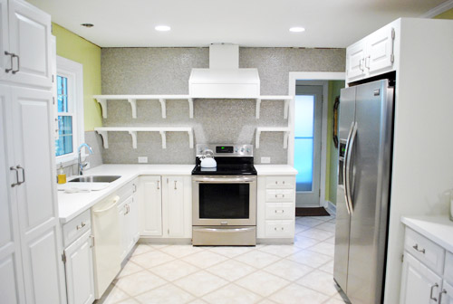
Remember yesterday when our shelves looked like this?
Well, then I had fun doing this (if you’re at work, you can watch this without sound and totally get the gist):
If you check out the video you can see that I can actually reach everything up on those top shelves except for the stuff in the corner by the window, but it’s easy enough to sit on the counter to grab it.
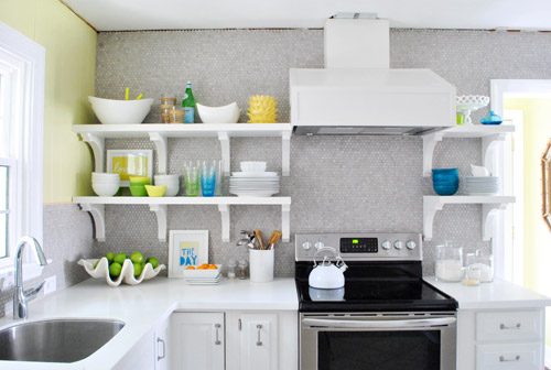
Who knew I’d be able to reach all that stuff? I totally expected to have to scream “Joooooohn” whenever I needed something up there (he’s the chef of the family so that probably wouldn’t have happened very often anyway). Or use a step stool if he’s missing/outside/hiding and I’m really desperate. Haha.
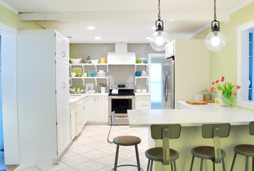
So now our shelves are chock full o’ stuff, and are most definitely still a work in progress, but mighty cheerful and functional all the same…
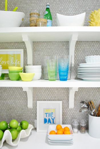
It’s not necessarily where things will stay – just a first pass for sure. I actually have since re-stacked some of the bowls – and plates & dishes have gotten used so things are constantly changing. It really is a completely rotating display. The funny thing is that it’s kind of crazy to “perfectly style” kitchen shelves anyway since it’s all supposed to be used and is always being picked up or washed or put back so I have already declared that I WILL NOT BE CRAZY. And John is holding me to it. Hah. So since nothing is glued down or expected to remain exactly where I placed it OR ELSE, consider this to be just one “take” of many when it comes to our open shelves. I’m sure ceramic animals will worm their way in there somewhere. And I’m sure as we add crown molding and patch the ceiling (at which point everything has to come back down from the shelves) things might get switched up. But that’s half the fun when you’re me.
As you can see from the video, I didn’t give anything too much thought. Sometimes over-thinking can be the bane of your existence when you’re loading up shelves or a bookcase. So it was all sort of first-thought. So for anyone wondering about my method… I actually consciously tried not to think too much and just moved stuff around and stepped back and tried to focus on what I wanted to be easiest to grab and grouping things that made sense (like all the items for setting the dinner table and dessert stuff). I’m sure it’ll evolve and change – and most likely get better and more functional – over time. Here’s hoping, anyway! And you know I’ll take pictures. Lots and lots of pictures.
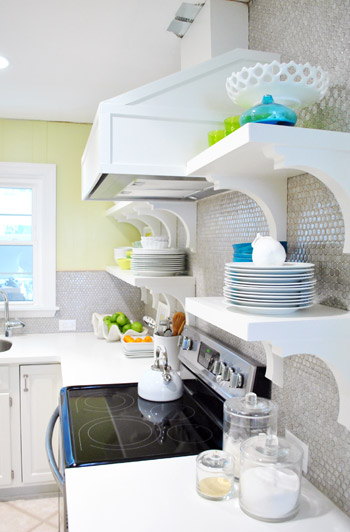
Oh and you can see from the shot above how shallow the brackets are and how deep our 12″ shelves are, so there’s plenty of room for stuff and the brackets don’t interfere with storage or anything. Whew.
But back to filling up those shelves. I tried hard not to think too hard (say that three times fast) but I did think about one thing the whole time I was at it: function. For example, I put our dessert bowls and dessert plates on the bottom right shelf and all of our large dinner dishes and cups and cereal bowls on the bottom left shelf. So those are closest at hand (and just a step or two away from the dishwasher with no cabinet doors to open, so that should be pretty convenient). Then the top shelves got things that we may use less often, but that still might sit out on counters in a kitchen anyway (ex: a cute cake stand, some bigger serving bowls, a vase, a bottle of my mom’s favorite bubbly drink, etc). We figure that even when those items sit in cabinets for a while they can get dusty, so it should be the same difference (a quick rinse and they’re ready to go). We’ll keep you posted on how it all works for sure.
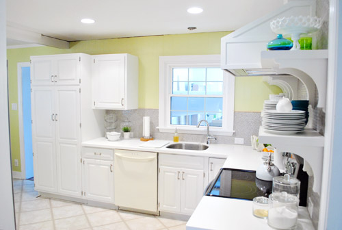
Here’s how the room now looks from the office doorway. Such a difference. Although the not-stainless dishwasher still kills us, but soon enough we should have the new one installed. Oh and I meant to take a shot of the window straight on to show the balance of the shelves that are spaced 14″ from the right of it and the cabinet that’s spaced 14″ to the left of it… but I had a brain fart. Epic picture-taking fail. So that shot’s to come.
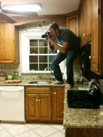
Memory lane time? Sure. The room used to look like this from the office doorway. Kinda crazy, right? I’m totally standing in the exact same spot – not any closer (see the counter cutting off at the bottom of each picture at nearly the same spot?). Isn’t it crazy how much closer the window feels in the picture below?
But let’s get back to the present. Do you hear a harp softly playing in the background or is it just me? Picture me twirling around with my arms out while orchestral music swells and birds come and fly around me holding ribbons in their beaks. Only less graceful and more awkward. And maybe the birds are just Burger and Clara holding toilet paper and spinning around beside me while I grin up at the can lights.
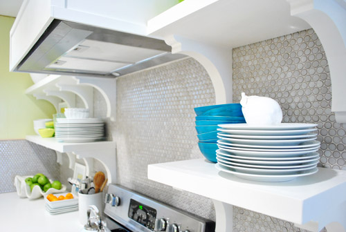
Oh and someone pointed out that we have lots of subtle curves going on with our brackets and our round penny tile and our round pendants. I love happy accidents like that! With more angular things like the range hood and the peninsula, it’s nice to have some softer shapes to complement them. High five for happy accidents.
Now that we have our pretty glass cups out in front of the boring clear ones we actually use them more. And I get to stare at them. Wait, that sounds creepy. I get to gaze at them. Better?
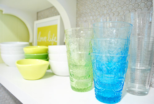
We think the random pops of blue, green, and yellow along with those two frames I stuck up there are fun. It’s definitely not a “magazine after” or anything – more like a gathering of all the stuff we actually use with some pretty decorative things tossed in there for fun. If a magazine blew in I think they’d probably add “more pretty” (flowers, lacquered boxes, candlesticks, etc) in exchange for “less function” (translation: I would love it and John would roll his eyes and say “um, where are all our plates and bowls and cups?”).
Oh and a bunch of folks asked if we considered a third row of shelves up top, but we figured once we loaded up those second shelves the stuff on them would balance with the top of the doorway, so anything above that might have been too heavy/cluttered for us. Plus that stuff would be really hard to reach/use.

And as for where we put the brackets, we wanted them all to be equally spaced on both sides (we looked at three on the left side but they didn’t feel as balanced with the ones on the right as four of them did). And that preferred layout thankfully worked with our studs (nearly all of our screws aligned perfectly and they feel really strong!), so after looking at a few different hanging options/bracket placements (and taping things off to help picture them) we just pulled the trigger and went with our favorite – which we thankfully love just as much in real life!
In short: we are so very happy with our wall o’ tile complete with glorious bracketed shelves full of sunshine and rainbows. Literally, the art actually says “Love Life” (it was the cover of a book that John got me, which I framed) and “Squeeze The Day” (a favorite flier from an old Boden catalog that came in the mail). We know open shelves (or these brackets/wall color/tile/pendants/stools/accessories) might not be everyone’s cup of tea, but we dig it. And the whole photography crew for the book is being very cute about stroking and gazing right along with us (full disclosure: this is one of those things that looks better in person, and even the video completely fails to capture it) so you’ll all just have to come over when we’re done with all of the crazy book chaos. Haha. You can even pour yourself a drink since you know where we keep the cups…

In other news: oh happy day – the tulips are still alive! I keep meaning to drop a penny in the water while Clara’s around so we can watch them perk up. Thanks for all the flower tips guys!
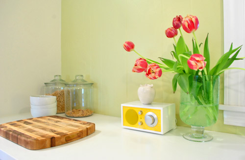
Here’s another shot sans crown molding and a patched ceiling. Oh and there will soon be a pendant hanging down over the sink too. We’re trying to tackle that, just so we don’t have to stare at torn up ceilings for much longer. So yes, it’s definitely a work in progress, but we’re jazz-hands-crazy about how our little “refurbished” kitchen is shaping up. And we’re definitely even more impatient than you guys about the cork floors! Can’t wait to get there and call this turkey done. Hah.
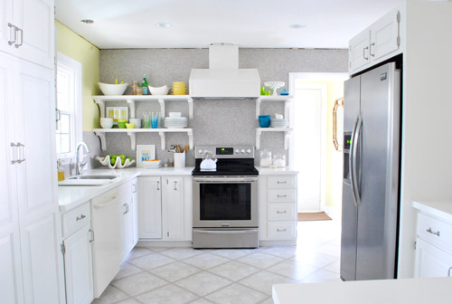
And just because I’m nuts, here’s what I did while playing around in photoshop.
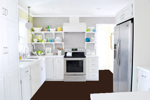
Flat brown paint dumped on the “floor” via photoshop hardly captures all the amazing texture that our marbled cork floors will bring, and the white paint dumped to replicate crown molding hardly looks real (nor does my crazy little made-up pendant over the sink, which will probably be a lot lighter looking and made of clear glass) but it was fun. And if you squint and hum the Dexter theme song, you can almoooooost see it (sidenote: John changed his ringtone from Dexter to the Parks & Recreation song, which saddened me for a nanosecond and then I realized how hilarious the Parks & Rec song is – we even set it to be our alarm tone too, just because it makes waking up extra early for book stuff almost pleasurable tolerable).
So spill it. Who is completely surprised that 5’2″ me can reach nearly everything on those upper shelves? That was a total unexpected bonus. Oh and for those wondering why there isn’t a crew of lovely book photoshoot people wandering in and out of the time lapse video, they have to set up lights for certain shots that take a while so they were shooting in the back bedrooms (and I gave them one of those “I’ll be back in thirty minutes, so hold tight and scream if you need me” things). Thankfully only John wandered in for a sec, so there were no photoshoot emergencies in the middle of my shelf-y fun (I even ducked out to answer some comment questions and take a call about our upcoming Portland gig). So as Martha would say, that’s a good thing. In summary: yay shelves. What have you guys been hanging/filling up with plates and bowls/filming in time lapse lately?
Psst- And now for a post about donuts.
UPDATE: We couldn’t love our open cabinets more. Check out a bracket tweak that we made here and an update post about how they function here here.

Tina Marie says
I have been quietly stalking you for a year now, but I must now profess my obsession with the Petersiks! The first site I go to in the morning, and the last place at night (just in case you get crazy and have a second post ). Loved the video! I’m thinking I may start my own blog called PetersiksAnonymous so I and others can safely, securely and of course anonymously proclaim our love, obsession and adoration for YoungHouseLove.com and the Petersik family. Just saying….I think I need an outlet!
PS – I think Jarvis would look great on the top left hand shelf, to look over and protect against burnt toast and runny eggs.
YoungHouseLove says
Haha- you’re so sweet Tina Marie! And we can’t bring Jarvis back in to supervise!
xo,
s
Tara G. says
Hooray for something to cross off the list and enjoy! :) My housekeeper was here today and I showed her some of your before and afters of the kitchen because she and her husband need to do some work on their place. I find it hilarious when they take an English word and make it Ukrainian- so, your kitchen is “fi-eye-nee.” :)
YoungHouseLove says
Haha, nice. So sweet!
xo,
s
Tamara says
wow! the color scheme turned out really fun and cheery. and i totally agree, spacing out the brackets on the left so they are the same distance as the ones on the right looks great!
i know ya’ll hate to cover any of that penny tile that you worked so hard to install, but have you thought about hanging something in the space above the stove? like a fun wall clock or something? it just seems like the perfect little framed-in spot to display something!
great work you two! you must never sleep!
tamara
YoungHouseLove says
Always another possibility! Fun idea!
xo,
s
Katherine Victoria says
Your video is making me crack up at work. It’s something about watching Sherry zip around moving this, straightening out that, hopping up and down off the counter. Love your kitchen – the colors are beatiful. You guys are EPIC!
YoungHouseLove says
Oh Katherine, you’re too kind. Thanks so much for all the kind words and the enthusiasm for our shelves guys! We love you!
xo,
s
Suni says
WHOO-HOOO!!! It looks so fantastic, and even though you said maybe not like a magazine picture, I’m thinking it totally does. Better Homes & Gardens has nothing on you guys!! Congrats, and enjoy!
YoungHouseLove says
Aw thanks Suni! You’re sweet!
xo,
s
Seriously Sassy Mama says
The dishes make it perfect. naked shelves are sad shelves.
YoungHouseLove says
Amen! We need to start a PSA about saving naked shelves.
xo,
s
Melissa says
It’s gorgeous!! Great job!! It is so cheerful & happy! I love it! =)
Madison says
First – so ridic! Such a crazy transformation and so stunning! Second, I’m sure you already saw this, BUT West Elm is having a light sale currently and they have some pretty schweet pendants and such! :)
Cheers!
Madison
YoungHouseLove says
Sweeeet! Thanks for the tip!
xo,
s
Bea @ CancunCOOKIES says
New follower from Cancun here (waving Hi!)… Love your kitchen redo… And the fresh colors! You did great!
Stefani says
Looks fantastic!!!
What are the yellow straw looking things sticking out of the big bowl on the top left shelf?
(looked through the comments… Thought for sure someone else would’ve asked that by now but didn’t see it!) :)
YoungHouseLove says
They’re the serving spoons that match the bowl. Good eye!
-John
Marcy L says
LOVE the video! I like the “3 dollars from Goodwill” moment! Shelves look great… very professional “shelfscaping” =)
Cassie says
I love this.
I was definitely able to close my eyes and visualize it yesterday and knew it would look awesome with all the stuff on the shelves, and I was not disappointed. Love the brackets, the bracket spacing, the number of shelves, the grellow, and the pendants…because I love that y’all are following your hearts and doing what makes YOU happy. THAT is what makes your blog so awesome…it’s so much fun to watch you create a space that your (beautiful, btw) family loves. It’s becoming such a happy home! Great job :)
Heather says
I’m not digging the setup, but I’m sure it will evolve and balance out in time.
Kelly says
I love the staging you guys! It’s all coming together so nicely! This is the most dramatic before/after EVER!
One question- Did you ever think of painting the brackets a soft gray color in tones close to the penny tile? That might be a nice way to tone them down a bit but still provide the bracket-y homey-ness you want. Just a thought, feel free to tell me to mind my biz. :)
YoungHouseLove says
That could be really fun! From the side we love how they read as all one white unit for now, but you never know where we’ll end up so it’s definitely a possibility!
xo,
s
Samma says
I keep thinking a little grey glaze for the cabinets, hood, and maybe shelf/brackets would give little accents. Kinda like Kristen did a week or so ago. http://kfddesigns.blogspot.com/2012/02/kitchen-cabinet-makeover.html
But don’t get me wrong it looks GREAT! as is, too.
YoungHouseLove says
Oh yes, that’s another fun way to go!
xo,
s
Becca McCurdy says
Aw, it looks awesome guys! Not gonna lie, I squealed with joy
when I saw that you got to fill the shelves! So much fun :)
Jane says
This looks amazing! You have put the shelf space to such good use without them being cluttered I’m always so impressed with your vision. Oh, and the colors on your shelves are making me even more excited for Spring!
Rachel G. says
Okay, keepin’ it real here (but there is a big BUT at the end of this). I haven’t been a huge fan of the stools. I love their design, just not in love with the dull gray/brown colors on them. I didn’t love the design you chose for the range hood (I actually liked your first drawing better). And yesterday when you showed the shelves hanging, I thought the brackets made them look so busy. I like the brackets, I just thought there were too many. BUT, and it’s a big one, all of the beautiful, crisp pops of color now adorning those shelves are really starting to bring it all together. I love how the brackets make it warm and quaint without being too rustic. I also think items on the shelves help bring the range hood into great proportion. And finally, I really do think the stools go so well with the overall design of the kitchen (but I’m still Team ORB where they are concerned). You guys always amaze me. My house is lacking so much and I think it is because I lack the confidence and gusto needed to make impactful design decisions. So great that you two are able to put your heads together and go for it. Congrats! I totally respect you both for having to listen to everyone’s opinions and maintaining the ability to make design decisions that work best for you all and that you will love. I’m in Richmond, so when you’re all finished I can’t wait to stop by and see it all in person. Just kidding!
YoungHouseLove says
Haha, come on over Rachel! And thanks so much for the sweet words!
xo,
s
Reenie says
LOVE….LOVE….LOVE it! Love all the pops of color mixed in with the white. Cute video. =)
laura says
Are these dishes/etc things you already had? Amazing how the color palette comes together, or was that all in the master plan?? I hate to think what my mismatch of dishes would look like on open shelves–I’d have to start all over again with a plan. Just wondering if these were just what you already had…if so, amazingly beautiful how it came together.
I don’t like clutter, so I didn’t think I would like it at all. But the whites (mostly) with a punch of color really work for me.
YoungHouseLove says
Yep – we already owned everything. We’ve been sort of collecting things in that color palette for the last couple of years so it wasn’t hard to find things that fit.
-John
Julia (PawleysIslandPosh) says
WoW! This might be my favorite post of yours yet. And not just because it’s a finished reveal. I actually like your along the way posts. But this is just so fresh and colorful and still has all clean lines. Very impressed that you stuck with John’s suggestion to display things you really use. Every picture I’ve pinned or seen of kitchen shelving usually just has beautiful but unrealistic vignettes. While I wish my shelves could hold nothing but colorful drink bottles and limes, it’s not very helpful for decorating my own spaces. LOVE! PS, I’m totally waiting to “spot” y’all in Target or HomeGoods now that I’m in Richmond. My crazy self seriously does a quick once over while I’m shopping to see if y’all are there.
xoxox
Cindy says
What a transformation! Personally, I love the brackets and the style of bracket that you used. I had no doubt, when you started this room, that it would look great, based on all your past projects. I wish you years of happiness in your home. Cindy
The Mrs @ Success Along the Weigh says
Dreamy…absolutely dreamy. You guys are rock stars!
Cheryl says
Is the Love Life art propped up on something?
I’m sure that as you use things you’ll decide if this a good arrangement or not – but it looks like a good start! Thanks for the tidbits of your thought process.
The change so far is amazing and the floors will just push it over the top!
YoungHouseLove says
Yep, it’s sitting on two short glasses.
-John
Lauryn says
EEEEE!! I am so excited for you guys and your kitchen! Its beautiful! And yes, I also cant wait to see the warmth the floors brings to the bright and cheery room. Its going to be great! Also, love the song on the video!
Amanda says
Love it!!!!
Watching the time lapse video, I was really hoping you would move the salad bowl to where you did (and I may have cheered when it happened)!
I feel like I get an added bonus because my kitchen stuff is yellow, and now you have given me all sorts of fun ideas :)
It all looks so happy — definitely a good thing!!!
Bridget says
This is probably a really weird question but where did you get your glass jars next to the stove? I am on the look out for those and only ones I can find are a little over what i want to pay! Your kitchen looks amazing though and cant wait to see the flooring go in!
YoungHouseLove says
I think those are from West Elm a while back? They were a wedding gift from my BFF’s mom!
xo,
s
Erin says
Bridget – you can find very similar ones at Walmart for $10-$15. We registered for them from Crate and Barrell when we got married and after dropping (and smashing) the top one day, I went on a hunt for a new one. I was SHOCKED to find almost the identical jars for a fraction of the price. Look in the homewares aisle.
Jessica says
They have similar glass canisters at Target! I bought a big one for 9.99 and a medium one for 7.99.
Chris says
If i didn’t see the the process I would never think this was the same kitchen. It’s so much brighter and younger looking it’s totally awsome. Just one question…why didn’t you use the same pendant over the sink that you used over the island? What ever you choose I’m sure it will look just as amazing as everything else.
YoungHouseLove says
We like that idea, only found two of them at the outlet. Still checking back for another one or another option though!
xo,
s
becky says
i love how you styled the shelves. we’ve done the same thing, and have about six months ahead of you guys…you will love every minute of them. putting the dishes away is a piece of cake. and dusting – not as big of a deal as you would think (though the top shelf is rather neglected unless our really tall friends are coming over and then it’s a manic “stand on the counter and wipe-wipe-wipe” sort of craziness)…what i’ve loved is that we did a similar neutral feeling and we’ve rearranged these all the time and get a whole new look whenever we want. i still haven’t figured out how to get framed artwork up – which i’ve been dreaming about layering into them…but all in good time. i’m so excited to see what you guys do with them as you try new things and play around with them…i need the some inspiration…now we can all kick back and wait for the flooring to be installed!
hollyloo says
i love that time lapse soooo much! you are so funny/adorable—especially during the step-back-and-ponder moments! well done—they look great!
Mary A says
I was holding my breath waiting for today’s post. Wasn’t sure I liked the brackets, but it looks awesome. What are your plans for the window?
YoungHouseLove says
Yay! Not sure yet! Will keep you posted!
xo,
s
Brandi says
I love it – the pops of blue are my favorite part (that and the framed Squeeze the Day). Amazing as usual!
Sarah says
Sherry, I totally took one of your photos from yesterday’s post and photo-shopped a dark floor, pendant light, filled the shelves with “stuff”, made the dishwasher silver, and added crown molding…I am a lunatic, it’s not even my house, but I was so excited and wanted to see what the finished product might look like…oh and yours looks WAY better than mine haha!
YoungHouseLove says
Bwahahahahahaha- I love it! And I kinda want to see it. Haha.
xo,
s
hollyloo says
ha! i totally did the same thing!! where is the best place to share it? facebook page?
YoungHouseLove says
Yep – we’d love for you to share it on our Facebook page!
-John
hollyloo says
up on facebook! fun!!
Lori says
OMG! Loooove! The pops of color are so pretty, fresh, cheerful, etc. etc. etc. And how perfect that you can reach the shelves without a stool! It looks magazine cover worthy to me!
Laurie says
So I knew the “brown floor” wasn’t real but when I looked at the “crown molding” I thought “wait, when did they get that done?” I thought I had missed part of the post about you busily installing molding in the midst of the chaos going on at your house. I haven’t even managed to hang three new pieces of art that I purchased and was feeling a bit shameful that you are getting all this accomplished while my little pictures are propped against a wall. Right, so I am off to get that done today! Also, LOVE the open shelves. Wasn’t sure how I would feel about it at first but now I am thinking I have a wall in my kitchen screaming for some open shelving. I have a wonderful collection of vintage cake plates and they would be ideal on open shelves.
Lindsey @ arkadian belle woods says
Looks so incredible! I love the pops of color you used! So gorgeous! I know it felt/feels good to get those gorgeous suckers loaded up with your pretty things!
Jeana says
Upcoming Portland gig? As in, Portland, Maine?
YoungHouseLove says
Portland, Oregon actually.
-John
Katherine Victoria says
If you guys ever did come to Portland, Maine I’d be first in line!!
YoungHouseLove says
Aw thanks!
xo
s
Regan @ RenovatingRothenbergers says
Those shelves look amazing!! I’m so excited for you two!! :)
Kelly says
I’m 5’2″ too. I’m sitting on the counter all the time too and begging the hubby to get down things for me if they are in the back or the stack of dishes got too high. So I feel the vertically challenged pain. But at least we know our limits, right?
Love, love, love your styling. The colors feel all bright and cheery. Awesome job.
Victoria R says
I love this kithcen! I never thought I was a fan of the white cabinets, but I’m almost sold ofter seeing all these pictures of yours!
Steph says
I love the shelf styling. You guys have such cute stuff, and the pops of color look great in your kitchen. I have to say that the pictures of the shelves up close are my favorite, but when you pull back and look at them straight on, I am not sold on the brackets. I know it’s your kitchen, so all that matters is that you’re happy…. just my two cents. The brackets cut it up and make it too choppy and cluttered for me. I also think maybe the range hood box seems to float too high above? I don’t know. But the side view (when you look at the window above your sink) is divine. It’s coming along, guys! Good work!
Melissa says
Made all the difference in the world! Love how bright and cheery it all is.
Alexi says
I love it! The shelves look awesome! I really love the pops of color against the tile. It’s amazing how much lighter & brighter the kitchen is now.
Elizabeth says
It looks great! And I LOVE the song you chose – thanks for putting the website at the end so I can listen to it all day :)
Sherry – is there a small ceramic animal (perhaps an elephant?) on top of the dessert plates on the bottom right-side shelf?
YoungHouseLove says
It is ceramic, but it’s actually a pear. I guess Sherry’s expanding her repertoire to include white ceramic fruit. :)
-John
Teresa @ wherelovemeetslife says
First, let me say Thank You! for posting early lol!! I came in to work this morning thinking about your reveal. *I did not drive by your house peering in the windows, hoping for a glimpse of the complete shelves though* I know your relieved by that. ;)
I love them!!! I like that you added the frames as well, it really adds a nice touch. And who told you that wouldn’t be a magazine finish??? I would totally pick that magazine off the stands!
Teresa @ wherelovemeetslife says
oh and you know your kitchen is going to be ALL OVER Pinterest today, right? lol
Kiki says
I would never dare open shelving because I can’t set things up or arrange them in any way that looks decent. So it’s AMAZING to see how great yours look! What an inspiration. And what fabulous, fun, bright, cheery colors. They really suit who you guys seem to be. :)
SherriEakin says
It looks so GREAT!! It looks like today’s post has won over a few of the “bracket haters”. ;)
I personally tend to gravitate toward floating shelves in general, but to me this really matches the design choices in rest of your house. It would have looked weird to walk from you dining room with its decor into an uber modern kitchen with no curves. Don’t sweat the haters and keep doing what you do – the kitchen is gorgeous!
YoungHouseLove says
Yeah, we really wanted to love floating shelves (it was our plan all along) but once we photoshopped them in it looked so hard and modern and didn’t really work with the rest of our house/stuff (we like a mix of old and new – or Ikea and thrift, haha).
xo,
s
Heather F. says
Ooooooo…me likey!! You guys are doing a wonderful job and I love watching the progress. I’ve always been curious to know if the previous homeowners know what you do and/or follow your progress?
YoungHouseLove says
Yep, they do know what we do (we met them during the buying process and they even invited us to their going away party). We know they read the blog religiously for the few months, but aren’t sure if they’re still keeping up these days.
-John
Erica says
Great job! It’s always nice to come along on your grand visions from beginning to end. Everything is now working so well together. Question – What do you use for your time lapse video? I’ve been filming myself painting lately (http://youtu.be/BoFcrBflGxo?hd=1) and my husband has been using the fancy adobe software after I’m done with my filming but i’m looking at a simpler way. Any suggestions?
YoungHouseLove says
We once used some “fancy” time lapse software for a time lapse video, but now we just film the whole thing in real time, upload the video and then speed it up like 2000% in iMovie.
-John
YoungHouseLove says
We use imovie (comes free on macs) to speed things up that we record with our flip. Hope it helps!
xo,
s
Beth says
Oh, snap! Just think how it will look once that floor is in!!!! Kudos!
Emily says
Love how everything came together! The colors are perfect! Is it strange that I especially love the fresh fruit in those white bowls?