Remember yesterday when our shelves looked like this?
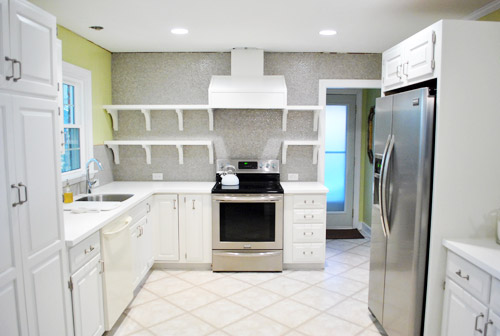
Well, then I had fun doing this (if you’re at work, you can watch this without sound and totally get the gist):
If you check out the video you can see that I can actually reach everything up on those top shelves except for the stuff in the corner by the window, but it’s easy enough to sit on the counter to grab it.
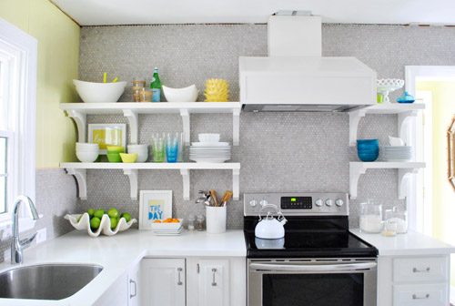
Who knew I’d be able to reach all that stuff? I totally expected to have to scream “Joooooohn” whenever I needed something up there (he’s the chef of the family so that probably wouldn’t have happened very often anyway). Or use a step stool if he’s missing/outside/hiding and I’m really desperate. Haha.
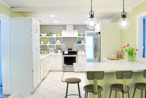
So now our shelves are chock full o’ stuff, and are most definitely still a work in progress, but mighty cheerful and functional all the same…
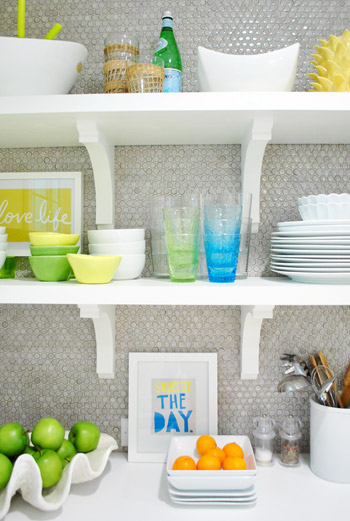
It’s not necessarily where things will stay – just a first pass for sure. I actually have since re-stacked some of the bowls – and plates & dishes have gotten used so things are constantly changing. It really is a completely rotating display. The funny thing is that it’s kind of crazy to “perfectly style” kitchen shelves anyway since it’s all supposed to be used and is always being picked up or washed or put back so I have already declared that I WILL NOT BE CRAZY. And John is holding me to it. Hah. So since nothing is glued down or expected to remain exactly where I placed it OR ELSE, consider this to be just one “take” of many when it comes to our open shelves. I’m sure ceramic animals will worm their way in there somewhere. And I’m sure as we add crown molding and patch the ceiling (at which point everything has to come back down from the shelves) things might get switched up. But that’s half the fun when you’re me.
As you can see from the video, I didn’t give anything too much thought. Sometimes over-thinking can be the bane of your existence when you’re loading up shelves or a bookcase. So it was all sort of first-thought. So for anyone wondering about my method… I actually consciously tried not to think too much and just moved stuff around and stepped back and tried to focus on what I wanted to be easiest to grab and grouping things that made sense (like all the items for setting the dinner table and dessert stuff). I’m sure it’ll evolve and change – and most likely get better and more functional – over time. Here’s hoping, anyway! And you know I’ll take pictures. Lots and lots of pictures.
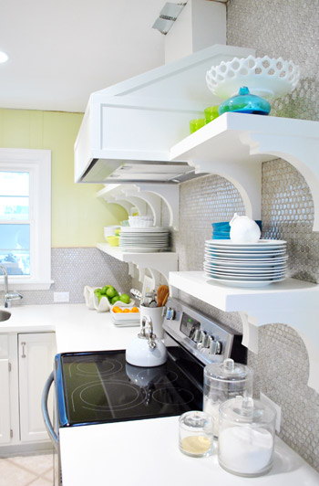
Oh and you can see from the shot above how shallow the brackets are and how deep our 12″ shelves are, so there’s plenty of room for stuff and the brackets don’t interfere with storage or anything. Whew.
But back to filling up those shelves. I tried hard not to think too hard (say that three times fast) but I did think about one thing the whole time I was at it: function. For example, I put our dessert bowls and dessert plates on the bottom right shelf and all of our large dinner dishes and cups and cereal bowls on the bottom left shelf. So those are closest at hand (and just a step or two away from the dishwasher with no cabinet doors to open, so that should be pretty convenient). Then the top shelves got things that we may use less often, but that still might sit out on counters in a kitchen anyway (ex: a cute cake stand, some bigger serving bowls, a vase, a bottle of my mom’s favorite bubbly drink, etc). We figure that even when those items sit in cabinets for a while they can get dusty, so it should be the same difference (a quick rinse and they’re ready to go). We’ll keep you posted on how it all works for sure.
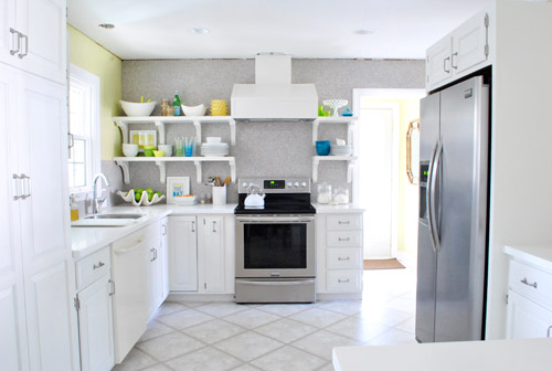
Here’s how the room now looks from the office doorway. Such a difference. Although the not-stainless dishwasher still kills us, but soon enough we should have the new one installed. Oh and I meant to take a shot of the window straight on to show the balance of the shelves that are spaced 14″ from the right of it and the cabinet that’s spaced 14″ to the left of it… but I had a brain fart. Epic picture-taking fail. So that shot’s to come.
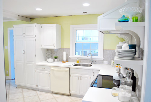
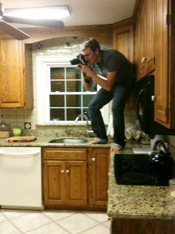
Memory lane time? Sure. The room used to look like this from the office doorway. Kinda crazy, right? I’m totally standing in the exact same spot – not any closer (see the counter cutting off at the bottom of each picture at nearly the same spot?). Isn’t it crazy how much closer the window feels in the picture below?
But let’s get back to the present. Do you hear a harp softly playing in the background or is it just me? Picture me twirling around with my arms out while orchestral music swells and birds come and fly around me holding ribbons in their beaks. Only less graceful and more awkward. And maybe the birds are just Burger and Clara holding toilet paper and spinning around beside me while I grin up at the can lights.
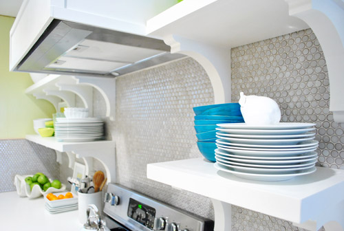
Oh and someone pointed out that we have lots of subtle curves going on with our brackets and our round penny tile and our round pendants. I love happy accidents like that! With more angular things like the range hood and the peninsula, it’s nice to have some softer shapes to complement them. High five for happy accidents.
Now that we have our pretty glass cups out in front of the boring clear ones we actually use them more. And I get to stare at them. Wait, that sounds creepy. I get to gaze at them. Better?
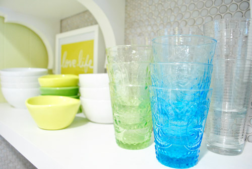
We think the random pops of blue, green, and yellow along with those two frames I stuck up there are fun. It’s definitely not a “magazine after” or anything – more like a gathering of all the stuff we actually use with some pretty decorative things tossed in there for fun. If a magazine blew in I think they’d probably add “more pretty” (flowers, lacquered boxes, candlesticks, etc) in exchange for “less function” (translation: I would love it and John would roll his eyes and say “um, where are all our plates and bowls and cups?”).
Oh and a bunch of folks asked if we considered a third row of shelves up top, but we figured once we loaded up those second shelves the stuff on them would balance with the top of the doorway, so anything above that might have been too heavy/cluttered for us. Plus that stuff would be really hard to reach/use.

And as for where we put the brackets, we wanted them all to be equally spaced on both sides (we looked at three on the left side but they didn’t feel as balanced with the ones on the right as four of them did). And that preferred layout thankfully worked with our studs (nearly all of our screws aligned perfectly and they feel really strong!), so after looking at a few different hanging options/bracket placements (and taping things off to help picture them) we just pulled the trigger and went with our favorite – which we thankfully love just as much in real life!
In short: we are so very happy with our wall o’ tile complete with glorious bracketed shelves full of sunshine and rainbows. Literally, the art actually says “Love Life” (it was the cover of a book that John got me, which I framed) and “Squeeze The Day” (a favorite flier from an old Boden catalog that came in the mail). We know open shelves (or these brackets/wall color/tile/pendants/stools/accessories) might not be everyone’s cup of tea, but we dig it. And the whole photography crew for the book is being very cute about stroking and gazing right along with us (full disclosure: this is one of those things that looks better in person, and even the video completely fails to capture it) so you’ll all just have to come over when we’re done with all of the crazy book chaos. Haha. You can even pour yourself a drink since you know where we keep the cups…

In other news: oh happy day – the tulips are still alive! I keep meaning to drop a penny in the water while Clara’s around so we can watch them perk up. Thanks for all the flower tips guys!
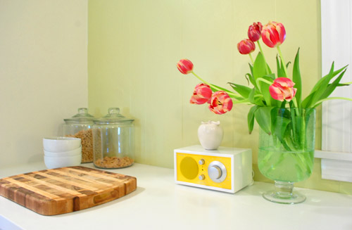
Here’s another shot sans crown molding and a patched ceiling. Oh and there will soon be a pendant hanging down over the sink too. We’re trying to tackle that, just so we don’t have to stare at torn up ceilings for much longer. So yes, it’s definitely a work in progress, but we’re jazz-hands-crazy about how our little “refurbished” kitchen is shaping up. And we’re definitely even more impatient than you guys about the cork floors! Can’t wait to get there and call this turkey done. Hah.
And just because I’m nuts, here’s what I did while playing around in photoshop.
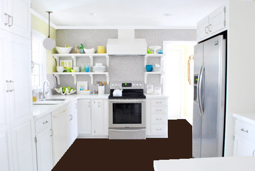
Flat brown paint dumped on the “floor” via photoshop hardly captures all the amazing texture that our marbled cork floors will bring, and the white paint dumped to replicate crown molding hardly looks real (nor does my crazy little made-up pendant over the sink, which will probably be a lot lighter looking and made of clear glass) but it was fun. And if you squint and hum the Dexter theme song, you can almoooooost see it (sidenote: John changed his ringtone from Dexter to the Parks & Recreation song, which saddened me for a nanosecond and then I realized how hilarious the Parks & Rec song is – we even set it to be our alarm tone too, just because it makes waking up extra early for book stuff almost pleasurable tolerable).
So spill it. Who is completely surprised that 5’2″ me can reach nearly everything on those upper shelves? That was a total unexpected bonus. Oh and for those wondering why there isn’t a crew of lovely book photoshoot people wandering in and out of the time lapse video, they have to set up lights for certain shots that take a while so they were shooting in the back bedrooms (and I gave them one of those “I’ll be back in thirty minutes, so hold tight and scream if you need me” things). Thankfully only John wandered in for a sec, so there were no photoshoot emergencies in the middle of my shelf-y fun (I even ducked out to answer some comment questions and take a call about our upcoming Portland gig). So as Martha would say, that’s a good thing. In summary: yay shelves. What have you guys been hanging/filling up with plates and bowls/filming in time lapse lately?
Psst- And now for a post about donuts.
UPDATE: We couldn’t love our open cabinets more. Check out a bracket tweak that we made here and an update post about how they function here here.

Lisa W. says
Another “where did you get…?” question. Where did you get that awesome radio on your counter by the tulips? I am in lurve!!
YoungHouseLove says
That’s made by Tivoli but I got it for sale on jossandmain.com a little while ago! Hope it helps!
xo,
s
Laura says
It looks great! Quick question…. Are all of the things on the shelves items that you already owned, or did you guy buy some new kitchen things to match your color scheme since they’re now out in the open?
YoungHouseLove says
It’s all stuff we already owned. We’ve been collecting stuff in that color palette for the last couple of years so there was lots to choose from.
-John
Jennifer C. says
Love, love, love the shelves and the styling! The video was fun too! I can’t believe how much your kitchen has changed… UH-mazing! Where did you find that cool yellow vase/bowl that’s on the top left shelf? Very cool! Love the texture.
YoungHouseLove says
HomeGoods!
xo,
s
Sherri says
Beautiful! That is seriously the most cheerful kitchen I have ever seen. I love it.
Melanie says
I do love that wall. Adding the framed art was a particularly nice touch. Having those bright pops of color makes the grellow seem a bit anemic to me though. Admittedly, I’m not a a fan of that shade in the first place, but it’s your house and if you love, it all is well. I just think that with so much white/light colored stuff, this room could easily handle something a touch more saturated (even a more saturated grellow ;p). I have a similarly super-white kitchen (white cabinets, light floors, white ’50s square tile wainscotting around the entire room and as the countertops. When I moved in, the walls were painted a pale blue and, even though it was a pretty color, it just made the room look too washed out. I painted it bay leaf (from Martha Stewart) and it really gave the room new life.
ANYway, if you love the grellow then thumbs up! But if you ever decide to change it somewhere down the road, the room could totally handle something stronger in saturation. The whole room has come a million miles from where it was before and looks great.
Jonel @ Sporks and Stuff says
So confession,I wasn’t really feeling the room. Something was off although I know it’s still a work in progress. I always thought it was the wall color (not a big fan of it but it’s not my kitchen, lol) but then the photoshop of the floors made me realize it’s the floors and everything looks so polished with just that “simple” change. Can’t wait to see the cork floors and then the room will really pop.
Bridgid Gallagher says
Time lapse video FTW! When the images of the final arrangement came up I totally swooned!! Brilliant! Dancing around á la The Sound of Music (or a Disney movie?) seems 100% reasonable. ;)
YoungHouseLove says
Wahoooooooooo! Thanks Bridgid. I appreciate you dancing with me.
xo,
s
Justine Wicks says
Wow! this looks amazing!!! so clean and fresh. Oh by the way, i just got my baby magazine in the mail. I began flipping through the pages when suddenly I exclaimed, “hey, I know them.” There in front of me were my two, favorite bloggers with pictures of Clara’s nursery! Once again, i was impressed:) Great job!
YoungHouseLove says
Oh really? What mag – American Baby? We were in there once and the pictures seem to be resurfacing every so often. :)
-John
Debbie C says
Can’t believe it’s the same kitchen as that old dark brown one! I really like the open shelves. Where’d ya get the blue and green glass tumblers? So pretty! They remind me of summertime. :)
YoungHouseLove says
They’re from World Market a few years ago.
-John
Amy L. says
Aw, it looks so nice. By the window, how does the tile terminate into the drywall? Is there a tile border of some sort?
YoungHouseLove says
There’s a little thin wood border that we’ll be painting to match the grout color!
xo,
s
Amy L. says
Nevermind, I found the answer.
https://www.younghouselove.com/2012/01/how-to-install-penny-tile-and-lots-of-it/
lindsay says
I really think you guys want to take a field trip to southern maryland and help me and the hubby finish off our kitchen. Its missing something and really needs the little things finished so I can mark it off the list :)
you guys are great and I can’t wait till you get the floors in.
Carla says
LOVE the video, LOVE the song, LOVE you guys and your shelves!!! :)
Helen says
I like the brackets and appreciate them for both form and function. Floating shelves would definitely make me nervous about potential shelf collapse! But while you’re photoshopping, I wonder if you could humor us with a shoop that shows the brackets painted a grey color more similar to the penny tile? I’m wondering if that would make them pop a little less so that they’re not vying for attention with the lovely dishware. Or maybe they’ll actually become even more noticeable? Haha.
YoungHouseLove says
Always another possibility! We’re not sure how it would look from the side (we like how they read as one white unit in profile) so we’ll have to see how it goes!
xo,
s
alison says
Omgeeeeee! This looks awesome. You sure have the nack for this, Sherry!
darbi says
Ok, so I have to admit, I have totally NOT been feeling this wall color and large expanse of white in the kitchen during this reno. But because I know you guys are fabulous, I’ve just been patiently waiting with a somewhat skeptic look on my face. The pops of color on the shelves are amazing! They just kind of bring it all together for me. I think it looks amazing now. It just breaks up all that white and the grellow (which I’m still not sure about) and makes the kitchen look happy. I’m ready for the floors now! :) Good job guys!
K (Barking Babymama) says
I love how you’re like “Oh I just didn’t think too much about where to put anything” and then it comes out so artistic and balanced – you make it sound so easy!! It looks amazing, and I thought watching you work in the video was fascinating!! More videos like that please – it’s just interesting to watch your artistic process!
Nadine says
You deserve to be proud of yourselves, congratulations for a really fantastic job! I so envy you….
K (Barking Babymama) says
Oh, and wasn’t there an animal head next to the fridge from your “Git Er Done” challenge (or whatever it’s called?)? Did I miss the announcement that you decided he didn’t belong there? Because I keep noticing you mention you need art for the right of the fridge?
YoungHouseLove says
Haha- yes Jarvis the rooster! Thanks to book chaos he’s in the bedroom. Oh but do you mean the antlers next to the fridge? They’re actually on the other side of the fridge, so you just can’t see him from these angles!
xo,
s
K (Barking Babymama) says
Ooooh, yes, it was the antlers I was wondering about. Okay good, I’m glad they are still there :)
erica says
Very fun- great job!!
I’m sure you’ve seen the latest spring inspiration catalog from Crate and Barrel? Page 6 and 7 (with all the yellows, greens, and teals) of dishware reminded me so much of your kitchen and filling up your shelves!
http://www.crateandbarrel.com/Catalog/View-Online.aspx?Catalog_name=7924_67937a23_33cda7ea&RFX_Res=high
Fun stuff, huh?! Enjoy your new space!
erica says
oh, page 4 and 5 too with the dishtowels. Tangler dishtowel is to die for. Anyway, thought I’d share!
YoungHouseLove says
Love them all! Thanks for sharing!
xo,
s
YoungHouseLove says
Love!
xo,
s
karen says
soooo nice!! I love the ‘squeeze the day’ art..how perfect! love those green and blue glasses and those glasses with the straw or something on them. so nice!!!
Courtney says
I think it looks great and the blue, green, yellow combo is right up my alley. In fact, that’s the colour scheme in our kitchen too! I recently splurging on a curry yellow lacquer Peugeot pepper mill and I am in looooove. http://www.amazon.com/gp/product/B0015VCQTQ/ref=oh_o00_s00_i02_details
What did you use to hang the “Love Life” print? Is it just a 3M hook? I really like the addition of art!
Courtney says
Uhhh… make that splurged – not splurging.
YoungHouseLove says
Haha, I knew what you meant. I actually just stick two green glass dish/cups under it to prop it up.
xo,
s
Radhika Paruchuri says
Wow… that kitchen looks awesome! infact word awesome is too small to describe how your kitchen feels and what an amazing job you both have done. I want to go home now and tear down my kitchen… :) or better I hire you both to do my kitchen becasue there is no way I can do anything close to this. So happy for you both and love reading your blog everyday.
YoungHouseLove says
Thanks so much Radhika! You’re so sweet!
xo,
s
Erin says
Love the time warp video. Your hands are moving so fast! :)
YoungHouseLove says
Haha- I’m a speedy lady. We actually didn’t speed that up I just walked super fast. Haha.
xo,
s
Katie Rose says
What are you talking about: “It’s definitely not a ‘magazine after’ or anything…”
YES IT IS! It is gorgeous! Something you definitely expect to see when you open up a BHG magazine. I have been looking forward to this step of the kitchen process more than anything else. Looks amazing! Great job guys!
YoungHouseLove says
Aw thanks Katie Rose! You’re sweet.
xo,
s
karen says
my 4 year old just said..’i like her kitchen’. so cute!!
YoungHouseLove says
Haha, I love it!
xo,
s
carley says
I am in love with every blue pop of color! I’m getting ready to diy an infant tutu for my newborn’s pictures and may have to steal that color for accent! Awesome that you can reach everything!!!!
Andrea B says
Super awesome! I love stop-motion videos. I particularly enjoyed how you kept moving back to the corner and pondering the scene (I do this a bazillion times for any furniture move or wall redecorate) and that John wandered in and out with a laptop. Made me feel right at home, since that is exactly what would happen with my hubby and me. lol.
The kitchen is gorgeous. Can’t wait to see the flooring added.
Melanie @ Mailbox Journey says
Go Sherry, Go! LOL. I love these kind of videos. Those shelves look great all accessorized.
Melissa says
Oh my word! I had to text my husband when I got to the end of this post. He is always teasing me for talking about “the blog people” as though we’re old pals. But, now it’s pure fate…I LOVE the parks and rec theme song and dance everytime it comes on! Every week I talk about how it would be the perfect alarm clock wake up because it’s so gosh darn happy! He doesnt think this qualifies as amazing news.
YoungHouseLove says
Haha- he’ll buck up when he gets to wake up to it.
xo,
s
Angel says
Wow! It looks great. I am totally in love with the color! I even pinned it. :) Someday…. Oh and Evan, my 3 year old, was getting jiggy with your video. LOL! We loved the music to go along with it. Made us smile.
YoungHouseLove says
Isn’t it the best song? John is the best video DJ a gal could ask for.
xo,
s
Candace D says
I love the shelves. Everything is so light, bright and colorful! Great job-I’m constantly amazed who you guys do these projects and save so much $$$$$.
P.S. Sherry, don’t forget, Bethany starts Feb. 20!!!!!! : )
YoungHouseLove says
Beyond excited! I keep hearing rumors her and Jason are divorcing. Ahhh. Anyone know? I hope it’s not true!
xo,
s
Missy says
Love the kitchen! Where did you get that yellow radio? It’s great! Also wondering where you got the LOVE LIFE print. Thanks!
YoungHouseLove says
The Love Life print is a book cover I framed! And the radio is from jossandmain.com but it’s made by Tivoli if you can’t find it there. Hope it helps!
xo,
s
Leigh says
I absolutely LOVE the shelves!!! I can’t wait for you guys to finish up. I am so antsy to see the completely finished kitchen you’d think it was mine! Where did you get the pretty turquoise/teal bowls on the top right shelf by the cake stand? They look like they’d match my kitchen well.
YoungHouseLove says
HomeGoods! Hope it helps.
xo,
s
Jen @ Domesticated Nomad says
I love how the shelves turned out. Confession: I wasn’t sure I was totally feelin’ the whole wall of penny tile, but now I so get it! It’s awesome texture behind the clean shelves and fun dishes.
When we lived in a tiny apartment, we put open shelves up for our most commonly used dishes and it worked great. We really loved it. Sometimes I miss it, but so far, not enough to demo out my nice neutral cabinets. Anyways. I’m sure you are really going to love the open storage over the long haul. It’s not as hard to keep clean as people say.
YoungHouseLove says
Aw thanks Jen!
xo,
s
Jamie @ The Treehouse says
That looked exhilirating. It was, wasn’t it? Nice work $herdog!
Kellie says
As always, you’ve totally nailed it! It’s an even more amazing before-and-after story than your first kitchen! Super impressed you DIYed all of it. Really curious how you’ll like the open shelving. It’s so beautiful so I really am hoping to hear that it’s functional as well. I agree that if you rotate things through enough dust shouldn’t be an issue and hope that’s the case. Great work you guys!
YoungHouseLove says
We’ll definitely keep you posted! So far it has been noticeably faster to unload the dishwasher – yay! No dust yet but we’ll have to let you know!
xo,
s
Jane N says
Love it! I watched the video on my phone at work while I was pumping, and I got so focused on it that I didn’t notice until it was too late that the bottle was full and pouring breast milk out the back onto my dress pants. Whoops! :)
YoungHouseLove says
Oopsie! So sorry about that. Haha.
xo,
s
pam says
AMAZING!! Thanks so much for sharing!
Wom-mom Ethne says
Very nice. Love your glasses. I saw on Pinterest some blue glass mason jars hung by a sink that had little wildflowers in them. Super cute. When Clara picks flowers for you this summer, loads of dandelions probably, you’ll totally want to do that.
YoungHouseLove says
So cute!!
xo,
s
Courtney says
I love your photoshop rendering of the cork floors–the Dexter theme song definitely helps with the visualization. Also, John’s cameo appearance in the video made me laugh, and I half expected Clara and Burger to join in at some point!
YoungHouseLove says
I wish they had wandered in too!
xo,
s
Nicole says
OMG!!! I LOVE IT!!!!
If you ever want to travel to St. Louis to help a friendly reader design her 50 year old ranch-er….the offer is there!
:)
Looks so great!
Nicole
YoungHouseLove says
Aw thanks Nicole! Never been to St Louis but it sounds fun!
xo,
s
Shelly says
OK, I have to be honest, I was really not feeling your paint color choice, but I’m loving it with your blue, green, and sort of citrus feeling dishes! Good Job!
YoungHouseLove says
Yay!!
xo
s
Sara Vallerie says
Love it! Today is moving day for us, I’m super excited. I looked at picture number six and thought, they should paint the ceiling a color. Keep it up!
Kellie says
When you’re playing in Photoshop, have you tried giving the dishwasher a stainless finish? If so, I’d love to see what that might look like!
Everything looks great!
YoungHouseLove says
I wish I had remembered to do that. Next time!
xo,
s
Jessica says
Ahh! This looks so great guys! I am in love with the open shelving and the shiny penny tile is such a great backdrop for everything – the blue and green pop great off of it. And thanks for the note on the video – I check every day from work and get really bummed when I can’t watch the video right away! :)
Liz says
It’s gorgeous! So much fun to watch it all come together- can’t wait for the grand finale! (PS- best line EVER “we’re jazz-hands-crazy about….” cracked me up!)
Emma says
My favorite part is seeing the groupings you create in a space – it gives me so many ideas to work with – oh, and I’m pretty sure my husband believes I look like you did sped up…but in real time. And I change things up often! I need to not be “crazy” too!
Theresa says
you are much too modest, I totally think this looks like a magazine after! I love the pops of color! awesome job. p.s., is that a ceramic animal I spy sitting atop the stack of plates on the lower right shelf? :)
YoungHouseLove says
Aw, you’re sweet! It’s a ceramic pear, but close enough!
xo,
s
Susan says
Loving the video! Glad I’m not the only one whose instinct focuses on a design element, steps back and tilts the head, and rearranges for the perfect look…only like a gazillion times until it’s “right”! Great job!
Jennifer says
Dude, I’m so jealous!! I LOVE LOVE LOVE your kitchen! I really do love the open shelving and how convenient it is. Where did you get teh glasses with the straw/ratan holders that are ont he top left shelf? I’ve been looking for some of those.
YoungHouseLove says
Those were from Sur La Table a few years back on clearance but have also seen them at HomeGoods. Hope it helps!
xo,
s