Remember yesterday when our shelves looked like this?
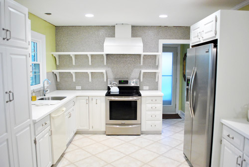
Well, then I had fun doing this (if you’re at work, you can watch this without sound and totally get the gist):
If you check out the video you can see that I can actually reach everything up on those top shelves except for the stuff in the corner by the window, but it’s easy enough to sit on the counter to grab it.
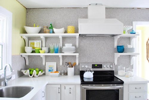
Who knew I’d be able to reach all that stuff? I totally expected to have to scream “Joooooohn” whenever I needed something up there (he’s the chef of the family so that probably wouldn’t have happened very often anyway). Or use a step stool if he’s missing/outside/hiding and I’m really desperate. Haha.
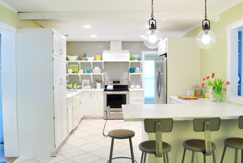
So now our shelves are chock full o’ stuff, and are most definitely still a work in progress, but mighty cheerful and functional all the same…
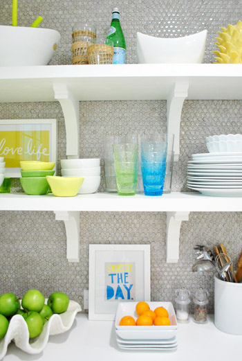
It’s not necessarily where things will stay – just a first pass for sure. I actually have since re-stacked some of the bowls – and plates & dishes have gotten used so things are constantly changing. It really is a completely rotating display. The funny thing is that it’s kind of crazy to “perfectly style” kitchen shelves anyway since it’s all supposed to be used and is always being picked up or washed or put back so I have already declared that I WILL NOT BE CRAZY. And John is holding me to it. Hah. So since nothing is glued down or expected to remain exactly where I placed it OR ELSE, consider this to be just one “take” of many when it comes to our open shelves. I’m sure ceramic animals will worm their way in there somewhere. And I’m sure as we add crown molding and patch the ceiling (at which point everything has to come back down from the shelves) things might get switched up. But that’s half the fun when you’re me.
As you can see from the video, I didn’t give anything too much thought. Sometimes over-thinking can be the bane of your existence when you’re loading up shelves or a bookcase. So it was all sort of first-thought. So for anyone wondering about my method… I actually consciously tried not to think too much and just moved stuff around and stepped back and tried to focus on what I wanted to be easiest to grab and grouping things that made sense (like all the items for setting the dinner table and dessert stuff). I’m sure it’ll evolve and change – and most likely get better and more functional – over time. Here’s hoping, anyway! And you know I’ll take pictures. Lots and lots of pictures.
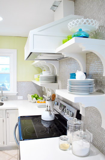
Oh and you can see from the shot above how shallow the brackets are and how deep our 12″ shelves are, so there’s plenty of room for stuff and the brackets don’t interfere with storage or anything. Whew.
But back to filling up those shelves. I tried hard not to think too hard (say that three times fast) but I did think about one thing the whole time I was at it: function. For example, I put our dessert bowls and dessert plates on the bottom right shelf and all of our large dinner dishes and cups and cereal bowls on the bottom left shelf. So those are closest at hand (and just a step or two away from the dishwasher with no cabinet doors to open, so that should be pretty convenient). Then the top shelves got things that we may use less often, but that still might sit out on counters in a kitchen anyway (ex: a cute cake stand, some bigger serving bowls, a vase, a bottle of my mom’s favorite bubbly drink, etc). We figure that even when those items sit in cabinets for a while they can get dusty, so it should be the same difference (a quick rinse and they’re ready to go). We’ll keep you posted on how it all works for sure.
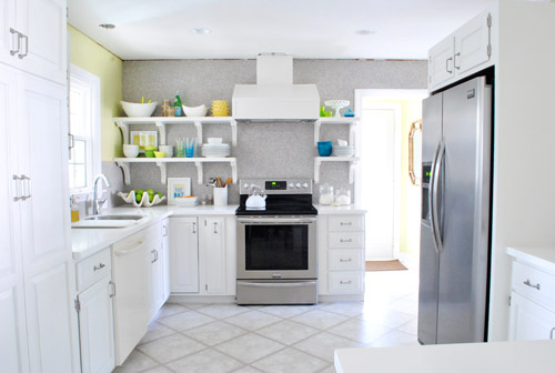
Here’s how the room now looks from the office doorway. Such a difference. Although the not-stainless dishwasher still kills us, but soon enough we should have the new one installed. Oh and I meant to take a shot of the window straight on to show the balance of the shelves that are spaced 14″ from the right of it and the cabinet that’s spaced 14″ to the left of it… but I had a brain fart. Epic picture-taking fail. So that shot’s to come.
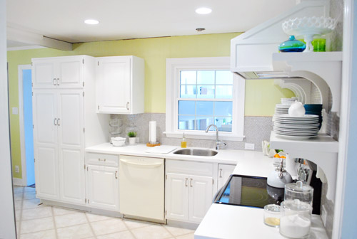
Memory lane time? Sure. The room used to look like this from the office doorway. Kinda crazy, right? I’m totally standing in the exact same spot – not any closer (see the counter cutting off at the bottom of each picture at nearly the same spot?). Isn’t it crazy how much closer the window feels in the picture below?
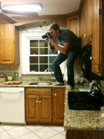
But let’s get back to the present. Do you hear a harp softly playing in the background or is it just me? Picture me twirling around with my arms out while orchestral music swells and birds come and fly around me holding ribbons in their beaks. Only less graceful and more awkward. And maybe the birds are just Burger and Clara holding toilet paper and spinning around beside me while I grin up at the can lights.
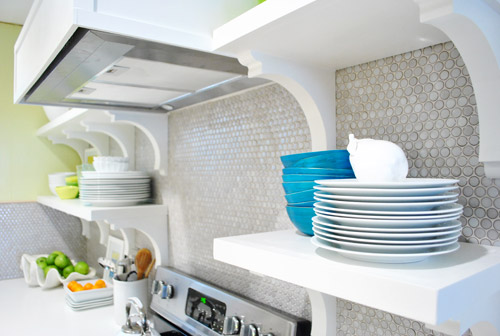
Oh and someone pointed out that we have lots of subtle curves going on with our brackets and our round penny tile and our round pendants. I love happy accidents like that! With more angular things like the range hood and the peninsula, it’s nice to have some softer shapes to complement them. High five for happy accidents.
Now that we have our pretty glass cups out in front of the boring clear ones we actually use them more. And I get to stare at them. Wait, that sounds creepy. I get to gaze at them. Better?
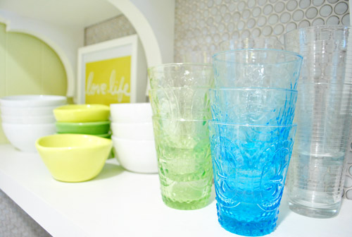
We think the random pops of blue, green, and yellow along with those two frames I stuck up there are fun. It’s definitely not a “magazine after” or anything – more like a gathering of all the stuff we actually use with some pretty decorative things tossed in there for fun. If a magazine blew in I think they’d probably add “more pretty” (flowers, lacquered boxes, candlesticks, etc) in exchange for “less function” (translation: I would love it and John would roll his eyes and say “um, where are all our plates and bowls and cups?”).
Oh and a bunch of folks asked if we considered a third row of shelves up top, but we figured once we loaded up those second shelves the stuff on them would balance with the top of the doorway, so anything above that might have been too heavy/cluttered for us. Plus that stuff would be really hard to reach/use.

And as for where we put the brackets, we wanted them all to be equally spaced on both sides (we looked at three on the left side but they didn’t feel as balanced with the ones on the right as four of them did). And that preferred layout thankfully worked with our studs (nearly all of our screws aligned perfectly and they feel really strong!), so after looking at a few different hanging options/bracket placements (and taping things off to help picture them) we just pulled the trigger and went with our favorite – which we thankfully love just as much in real life!
In short: we are so very happy with our wall o’ tile complete with glorious bracketed shelves full of sunshine and rainbows. Literally, the art actually says “Love Life” (it was the cover of a book that John got me, which I framed) and “Squeeze The Day” (a favorite flier from an old Boden catalog that came in the mail). We know open shelves (or these brackets/wall color/tile/pendants/stools/accessories) might not be everyone’s cup of tea, but we dig it. And the whole photography crew for the book is being very cute about stroking and gazing right along with us (full disclosure: this is one of those things that looks better in person, and even the video completely fails to capture it) so you’ll all just have to come over when we’re done with all of the crazy book chaos. Haha. You can even pour yourself a drink since you know where we keep the cups…

In other news: oh happy day – the tulips are still alive! I keep meaning to drop a penny in the water while Clara’s around so we can watch them perk up. Thanks for all the flower tips guys!
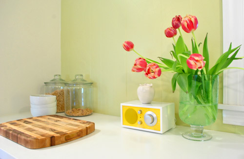
Here’s another shot sans crown molding and a patched ceiling. Oh and there will soon be a pendant hanging down over the sink too. We’re trying to tackle that, just so we don’t have to stare at torn up ceilings for much longer. So yes, it’s definitely a work in progress, but we’re jazz-hands-crazy about how our little “refurbished” kitchen is shaping up. And we’re definitely even more impatient than you guys about the cork floors! Can’t wait to get there and call this turkey done. Hah.
And just because I’m nuts, here’s what I did while playing around in photoshop.
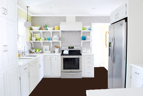
Flat brown paint dumped on the “floor” via photoshop hardly captures all the amazing texture that our marbled cork floors will bring, and the white paint dumped to replicate crown molding hardly looks real (nor does my crazy little made-up pendant over the sink, which will probably be a lot lighter looking and made of clear glass) but it was fun. And if you squint and hum the Dexter theme song, you can almoooooost see it (sidenote: John changed his ringtone from Dexter to the Parks & Recreation song, which saddened me for a nanosecond and then I realized how hilarious the Parks & Rec song is – we even set it to be our alarm tone too, just because it makes waking up extra early for book stuff almost pleasurable tolerable).
So spill it. Who is completely surprised that 5’2″ me can reach nearly everything on those upper shelves? That was a total unexpected bonus. Oh and for those wondering why there isn’t a crew of lovely book photoshoot people wandering in and out of the time lapse video, they have to set up lights for certain shots that take a while so they were shooting in the back bedrooms (and I gave them one of those “I’ll be back in thirty minutes, so hold tight and scream if you need me” things). Thankfully only John wandered in for a sec, so there were no photoshoot emergencies in the middle of my shelf-y fun (I even ducked out to answer some comment questions and take a call about our upcoming Portland gig). So as Martha would say, that’s a good thing. In summary: yay shelves. What have you guys been hanging/filling up with plates and bowls/filming in time lapse lately?
Psst- And now for a post about donuts.
UPDATE: We couldn’t love our open cabinets more. Check out a bracket tweak that we made here and an update post about how they function here here.

Nette @ This Dusty House says
They’re gorgeous! You guys are so good at the colour thing, taking a blank slate and adding the little details that make it you. Wish I could figure out that skill… Thanks for the inspiration! And that video was so fun!
dave says
first off i want to say i love you guys and about 99.9% of what you do. i think this for me is the .1% of the time. I guess it’s because i got use to how empty the wall was. I just think it looks heavy maybe because of the brackets as apposed to just a floating shelf and cluttered …..to many nice things on the self…my eyes are going nuts.
anyways doesn’t matter what i think….I’m supper happy you guys love it and that is all that matters.
trish says
I not amazed at you reaching the high shelf but at the speed in which you do it! Love it all in high speed!! It looks great. You have great vision!
Brianne says
I love it. It looks a little busy with the brackets tho.
Greg Summerhays says
Looks amazing! Love the video.
Renee says
I.LOVE.IT. It has been so much fun watching you guys transform your kitchen. It gives me hope for transforming some of the rooms in our house.
Jessica says
The shelves make such a big difference! It looks like a real kitchen now!
Amanda Kirby says
I love the video!
You guys are great!
Sarah says
what a transformation! Your kitchen is so much lighter and brighter! Those shelves are very sweet!
Sherry from BC says
Loved the video…..the shelves look great. Only thing missing is an animal. Have you thought of respraying the rooster turquoise to match some of the glassware and putting it up there somewhere? Or a random white ceramic beastie?
YoungHouseLove says
We need to get him back in there (he’s in the bedroom due to book chaos) but we can’t wait to load that room up with ceramic animals. Well I can’t wait. John probably can. Haha.
xo,
s
Tomi Ann says
It looks beautiful! Such a cheerful, happy kitchen — I totally love it!
Lina says
Your kitchen is looking really pretty!
Brittney Colyer says
Awesome job guys! Looks totally lovely :)
Vicki says
Damn, Sherry. This looks so good. It’s been so fun watching the whole process, I feel like this is my kitchen! Seeing stuff on the shelves makes me so HAPPY.
YoungHouseLove says
Aw thanks Vicki! You guys make me happy.
xo,
s
julia says
Quick question – what did you buy to protect you’re white painted crib from bite marks? We have the same crib as you and my 11 month old destroyed it yesterday by pulling up and biting around the top (picture big tears rolling down my face). Also, I’ve never owned painted furniture before this. Can I fix it? If I bring part of it to the paint store, can they match the white paint? Will it look wierd if I try to touch up the parts where the paint scraped off? Do I have to sand it down and start all over?
Thanks!
ps. kitchen looks great!
YoungHouseLove says
We got these little BPA free plastic sleeves for the top that we used for a little while when she was in her biting phase. They were from Toys R Us I think! Thankfully she got over that phase pretty fast! Ours has some small bite marks, but we don’t mind. Maybe try using wood putty to fill them and paint and poly them later (when he/she’s definitely done biting?) – we’re just going to live with ours since they’re not too bad and we figure if we have a second bean he/she might do some biting too. Haha.
xo,
s
Breanna says
you forgot to photoshop in the stainless steel dishwasher. other than that it looks AMAZING! :) i am a sucker for open shelving in the kitchen.
YoungHouseLove says
Totally forgot! Next time!
xo,
s
amber p says
It looks awesome! You know, i think for some added quirk, a chalkboard wall on that large end-cabinet on the left would be cool!
YoungHouseLove says
I love that idea! We’re waiting for the cork floors to go down to see if it’ll be too dark! We’ll keep you posted for sure!
xo,
s
Stephanie says
I was thinking this SAME EXACT thing! I’ve been wanting to mention it — it would look aweessommee!
Kaitlyn says
Ditto on the chalkboard wall! I was thinking about that too, LOL.
amber p says
i posted about the chalkboard wall….sorry…don’t you love when people give their two-cents?! I love everything that you do. Can’t wait to see the cork floors!
Aja says
The only thing that bugs me is that the bottom of the hood is aligned with the shelf – I’d have made it go about 2/3 inches lower to cut the lines and balance it out more but otherwise bravo!
Sarah H. says
I love how the shelves look all loaded up! Is it weird that as I was driving to work this morning, I thought “can’t wait to see what they put on the shelves”? So glad I can live vicariously through your kitchen remodel!
Christa M says
Regarding the title of this post – Don’t ya miss not having to get out of your car to pump gas $her-Dog?
YoungHouseLove says
She doesn’t have to miss it all – I pump all of our gas! :)
-John
Christa M says
So the only thing she’s pumpin’ is her fist HAH! PS _ the kitchen is coming along great!
Carla says
All those colors are really cheery set against the white. I’m just not too fond of the shelving brackets. They occupy too much space and look too busy and jabbing at the back of your kitchen. And with two massive cabinets (the fridge and the one near the door), your kitchen is feeling really boxed in and heavy, despite the light colors. Do you have plans for those large cabinets? Thanks!
YoungHouseLove says
We’re definitely thinking about doing something fun on the side of the fridge but we’re waiting for the cork floors to go in since they’re such game changers! We’ll share everything as we go for sure though!
xo,
s
Jenn @ Orange & Peach says
I am obsessed with the idea of shelves instead of cabinets! Your kitchen looks gorgeous!
Courtney says
Love it all! Just one question: how did you hang the “Love Life” pic?
YoungHouseLove says
It’s a chunky frame actually just propped up on two short glasses. Tricky aren’t we!
-John
Bethany says
Holla, my 5’2″ sista!! I can’t reach ANYTHING in my kitchen. God bless those tall husbands we keep around!
Jill @ Mission Decorate says
That video is H-I-L-A-R-I-O-U-S! It totally highlights the ridiculous “logic” we put into making something look like no time at all was put into it. Love!
Laura says
A few things…
1. LOVE the video! Fun to watch your thought process. Would love to see more of those types of videos on other projects too, wherever you see fit! :)
2. The kitchen is looking amazing too. The grey penny tile has totally grown on me. Wasn’t sure at first. :)
3. Can’t wait for your Portland trip! You’re coming to my city! And I’ve definitely registered for the meet & greet!
Xochitl Martinez says
Hello Sherry and John,
I’ve been reading your blog for a year and a half but this is the first time I dare to write you anything. I have to say that I love and admire all the work and creativity you put on your beautiful house and life. This is also one the best DIY blogs around the net and I can’t wait to get your new book. I’m myself a kind of DIY girl (when I have time) and every time I read one of your posts related to paint I’m always curious about one thing but I’ve never seen you write anything about it. My doubt is about ‘curing times’ for the paint. I painted some of the furniture around my house (with latex paint) and in all of them I had the same issue: the paint doesn’t seem to cure completely. I use quality products: Zinsser primer, Benjamin Moore paint, Purdy brushes and I follow the instructions thoroughly about drying time, applying thin layers and weather conditions to paint and yet the moment I think they are ready and I start putting things over them, some (specially wood, glass, ceramic objects) get a little stuck on the surface. I’ve checked many blogs about this problem and I read that latex paint is famous for having this problem and it seems that it doesn’t have any solution. The only thing the experts recommend is better to paint with oil (which I really don’t want to). So, my question is: do you have this problem with your painted furniture/cabinets and how do you solve this? Thank you guys!
YoungHouseLove says
Our tip: use Zinsser Smart Prime + Benjamin Moore Advance paint and use a small foam roller to apply it super thinly! Good primer + good paint + thin thin thin coats (and ample drying time) is the key. Nothing sticks to our shelves (thank goodness!) but other furniture we’ve painted has been tacky for much longer, so quality stuff and thin coats seems to be the answer! Hope it helps.
xo,
s
John says
Thanks for almost mentioning me about the circle theme. I’m sure someone else mentioned it too. See that wall outlet works great for the radio.
Brooke Ober says
Love the open shelves! If only I could convince my hubs to do the same! Question- where did you get your fruit bowl?
YoungHouseLove says
That’s a faux clam shell from ZGallerie a while back.
xo,
s
Stephanie says
AMAZING!! I love it! I was a little unsure about the brackets yesterday, but now with the shelves looking all pretty it all really comes together. I should know better than to doubt you!
Also, I’ve been trying with no success to find the post about the artwork you put up outside Clara’s room, the art you got from the craft show (?). Can you please help a sista out?
YoungHouseLove says
Here ya go! https://www.younghouselove.com/2011/12/holiday-by-hand/
-John
Jenny says
LOVE THE VIDEO!!!!
Maureen @ This (Kinda) Old House says
These look great! I like the brackets because, like you said, without them it is a bit too modern looking. This adds charm while still looking very clean and sleek.
I was scouring your archives yesterday and same across your post about having to change your name from This Young House. LOL Considering the name of my blog, this definitely caught my eye. However, I am pretty sure they will never know who the heck I am. Ha!
Can’t wait to see the floors in there!
YoungHouseLove says
Funny you say that because I was thinking about the same thing when I saw one of your comments yesterday. Let’s just hope those folks have become less worried about us little bloggers over the last two years. :)
-John
sandy says
The kitchen is quite a transformation! Do you think the brackets make the shelves look a little “bottom heavy”? I guess I was expecting full on “floating” shelves. Shame to cover up that gorge penny tile with the brackets. Congrats on a job well done. Can’t wait for the floor!
YoungHouseLove says
We actually photoshopped floating shelves (it was always our plan) and it looked too stark and modern for us (we love the mix of old and new – or Ikea and thrift, haha) so we opted for brackets and love it! But to bracket or not to bracket debate is definitely one for the ages!
xo,
s
KB says
Love, love, love this. Wow!
John says
Thanks for almost mentioning me about the circle theme. I’m sure someone else mentioned it too. See the wall outlet worked out great for the radio. Now if the theme were hexagonals you would be in heaven!
Jessica says
that’s some jersey-licious music you got going! ha nice.
Jen says
I am speechless. Sherry, your styling skills are untouchable. From your built ins in the dining room to the sofa table behind your couch in the family room and now these open shelves, you have an impeccable eye for accessorizing. I wish I could borrow those eyes of yours, I tried styling one single shelf the other day and ended up throwing my hands up thirty plus minutes later… Feeling inspired to give it another shot.
The colors are so bright and cheery. I bet it felt as fab as it looks to finally be accessorizing after all of the hard work you have been doing!
xoxo!
Jen
YoungHouseLove says
Aw thanks Jen! You’re so sweet!
xo,
s
Lauren L says
YAY! ohmygoshI’msoexcitedforyouguys. It looks soooooo good. I was worried about the long shelves on one side and shorties on the other. But filled with stuff it looks just great!
Jessica says
I love it, but something is throwing me off.. maybe it’s the shelves linging up too perfectly with the range hood? I am so drawn to that, thinking maybe the range hood should be a big lower? Are you going to put anyting in that empty space between the hood and your stove? Maybe a little mini shelf right above the stove…
YoungHouseLove says
Oh yes we have thought about art above the range (we had some in our last house and really liked it). We’ll keep you posted!
xo,
s
SM says
I would add some greenery to the shelves to soften the lines. Maybe a potted plant or some herbs! I think the green of the plant/herb would pop against the tile and go with the scheme of the grellow walls.
Katie says
I bet it’s an awesome feeling to finally get to see a finished version of something in the works for so long! I love that everything you guys do in the house reflects your personalities. Also, after reading through the comments, and in light of the post you all did on criticism, I think it’s admirable that you post (and respond to) both positive and negative comments.
Elaine says
Can’t wait to see the kitchen with the rooster back! Everyday I’m impressed even more with your lovely kitchen re-do….also can’t wait for the floors!
SM says
One additional suggestion, for the very top shelf, I would add some tall things, like a tall vase. That way there is a bit more variation in the height of things on the shelf. Right now, everythign is about the same height.
YoungHouseLove says
Oh yes, we’d love to switch things up as we go! Will share pics of the whole evolution!
xo,
s
Erin C says
Can I just say I love you guys! I love what you do and I love how much you inspire me! I wish you lived closer so we could be besties. Have I creeped you out yet?! Quite honestly didn’t think I was going to like the open shelves but like usual I was wrong. They look FANTASTIC!!!
Deborah Nowland says
You are a VERY talented writer and designer. Excellent job of describing the process and darling idea to include the video. FANTASTIC!!!!
Melissa says
I love that you looked in the dishwasher when loading up the shelves!
Erin says
Bring those grey n white polka-dot mugs back out!!!!
Right away!!! Everything otherwise is A-mazingly Beautiful!
Way ta go!!
Meggan Colombo says
Sherry – I’m so impressed you can reach. And glad…since it is your kitchen. My mom is 5 2 and always asked me (5 10) to get stuff. But I was reminded a lot (when i had to duck under a tree or something) that she could walk right through :) and she can hem pants…i on the other hand can not add to them…it’d look pretty silly :)
Erica Meyer says
Kitchen looks awesome!!! Curious if the dishwasher is staying since it’s not the same color as the cabinets. How are you addressing that? Maybe I missed it in another post somewhere.
YoungHouseLove says
Nope, it’s going. We’ve got a stainless one that we were just waiting to install until we were closer to getting the floors done. We’re nearly there!
-John