Remember yesterday when our shelves looked like this?
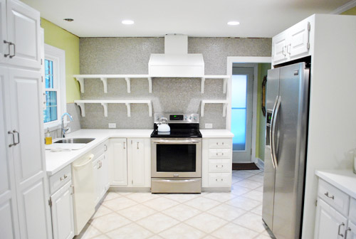
Well, then I had fun doing this (if you’re at work, you can watch this without sound and totally get the gist):
If you check out the video you can see that I can actually reach everything up on those top shelves except for the stuff in the corner by the window, but it’s easy enough to sit on the counter to grab it.
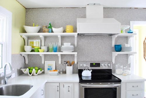
Who knew I’d be able to reach all that stuff? I totally expected to have to scream “Joooooohn” whenever I needed something up there (he’s the chef of the family so that probably wouldn’t have happened very often anyway). Or use a step stool if he’s missing/outside/hiding and I’m really desperate. Haha.
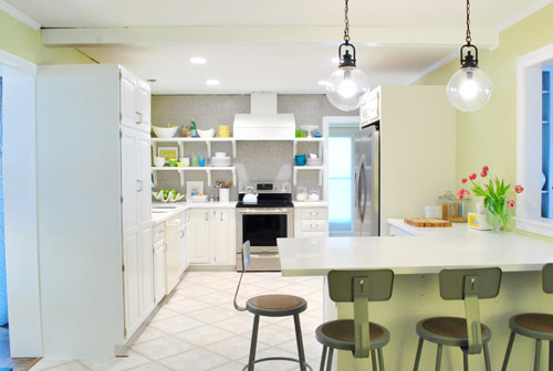
So now our shelves are chock full o’ stuff, and are most definitely still a work in progress, but mighty cheerful and functional all the same…
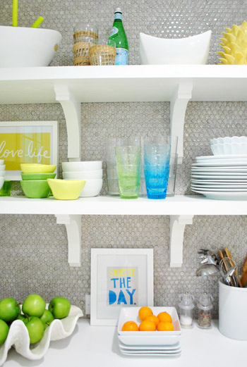
It’s not necessarily where things will stay – just a first pass for sure. I actually have since re-stacked some of the bowls – and plates & dishes have gotten used so things are constantly changing. It really is a completely rotating display. The funny thing is that it’s kind of crazy to “perfectly style” kitchen shelves anyway since it’s all supposed to be used and is always being picked up or washed or put back so I have already declared that I WILL NOT BE CRAZY. And John is holding me to it. Hah. So since nothing is glued down or expected to remain exactly where I placed it OR ELSE, consider this to be just one “take” of many when it comes to our open shelves. I’m sure ceramic animals will worm their way in there somewhere. And I’m sure as we add crown molding and patch the ceiling (at which point everything has to come back down from the shelves) things might get switched up. But that’s half the fun when you’re me.
As you can see from the video, I didn’t give anything too much thought. Sometimes over-thinking can be the bane of your existence when you’re loading up shelves or a bookcase. So it was all sort of first-thought. So for anyone wondering about my method… I actually consciously tried not to think too much and just moved stuff around and stepped back and tried to focus on what I wanted to be easiest to grab and grouping things that made sense (like all the items for setting the dinner table and dessert stuff). I’m sure it’ll evolve and change – and most likely get better and more functional – over time. Here’s hoping, anyway! And you know I’ll take pictures. Lots and lots of pictures.
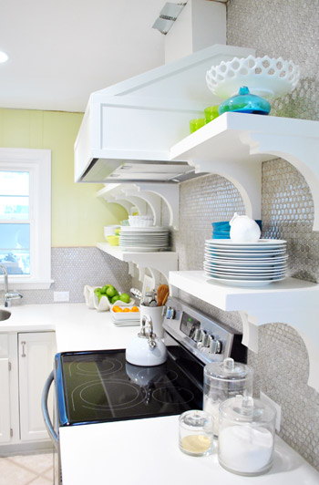
Oh and you can see from the shot above how shallow the brackets are and how deep our 12″ shelves are, so there’s plenty of room for stuff and the brackets don’t interfere with storage or anything. Whew.
But back to filling up those shelves. I tried hard not to think too hard (say that three times fast) but I did think about one thing the whole time I was at it: function. For example, I put our dessert bowls and dessert plates on the bottom right shelf and all of our large dinner dishes and cups and cereal bowls on the bottom left shelf. So those are closest at hand (and just a step or two away from the dishwasher with no cabinet doors to open, so that should be pretty convenient). Then the top shelves got things that we may use less often, but that still might sit out on counters in a kitchen anyway (ex: a cute cake stand, some bigger serving bowls, a vase, a bottle of my mom’s favorite bubbly drink, etc). We figure that even when those items sit in cabinets for a while they can get dusty, so it should be the same difference (a quick rinse and they’re ready to go). We’ll keep you posted on how it all works for sure.
Here’s how the room now looks from the office doorway. Such a difference. Although the not-stainless dishwasher still kills us, but soon enough we should have the new one installed. Oh and I meant to take a shot of the window straight on to show the balance of the shelves that are spaced 14″ from the right of it and the cabinet that’s spaced 14″ to the left of it… but I had a brain fart. Epic picture-taking fail. So that shot’s to come.
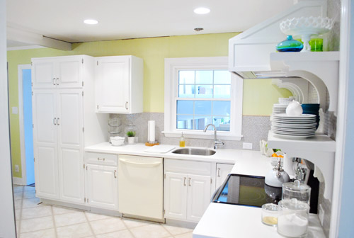
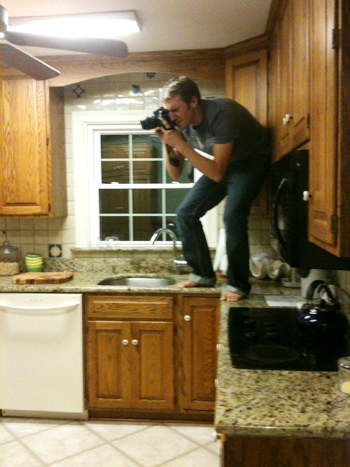
Memory lane time? Sure. The room used to look like this from the office doorway. Kinda crazy, right? I’m totally standing in the exact same spot – not any closer (see the counter cutting off at the bottom of each picture at nearly the same spot?). Isn’t it crazy how much closer the window feels in the picture below?
But let’s get back to the present. Do you hear a harp softly playing in the background or is it just me? Picture me twirling around with my arms out while orchestral music swells and birds come and fly around me holding ribbons in their beaks. Only less graceful and more awkward. And maybe the birds are just Burger and Clara holding toilet paper and spinning around beside me while I grin up at the can lights.
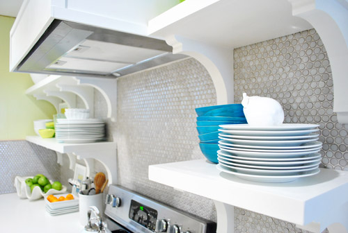
Oh and someone pointed out that we have lots of subtle curves going on with our brackets and our round penny tile and our round pendants. I love happy accidents like that! With more angular things like the range hood and the peninsula, it’s nice to have some softer shapes to complement them. High five for happy accidents.
Now that we have our pretty glass cups out in front of the boring clear ones we actually use them more. And I get to stare at them. Wait, that sounds creepy. I get to gaze at them. Better?
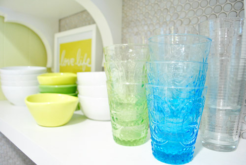
We think the random pops of blue, green, and yellow along with those two frames I stuck up there are fun. It’s definitely not a “magazine after” or anything – more like a gathering of all the stuff we actually use with some pretty decorative things tossed in there for fun. If a magazine blew in I think they’d probably add “more pretty” (flowers, lacquered boxes, candlesticks, etc) in exchange for “less function” (translation: I would love it and John would roll his eyes and say “um, where are all our plates and bowls and cups?”).
Oh and a bunch of folks asked if we considered a third row of shelves up top, but we figured once we loaded up those second shelves the stuff on them would balance with the top of the doorway, so anything above that might have been too heavy/cluttered for us. Plus that stuff would be really hard to reach/use.

And as for where we put the brackets, we wanted them all to be equally spaced on both sides (we looked at three on the left side but they didn’t feel as balanced with the ones on the right as four of them did). And that preferred layout thankfully worked with our studs (nearly all of our screws aligned perfectly and they feel really strong!), so after looking at a few different hanging options/bracket placements (and taping things off to help picture them) we just pulled the trigger and went with our favorite – which we thankfully love just as much in real life!
In short: we are so very happy with our wall o’ tile complete with glorious bracketed shelves full of sunshine and rainbows. Literally, the art actually says “Love Life” (it was the cover of a book that John got me, which I framed) and “Squeeze The Day” (a favorite flier from an old Boden catalog that came in the mail). We know open shelves (or these brackets/wall color/tile/pendants/stools/accessories) might not be everyone’s cup of tea, but we dig it. And the whole photography crew for the book is being very cute about stroking and gazing right along with us (full disclosure: this is one of those things that looks better in person, and even the video completely fails to capture it) so you’ll all just have to come over when we’re done with all of the crazy book chaos. Haha. You can even pour yourself a drink since you know where we keep the cups…

In other news: oh happy day – the tulips are still alive! I keep meaning to drop a penny in the water while Clara’s around so we can watch them perk up. Thanks for all the flower tips guys!
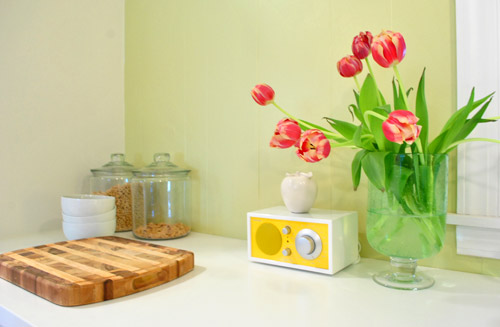
Here’s another shot sans crown molding and a patched ceiling. Oh and there will soon be a pendant hanging down over the sink too. We’re trying to tackle that, just so we don’t have to stare at torn up ceilings for much longer. So yes, it’s definitely a work in progress, but we’re jazz-hands-crazy about how our little “refurbished” kitchen is shaping up. And we’re definitely even more impatient than you guys about the cork floors! Can’t wait to get there and call this turkey done. Hah.
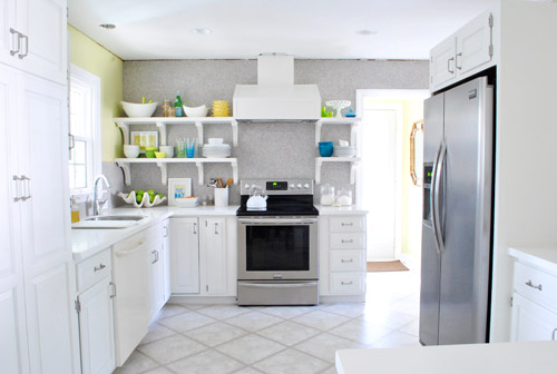
And just because I’m nuts, here’s what I did while playing around in photoshop.
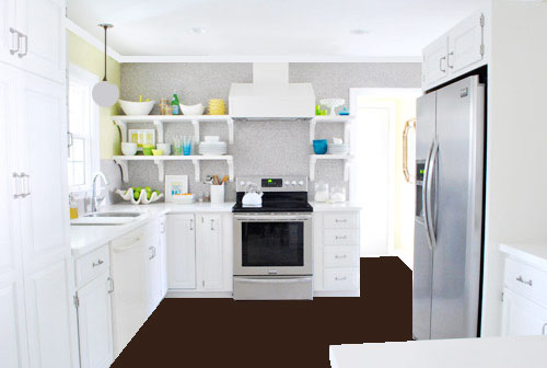
Flat brown paint dumped on the “floor” via photoshop hardly captures all the amazing texture that our marbled cork floors will bring, and the white paint dumped to replicate crown molding hardly looks real (nor does my crazy little made-up pendant over the sink, which will probably be a lot lighter looking and made of clear glass) but it was fun. And if you squint and hum the Dexter theme song, you can almoooooost see it (sidenote: John changed his ringtone from Dexter to the Parks & Recreation song, which saddened me for a nanosecond and then I realized how hilarious the Parks & Rec song is – we even set it to be our alarm tone too, just because it makes waking up extra early for book stuff almost pleasurable tolerable).
So spill it. Who is completely surprised that 5’2″ me can reach nearly everything on those upper shelves? That was a total unexpected bonus. Oh and for those wondering why there isn’t a crew of lovely book photoshoot people wandering in and out of the time lapse video, they have to set up lights for certain shots that take a while so they were shooting in the back bedrooms (and I gave them one of those “I’ll be back in thirty minutes, so hold tight and scream if you need me” things). Thankfully only John wandered in for a sec, so there were no photoshoot emergencies in the middle of my shelf-y fun (I even ducked out to answer some comment questions and take a call about our upcoming Portland gig). So as Martha would say, that’s a good thing. In summary: yay shelves. What have you guys been hanging/filling up with plates and bowls/filming in time lapse lately?
Psst- And now for a post about donuts.
UPDATE: We couldn’t love our open cabinets more. Check out a bracket tweak that we made here and an update post about how they function here here.

Debbie~refreshrestyle says
I love it! You had me hypnotized
Tia says
Love love love!! I literally wrote an email to my Hubbby at work yesterday and said ” let’s paint our cabinets white & have open shelving and do it all this weekend” He promptly asked me to take my temperature… haha!
YoungHouseLove says
LOL. Totally using that one on Sherry next time she makes a crazy request.
-John
Evy says
I think the bracket style goes well with the hood cover and cabinet door style. Nice modern style with a little whimsical touch. Super modern style would make the house feels a bit cold. This kitchen has a good balance. Amazing job! Love the pop of colors against gray tile wall.
Rachel says
I loved the video! I’m 5’2″ myself so I took note of the impressive shelf accessibility right away! I kept waiting for the step stool to come out:). Your kitchen is shaping up beautifully while still living within your means, what a blessing!
Jenny says
This post was AMAZING. My new fave thing on the internet. Love love love how you styled those shelves. What a fun, fresh, awesome kitchen you have. I am hoping for ceramic animals to migrate in here and that made me wonder – did Jarvis get the boot?
I would gaze/stare at those cups too, btw. :)
YoungHouseLove says
Jarvis is dying to get back in there. He’s hiding in the bedroom thanks to book chaos but can’t wait to come back in and be the boss of the kitchen.
xo,
s
Momcat says
I’m loving it!! Extra points for tossing in the “jazz-hands” reference, LOL. Hey next time you dump all that brown paint on the floor & photoshop in the moulding, can you add a silver front onto that dishwasher? It would really match nicely then (wink!!) That would look wicked good!
YoungHouseLove says
Haha- I totally forgot! Next time for sure!
xo,
s
Rhune says
I love it! Makes me want to sit at the counter and yell out my order of bottomless tropical shave ice, and pretend I’m at some open-air Caribbean cafe.
Misha Sandusky says
i LOVE your newly filled shelves. the open shelving in this kitchen is spectacular (as is the entire kitchen!). if we ever have a chance to remodel a kitchen, i hope it will include open shelving. thanks for testing out the shelf height – even at a towering 5′ 3″ i often have to ask my husband for help reaching (every)thing & have little footstools all over our townhouse.
ADORE this blog! misha
Kari says
Looks great! I love it!
That print, “love life” is perfect! Where did you find it?
Keep up the good work guys!
YoungHouseLove says
That’s actually a book cover I just framed!
xo,
s
Nina says
So jealous! Out here in the San Francisco Bay Area, we can’t have open shelves because it’s not earthquake safe. I guess I’ve been trained well: the first thing I thought when I saw your (lovely) finished arrangement was “nooooooooooo! All that glass and ceramic is going to come flying down and hit the baby when the Big One hits!!!”
Oh how nice to live in Richmond!
YoungHouseLove says
Too funny!
xo,
s
erika m says
I wish I could read through all the comments, but unfortunately time isn’t on my side…I love the shelves filled up…it really finished it for me! Think you might paint your laundry room mirror a blue or yellow? I think it would look amazing! my 2 cents:)
YoungHouseLove says
Always a possibility down the line! Just seeing how the rest of the room comes together to see where we end up!
xo,
s
Paula says
I too am anxiously awaiting the cork floor installation. I have 22 boxes of cork that I think we can install and my husband is not so sure. When do you think you will start that project. Do you have to tear out the old floor first? We have two layers to tear out. Dreading that a bit. Hope it all goes smoothly. Really enjoy your blog. We are 56 years old and still enjoy doing projects.
YoungHouseLove says
Sounds like you guys are going to be busy! We can’t rip up our floors since there is an asbestos liner under our vinyl tile so it’ll float over ours. We’ll keep you posted on how it goes! Hoping to tackle it in a week or two!
xo,
s
Heather says
It looks amazing! This is one of the funniest posts I have read in a while. I’m totally obsessed with “your” version of enchanted and need to see it acted out…maybe your next video? Love you guys :)
YoungHouseLove says
Haha, maybe I’ll post that someday… if I get waaay less bashful.
xo,
s
Melanie says
I’ve enjoyed watching your kitchen come together over the last few months, and love how it’s turning out!
My husband and I are getting ready to have a speedy kitchen renovation courtesy of the folks at the DIY Network. We’re going to be on a show called Run My Renovation, and the voting for how our kitchen is going to look is going on now. Kinda scary, but we’re hoping it’ll turn out great! I can safely say that we were not expecting a red, yellow or blue fridge to be in the mix!
Here’s the link if you want to check it out: http://www.diynetwork.com/kitchen/help-us-give-an-old-kitchen-a-cool-new-retro-style/pictures/index.html
YoungHouseLove says
Wow, so exciting! You’ll have to tell us how it goes! Have fun!
xo,
s
Deanna says
Wow! My dh and I have been so amazed by your kitchen transformation! It looks amazing! Enjoy :)
Lesley says
Looks awesome! Did you use your flip to take the video? How do you mak the time lapse from that if hat is what you did?
YoungHouseLove says
We filmed with our Flip and then sped it up using iMovie (it comes free with Macs).
xo,
s
Kelsey says
I also have been sitting on my hands before making any comments about the shelves, but sadly, I’m just not feeling them (but of course it’s your house and if you love ’em then mission accomplished!)
The brackets feel to heavy to me, and are too long vertically. I think if the shelves were true “floating” shelves it would feel more balanced and open.
However, I’m loving the color scheme and the penny tile makes me swoon!
Jenny says
Soooooo nice! Great job. The colorful dishes and cups really tie in the yellow now. Shelves are the best I have seen! Gotta snag those brackets for under my kitchen doorless cupboards.
Kate says
I love the space and I am saying this with love but I keep thinking that the cabinets should have a soffit over them with layered crown detail…they just feel incomplete. I think it would add such a custom look to the cabinets. It could also allow for an alternate color in the kitchen area…like a sherwin williams repose gray so that the tile wall and shelves can shine. The lime is a little distracting from the beauty of the tile. Just one gals opinion though, the most important thing is that you love it.
Kaitlyn says
LOVE IT!!!! And in my opinion, it definitely has that “magazine-after” look/feel. You guys are amazing… can’t wait for the rest of the kitchen updates!
Megan F says
Thumbs up! I was leery when everything was looking so monotone but you’ve won me over, as usual. It was also fun to watch the process of picking and choosing what went where. Great choices- including the music for the video!
Paige says
It looks amazing! The little bits of color are so fun.
And ya know, I didn’t even notice the lack of crown molding until you said something! The shelves are magical.
Casey Moore says
I saw an amazing idea on pinterest! I know you’d appreciate saving a buck or two :)
http://pinterest.com/pin/2040762300676401/
YoungHouseLove says
So smart!
xo,
s
Nichole C. says
It looks SO GREAT! Love the little pops of color with the white. Can’t wait to see the floor install!
Jill-O says
Awesome, just freaking awesome.
Sherry says
Obviously I’m not the 1st person to love or notice your kitchen!!!! Eeeegads! Where have I been??? I saw just a snapshot on Pinterest and had to follow the links back to you. Your dressing of those shelves,the colors, the backsplash…everything is so amazing and bright and cheerful…and…and…
Well, I just love it. I’m sure you’ve heard that before ;)
I didn’t read word for word…I better go check if you have product sources in there. Specifically for the backsplash?
I love your kitchen :)
YoungHouseLove says
Aw thanks Sherry! It’s penny tile that we got on sale from The Tile Shop!
xo,
s
Britt says
I have nothing but glowing opinions on the site, this renovation and your mad shelf-styling skillz, but I’m delurking to send you guys a youtube video so you can sing to John’s new ringtone. Because surely you feel like singing; http://www.youtube.com/watch?v=9LXuAtRwuGY
YoungHouseLove says
Hahahahaha. Hilarious!
xo,
s
Lyn says
Love how your kitchen has come together! This is a real random question, but I’ve been noticing in pictures recently that Sherry’s nails have been painted, which I remember reading at one point was something she didn’t do. Is this for the book pictures? It’s real snazzy!
YoungHouseLove says
Haha, yes! I have so much paint/glue under my nails that for process shots for the book I have to paint my nails to hide it!
xo,
s
shana says
LOVE! I was never so sure about open shelving, but you’ve got me convinced. And the colors…don’t know if I was already on board with that scheme of if just reading you daily has me absorbing that pallet. Just totally dig it.
Kelly says
I recently did a time laps of Chris and I doing our fence! It was a lot of fun. Take a look: <a href=http://youtu.be/GQuT4aDGxKs
Love your open shelves!!!! I can’t wait to move unto our kitchen redo, guess I have to get through my wedding first ;)
YoungHouseLove says
So much fun!
xo,
s
Serena says
Love the shelves! You guys have totally transformed that kitchen! Can’t wait to see how the floors will turn out.
Have to say though, I almost feel like painting those shelves grellow to match your walls would be really fun and exciting… especially since a lot of your plateware is white!
Amber V. says
I accept that this makes me a crazy person.. but the last 30 seconds of that video are sexy. No offense to Shari and the first 2.5 minutes but those close ups are perfection.
The kitchen reno is my favorite project to date, and I have been reading for a loooooooong time.
Well done!
YoungHouseLove says
Haha, thanks!
xo,
s
Rebecca Ort says
Kitchen looks awesome…just beautiful!!! I get so excited to look at your blog everyday to see any new changes!! You have inspired me to re-do our kitchen on a budget…beautiful does not have to be expensive! I will be sure to submit for your reader re-do’s I am soooo inspired!
Sarah says
Looks gawgeous! (That’s how we say “gorgeous” where i’m from in new ‘awlins). The pops of color add so much personality! The entire kitchen transformation so far is really unbelievable. And you can tell even from the photoshop doodle that the dark floors are going to be such a game-changer! I think they’re going to add lots of warmth and richness to the already amazing room! Keep it up, S&J!
Stefani says
It looks fabulous!! And I can’t believe you got that milk glass piece for $3!! I have the exact same piece in my collection and thought that $18 at the antique store was a good deal!!
YoungHouseLove says
No way! It has a tiny crack on the back rim so maybe that’s why it was marked down?
xo,
s
Hayley says
Nice! Your kitchen is looking super spiffy!
I know this post is about the shelves, which look great by the way, but I just had a thought about those bar stools. Not sure if you’ve already mentioned this or not, but are you able to unscrew the seat from the bottom? THAT would be cool, then you could cover them with different fabrics and pop them right back on.
Anyway, I wish I had even half of the energy you two seem to have.
Keep up the good work!
YoungHouseLove says
Oh yes, we’re definitely considering that along with a new color- just waiting for the floors to go in before making any changes since it’ll change the look of the room so much!
xo,
s
Rachael says
I also can’t find the song. The band only has 4 songs on their page, and Brand New Love isn’t one of them. They also only have the same 4 songs on itunes. Must… have… music…. :-) If you happen to find it, could you post a link?
YoungHouseLove says
Here’s where we found it! http://www.jamendo.com/en/album/98504
-John
Rachael says
thank you thank you thank you!!!
anna says
it’s funny – i didn’t expect to like the brackets, and i don’t particularly like them in the full-kitchen shots, but they do look kind of cute in the close-ups, and really, that’s probably more what you’re seeing, anyway. ;) possibly helps that i *love* the colours – white-green-blue-yellow is my favourite colour combo EVER! :D
Michelle says
Ahhh I think the dark floors and adding the trim is going to be the icing on the cake…looks great!
Wrenaria says
Lovely! It hit me for the first time while looking at this post that with two very curious bengal cats that love to get into EVERYTHING, I will probably never have the option of having open shelving. It would be a disaster.
Love all the pops of blue and green and yellow. So fun!
Julia says
Love it! I am totally digging the turquoise/apple green/grellow color scheme. I do think, however, more than ever those stools are screaming, for the love! PLEASE spray paint us grellow!! (Or maybe a greenish/grayish/yellowish? Greenellow?
YoungHouseLove says
Haha- we’re definitely open to altering them once we have the cork floors down and can really see how the finished room will look (an entire plane of rich dark brown will definitely be a game changer!).
xo,
s
Mallory says
I’m such a sucker for open shelving so I might as well chime in with a “LOVE IT!” Also, looking forward to seeing you at the Portland Home and Garden Show! I’ll be the giddy 5’0 girl showing you the photos of my little dachshund, Bella…she was one of Burger’s bachelorettes :) So, there you go..I just outed myself. Haha.
YoungHouseLove says
Haha- we were just talking about Burge’s bachelorettes today with the photography crew! So funny you brought that up!
xo,
s
stephanie says
Hi guys-
I Have been away from a computer all day and was dying to get home to check out the shelves all full of your cute dishes. Seriously it looks AMAZING! I am drooling at the photos. I have made them as big is i can just to check out every detail. LOVE those colors. THat is one happy kitchen!
YoungHouseLove says
Aw, you’re sweet! Thanks Stephanie!
xo,
s
Irene says
Absolutely love the open shelves, although part of me now screams “not earthquake proof!” at the sight- I live in Christchurch, NZ and our rather frequent earthquakes over the last year have both destroyed any open shelf plans of my own, as well as significantly editing my ‘pretty decorative things’ collection to display. Great to be able to live vicariously through your pics :)
YoungHouseLove says
Aw man, so sorry about that Irene! Keep those dishes and ceramic animals safe!
xo,
s
Abby says
Wow, I’m a little shocked at how negative some people are…People, it’s not your house! Lol. I think people are just looking at the flat, far away, two dimensional look of the first couple photographs. I, too, was wondering what y’all were thinking with the first bracket post but the close ups sold me. The curves, the “architectural” details. I bet they’re sexy in person. I’m enjoying the process, whether I agree with all the decisions or not. How boring would it be if everyone loved all the same things, right? One day I hope to have a white kitchen, and y’all have definitely given me courage to try painting dark wood cabinets! Can’t wait for the floors to go in (and the dishwasher to change haha)!
Ashley @ DesignBuildLove says
kitchen turned out phenomenal guys! Absolutely LOVE the colors!!!
Haley says
That time lapse video is awesome and the kitchen looks so good! I’m very very impressed
YoungHouseLove says
Thanks so much Haley!
xo,
s
Anne F. says
I watched the video at work with no sound and was mentally playing yakety sax in my head. It was highly entertaining, to say the least.
I love how the dishes you guys picked out magically go with your grellow and totally pop against the grey and white background. And I can totally relate about the staring and admiring the new display. I do it too, and sometimes feel like a creeper. It all looks so nice AND functional. Kudos to you guys for managing this despite the current household madness!
Dacia @ Lemon Drop Life says
Ha, I love that song you guys chose for the video! I can totally picture Sherry cuddled up to the shelves, singing it to them at the top of her lungs! They look awesome, guys!!
Drew @ Epicfinances.com says
I think the idea of changing up the floor is a good one. Be sure to photoshop in the actual floor tile color and look before installation though!