Remember when we took Ed The Bed’s top rails off and mentioned needing some finials to finish things off? That’s where a finial fashion show comes in. Yup, I’m nerdy like that. I ran out to Home Depot and Lowe’s where I bought these four options and I gave them all a spin on Ed to see which ones we liked best. Here’s the spread:
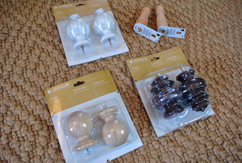
The long wood “finials” on the top right were actually chair legs from Lowe’s, but I just wanted to see if something long and lean was the way to go. And you know we like to use “weird” things as other things. So legs as finials wasn’t that much of a stretch for us. Unfortunately once John suggested that they resembled “man parts” I just couldn’t get past it. What can I say, the idea of sleeping under four willies gave me the willies. So they were instantly eliminated before even partaking in the fashion show fun.
But here are the other three options in place atop one of Ed’s posts. The first option was a set of round finials from Home Depot that were actually meant for curtains rods, but the attached screws at the base of each one slipped right into the predrilled holes in the top of Ed’s posts.
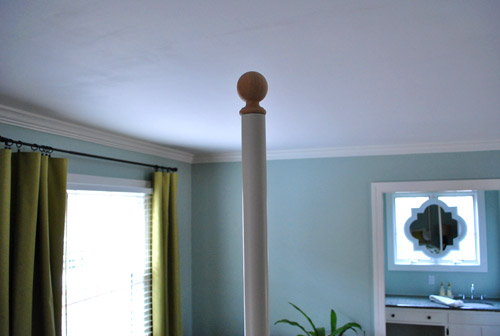
They definitely could work (especially if we painted them white to match Ed), but I thought the basic round ball sort of looked like the top of a banister. You know, kinda “builder.” So although it mimicked the shape of our big dandelion-esque light and most definitely wouldn’t “not work,” we weren’t 100% over the moon about them either. Just because they felt like we got banister tops from the home improvement store and tried to play them off as four-poster finials.
These ornate curtain finials (also from HD) felt very heavy, formal, and almost pineapple-ish:
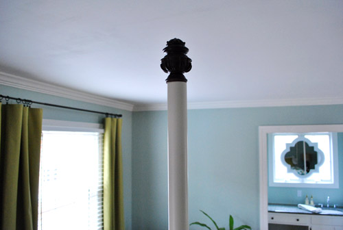
The reason we picked these up to begin with (since you might think they would never work with the modern lines of Ed the Bed) was because we plan to bring in a curvy antique-ish dresser to play off of the more modern chandelier. So we wanted to see if the clean lines of the bed would actually work with something a little formal on top. Of course the dark color threw us off, but painted white we actually thought they’d work. Especially because they sort of tied into the shape of our mirror above the sink in the background too.
These last curtain finials (also from HD) are kind of the compromise between the builder basic round ones and the super ornate formal ones:
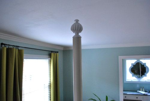
And they were already white (although not a perfect match) so it helped us visualize how they’d work without much effort. We liked how they still had round orbs within them (which subtly mimicked the light fixture) but they also had a semi-old-ish vibe going on, so they would tie Ed into a curvy and ornate leggy dresser if we ever get a hold of one of those (we’ve been stalking Craigslist like crazy).
When we stepped back, we knew we had a winner. They just felt the best to us after studying them all in person for a while and weighing our options. Here they are from afar:
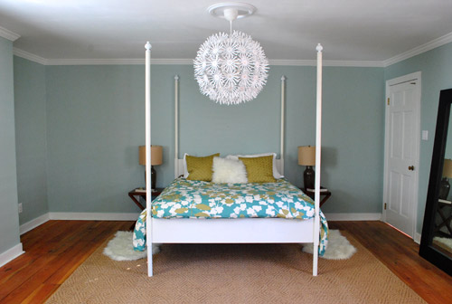
It’s like they were made for Ed. Psst- Remember we’re contemplating a bedside lamp & night stand upgrade, we’re just working with those for now since we have ’em. So we packed up the other finials and back to the store they went. Thankfully I was able to slip one finial out of the top of the packaging without cutting or unstapling anything, which means I could slide each one back in and return them in perfect condition. In fact I remembered to take the picture of them in their packaging after putting each finial back in, so you can see how “mint” they looked. Yes, I’m actually proud of ridiculously random things like that.
Oh but actually adhering the finials was another little challenge. They each had screws that slid right into the predrilled hole on the top of each of Ed’s posts, but the hole was a smidge too wide for the screw (so they teetered ever so slightly if the post was jostled). And getting the screw out of the finials and replacing it with something thicker that might have fit Ed’s holes seemed like it might take a while. So being the impatient girl that I am, I decided we should try using a ball of poster putty to squeeze the screw through and beef things up, thereby creating a sticky-gum-like effect to hopefully hold things more securaly.
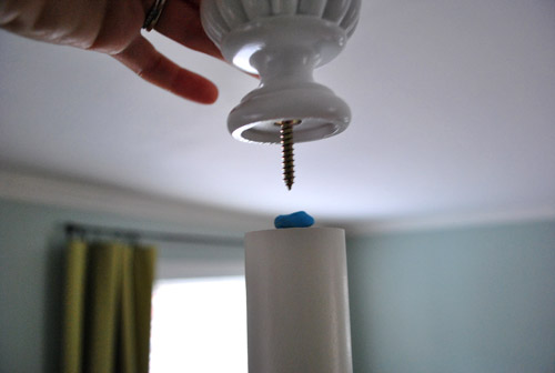
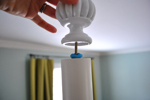
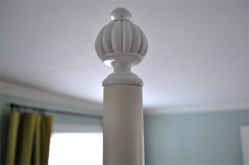
And holy cow it worked. The finials didn’t waver back and forth anymore, they were stuck in place for good. Except not really for good, which is good. If we ever change our minds, since poster putty is easily un-stuck, it’ll just take a few firm pulls on each finial to remove them without any permanent damage to Ed or the finials themselves.
So there you have it. The easiest and most reversible Ikea Hack ever. Haha. Oh wait- and yes, we still have to paint the finials to match Ed because they’re not exactly the same tone of white, so I’ll just bring home a bunch of paint swatches to see which one looks most like the paint on the posts and then I’ll just get a test pot of it for a few bucks and paint the finials for a more seamless look.
Wait, did you think that was the end of the post? Well… (cue the confetti)… we still have some art to discuss. We gave the ram and two thrift store finds a spin above our bed (I know not everyone would want to wake up under a ceramic ram head but it’s totally my idea of a good time). But – sad face – we’re thinking they’re probably too dinky for that spot.
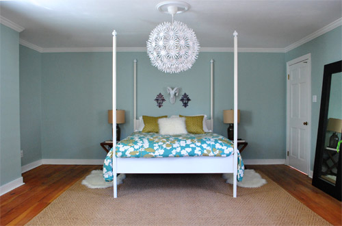
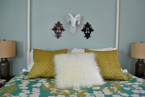
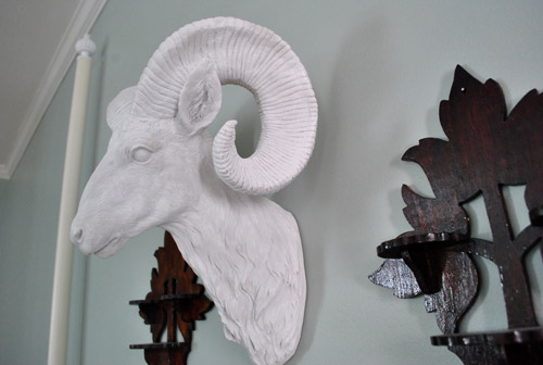
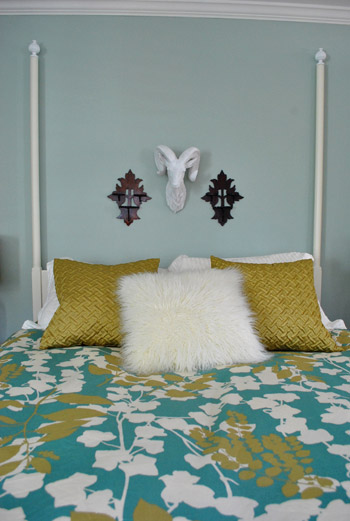
Maybe once we add all the missing furniture and other art into the room they’ll feel a bit less teensy, but for now we’re not sold. But I like waking up under a ram so they’re still hanging there. We’re thinking about some giant canvas art or something for that spot down the road. Who knows where we’ll end up though.
Oh and here’s one of my favorite corners of the room that we realize hasn’t been pictured in a while.
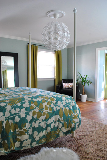
How sweet does that chair and those curtains look through those finial topped posts? I love gazing at it sleepily in the morning. When I’m not smiling up at my ram friend of course.

Amanda says
Love the room! Especially love the video of Burger. My sister’s Jack Russell does the same exact thing. If there’s any kind of blanket, he has to burrow his way underneath it!
bryn alexandra interiors says
I have to be honest – I don’t love the finials. It makes the contemporary, modern bed look dated.
I recently came across an image and thought of your bed. It was your same Edland bed with the rails taken off, but the tops 5″ or so of the posts were painted a cool color. In your case, I would do the lime green color that is in your room. I think this would create a finished look while keeping the modern lines of the bed. Just throwing it out there.
Now if only I could find that picture to show you!!
bryn alexandra interiors says
Okay good news! I found the picture:
http://tinyurl.com/4cj3w6x
YoungHouseLove says
Uh oh I really like that.
xo,
s
bryn alexandra interiors says
You should totally do it!! It would look great, especially with a bit of color :) :)
Amy says
Oooo, I really like that too! Alas, I could never have a four-poster bed. Our bedroom is basically in the attic and has uber-low ceilings. Boo!
YoungHouseLove says
I know right? This is seriously making me rethink things. But that room is really neutral so I wonder if a contrasting color up there would be too much with our loud chandelier and colorful bedding and bright curtains. Hmm.
xo,
s
Elizabeth says
Hmmm…I’m thinking I actually like this better than the finials. They seem to be competing with the light.
Rebecca @ the lil house that could says
Hm maybe if you do an oil rubbed bronze type of color rather than the green it wouldn’t compete with everything else going on and would instead accentuate the lines of the bed? Sort of like the “mascara” for the windows with your curtain rods :)
YoungHouseLove says
This is true! We’ll have to pay around with some bronze paper to see how it looks before committing!
xo,
s
samantha owens says
oooo i love this!! give it a whirl with the paper, let’s see if it competes with the softness of your room. maybe this could be the ‘eyeliner’ to your bed :)
Paige says
uh oh. I really like this too!!!! definitely keeps in line with Ed’s modern figure.
LOVE it.
Jen says
L.O.V.E. this idea! I was sad when the rails came down and am not really feeling the finials (not yet, at least), but this I think gives the open and airy feel while “finishing” the top of the bed and keeping the more modern feel. You could do a dark brown color to tie in the other dark elements in the room. I don’t think something like that would compete or be too busy.
YoungHouseLove says
We’re definitely game to give it the ol’ college try!
xo,
s
Amanda says
ohhhh I LOVE this! I liked the bed better before the haircut but this picture is changing my mind!
KathyG says
OH Yeah! Painting the top of those rails is the ticket!
Donita says
LOVE the finial’s. Those were my choice, the minute I saw all of the options. ;-) They look great on your bed. What kind of lamps and stands are you thinking?
P.S. I can just see above your bed, that picture *or one like it* of the pears that you painted for Clara’s room. If you did them the same color as the gold in the comforter. Just a suggestion. I’m sure you have something amazing cooking up. :-)
YoungHouseLove says
Not sure about the lamps or nightstands but we’d love something with a drawer and maybe something leggier and more antique. Who know what we’ll find! We’re definitely planning to hit up some yard sales soon.
xo,
s
Shelley says
Looks so much better without the top rails. Those kinds of beds look good if you don’t have to live with them. Now it looks airy instead of like a tent. I vote for just the ram head without the other stuff around it. I think it is too chachki with all 3. It might look small, but break a rule once in a while.
Sarah says
Love the video–My 18 mon old son watched it, and he said, “Uh oh” several times. I think he was expecting Burger to come back out. lol. Then he said, “No no dog.” ha ha! Thanks for the toddler entertainment, along w/ fun things for the mama to look at/be inspired by! :)
YoungHouseLove says
Hahaha, love it! Clara wakes up saying “doggie – burger – doggie – burger” like she immediately wants us to get her from her crib so we can go look for the dog. Haha.
xo,
s
Melissa @ HOUSEography says
The finials look really good. Sadly, I also thought the others looked like man parts. I did a double take when I looked at the picture! What about some thick molding around the ensemble to beef (goat?) it up a bit?
YoungHouseLove says
That’s definitely a possibility!
xo,
s
Bri says
Your room is coming along nicely! Can’t wait to see what you do with the antique-y dresser. I’ve been scouring craigslist for the past few months trying to find one that wasn’t so pretty I felt bad for refinishing it but still actual wood. And Burger is an adorable little punk. I watched the video twice, laughing at his scooching method under the covers. I’m just glad my dog doesn’t do that (he’s a VERY furry 70 pounds, I’d have to wash the bedding every day…) :) Love you guys, keep up the great work!
susan says
Finials yes, art no. Something larger like the framed colors over your sofa. Loved the pic across the room of the curtains and corner. susan
Claire says
Love that Burger!!
Kate says
Can you tell me where oh where you found the finials at HD?!? I’ve gone there several different times now looking for finials like that to top off our headboard (it’s a black metal pipe headboard that I got for $5 at the thrift store, but it has blank, empty tops since it obviously at one time had something connected to the ends that it no longer there). What department/area were they in? What is their name? I’ve tried asking at HD and they have no clue.
YoungHouseLove says
They’re in the curtain department (they’re meant to be added to curtain rods). And you can see what the packaging looks like in that first pic. Hope it helps!
xo,
s
Dugi says
I’m loving the colours. The new rug is heaps nice. But the sheep skins on either side of the bed….well ..err guys, please explain?
I would have liked to keep the four poster bed as it was and add a Bali style sheer curtains….but with teh new pendant light and everything I think you guys were right to remove the bars.
YoungHouseLove says
That’s just a personal preference thing. Stepping out onto something soft just makes us happy. But we do have more of an appetite for faux sheepskins than the average bear.
xo,
s
Jessica says
Great choice on the finials and I agree with a giant canvas above the bed. Maybe get some acrylics, paint the background a solid color (like the green from your bedspread) and give Clara some slightly different tones of the same color and let her go to town?
YoungHouseLove says
Wahoo! I love kid art!
xo,
s
Kara Sullivan says
Love your curtains. They would go perfectly in my living room. Where are they from?
YoungHouseLove says
We made those. Here’s that post for ya: https://www.younghouselove.com/2011/01/look-how-domestic-my-wife-is/
xo,
s
Paulina J! says
“The idea of sleeping under four willies gave me the willies” LOL!! I almost lost my Scottish Oats on that one! Thanks for the laugh and sharing Burger with us!
Cassie says
Hmmm… I think the finials make your bed look like the Taj Mahal. Hahaha!
YoungHouseLove says
Isn’t that a romantic place? Haha. Maybe it fits. I think the mirror above the sink looks Taj Mahal-ish too. Haha.
xo,
s
Sara says
Haha, I was thinking the exact same thing on the shape of the finials! It reminded me of the tops of some of the palaces in Russia or somewhere far away. It’s like being on vacation everytime you step into the room!
Wom-mom Ethne says
I do love your room, ‘cept the ram’s head! Tho I did hang a buffalo skull above my couch one time (it’s in the entryway now – didn’t want to scare our little ones). If you have to have the ram over your bed, you should name him!
http://www.wom-mom.com
YoungHouseLove says
We’ve called him Ramsy a few times. Maybe it’ll stick. You’re right that you should know the name of “people” you sleep with.
xo,
s
Laura@JourneyChic says
The photo of the second finial looks like a weird silhouette, hah! I really like the ones you chose, and can’t wait to see how you mix modern with antique.
Mindy@FindingSilverLinings says
Sherry,
You are hysterical! I spit my coffee out because you don’t wanna sleep under “willies”!! I’m dying!
Aaaanyway, I think the size of the above the bed decorations is good. If those things were any bigger, it would take away from the light or make it look like there was too much going on in one space.
You guys crack me up! LOL!
xo
Mindy
Sarbear says
Oh my gosh how I love Burger. Chihuahuas have to be the best ever. I admit being a bit biased.
Allison says
Oh yes, those finials definitely make it more polished and complete. I always get excited when there’s a YHL fashion show going on!
Megan S. says
You made my kids day with the Burger video, lol!
I suspect I will be replaying those 20 seconds many times throughout the day today, they get a kick out of him.
In the meantime, they will passing along a petition titled “Bring Burger’s Blog Back” ;)
Your home is coming together beautifully!
Caitlin says
Love that you took the top rails off..also the mirror in your bathroom over the window almost looks like stained glass in the photo. =)
Susan says
Sherry, great finial choice! Burger is hilarious!
Stephanie says
HA! My cat pulls a “Burger” when it’s cold out (or when he just wants to get away from us. Though, he barely messes up the bed (one of these days, we’re going to sit on him, I swear!).
Josh says
Looks great. I like the ram head. I had an idea, what if you put an ornate picture frame around him that is just the frame, no mat or glass, that would sort of make the ram’s head look like a portrait in the frame? It might make the whole thing look a bit larger and could also help play up the older feel of the room. Just an idea I thought I’d share.
I really like the Young House Love blog. I think it’s your writing that makes it the best, keeps people interested.
Thanks.
YoungHouseLove says
LOVE THAT IDEA so much!
xo,
s
Melissa T says
Haha! I almost spit out my coffee when I read about the “man part” finials and then looked at the picture again! Love the ones you guys chose!
Marilyn says
I really like what you have done with the bedroom. If you like the bed without the finials, maybe you could do a metallic look on the top section instead of painting a color. You know how they cap contemporary pieces of furniture with metal.
YoungHouseLove says
Bryn actually shared a link to someone who did that and it looked awesome! We just worry with all the other things going on in our room (the colorful duvet, the giant light, the bright curtains, the large moorish mirror) that a contrasting color on the top might be too crazy. Hmm.
xo,
s
bryn alexandra interiors says
Sherry,
I don’t think it’d be competing at all, especially with that huge, graphic lantern. It will visually add balance with the large lantern (in my opinion).
I’m also obsessed with themes of three to help balance a room. In this case 1-green curtains, 2-green throw pillows 3-green caps in a (somewhat) visual triangle.
Just my two cents :)
YoungHouseLove says
We’ll definitely think about it! We could even try it out with colored paper bands taped around the finials to “test drive” it since John is really anti anything permanent! My only fear is that it’ll compete more with everything else, but who knows, we might love it even more than our fashion show winning finials!
xo,
s
kelly says
Finials were needed, they make the bed look complete. But, I sort of like the second example for the finials better (painted white of course) they are a bit more substantial and their shape ties in with the shape of the window mirror.
CasaCullen says
just for the record…BURGER CRACKS ME UP!!!
he’s the funniest lil’ muffin head! :)
Jennifer says
Instead of hanging something over the bed, hanging large mirrors or other art over the bedside tables would look nice.
Erin says
This post could not have come at a better time! I recently re-painted an old bed for our guest room that is missing all but one finial. I’ve been struggling with what to replace them with, especially because (pardon my thats what she said moment) none of the finials that I bought seemed to fit in the hole.
Thanks so much for the tip–love your blog, and those finials look great!
Leanne says
that’s TUURR–IBLE! oh Burger!
And i was totally thinking on a puddy like substance as i was reading about the finials!
But i must say… The goat head is just kind of wierd! Maybe you could put some sort of microphone device in it and spook Burger when he’s trying to be mischievious! Of course you would have to also have a hidded camera for the response ;)
Allison says
Oh and this has nothing to do with your bedroom, but I heard on NPR yesterday that there’s a special health insurance tax write-off just for 2010 for self-employed persons. I’m sure you already know about it since you use an accountant, but wanted to pass it along just in case!
http://taxes.about.com/od/deductionscredits/qt/healthinsurance.htm
YoungHouseLove says
Wahoo! Thanks so much! Off to call the accountant!
xo,
s
Leanne says
P.S…. those top right finials are waaay too funny.. and a little inappropriate! sorry i can’t stop laughing at them!!!!
Paige says
hahahaha oh man–I had to look back at the first picture after you said “man parts”…it TOTALLY does. wow.
I personally liked all 3 finials that you picked out–I thought they all looked good, but I can see why you chose the last ones. I think it will tie in nicely to some antique dresser (which I’m SUPER stoked about seeing whenever you snatch one up!).
I personally love that you took the top beams off Ed. I think it opens up the bed to the ceiling and kinda makes me want to do a deep inhale/exhale “whew!” thing. It also allows for the crazy awesome light fixture to really do her thang, and light stuff up!
I was hoping the RAM would work, but alas, it does seem too small…but I think I would enjoy looking up at him in the morning!
aaaaaaaaand the Burger video was hysterical! what a funny guy.
really enjoyable post. hope the nonsensical debate about the definition of “art” desists.
Joy says
Loved the Burger video. You continue to keep things real.
– Joy
Angela says
Absolutely hilarious about the “man parts”!!! I have to admit I liked the bed better with the rails…
ginai says
oooh the finals look great there, I love the white ones, look like they were meant to always be!
But of course as you know, I LOVE ALL THAT YA’LL DO!!!!
and Burger….. LOL he is soo cute! I swear I know ppl that would just die about letting a dog in the bed, but I have done it too… not now because my dog is way too big, but burger is little and that makes for ok. ((:
I love yall!
ginai
Kiran says
OMG! That small change makes a whole load of great difference! Now, give me that bed ;)
YoungHouseLove says
You can’t have it! We can’t bear the thought of sleeping on the floor again! Haha.
xo,
s
Funnelcloud Rachel says
Love the Burger video – he’s like a mole tunneling around in there! I grew up with a dachshund who did the same thing. Now we have an 85 pound greyhound and a 75 pound coonhound – they aren’t allowed in the bed!
Also, cracked up at the “man part” finials – I wish you had tested them out on Ed the Bed just for laughs!
YoungHouseLove says
Haha, how have we never made the mole analogy before with Burger? He’s totally our little mole! Always tunneling and burrowing!
xo,
s
Snickrsnack Katie says
I just can’t express how much better I think that room looks without the top of the bed there. Once you took those rails down, and now with the finials, it looks SO amazing. I detested that light fixture at first but just adore it now. It is amazing how one simple change could make the world of difference!
Snickrsnack Katie says
And yes, John is right. Those feet for finials totally look like weiners.
Cindy says
So let me get this straight:
sleeping under a ram = okay
sleeping under four willies = not okay
LOL Finials look great. I’m not a fan of the ram/sconce setup either. xo
YoungHouseLove says
Hahah. Exaaaactly! You get me.
xo,
s
Sharon in NYC says
I’m sure you covered this before I discovered your blog, but where did you get the duvet cover in the master bedroom? (Finials look fab, btw. I was sad to see the rails go but the finials make up for it. Nice!)
YoungHouseLove says
It’s from West Elm about three months back. Hope it helps!
xo,
s
Danielle @ The Sunshine Girl says
That video is too cute! Gotta love four legged babies!
And I love the finials too! I missed the post where you took the top rails off but I like the new look!
Oona says
I think the finials are great. Ed looked fine without them, but it’s definitely more YHL with the finials.
BTW, that exchange with Bob was hilarious.
Lindsay says
You guys crack me up! The finials that looked like “man parts”…to funny!
I love the new things you have going on. I think everything is turning out lovely. And you gotta love Burger going back to bed…so sneaky!
Rachael says
Of the three finial options, I definitely like the white ones the best! I do love your chair corner, it looks like an inviting place to read!
Also, you have a very strange dog! :)
Shannon says
Can’t say that I love anything except the video of Burger.
The finals make the bed look cheap and clash with the light fixture and as you said, the ram looks dinky.
Something like fabric stretched across the “head” two posts would create a pretty neat “headboard” look, without just using art, art above the bed just seems so…already done, if you know what I mean.
Instead of round-esque finials, what about larger squares on the top of the bed? or something in another material…metal? I think it should stay clean lined. But, it’s not my house, so just my two cents!
YoungHouseLove says
Check out the link below that Bryn submitted with a similar finial suggestion! I love it! Might take it for a spin. Not sure yet…
xo,
s
Deb says
Just wanted to say…LOVE the ART :) so there. Oh and Penny loves the ART as well. Keep up the great work guys!
Stephanie Phillips says
I love the ART as well!