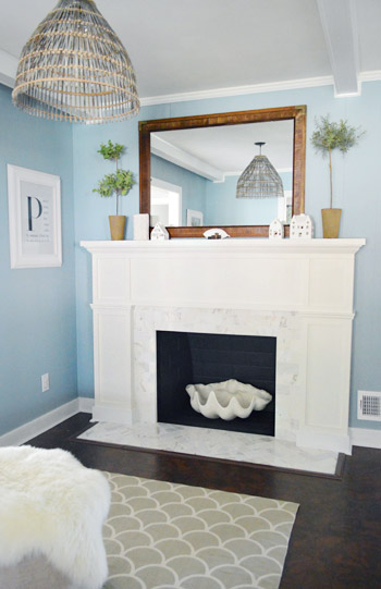
We can officially stick a fork in it, guys. Well, Sherry actually stuck an oversized fauz clam shell in it, but that’s doesn’t roll off the tongue quite as well. Either way, the fireplace makeover is complete.
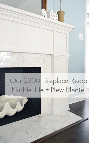
To back up a smidge, you saw us devise a plan for this little refacing makeover, add some marble subway tile and then build out around it. Reminder: fireplace code is different in every area (and requirements vary if it’s wood burning or if it has a gas insert, etc) so it’s a good idea to check that before going nuts on your fireplace.
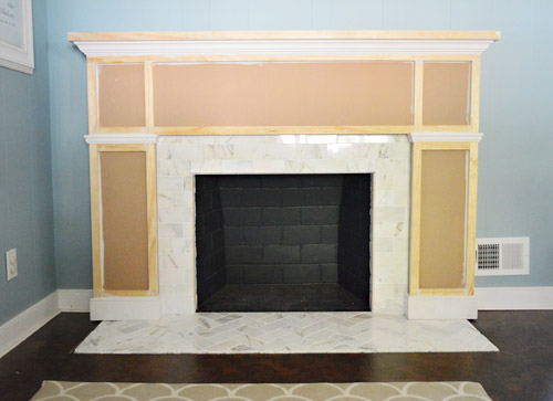
Our fireplace is non-working (we’d love to add a gas insert and even double-side it down the road) but for this phase of the process all that was left was to add some primer and paint.
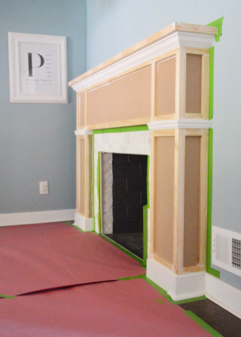
I’ll spare you the play-by-play of the painting process because it wasn’t all that exciting. First we primed (using what we already had on hand) then painted the whole thing with Benjamin Moore’s Cloud Cover since it’s what’s on the nearby cabinets (and because we had some leftover). After that we did some touch-ups, like giving the firebox itself a fresh coat of its original color (Benjamin Moore’s Temptation) Note: use fireplace-approved high heat paint if you have a working fireplace.
And after giving it a couple of days to “cure” we put everything back so that we could call this puppy complete. And it’s a puppy that I kind of want to curl up with (yes, Sherry pets it).
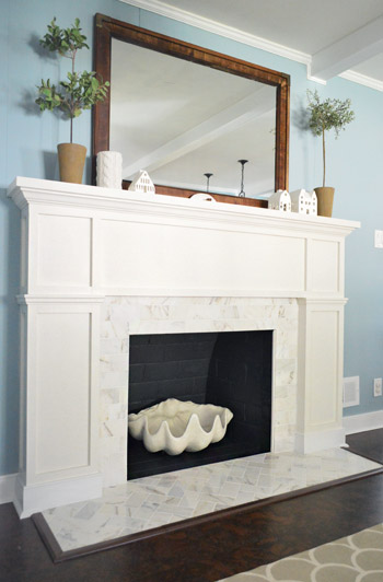
Update: A few folks are asking if we considered widening the tiled heath to match the width of the built-out sides of the fireplace – we did, but since it’s just a bit of shoe molding (which also extends around all of our cabinets) it didn’t bother us enough to rip up cork to make it happen. Perhaps down the line we’ll paint the brown floor trim white to make it appear wider if it bothers us :)
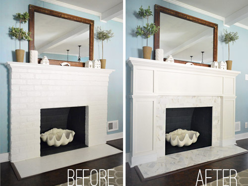
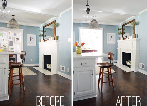
Here’s an obligatory before and after for ya:
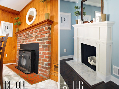
But I much prefer this one, which shows what the fireplace looked like when we bought our house back in 2010…
Since the painting step didn’t cost us any extra money (we used supplies that we already owned), the total cost for the project is just the addition of the two budgets we’ve already shared (tiling was $99 and building out was $98.75) but here’s the full breakdown:
- Cement board (2 sheets): $16
- Masonry screws: already owned
- Liquid Nails Heavy Duty: $2
- Subway tile: $5.50/sq ft, totaling $70
- Thinset: already owned
- Tiling tools (saw, trowel, float, etc): already owned
- Grout: $11
- Tile sealer: already owned
- MDF frame: $35
- Mantle top: $17
- Crown, baseboard, & decorative trim: $22.75
- 1 x 2″ boxes: $24
- TOTAL: $197.75 (* thanks to holiday gift cards from the family we only spent $147.75 – but without gift cards or already owned supplies this might be a $250 upgrade)
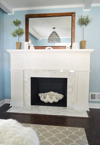
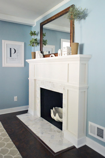
Definitely not our cheapest project, but we love it. The herringbone marble tile and the tailored built-out surround looks pretty darn expensive (at least in our humble opinion). We’ve never had a tiled fireplace so we suddenly feel very swanky indeed. Perchance I’ll start sporting an ascot.
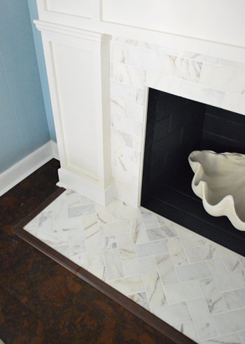
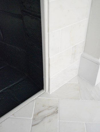
Some of you were curious about how we concealed the exposed edge of the cement board around the firebox. We just used a piece of trim that we had in our scrap pile (it’s slightly rounded on both sides). Before grouting we glued it in place to provide a clean edge to grout up against and now it’s painted to match everything else. Obviously for a functioning wood-burning fireplace that’s no bueno, so you’d probably want to use something like this. And if we ever convert our fireplace to a wood-burning one (which is unlikely since it would require a ton of chimney work) we’ll just pop out the wood trim and install tile edge pieces.
Now back to the gratuitous after shots.
Ok, one more and we’re done.
Just this guy and I’m out.
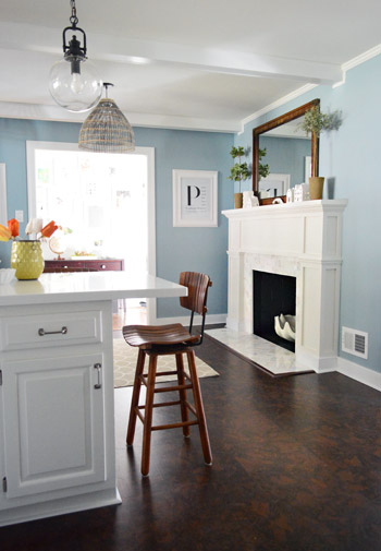
Oh wait, here’s a good comparison shot that shows how the original fireplace was pretty thin and even a little top-heavy, while the new chunkier tiled-and-framed-out version feels more “focal-point-ish.” In person has even more dimension (unfortunately photos of a white-ish surround with white-ish tile don’t depict all the texture and interest that they have in real life).
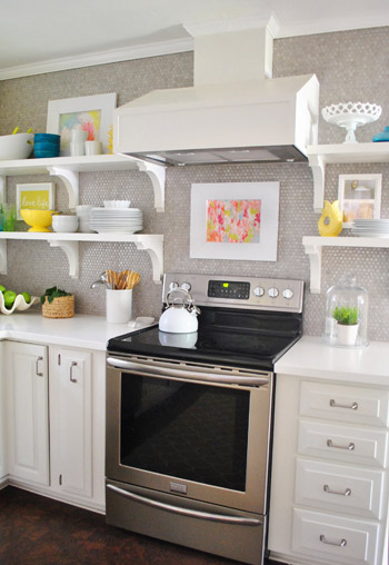
But perhaps best of all, our wall of penny tile on the other side of the room no longer feels like it’s “the fancy wall” while the rest of the kitchen struggles to keep up. The herringbone marble fireplace finally gives the penny tile a run for its money, in the best possible way. According to Sherry “it’s a swank-off in our kitchen.” Fireplace vs. wall o’ penny tile. Who will win? It’s anyone’s guess. (Spoiler alert: Sherry says the wall of penny tile wins because she pets it slightly more than the marble but it’s very close.)
So that’s the end of our little fireplace update. We’re really glad to have it done and are looking forward to some porch and carport updates. So come on end-of-March snow, give it a rest so we can get outside and start working! What are you guys doing? Any tiling, mantel building, priming, or painting? What about placing giant clam shells around the house? Any of that going on? That’s all in a days work for my lady.
P.S. If you want to read about this makeover from the beginning, check out our planning process, how we tiled and how we built out the wood frame around it.
Update – Wanna know where we got something in our house or what paint colors we used? Just click on this button:


Eve says
Very classy indeed! Looks excellent. Reminds me of the tiled surrounds and wood mantels in the vintage Art Deco brownstones near my college apartment (my friend scored one such apartment a few years after graduation and I was always in awe). :)
GreekWife says
Did you guys consider expanding the footprint of the tile to come out even to the edge of the new fireplace?
YoungHouseLove says
We did but since it’s just shoe molding (which also extends around all of our cabinets) it didn’t bother us enough to rip up cork to make it happen :)
xo
s
Tracy says
I love when you guys do something and it looks like it’s always been that way. The fireplace looks complete. If there wasn’t a before I would think “Well of course the fireplace looks that way!”
YoungHouseLove says
Aw thanks Tracy!
xo
s
EB says
hi there! Looks awesome! Question for you – any tips on using caulk to seal those gaps when the trim/baseboard is wood/stained and not painted? Im just discovering the wonders of this technique! Thanks!
YoungHouseLove says
Hmm, I think you would have to use wood filler since caulk would be visible if you stained the wood. Anyone have tips for EB?!
xo
s
Tracy H. says
Love the new fireplace. Awesome! But I just can’t get enough of the blue! If you would have said something ahead of time, I would have thought “Blue, really?” But I LOVE it soooo much. It seems to really pull things together. I love it with the basket light and the stools. And it’s amazing with the new fireplace! Now I want to paint something blue! Just have to get our new floors first. The contractors are coming this Saturday!
YoungHouseLove says
Aw thanks Tracy! Good luck on Saturday!
xo
s
Christina says
This is INCREDIBLE! I love all of your projects but for some reason this one is my favorite. I just love it. Bravo.
YoungHouseLove says
Aw thanks Christina! I think it might be my favorite too! It’s amazing how different it looks – and even feels. Haha! Too much petting going on…
xo
s
Globetrekker says
Looks incredible – when did you paint the kitchen? How could I have missed it?
YoungHouseLove says
Here’s that post for ya: https://www.younghouselove.com/2013/03/kitchie-kitchie-ya-ya-da-da/
xo
s
Thirkellgirl says
The surround looks much better, but the first thing that I notice is that the hearth now looks too small for the box. Why didn’t you change that while you were at it?
YoungHouseLove says
We considered widening the tiled heath to match the width of the built-out sides of the fireplace, but since it’s just a bit of shoe molding (which also extends around all of our cabinets) it didn’t bother us enough to rip up cork to make it happen :)
xo
s
Jesse says
Not sure if I like the fact that the hearth isn’t as wide or wider than the base of the fireplace. Seems off balance to me, but I think you guys did an amazing job with the construction. A non working fireplace would be a total waste to me, but you’ve made it an attractive, just for looks focal point.
Lindsey says
Love the fireplace. I hope we have one in our “future house” that we can use your post for sometime. Thanks for the inspiration!
Amy @ Elephant Eats says
This is SUCH a gorgeous makeover. I can’t wait to have an ugly fireplace of my own to redo ;)
I think it would look even more seamless if you used white trim between the herringbone tile part and the floor, to make it look like a continuation of the quarter round trim under the baseboard part on the front of the fireplace rather than the brown that matches the floor. Then it would look like one continues piece of quarter round trim. Just a suggestion but obviously you guys rock and it looks amazing either way :)
YoungHouseLove says
Oh yes I though about painting it white too! Might do that down the line (just worried with foot traffic on white trim, ya know?).
xo
s
Michelle says
I LOVE it! I love how detailed your posts are, too, so I was looking forward to seeing how you finished off the trim and the floor… How did you attach those pieces, and did you have to shave down any of the cork or anything like that?
YoungHouseLove says
We actually left the cork as-is (didn’t want to remove it or cut it down) so we just removed the trim pieces that were there originally, added the new hearth tile, put the trim pieces back down (nailed them in the same way we did originally) and added the shoe molding and stuff around the fireplace (with a nail gun, being very careful not to shoot the tile of course, haha!). Hope it helps!
xo
s
Michelle says
Yes, that does, thank you!!
Rachel says
This looks fantastic! I already thought it was fancy to have a fireplace in the kitchen, but now it has been taken to a whole new level!
YoungHouseLove says
Aw thanks Rachel!
xo
s
Lauren says
This might be one of my favorite make overs that you guys have done yet! It looks incredible and really helps define the space. I am also loving the new wall color so much more than the previous… it looks more mature and elegant but still has a playful element. Also helping my love for it is that we used that same Home Depot tile in our master bath… our walk in shower and tub surround with it is heavenly!
YoungHouseLove says
Thanks so much Lauren! I think it’s one of our favorites too! In person it’s just so exciting to walk into the kitchen and see. Haha, we’re nerds.
xo
s
ashley jensen says
I absolutely love it all now! The hubs and I are tossing around the idea of staining our kitchen cabinets (which are natural but sealed birch wood) a nice dark walnut or kona. I would love to do something like the Corian countertops too. Think Clara’s changing table, as a kitchen. Your makeover on that is what sparked the idea for me anyway! Also I want to say thank you, because seeing the upgrades you guys do youself make things not look so impossibe and fairly easy sometimes. The thought of taking on certain projects do not completely terrify me anymore!
YoungHouseLove says
Ooh that sounds gorgeous! I can’t wait to see it! Send pics.
xo
s
Jess @ Little House. Big Heart. says
It’s gorgeous! I just can’t get over the herringbone tile. I think I’m in love!
YoungHouseLove says
Aw thanks Jess! Come over so we can pet it together!
xo
s
Maggie says
Where did you get the clam? Its my favorite part.
YoungHouseLove says
They sell them at ZGallerie (we have a smaller one that we use for a fruit bowl) and this bigger one was from Joss & Main about a year ago. Hope it helps!
xo
s
Cassondra says
I laughed out loud at “swank-off”, your house is getting so fancy and grown-up! But still fun and full of personality of course. Looks fantastic!
Ethne @ Wom-Mom says
This is beautiful. The before and after (from what you just had before), from a distance, doesn’t jump out at first glance, but then the lovely details come together. I’d love something like this. The before from when you bought the house, that’s awesome. Can’t wait for the next before and after (of the whole house), though I think it’ll be a while since you did one not too long ago. Now, I look forward to your yard transformations – sorry, I know that means lots of sweat. :) I’m dying for spring.
YoungHouseLove says
Haha, me too!
xo
s
Margaret Mailman says
Love, love, love! Absolutely stunning! Love your step-by-step and cost of the reno too! I <3 you guys!
Karyl says
As my 4yr old says, it’s “bootiful”. Well done!
Alexi says
The fireplace looks gorgeous! Love the marble tile, so pretty! It’s pretty amazing how far that kitchen has come!
Caitlin says
It looks so. good. What did you use/where did you get the molding around the marble hearth? I looks like it was there from when you put in the cork floors, but blends really well, something we will need for ours.
YoungHouseLove says
Aw thanks Caitlin! We just got that from Home Depot, it’s the same baseboard and shoe molding we have in the rest of the kitchen (around the cabinets) so it fits in nicely. We just nailed it in :)
xo
s
holly says
That is absolutely beautiful, and I think worth every penny you spent!! Great job!
Kara says
I love this! We are getting a modular home in the next few weeks and the fireplace looks like it belongs in a log cabin. I cannot wait to use this for my main inspiration. Beautiful. My favorite makeover of yours!
YoungHouseLove says
Aw thanks Kara!
xo
s
Reenie says
WOW!! Looks fabulous ~ great job Youngsters. :)
YoungHouseLove says
Thanks Reenie!
xo
s
Kristin says
It looks great! The marble tile, the build out – those are all details that really make a space in my opinion. I’m still currently working on my kitchen update (the floor has been a little finnicky). Once that’s done, I’m moving on to making new curtains for the master bedroom and refinishing an antique dresser for either the master or spare – not sure where it’s going yet. :) Waiting for it to warm up a little so I can do the dirty work in the garage.
Kathryn says
Swanky, indeed! If you were still on the book tour, you’d no doubt be given ascots galore and monocles and pince-nez to take photos with.
And I appreciate all the shots from the various angles. Scrolling through the post, as soon as I’d think, ‘but I wish I could see it from *that* angle’… BAM! You guys delivered. (and as ever, the trouble you go to with the budget breakdown kicks heiney. It ain’t just about the photo pr0n!)
YoungHouseLove says
Haha, thanks Kathryn! John’s holding out for his ascot… maybe I can make it happen for a certain Father’s Day… haha!
xo
s
Julia Cochran says
You two are so inspiring! The fireplace looks amazing but that penny wall is incredible! LOVE!!!
Allison @ House of Hepworths says
This is absolutely fab you guys. Very impressed. Love it so much!
I want to add, just to make you feel better, that we have a fireplace that the builder added to the house, and the surround is wider than the hearth. I think that’s normal. Here’s a post about it in case you want to see exactly what I’m talking about.
http://www.houseofhepworths.com/2012/10/11/a-dramatic-fireplace-makeover-white-moulding-black-mantle/
Great job! I love when you show DIY projects. You are so good at them!!
YoungHouseLove says
Pretty! Yeah, we’ve seen it both ways, so we didn’t think it was too rare for the molding to bump out a little. :)
xo
s
Lisa says
The fireplace job looks ah-mazing and all, but GIVE ME THAT GIANT FAUX CLAMSHELL. Please. It is the bomb in that particular use.
YoungHouseLove says
Hahah!
xo
s
Ashley | Spoonful of Flavor says
At first I wasn’t sure I would like it, but I love it! It looks great and more modern. I love the clamshell.
Gabbi @ Retro Ranch Reno says
For reals, words can’t even describe how much I love your fireplace makeover. It’s got me really itching to demo our hearth and get started on updating it!!!!
YoungHouseLove says
Aw thanks Gabbi! Good luck with yours!
xo
s
anna says
i think i liked it better before… the look of it was cleaner somehow…
ashley @ sunnysideshlee.com says
I love the change in the fireplace – it makes it seem more grand without adding too much height! And it’s obvs better than Day 1 Holla! That marble is to die for – great job, as always guys! I love your home!!
Danielle says
That fireplace has been slathered in awesomesauce! Great job!
gemma@thesweetestdigs says
Bangin’!! :)
Jen @ de Jong Dream House says
I love the marble surround! I really wanted to do that with our fireplace but without wide electric insert it didn’t work. I love the way ours turned out (http://www.dejongdreamhouse.com/2013/01/family-photo-above-mantle.html) but I’ll come look at yours and drool over that gorgeous marble! By the way, I love seeing another home with cork, too. We love ours.
YoungHouseLove says
Aw thanks Jen! Yay for cork!
xo
s
Amanda says
Love, love, love!! We’ve been discussing putting a pellet stove insert/fireplace in our living room. Oil prices and NH cold weather and all!
What’s the width and height of the whole mantle? I’m hoping to copy your design, hope you don’t mind! Imitation is the best form of flattery and all!
YoungHouseLove says
It’s 54″ high by 78″ wide. Hope it helps!
xo
s
Lilly says
Fantastic makeover! I LOVE the herringbone. We have a fireplace that has been completely drywalled over–I’ve been thinking/dreaming of building a fake mantle to make it a (non-working) fireplace. Thanks for the inspiration!
YoungHouseLove says
Sure thing, good luck Lilly!
xo
s
Christina @ Homemade Ocean says
I was gonna say, “That is one classy fireplace” but I scrolled through the comments and realized there is an abundance oh “classy” comments.
So instead I will say, HOLY HERRINGBONE….I love it :)
RebeccaNYC says
a little oversized for the space….? maybe the photos are skewing that for me. I still like the old one (painted white) better, the size and style seemed more appropriate for the space. But I’m so glad you are happy with it, and it was beautifully done, as are all your projects.
Gabriella @ Our Life In Action says
OMG it is beautiful!! And the I can’t believe the price. Holy stromboli! Great job!
Virginia says
The fireplace makeover makes the new blue walls really pop. Something about the extra white surfaces (and shiny marble tile) balances the penny tile and cabinets while making the cork flooring look rich and chocolatey and luxurious. It also shows how much natural light comes in from other rooms! The weather may not be spring-like and sexy, but your kitchen certainly is!
Karen @ Aurelia Interiors says
Hey guys, looking really swanky up in there!!! Might I suggest that instead of just black you paint the interior or the fireplace a deep grey to tie in better with the grey veining in the marble subway tile and the grey penny tile? Just a thought!
YoungHouseLove says
Ooh that’s fun! Always a possibility!
xo
s
Dianne says
Well done! You two always amaze me with your ability to get a quality project completed with a small investment.
Liz says
This looks flat out amazing! I envy your vision. It sounds awful, but I was totally doubting the project in your progress posts. As always, your eye for the esthetic trumps mine!
Alex says
Love love love it!! The chunky-ness of it is awesome; definitely fits that huge room! This has made me excited for you to build out (chunk up?) the columns on your porch someday!! :)
Karen M. says
I love it! It is outstanding against the new blue paint.
Great job!
Stephanie @ Sandpaper & Glue says
I love how this came out- you guys did a really nice job on it!
YoungHouseLove says
Aw thanks Stephanie!
xo
s