We can officially stick a fork in it, guys. Well, Sherry actually stuck an oversized fauz clam shell in it, but that’s doesn’t roll off the tongue quite as well. Either way, the fireplace makeover is complete.
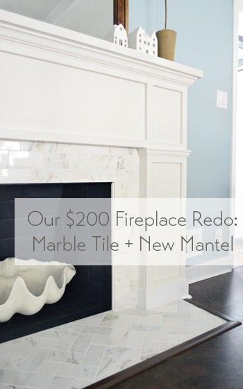
To back up a smidge, you saw us devise a plan for this little refacing makeover, add some marble subway tile and then build out around it. Reminder: fireplace code is different in every area (and requirements vary if it’s wood burning or if it has a gas insert, etc) so it’s a good idea to check that before going nuts on your fireplace.
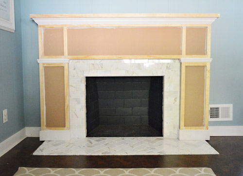
Our fireplace is non-working (we’d love to add a gas insert and even double-side it down the road) but for this phase of the process all that was left was to add some primer and paint.
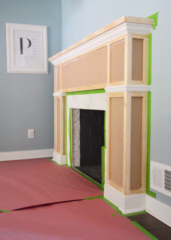
I’ll spare you the play-by-play of the painting process because it wasn’t all that exciting. First we primed (using what we already had on hand) then painted the whole thing with Benjamin Moore’s Cloud Cover since it’s what’s on the nearby cabinets (and because we had some leftover). After that we did some touch-ups, like giving the firebox itself a fresh coat of its original color (Benjamin Moore’s Temptation) Note: use fireplace-approved high heat paint if you have a working fireplace.
And after giving it a couple of days to “cure” we put everything back so that we could call this puppy complete. And it’s a puppy that I kind of want to curl up with (yes, Sherry pets it).
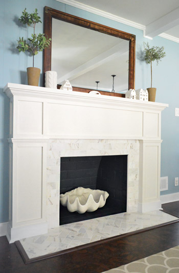
Update: A few folks are asking if we considered widening the tiled heath to match the width of the built-out sides of the fireplace – we did, but since it’s just a bit of shoe molding (which also extends around all of our cabinets) it didn’t bother us enough to rip up cork to make it happen. Perhaps down the line we’ll paint the brown floor trim white to make it appear wider if it bothers us :)
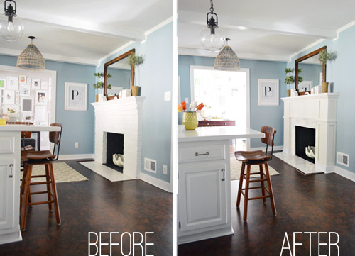
Here’s an obligatory before and after for ya:
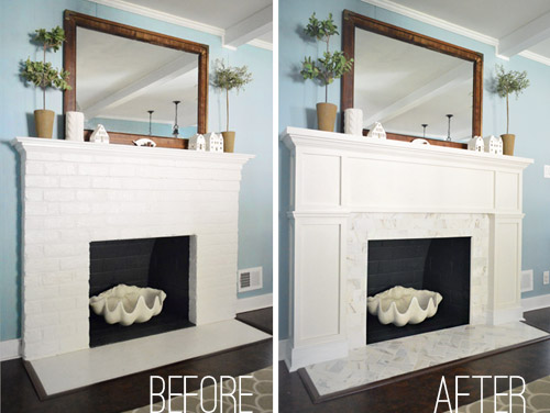
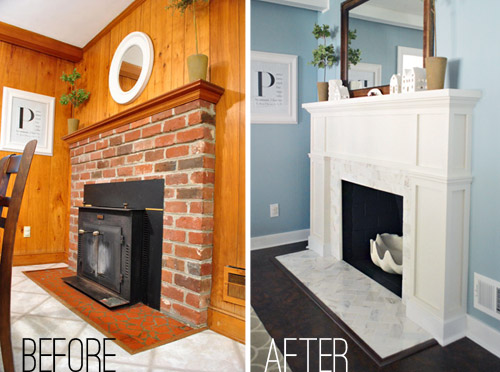
But I much prefer this one, which shows what the fireplace looked like when we bought our house back in 2010…
Since the painting step didn’t cost us any extra money (we used supplies that we already owned), the total cost for the project is just the addition of the two budgets we’ve already shared (tiling was $99 and building out was $98.75) but here’s the full breakdown:
- Cement board (2 sheets): $16
- Masonry screws: already owned
- Liquid Nails Heavy Duty: $2
- Subway tile: $5.50/sq ft, totaling $70
- Thinset: already owned
- Tiling tools (saw, trowel, float, etc): already owned
- Grout: $11
- Tile sealer: already owned
- MDF frame: $35
- Mantle top: $17
- Crown, baseboard, & decorative trim: $22.75
- 1 x 2″ boxes: $24
- TOTAL: $197.75 (* thanks to holiday gift cards from the family we only spent $147.75 – but without gift cards or already owned supplies this might be a $250 upgrade)
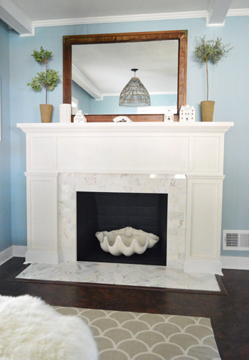
Definitely not our cheapest project, but we love it. The herringbone marble tile and the tailored built-out surround looks pretty darn expensive (at least in our humble opinion). We’ve never had a tiled fireplace so we suddenly feel very swanky indeed. Perchance I’ll start sporting an ascot.
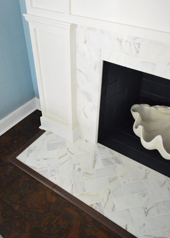
Some of you were curious about how we concealed the exposed edge of the cement board around the firebox. We just used a piece of trim that we had in our scrap pile (it’s slightly rounded on both sides). Before grouting we glued it in place to provide a clean edge to grout up against and now it’s painted to match everything else. Obviously for a functioning wood-burning fireplace that’s no bueno, so you’d probably want to use something like this. And if we ever convert our fireplace to a wood-burning one (which is unlikely since it would require a ton of chimney work) we’ll just pop out the wood trim and install tile edge pieces.
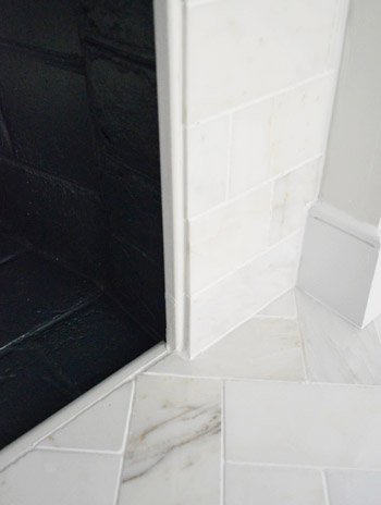
Now back to the gratuitous after shots.
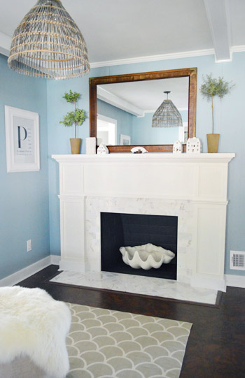
Ok, one more and we’re done.
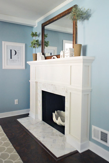
Just this guy and I’m out.
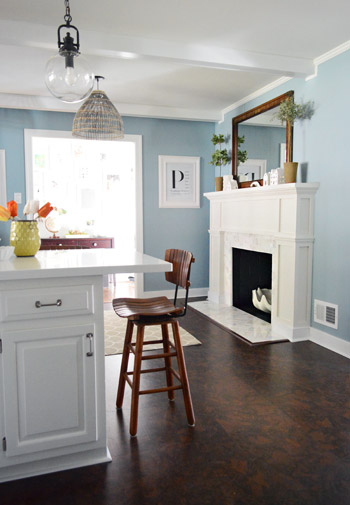
Oh wait, here’s a good comparison shot that shows how the original fireplace was pretty thin and even a little top-heavy, while the new chunkier tiled-and-framed-out version feels more “focal-point-ish.” In person has even more dimension (unfortunately photos of a white-ish surround with white-ish tile don’t depict all the texture and interest that they have in real life).
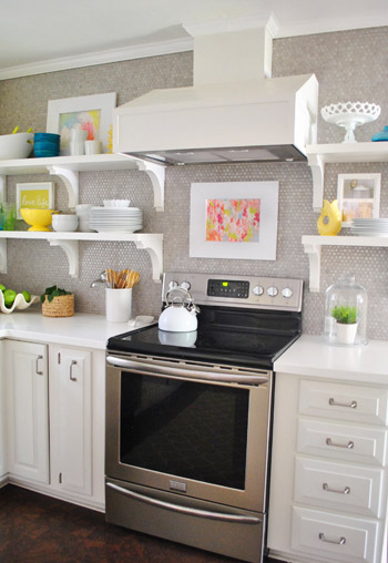
But perhaps best of all, our wall of penny tile on the other side of the room no longer feels like it’s “the fancy wall” while the rest of the kitchen struggles to keep up. The herringbone marble fireplace finally gives the penny tile a run for its money, in the best possible way. According to Sherry “it’s a swank-off in our kitchen.” Fireplace vs. wall o’ penny tile. Who will win? It’s anyone’s guess. (Spoiler alert: Sherry says the wall of penny tile wins because she pets it slightly more than the marble but it’s very close.)
So that’s the end of our little fireplace update. We’re really glad to have it done and are looking forward to some porch and carport updates. So come on end-of-March snow, give it a rest so we can get outside and start working! What are you guys doing? Any tiling, mantel building, priming, or painting? What about placing giant clam shells around the house? Any of that going on? That’s all in a days work for my lady.
P.S. If you want to read about this makeover from the beginning, check out our planning process, how we tiled and how we built out the wood frame around it.
Update – Wanna know where we got something in our house or what paint colors we used? Just click on this button:


mollie d says
I have to say- I kinda liked it before a little better. I think the brick was charming, but I’m a mid-century lover.
It is very pretty redone though, if I hadn’t loved the before so much, I would have loved this fireplace- it will be fun to decorate at Christmas
K says
Noticed the white mirror above fireplace when you moved in, kind of look like the new one in the bedroom post from yesterday! Probably not in real life! Love young house love read it every day!
Nick says
Chunky never looked so right. Hollllla. Glad you didn’t bother with widening the base tile to match the width of the mantel–definitely doesn’t pass the headache/payoff litmus test.
YoungHouseLove says
Thanks Nick! We thought so too! Haha!
xo
s
Rachel H says
Holy cats, you guys, that looks bomb! I can’t believe how awesome that is! (Well, of course, I can believe it, but you KNOW what I mean.) Now I wish I had a fireplace to redo!
YoungHouseLove says
Aw thanks Rachel. And thanks for using one of my favorite expressions. People don’t say “holy cats” enough.
xo
s
Kate says
Holy cow! It looks AMAZING! Nice job guys.
Maureen says
Absolutely beautiful…a wonderful transformation (and it wasn’t bad to begin with!)
Erin says
I love this, you did a great job!!
Is it just my eyes, or are the baseboard trim parts on the tile/fireplace surround a brighter white than the rest of the fireplace surround?
YoungHouseLove says
Oh yes, we painted the baseboards the same color as the rest of the room, so they’re just slightly lighter. Great eye!
xo
s
Elizabeth says
You guys are really amazing. Every project is better than the next. That’s why your readers keep coming back for more!
YoungHouseLove says
Thanks so much Elizabeth! You’re so sweet!
xo
s
Kristy says
It’s beautiful! I vote YEA on painting the floor trim white to widen the hearth just a little more.. but I’m in love with the new look already. Once again, great job!
Brenda says
What did you use to cover the tile edge on the floor? Looks so swanky!
YoungHouseLove says
Thanks Brenda! That’s just floor “transition pieces” from Home Depot. They even come in that finish.
xo
s
Elisabeth A. says
SO FREAKING AWESOME!! I just sent this to my DIY happy husband. He built/installed bookshelf built-ins on either side of our lame builder-grade fireplace. The current fireplace surround is slate which seems like a big, black hole to me. I would love something bright and white like this.
Julie B says
I love it…it looks amazing! We have an unpainted fireplace that looks ok right now, but I’ve been trying to convince the hubs to paint/update it for 4 years!! I will definitely be showing him this make-over while saying, “Look how good our fireplace could look! John and Sherry did it themselves…and added step by step instructions!” :)
Thanks for all the home improvement inspirations!
YoungHouseLove says
Aw, of course Julie! You’re so sweet!
xo
s
crystal says
good job on the successful reno :) just a thought: in aiming to add more visual interest, maybe paint the wooden backboard a shade or two darker (dove grey-ish) to make the white trim work pop a bit more and tie in to the grey tones from the tile! definitely good inspiration though-thanks!
Jillian {Her Split Ends} says
A-Maz-Ballz
So fabulous. I LOVE the details, the molding, the MARBLE…oh i love!
Nicely done
~ Jillian
YoungHouseLove says
Haha, thanks Jillian!
xo
s
Ashley@AttemptsAtDomestication says
It looks awesome! And oh so classy!
At first when you painted things blue I wasnt quite sure how I felt about it, but now with new built out fireplace it all makes sense and I love it!
Not that you needed my permission ;)
YoungHouseLove says
Ha, thanks Ashley!
xo
s
Megan says
Are you guys planning a video tour anytime soon? I’m antsy to see how the hallway/sunroom/big girl room/fireplace changes look all put together!
YoungHouseLove says
Yes, we’ve got it on the to-do list this week! Wahoo!
xo
s
Megan says
Can’t wait!!
Serena says
I’m not sure if I like it more than the brick. It looks really sleek and clean, and like that the mantel has become more substantial… but to be blunt, it looks like it cost $100 (as opposed to being more expensive-looking)and doesn’t have a lot of character. Maybe it’s hard to make it look that way with the MDF – did you guys ever contemplate maybe using materials that would’ve developed more patina or character? The marble tile part looks great!
YoungHouseLove says
I think it’s a perfect case of needing to see it in real life. In person you can’t tell the difference between a painted wood mantel or an MDF one, so we’re really happy with it :)
xo
s
carrie says
LOVE LOVE LOVE the fireplace, so wish that I could do this with mine…
only thought is that mirror now seems to take something away from the fireplace seems too big or wrong color or maybe needs to be mounted a little higher to see the blue wall on the bottom..
It just that the fireplace is such a really great focal point but the mirror catches the eye too much
Cathy C says
Your fireplace looks amazing! Two minor questions:
I know the house was sold as a nonworking fireplace, but the before picture shows a wood stove. Is it more just that it needs to be converted back?
Also, in the pictures it looks like the wood surround is a slightly different color white than the baseboard. Am I imagining that? Or did you do it to match the rest of the room, where the trim is one color and the cabinets are a slightly different white? I am assuming maybe its not as noticable in person?
Love this with the blue too, i have a blue kitchen, so when I saw you painted I got all excited :)
YoungHouseLove says
The chimney is crumbling so it would need to be relined/rebuilt. So it would be a big project to convert it (hence the idea of a gas insert). As for the baseboards, throughout the room they’re slightly lighter than the cabinets so we did it on the fireplace too. It’s not noticeable in person at all, but I’m type A enough to want to keep it cohesive. Haha!
xo
s
Cassidy says
LOVE LOVE LOVE IT!!
Mallory says
Love the makeover! I have no idea why my 24 year old self is fascinated with fireplaces. Something about them just makes a house feel like a home to me. I’ve been on pins and needles [well, maybe just an office chair] waiting to see the after photos. When I bought my condo, the #1 thing on my wishlist was a fireplace. Sadly, it only came with a small brick surround. So after months of begging, my dad built me a custom wood surround and mantel. It’s a beauty. Maybe one day I’ll look into replacing the brick with marble similar to yours! Absolutely love it!
YoungHouseLove says
That’s so sweet Mallory! I love it!
xo
s
Laci says
It looks AMAZING!!
On a completely un-fireplace-related note, one of my highschool classmates makes really cool furniture from old bike parts and other found items. Everytime I see her pieces I think of John. Here is the link to her Etsy page. I may have already shared it with ya’ll, but they just wrote about her in O magazine; so I think it’s worth a re-share!! ;-)
http://www.etsy.com/shop/ReMainDesigns#
Here’s the O magazine link:
http://www.oprah.com/world/Eco-Friendly-Products-Green-Entrepreneurs
YoungHouseLove says
No way, that’s so cool! Off to show John!
xo
s
Roxanne M says
That is one FINE looking fireplace. Love love love it. It’s one of my favorite Petersik home improvements! I will also use it to redo a fireplace at some point, methinks :)
Annelise in Edmonds says
At first, I was like why would you want to change that cool painted brick…I thought it brought a nice style to the room, but once I saw the comparison shot from the kitchen – WOW! I totally see how awesome an idea it was to make it over! It definitely balances the structure out and the items on the mantel look better (safer) with way more room between the ledge and the wall! Once again – you both amaze me!!
YoungHouseLove says
Thanks so much Annelise! You’re so sweet!
xo
s
karen says
so fresh and so clean!! it’s calling for some birch logs!!
Emily | Sparkle Meets Pop says
This could be my favorite makeover you guys have ever done — and that’s saying something because I usually love them all!
YoungHouseLove says
Thanks so much Emily!
xo
s
Bethany says
Nice work! I think it would look pretty stunning with an arrangement of white pillar candles in the hearth.
Erin says
I love watching all of your transformations, even if they aren’t personally my style. I have always admired your ingenuity and creativeness! However, this fireplace….OMG. Gorgeous. Absolutely hands down beautiful. I can only hope and pray the next time we buy a house it’ll have a fireplace that I can do just like this. Stunning!
YoungHouseLove says
Aw thanks so much Erin! You’re so sweet!
xo
s
karen says
oh..you know what’s throwing me off a bit…i think it’s the bottom trim part…it’s the baseboard white instead of the fireplace white.
Alicia says
Wow that is so impressive! It looks so amazing…and it looks like it cost way more than $200!
YoungHouseLove says
Thanks Alicia!
xo
s
Katja @ Shift Ctrl ART says
This is absolutely STUNNING. I love the tile and the box design is gorgeous. Love it!!
Claire says
I’m really loving classic architectural details right now and this is right in line with that! Great work. And I personally think that $250 is a very reasonable price for upgrading such a significant focal point in the room.
Laurie says
Great job on the fireplace. Do you have a closeup pic of the “P” picture? We are making some wall art here and are looking for last name letter ideas.
YoungHouseLove says
Oh yes, here’s a post about that: https://www.younghouselove.com/2009/10/how-to-make-a-magazine-monogram/
xo
s
Gillian Kerr says
All i can say is WOW!!! And… if you guys ever fancy a holiday in Northern Ireland you are welcome to crash at my house in exchange for lessons in how to do amazing makeovers like this!! My wood working skills are non existent :( xx
YoungHouseLove says
Aw thanks Gillian!
xo
s
Lisa E says
Looks fab, great work guys! I wish I had your energy to complete so many projects while constantly posting on your blog, working and raising Clara! Whew! I don’t think I could do a blog with the same questions being asked over and over when you already address it, not to mention the negative comments when you don’t solicit advice. If you do, that’s different. If you don’t, then if they don’t like it, they should keep their comments to themselves. Common courtesy. Jus’ sayin’……… I give you so much credit.
Angela says
That is amazing. Really really amazing. Great vision and excellent execution. (Man, does that sound condescending, but I mean it and with lots of love and admiration for the great work.)
Awkwardly yours,
Angela
YoungHouseLove says
Haha, awkwardly yours = hilarious.
xo
s
Sasha P. says
Wow. Just wow. It looks amazing! The fireplace has so much presence now! I have a similar situation in my old house (100 yrs. old) with non-working fireplaces. This is the kick in the pants I needed to take updating them off the back burner. Also, it’s soooo much easier to convince my husband we can do it when I can show him someone else’s super successful endeavor! I saw that tile in the store just a few weeks ago for the first time, and immediately thought it would be a great, affordable option for us…hope you don’t mind a copycat cause I be lovin your tile pattern. Thanks for sharing!!
YoungHouseLove says
Haha, do it up Sasha! Send me pics :)
xo
s
Sarah S. says
Excellent work, guys! I can’t believe the difference. I loved the painted brick before but you guys really gave it a boost with the new look. Bravo!!
Case says
In a future post, could we see how it looks from your entry? (Yeah, the problem with this post is that you didn’t take enough pictures.) Wait, am I right that you can see it from the entry?
YoungHouseLove says
Ooh yeah, it’s pretty! We want to make a whole house video too :)
xo
s
Julie says
It looks ahmayzing! I’m so jealous now.
Shannon S. says
It looks so awesome! Question (said in Dwight voice): did you guys find that the tiles were all different colors? I know there is variation in marble, but I heard that you have to go through the boxes and match the similarly-toned tiles before you use them. I was thinking about using this for a backsplash, and if it looks this good, I’ll be happy as a CLAM! Ok, sorry for that one.
YoungHouseLove says
We only found a few oddly orange/yellow ones and picked those out, but we bought enough for a small amount of overage (that’s always recommended when you’re tiling) and thankfully there weren’t too many “bad eggs” – maybe just 5%?
xo
s
Gretchen@BoxyColonial says
Wanna hear something funny? One of our fireplaces actually has clamshells molded into the stone around it. Whoever had our house before us had a thing for weirdly ostentatious fireplaces. Your clamshell and your new fireplace are fabulous :)
YoungHouseLove says
No way! I love that!
xo
s
Jenna says
Looking great!! Where did you get that clam shell?! Love it!
YoungHouseLove says
That was from Joss & Main a while ago.
xo
s
Kerry says
Wow — and I thought it looked beautiful already! What a difference. You two are on a roll!
Elegant.
Professional.
Refined.
Da bomb.
YoungHouseLove says
Thanks so much Kerry!
xo
s
Casey says
I would pet it too. It looks AMAZING! I am officially IN LOVE with that tile!!
Jenna says
The finished product looks amazing. Great choices on the subway tile. Feeling inspired as always. Where did you find that clam shell? It’s beautiful!
YoungHouseLove says
It was from Joss & Main a while back, but they also sell them at ZGallerie I think!
xo
s
Jen @ Domesticated Nomad says
Ascot…definitely and then post pictures with many obligatory Scooby-Doo references. :)
YoungHouseLove says
Hahah!
xo
s
Marilyn says
I just love it! And I have to say, I loved the grellow, but the blue is just stunning with the marble and white. Y’all seriously stepped up the kitchen lately!
YoungHouseLove says
Thanks so much Marilyn!
xo
s
Nicole @ Liberty Belles says
the herringbone pattern is AMAZE! well done :)
Lauren Nicole says
I love how the new fireplace sort of mimics the simple lines in the cabinet doors. I didn’t really notice it before, but the brick didn’t really complement the space. Great project!