We can officially stick a fork in it, guys. Well, Sherry actually stuck an oversized fauz clam shell in it, but that’s doesn’t roll off the tongue quite as well. Either way, the fireplace makeover is complete.
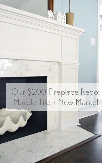
To back up a smidge, you saw us devise a plan for this little refacing makeover, add some marble subway tile and then build out around it. Reminder: fireplace code is different in every area (and requirements vary if it’s wood burning or if it has a gas insert, etc) so it’s a good idea to check that before going nuts on your fireplace.
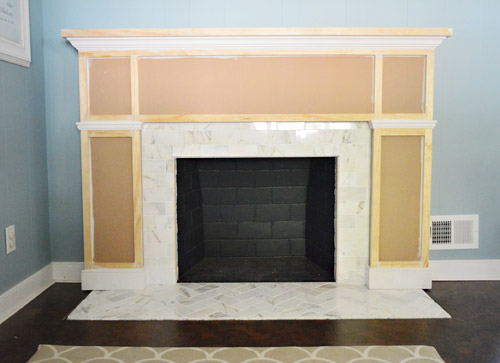
Our fireplace is non-working (we’d love to add a gas insert and even double-side it down the road) but for this phase of the process all that was left was to add some primer and paint.
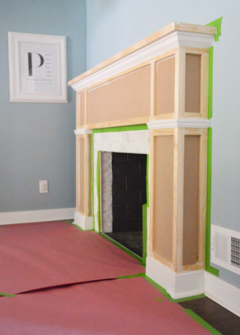
I’ll spare you the play-by-play of the painting process because it wasn’t all that exciting. First we primed (using what we already had on hand) then painted the whole thing with Benjamin Moore’s Cloud Cover since it’s what’s on the nearby cabinets (and because we had some leftover). After that we did some touch-ups, like giving the firebox itself a fresh coat of its original color (Benjamin Moore’s Temptation) Note: use fireplace-approved high heat paint if you have a working fireplace.
And after giving it a couple of days to “cure” we put everything back so that we could call this puppy complete. And it’s a puppy that I kind of want to curl up with (yes, Sherry pets it).
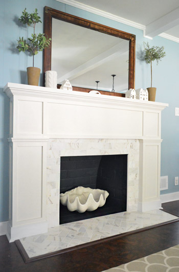
Update: A few folks are asking if we considered widening the tiled heath to match the width of the built-out sides of the fireplace – we did, but since it’s just a bit of shoe molding (which also extends around all of our cabinets) it didn’t bother us enough to rip up cork to make it happen. Perhaps down the line we’ll paint the brown floor trim white to make it appear wider if it bothers us :)
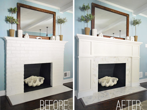
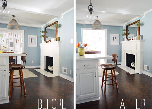
Here’s an obligatory before and after for ya:
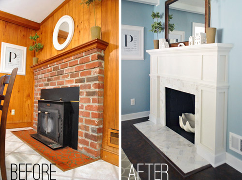
But I much prefer this one, which shows what the fireplace looked like when we bought our house back in 2010…
Since the painting step didn’t cost us any extra money (we used supplies that we already owned), the total cost for the project is just the addition of the two budgets we’ve already shared (tiling was $99 and building out was $98.75) but here’s the full breakdown:
- Cement board (2 sheets): $16
- Masonry screws: already owned
- Liquid Nails Heavy Duty: $2
- Subway tile: $5.50/sq ft, totaling $70
- Thinset: already owned
- Tiling tools (saw, trowel, float, etc): already owned
- Grout: $11
- Tile sealer: already owned
- MDF frame: $35
- Mantle top: $17
- Crown, baseboard, & decorative trim: $22.75
- 1 x 2″ boxes: $24
- TOTAL: $197.75 (* thanks to holiday gift cards from the family we only spent $147.75 – but without gift cards or already owned supplies this might be a $250 upgrade)
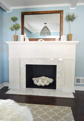
Definitely not our cheapest project, but we love it. The herringbone marble tile and the tailored built-out surround looks pretty darn expensive (at least in our humble opinion). We’ve never had a tiled fireplace so we suddenly feel very swanky indeed. Perchance I’ll start sporting an ascot.
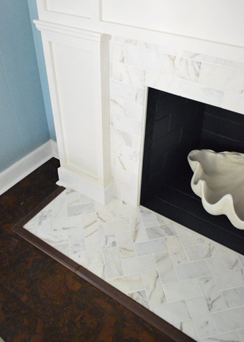
Some of you were curious about how we concealed the exposed edge of the cement board around the firebox. We just used a piece of trim that we had in our scrap pile (it’s slightly rounded on both sides). Before grouting we glued it in place to provide a clean edge to grout up against and now it’s painted to match everything else. Obviously for a functioning wood-burning fireplace that’s no bueno, so you’d probably want to use something like this. And if we ever convert our fireplace to a wood-burning one (which is unlikely since it would require a ton of chimney work) we’ll just pop out the wood trim and install tile edge pieces.
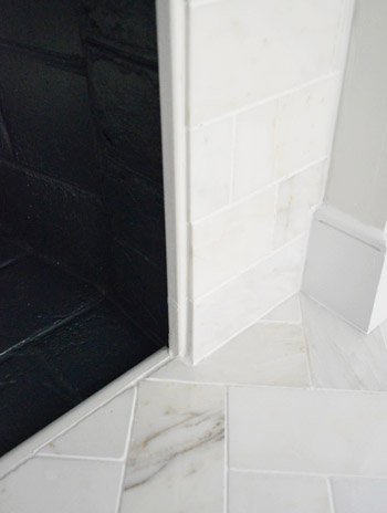
Now back to the gratuitous after shots.
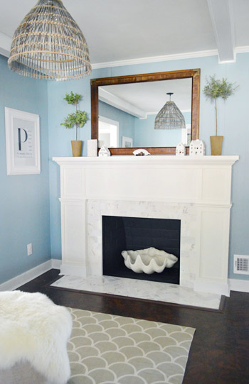
Ok, one more and we’re done.
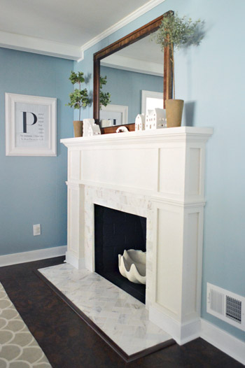
Just this guy and I’m out.
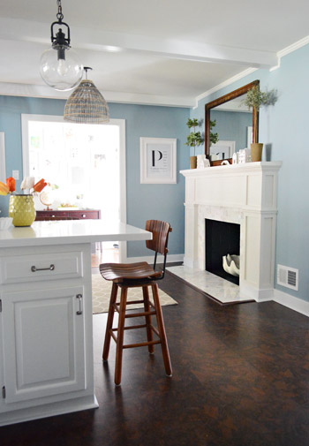
Oh wait, here’s a good comparison shot that shows how the original fireplace was pretty thin and even a little top-heavy, while the new chunkier tiled-and-framed-out version feels more “focal-point-ish.” In person has even more dimension (unfortunately photos of a white-ish surround with white-ish tile don’t depict all the texture and interest that they have in real life).
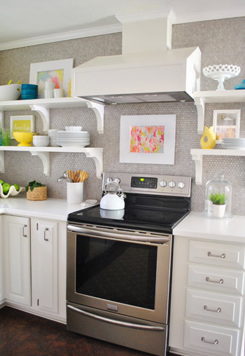
But perhaps best of all, our wall of penny tile on the other side of the room no longer feels like it’s “the fancy wall” while the rest of the kitchen struggles to keep up. The herringbone marble fireplace finally gives the penny tile a run for its money, in the best possible way. According to Sherry “it’s a swank-off in our kitchen.” Fireplace vs. wall o’ penny tile. Who will win? It’s anyone’s guess. (Spoiler alert: Sherry says the wall of penny tile wins because she pets it slightly more than the marble but it’s very close.)
So that’s the end of our little fireplace update. We’re really glad to have it done and are looking forward to some porch and carport updates. So come on end-of-March snow, give it a rest so we can get outside and start working! What are you guys doing? Any tiling, mantel building, priming, or painting? What about placing giant clam shells around the house? Any of that going on? That’s all in a days work for my lady.
P.S. If you want to read about this makeover from the beginning, check out our planning process, how we tiled and how we built out the wood frame around it.
Update – Wanna know where we got something in our house or what paint colors we used? Just click on this button:


Louise says
That looks lovely :) The tiles are so shiny and pretty, even in the pictures I can tell! I think I’d plonk some battery operated fairy lights in the clam shell for a cosy glow in the evenings, oh and I love the herringbone pattern – looks well posh! ;)
Ashley says
It looks really nice! Between this and the board and batten you guys seem to be making more traditional choices now. Are you thinking of taking the house in that direction?
YoungHouseLove says
I think we just like a mix, so we add in modern, traditional, bright pops of color, neutrals, texture, etc – we like a smorgasbord :)
xo
s
mary says
I wouldn’t make the hearth the same width. There’s enough perfect rectangles already.
Someone has probably mentioned this but just in case… The tv show Revenge has that fishing basket lampshade used in a set (the Stowaway bar) but it has a big, white globe over the bulb and under the basket. It looks nice like that, if you ever wanted to doll yours up some.
YoungHouseLove says
No way, I love that!
xo
s
Leigh says
Looks AMAZING! I love it!
Anne says
I was skeptical about your plans, and I’m still a little leery of painting brick/wood (or messing with them), but it looks great! And I absolutely love the new color of the kitchen.
Dawn says
The fireplace mantel looks great, you guys did a awesome job. John, you’ve earned the right to sport an ascot!
Jennifer says
White wood trim + marble is right up my alley! This is one of my favorite makeovers you’ve done. Amazing work, you guys!
Julia says
Absolutely B E A U T I F U L !
What a difference from the original fireplace. You guys rock!
Hugs from Argentina.
Julia
homelifeandbeyond.wordpress.com
Karla says
This is beautiful! I love the tile you chose, although I was wondering if in person it shines a little more than in the photos. Did you consider painting the surround a slightly darker color to make the tile pop more?
P.S. if I were Sherry I would be petting your new fireplace too!
YoungHouseLove says
Oh yes in person there’s so much contrast between shiny and veiny marble stone and painted wood, so it really gleams and sets off the mantel :)
xo
s
Katie says
I love the herringbone pattern the most! Beautiful!
One question, because we just moved into a house with a beautiful wood-burning fireplace and lovely wood floors … but there is no fire-proof “flooring” right in front of the fireplace. Do you think it would be pretty simple to lay tile or something similar to what you have, without a space existing for it? (Does that make sense? You already had a faux-bricky space to cover up … we just have continuous wood floors). Thanks!
YoungHouseLove says
Oh yeah, I’d just cut out whatever’s there and add cement board and tile. Might be a little challenging but hopefully it’ll look great when you’re done.
xo
s
Amber says
Such a great project! I will be remodeling soon and will def use this as inspiration.
Chaney says
It’s beauuuutiful!! Lovely! Great job, y’all!
Chaucea says
Marble threshold! :-)
Bevel-edged marble strips–like what are used for thresholds–could be an elegant and attractive solution to that off-ness of the hearth being smaller than the sides of the fireplace surround.
These sites, for instance, have some examples: http://www.tiling-treasures.com/marble-thresholds.html
http://www.marblethresholds.com
http://www.windowsills.com/thresholds/
Callie says
Sooo shiny!!! Fabulous! You guys have such a classy decorating eye ;) And it goes so well with the blue – I was a grellow fan but the blue comes through much better in the photos – so calm and yet vibrant. Ha and I love the ‘swank-off’…I’m picturing Sherry in yoga pants swishing through the kitchen with a discriminating eye! :)
(Also random comment – your web site is in my Chrome bookmarks bar and it doesn’t show a specialized icon like a lot of other blogs I read do, just a white page icon. Perhaps a bug?)
YoungHouseLove says
Aw man, we have an icon but maybe it’s glitchy in chrome?
xo
s
Danielle SW says
Gorgeous! I love how the front edge of the clam shell mimics the shape of flames.
Lisa in Seattle says
Danielle, I love that too! (Plus it adds nice organic curves amongst the rectangles.) We haven’t converted our upstairs wood-burning fireplace to gas yet, and for now I have a pile of antlers in the grate. The tips look like frozen flames too. I thought about painting them in fire tones or gold-leafing them, but I like ’em au naturel!
Jill says
Ohhhhh seeing your fire place makes me miss our house in Washington… We are stuck in Crapolorado (aka Colorado) for the time being in a tiny tiny rental home with no fireplace… Whenever I go home to Washington I literally pull up a chair and sit in front of my massive fireplace! One day we will get to go home and continue to work on our craftsman home, but until then (and well lets be honest till the end of time) I will happily follow your journey on your home love-renovations! :)
Dawn says
If ever your hankering to do another fireplace and your presence in Annapolis coincides, consider this my pretty please! Love the change you’ve made.
YoungHouseLove says
Haha, it’s a plan Dawn!
xo
s
Jennifer @ Miller Musings Blog says
Ah! I love it so much!!! It makes me wish we could do something about our giant red brick fireplace sucking the life/light out of the living room! But right now we’re working on finishing touches of painting our kitchen:
http://www.millermusingsblog.com/2013/03/lighten-up-kitchen-progress.html
and this weekend it’s building raised bed planters, and then built-ins for the dining room to office conversion, so who knows when we’ll get to the fireplace! ha!
Helen says
Ah, love it. Maybe I’m weird, but I actually like that the hearth stone area does not extend all the way to the edges of the fireplace surround. It looks more interesting and layered this way.
Have you thought about painting the MDF areas a subtly darker color? I think it would make the trim really pop!
YoungHouseLove says
Yeah I thought the same thing! When John sketched it out both ways it felt “flatter” when it was the same width and a little more “fancy” and dimensional with the extra shapes that it created when we didn’t cut back the cork and make the hearth bigger :)
xo
s
Miyu says
GRRR!! I wish I saw this 2 months ago! I’d just finished the process of refacing my non-working ugly brick fireplace. Except I did the entire thing in stacked stone, similar in color to yours. Lighter tile has definitely made the room look brighter, but I kinda like this idea of putting an MDF surround too… oh well :) Nice job guys!!
christine says
Long time reader, never commented. By far, one of the best projects yet. Perfection. Now you have me wanting to replace my dated tile surround on my fireplace.
YoungHouseLove says
Thanks so much Christine!
xo
s
Nay says
Gorgeous job! On a side note, do you watch Revenge? In Jack’s place, I noticed his light pendant looks so similar to the one you two put together with the basket that is hanging here in your little fireplace nook. Pretty cool…although I did feel kinda stalker-ish for noticing that!
YoungHouseLove says
Never seen it but it sounds awesome!
xo
s
Sena Dees says
So I am a little late to the party and just recently discovered your blog. Which I am now in love with. Love the new fireplace! I have scavanged your Project tab and love the art section, I need more art, but I was wondering how you mat your DIY art? Ie: the magazine monogram? DO you have a board and razor you cut your own mats or do you pull a stick it on cardstock kind of thing like with the lady-in-pool piece?
YoungHouseLove says
Aw thanks Sena! We usually use mat board (you can buy it at Michael’s or JoAnn) for the background to act as a mat. Or even large pieces of posterboard or paper. I don’t cut them because I use them as the background (so I just usually tape the item centered in front of it). Hope it helps :)
xo
s
Phuong says
YOWZA!! What a FANCY fireplace! I think I’m going to have to get me a clam shell. Hope I never have to fight you for it! :)
YoungHouseLove says
Hahah!
xo
s
Kelli says
Another beautiful home run for YHL! Way to go team! It looks amazing!
Mary | lemongroveblog says
Love the before and after shots. I’ve been dying to update our fireplace surround it a similar fashion so it is good to see the play by play!
Evin says
In fact, I am doing some tiling this week too, thanks for asking. White subway tiles are going on the backsplash of my son’s homemade play kitchen tomorrow. Very exciting! I love your fireplace update. Well worth the time and financial investment to have another spot in your home you are head-over-heels in love with.
Sara says
Wow!! That looks crazy good! A question for you. Your topiary trees on you mantel are they fake or real? I have been looking for some taller, skinny ones like that but having nooooo luck! Love your blog!!
YoungHouseLove says
They’re fakers! I got them from Crate & Barrel on sale about two or three years ago.
xo
s
Lori Clark says
I LOVE it! We plan on removing our fireplace insert too and i look forward to the day I can be posting several shots for my friends to ooh and ahh over :)
Tara says
Cool! You’ve probably been asked this a million times, but do the former owners of this house know about your blog? I think it would be fun for them to see all of the wonderful changes you’ve made to this home!
YoungHouseLove says
Yes, they read! But we’d love to have them over in person to see it someday :)
xo
s
Tiffany A says
I usually don’t comment, but I love your blog. I saw this post at Better After today, and it looks do much like your fire place before and after I had to share.
http://www.betterafter.net/2013/03/burnt-out-to-burnin-up.html?m=1
YoungHouseLove says
So cool!
xo
s
Tarnya Cook says
I LOVE IT!
yes that did require Caps Lock.
And John I look forward to the photos of you sporting that Ascot reading a book by the fireplace! :)
Tarnya
xx
sarah@SBrandesDesigns says
What a stunning transformation!!! Definitely worth every penny…
Makes me want a fireplace even more :-( The troubles of being a renter…
Natalie / Eternal Summer says
I love this so much! Most beautiful non-working fireplace award goes to you. The tile alone makes me drool.
Krystal Lee says
We are just finishing reno-ing our living area with some new paint, curtains etc etc but were stuck on what to do with the hearth. um…herringbone tile it is! Love love love this, thank you!
Candy from Candied Fabrics says
Oh this looks great! And amazingly not expensive as well!
Heidi P. says
Wow. Swank-a-licious. You’re kitchen went from fun/playful with the grellow walls and teal/turquoise stools to sofisticated and high end with all the wood and sparkle and blue. I like(d) both! Nice work, craftsman John!
Angel says
i can’t believe you guys did that for under $200…. amazing. seriously you guys are handy. looks great. congrats and enjoy. PS you guys work super fast…. at least it feels like it.
YoungHouseLove says
Aw thanks Angel!
xo
s
Amber says
Great transformation. On the subject of non-working fireplaces, I recently found out that the chimney liner for my fireplace in the house I just bought is, in fact, cracked all the way up, so my fireplace is non-useable too. I plan on installing a wood-burning stove which requires an exhaust pipe to run all the way up the chimney anyway. My chimney inspector said buying and installing the wood-burning stove would be cheaper than fixing the chimney lining. Plus it’s way more efficient as a heat source.
YoungHouseLove says
Smart!
xo
s
Lee says
Love it! and…paint that floor trim white today! You won’t be sorry. :)
C says
Great job!!! I wish we had the guts to do things like this! My mantle is an ugly light brown and we hate it…yet we can’t seem to find the courage to paint it….what if we mess it up even more…what if it totally looks DIY’d!! AAahh
Anyway. very nice.
…and just a small tiny little comment….I don’t so much like the mirror on top of your mantle….it seems a nice white crispy mirror would be so much better! I know you are trying to tie it in with the floor and all…but…naaaah..
Dave says
Love the fireplace redo! you guys are awesome. Got to say though i would have extended the the floor tile to match the new width of the fireplace…..something about it just looks a bit off… i would have gotten out my oscillating tool and carefully cut the cork on each side to widen it out, without having to pull up the floor…..but that is just me.
Love everything you do.
Mr. & Mrs. P says
Guys the fireplace reno came out amazing!!! Wish we had a fireplace in our house… I guess its really not necessary since we live in Miami, but its still nice to look at.. =)
Amanda says
What is the brand and name of your beautiful blue paint??
YoungHouseLove says
It’s Colorado Blue by Benjamin Moore.
xo
s
Tracey says
Wowza this looks so good! What a difference for just $200.00. Your pictures are beautiful. Great job once again!
YoungHouseLove says
Thanks Tracey!
xo
s
JoDi says
Gorgeous result! Really looks fabulous. I think it looks better with the hearth not as wide as the surround. It gives it more visual interest. It would all be too boxy if everything was even.
YoungHouseLove says
I totally think you’re right JoDi! It really pops and has dimension with the pretty angles on the floor with all that molding :)
xo
s
Kim says
Your fireplace is gorgeous. What a beautiful transformation. We recently had our downstairs painted and added dark and light grays to our very white, funky fireplace. http://bigwhitehouseonthehill.files.wordpress.com/2013/03/fireplace-collage.jpg Little tweaks can make such a huge difference. Way to go.
jill says
Beautiful. I want to take a vacation in your kitchen.
Liz says
I’m sorry – I think the brick has so much more character and fits the style of your home perfectly. This new fireplace, while very pretty, is very generic and board & batten is trendy and will look dated. Plus, I do think you (not you personally, but the “general” you)can overdo it with the board and batten, it’s just too much. This is such a formal fireplace now, so I don’t see it as the cozy character piece that belongs in a space off the kitchen. I know you also addressed the pieces along both sides that extend out from the tile, but that shows even more that it’s not made to be that way. Just my opinion – I hope that you keep some natural character in your house, as opposed to looking like every single blog in blog land. It’s what makes people talk and houses unique – a very special thing.
LARY@ Inspiration Nook says
Absolutely love it! I have this song below stuck in my head for work, you should totally do a happy dance to this in your kitchen. HA (Let me know if you do)
YoungHouseLove says
Hahaha, I love it! Dancing in progress.
xo
s
LARY@ Inspiration Nook says
Yes! “I love it”