Psst- We just learned about another awesome way to raise money for the relief fund for the Sandy Hook tragedy thanks to some generous Etsy artists who are donating money that they make this week from their Etsy shops to the cause. Check it out here.
We’re putting the finishing touches on Clara’s DIYed Christmas present, so we’ll be back with a ton of pictures and details for you tomorrow (ahhhhhicantwait) but in the meantime, lots of folks have requested a post about what we’d do differently if we were decorating our first house now, instead of 2-6 years ago. See, back in this video we mentioned that when we look at old pics we love it, but there’s always at least one or two things we’d change if we were living there now – and you guys have been asking for more details. Sing it with me “if I could turn back tahhhhhhhm.” So without further ado, here’s the room by room lowdown.
The Living Room
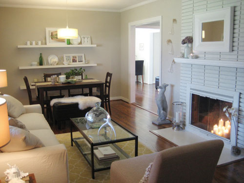
What we’d change: We really didn’t use the living area of this room as much as we would have liked, especially in such a small house (it was only 1250 square feet). So anything to make it more functional/enticing might have made the difference. Like a round coffee table like this to use for games as opposed to our pretty glass table that was always full of props (our current padded ottoman never has anything on it so it’s always ready for Clara’s toys or game night). We also would have added more color, so from sofa and chair cushions with pops of happy color (like this) to patterned curtains or lamp shades and even brighter art, we definitely would have punched up the tone-on-tone look.
Wait, this would be more fun with a moodboard. Whoop, here it is. This isn’t a moodboard for one room, it’s a mish-mash of whole-house items that we think would add interest and color everywhere (I quickly linked to sources here and then explained where they’d go in the copy along with each room/picture).
1. This fabric is from here 2. This chair is from here (that price is for two, but still a little high so maybe a craigslist/thrift makeover could get the look for less) 3. This fabric is from here 4. This rug is from here 5. This sconce is from here (the outlet near our house carries them for 60% off sometimes).
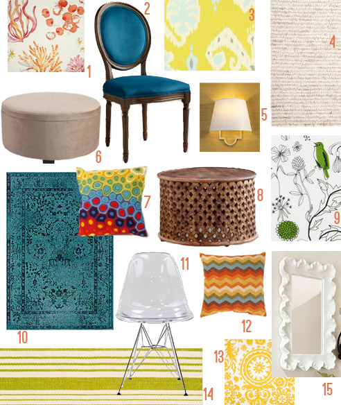
6. This ottoman is from here 7. This pillow is from here 8. This coffee table is from here 9. This fabric is from here 10. This rug is from here 11. This chair is from here 12. This pillow is from here 13. This fabric is from here 14. This rug is from here 15. This mirror is from here.
The Kitchen
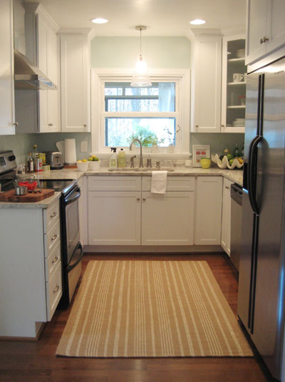
What we’d change: We loved that little kitchen of ours, even if it was narrow enough to touch both sides of the counter while standing in the middle. One thing we always wished we could change about it was to have a window that looks into the backyard (instead of looking into the sunroom, which the kitchen window in our current house does too!) but since that’s not a very easy change (moving a sunroom and detached basement) we probably wouldn’t have done that no matter how long we lived there. I definitely think things like the area rug and the wall color would have been switched out after a while, just to keep things feeling fresh. Maybe a colorful striped Dash & Albert rug like this with dark and moody chocolate or navy walls like this could have been a fun alternate kitchen universe!
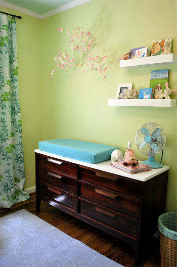
The Nursery
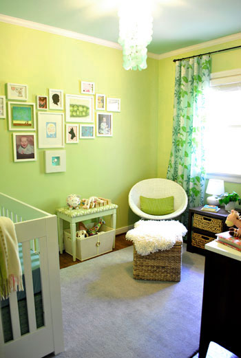
What we’d change: Since we did this room a few years after some of the other rooms that we’ve looked at so far, it’s nice and happy and bright, which is more our jam these days than the more neutral tone-on-tone thing we had going on in the living room. So maybe just for fun we’d change out accessories like the rug (maybe for this cool one?), but in general we still love – and miss! – that sweet first nursery that we made for Clara nearly three years ago.
Our Bedroom
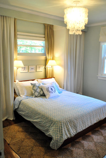
What we’d change: Our bed was always on the low side, so I’d love to have built it up to have storage under it (that room was tiny so it would have been really functional too). I think I also would have changed out the bedding over time, probably with a fluffy white duvet and a bunch of patterned pillows like this. Oh and switching out the tan curtains on either side of the window for some patterned fabric like this could have been interesting. The neutral jute rug also worked just fine, but something plush and shaggy like this would have been an extra luxurious upgrade.
Our Bathroom
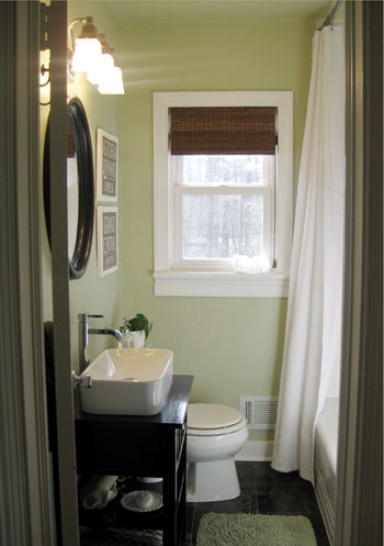
What we’d change: This room was also something we did more towards the end of our life at that house (about a year before we moved, as opposed to 3-4 years before) so I think it feels more like our aesthetic now since there’s some color on the walls, some contrast with the dark mirror and the dark floors and the homemade vanity. Although I think if we lived there now I would have chosen a printed fabric like this for a roman shade in the window (sort of like the one in our current hall bathroom’s window), just to inject a little more print/interest into the room.
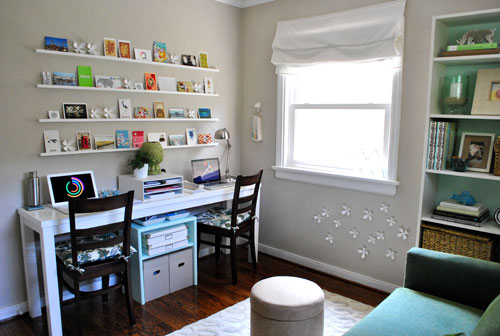
The Office/Guest Bedroom/Playroom
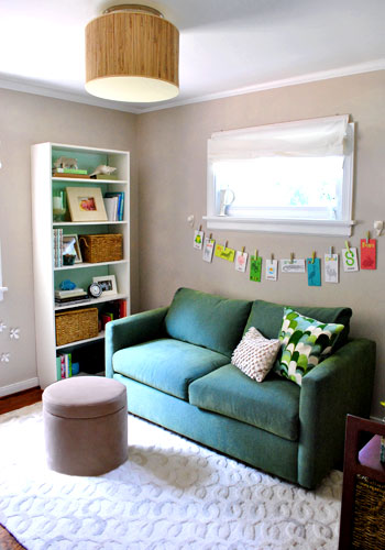
What we’d change: I was afraid to put floor length curtains in here with the sofa in front of the window, but I think we could have popped the sofa out from the wall a little (like we did with the floor length curtains that ran behind the sofa in the living room) and it would have been fine. Don’t you think long dramatic curtains in like this would have been awesome hung high and wide on both windows? I think it would have made the room feel taller and more airy (it was very very tiny in real life). And as for those sad desk chairs (we reused table chairs with little seat cushions from World Market) I think today we’d totally go for chairs like this (maybe found on craigslist and then self-reupholstered to keep costs down?). Oh and this larger and wider (more storage!) ottoman would be awesome in the place of the little thimble-ish one we had.
The Den
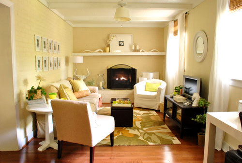
What we’d change: The addition of that sweet Clara rug helped to wake up the room (here’s where we started moving towards pops of color and prints in rooms to add interest since the old jute rug that was in there was a little too tone-on-tone and washed out for us). And I can see how in taking this photo I even tried to get other pops of bright color into the room (the pillow on the chair, the bowls on the round table to the left, the tray on the ottoman, etc) so I think we would just take that further if it were our room today. One giant piece of colorful art above the entire sofa (like this, which has meaning since it’s a map of NYC – where we met and fell in love) would have been awesome along with brighter pillows and maybe even subtly patterned curtains.
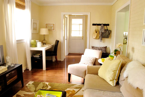
What we’d change: I also think switching out the desk chair with something less traditional and more fun, like this (and adding a bold patterned lampshade on the desk) would have been awesome. And to balance things out I’d hang a brighter scarf or bag on the coat rack on the right for balance (there was always in-rotation stuff as well as I-just-hung-it-there-because-it’s-pretty stuff up there). Your house should make you smile, right?
The Laundry Nook
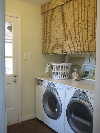
What we’d change: This was actually a really functional and fitting space for us (we still miss it, actually) so we really liked that we could watch TV in the adjoined living room while doing laundry and shove a whole bunch of ugly stuff up into the shelves above the counter, which were hidden by bamboo blinds. Other than switching out some of the art leaning along the back wall for things with a few more pops of color, and maybe changing out some things on the counter for bolder and happier items, I don’t think we’d change much. Oh but you know I’d ORB the gold doorknob in a hot minute.
The Half Bathroom
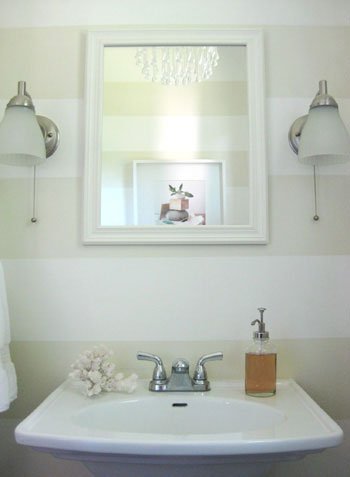
What we’d change: We really liked the stripes, so hmm… what would we change? I definitely think the sconces could have been more fun, maybe something like this (the lighting outlet near our house has lots of discounted Shades of Light sconces like this)? And the mirror could have been a lot cooler – like this guy (who I’ve been obsessed with for years) perhaps? And then we could bring in some brighter and more playful art and a patterned fabric shade made from this fabric (not sure I could get John on board with it, but a gal can dream) on that crisp white window frame would have looked awesome.
The Sunroom
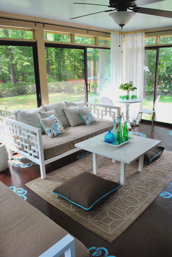
What we’d change: We’d get a bigger rug I think, maybe jute and a few feet wider and longer so both daybeds could sit on it a lot more and feel nicely defined by the larger rug (which would ground the room). I also think the floor cushions could have been a lot more fun if they were covered in this fabric. And these pillows could live on the daybeds instead of the mostly-tan ones that were there before. And as for the stenciled floor, with a larger jute rug I think we might have been tempted to paint it all chocolate brown again and let the textiles in the room be the focus (as well as the view). We also loved the blue ceiling but if we were going to be there for years longer we probably would have manned up and painted the walls (so. much. cutting. in.) bright white to play off of the color in the daybeds and the other furnishings in the room (instead of leaving them tan like they were when we bought the house).
The Patio
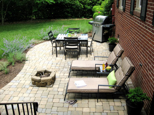
What we’d change: More color! Planters in lime and teal and even tangerine full of flowering plants would have been awesome along with some bright outdoor cushions like these for the chairs and loungers. And I think we’d plant more colorful plants around the perimeter too.
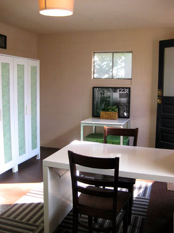
The Basement
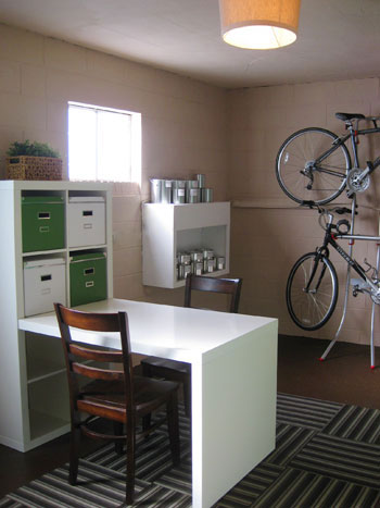
What we’d change: This basement upgrade was actually a really fun project for us, so I think we’d do a lot of things the same way. I don’t think we’d have chairs down there (we didn’t really sit much, although we did use the desk area to take tupperware bins out of storage and open them up to find certain things). I probably would have painted the door bright red like the front door, just for fun. And I definitely think we would have outgrown that paint storage method (we have about 50% more cans now) so we’d have to add another shelf or two for more can storage.
The Front Yard
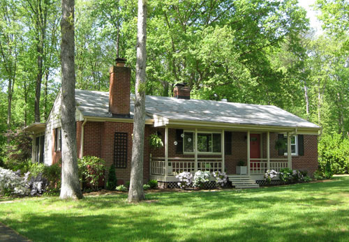
What we’d change: Well, this might be the boring answer, but not much. Haha. We hated the light-colored worn-down roof that you see in this picture but we got a nice new one about a year before we moved (no idea why we never updated the pic!) and the new roof seemed to help with resale as well as general curb appeal. We still miss this cute little facade and the big green lawn. Although one thing we’d probably change about that lot if we could would be to have less to mow and rake (there was much more to mow/rake out front, on the side, and out back then we currently have to mow here since more of our property is woodsy and wild). So maybe we’d turn the side yard and more of the back yard into a wooded space by adding trees, bushes, and mulch over time.
The Front Porch
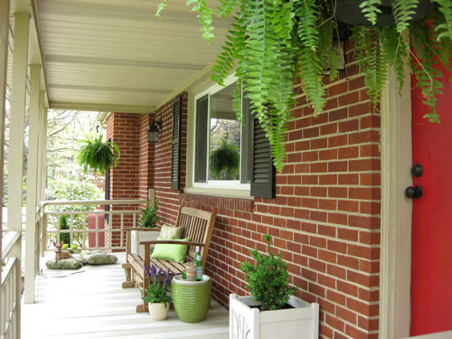
What we’d change: For some reason the outside spaces are harder for us to say “that’s not really our style anymore” (as opposed to the rooms inside), but I think we would have loved to build big planter boxes for all the front windows, which might have meant moving the rocker and the glider a bit (along with the potted planters too).
The Backyard
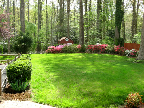
What we’d change: As I mentioned in the front yard blurb, I think having less to mow would have been nice, so maybe naturalizing more of the yard so it was half the size (still large enough for kid & dog pursuits) and adding more trees and bushes and other wild no-need-to-mow items would have been nice. I’m not going to lie though, we loved this lot. It was so private and sweet. We still miss it all the time!
So there you have it. A brain dump of what we might do differently if we were to decorate our first house now instead of 2-6 years ago. Do you guys look at photos of your previous homes (or even rooms in your current house) and think about what you might do differently now? It’s so funny how our style seems very similar in some ways (we still love wood floors, white cabinets, textures like jute and faux sheepskin, dark wood and white furnishings, floor to ceiling curtains, and white frames) yet our current house seems a lot more colorful, playful, and happy to us (just click here and scroll down to see what I mean).

Christine says
I still think your first house is chock full of great ideas that are still useful.
YoungHouseLove says
Aw thanks Christine! We learned so much from that home. It was our first baby!
xo
s
lauren says
The vanity link is missing. Thanks!
YoungHouseLove says
All filled in :)
xo
s
Pam C says
I always loved that room – but I thought it would make a beautiful dining room. I love dining rooms with fireplaces.
Anele @ Success Along the Weigh says
Well we’re still in our first home (15+ years!) but yeah our (my) style is different than when we first moved in. We still used my black laquer furniture in our bedroom from my teen years and have gone through a slightly masculine look with wrought iron to tropical with wicker to our current French Country with mixes of antiques and new pieces. But the bathroom is going to get a paint update after the new year! YAY!
Jess @ Little House. Big Heart. says
Your first house was so adorable! I can’t wait to someday look back at the Little House and be able to do the same thing. We’re really starting to make the Little House ours and I’m loving it more each day!
I’d love to hear a little about how you guys embrace your home’s quirks. Right now we’ve resigned ourselves to living with textured walls and are trying to find a way to love them. How have you learned to love your houses quirks?
YoungHouseLove says
Hmm, I think that’s a tough question because some we just can’t embrace (sometimes something bugs us for years and then we finally fix it and scream “why didn’t we do that sooner!” but as for textured walls I would try to take the focus off of them with gorgeous curtains, colorful rugs, bright art, happy pillows – anything to make the walls seem to drop away :)
xo
s
Anne @ Planting Sequoias says
I am drooling over those WM Peacock chairs! Hmmm, I wonder if Santa is still taking orders??? ;)
YoungHouseLove says
Aren’t those awesome! I just saw some just like them on Housewives of Beverly Hills last night (in Kyle’s house). They looked so fancy! I bet hers were… haha!
xo
s
NAomi says
I would live to know the source of your office desk in the old house. Which desk do you prefer? The new or old?
YoungHouseLove says
We still have that desk and love it! It’s in our living room now full of cards and stamps and our address books (it’s where I write thank yous). It’s from West Elm a while back and we love it! Just wasn’t nearly big enough and didn’t have storage to be a full-time desk for a work-at-home family (we need places to shove all our files and more top space to spread out!).
xo
s
naomi says
Ahhh, I was actually speaking of the desk in the guestroom…but I dug a bit and it looks like it was a homemade thing too! Darn you DIYers LOL
YoungHouseLove says
Haha, it wasn’t too hard! And we had the door around so it was really just adding legs and some framing to go around it. I bet you could do it!
xo
s
Lori says
I think it’s really interesting to see how your style has not changed, but evolved. Like you said, you still favor certain aspects of your old home that you carried into the new one, but there’s more drama and contrast now.
Yes, there are many things that I’d change in our current house from when we moved in five years ago. Need. more. time. (and cash!).
Gloria says
Great post, but FYI in your master bath paragraph, you accidentally left in two placeholder “LINK”s.
xox
YoungHouseLove says
Oh yes, all fixed! Thanks Gloria!
xo
s
Robin says
I love doing this to places we used to live in. In fact I do this to our current place! I look at what we’ve got and think okay… but what would be more awesome?!
erika m says
I don’t comment too much, but I really like this post. Our little ranch is very similar to your first home! I took away from the post….MORE textiles, MORE color! We have those short high rectangle windows in all of our bedrooms and I have such a hard time imagining long flowy curtains on the stubby windows. I was leaning more towards updated cornices and roman shades.
YoungHouseLove says
Aw thanks Erika!
xo
s
Lauren says
I still want to pick up your old den and move it to my house :) So cozy. Do you ever wonder what the new owners have done to decorate your old place?
YoungHouseLove says
Yes, we’d love to see the house now! When we sold we left the ball in their court, so we’re still waiting by the phone…
xo
s
Lauren says
That would be a fun post! Maybe someday…
YoungHouseLove says
Oh man, it would be so much fun!
xo
s
Amber says
Now THAT would be intimidating. LOL
Elizabeth says
I was going to ask the same thing! I still remember as a little kid, driving with my mom past the “old house” to find they’d painted the door bright aqua (it had been brown/maroon) and thinking it was the coolest door ever. Hope you get the opportunity some day!
YoungHouseLove says
We definitely drive by and wave (our new house is only about a mile from our old house, hah) but we’d love to peek inside again someday!
xo
s
Ade@fortheloveofpainting says
Such a cute house…I always do that ( what would have I done different!)
gemma@thesweetestdigs says
It’s fun how personal style and tastes evolve. Maybe 5 or 10 years down the line you’ll be writing a similar post with your current pad! I love both of your houses – quite different, but both seem to warm, inviting, and fun.
Taya says
Your first and second home definitely each have their own unique vibes, but I love that you showed us what you’d do differently now in the first house!
cory says
your house is awesome,i wanna the buy the white chair for a long time, you must good at Decorating the room. it looks soooo good.
Alana @ Domestic Bliss Diaries says
This is such an interesting post because it’s definitely evident that you’re styles have evolved over the years. {And, it’s been a pleasure to be along for the ride…}. I do have one question though: It seems like you guys don’t really get paralyzed by having to choose a color scheme; as in, no color seems to be off limits and it somehow magically works. Is that true? Do you try to keep a cohesive color scheme or do you simply purchase what you like and what you think will work in the space?
P.S. Just got my copy of your book in the mail yesterday and I just want you to know that I blame you two for my sleepless night last night… my mind was racing with all kind of ideas for my house!
YoungHouseLove says
Aw you’re so sweet! So glad you’re loving the book! As for colors, I think there are definitely tones/shades of every color that we can make work (and others that we stay away from). For example, dark colors like maroon and evergreen don’t seem to really “go” with our styles (we love neutral/natural or pops of bright colors like lime, yellow, red, teal, etc). At the same token, pastel-y colors don’t usually work for us either (we prefer muted toned down colors with gray undertones instead, like our new plummy gray bathroom, or a blue-gray wall color over a pastel purple or blue choice). So I think we try to use every color that we can, but we just use the shade of it that seems to fit most with what we love!
xo
s
[email protected] says
I start to think I want more neutrals in my house, then I see something like pillow #7 … I could build a whole room around that pillow!
YoungHouseLove says
I know, right?! I think every since we had Clara we’re much much more into color. It’s just so happy!
xo
s
Sandy P. says
Hmmm … me personally, I wouldn’t change a thing! There’s something about that house that still today I keep going back to for a tour. That’s where YHL started …
YoungHouseLove says
Aw thanks so much Sandy! We love that it’s where we started. Such a cute little house. I keep wanting to just ring the bell and crash it, but the owners have our contact info so they know they can always call us if they want us to see it. Haha!
xo
s
Annie says
Wow, what a worthless post.
YoungHouseLove says
Really? I spent hours on this due to many requests for it. Sorry to disappoint you though. Can’t win ’em all! We painted a wall yesterday (which we probably do once every few months, so it’s a big-ish project for us) and we’re building/painting a Christmas gift for Clara that we’ll share tomorrow. We just can’t make every post a project – so very sorry if that’s your expectation. You can see by perusing our Monthly Roundups that although we usually share 2-3 house-related projects/updates each week, we still end up getting a ton done each month. It’s that “magical” pace that has allowed us to do this for over five years without burning out :)
xo
s
Abby says
Wow, what a worthless comment.
Meredith says
Sherry, you are *so* classy. I would be inclined to respond with “wow, what a worthless comment” but no, you’re very polite and rise above. And perhaps that is why YHL has been such an overwhelming success. My resolution for 2013: take a page from the book of Sherry and resist the snark! :)
Kathi says
wow – what a rude comment. YHL works hard to provide us with content (that we get to read, for FREE). If you’re not into a post, then skip it. Why take the energy to post something so hateful?
Emma says
No need to defend yourself or apologize Sherry. This is obviously an interesting post – look at all of the positive comments! Add mine to the “positive comment” list too! ;)
heather says
I think sometimes people forget Sherry and John are real who words affect just like you and I, and not just here to churn out material for our entertainment that suits everyone. Hearing (reading) someone call another person, or their efforts, worthless simply because it didn’t suit your tastes is heartbreaking. Please spread kindness and love throughout this world. Right now, the world needs it more than ever. With that said, I’m so glad this community is one that is 99% of the time positive and it’s part of the reason I keep coming back. John and Sherry, you owe us nothing – thank you though for doing this. It’s fun to read.
YoungHouseLove says
Aw thanks you guys!
xo
s
Kitty says
Major respect for you Sherry for not only leaving this snark up, but by giving such a classy response.
Love ya $herdog!
YoungHouseLove says
Oh yes, nearly every single comment that we receive goes through (we just remove spam and maybe once every two years or so we’ll delete something truly ridiculous that we think an angry teen submitted like “your baby is ugly” or “you smell like farts” – but otherwise it’s all here in the comments – hahah!). I think we’re just blessed with exceptionally kind and encouraging readers. This is totally our happy place :)
xo
s
Kim says
I thought it was a great post. Sherry~ way to keep it classy. Heather~ I like your reminder and point of view :)
Jennie says
Sherry, I really enjoyed this post. I think it is always useful to be reflective … It is a great way to learn. Thank you for all the posts you guys do – they are a major source of Internet enjoyment for me, and being a writer myself, I understand the amount of work that goes into even the simplest posts (this not being one of those … it was quite detailed!) Thanks again for being a positive role model in the way you handle negativity.
Kim says
Sorry you have to deal with people like Annie.
Susan (Between Naps on the Porch) says
Love seeing all the pics from your first house. It is so much fun to look back and see the choices we made for our first homes and how our taste evolves and changes.
YoungHouseLove says
Thanks Susan!
xo
s
Amy says
I never thought of your first house as being all that small, but comparing it to your current house is kind of nuts. That office is so teeny tiny!
YoungHouseLove says
Oh yes, it was really small, but so cozy! We miss that den so much since our current living room is giant and echo-y!
xo
s
Ray says
I just had to leave a comment because the pillow you mentioned above with the oranges and blues is one of the first fabric samples I got before I moved into my new house! AND the navy kitchen is one that I saved when we were getting ready to paint our kitchen cabinets white and wanted to gather up some ideas. Btw, I followed your kitchen painting tutorial exactly as you described in an older post and it turned out AMAZING! We have a small kitchen that was full of honey oak cabinets and the white made such a huge difference to open and brighten things up. I’ll make sure to send you a picture once everything is nice and accessorized. Thanks for continuing to inspire/motivate me to do the work!
YoungHouseLove says
No way! That’s so funny about the pillow and the fabric sample. What a small world. And I’m so glad that painting your cabinets worked out so well! Wahoo!
xo
s
Gabriella @ Our Life In Action says
So I just have to ask – where did you get that white ‘fur’ rug thingy that I see on your couch, under the tree, on a stool. I just love it!
YoungHouseLove says
It’s actually a faux sheepskin rug from Ikea a while back. We have three and they move all over the house!
xo
s
Gabriella @ Our Life In Action says
Three of them….LOL!!! That would explain it….I thought you had one that just kept moving and photo bombing all your pictures. ;-)
I love it….fingers crossed they still sell them. Mama needs a faux sheepskin rug for Christmas ;-)
YoungHouseLove says
Haha, yes I resisted the urge to get ten. Hahah!
xo
s
Kim says
They do still sell them I saw them there 3 days ago in the rug section. I noticed them because I thought to myself, “oh there are the YHL sheepskins!” lol
YoungHouseLove says
So funny! They sell real ones and faux ones, so if you like faux ones just be sure to check the back (it’s clear which ones are hide and which ones aren’t).
xo
s
Meghan, UK says
I thought this post was really interesting – having just moved house ourselves (two months in!) to our second owned-home, I find myself doing the same thing mentally. It’s great to see you doing the same and figuring out how tastes change/mature!
YoungHouseLove says
Aw thanks Meghan! So glad!
xo
s
Patricia says
Your etsy link brought up a Instagram picture of pancake and French fries’s dogs?!
YoungHouseLove says
It did? When I click it, it goes here: http://www.crafting4cause.com/
It should go to crafting4cause! Haha. No idea why you got Jules’ dog! But that’s kind of hilarious. Anyone else having an issue with that link?
xo
s
Patricia says
Nevermind!! It worked just now.
YoungHouseLove says
So glad!
xo
s
littleoakcreations says
Very interesting post (not “worthless”, in my opinion) — I think it’s interesting to see what we grow from and where trends take us. For example, in college I bought all BRIGHT things – orange, yellow, pink, bright anything, you name it, I had it. But now I really adore the Pottery Barn look and the classic neutrals with only a bit of “pop!” Our tastes change as we mature and I think this was a great post to highlight that. Thank you for taking the time to put it together!
Brenda says
I agree about adding pops of color. I think that’s my favorite difference between your styles from old house to current house. It has more personality, seems more like a place a family lives and plays. I think too much white/neutral subconsciously makes me feel worried about getting anything dirty, so I find it less relaxing.
House Crazy Sarah says
I just loved that first house of yours – it was so cozy and the lot was gorgeous. I was relieved when you chose a similar house when you needed more space. Looking back at those pics, there’s nothing to be ashamed about – you guys have a great sense of style, then and now!
YoungHouseLove says
Aw thanks so much Sarah!
xo
s
Ethne @ Wom-Mom says
Oh, I love the striped walls in that bathroom. LOVE. Like a string of pearls on the walls. Glad you wouldn’t change that. I’ll have to hunt down your post about painting that one of these days. I wouldn’t want you to change the turquoise stencil on the floor of the sunroom. Those are rad.
YoungHouseLove says
You can totally do those stripes Ethne! I’m cheering you on from VA!
xo
s
Amanda Bolan says
I found that after we had kids, we had to be more creative in the ways we added color and decor. It made me think of ways to keep the house looking “grown up” but safe for little hands. I also think my kids made me happy in general and so I was more likely to use fun colors to create “cheery” spaces.
YoungHouseLove says
Amen! Having Clara made us instantly more into color in some crazy way! She made us want to color our world. Haha. Corny but true.
xo
s
Angela says
Sherry, that’s not corny at all! It’s true that kids change us and that their presence makes us see things differently, even more innocently. I think it’s beautiful that Clara did that for you and John.
This was the coolest post. Those blue chairs are so beautiful and a focal point without being gaudy. Can you work them into your new place? :) How would you use the fabric in the first picture of the living room? Pillows? Love it all, with and without the new ideas. It was a warm, welcoming space, just like your new house.
YoungHouseLove says
Oh yes, that would be pretty pillows in the living room! And as for those chairs, I’m so hopelessly in love with them that maybe when they go on sale we can figure out a way to bring them in :)
xo
s
Monika says
Those chairs would be totally great in your dining room! Oh boy, you should totally adopt them!
YoungHouseLove says
If only we had the budget… hmm, maybe Santa will magically bring them? Hah!
xo
s
heather says
I look back at the quick paint job we did before our appraisal, and the colors are just so cold. I loved them, when we did it in the spring and summer, but in the winter it’s chilly chilly. I still love one color we chose though, called Revere Pewter. It’s a warmer greige tone that I think will make it into the “new house”. I definitely plan on having a lot more wood, and warm tones throughout the house. It will just make these long, dark, cold winters feel a lot warmer. Plus, now that I work in a gray office I think I’m over the gray wall thing haha. I find myself wanting color more and more.
Christina @ Homemade Ocean says
I feel the same way about color…for so long I have “played it a little on the safe side” with neutrals and pretty whites and tans. Now I want to add fun, make our home feel more like us…which is fun and crazy!!!
What a cool post, I love seeing how you have evolved :)
YoungHouseLove says
Thanks Christina! Adding color is the most fun part! Seriously, we were missing out on it in the first house but it’s awesome to add those finishing “pops” in the second house :)
xo
s
Sophie says
EEEEE my postcard to you guys made a return in this post – the red phone box on the bottom shelf of your old guest bedroom/office/playroom
I prefer your new house in almost every way except I just wish that your old bedroom was still around on the blog. Even though it’s not my style I loved it SO much!
YoungHouseLove says
Wahooo! I love that card! We can’t wait to hang those postcard ledges up again! Probably in the guest room or Clara’s big girl room (full of flash cards, her art, and fun postcards of places we want to visit!).
xo
s
Melinda says
Crazy idea — You guys should totally house crash your old place. It would be cool to see how it looks now.
YoungHouseLove says
We’d love to do that! The ball is in their court so we’re crossing our fingers that someday they’ll have us back!
xo
s
Sarah says
The Cher reference made me laugh and then picture her in fishnets and that crazy thong/leather jacket ensemble… at which point I stoppped laughing.
YoungHouseLove says
Hahah!
xo
s
Cassidy says
I am also donating 20% of profits from my {ready to ship} section through 8am tomorrow to the victims of Sandy Hook. Here is a link to the items that are included (and will ship in time for Christmas!!).
http://www.etsy.com/shop/CassCrochetCreations?section_id=12717807
YoungHouseLove says
That’s awesome Cassidy!
xo
s
Brooke says
Where did you find your original two tier glass cofee table? I’ve been looking for one similar but I haven’t found one I liked until yours. I can see why it wouldn’t be good for kiddos but it sure is pretty :)
YoungHouseLove says
That was from a thrift store, but I think Pottery Barn sells (or did sell) something similar! Hope it helps!
xo
s
Jessica says
Pottery Barn sells something similar it is called the Tanner coffee table
Marla says
That was a fun post to read. Ten in my book. I really enjoyed clicking on all the links. It got me thinking about what I should update.
YoungHouseLove says
Thanks Marla!
xo
s
Barbara says
Personally, I LOVED your first house. You say “1250 sq ft” like it was tiny – I live in 910 sq ft!! Your house was HUGE!
I think all of the muted colors made that house cozy, calm and look much larger than it was. Had you put the colors you’re using now in it, it wouldn’t be right.
I also think it’s very interesting that as we grow older and do one thing, the next thing seems very new and fun. Then you travel back to the old thing, get bored and do another thing. It’s just life. Tastes change, then change again.
I would have bought your house immediately (had I lived anywhere near VA!).
YoungHouseLove says
Hah, I think when we first moved in coming from NYC it felt like a palace! But after we had Clara, both worked from home full time, and had relatives and friends coming to stay with us a lot to meet/see the new kiddo (and only had one full bath) the walls started to close in on us! Haha. But I still totally miss my tiny one room studio in NYC. Those were the days…
xo,
s
Sangeetha says
Thank you so much for the mood boards! Just what I needed. The reason I started following your blog was your first house! MY living room has the exact layout as yours but a little smaller. I am a nerdy neuroscientist and have absolutely no eye for design and hence am so thankful the mood boards! I have a question which I really which you would answer….Instead of a rectangular dining table at the end of the room, I have a smaller round one. I really hav eonly two chairs for the dining table as I feel adding more makes the room look smaller. This is our only living/dining space and hence we hardly ever use the dining table. I do not want to switch out the dining table as it is new (2 yrs) and I paid $500 for it. Would you have any suggestions to make it work? Pretty please tell me?!!
YoungHouseLove says
Hmm, I would just live with it since you want to keep it and just bring out the extra chairs when you need them since all the time you said they look cluttered. Adding mirrors and light paint can make a room look larger and even breezy curtains in a light tone can make a room feel taller and more airy too. Hope it helps!
xo
s
Sangeetha says
It does help. Thanks so much!!!!!!!!!!!
Cait @ Hernando House says
Very interesting to see how your style has evolved! I think I missed where you said you’d use the yellow fabric (#13?), but I love that print! We used it in our art room/office (about halfway down here), and the curtains make me smile every time I walk in the room.
YoungHouseLove says
So pretty! I’d love that for cushions in the sunroom I think!
xo
s
Cait @ Hernando House says
Thanks! Oh yeah, that would make lovely sunroom cushions! We actually used the same print in a muted turquoise for an ottoman and love it. (We also used it in navy for bedroom curtains… #addict)
Stacy says
I think that considering you guys ended up in a bigger house – you actually helped your resale value by staying very neutral with many of your choices. You can see toward the end where you started branching out a bit more, like when you stenciled the floor of your sun room and how you decorated Clara’s room, but I’m willing to bet the people who bought your house were able to envision themselves there b/c of how you decorated. And the new roof thing?! That’s a great resale feature. I know my husband and I looked for that when we bought our house. I love the changes you would make though and it was nice to see a different perspective.
YoungHouseLove says
That’s interesting! I think you’re right!
xo
s
Cathy D says
Wouldn’t change a THING about that sunroom, personally. Haha. Great post! Hindsight’s always 20/20 :)
YoungHouseLove says
Aw thanks Cathy!
xo
s
ErinY says
I can’t believe that house was only 1250 sq ft! It always looks so much bigger than that in the pictures! How big is your current house? Wondering if I’m getting the wrong idea about this one too! lol
YoungHouseLove says
The current one is around 2400, so it’s a lot more room (having just one full bathroom was the hardest part of the first house when we had relatives and friends over and both worked from home, etc).
xo
s
Nem says
I love the style of your your first house. It seems that you wanted to add more color and prints to it, but I’m sure the neutrals were helpful in the selling process. :) Still a great house!
Rachel A says
I thought your first house was beautiful (and your current house!). My husband and I will be moving soon, and I realized the layout of your first living/dining room might be good for us. Do you know the measurements of that room (or is it somewhere on the blog)? Thanks!!
YoungHouseLove says
Oh yes, it’s 22 x 12′ in there. Here’s a post with all the room’s approximate measurements at the bottom for ya: https://www.younghouselove.com/whats-the-floor-plan-stan/
xo
s
Kitty says
I really enjoyed this post, it’s interesting to see how you’d change things up if you were still there now.
When I decorated my old house I was really not thinking about anything more than “ooh I like these colours, they’re bound to work!” They really didn’t, and if I’d stayed there I would have changed things up a lot.
I wonder how I’ll feel about the decorating I’ve done here in a few years time.
Ellen says
Where is that rug in your sunroom from? It looks like just what I need for my bedroom!
YoungHouseLove says
That was from Pier1 a while back. Hope it helps!
xo
s
mary @ B&Gjournals says
so interesting to see you go back and make notes of where your style has evolved—and its good to remember that our styles are always evolving and to not necessarily think of every pick/project/purchase as absolutely permanent or emblematic or your style, but rather a journey of your style…
YoungHouseLove says
Thanks Mary! Glad you guys are enjoying this little peek back. So interesting to hear what you guys would change about your old places too!
xo
s