Last Friday on this post we got this comment and thought it sounded like a good time: “I love your videos and it’s crazy to see the difference in YHL style from the first house to this house! If you wanted to do a side-by-side of rooms past and present, I wouldn’t hate it :)” – Sarah
I decided I wouldn’t hate it either. So here we go. It’s a battle to the death. First house vs. current house. Cue the dramatic music and picture me in a Gladiator outfit. Of course it’s kind of an unfair fight since we’ve been in this house for eight months and it took us four and a half years to finish our first one (and we definitely expect this one to take us at least that long since it’s bigger and we have crazier plans). So think of this as finished vs. in-progress (aka: cut the current house a little slack). Oh and we stole most of the current house pics from our House Tour page, hence the big “progress” label on the bottom. Anyway, it’s on:
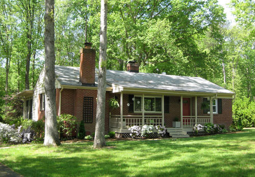
The Front Yard, First House:
The Front Yard, Current House:
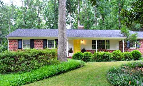
Winner: The first house. That’s an easy one. It took us over four years to upgrade it from this disaster, and we still need at least three more years on our current one, since from other angles it looks like this unfortunate mess.
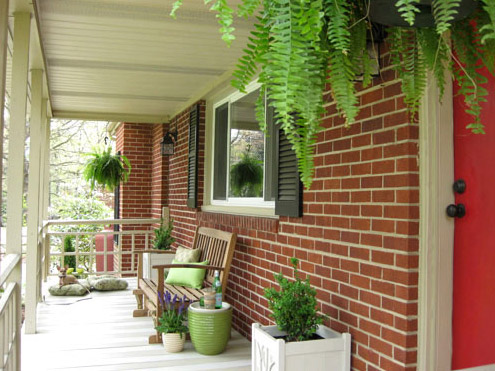
The Front Porch, First House:
The Front Porch, Current House:
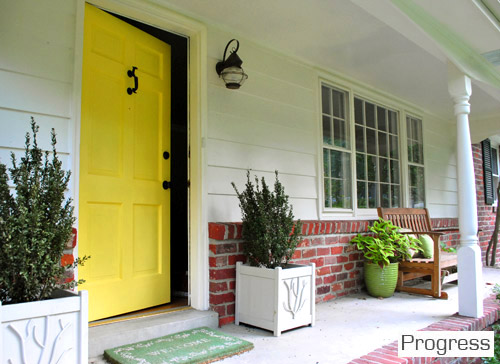
Winner: The first house. We actually would give the front door win to our second house (we loved the red but we lurrrve the yellow). But we still have big plans for boxing out the porch columns and staining the concrete and doing about a million other things at our new digs – and the hanging ferns and tan-and-cream stripes on the first house’s porch were a few of our favorite things.
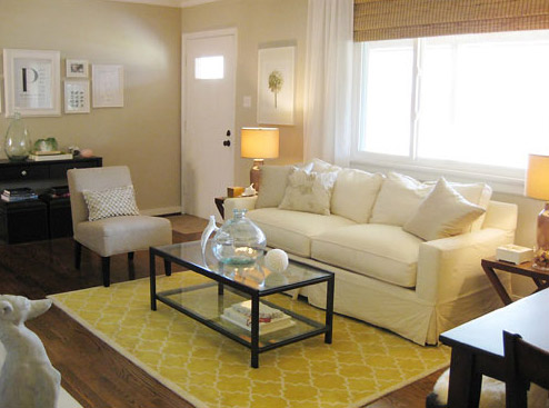
The Living Room, First House:
The Living Room, Current House:
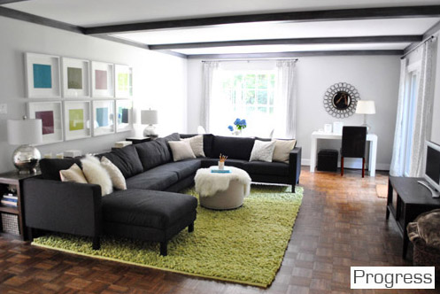
Winner: Our current house. This might be a controversial choice since our current living room is nowhere near done (and still looks like a hot mess from certain angles), but we never really used our formal living room in the first house (we had a den for TV watching and chillaxing). So we feel tons more at home in the current living room where we can sink into our giant sofa, play on the cushy rug with the bean, and even eat by the big window at the pedestal table in the back (sometimes while watching TV, we’ll admit it).
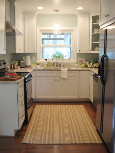
The Kitchen, First House:
The Kitchen, Current House:
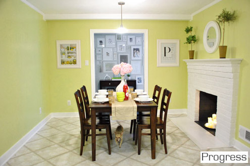
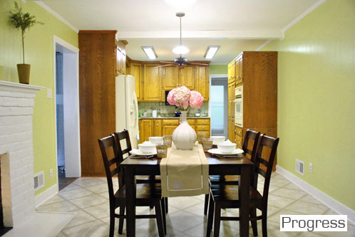
Winner: Is it lame to say it’s a tie? The first house’s kitchen made our hearts go pitter patter when it came to the granite counter, shiny white cabinets, and the stainless steel appliances… but it was tiny. The new kitchen, although extremely early on in our big makeover plan, is nice and spacious, with a fireplace and room for an eat-in area. And once we knock a huge opening to the dining room, get new appliances, paint the cabinets, and upgrade our old table for something built-in, we think the current kitchen will take the win, hands down. So I guess it’s a tie just because the last one was full of loveliness but pretty small, and this one is full of space to spread out and some serious promise.
The Hallway, First House:
The Hallway, Current House:
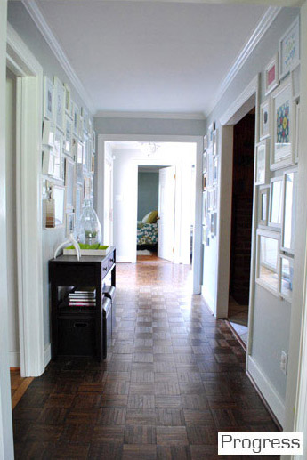
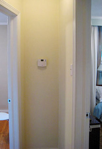
Winner: Current house. We’re so thankful to have a nice wide, light-filled hallway. And the giant family gallery of frames makes us feel all warm and fuzzy.
The Spare Bedroom, First House:
The Spare Bedroom, Second House:
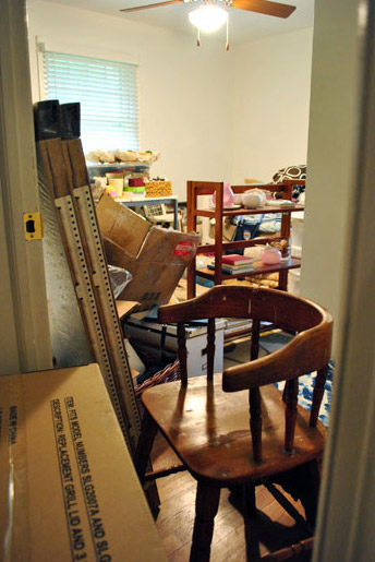
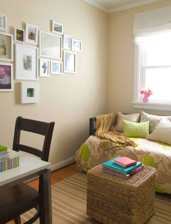
Winner: The first house. Duh. Although this picture is stolen from an old post about how messy the playroom was before my mom helped me clean it, once again it looks almost this ca-razy. So yeah, the clean little room with a daybed and a desk was a lot less hive-inducing.
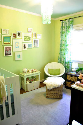
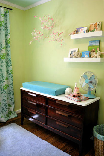
The Nursery (Formerly The Third Bedroom), First House:
The Nursery, Current House:
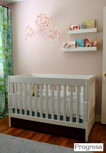
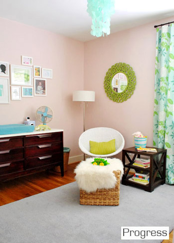
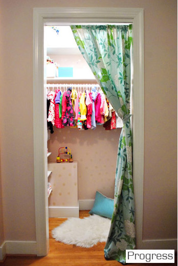
Winner: Current house. But it was a hard call. We loved the room that we took Clara home from the hospital to so much. It just was such a sentimental space. But the bigger closet in the current room (which Clara now uses as a reading nook) gives her current room the edge.
The Master Bedroom, First House:
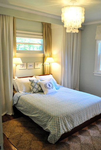
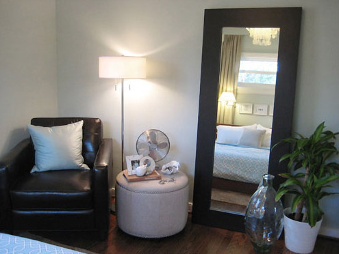
The Master Bedroom, Current House:
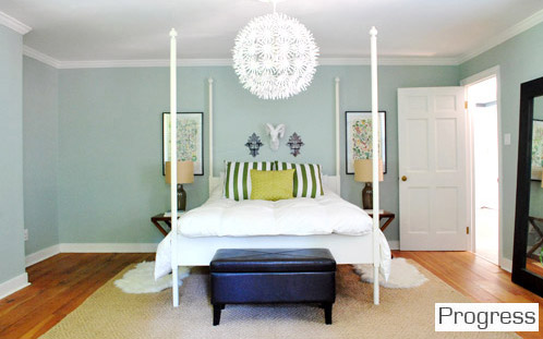
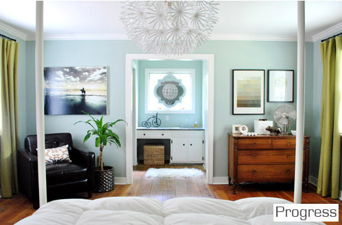
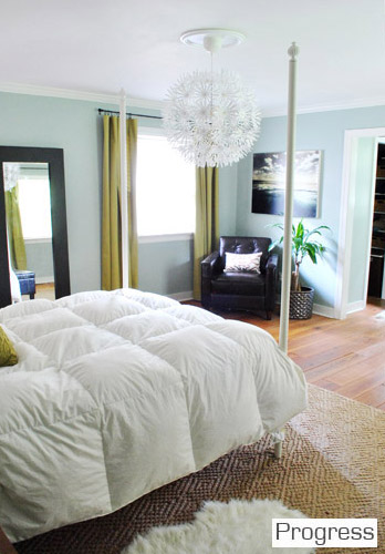
Winner: Current house. Even though it’s only about 20% done, sleeping under that big chandelier which reflects perfectly in the mirror that we hung above the sink makes us geeky-giddy. And of course having a walk-in closet and a master bathroom that’s actually connected is a huge step up. Although the built-ins that we created with doorless Ikea wardrobes to flank the bed in our first house (and provide some much needed storage) always have a special place in our hearts.
The Master Bathroom (located in the hall), First House:
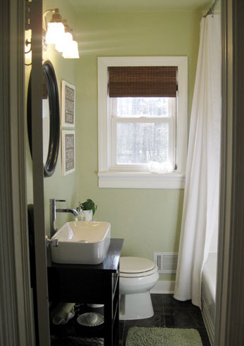
The Master Bathroom (actually attached to our bedroom this time), Current House:
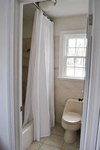
Winner: First house. By a mile. We loved that complete bathroom gut job more than words can say. And we haven’t really touched our new one. But we can’t wait to update things (check out that bisque toilet). We’ll probably love this one more someday, since it’s attached and doesn’t have to be shared by everyone in the house.
The Office/Guest Bedroom/Playroom, First House:
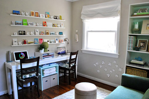
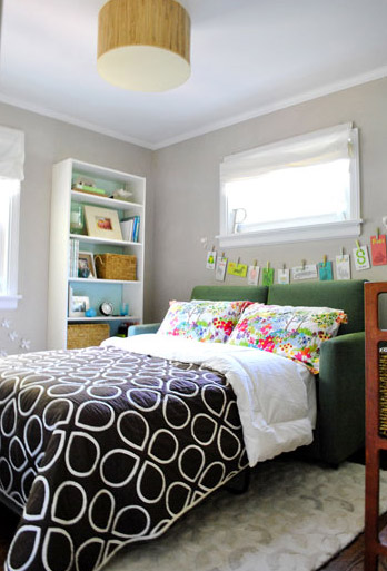
The Office & Guest Bedroom (which are now separate rooms), Current House:
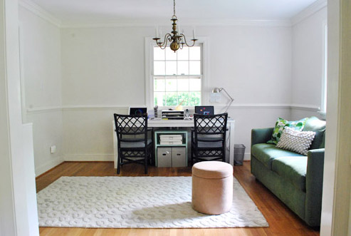
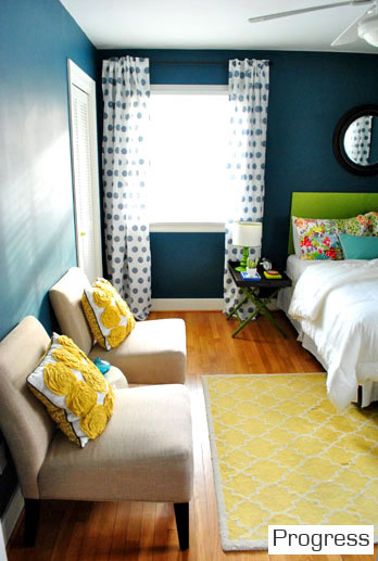
Winner: Current house. The office in our first house was such a great multi-tasking space, but it was teeny and it made us feel a little cramped when we were all in there (just look at how small the desk that used to take up a whole wall looks in the new office pic to see what we mean). And when guests came to town it was hard to do blog stuff (which definitely doesn’t stop on nights and weekends) since the office was occupied by family & friends. So although our first home’s office/playroom/guest room was such a fun space, it’s a lot more functional to have our own cheerful guest room (with its own attached bath) for guests. Although we wholeheartedly admit that our current office situation “ain’t got no alibi, it’s uggggly (hey, hey) it’s ugly.”
The Den, First House:
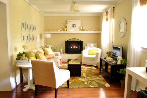
Winner: The first house. 1) Because our current house doesn’t have a den, and 2) Because our first house’s den was one of our favorite rooms ever – so cozy. Although the room that we call “the living room” in our current house could have been a den (but instead we opted to turn what used to be a formal living room into a spacious dining room to accommodate our huge family who couldn’t squeeze into the dining room behind it, which we made into the office). We decided that one huge casual room for TV, reading, playing, & hanging out was more than enough, so we didn’t need a second formal living space in the front (especially because we didn’t use the first house’s formal living room much at all).
Dining Room, Current House:
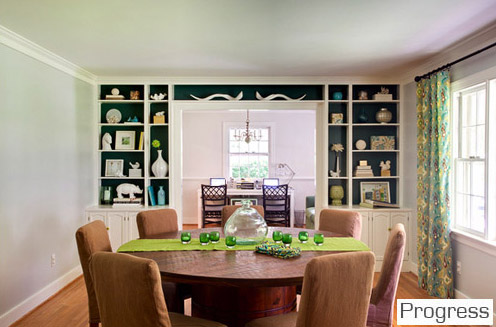
Winner: Current house. 1) Because those curtains are my babies and we’re enamored with the dark teal color that we painted on the back of the built-ins, and 2) Because our first house didn’t even have a dining room (it just had a dining nook in the corner of the living room). Well, originally it had a small dining room off of the other side of the kitchen but we closed off that doorway to turn it into a third bedroom which later became the nursery since we needed that space far more. It’s all much more clearly explained here.
The Laundry Area, First House:
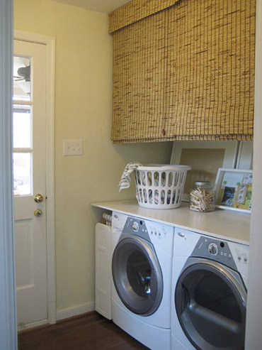
Laundry Area, Current House:
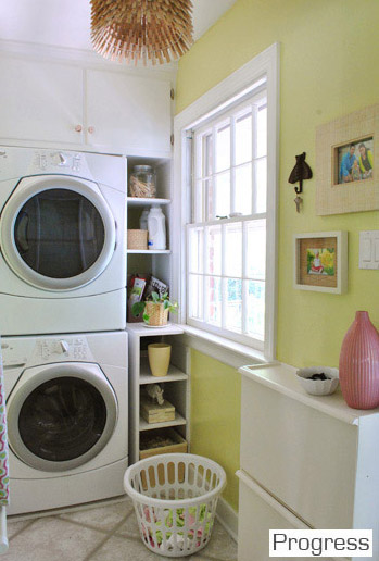
Winner: The current house. We love our new laundry space. Even though it’s narrow and we don’t have a surface for folding, it just feels happier. Plus we don’t have to fight all of our normal human urges to resist clutterering up a big long counter near the door like we did in our first house (it was always full of incoming or outbound stuff). And it’s more fun to fold laundry in front of the TV on the sofa in the living room anyway.
The Hall Bathroom, First House:
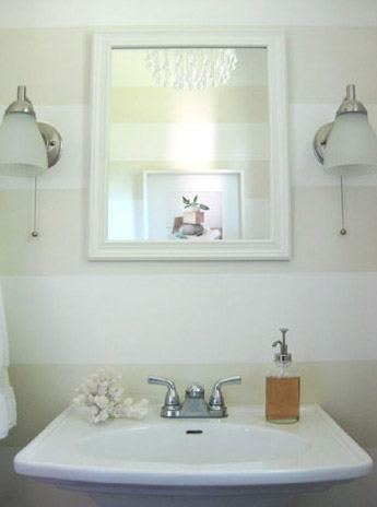
Hall Bathroom, Current House:
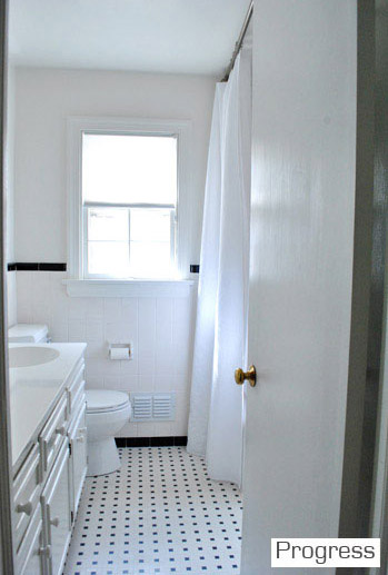
Winner: First house? The stripes and the fun glass chandelier were so charming. And we loved the pedestal sink and the pocket door too. But the new hall bath isn’t just a toilet – there’s a tub in there, which is where Clara takes all of her baths. So maybe the current house wins for function but the first house wins for sweetness? Either way, that blank slate of a bathroom in the current house is begging for some love. But we’ll count this as a point for the first house until we tackle the new one, since that was our first instinct.
The Sunroom, First House:
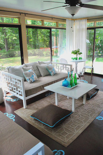
The Sunroom, Current House:
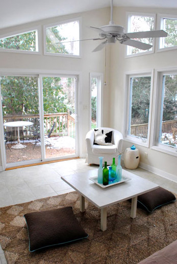
Winner: First house, all the way. We have about ten million things on the list for the current one though, so maybe in four years it’ll give our first one a run for its money…
The Patio, First House:
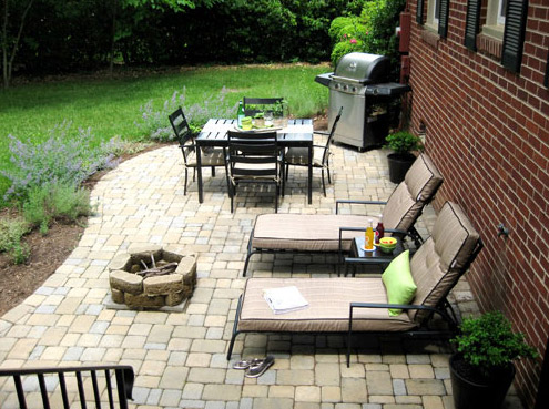
The Patio, Current House:
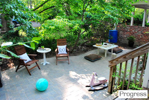
Winner: Current house. Just because it’s more spacious and cozy/shaded. But most of all because we did it ourselves (we hired out the first house’s patio since we were three weeks away from our backyard wedding and worried that if we tried to DIY it we’d get married next to a half-finished mud pit).
The Basement, First House:
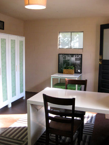
The Basement, Current House:
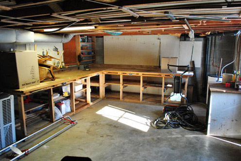
Winner: First house. Because we’ve obviously spent a little more time on the first one. Haha. But you never know what we’ll do down there with our current one someday…
The Backyard, First House:
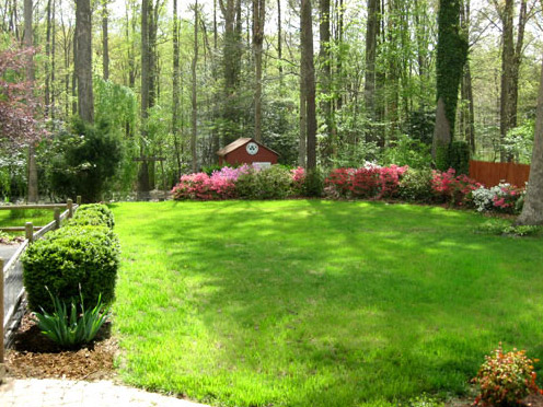
The Backyard, Current House:
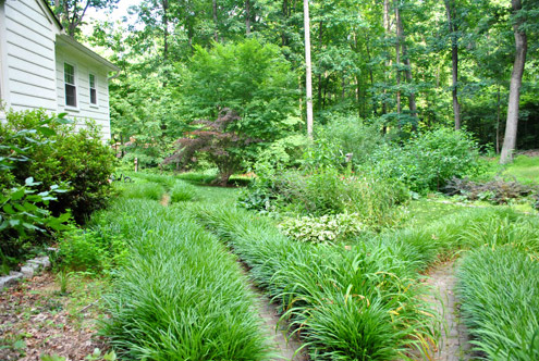
Winner: First house. We still miss that lovely flat grassy area surrounded by pretty woods. Someday we’ll get there though (after lots of transplanting, to hopefully make a little grassy spot for Clara and Burger to romp).
So there you have it. I think the final tally is 9 to 8 (with our first house in the lead). But I guess in fairness we should revisit this whole comparison thing when some of the spaces in the new house have actually been updated a bit more. That was a really fun little comparison though, Sarah. Thanks for the suggestion. It’s interesting to see how our style is gradually evolving, although we always have a soft spot for the tone-on-tone look of our first baby- er, house. What do you guys think? Have you ever looked at photos of your current house next to photos of a previous house to compare what you liked or disliked about them? Isn’t it funny how a new house is a chance to completely reinvent yourself, yet you’re usually working with a lot of existing furniture, so it still has “glances” of your first style going on? The evolution is definitely all part of the fun.
Psst- Check out a full source list for where we got nearly every last item (and what paint colors we used) in our first house here (we’re still working on one for our current house).

Tara says
I love both of your houses! What color was your kitchen in the old house? LOVE THAT COLOR!!! I love yall’s style and reading your blog totally inspires me to make our house more “ours”!!
YoungHouseLove says
That was Glidden’s Gentle Tide (they no longer sell it but can look up the formula for you at the paint desk and custom mix it).
xo,
s
Sarah says
This was EXACTLY what I was thinking… and you surprised me on a few spaces!! I also totally forgot your basement-redo and will have to go stalk your tips for ours. Thanks for responding to this so quickly, you little overachievers :)
YoungHouseLove says
Aw thanks for the suggestion Sarah. So much fun!
xo,
s
Maureen@This (Kinda) Old House says
This was a great post! I hope my house turns out as nice as yours! We have so much work ahead of us! It will be fun, but I am so impatient. :)
jordan says
that was fun! thanks! 2 questions…i have the same Target soap pump (copied off of my fav home bloggers:)! Do you have trouble with the soap clogging in the soap pump? Secondly, do you regret selling your patio furniture from your first home? THanks!
YoungHouseLove says
Since we inherited the table and four chairs when we moved here (that we ORBed), we’re pretty happy with selling the other stuff instead of moving it (since we don’t exactly have lives that include laying around on lounge chairs with a one year old, haha). As for my soap pump, I use Dr. Bronners (watered down 50% like they suggest) and it flows nicely. Haha.
xo,
s
Taylor says
What a neat idea for a post! I love that your two spaces are SO different! I tend to fall into “design ruts” and everywhere I’ve lived has looked almost identical. I am determined to spice it up the next go around!
heather says
I somehow always missed your rug in the first house living room and flipped when I saw it (I think I started reading around the move, so that might be why). That is the *exact* and I mean *exact* rug I’ve had in my head I’ve been trying to find for our living room now. Where on earth did you get it? I’m sure they don’t still make it but I will be on the hunt for a similar style. Uhg. Want. Now.
YoungHouseLove says
Oh yeah, she lives in our guest room now. It’s the moorish tile rug from Pottery Barn but they don’t sell it anymore. Maybe try ebay?
xo,
s
Heather says
consider the rambo gear strapped on. I’m ready for the good fight to find that rug.
YoungHouseLove says
Good luck Rambo!
xo,
s
Cari says
I love the first house vs. current house showdown. I noticed in you office from the first house you used the umbra flowers under the window and I’ve been contemplating getting some. The reviews I’ve read are very mixed with some people saying that they fell off the wall. I just wondering how they held up for you. Thanks!
P.S. My daughter, Laken(2), is a fan of Clara’s videos!
YoungHouseLove says
Ours are the older version that have pins with strong magnets which we love (we hear some of the new ones are just push pins and aren’t magnetic). Hope it helps!
xo,
s
Tiffany says
Ok…hope you don’t get too mad at me but I (as we all did) fell in love with you guys and your first house right along with you. That goes for the awesome light, breezy and neutral color palate and decorating style you chose.
Your new house is beautiful and you guys are uber talented and I’d live in a cardboard box if you decorated it, BUT your first house was AMAZING! I miss it. :)
Krystle @ ColorTransformedFamily says
Such a neat idea to contrast the two. It is so interesting to see how the color choices/ style has changed. I bet sometimes it’s hard not to revert back to the style choices you used in the first house. It also looks like you have made some amazing progres on your current house even though you have only lived there a few months. I think the living room is my favorite. I would love a huge sofa like that. What a nice place to call home.
jennifer says
love it! There is def potential for the current one to be awesome!!! Im wondering now looking through your whole house, what kinds of storage did you need for the bean? We are expecting our first and im in nesting mode, but I have no idea what all I need to store? Obbiously toys, but like what do I need for the changing area, bath stuff, extra linens, anything else? I would appreciate your expertise! looking forward to seeing more progress on the current house!
YoungHouseLove says
We just use lots of storage ottomans and big woven baskets for most of her stuff. Her closet and dresser store all of her clothes and shoes (the outgrown stuff goes up in the attic in tupperware for future kiddos) and most toys get tucked into baskets or ottomans. Hope it helps!
xo,
s
Brandy @ midcenturymodernlove says
i love this! i actually referred to both your red and yellow front doors on my post today. we just finished painting the inside of our front door a fun green.
RhodeyGirl says
This is one of my favorite posts ever!
judi says
so this isn’t related to this post exactly but just to the comment that inspired it … if you’re taking post suggestions, can i please put one in?
i’d love some tips and insight from you guys on how you keep things clean and organized *digitally* speaking. maintaining a blog like this must require a pretty rock-solid method of managing content, and i’m just curious how you make that work … even just the ‘simple’ task of managing personal photos feels like a daunting task. can’t wait to hear if you actually talk about this sometime, thanks in advance!
YoungHouseLove says
We back all of our family pics up on a site like Flickr (just in case) along with on our external hard drive (where we also store blog pics for safekeeping along with hosting them digitally on a cloud server like amazon.cloud). When it comes to our desktop, we just have a folder with a general title (ex: family pics) and then folders by month within that folder (ex: Jan, Feb. March) and then within those folders we stick the family pics from that time. It makes it pretty easy to find things (we just figure out what month it happened in or flip through a few folders) and then at the end of each year we have a “family yearbook” made on a site like mypublisher (for about $50 we have a year’s worth of photos in a skinny, easy to store hardcover book. Hope it helps!
xo,
s
Jenny Jen Librarian says
I was interested in clicking on the link to your bathroom gut job, as I am getting ready to rebuild mine down to the subfloors…..excitingscaryexciting! At any rate, the link doesn’t work, it takes me to a WordPress Admin portal to log in an edit the post.
YoungHouseLove says
Oh man, I thought I fixed that. Here’s the link for ya: https://www.younghouselove.com/2010/01/tackling-the-bathroom-the-big-reveal/
xo,
s
Lesley says
I loved this post! How fun to see it all together like that.
BTW, I die every time I see those polka-dot curtains. They make me giddy all over :)
Lesley says
Fun post. On another note, I live on the Gulf Coast and had to endure Hurricane Katrina in 05. I know Irene is heading north and just saying prayers for safety for your family and the entire path of the storm.
YoungHouseLove says
Thanks so much! We’re hoping she spares the whole coast and curves back out to sea!
xo,
s
Lakshmi says
I loved what you did with the wrapping paper to your basement Ikea cabinets so much! We just got married/ moved to NY and we bought an Ikea bedside table that was similar, so I totally bought gorgeous tealish blue paisley wrapping paper and copied your idea. I have to admit that’s pretty much my only house related DIY project that I’ve every done – everytime I walk by it I smile really proudly. Haha…thank you for that inspiration!
Katie says
Do you like the sofa bed in your office/guest bedroom (first house)? I’ve been looking for a recommendation for something similar.
YoungHouseLove says
Yup, it’s by Rowe and we have loved it (and heard from guests that it’s very comfy).
xo,
s
maria says
aside from the hideous yellow door on your front door, this post is very inspiring, I like so many of your choices.
Ashley J says
People are crayzay if they think the yellow door is hideous! It is so sunny and lovely!
Erin says
Love it! This is really fun for someone who is fairly new, and has only seen the new house posts. Also, can I just say how much I love the dining room wall? Every time I see the two pieces above the arch, i just giggle since it looks like a mustache. I may need to work that into my home…
Casey says
I really enjoyed that stroll down memory lane! I think sweet Clara’s new closet is beyond precious, but LOVED that crisp green on her old walls — I might’ve given that room the edge. ;)
I think of all the rooms owed a future redo, I’m most excited about your sunroom. I feel that’s really where you get to be bold and exercise full creativity!
Jaime says
I loved your old house. Still makes me shed a small tear when I think of it. Your new house isn’t at all my style, but I like seeing what you’re doing and figuring out how to apply it to my own house and sensibilities. Who was trolling Craig’s List for a cheap rocker last night? This girl. And I don’t even think I like rockers.
Kathryn says
Cute post. However…I disagree that your first house had a better basement…I mean you can do so much more with what you have in your new house!! Like use tools. And you can get all “projecty” down there. It seems more user friendly for your blog, and you don’t have to put everything in your soon to be garage. It’s doesn’t look beautious like your other one, but I feel like it totally wins in DIY function.
YoungHouseLove says
It’s true! John does do way more projects down there (I’m too scared of spider-crickets). So it definitely wins for function!
xo,
s
Chrissy says
This post calms me down. As a newly wed/ newly homeowner, I feel like I’m constatnly drowning in a flashflood of ideas with no time to spare. I’m a “need instant results” kind of girl and, therefore, I’ve already made the mistake of starting a project (or two, or three, or ten) in every room at the same time. Seeing how progress can take time in both of your houses brings me to say “Whoosaaaa” and take a deep breath. Feels better. Thank you.
PS – Although, you ‘ve done many different things with both of your very different kinds of spaces….a home is always about the people who are in it and I can still feel the same friendly comfy vibe in both houses. Thanks for creating such a great site and letting us into your warm home! Stay safe there during the hurricane!
Cricket says
Thanks for the post! I’ve been mentally comparing them, but it’s so nice to see the two houses “side by side”. :)
Oh, and don’t feel bad about your “spare bedroom”. On a recent trip to Colonial Willamsburg, we learned that most houses had a storage room called a “lumber room”. Until further developments, it’s your lumber room. ;)
Thanks for all you do here. And Clara is soo enchanting. :)
YoungHouseLove says
Haha, a lumber room. I love it!
xo,
s
Sharon says
What a GREAT idea to do a side-by-side comparison!! And ALL you’ve done in EIGHT mos!! WOW – Feelin’ like a major slacker.
Kudos to your dedication and determination. You do-ers really are inspiring. Hope looking back at your pix puts a spring in your step and a song in your heart!! :-)
Monica says
Great idea! It will be interesting to compare the houses at a later date when you have more done to your new house. I am more partial to your decorating style in the first house. I know the current owner’s of your first house read (sometimes?) your blog. I wonder if they will ever invite you over to check out the changes and decor they have made there. It would be even more fun if they allowed you to house crash it for the blog!
YoungHouseLove says
We’ve definitely left the ball in their court when it comes to house crashing! Here’s hoping…
xo,
s
Chase says
That was so fun! Thanks for taking the time to do that. :)
Karen says
What a great post. I love your first house because it seemed so serene and cozy. I love the colors you’re using in the new house.
I think I agree with all your assessments except for the sunroom. I think the one in the new house trumps the one in the old house because of the high ceilings, all the windows and because it’s so bright and airy.
janet @ ordinary mom says
I was telling my husband just yesterday how I realized that I am decorating our new house in the same colour scheme of our first house (we had a house in between). Our 2nd house was a turn key that had been designed by someone else and was VERY pretty and neutral and NOT me. This house has all my favourite colours back that I put in the first house. If it isn’t broke… ;)
Michelle @ Our DIY Dream says
Really cool idea for a post! I loved looking at the comparison pics and reading your thoughts on them. Thanks for sharing!
Alyssa says
Wow! Great post, I really enjoyed the pics and comparing:). Everyone reading from their offices must be crazy busy because as I type this, I’m comment #15!! This SAHM is usually on page 3 or 4 with my comments so I’m happy to be so close to the “top”, wahoo, makes me feel like I don’t suck at life!! lol We are in the process of selling so I am really taking notes on the things I love from both places…my hubby is going to love that once we find a new place!!!
Alyssa says
^^^^^^^just goes to show how Long it takes a SAHM to write one simple comment!! Lol
ruthy says
what a great post! its truly amazing to see what you two have transformed…and to realize that it all takes time. I’m a bit overwhelmed thinking about all I want to do and the $ its going to take…but realizing it took you about 4 years to complete it all gives me a bit of perspective!
Shanna says
Love it! And as someone who just moved into my new house about 2 months ago, I appreciate the fact that you showed certain rooms (guest room!) as they are right now. We have a guest room that looks very similar. And funny, our first home’s “hallway” and current home’s long rambling hallway closely resemble your respective homes’ hallways.
What a fun idea!
Rebecca says
I love Clara’s changing table. Is it a dresser or an actual changing table? Where did you get it? I love the style.
YoungHouseLove says
It’s actually a vintage dresser that we got for $20 from craiglist and refinished (and then just topped with a changing pad so it was multifunctional). Here’s that post for ya: https://www.younghouselove.com/2010/03/nursery-progress-refinishing-a-veneer-dresser/
xo,
s
Sarah says
This was a very cool idea but I must say, I disagree with the winner of the sun room. The first house was beautifully decorated and definitely showed off the love, but the architecture in the current sunroom is unbeatable! I can’t wait to see what you guys do with it! Regardless, it’s all beautiful!
Louise says
I love that American houses have basements (for all that “stuff”) and that your houses are so HUGE, with so many rooms. Wow – jealous from Sydney! Fun to see the before and afters!
Crystal G. says
You may think I’m crazy for suggesting this, but have you considered painting your doorframe the same color as your shutters? (Like a black-ish color?) It would really make your door pop even more and help take the focus away from that wayward tree.
YoungHouseLove says
We definitely have plans to possibly paint other exterior things (trim, shutters, siding, etc) so it’ll be fun to see where we end up! We promise to keep ya posted!
xo,
s
ashlee says
the first house was wonderful, no denying that. but your new house has SO MUCH POTENTIAL. look at that gigantic unfinished basement! & i can’t WAIT to see what you do with the extra bedroom/playroom.
i love how you guys are so excited about change. change in my own home stresses me out. :)
loving all the recent posts!
Kelly says
I’m so glad you did this post! I just found your blog a few months ago and fell in (Young House) love! I started going through your archives from the beginning so I’d forgotten what your new one looks like! I totally didn’t realize you had a mster bathroom or basement. I love the sunroom, too. Great work on both house! Can’t wait to keep reading to see what you do with the kitchen!
rooma says
loved it! though I think the second one will take the cake some day.
on a totally diff note, would love to have a post from you guys on blw on baby centre. thanks. :)
YoungHouseLove says
That’s a really good idea- I’ll have to add it to the list!
xo,
s
Taylor Duran says
I love both your houses! They both reflect your easy-breezy-come-have-a-drink-with-us attitude that I envision you must have ‘cuz you seem so cool. In thinking about your kitchen, have you looked into Rust-Oleum Cabinet Transformations? We’re considering it for our new-to-us house, but I want to hear someone’s true testimonial first. :)
YoungHouseLove says
I’ve read about other bloggers using it and they love it! My only concern is if it’s as low/no VOC as I can go (since we have the bean around and try to be conscious of that whenever we can).
xo,
s
Shreya says
What a great post! I loved looking at how your style has changed, it still reflects your family but is different!
karen says
ooooo…before i forget…maybe an idea for when you put the large opening from the kitchen to the dining room (which i think will be awesome…you can put pocket doors…if you need more privacy or for noise control.
YoungHouseLove says
That would definitely be an awesome addition if they’re in the budget!
xo,
s
Marianne DeMeyers says
Hey Sherry and John,
While we are on the Vs. trail, what are your thoughts on new homes vs. “vintage” homes. I have been in my new construction home for 5 years and I have NO inspiration. It’s builder blah. I thought the blank canvas would be so fun. I love the old bones of older homes. Anyone out there loving the new blank canvas?
YoungHouseLove says
I have seen some gorgeous new construction homes, but John and I are hopelessly in love with older ones- just for the character and also for the potential to turn them from something not-current-at-all into something functional and beautiful!
xo,
s
Melanie says
We are building a new home after losing ours in a fire in January. I am scared to death of the stark boring builder style. Although my father and I designed it and tried to add character to it where we could. We will have to make decisions on what to add in 4 baths & 2 kitchens, and I’m so nervous about making the right ones. I agree, starting with a blank slate sounds like fun, but in our case we won’t have the time to live with something for a while and make decisions based on what would work better, what we like more, etc.
YoungHouseLove says
Oh Melanie, so sorry about the circumstances for building but I know you’ll create something lovely that you’re so proud of! It’s like the phases of decorating, you’ll probably add things and subtract them until you end up right where you want to be!
xo,
s
Jenn Khoury says
I loved looking at the comparison between the two houses! I want to try it with ours now!
Stacy says
This was such a super fun post! I enjoyed seeing the spaces in your new home…and it puts me to shame! I have been living in my new house for a year and a half and it is nowhere NEAR what you all have done!
Natalie says
Hey Sherry
I love the green rug in your living room of the current house. I would love to get a colorful one like that, but I have a big golden retriever (who sheds like the dickens) and a 4 month old who will be spending more and more time on the floor. Is it hard to vacuum? I keep picturing the vacuum from “The Brave Little Toaster” where it sucks up it’s own cord and is choking and can’t run when I imagine trying to vacuum that beast. Just me?? Ok….Thoughts about cleaning/vacuuming that green beast? Weird visual I know
YoungHouseLove says
The strangest thing about that rug is that it’s less sheddy than other wool rugs we own (that aren’t nearly as shaggy). It must be knotted really tightly or something, because we just vacuum it once a week and we’re good. We did vacuum it about once every two days for the first week, just to shake anything loose that might come out, but it’s nice and easy now!
xo,
s