Last week we showed you how things landed in our kitchen, just using the furniture and things that we already own. And this week we’re sharing how it’s looking upstairs. This is quickly becoming one of our favorite rooms because it has windows on ALL FOUR SIDES. Not only does it get tons of great light, but it also gives us views of the greenery outside at virtually every turn.
We knew we wanted this room to be a nice big shared family space that we could all spend lots of time in together (instead of breaking it up into a bedroom/bathroom for us or two bedrooms/bathroom for the kids) and it has been working so well as a family room + workspace. We also didn’t love the idea of the kids having to go upstairs or downstairs to get us in the middle of the night if they needed us, because that still happens sometimes, so us all sleeping on the same floor and having this awesome light filled space upstairs to spend time in during the day and into the evening has been great.
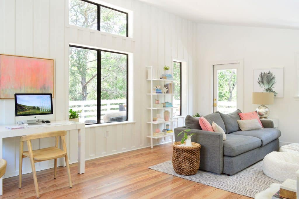
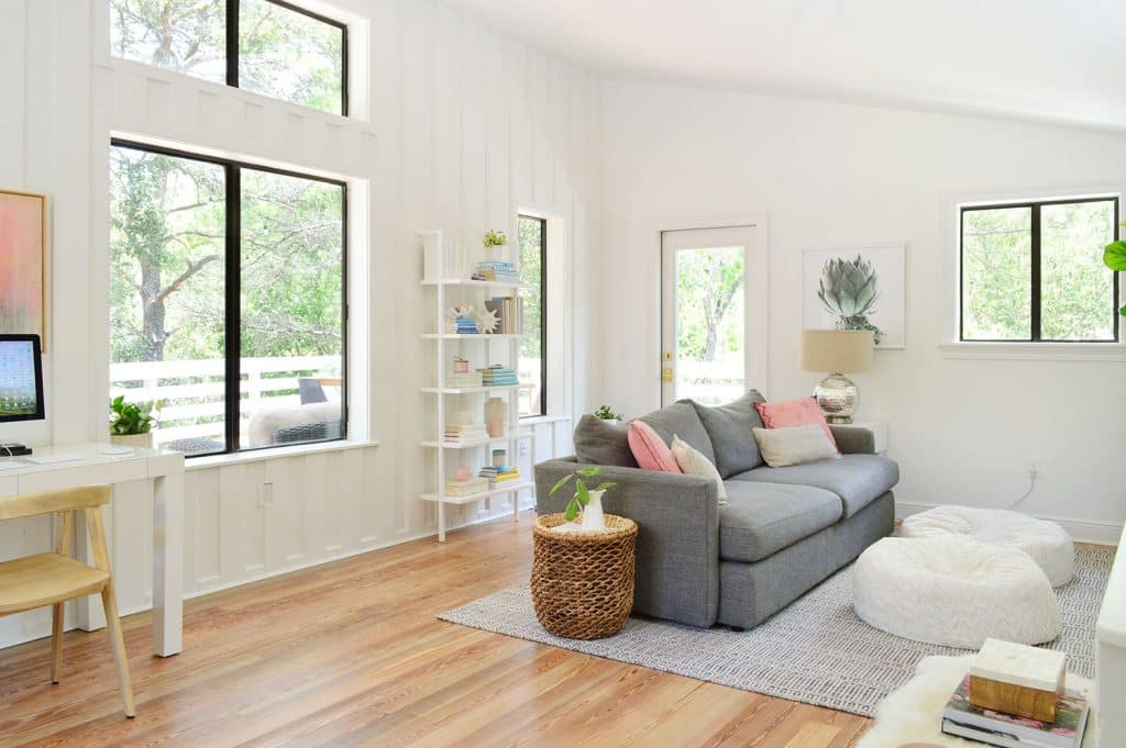
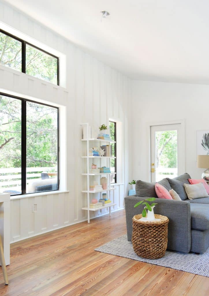
See that big double window with the transom window above it in the photo above? That’s perfectly centered in the room, and you can see that we created two different areas that are basically each half of the space (a living area on the right side, which is defined by that nice big area rug – and an office/art/work area on the left side of the room).
For context, that gray rug is 8 x 10′ and the sofa is a whopping 93″ inches long. So this room is BIG. I mean if you look at where the rug hits compared to that center spine of the window in the photo above, you can see that this area is literally just shy of half of the room’s width!
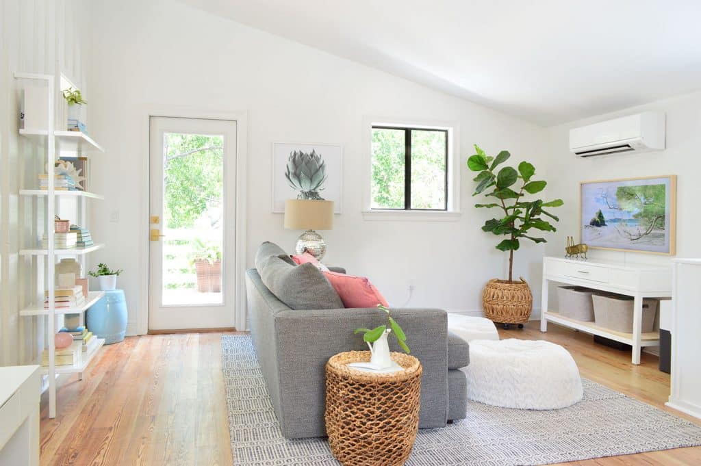
We’ve heard from so many of you who live in smaller homes who have said “larger living areas and smaller sleeping spaces are great in a smaller home because you share the larger spaces together, and just go into the bedrooms to sleep, so it feels a lot more spacious to have the square footage in the shared rooms!” We totally agree already! It has been great having one big shared space downstairs (more on that here) & this one upstairs – along with the huge deck that we can all enjoy up here too (you can see more photos of the deck in this post about the exterior).
Let’s swing back over to the left side of the space, which is essentially a work desk/homework area/art zone for the kids as well as a desk for us to work from when we want to use our big desktop monitor (our other computer is a laptop so we use that in any number of other spots like downstairs at the kitchen table or even upstairs on the deck).
Just like in the kitchen, we’ve furnished and decorated it almost entirely with things we already owned. The only new purchases are the chairs in the office area, a couple of storage baskets, and a new TV since we moved without one (we sold our wall-mounted TVs in Richmond with the house – more on what stayed behind in that house here & this podcast explains how we priced everything – aka, the exact amount of money we made selling all of those items with the house).
I won’t go as far as to say things are 100% perfect for this space (more on that as we go) but everything fell into place remarkably well considering it was just stuff that we shoved into the pod and hoped would work out for the best – and I’m glad it doesn’t put our feet to the fire to replace anything immediately.
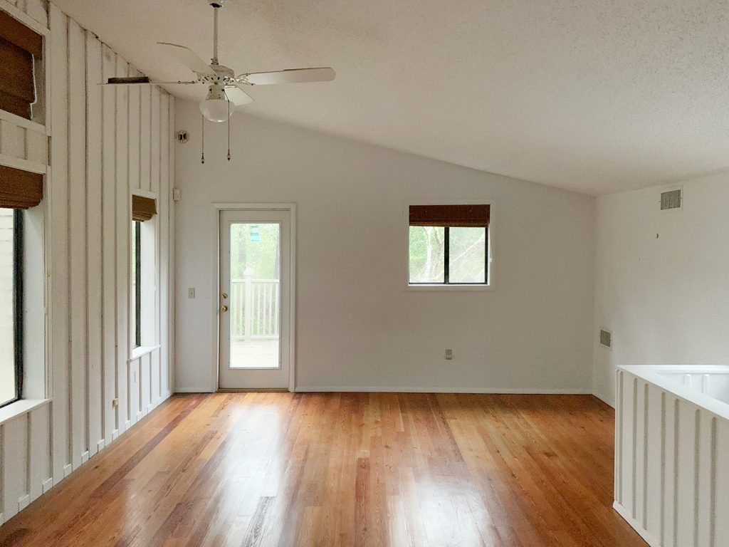
The lounge-y half of the room looked like this back when we saw it in February:
And after things like a fresh coat of paint (SW Pure White), refinishing the floors, and plopping down our furniture, it looks like this today. It also helps not taking this photo on a rainy day with your iPhone.
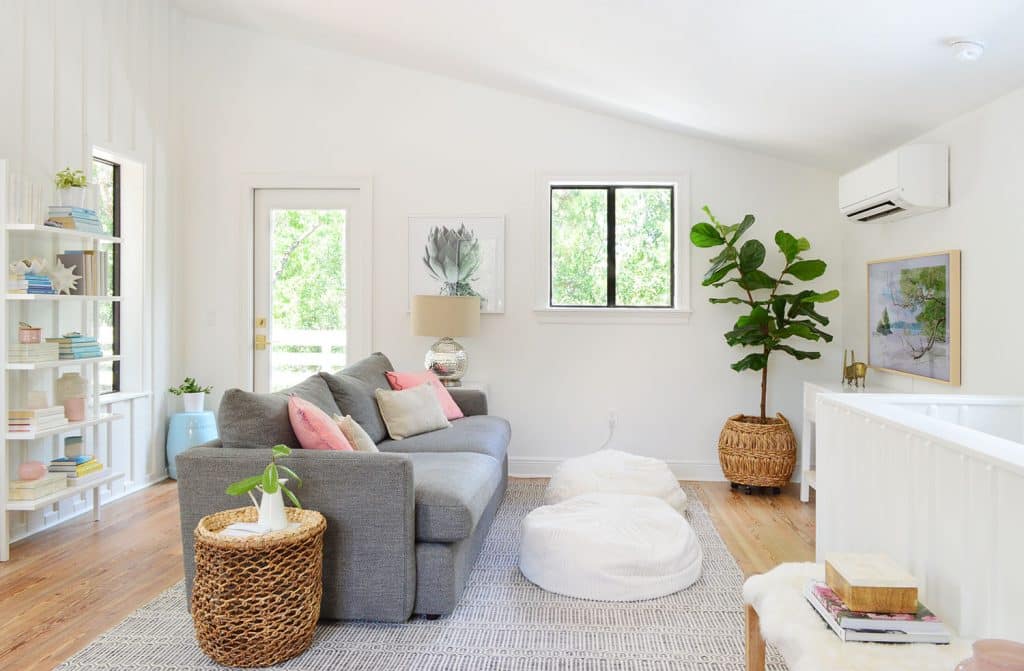
You may recognize a lot of the furniture in these pictures, although many of these items have never occupied the same space before. The couch is from our old living room. The rug is from our son’s old bedroom. The white wall-mounted bookshelf is from our beach house living room. The bean bags are from our kids’ old art room (we’ll eventually get a proper coffee table but they’re just fine for now). We thought this room would take a lot of rearranging to get everything to playing nicely together, but everything pretty much stayed exactly where we put it down on those first few days of unpacking.

It was pretty natural to orient the seating area this way because this was the best place to hang the TV since, again, there are windows on all four sides of the room. This was basically the only wall with enough space for the TV to not overlap a window – and so far it has been great. I realize it’s not the most sophisticated decision to let a TV direct your furniture placement, but you already know we’re not sophisticated. Especially if you know our TV viewing habits (The Circle, anyone?)
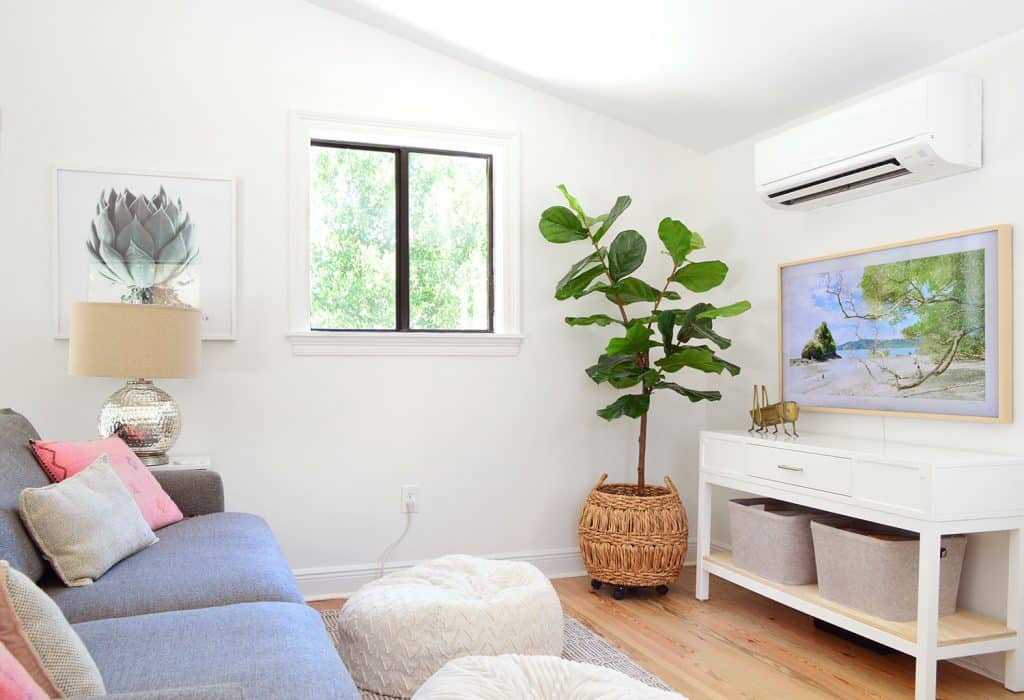
And yes, we did splurge to buy ourselves the Frame TV (hello blogger bandwagon!) since it will likely be our only television in the house. I’m glad we got it, but I think overall I’d give it a B+. We love how close it sits to the wall and that we could magnetically attach the beige “bezel” around it to make it look more like a light wood picture frame (that comes with the TV).
But I think the “art” screensaver looks better in pictures than it does in real life (that’s a photo from our family’s Costa Rica trip earlier this year that we use as “art” when the TV isn’t on) so we leave ours powered off a lot with just a plain ol’ black screen. Maybe I’ll dive into things a little deeper in an upcoming podcast, but since we were on the topic I figured I’d throw out my two cents.
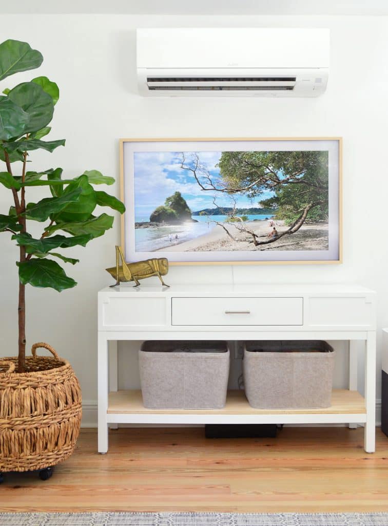
One other quick update that we did in here was to add a bottom shelf to that white console table (it had been in our old dining room but it had an open bottom). So after we put it up here under the TV, we just cut a piece of plywood so it could rest across the lower supports, giving us a super functional shelf instead of just a boxed off base that had zero storage. Then we bought these two felt baskets to wrangle all of our board games, since we find that we play them most often out on the upstairs deck after dinner.
Also if you’re wondering what that white thing is above the TV, it’s just a much more efficient heating/cooling solution (often called a mini-split) than we had up here before. We got four different estimates from different local heating & air pros because we really really just wanted a wall vent or two and not a big white wall mounted unit like the one we ended up with. But every single pro said this room would never be as comfortable as the rest of the house without this unit. So function beat form, and there you have it. Sure enough, they’re right. This room is extremely comfortable – even with all those big windows, and two of the vents that were formerly powered by the system downstairs never would have been as efficient or effective.
Getting back to the furniture placement conversation… access to the deck was another helpful factor.
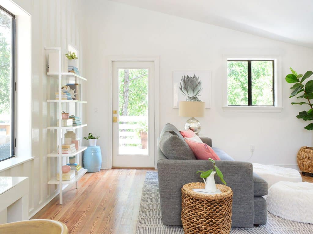
Obviously we wanted to have a nice easy path to the door that leads to our upstairs deck, and having the couch there actually creates a nice corridor leading out there. Ideally the rug would be a little bit shorter so it doesn’t encroach on the door frame, but that’s hardly a deal killer for now. Again, just working with what we have. It’s kind of amazing to realize that so much of our furniture that worked in a 3,150 square foot brick colonial can land here and also work so well in a more modern 1,400 square foot beach house.
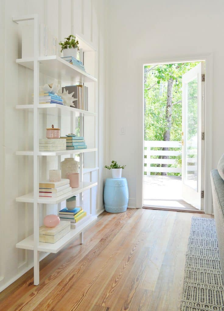
I was initially hesitant to put this bookshelf in such a high traffic pathway, but it has proven to be great (dare I type the words “Sherry was right”?). There have been zero bumping-into-it-incidents and it actually makes sense of a weird sliver of wall that we’d otherwise have trouble using for any other functional purpose. I think the key is that it’s super shallow, and if you pay attention to how close you walk to the wall, you’re usually like a foot away from it – even in a hallway or corridor.
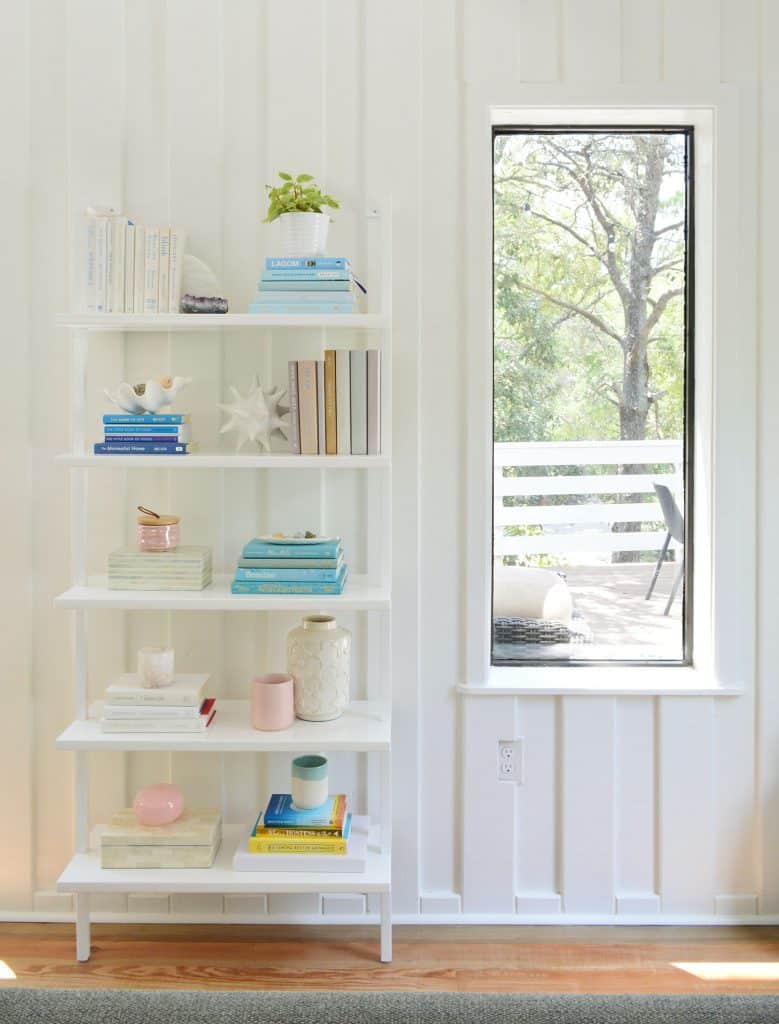
One last note about this side of the room. We actually have a huge pendant light fixture on order (tall ceilings = we can fit something big and cool) that will hang from the ceiling junction box that you see in the picture below (it’s centered on the window – just hard to tell from this shot). Our plan was to live here first, during a hot summer month before making the call on ceiling fan versus light fixture, and thankfully we’re halfway through June and this room stays completely cool and comfortable, so we can confidently go with a nice big pendant light without worrying we’ll sweat without a fan.
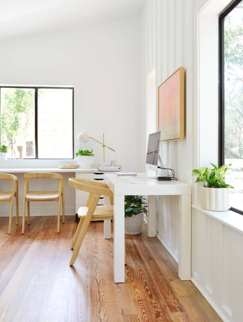
But now let’ swing around to the other half of the room: the workspace half. If the living area is the “party in the front,” this other side might be considered the “business in the back.” And yes, I just compared this room to a mullet.
Since this house is significantly smaller than our last house, we no longer have the luxury of a separate office and art space for our kids – although it was only earlier this year that we separated those functions in our last (very big) house. So we’re hardly strangers to working with our kids drawing and crafting nearby. In fact that was the setup in our last office for over 6 years – and honestly if this wider desk would have fit in there we might have just done that. The verdict after a month like this: it has been working out really well – even through quarantine & distance learning, which feels like the ultimate test.
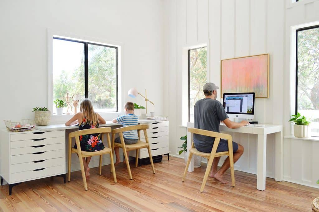
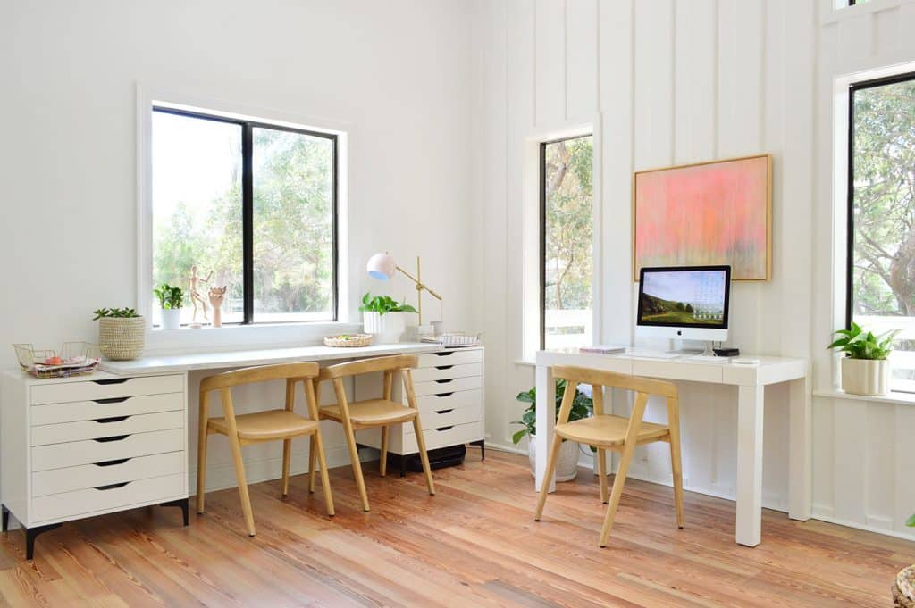
You may actually recognize their desk setup as a condensed version of the mega desk that we created in their old art room. We used 2 of the 3 drawer bases (these Ikea pieces + these legs we added) and 1 of the 2 marble-look countertops (we donated the unused parts after getting here and finalizing the layout).
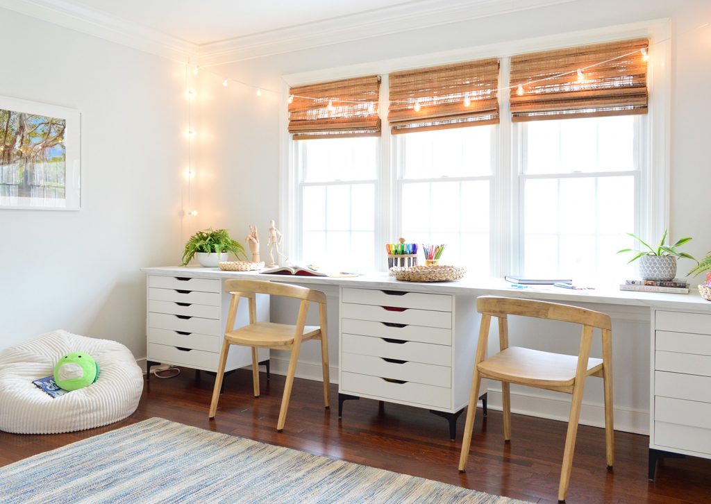
You may notice that the one counter isn’t long enough to fully span the two desks in the photo below (at least not with space for two chairs in the middle). Ikea does sell a longer 8 foot version of this counter but it doesn’t seem worth the $249 delivery cost (!!!) to solve a problem that’s not actually a functional problem for anyone. Someday we might add butcher block to the ends or pick up the longer counter if we’re road tripping by an Ikea – but for now it’s just fine.

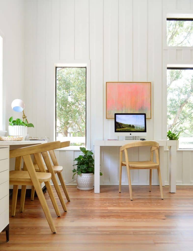
The grown-up work area here is really just my old desk (well technically it’s Sherry’s old desk from when we got married! Yes, we’ve had this for over 13 years!). We majorly pared down our files and paperwork before moving – digitizing some but mostly just shredding stuff that we didn’t need anymore – so we don’t need nearly as much file space as we had before. We’ve borrowed a few drawers in the kids’ desk that they weren’t using, and we have lesser-used files stashed in the bedroom for now.
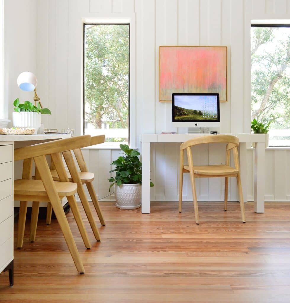
So eventually we’ll probably figure out a way to put our “office stuff” in one place, but I do feel proud for sneaking my printer under one of the drawer bases (look closely and you’ll see it in the photo above and the one before that). It kinda lurks in the shadows and wirelessly spits out papers when needed. It’s a bit harder to use the scanner this way, but we almost exclusively scan from a free app on our phone anyways (the HP Smart App for anyone wondering – not sponsored, it’s just really easy & fast).
I’m actually sitting in this very spot right now as I type this and, I have to say, after 7 years of working facing a plain old wall – it’s AMAZING to be able see so much greenery from my desk chair. I have windows on two sides. Bonus perk: I get to watch Burger sun himself out on the deck with a “Jealous, bro?” look on his smug little chihuahua face.
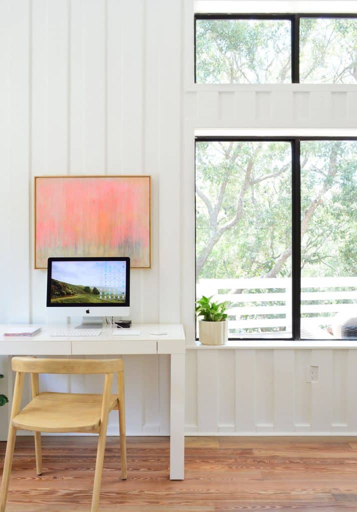
It’s hard to tell from these photos, but there’s actually quite a bit of empty space that’s still on this side of the room. In fact, we could float a second 8×10′ rug on this side. We probably will add one at some point, but we’re happy to just let the room percolate for a while. That way we can see what functional improvements we may need to make so we don’t fall into the trap of buying stuff just to fill a space that might get rearranged or tweaked anyway.
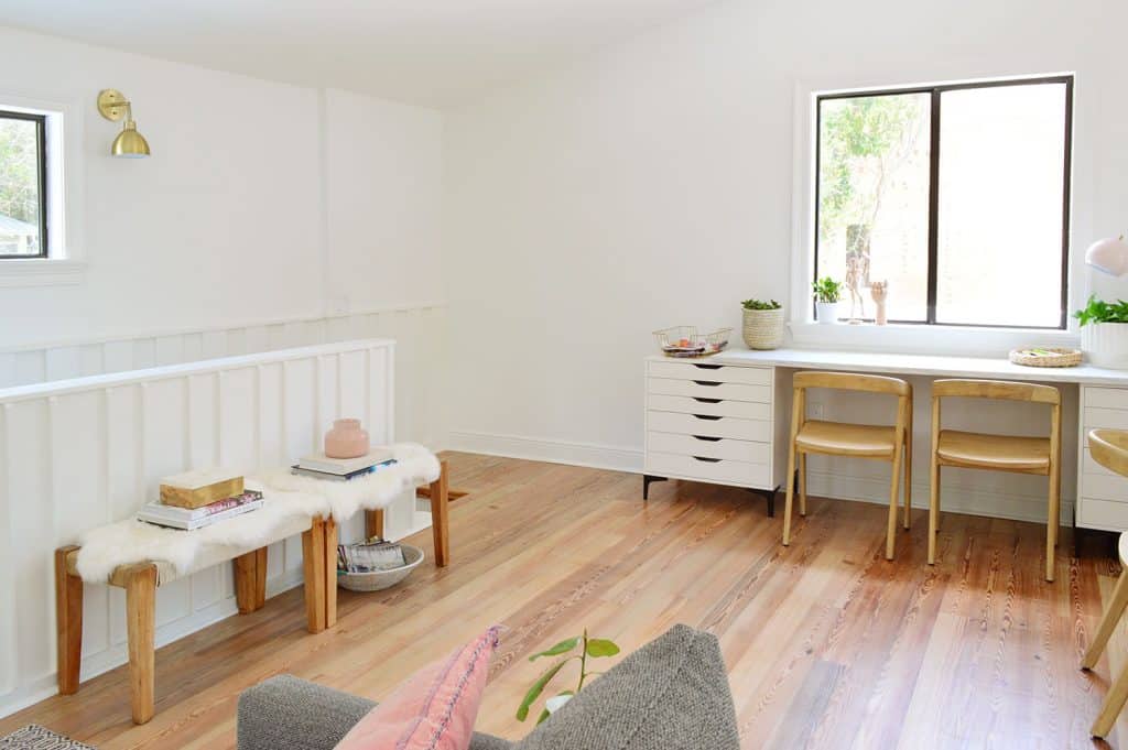
And speaking of just filling space – yes, those benches to the left of the photo above are pretty much just doing that right now. But we owned them, didn’t want to part with them yet (they might be useful in the future guest room at the foot of the bed for example), and there was an empty space for them right there, so… they live there for now.
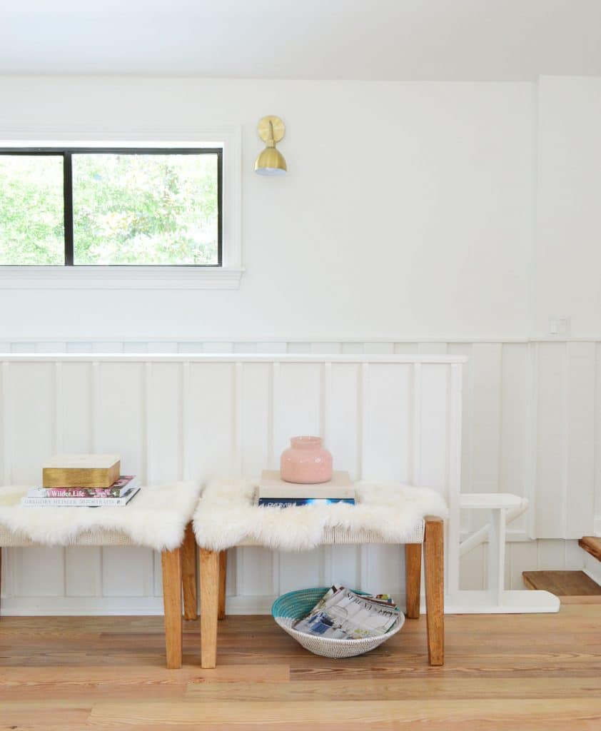
So there you have it: the current state of our upstairs living area. Will it always look like this? Nope. But I’m beyond grateful that so much of what we already owned and moved down here (and, in the case of the couch, were baaaaaarely able to wrestle up the stairs) is working so well for us.

Now excuse me while I go gaze out the windows for a little while. Or maybe it’s laptop time on the deck…
P.S. You can catch up on our entire Florida house renovation in just 8 posts right here. From the exterior makeover to the projects we planned from afar to our recent floor refinishing, we’ve covered a lot of ground.
*This post contains affiliate links, so we may earn a small commission when you make a purchase through links on our site at no additional cost to you.
