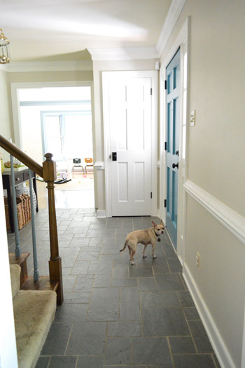
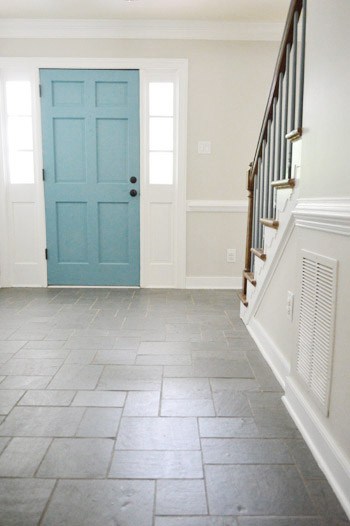
The deed is done. Behold, our freshly painted foyer:
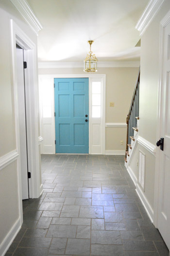
It feels about a foot taller and at least two feet wider than it did before. Ah, the power of paint.
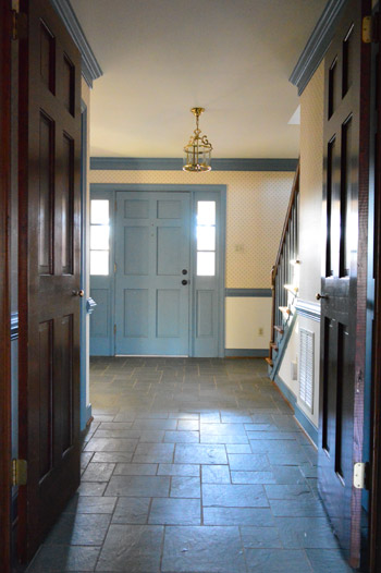
This shot’s probably the most accurate when it comes to color. It’s definitely one of those soft neutrals that shifts throughout the day, but I’d say it’s one part sand and one part greige. Not too cool and not too warm. And pretty darn beautiful with white trim.
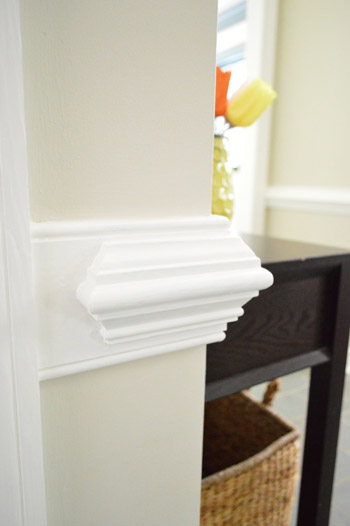
As for choosing the color, we mentioned a bunch of swatches we were loving in this post, and shared this little makeshift palette:
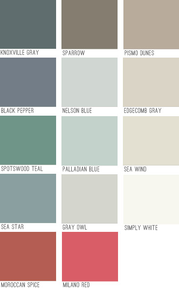
Can you guess who ended up in the foyer?
Good ol’ Edgecomb Gray. The funny part about that swatch is it’s not really gray (it’s warmer, more like a greige). Another pretty hilarious thing about it is that it looked terrible in our last house, but here it’s gorgeous (it’s crazy how differently a swatch can read depending on the lighting situation, what direction your room faces, etc). So in a sea of paint chips it was an easy choice. Which is nice because it’s a pretty big commitment.
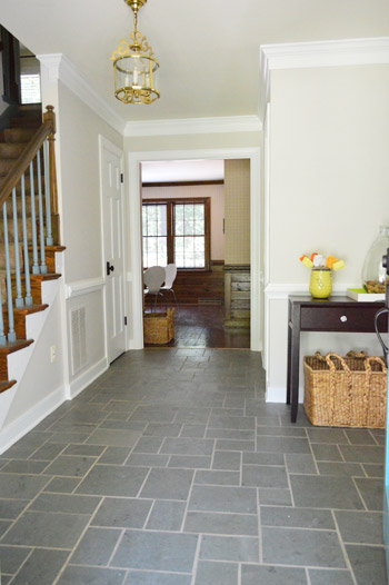
The foyer leads to four downstairs rooms as well as flowing up the stairs and into the hallway up there which leads to six additional rooms – so we knew that whatever we chose would have to work well with any other wall colors we’d be choosing for all ten of those spaces that will connect to it.
As for getting it up on the walls, first we filled in a few nail holes with spackle and then primed those spots as well as any areas that had raw drywall (from our wallpaper peeling adventures).
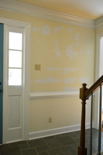
Then it was painting time. It thankfully only took two coats (as opposed to the trim, which took four). We went with an eggshell finish in BM’s no-VOC Natura stuff, so John got his roll on and I cut in – yes, around chair rail, crown molding, baseboards, and seven (!!) doorways.
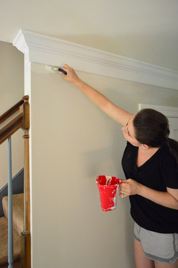
As you can imagine it took John about one tenth of the time to roll that it took me to cut in around all of those edges, but it was totally worth it. I love the new wall color so much that I could do a musical number about it. (Seriously, don’t tempt me – I’m a terrible dancer).
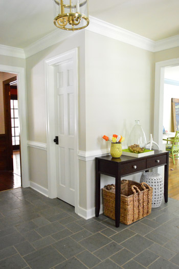
It’s one of those colors that changes throughout the day and feels so airy and breezy, like the sky at the beach. Some moments it’s like the lightest part of a platinum cloud, and other moments it’s warmer and richer – like coffee with lots of milk swirling around in there.
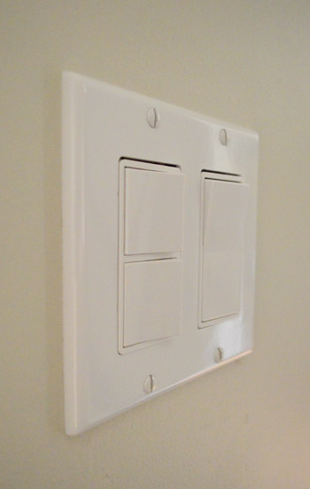
We have a devoted post all about this paint color if you want to see more photos of Edgecomb Gray in our house & read why we love it so much. Oh and after our paint job, we switched out the old yellowed outlets and switches for crisp new white ones. Such a cheap fix, but just like fresh paint, they go a long way in making the room feel updated.
Can’t wait to get some art going on. Oh yeah and paint the other fifteen rooms in our house (note to self: don’t think about that, just focus on your musical number).
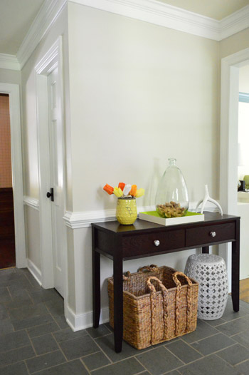
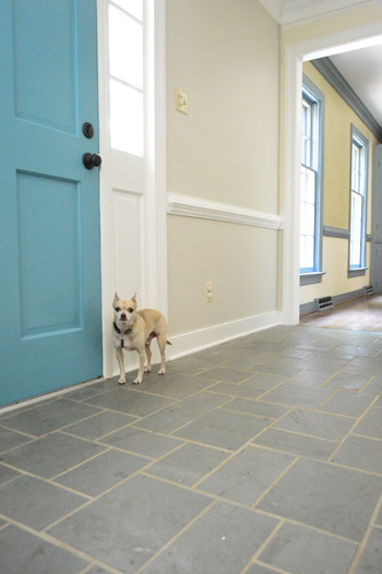
It’s nice to have a pop of color in the door since all of the white trim and doors around it seem to temper it while the neutral walls and the dark floors and door hardware ground things. And you know the light fixture is on my ORB list.
I like this shot because the blue spindles leading up the stairs almost look black instead of periwinkle blue. Although I think we’re leaning towards white for those spindles (when we can work up the energy to do four coats on them) and eventually we’d love to ebonize the top part of the railing to go with the dark door hardware everywhere. Sort of like this or this.
In the meantime we’re just soaking up the victory of completing a whole lotta trim, doors, chair rail, crown, and getting some fresh paint on the walls in there.
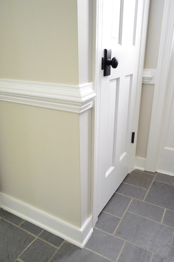
Change is good.

Taya says
Omg! It looks awesome in there!!
Sharon Sprague says
Not only do I love the color and how bright it looks. I love that Burger has photobombed! My dogs do that all the time. It’s pretty awesome when they do that all shifty and all. So loving the transformation. Super fun! I just shared a room makeover on my site. You might recognize a book on my ottoman. :) http://www.houseconfetti.com
Hope you’re loving it all as much as we are loving reading about it. Congrats!
Sharon Sprague says
Question. All of your photos look so great. May I ask what size you save all of your images at for posting? Thanks!
Sharon at houseconfetti.com
YoungHouseLove says
Thanks Sharon! We do 500 wide for horizontal and 375 for vertical.
xo
s
Amanda H. says
I like this color, however when I see a color I like, it is almost always shown with white trim. We live in an older home with very wide dark wood trim that has a reddish undertone. There is a lot of trim and built-ins, plus our wood floors almost match it. My husband isn’t on board with painting the trim white so I have to work with it. Do you have a good color suggestion? Would this color pair well with darker trim?
YoungHouseLove says
I think it could be really pretty with dark trim too! I’d bring home a swatch and hold it up and see!
xo
s
qs777 says
Too funny! I just bought 2 gal. of Edgecomb Gray to use in our hallway. For us, it totally looks blue/gray because we have no natural light so the paint guy cut down the black in it just a bit. I liked the blue, just not so much of it. Now, it looks more like what yours does. Looking good! The light is actually growing on me more, although maybe it looks different in person.
Julianne says
Looks fantastic! Loving your paint choices..so nice and fresh! :0)
Kaesey says
The foyer looks wonderful! It’s so much work to spackle and paint and fix all the little dings and switch covers and whatnot, but it’s worth it. (I just removed paint from old brass hardware – sheesh! But it looks so nice now: http://kaesey.wordpress.com/2013/07/29/a-little-progress/) I will keep that gray in my arsenal of ideas….are you going to use it in the upstairs hallway, too?
YoungHouseLove says
Yes, I think we’ll carry it up the stairs and use it up in that hallway as well.
xo
s
{plum} says
Have you ever used Kilz primer? It cuts the number of coats to cover a dark color in half. Give it a try for all your other blue trim! :)
YoungHouseLove says
Oh yes, we’ve used Kilz and Zinsser and more- you name it! But for this stubborn blue it took 2 coats of primer + two coats of paint – even the thick stainblocking primer like Kilz.
xo
s
Ann says
I love how it looks! I am glad your foyer went from the darkness to the light! :-) Just a quick question… we have seen all of the trim & wall painting going on, wondering what you do about ceilings? For the life of me, I cannot re-paint a space without doing the ceiling also – it looks dirty & not as crisp to me without knocking that out while I have the painting supplies out. (and I know it is just me being WAY to OCD – so I am wondering what other people do?)
YoungHouseLove says
We’re hoping to tackle the ceilings soon, but we’re not sure what colors to go with (white? a half-tint of the walls? soft soft blue?) – will keep you posted!
xo
s
Erica says
Looks fantastic! Makes the foyer floor look like new. Curious to read about the ebonizing of the banister. Keep up the great work you guys!
Jane says
How come John decided to use a roller for the paint instead of his sprayer?
YoungHouseLove says
The sprayer requires so much extra prep in taping things off because of it’s “overspray” (i.e. misting paint beyond the intended areas) that it’s actually much faster and cleaner to use a roller in instances like these.
-John
Momlady says
Outstanding! Congrats! Woot! What a transformation! It’s fabulous seeing Young Master Burger giving the Petersik tour of the foyer. Cudos!
Julie @ Living on the Ledge says
This is looking fantastic!!!
I have a general paint question, hoping you guys or some readers might have some input.
I know you guys are Benjamin Moore fans all the way and very loyal, but we are building a house on a budget, and are doing the painting on our own. In our area we have a choice between Sherwin Williams, and then the Home Depot paints, like Behr and Glidden. Have you guys used any of these in the past and have a strong preference one way or another? The HD paints are much cheaper by comparison, but I don’t know if that qualit is cheaper too?
Thanks!
YoungHouseLove says
We actually have really liked HD paints in the past too! They’re a little thinner sometimes (hence the price difference) but usually with two coats they can look great! We liked Behr a lot but Olympic Premium (from Lowe’s) became our favorite since they have no-VOC paint even when it comes to the added colorants (many other brands add colorants and then it’s not no-VOC anymore).
xo
s
Angela says
Julie,
We have the same choices as you in our area, but we use Sherwin-Williams paint almost exclusively. The staff is super helpful and recently color matched paint to BM Soft Sky. I’m using it to paint a hutch purchased off Craigslist. I’ve only have two coats so far but I’m loving it.
SW recently introduced a new line with Pottery Barn colors and I bought some paint to repaint my 1990’s oak vanity. I was inspired by YHL’s post and thought I’d try a bold color since I have to work with the tile (white with a dark blue accent tile) so I chose the PB color “Naval”. Can’t wait to get started but I have to finish the hutch first!
Chenell says
I think that light fixture is going to be a sleeper favorite. Once it is painted with the ORB, it’s going to be gorgeous. Such great lines on that thing. I agree with everyone…the looks awesome. Enjoy!
lisa says
WOW!!!! You guys are amazing. Raw talent. You have great eyes. You know how to pick just the right paint color. You are my inspiration. I read your blog everyday and follow the progress. I have been anxiously waiting to see the paint color choice after the wallpaper came down. Excellent, aesthetic pleasing.
Katie says
Curious. Did you ever consider removing the chair rail?
YoungHouseLove says
We thought about it but ultimately we like the architecture and the nice molding at this house. Keeps things interesting…
xo
s
Alicia says
Gorgeous! We too have ugly yellowed light switches. Do you find it easier to replace them room by room or is it something you would consider changing all at once? I feel a little paranoid that if I took too long manufacturers might change them up on me! What have you decided to do?
YoungHouseLove says
We tend to go room by room just because it’s a long tedious task to do all at once. And since we go with pretty stock switch designs I’m not too worried about them getting redesigned or discontinued. But if you want to go with something pretty unique or specific looking it might be better to go all at once.
-John
lisa says
I think the reason why YHL is so successful is because you share everything with us. Paint color names, detail source list & etc. My neighbor will not share her paint color names with me. TV decorating shows will not share paint color names. You see a cool room in a magazine that you want to duplicate? Tough, most magazines don’t share paint color names but thumbs up for HGTV magazine for sharing. That is why I buy HGTV magazine and read YHL everyday. Thanks for sharing. By the way, love YHL in HGTV mag. HGTV should give YHL a reality show.
YoungHouseLove says
Aw thanks Lisa! We’re way to skeeeered to ever sign on for a TV show, but we love sharing our paint colors with you!
xo
s
minabey says
I didn’t know that. But why wouldn’t they tell? Particularly your neighbors. Just curious. Is it a taboo to tell? I mean like asking a woman’s age or how much a person earns?
Sorry for asking… different continent, that’s all.
Jill says
Beautiful. Just the light the foyer needed it. Like always, you made ugly bello again.
Megan says
It looks so amazing! Do you have a spackle that you prefer to use?
YoungHouseLove says
We like Dap Crackshot. The one with the blue lid.
xo
s
jackie says
Looks amazing! Do you guys plan to keep the tile floor or run wood throughout the first floor as well?
YoungHouseLove says
We’d love to work with it if we can revive the grout and repair a few cracked areas!
xo
s
Leah says
Beautiful – like a weight has been lifted and the space can breathe now! I wanted to chime in for a soft blue ceiling… my ceiling in my entry foyer is painted “Palladian Blue” and it is light and lovely and lifts up the whole space. It would look beautiful with your front door!
YoungHouseLove says
I LOVE that idea! Just have to sell John on it.
xo
s
Alice says
Amazing that that is the same foyer. Makes me wonder how the previous owners lived with all that blue trim and wallpaper for so long.
Also, I think I may have made this comment before (maybe, maybe not), but I am curiou why my doors have three hinges but all your doors have two. Now I am trying to remember if the doors in your previous home had 2 or 3!
YoungHouseLove says
So funny! I think our front door has three but the other doors have two! I think the others in our previous houses have had two as well.
xo
s
Catt says
We painted the exterior of our house Edgecomb Gray last year and loved it so much we painted the kitchen the same color when we renovated that this April.
Kristin @ Everyday Organizing says
Wow, this looks incredible! It is hard to believe it is even the same space. I also really love your little entry table. It is perfectly styled and I love the big basket underneath as a catch-all for shoes, etc.
Shannon says
Will you be carrying the same color into the stairwell & the upstairs hall or will those zones have their own color?
YoungHouseLove says
Same color for those areas, just to keep the flow.
xo
s
Jamie @ A Chandelier Life says
Wow, it doesn’t even hardly look like the same space. Really, really nice.
danielle says
what a BEAUTIFUL transformation!
we just used natura paint for the first time this weekend and were very happy with the results… but our local True Value told us that Benjamin Moore is phasing out that paint line…
??? BUMMER.
YoungHouseLove says
Oh no! We didn’t hear that! We’ve tried their UltraSpec (cheaper line of no-VOC) and have liked that too, but Natura is our favorite.
xo
s
Toni From says
I love how clean and bright your foyer looks now. I also love the pic of Burger walking along the wall-his face is priceless: “What, you didn’t see me do anything.” At least that is what I pretended he was saying.
jessica @fourgenerationsoneroof says
The light color and blue door look beautiful together! Loving the dark hardware also :)
Fran says
Looks wonderful!
Devon says
It looks gorgeous! We are officially one month into our new (very old) place and the foyer was my first major project. We went with BM Gray Owl – but it looks very sea glass blue in our place, depending on the light. I love it, but it definitely went on differently than the swatches we painted on the walls even!
And Sherry- go you for being the cutting in queen. I think your tutorials are the only reason I’ve been able to figure it out!
Stevie says
You may have already gone over this in another post and I missed it…but did you change the direction your doors open? In the before picture it looks like the door on the left opens into the hall and in the after it seems to open into that room. Am I crazy?
YoungHouseLove says
I see what you mean! In that second photo (the before) the brown doors are actually an extra set of doors that closed the foyer off from the kitchen, but we removed those to open things up. So the door to the bathroom was always hung that way, it was just hiding behind the wood doors that blocked off the kitchen in that before shot.
xo
s
Diana says
Oohhhh…looks great!! All your paint posts almost make me wish I had rooms in my house left to paint!
Alicia says
Looks great! And it really opens up the area!
Amanda says
That’s such a pretty colour — I love love the door colour still and I think I’m going to make it my accent colour in my very white bathroom. But the majority of my apartment is a light gray/blue (mostly blue) would it be too weird to have a blue colour in the bathroom as well? It’s all connected; then the bedroom is a light (barely most-people-can’t-tell-there) pink.
YoungHouseLove says
I think it would be pretty, and as long as you use art or accessories in a few other colors it hopefully all won’t feel too blue.
xo
s
JoJo says
I’m so excited to see what kind of light fixture you choose! It makes the tile look great too! Well done YHLers, well done.
Amanda says
I knew the color the second I saw it! We just painted our foyer the exact same color about six weeks ago. It really does look different throughout the day , but it’s always warm and welcoming. Good choice!
Jan says
Wow!! Looks amazing, love all the detail in the chair rails.
Sherri says
The paint color brightens and expands the foyer so much. And the door color adds the explanation point to the space. I also noticed something that most people don’t pay much attention to: The screws on the outlet cover are all the same direction, the lines all vertical. I do the same thing with mine and like that attention to detail!
Janet S. says
Since the front door smiles into the house with a happy shade of turquoise, what about painting the stair rail spindles the same color? that might be fun. It would be less coats of paint to deal with and something a little different, a quirky little surprise!
YoungHouseLove says
We think we like the focal point of the door being bright and happy on both sides without it competing with other things in the foyer, but you never know where we’ll end up.
xo
s
Starla says
The foyer looks beautiful! I have noticed you don’t use tape when you are cutting in. Do you have a super steady hand, or are you not bothered if the paint line is not straight? Just curious.
YoungHouseLove says
After years of doing it I have a pretty steady hand, but my secret weapon is also a short handled 2″ angled brush. Gives me so much more control than a long-handled brush, so my lines stay nice and straight. I can even do it left handed!
xo
s
Lacey says
I think the foyer is a good balance of sophistication and fun.
Nikki Thomas says
I love the transformation….It looks open and inviting. Love you work.
Kate says
Looks great. Edgecomb grey is the main color in our house as well. I love it. It is so crisp and clean. I love that it looks different in all different lights.
Autumn Beach says
Oh, it’s BEAUTIFUL. Just beautiful.
Betsy says
Wow, I just have to say you guys have some amazing trim in your new house! I think the blue befores were so bad I didn’t look at it fully. :) But painted white and beside fresh walls, the architecture of the chair rail and crown molding really sings! I feel like that foyer would look awesome with something fuschia (in a pic or a flower or a frame).
Cee says
I love how you guys take it one room at a time. I’m always jumping around my house with projects but really need to focus my time on one so I can finally check it off my list and move on. I’m getting better:(
Kaytie says
Just incredible! It looks so refreshing, my blood pressure went down about 10 points by looking at the pictures. Well done!
diane olsen says
Lovely! Now I wish I’d done that color!