The deed is done! Rockport Gray is all up in this hizzy.
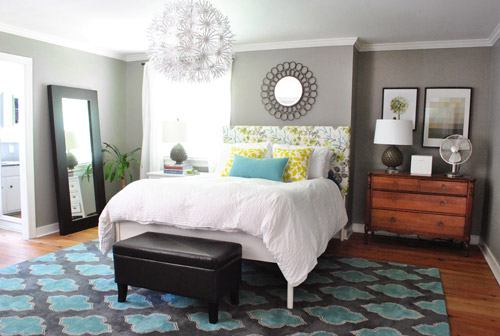
We love how much more things like the extra thick crown molding and the trim around the doors and windows pops now that the color is deeper and more… sleepy? Can you describe a bedroom color that way? In love.
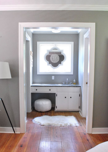
It’s such a mutating color. Sometimes it looks lighter and grayer.
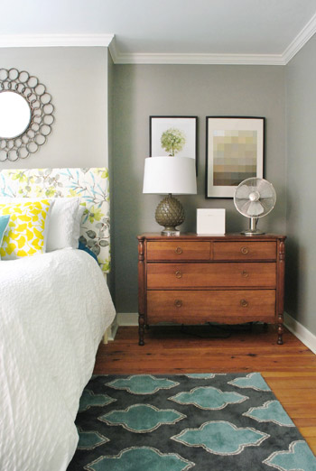
And sometimes it looks moodier and more mocha.
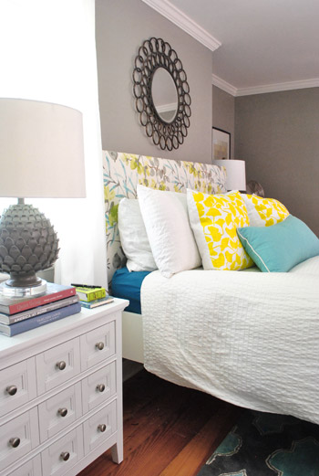
We think it looks especially good with our cheap-o Ikea curtains (Vivan panels for $9 a pop) and other crisp white things, like this old side table from our first house’s den and the white lamp shade on our floor lamp.
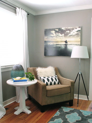
So yeah, we likey the new vibe in the bedroom.
Basically the room looked kind of soft and sweet with the light gray-blue walls before…
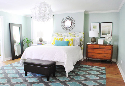
… but they were kinda similar to the walls in our first house’s bedroom (which we did love, but after 4.5 years with it we thought it would be fun to try something different).
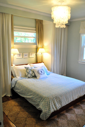
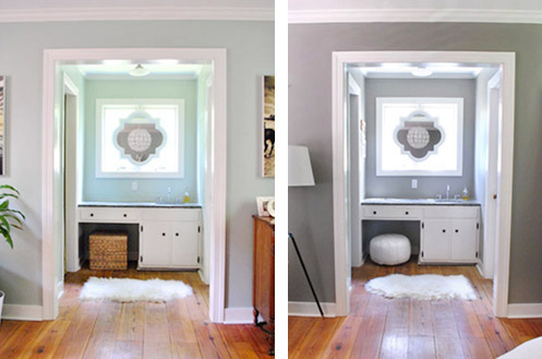
It also felt a little too blue when you factored in the blue in the rug, the headboard fabric, etc. We just wanted something with a little more oomph. See how these side by side shots show how much more the molding and the fabric on the headboard pops? Now they stand out and say I am molding/headboard, hear me roar.
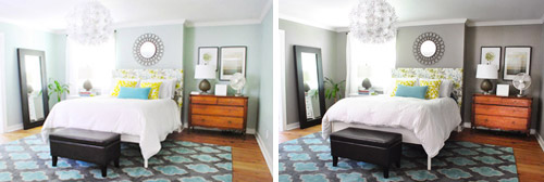
These vertical images might help you see the molding effect more easily (since they’re not as small). Doesn’t the trim almost look like it has been beefed up and whitened in the picture on the right? It’s all thanks to the contrast that the deeper and less airy color brings. Seriously, I didn’t repaint the molding or anything.
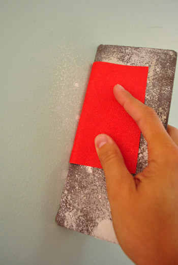
As for the process, we basically spackled any nail holes that we weren’t going to be using anymore (like the ones that used to hold the art up over the bed when it was on the other wall) and then sanded them so they were smooth.
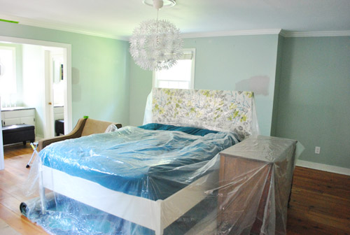
Then we moved a lot of stuff out of the room, and covered the remaining furnishings that we pushed into the center of the room with plastic drop cloths):
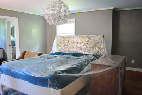
We taped off the crown molding too (since on a step ladder I’m less steady handed). But I can freehand all the trim around the windows, doors, baseboards, and outlets without tape – so that saves us time and tape.
It’s amazing what an instant difference the new paint on the wall was. But it took us about five or six hours of prep/painting to get to that point. It’s a big room (16 x 16′) and we were also painting the entire sink nook (which is like another small room that’s attached with tons of windows and doorways to cut in around). So we just put on some music and got down to business. Painting business. Not funny business.
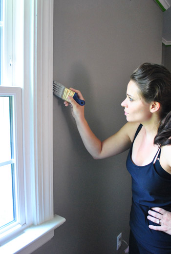
There was some of this (I’m the cutter-inner in the family and John is the roller):
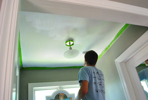
And some of this (we actually painted the ceiling above the sink nook a color for the book photoshoots back in January, so we finally got to repaint it back to white while we were doing the walls):
As we mentioned, the room is 16 x 16′ – and we actually used less than a gallon of paint for this entire paint job (including the sink nook). Maybe around 2/3rds of one? Benjamin Moore paint (this was Rockport Gray in their Natura base, which is VOC free) has great coverage, so when we used Olympic to paint this room for the first time we used the whole gallon since we needed two full coats, but this time we only needed one coat and a few touch ups as a second coat instead of a full second application. Oh and we went with an eggshell finish for anyone wondering (it’s nice and matte but still a bit more durable and wipe-able than flat paint would have been).
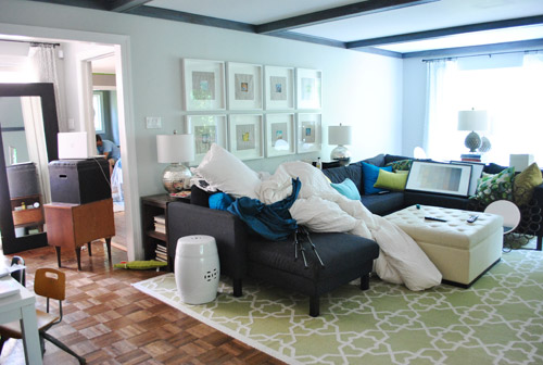
There was still the same amount of house chaos even though we only needed one coat of paint this time. Because of course when you paint a room, at least one other room looks like complete insanity since all of the stuff from the room that you’re painting gets dumped in there. Like our living room in this case:
For those wondering where Clara was, her grandparents graciously offered to take her to the playground, lunch, and the library while we got this done. So thankful! We’ve definitely painted rooms while she napped and it has worked (like the bedroom when we painted it the first time) but it’s usually just a lot more choppy because we both work hard for the two-ish hours that she naps and then one of us has to watch her while the other one works (ex: I continue to cut in while John watches Clara after she wakes up) and then we switch (I watch her while he rolls).
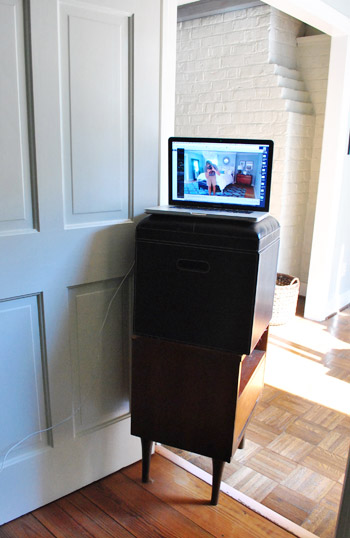
Here was our little setup to catch the process on our laptop’s camera (which has a longer battery life when plugged in than our Flip HD, which can only record for an hour). Oh yes, we’re high tech around here. There was ottoman on side table action (we used iMovie to make the video, which comes free with most Macs and has easy settings to speed things up):
So whoop, there it is. Darker, moodier paint that makes us wanna sleep. Haha. And kinda makes us want to paint a whole lot of other rooms in darker tones since it’s amazing how much more substantial the molding looks. But when we stop to think about it, ultimately we like the balance in the whole house’s current palette, which consists of:
- some light neutrals – like the soft gray in the living room and dining room
- some happy tones – like the grellow in the kitchen and the light pink in Clara’s room
- some deep saturated colors – like the dark teal guest room and the back of the dining room built-ins
Should be fun to see what colors we end up with in the completely untouched sunroom, playroom, hall bathroom, and guest bathroom though. In the meantime, what are you guys painting? Anyone diving into darker colors? Or lightening up with something soft? Feel free to name your favorite wall color of all time – it’s always interesting to hear what you guys are loving.

Sam G says
Great decison, the gray looks awesome in the room.
Sherry from BC says
It was great before but fabulous now. The darker colour just really makes the headboard and light and moulding pop. I start vacation next week and hope to paint my bedroom too. Since I have gone to all white bedding and have new vibrant art, I am doing a taupe to cover the pale green that I have now. Time for a change and I think it will make all my accessories really stand out. I will watch the time lapse later, I am still at work after all, but do want to see the change happen.
Katie says
Great shade of gray, but I’m still not digging the combo of the headboard fabric with the rug. Just my taste, but I love that you guys are willing to take risks and change things up!
Sam @ The Junk House says
I painted my craft room on Saturday. I used Sterling by Ben Moore (light gray) because the room is really small with no natural light, so I didn’t want it to turn into a cave. It was my first time using Ben Moore paint and I loved it. The walls were originally white, but were FILTHY. It covered everything in 1 coat plus some touch ups. I still need to paint the trim and door with a fresh white coat of paint though. Hopefully I’ll get it done soon because my office is a complete disaster zone with all the craft room stuff thrown in there.
quirkstreet says
Wow! Looks fantastic!
Tina says
I didnt think I was going to like it, but I love it! Seriously- looks amazing.
Kate says
We painted our current bedroom Martha Stewart’s “Cement” (or Cement Gray, can’t remember which it is at the moment), which looks very similar to Rockport Gray… we love it! It’s definitely an awesome bedroom color! What we’ve been lacking is accent colors (we just had a bit of yellow in there, as well as a bunch of other neutrals… but we have been slowly adding more), so I will be showing this post to the hubs for ideas on how to incorporate more colorful accents!
Kathryn says
Burger’s tail….. Hilarious , great color
mellieiniowa says
I love the new color. Every time I saw pictures of your bedroom, I kept thinking that your rug really didn’t work. With the new color, everything meshes.
Brooke says
Love it! It’s very similar to the color we used in our living room, and I, too, love how it morphs throughout the day with the changes in sunlight. It also made me love all the white features in the room – it really is a fabulous color. Your bedroom has gone from “meh” to “haven” for me with just these last few changes – I just love it :)
Julia @ Life on Churchill says
I am such a fan of grey. It looks great with your white molding, and I think it looks great with wood accents (like your dresser) We painted our bedroom a light grey last year and its very restful.
Jenni T says
I like it, it does make the white pop for sure. My daughter was leaning against me while I was looking at the blog and she said is that girl painting in her nightgown? I laughed so hard thinking you would put something like “woke up straight out of bed and started trimming by the window”.
YoungHouseLove says
Hahaha, if only I were glamorous to even own a nightgown!
xo,
s
Stephanie says
Love the grey. It makes the entire room just look so much more grown up and you’re right- Everything POPs!
I’ve been obsessed with grey lately and trying to find the perfect one for my living room. :)
Kate says
I love, Love, LOVE it!! I’ve been thinking of painting my guest bedroom, which will eventually be a nursery/kids room, in Rockport Grey from Benjamin Moore. It’s a wonderful neutral and as you said, so easy to throw in pops of color. =)
Seeing another beautiful example of B.M. Rockport Grey in a bedroom reaffirms my thought.
Great work you two!
Erin says
I’m totally biased (it’s the same color as my bedroom), but I love the switch. We have canary yellow and turquoise as our accents. I love the contrast of your headboard and white pieces. Unfortunately, my fiance drew a line in the sand on painted furniture and an upholstered bed (my choices).
We’re now trying to figure out what color to paint our windowless master bathroom :)
Mandy S says
Thanks for giving the room specs and paint usage. Not even a whole gallon for the entire room??? I am a Behr girl all the way, but I may have to get a gallon of Benjamin Moore now…
Lauren says
Oh my goodness what a DIFFERENCE!!! Love love love LOVE!!
Jen@The Decor Scene says
Love it!!! It does seem more welcoming or “come here and sleep awhile” kind of feel to it for sure. I wish we didn’t have dark cherry wood furniture now. This color would be way too dark with all our dark furniture, but I’m so lovin’ gray right now and I really want to paint a room gray. I think I might keep this color in mind for our Great Room, but we will see. Thanks for the inspiration. :)
Marissa@ohhhsolovely says
i do love the way the new color seems to make everything pop. to me, it really helps tie together the rug & the headboard. by the way, that rug is so great! i love the size & colors!
Katherine says
Very sophisticated. I liked the before colour as well, but love this one more.
Deep grey toned sheets with the white bedding would be striking.
Melanie says
I have a similar color in my hallways and bedrooms (Behr’s Ashwood), and I LOVE it. It really does bring out the molding and all the bright fun accents.
Gabriella @ Our Life In Action says
VERY PRETTY!!!!!! Great job you guys!
Kimberly says
Where did you get the mirror above your bed? It’s gorgeous! I love the grey, I’ve been trying to convince my husband to switch to white trim and grey instead of oak / beige combo. So far we’re on the basement and he’s starting to see I’m right :) I might have to try convincing him to do crown molding on top because that really makes it pop!
YoungHouseLove says
It’s from Hobby Lobby.
-John
Katie says
Do you have a tutorial on how to cut in? I’d love to paint without tape someday…
YoungHouseLove says
We actually have a video! You can find it in this post: https://www.younghouselove.com/2011/02/holy-buckets/
-John
Amanda says
Just GO for it Katie. You can always do touch ups on the base board later. I’m so lazy that I paint without tape. I find I get more on teh floor than the actual baseboards. And the CEILING. Because IT IS hard to get the ceiling while standing on a chair (yea not so safe, I don’t have a step ladder … oops)
Karyn says
LOVE the change and LOVE your blog for a little inspiration! We, too, are digging the gray tones lately. In fact, I just spent the past two weeks painting every square inch of our new condo various “cool” neutral shades– talk about sick of taping! Favorite paint color/names to-date: Stillwater and London Smoke.
YoungHouseLove says
Those sounds moody and awesome.
xo,
s
Cynthia says
OK, I love the color but HOW is it possible that your hair looks SO good while painting???
YoungHouseLove says
You think that looks good? It’s all wavy from the humidity. I think it’s one step away from an Elvis swoop! Haha.
xo,
s
Miss Charming says
Love the color! It’s amazing what a difference it makes in the room. I’m absolutely loving your rugs, too. (livingroom and bedroom.) Where did you find them?
YoungHouseLove says
The living room one is from jossandmain.com and the bedroom one is from a local lighting/rug outlet called The Decorating Outlet (we got it for a steal because it has a small hole you can’t even see in it).
xo,
s
Kelly says
Random, but just had to say Sherry – you look GORG in that picture! Something about the light and the angles of your face… model :)
YoungHouseLove says
You’re very kind to say that. I was sweaty and felt pretty gross at that exact moment. Haha.
xo,
s
Shelby Cash says
Benjamin Moore’s “Dolphins Cove Blue” is my absolute fave, lots of my friends have had a love at first sight affair with that pretty shade. I also love BM’s “Fairway Oaks” it makes the trim pop and it’s just a good ole’ warm rich color, kind of like caramel on a hot fudge sundae, mmm.
YoungHouseLove says
Those sound awesome. Thanks for sharing your favorites everyone!
xo,
s
Bethindc says
Very Nice! I’d love to see a shot from down the hallway, showing the dresser after your recent rearrangement. I’ll be it looks great from there.
DJ Sherry says
We have this color in our tv room and love it. Works with warm and cool colors. One question – what is the name of the blue color that was there? I am wanting to paint a guest room a blue like that and now its not listed! I did use your Dune Grass from the bathroom in your old house and in our master bath. Spa like. Thanks in advance.
YoungHouseLove says
That was carolina inn club aqua by Valspar.
xo,
s
Amy says
I tried to find on the source list, but couldn’t…where is the white 3-drawer side table from? I love it!
YoungHouseLove says
That’s from jossandmain.com a while back. Maybe try wayfair.com or overstock.com?
xo,
s
Karen F says
Awesome paint color! It makes such a difference. Love the video, too! Now I have the urge to paint – although the next room we paint will be my 5 yr old’s room, so no moody grays happening there. Probably a light green (which is what it was before we painted it bubble gum pink. I can’t stand the pink!)
Also, alternate title for yesterday’s post – “50 Shades of Grey (or maybe just 2)”. Although you might have crashed your site!
YoungHouseLove says
Oh man, good thinking!
-John
Sarah says
Sherry & John,
I love, love, love the gray! My husband and I just bought a new house and I’d like to incorporate more gray as opposed to beige which is what I normally do. However, I’m worried it will look more on the “institutional” side of gray rather than the “cozy” side which is what your paint looks like. However, we normally like to stick to Olympic. How can I get the Rockport Gray or Moonshine in Olympic? I don’t think anyone around here sells Benjamin Moore for me to be able to get a swatch to do some matching. Help!
YoungHouseLove says
You just got to the desk and ask them to color match it. They’ll look up the BM formula on the computer and mix it up with their paint!
xo,
s
Sarah says
Thanks for the info!!!
Mary S. says
Love the new color, beautiful without being too dark. I am always hesitant about a darker color and end up loving it wishing I had done it sooner.
I really like how that gorge-i rug looks now!
Waiting patiently for a deck update :)
Patti Morton says
Love the new color – what a difference! What would black lampshades on the artichoke lamps look like???????
YoungHouseLove says
That could be fun! Right now we love how the white of the shades and curtains and trim pops but you never know where we’ll end up!
xo,
s
hyzen says
Looks great–I love it! But hey, what was the old color called!? I just went looking at your page describing your paint colors, and I see you already updated it to reflect the Rockport Gray, but there seems to be no mention of what it was before. I actually really like both colors–Rockport Gray is one I am considering for my dining room, but I am looking for a muted grey-blue-green in the kitchen, similar to what your bedroom used to be. Thanks!
YoungHouseLove says
The old color was called Carolina Inn Club Aqua by Valspar.
-John
Amanda says
Love!
We’re still working away on our bathroom, but I’m starting to contemplate changing around the bedroom. The furniture is a dark cherry, but the walls, bedding, and carpet are all shades of brown/tan. We have pops of red, but it’s just not working for me anymore.
I’m thinking I’d like to tie in the bedroom colors to the bathroom colors – our floor tile is the same that you used for your backsplash and the walls are Benjamin Moore’s Catalina Blue. It just looks so fresh and wonderful (even though we still have a lot of work to do)…
Holly says
Wonderful choice! I love the way it matches your headboard, and props for not using a ‘Fifty Shades of Grey’ title :)
YoungHouseLove says
Oh man, missed opportunity! Next time!
-John
Maggie says
What are you doing with the mid century night stands? I want them :0)
YoungHouseLove says
Not sure if we’ll use them in the guest room or playroom or sunroom yet. Will definitely share a link if we craigslist them!
xo,
s
S @ keepitneat says
Love the new color. Definitely more “mature”, if that’s even a cool adjective to use?!
Danica Allen says
fabulous! I’m loving your bedroom more with every change you make!
Lindsay says
Love the new color!!
And do you really not take off outlet/light switch covers when you paint? Funny how everyone does things differently, but I always feel like it save me so much time and potential clumpy paint edges to just remove them.
YoungHouseLove says
Yep. We like to live on the edge. :) And I can thank my expert cutter-in-er Sherry for that.
-John
Katie says
And, where do you buy Benjamin Moore paints? I suppose I could google it myself though…
YoungHouseLove says
We get ours at a local dealer called The Virginia Paint Company.
-John
darci says
LOVE IT — we have that same gray in our son’s nursery and it’s gorgeous!
And I totally agree, it definitely makes your trim and crown “pop” a little more! Beautiful. :)
bridget says
Your paint job looks so professional, what brand roller, brush and painter tape do you use?
YoungHouseLove says
We use frog tape and shurline rollers most of the time, but sometimes we use other things. They all seem to work if HD or Lowe’s sells them so we’re not too particular!
xo,
s
bridget says
thanks Sherry no clue how you stay on top of all your comments, you obviously have mad organizational skills! I went to BM today and was shocked at the almost 60 price tag but I totally trust your recommendations…I bought your vaccum after having to return a brand new one(an embrassement I would not like to go through again).
YoungHouseLove says
Haha, hope the vacuum is doing well (still have ours!) and that you love the paint!
xo,
s
Heather C says
The color makes all the difference in the world… The room looks great! Sherry, you look like a super model in the picture of you painting… Your side profile, the lighting, the soft waves in your hair. SO CUTE! I wish I looked that good working around the house! Go Girl!
YoungHouseLove says
Haha- you’re very sweet. I promise straight on I was a hot mess! Totally paint in the hair and even on my cheek.
xo,
s
Lindsay says
Love this! This makes all of the other beautiful colors you have as accents just POP!
I’ve been thinking about painting the wood paneling in my attic/loft bedroom. I can’t stand to look at the paneling anymore! It’s on either side of the room, up to about chair height, then regular dry wall from then paneling up to the celing. Any tips for painting paneling? I like the 2-tone look, just not with fake wood! Thanks in advance!
YoungHouseLove says
I would check out our Project page- we have painted paneling and have a few posts about it! Hope it helps.
xo,
s
Christie says
I can’t believe one gallon of paint was all you needed for that big room!
The color is lovely … the room looks grown-up. :D
Jessie says
fabulous! thanks for sharing
and thanks for sharing the tips on the time lapse video — i want to do that too! :)