Ever since we shared a picture of the kids bedding we picked up at HomeGoods for our daughter’s room in the podcast show notes for Episode #69, we’ve been meaning to share a room update. Over the last few months we’ve been giving our little girl’s bedroom an update, complete with new paint and an antique bed scored on Craigslist!
Why Update Her Bedroom?
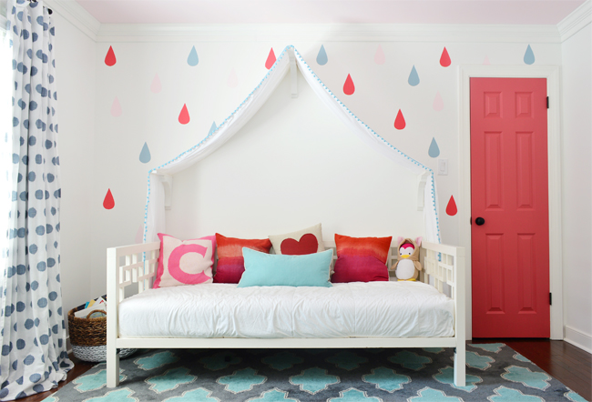
Because dang it, kids grow up. And sometimes they don’t want their 7-year-old room to look like their “little kid” room anymore (please can’t 7 still be little?!). So here’s how our daughter’s room has grown up a bit – but not too much. Thank goodness there aren’t New Kids On The Block posters (or their 2017 equivalent) quite yet. I know they’re coming! You might remember that it used to look like this right after she upgraded from a crib to a daybed back in the day (I think this was taken when she was 3, sniff!).
And we later got her a larger bed and made a few other changes at her request (we shared this post over a year ago, but mentioned we still wanted to tackle a few things, like adding a headboard, etc).
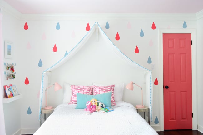
Well, a few months later she told us she didn’t want the canopy anymore. So down it came. And with the canopy gone (which you can also see around the 3-minute mark of this video house tour we did last year) the raindrops were looking pretty weird. Some were even half-painted along the line where the canopy once sat. We considered just touching them up, but they were dubbed “too babyish” by our girl, so over the last several months we’ve been making some little tweaks here and there – including a new paint color on the walls to cover up those drops. We sanded them slightly, then primed, and then just used two coats of White Heron by Sherwin Williams. It totally covered them and the entire wall feels flat to the touch. Whew.
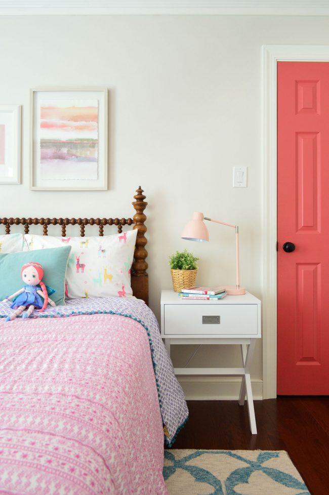
Also, because I’m neurotic, it should be noted that our tiny client has now decided that she likes the purple side of her comforter better, so these room photos all look slightly odd to me because I’ve already become used to the purple side being up, and I have to tell you: SHE’S A BETTER DECORATOR THAN I AM, because it looks so much better that way. I have no idea why, but the cooler purple pattern just works with the rug so nicely. Still might change out the curtains someday – but on the whole it’s looking a lot more finished lately.
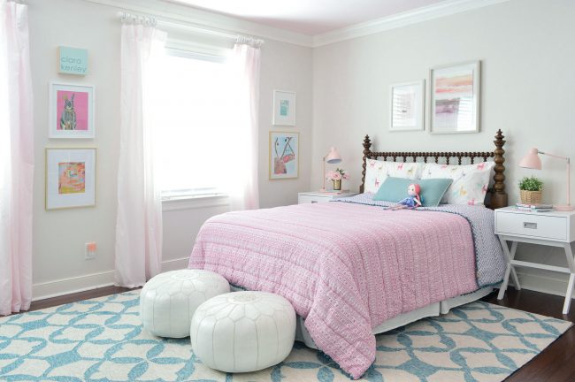
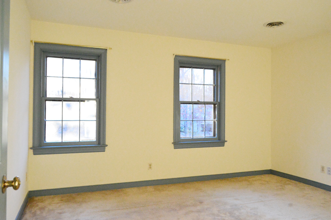
Certainly a far cry from the room we started with:
The New Bed
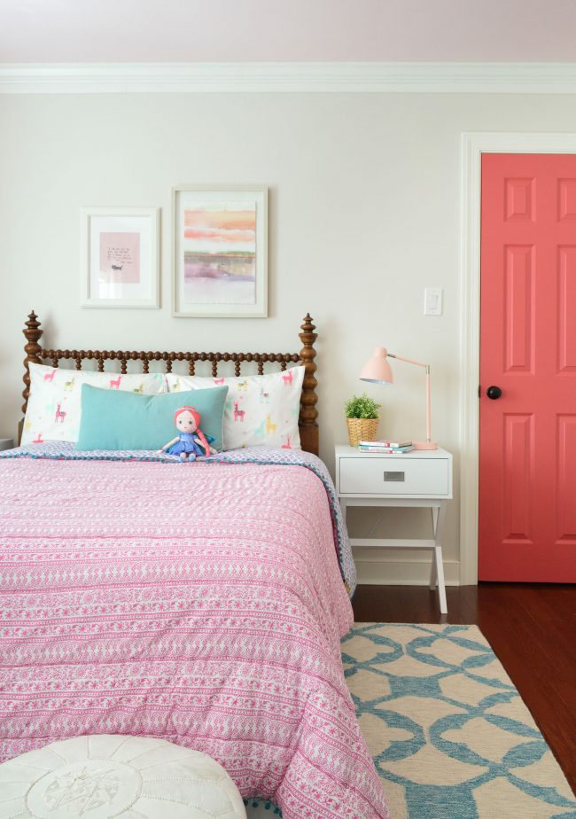
But back to that headboard that we mentioned we were searching for, oh, over a year. We eventually found this treasure on craigslist for $90 (yes, I’m 35 and I call old wooden things treasures now). It’s a complete bed with side rails and a footboard (the seller said it’s 100 years old and it actually has holes in the frame to wind rope around to support an old straw mattress!). There are newer comparable beds that are $1000+ (like this one from Wayfair), so yes yes yes to this craigslist find! For anyone looking for a similar secondhand one, there are some good ones on Etsy and Chairish.

When we propped up the footboard it was feeling kind of dark and imposing in the room (both visually and literally – we all kept bumping into it), but the footboard is so cool on its own that we’re planning to use it as a headboard in our son’s room eventually. It’s not exactly the same, so it’ll be cool to see what looks like this headboard’s sibling in his room.
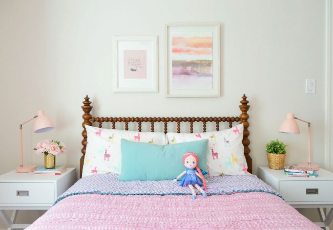
Since we weren’t using the fully assembled bed, and just wanted to attach the headboard to the wall, we used some scrap wood to create a cleat on the back of the headboard so it could hang independently of the rest of the bed (here’s where we showed you how to make a headboard cleat). I love that it brings something old to the room, but the spools still keep it feeling fun. When I tuck her in I probably talk way too much about how cool it is to have a bed that’s 100 years old. Moms are so lame.
I’m also obsessed with how the little pom-pom trim that lines the comforter sort of mimics the shape of the spools in the headboard. It’s like it was meant to be together (again, we found that gem at HomeGoods – and the llama sheets are from Target because, llamas!).
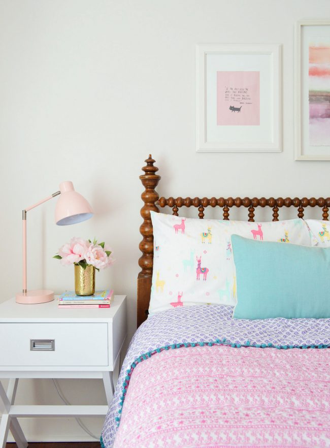
The white nightstands are from Target. I loved the campaign hardware detail, the nice functional drawer, and the fact that they’re white (we had old wood side tables that looked super heavy with the wood headboard – so my tip would be to try mixing in white night tables if you’re battling that issue yourself). She still has her trusty pink touch lamps that we got her over a year ago (I don’t have to tell any parent this, but kids love tapping things on and off – it’s one step away from my childhood favorite: The Clapper). Also, I love that she uses the drawers for practical things like storing doll clothes and housing a tiny toy mouse.
The abstract art above the bed is from Target and the pink quote art is just a page I tore out of a magazine called Flow. It reads “If you only read the books that everyone else is reading, you can only think what everyone else is thinking. -Haruki Murakami” And it has a cat on it for good measure. When I asked her if she wanted me to hang that up there in the frame she said “Yes because NOBODY else likes to read BabyMouse comics AND Goosebumps at the same time!” This kid.
The Paint
Back to the walls for a sec – we went with White Heron paint after really liking how it looked throughout the beach house.
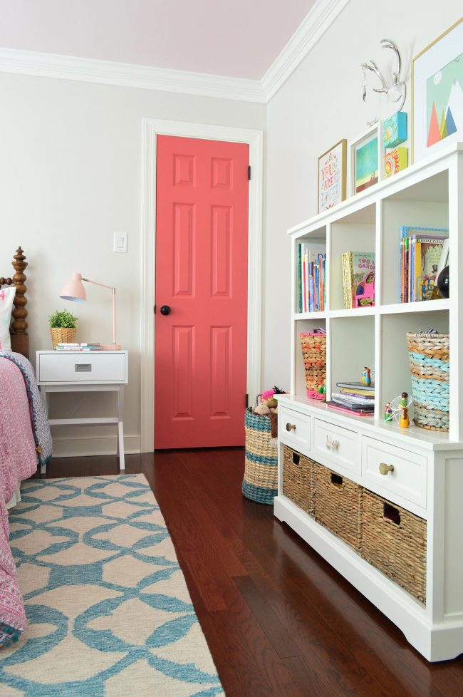
It plays well all of the other existing paint colors: the bright white trim (Benjamin Moore’s Simply White), the soft pink ceiling (Benjamin Moore’s Pink Cadillac) and the bold closet door (Benjamin Moore’s Cinco de Mayo). White Heron is a very soft warm grey-tan color, so we joke that her room’s kind of like a muted Neopolitan ice cream bar now, thanks to that strawberry ceiling and vanilla trim.
The Storage & Art
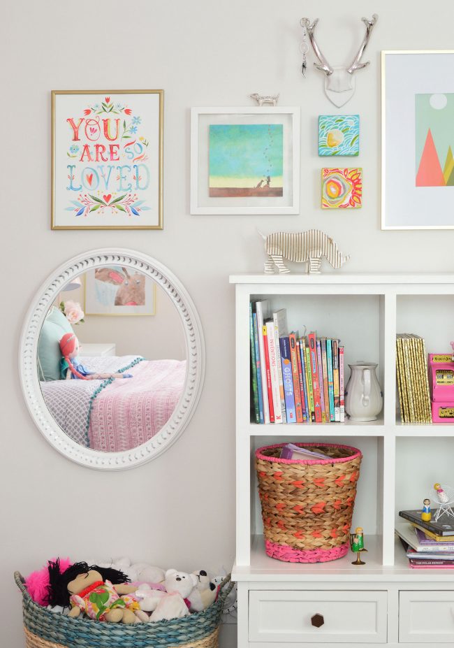
While we kept the DIY toy/book storage as is (we made that a few years ago and covered the process in our second book), we did refresh some of the art around it. It was fun to see what things got to stay and what got switched out, and our daughter insisted on the little silver antlers (they were downstairs in a pile of things that I was going to use at the beach house) because it was the perfect spot to hang her dreamcatcher keychain. Clearly she’s into form and function – ha!
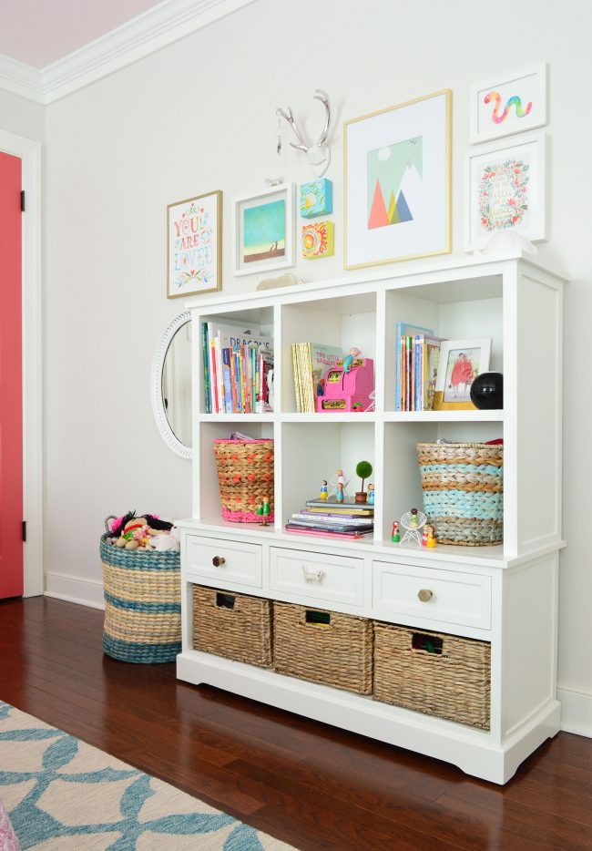
This photo cracks me up because you can get a sense of how the bookcase has kind of become a playhouse of sorts too. Part of the “de-babying” of the room was also heeding her request to remove the homemade dollhouse in the closet (more on that in a moment while I sob quietly behind my laptop). We craigslisted it to a grandmother who was very excited to have it for her grandkids, so we were happy it was going somewhere that would get more use, but I do find it oddly reassuring when I walk in and the bookshelves have been turned into tiny rooms for her toys.
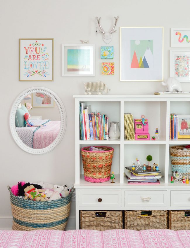
I also had some fun bringing in some gold, just because I love those gold Target frames and have probably purchased my body weight in them, but also because I like that there’s some silver layered in with them as well (in the antlers, the oval mirror I painted years ago for her, and even that little silver spotted dog sitting on the frame). That dog actually used to be a drawer knob but it cracked and fell off, but he has lived on as a little picture-sitter of sorts.
The Dresser
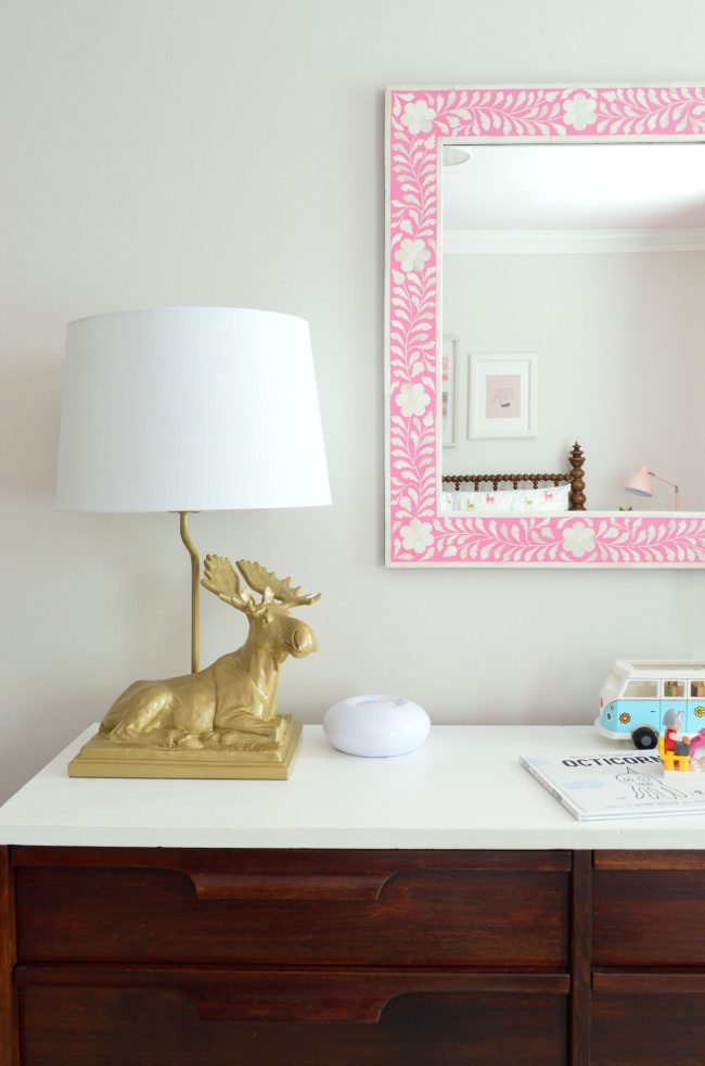
The wall opposite the bed still features her old changing-table-turned-dresser (it’s almost 8 years old and still going strong!) with that pretty inlay mirror above it that we all love. I think the only update here is that I spray painted the yard sale moose lamp gold because he used to be white and I thought he’d pop more, but he’s looking kind of weird in this picture. In person he’s less bold looking (more of a soft hammered gold) but here he looks… I don’t know… like a golden chicken nugget.
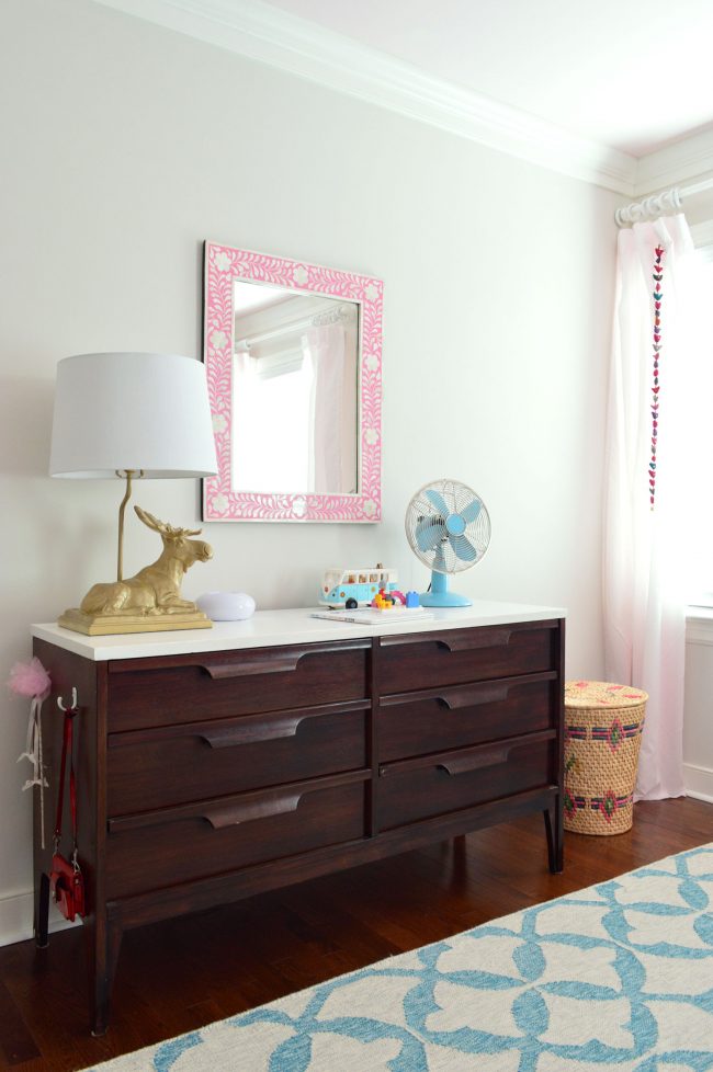
That laundry basket is an estate sale find and the curtains are Ikea panels I dyed light pink years ago. They’re probably the next thing we’ll upgrade in here, because they’re so lightweight that it’s hard to keep them looking like they haven’t been whipped by a daily tornado.
The paint color change has been good for lots of reason. As much as we liked the white, her room always felt a little disconnected from the rest of the upstairs because everything else had a warm tan-gray color on the wall (this room had been a super crisp white color). Plus, her room gets the best light of any room in the house, so it can definitely handle something less stark. We also like how it’s helping the white elements – like the crown molding or the lampshade below – pop off the walls a little better. Once again: chicken nugget moose, everyone.
The Closet
As I mentioned earlier, the closet got a little update too. With the dollhouse not getting used anymore (*SOB!*), we basically just asked our daughter what she’d rather use that spot for, and she requested a place to draw and write. I had always thought a vanity might make sense in there when she’s older, so I love that this works as a drawing/writing nook and could also be a getting-ready space for her someday (since I’m sure someday she’ll need a larger and more legit desk, which I imagine might take the place of her bookcase down the line).
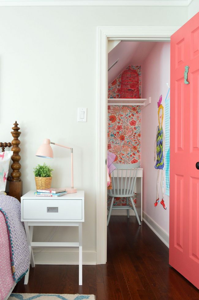
We grabbed the vanity at Ikea since it’s small enough to easily fit into that nook (remember when we “wallpapered” that back wall with fabric years ago). Then we just brought in one of our spare dining room chairs for a place to sit. It had been in the attic since we got upholstered end chairs for the dining room, so it’s nice to make use of it.
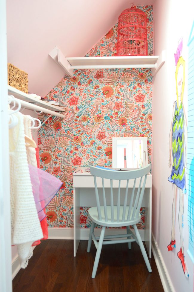
The desk/vanity flips up on one side, so it’s great for stashing pencils and stuff, while the other half has a normal drawer for tucking away papers. I’m not sure I agree with Ikea’s inexplicable decision to make the inside of the vanity blood-red, but it actually works in here.
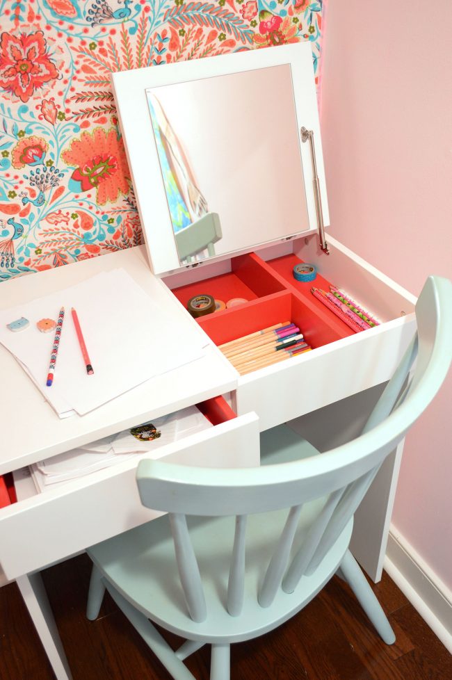
It may seem like overkill to have three kids drawing/writing surfaces in the house (if you include their desks in our office and the bonus room) but they all get used, and this one is nice because it’s just hers and she can work in here quietly in the morning before her brother wakes up.
Get The Look: Updated Girl’s Bedroom
For anyone looking for all of our sources in one place, here’s a little get-the-look mood board for ya. We hunted down similar items for the things that are thrifted or discontinued:

1. Walls (SW White Heron) / 2. Trim (BM Simply White) / 3. Ceiling (BM Pink Cadillac) / 4. Door (BM Cinco de Mayo) / 5. Touch Lamp / 6. Bedside Table / 7. Faux Plant / 8. Woven Pot / 9. Windsor Chair / 10. Vanity / 11. White Pouf / 12. Faux Antlers / 13. Abstract Print / 14. Toy Storage / 15. Colorful Print / 16. Antique Wooden Spool Bed / 17. Inlay Mirror / 18. Midcentury Dresser / 19. Throw Pillow / 20. Llama Sheets / 21. Rug / 22. Bedding Set
I’m sure it’s not the last evolution this room will see. At some point, she’ll probably need a dresser with deeper drawers (what once held onesies and diapers perfectly is sometimes feeling maxed out with sweatshirts and skinny jeans). And I really can see that bookcase getting swapped out for a full-sized desk in a few years if she wants more space to spread out. And who knows when and if those curtains will change. Will it be before or after the Nick Jonas posters (or whoever’s the current heartthrob at the time) go up? Everyone says it, but they really do grow up too fast (*sniffle*).
Psst- Wanna see other kids updates and projects? Here are dozens of tutorials from our archives.
*This post contains affiliate links*
