Yup, we finally gave Ed a little haircut. For over a year and a half we tried to work with the posts on Ed the bed, but the realization that we didn’t have a lofted ceiling or a floor plan that made sense of those big dramatic posts slowly worked its way into our conscious and we finally decided that just because Ed was born with long hair posts doesn’t mean that a little haircut is cruel and unusual bed punishment. So here he is before…
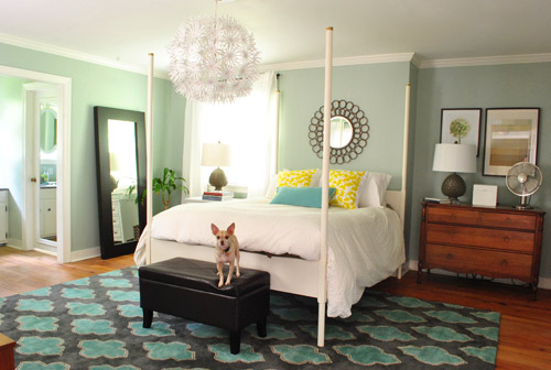
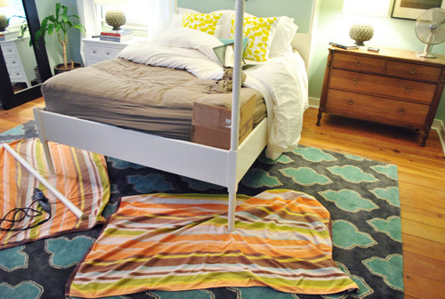
… during…
… and after…
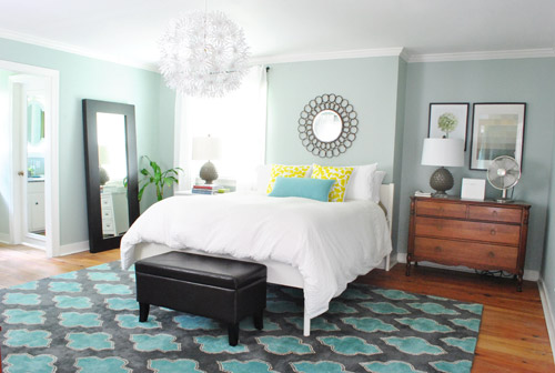
This whole bed-trimming project was free, took about an hour of work, and we totally dig the more open look. It was just too much vertical stuff going on- especially with the bed right next to the window (with those floor length curtains going on). Ed’s totally crying out for a large fabric headboard so we can raise the mirror above the bed about another foot or two (like this poorly photoshopped rendering) and someday we’d love to stain the floors (and possibly the dresser) darker…
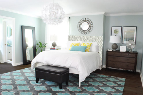
… but we’re getting there. And just because I can’t stop at one photoshopped headboard option, here are some more I had fun with:
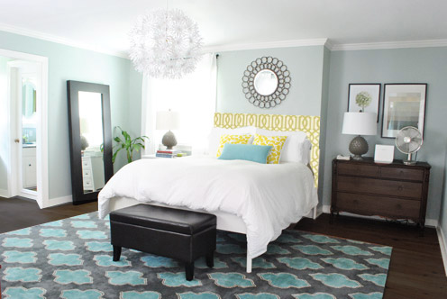
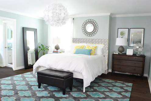
But back to reality. You know we like to use what we have, and we love Ed for so many reasons. The height, the comfort, and the thin airy legs that he sits on which allow us to hang out be weird under the bed…
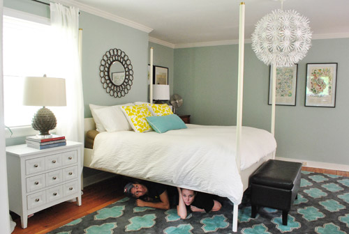
… so instead of completely scrapping him (ex: craigslisting him and buying a new bed) we devised a completely reversible plan to give his posts a little trim. How is it reversible? Well, while they don’t just screw off or anything, they’re solid wood posts. So we can always reattach them by adding a nice long metal screw to the center of each post that we could just screw back into the bed frame to attach them (it’s how a bunch of Ikea items are made, like how Lack tables have legs that can be screwed on and off). So although we don’t foresee any reason to put those suckers back on, who knows… maybe someday we’ll end up in a house with lofted ceilings and we’ll wish we could put Ed back together – and now, theoretically we can. Haha.
So after concocting our little Ed-tweaking plan, this is how it all went down (complete with insanely embarrassing not-meant-to-sound-perverted comments by yours truly):
For those who can’t watch the video (perhaps you’re at work, although it pretty much tells the story on mute) we snapped some photos for ya too. We basically just lined the Dremel up (we have a Multimax, and used the wood cutting attachment) with the base of the post and slowly sawed around it.
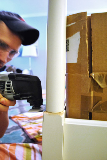
Oh and see how we put a piece of cardboard between the mattress and the post? Just wanted to make sure we didn’t get too chop-happy near the mattress (and moving our organic mattress takes the strength of ten vampires, so we just didn’t have it in us).
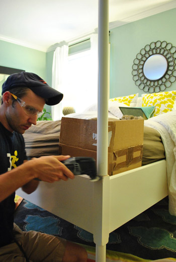
Thankfully we had no mattress casualties and each post came down after around five minutes of careful cutting.
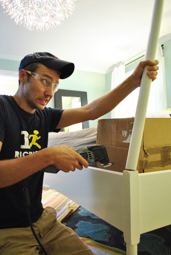
We actually got much better at making super clean cuts as we went, so we’re glad we started on the two bottom posts of the bed (which will always be covered by the comforter anyway) and worked our way up to the top two posts, which are seen a lot more.
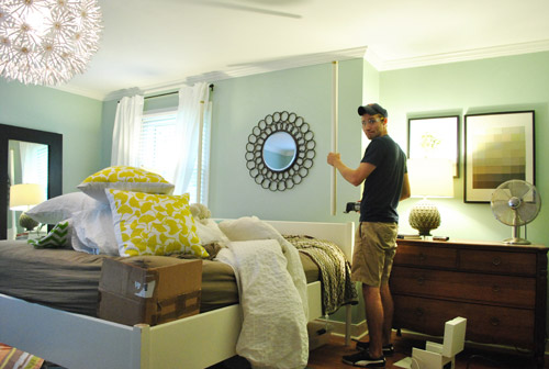
John even let me take a spin. I had to wrestle the Dremel from his cold dead tool-loving hands, but it was worth the trouble. Girls need a romp with a power tool every once in a while too. Especially because safety glasses are so undeniably sexy.
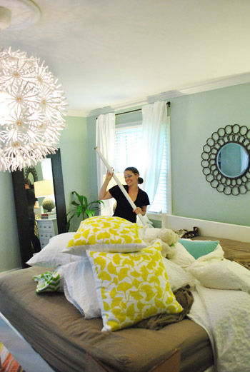
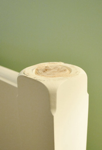
We were really surprised how nice the top posts looked when they were cut. See the circle detail that they ended up sporting (the bottom posts didn’t have those)? They made it look like a decorative design, so they looked convincing. Like they were meant to be this way. Total happy accident.
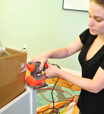
Then we just did some sanding to get everything smooth…
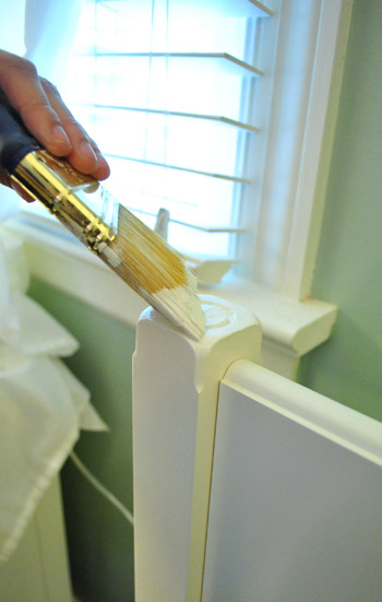
… and I used the Ikea-white paint (I did a little hunting to find the perfect white paint that matches Ikea’s white tone here) that we had leftover from another project.
Check out the top right post after cutting, sanding, and painting…
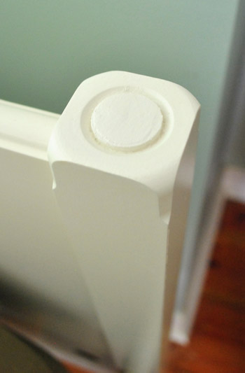
… and the top left post after the same rigmarole.
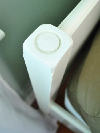
By the time the paint dried and we made the bed it totally looked like Ed was born this way. Cue the Lady Gaga dance-a-thon.

Here’s John breaking it down. Just kidding. He ran through the shot and kicked his leg up in some sort of weird victory cry and somehow the camera caught his ghosted karate move. Hilarious.
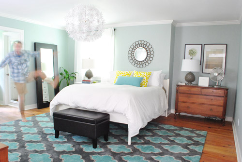
Here are things from another angle. Obviously we need nice large art where those botanicals are floating on that wall on the right of this picture (we’ll rehang the botanicals over a chair that we have in another corner), but we’re getting there. Especially once we build an upholstered headboard for Ed and move the mirror a bit higher, so it further ties into the chandelier.
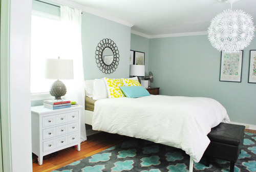
I can’t tell you how much we like this hand-me-down dresser from John’s parents in the nook. It’s the perfect fit.
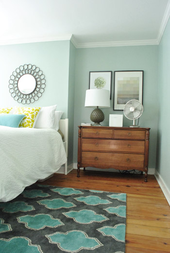
We already shared how it looks from the hallway in this morning’s post, but here’s that shot again, just to refresh the ol’ memory:
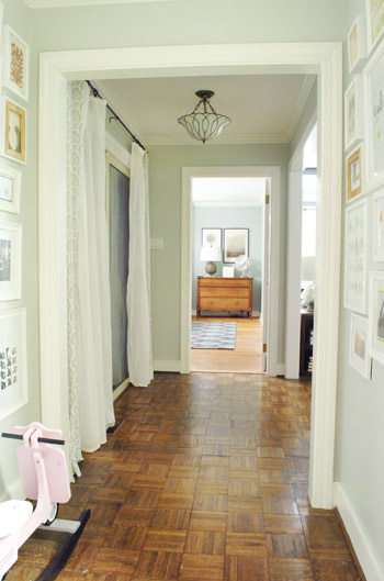
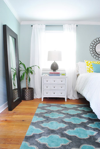
Although it definitely doesn’t match the wood dresser on the other side, there’s something charming about the little white nightstand in the window. And the fact that we have the same bedside lamps on each one sort of connects the two pieces, even though they’re very different.
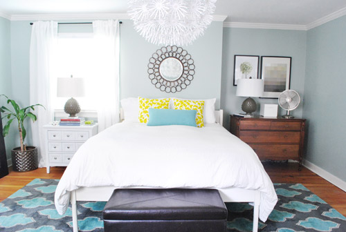
Here’s a straight shot of the bed as it looks now. I’m definitely itching to get on that headboard project so I can bump the mirror up a bit higher so not everything will be in the same line (the art on the right and the mirror are so perfectly lined up, I think the bed will feel more special with a big fabric headboard and a higher focal point above it). And as for the color of the dresser and the white nightstand, we’re open to painting or staining something, but we’re not rushing into anything.
One thing is for sure, it definitely feels more homey and full than it used to look back when the bed was on the wall near the door.
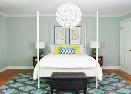
And it’s so much nicer to walk into this view, instead of stepping three steps in the door and hitting the bed.

So that’s the latest bedroom tweak, but we’re probably a good dozen tweaks from being done in here. Haha, you know us. Inching along. But you know we’ll keep you posted when we tackle other things, like dealing with the bare wall across from the bed, making a giant fabric headboard and moving the mirror up, etc. Should be fun…
Oh and how funny is this? Every morning around 10am the sun shines through the window above the sink (this pic is from before Ed’s move and subsequent haircut)…
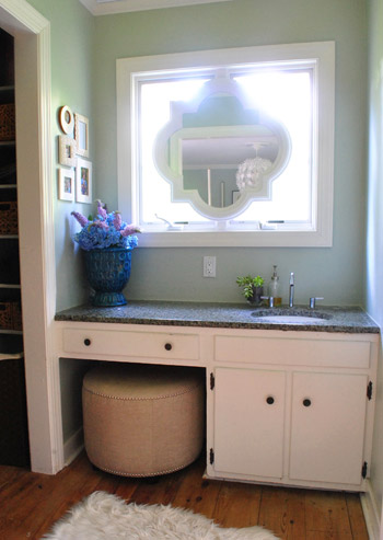
… and this shape is reflected on the rug:
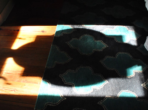
Yup, the elongated shadow is pretty much exactly the same shape that’s on the rug itself. The weirdest thing is that when we fell in love with this rug and snatched it up at a local outlet, we made absolutely no connection that it had a similar shape to the mirror above the sink. Hooray for happy accidents.
What are you guys up to in the bedroom (decor wise, I mean – let’s not get saucy). Has anyone else altered their bed to make it work better for their room? Or straight up built one from scratch? Anyone else planning to make a headboard in the next few weeks? I can’t wait to go fabric shopping…

Bek Howard says
Wowee it is looking great. I love the bed being next to the window. It’s amazing how just moving things around can change things so much. The best part is you have used things you already had (or were given, in the case of the dresser) like the night stand. Well done love it. Are you still thinking of changing the wall colour?
YoungHouseLove says
John is on the wall color changing boat (he wants to go a bit darker) but I’m not 100% sold yet, but we’ll keep you posted!
xo,
s
Katelyn says
It’s amazing what a little rearranging of furniture will do! I love it! And how rewarding.. FREE! :)
i’m dyyyying to diy my headboard and your future post is already giving me crafty-blog-reading-jealousy. ;) My goal is to tackle this baby, http://littlegreennotebook.blogspot.com/2012/02/diy-tufted-headboard.html
can’t wait to see what you guys come up with! keep on keeping on!
YoungHouseLove says
Love that tutorial!
xo,
s
Gaidig says
Looks really great. I agree that it’s much warmer looking. I do wonder if it’s annoying to have your bedside tables (especially on John’s side) farther away from the bed.
YoungHouseLove says
Check out the comments right before this for that answer!
xo,
s
Becky says
Wow! I absolutely love the new arrangement of furniture. Everything just pops so much better. Ed looks great with the buzz cut too…now your fancy light can really stand out!
kb says
Love the heck out of this. I had always liked that bed, yet felt like there was something unexplainably “off” about it. Clearly you SAW things the same way ;)
YoungHouseLove says
Hahaha, ten points for a bed-cutting pun.
xo,
s
Katie says
I love it! What a small project to make such a big difference. Can’t wait to see y’all at Haven!
YoungHouseLove says
Aw thanks Katie! So excited about it!
xo,
s
Andrea says
Are you kidding me?! I freaking love these bedroom changes… it looks awesome!! Somehow, it seems to be more bedroom-esque and appealing. LOVE IT!!!
Veronica says
I loved Ed with his tall posts but he looks FANTASTIC without too! The bed doesn’t seem to be awkwardly placed anymore, it is as if it was meant to be there now. Way to go!
Jo says
These bedroom posts are everything I love about YHL. Totally delightful to see the impact of relatively small changes. And, I just love this blog. Reading the posts after a long day at work always feels like a treat to myself.
YoungHouseLove says
Aw thanks Jo! So sweet of you to say!
xo,
s
Frances says
I absolutely love the room this way. Too bad about old Ed’s new ‘hair’ cut but I definitely think it was the right decision. I love your style!
Madhu says
Hi Sherry, I think a sliding barn door to the bathroom would give privacy and will be a nice touch to the space as well. What do you think?
YoungHouseLove says
Oh yes, we’ve considered three options for that (pocket door, sliding barn door, and french doors) but we’re not sure where we’ll land! We’ll definitely keep you posted!
xo,
s
nerr says
Can’t get over how GOOD the bedroom is looking now. Love it to the n-th degree!
YoungHouseLove says
Aw thanks!
xo,
s
Nicole says
I honestly wasn’t such a fan of the bedroom for the longest time, but this change is amazing! I love love the placement of the bed and the change up with the nook. It’s evolving in such an awesome way! :)
Sarah says
This post is the reason I read your blog every morning. I always thought there was something off about your bedroom. But to each their own, who cares what I think? But then you come up with this amazing change! I never would have thought of it! It looks amazing! Your writing and your projects are the inspiration I need to tackle projects at my house. Thank you. If only your house had an upstairs with slanted ceilings…. :)
YoungHouseLove says
Aw, you’re so sweet! We’re just blindly feeling our way around and messing with things until we like them! Gotta love trial and error design! Haha.
xo
s
Rotem says
Haha seems like someone was majorly influenced by True Blood’s last episode, first with the teenage vampire under the bed from the morning, and then John’s dead cold hands this afternoon…
I absolutely love reading your posts. Thanks for sharing!
Mandy says
Wow, its amazing how such a little change has such an impact! I love it, looks great, and I think the whole bedroom change is awesome :)
Tirsa says
Love, love love the changes! Amazing how changing the position of things make your room seem so much more done. Love it. Can’t wait to see what other changes you have up your sleeves. :)
Mel says
Man o Man I have been waiting for you guys to buzz those off. Is that wrong? It looks so much better.
Natalie says
Love what you’ve done with your bedroom :) However I was wondering if moving your large mirror to opposite wall might brighten up the nook side a bit? As is the light seems very concentrated on one side.
YoungHouseLove says
It’s always a possibility for things to shift around as we go! Probably a lot more tweaks until we call this baby done – but for now we like the dresser in the nook and the mirror over on that wall to bring the wood tone on both sides of the bed!
xo,
s
Paula M. says
Thank goodness those posts are gone! As long as you had them, I wasn’t going to diss them, but now that they’re gone, I can admit it: I never liked them! (Does it sound as though I’m talking about a friend’s ex-lover? LOL!)
Maybe if they’d had some sheer fabric hanging from a setup that went all around the bed … but nah… not even then.
Much better this way! I think Ed is breathing a sigh of relief, too …. ;)
Steph says
Ok, so I adore the changes in this room. It looks so awesome. There is an aura of sophistication that was not there before. My vote would be to take out the Maskros light. I know you love it, and it’s your ultimate decision, but I think it clashes with the style in there. It’s a cheap point in an otherwise cultivated and sophisticated setting.
bean says
much better. please don’t ruin those floors or the dresser by staining them; leave them as is and you will realize later how much better that is. sometimes doing nothing is best. those wide-planked floors are a gorgeous gift that should just be. the photo shop you did with the stained floor and stained dresser made me a wee bit sick.
bean says
the lighter floors look warm and bright. the darker floors look like a generic hotel room.
Leash says
Soooooo much better!!! Why didnt you do this ages ago?? ;) LOVE IT!!
Kristy says
No more bedhead for Ed!
And WOW, I just can’t get over how much I love the changes you’re making to this room! Something about it just never sat quite right with me before (sorry!) but I know that like all things home-related, it was– and probably always will be, to some degree– a work in progress. I’m really excited to see the new stuff going on in there though, I think you guys are definitely heading in the right direction. It’s looking so cozy now, and I love Ed’s haircut. Maybe it’s because you’ve been giving each other haircuts for so long, but Ed’s looking better than ever.. YAY! Great day for YHL!!!
Sarah says
My fiance and I are getting married in less than 3 weeks and I’m much more interested in renovating his (our) closet, changing out the bathroom fixtures, and painting/prepping the bedroom than planning our wedding, which, by pure coincidence, happens to be a DIY extravaganza on the 7th of July. Our bed will be a mahogany canopy bed from Crate and Barrel that his parents generously gave us as our wedding gift, but the ceilings are vaulted in his (our) room. :)
Pip says
Such a huge impact for no cost! Very inspiring – I find it difficult to ‘see’ how rooms could be re-configured, this is such a great example. It was well worth lugging that heavy mattress around.
MoHole says
It looks great! I really like the room changes.
And I’m stoked to see what you come up with on the big wall and for the fabric headboard – I’ve been thinking of doing a fabric headboard and I have a big empty wall that needs some attention. Looking fwd to the next installment!
Pia says
Like the short cut Ed. :)
But I think that the bed needs more space on the sides. Have you thought about adding a fake wall, for example 30cm wide, on the nook side of the bed? And having bookshelves in the space behind the “wall”. The nook will be a little narrower but the perfect place for a floor lamp to balance the light from the window. And then you could blow up the headboard to a bigger size without being limited by the narrow space.
You will need to move the beautiful dresser but there should be space on the wall where the bed lived previously.
Looking forward to see the deck progress. Yours is a much simpler project than ours. We are building a huge deck (73 square meters) :)
YoungHouseLove says
Oh yes we have talked about adding a built-in to the nook down the road for sure! We don’t think we want to add a fake wall because we’d rather use the alcove, but who knows where we’ll end up!
xo,
s
NYer says
love, love, love the placement of the bed! you guys rock! I think Pia’s suggestion is interesting: to widen the headboard wall just a little bit (she suggested building out maybe 12 inches), which would still keep the nook, just on a slightly narrower scale. (I never would have thought of these changes, nor would I ever attempt to build out a wall, because I’m just not creative or handy like that, but you two can do anything!) Love the new view down the hall too
Sophie from France says
Good job guys! I love the original Edland bed but it often doesn’t work with regular ceilings. In your first post, your bed seemed cramped to me, due to the posts. I guess you felt it this way too. I’m not a fan of the upholstered headboard idea though, since your bed seems a smidge wider than the wall behind it. The wall looks already as a giant headboard. You just need to anchor your bed, maybe a walltreatment would do the trick like wallpaper or stencil on a narrower width than the bed.
Danette from Oz says
I LOVE, LOVE, LOVE the new bedroom layout!! What a huge difference Removing the posts has made to the look of your room. I am loving…did I mention that already? Can’t wait to read your run down and how to for the bedhead as I am looking forward to making a headboard once our renovations are complete! :)
Dayna says
Ed looks so fab with his new haircut. Opens everything up! I LOVE IT!
Olivia says
Looks amazing! SOOO much better!! You know, I’m a big fan of dark wood flooring, but I LOVE the honey-gold color you have going now. Especially with the paint color in the bedroom. Excellent combo. I’ll be a little sad to see it go!
Amanda says
I am actually planning on making a headboard soon .. a lushy plushy grey one. Can’t wait. But first! I have to paint my room. I’ll get there.
Lisa says
Hi John and Sherry – It is amazing what a difference the rearrangement and new bed is making. Very inspiring. Question – what is the name of the paint on the walls?
YoungHouseLove says
That’s Carolina Inn Club Aqua by Valspar. Hope it helps!
xo,
s
Keri Beth says
I’m building a headboard right now! It’s the rustic-look planked headboard from the Ana White site. I’ve been working on my bedroom makeover for the last month: I’ve painted (from warm butter yellow to a pale sky blue), hung curtains, added a rug, raised the bed up on a frame, bought new lamps, ordered a quilt, and today’s the day to stain the new headboard, which looks great. Still to go: paint our old dressers (currently a very 80s golden oak) white and find or build new nightstands. The room already looks so much better! I’m going for an updated farmhouse/bed and breakfast sort of look.
YoungHouseLove says
Sounds so cool!
xo,
s
Keri Beth says
Did I mention your bed looks SO MUCH BETTER?
Jenelle says
I love Ed’s new haircut! Good job!
Just wanted to point out a typo, though…
In the last paragraph, I think you meant “absolutely no” instead of “absolutely not.”
Have a great day!
YoungHouseLove says
Thanks! All fixed!
xo,
s
Carla says
I was thinking this morning, after the furniture rearrangement, that you should lose the posts. And you did it!! I feel like I have magical powers. Here’s my next jedi mind trick – don’t paint the nightstands to match eachother. I like that they are different, too matchy-matchy reminds me of bridesmaid’s dresses.
YoungHouseLove says
Oh yes I think we’re leaning towards staining the dresser on John’s side like in the photoshopped rendering (but leaving the white one on my side).
Kristin says
I can’t believe what a difference that little (big) change made! Looks great, guys!
cara says
I love the room change up and Ed’s haircut. I never liked his long hair! I think the gray clored headboard would look good. I LOVE making upholstered headboards. Gettign ready to make one for a twin bed/look like a couch project so we will see how that goes.
Dave says
Wow you really weren’t joking when you say you get 80 comments an hour!
Great job and yay for happy accidents! haha. I actually wanted to comment to say that it’s the first time EVER I’ve seen the word ‘rigmarole’ written anywhere. I always though it’s just a word my mum made up :P hahaha!! (you might be laughing, but it’s true she did that and still does. LOL)
Great blog. It has inspired me to motivate my wife that we start blogging our adventures. I have been working on the house almost every weekend for a year now and it’s slowing coming along nicely. Well, you better get to the rest of the comments then :P ciao!
YoungHouseLove says
Haha thanks Dave! I had to google it to be sure I was spelling it right. Haha.
xo,
s
Nicole says
Three comments: Looks great! Burger must have loved the blankets and pillows piled on the bed (puppy nap heaven). And i LOVE John’s highkick (very Elaine from Seinfeld). Thankyou.
Chelsea says
Love it! They say its good karma to have your bed facing directly across from your bedroom door.
Jess @ Little House. Big Heart. says
We’re upholstering a headboard for our master bedroom this weekend! I think we’re going to use a natural duck cloth canvas (which we got 50% off at the Hob Lob) to bring a little warmth to our new blue room. :)
Ed looks much better! I’m seriously loving this new arrangement for your room!
YoungHouseLove says
That cloth canvas sounds awesome! Send pics!
xo,
s
Angie Lee says
I love all the changes you two are making. The new bed location looks better and a more natural fit. The first headboard mock-up looks great and doesn’t compete with the patterned rug.
Keep it up!
Tracey says
LOVE it. You guys rocked in the bedroom! (Wait, wha? ;) Moving the bed on to a different wall makes the room look huge now! Love that you see the sweet dresser from the hall, LOVE that you hacked off Ed’s stems… Love it all! Good work, guys!!!
P.S. – For what it’s worth, I love the Greek key pattern for the headboard. Looks funky and classy without competing with the rug!
Jules Klimek says
Looks awesome, and I like the white night stand and the dark dresser. Love when things aren’t matchy matchy!
Can’t wait to make my own headboard. I have a loooong way to go to make our bedroom homey. Right now it’s truly just a place to sleep! Dressers all need paint, need art, need headboard, need area rug…. But it’s all gonna have to wait until I get my garden planted!
Jennifer says
I can’t keep up!!! The changes are fantastic! I love the new bed position, the view from the hallway, the feng shui of it all, everything! It’s amazing how getting rid of the bed posts actually makes the bed look higher. There is one little thing I would write in response to another comment I read. Please don’t put any furniture below the botanical prints on the wall where the bed used to be. It’ll ruin the view from the hallway. Instead, you might consider moving them to hang in a vertical arrangement where the leaning mirror currently resides. That will enable you to move the mirror to the wall opposite the bed. That way you can stand farther from it when checking yourself out. I just did this in a client’s room and it looked great. It might not work in person, but according to the pictures it could be a possibility? I just know that my clients liked being able to stand farther away from the mirror and that it reflected their nightstand and lamp. Just a thought. I am so glad to be back reading this blog it really is so inspiring. Thanks! Sorry for all the lovey/gushy stuff. It’s just a good vibe thing.
YoungHouseLove says
Oh yes the plan for the botanicals is to hang them in the corner where we have an armchair and we’d love to get a large piece of art for that wall, which wouldn’t block the dresser. Just keeping an eye out to see what we find!
xo,
s
t says
The room looks more spacious and restful this way; I would opt for just keeping the bed the way it is and not adding an upholstered headboard; there is enough pattern in the rug and you can always change things up with the pillow covers. I’ve been reading about ‘quieting the eyes’ and the need to let them rest.