Goin’ to the chapel and we’re…. gonna have a bay-yay-yay-by.
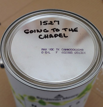
Ok, so that’s not how the song goes, but it is the paint color that we chose for the walls of the nursery (which is pretty sweet considering the name of the paint that we used in Clara’s nursery in our last house was Proposal). Honestly, color names don’t sway us. We’re pragmatic pick-our-favorite-swatch-not-our-favorite-name folks. But it’s always nice when they’re not something ominous. You know, like Sleepless Nights or Zombie Spawn.
Back when we shared our plans for the room with this makeshift mood board of sorts, a few commenters asked if we were going to paint the walls that bold green tone. We explained that we were planning to use that more for accents around the room (like a bold green closet door, a chair cushion, some art, and maybe a crib skirt) and were leaning towards a soft neutral color for the walls. Just so we can layer a bunch of colors and patterns on top of that as the little guy grows, according to his preferences – like we’ve done in Clara’s room.

We’ve really appreciated that Clara’s walls are a completely goes-with-anything tone, so that as she grows we can switch things up without clearing and painting the entire room, but it’s still far from colorless or devoid of personality.
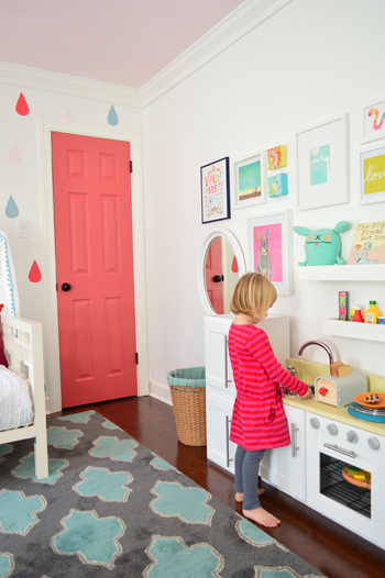
But “something neutral on the walls” can still mean a whole lot of things. White? Light gray? Soft tan? Even a muted tawny-green or blue-gray can qualify. So we considered a few color pairings like…
- a moody deep-ish gray ceiling, white built-ins, a colorful closet door, and light gray walls
- a bright white ceiling, moody built-ins, a colorful closet door, and soft taupe walls
- a colorful ceiling, white built-ins, a white closet door, and soft tan walls
And the winning combo was… #2. We just really liked the idea of some mushroom-toned built-ins (with a stained wood top for a little bit of added interest). Like this photoshopped rendering from last week…
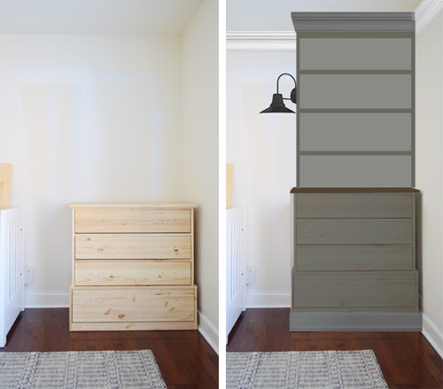
… along with a bold green closet door.
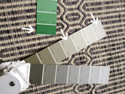
So we just held up a bunch of swatches and considered things like the rug, the built-in colors we liked best, and some possible bold greens for the closet door. In the end it was between some more gray-based tones (on that bottom swatch) and some more mushroom-ish tones (on the top one). See how the darkest color of that top swatch is brown while the other swatch is closer to charcoal gray? We decided we liked the ones with brown undertones a little better than the cooler gray ones, so that’s how we chose Going To The Chapel for the walls, and then slid three tones deeper for our built-in color (Senora Gray). We opted to go with plain white for the ceiling (Simply White in a flat finish) just to tie into the white trim (since the built-ins won’t be going white) and for some nice contrast.
As for getting it done, we just removed the rug, and pushed everything else into the middle of the room.
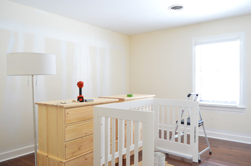
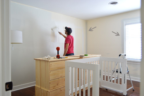
We covered it with a dropcloth when we tackled the ceiling – and we ended up going with two coats, just to be sure we had good coverage. As usual, John rolled and I cut in around the edges – although I didn’t have to be perfect since we’re going to add chunky crown around the room, so that corner where the wall meets the ceiling will be covered.
Then it was onto the walls, which also took two coats. It’s harder to pick up in photos than in person, but the whole room had an obvious yellow tint before. You can see the difference most when you look at the areas that I cut in vs. the walls around them. This is before the paint was dry, so the difference got more obvious a little later, but I didn’t get a picture of that since we had already covered most of the walls by the time they started drying.
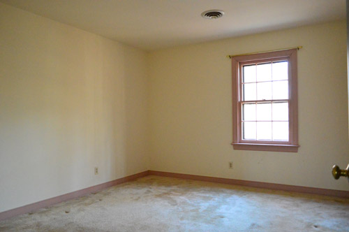
But speaking of comparisons, here’s the room “before” (let’s go way back into the mauve trim days, shall we?):
And here it is now (thanks to ripping up the old carpet, spraying the trim and doors white, laying some hardwood floors, and freshening up the walls and ceiling).
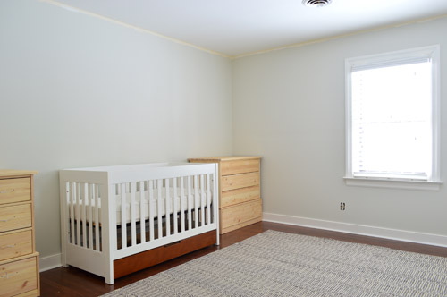
It’s hard to tell in photos just how different it feels in there! But just the fact that those door overspray marks are finally gone (you can see them in the first picture of everything pushed into the middle of the room) is music to our ears – er, eyes. If only they weren’t still in the guest room…
And here’s the room with some other elements that we’re hoping to work in later.
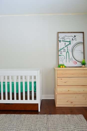
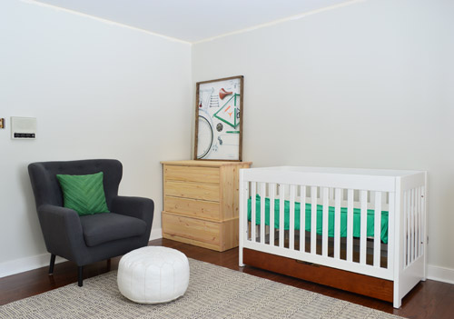
That’s our bike art (which will be hung somewhere else, since the shelves of the built-in will go there) and the slice of green on the mattress is just a long cotton dress of mine that I shoved in there. I’m a weirdo, I just wanted to see what a green sheet might look like. Of course the built-ins will be painted our mushroomy-brown-gray color and those bare walls above the crib won’t be bare when we really get things going. And that slice of old paint around the ceiling will be covered with chunky crown molding. Details, details.
We also brought up our armchair from the corner of the office when we realized that it would be great for the nursery – and once we redo the office there most likely won’t be room for a big plush armchair anyway. It’s still looking crazy stark in here, but it’s better than that pink-trimmed before – so we’ll take it!
Here’s our to-do list with around 11 weeks before this baby’s here:
clean out the roomget a rug(more on those two here)research & buy dressers or cabinet bases to create built-ins along the crib wall(more on that here)paint the walls and ceiling
find an armchair for all that late night nursing- build-in and paint/stain the dressers we bought last week
- add chunky crown molding around the room
- address the window (bamboo blinds + blackout curtains?)
- paint the closet door a fun color (bold green?) and redo the inside for tiny clothes (add a second hanging bar, cubby storage, etc)
- add sconces to the sides of the built-ins
- create some sort of slatted or trimmed out wall between the built-ins for interest?
- get the ceiling wired for an overhead light fixture (none of the upstairs bedrooms have them)
- bring in a dresser/changing table (we’re 80% sure we’ll use the wooden hand-me-down from John’s dad that’s currently in our closet)
- build custom shelves (since John did this for Clara, he’d like for this to be a tradition)
- make a woodsy little cuckoo clock (since I made one for Clara, I’d like to make a charming little rustic one for the bun as well)
- DIY a mobile
- make/hang art (at least one or two prints will have a sea-faring reference, thanks to Clara’s baby boy nickname of “The Barnacle”)
- figure out bedding (make a crib skirt, etc)
Is anyone else painting walls or ceilings? Or planning to paint some cabinetry or built-ins in a non-white color? I gotta tell ya, it’s more thrilling than it should be. #yolo

Chesley says
Are you set on an overhead light installation? I love a lamps only room. Just sayin’ – wink.
Love how it’s coming together!
YoungHouseLove says
I think we’re just used to having one overhead light in a bedroom, so even with a floor lamp and some sconces we lean towards adding that.
xo
s
Alex says
I know that your #1 priority is safety, so I hate to even ask this and imply that you haven’t given thought to keeping the bun safe, but could you expound a little on the crib-between-the-built-ins idea? I think it’s just the perspective through photographs, but it looks like the crib would be RIGHT next to the built ins…i.e. “Come climb up these shelves, Baby P!” But I also remember folks being a little aghast Clara’s crib was below that wall of frames in her first nursery, but a different shot you posted when you rearranged her room showed that the crib was actually pulled out way further than baby-arm-length.
So…it won’t really be that close to the shelves, will it?
Also, do you think you’ll do a header like in your first master bedroom to make it nook-y or just let the depth of the built-ins create the enveloping feeling?
YoungHouseLove says
Good question! It’s hard to see in photos but the space between the two built-ins would fit a twin bed longwise, so it’s a lot wider than the crib. So even a child with a really long armspan (like his dadydy, haha) wouldn’t be able to reach the built-ins from inside the crib. As for a header, we thought about it but ultimately liked the idea of them each looking like their own corner units. We tried photoshopping it both ways, and just liked this open feeling better for the space this time. Maybe since there’s not a flush bed in there right now, so with the space on each side of the crib a header looked weirder?
xo
s
Alex says
That makes sense, thanks Sherry!
Yes, (for what it’s worth) I totally agree, esp. after seeing them painted and installed in today’s post. They look more like corner units than a wall-of-built-ins, even accounting for once the shelves go up.
It really looks awesome; what a lucky bun!
P.S. I’m giggling about a baby coming out with John’s wingspan. In my family we always joke about our future baby coming out with Daddy’s majestic beard. :)
YoungHouseLove says
That’s so funny! We were saying since John now sports a beard for his winter look, that we wonder if his son will come out with one too!
xo
s
Carrie Lea says
A) I really love this color. I’ve been looking for a warm gray for my incredibly hard to pick a color for because the lighting sucks in there bedroom walls and this might be a contender.
B) I’m so obsessed with that rug it borders on unhealthy.
C) Did you guys get rid of the dresser you bought for Clara’s big girl room in house #2?
D) congrats on being down to only one overspray room! YAY!
YoungHouseLove says
Aw thanks Carrie Lea! This room only has one window so I think it would be great for a room without much lighting! As for the rug, I hope one finds you someday! And as for the dresser, yes we craigslisted that when we moved – more on that here.
xo
s
Carrie Lea says
Excellent! I have two windows in my bedroom one east and one south but the east wall never gets natural light and the only time it’s bright in there is like at 10 am. And I’m not really ever home at 10 am. :)
I hope one finds me too. It’s the perfect rug. Deep sigh.
Oh duh! I remember that now. Thanks for the reminder!
I love the hand me down dresser and love the idea of it being in your son’s room. It makes it even more special!
YoungHouseLove says
Thanks Carrie Lea!
xo
s
Jamie says
I was wondering what brand of paint you used. Did you paint while pregnant? I’m pregnant and worried about painting. Is it okay?
Thanks!
YoungHouseLove says
Anything with no-VOCs is prego safe, so you can use Mythic, Olympic Premium, or Ben Moore’s Natura or Ultra Spec lines. Hope it helps!
xo
s
Ang says
I love what you have so far and can’t wait to see it finished! Did you consider white built-ins with a pop of green and/or pattern in the back? Could be a great nod to your former house :)
YoungHouseLove says
We did think about that but might use that idea somewhere else (like the corner units in our dining room).
xo
s
Tiffany Nagy says
its looking so great!!!
Minna says
Kind of random post-painting question: How do you clean you brushes? Soap and water? Or is there a better way? And can you save a brush that has paint dried on?
Thank you!
YoungHouseLove says
I just run them under water if it’s latex/water-based paint. No-VOC paint is especially easy to wash out. I rinse it until the water runs clear and lay it out on a paper towel to dry. If paint dries on a brush it could be done-zo, but soaking it in vinegar might help.
xo
s
Sarah says
You’ve really inspired us with the “neutral” background for a kids room. I’m filling holes getting ready to re-paint our girls’ room. It was hard to pick a color in the glowing yellow room (it seemed like a good idea 6 years ago) but hopefully I picked the right light grey that will compliment some existing pieces in the room.
Amy says
Any ideas on where I can get a similar arm chair? (Open question to the crowd. Love the modern look, but not a fan of all of the chairs these days with no arm rests. And something comfortable would be cool.
YoungHouseLove says
We got it from Joss & Main so maybe try there or overstock?
xo
s
InfoDiva says
What’s your advice about dealing with metal HVAC vents in the ceiling? I see you have a big round one. Do you paint it with the ceiling paint, spray paint it, or just leave it alone?
Painted with the ceiling paint blends in best, but boy do those things get grungy after a while.
YoungHouseLove says
Ours were already painted to match the previous ceiling color so we just reprinted them (thin coats with a brush seems to work).
xo
s
Emily says
InfoDiva- I used to have yellowed ceilings and recently painted them white. I spray painted the circular HVAC vents white and it took less than 5 minutes and looks perfect!
Jessica @ Dear Emmeline says
I added a pop of green in my son’s room with a fun light fixture from Urban Outfitters. Love it!
http://www.urbanoutfitters.com/urban/catalog/productdetail.jsp?id=26621722&parentid=A_FURN_LIGHTING
Jessica @ Dear Emmeline says
p.s. Love where your little man’s room is heading! We’re moving into an old home soon and will be redoing A LOT. I’m also expecting early May (a boy) so we’ll be redoing one of the rooms for the boys. Can’t wait to settle on the house and get started! You’re making me motivated!
YoungHouseLove says
Wahoo! Congrats Jessica!
xo
s
YoungHouseLove says
Really fun! Thanks so much for the link!
xo
s
Lanie says
Both of your babies have wedding themed nurseries. Proposal (which I painted my daughter’s nursery) and Going to the Chapel. :)
YoungHouseLove says
Isn’t that funny and random?!
xo
s
Sarah @ The Simple Home says
Love that! Can’t wait to see the room finished!
Sarah
http://www.thesimplehomeblog.blogspot.com
Joanna says
We painted our nursery over the weekend! Benjamin Moore’s Stonington Gray was our winner- hoping to bring in some darker gray accents later!
YoungHouseLove says
Love that color too! We hear it’s awesome!
xo
s
Gail says
Love what you’ve done in here! What a difference from the first “before” shot- wow! I have 2 boys and have loved putting their rooms together for them–although they are still very much in progress! I love all the colors you chose too and what you plan to do with the rest of the room. Sooo fun! Planning the nursery is always such a fun part of anticipating a baby. Enjoy every moment!
Gail
YoungHouseLove says
Thanks so much Gail!
xo
s
Kelly says
I love your color choice for the walls! I am curious though, you initially had posted a color scheme for this house, but as you have gone along, you have swerved a bit away from it. Although I think this color is still in the same family of colors (I think I remember pismo dunes and edgecomb gray, etc, but I do not remember you mentioning going to the chapel) How do you set a mood for your house, but make it flexible enough when it is time to paint, you can slightly change the color? I love Benjamin Moore paint and I am slowly but surely painting my house interior with it, but I am trying to keep with a flow, but sometimes what I think will work ends up not working quite right due to lighting or other colors in the room. I am trying to keep to a plan but be flexible.
YoungHouseLove says
Oh yes, I think that palette was sort of a jumping off point and we’ve used a bunch of those exact colors (I think in the bedroom, the bathroom, and the kitchen) and then swerved a little too (we didn’t know we’d have a baby boy when we made that, and we didn’t have all of our ideas fleshed out back then, like the dark pink door in Clara’s room, etc). I think being flexible is key as you go, since rooms seem to evolve as you live there, but having a color-map as a starting point is nice.
xo
s
Amanda ~NoDak Nest says
The Hubster and I have spent the past 2 weekends painting walls, ceilings, and trim in all of the rooms of the 1930’s house we just bought and are fixing up. Still waiting to see the light at the end of the tunnel. I’m getting anxious to move on to some of the more ‘fun’ projects than just painting but it’s good to see I’m not the only one with a laundry list of projects for each of my rooms!
YoungHouseLove says
That’s amazing! I can’t imagine moving that fast. GO AMANDA!
xo
s
Abbie says
I love it! It is so simple, yet with so much personality. Can’t wait to see the finished product.
Kate says
Okay. So I know you relocated the armchair but where did you originally purchase it? Totally in love with it! The room is coming along and starting to look great!
YoungHouseLove says
Thanks Kate! It’s from Joss & Main a while back, but maybe try overstock.com or wayfair.com too?
xo
s
Kate says
Sweet! Thanks Sherry!
Page says
Just wondering about the placement of the sconces. I really like them, but won’t they shine in poor little Barnacle’s eyes?
YoungHouseLove says
Oh yes, we won’t have them on when he’s in the crib (we’re total darkness while they sleep folks, including blackout curtains) but you know how people have sconces over their beds for reading lights? When he grows up and we get a twin bed (or eventually even a full sized bed in that nook sticking out into the room) we hope he’ll use them for reading lights.
xo
s
Steph Reiner says
I’m usually a lurker but I’ve been on a commenting roll. Sort of. Also, you got me hooked on Katie Bower’s blog and I was just reading about how she painted her garage door this color green! (At least it looks similar on my screen) We just found out we’re having another girl so I’m trying to convince my husband that painting the closet door in the girl’s room a cool color is necessary. :D
YoungHouseLove says
Isn’t that funny? I think her door looks great!
xo
s
mp says
Love it!
Timothy says
what are the dimensions of his room? it is just a square/rectangle right? I’m curious to know how big it is considering you have the crib and the built-ins on that wall.(btw i love that emerald green color you chose as the accent. its my favorite color!!!)
YoungHouseLove says
Thanks Timothy! I think the big rug makes it look more expansive in photos, but it’s just a rectangle and it’s 11.5 x 13.5′
xo
s
Gina says
I really like the colors for the built-ins. I was wondering what made you decide to put them on that wall though. Won’t that limit the layout of the room in the future? i.e. that space will only be fit for a bed or similarly shaped object. Did you think about having them take up that wall with the window? (That’s where my brain went)
YoungHouseLove says
Yes, since the window is off centered we just liked the idea of putting them on the long wall with space for a crib/bed in between them for a more balanced look. We think it’s still flexible because a twin bed can fit in that space longways or even a full or queen sticking into the room, which we’ll go with when he’s older. There are still three other walls to use for things like dressers, desks, chairs, etc – so we hope it’ll work out. We figure if we put them on the window wall the same would be true (whichever wall we put them on would free up the three other walls) so we just went with the one we thought would work best.
xo
s
Kristen | Popcorn on the Stove says
LOVE the color you chose for the wall! I think this room is going to turn out amazingly!
YoungHouseLove says
Thanks Kristen!
xo
s
Sara V (NC) says
Wow so funny that Clara’s paint color was Proposal and this one is Going to the Chapel….maybe the next baby’s room color will be ‘Honeymoon’? haha!
YoungHouseLove says
Haha!
xo
s
Natalie says
Great choice for the wall colour. Can’t wait to see the built-ins.
YoungHouseLove says
Thanks Natalie!
xo
s
grace says
looks great! just a thought but one shade darker on the swatch might look grrrreat on the built-ins. a little more contrast for a lot more impact. keep it up, sherry & john.
YoungHouseLove says
Thanks Grace! We debated which shade for the built-ins for a while, but I think Senora Gray is still our fave. Will keep you posted!
xo
s
Dani says
Ohhhhhh I’ve had this board saved to my Pinterest for AGES, it’s totally what you’re looking at!
http://designboards.net/2012/09/modern-glamour-nursery-unisex-baby/
YoungHouseLove says
So much fun! I love that green tree thing! Is that a bookcase? So cool.
xo
s
Pamela says
The green dress provides the right pop of color, but probably doesn’t fit so well on the mattress. Would you consider making your own crib sheets to get just the right color green? I know the Richmond area has at least one incredible quilt shop with racks of green fabric. Just two yards of organic cotton (prewashed before sewing) yields wonderful results. I’m a bit of a seamstress, so this would be easier for me than actually shopping for crib sheets, but you should be able to follow a tutorial like this: http://www.sew4home.com/projects/bed-linens/michael-miller-fabrics-citron-gray-nursery-fitted-crib-sheet.
YoungHouseLove says
Yes, that would be fun! I’m scared of adding elastic, but I bet someone could teach this old scared-of-sewing dog some new tricks :)
xo
s
Pamela says
No sewing involved with that elastic. Just make a little pocket all around the bottom edge of the sheet (with a 2-inch opening) and thread 60 odd inches of 1/4-inch elastic through. You can just tie the ends together if you don’t want to sew them together. Even sewing up the opening is optional.
YoungHouseLove says
Thanks for the tip! Would never have known that!
xo
s
Kate says
Looks fantastic so far you guys! Mind sharing the details of the color green? Thanks!
YoungHouseLove says
I think that’s Bunker Hill Green by Ben Moore.
xo
s
Tricia S says
My local Target has some cool blackout curtains in solid and graphic prints. They also are in the middle of their seasonal home decor clearance sale. Oodles of cool picture frames including this neat stainless steel cable system with fixed white owl clips to hold photos. I love the way the nursery is headed!
YoungHouseLove says
Thanks for the tip Tricia!
xo
s
Alayne says
This post is so inspiring for me right now! We’re about 10 weeks behind you, and just beginning the process of clearing out the office/spare room/I-don’t-know where-this-goes-so-I’ll-just-set-it-here room. So excited to begin painting the walls, we’re thinking something with a bit of a punch like white walls and one deep navy coloured accent wall. Can’t wait to see the continued progress in your nursery, thanks for sharing!
Meredith says
Hi there! Love the color you picked. Question about your built-ins… Will they be flush to the wall? I noticed that the bottom pieces you have won’t be able to flush to the wall, and I wondered if you had a plan to make the tops the same or different to the bottoms. xoxo, Meredith
YoungHouseLove says
Oh yes, we’ll be cutting out the baseboard and building those in so they’re completely flush to the corner. More details as we go!
xo
s
Cathy says
The fun part of putting a room together after the hard work! We just finished our boy’s room and used a similar green but on the ceiling, white walls and dark hardwood floors, looks amazing at night too with the green ceiling, feels very cozy!
Laci says
IF I get caught up at work, we will be painting our son’s and baby # 3’s bedroom this weekend. I’m super nervous about it because we’re trying to marry a red and blue accented super-hero room (my six year old) with blue and yellow moon and stars theme (baby # 3)….and not make it look too circus-y. I did find a sign from Pottery Barn that says “All Big Brothers Are Super Heroes;” so I’m hoping we can match the blues (all the colors are accents on a very light-greyish base color) and tie in the super-heroes/stars that way. ??
p.s. It’s been FOREVER since I’ve commented, and I’ve been having to catch up on posts on my off weekends bc work has been so busy. :-( I think I’m only a couple of weeks behind you with my due date. No matter how dorky it is (on my part), I’m SO excited that ya’ll are expecting again and that we are pregnant at the same time!!
YoungHouseLove says
That sounds so cute! I think it’s going to look amazing! And good luck with your pregnancy Laci!
xo
s
Brenda says
Great job, Sherry and John. Love everything about the subtle colors with the pop of green.
Erin says
I love the chair that you picked! Perfect choice for a modern baby/kids room.
YoungHouseLove says
Thanks Erin!
xo
s
melissa says
Making your own mobile?? Can’t wait! You must check these out…. They are so crazy fun!
https://www.etsy.com/shop/PinkCheeksStudios?ref=l2-shopheader-name
YoungHouseLove says
Oh my gosh, amazing!
xo
s
Jill says
Lovely! I love the black & white striped tote in your initial mood board… Can you share the resource for this?
YoungHouseLove says
That’s from The Container Store.
xo
s
Peggy says
Stumbled across this tonight and thought of you guys. Paint chips, baby! http://etsy.me/1glJTaT
YoungHouseLove says
Really cute!
xo
s
Tara Dawes says
Looks great! Can’t wait to see it when it’s finished. We are currently in the longest process ever of picking out a paint color for our tv room/den. We currently have something like 6 different samples on our wall and I still can’t decide. I’m scared of picking the wrong color, also the fact that Sherwin Williams only carries (at least at our location) sample pots in a glossy finish isn’t helping. We have to pick not only a color/finish that goes with our furniture/style and that we like but also one that works with the WORST thickest wall texture ever. I think we finally decided that they put orange peel on super super super thick and then didn’t bother to scrape it down. I hate it so much. Anyone know if for something that textured would a matte or a flat finish work better? Are there colors that would hide the texture, or make it more noticeable? Also, how do you deal with fear of making the wrong color choice? The last color I picked for my house was the laundry room – what I thought was a pretty yellow turned our laundry room into a neon kindergarten, so my track record scares me!!!
YoungHouseLove says
Yes, the flatter the finish, the less it’ll emphasize that texture (something glossy would essentially shine a spotlight on it). As for making the wrong color choice, I’d hold up a bunch of swatches and compare them to each other in all times of day and grab a test pot if you’re still not sure (even if it’s shiny it can help you get the color right, and then you can order it in the flatter finish).
xo
s
Casey says
Ooh! For the mobile, I suggest the Munari mobile from the Montessori infant series. It’s a high-contrast black and white mobile. You can buy them on Etsy or make one yourselves.
Pretty colors you picked out, thar! :)
YoungHouseLove says
Thanks Casey! Will check it out!
xo
s
Jenny says
Loving the palette in there! Just was looking through a new H&M catalog and they have a bunch of stuff in Home that’s emerald green, and in kids there’s an emerald green dinosaur pillow. Made me think of you! xox
YoungHouseLove says
So cute!
xo
s
Michelle says
I love how your nursery is coming together! I am up to my eye balls in paint. My kids are on their 5th day off this month due to the extreme cold (Minnesota) and I am about to lose it. So, what to do but completely tear apart the living room and repaint it? Seems like the logical thing to do…
YoungHouseLove says
Haha! My best friend just painted her living room due to kids being home all week and going stir crazy! Her four year old “helped.”
xo
s
Emily says
A quick idea for a slatted/trimmed out wall between the builtins–saw this stuff at west elm over the weekend and thought it looked awesome! http://www.westelm.com/products/stikwood-adhesive-wood-paneling-w815/
YoungHouseLove says
Really cool! Thanks for sharing!
xo
s
Crystal S. says
I love that paint name. When choosing a paint color, I have wished before that a certain one would work, just because I liked the name better. Congrats on your expanding family. That bicycle art is very cute. : )
YoungHouseLove says
Thanks Crystal!
xo
s
Lisa says
I hate to confess it but I am color phobic. I have painted our walls so many times, our friends and family are shocked when they visit because the walls are rarely the same as their last visit. One room I painted a pale icy blue and I KNEW the minute I rolled it on it had to go. I have physical reactions to color (yup, I’m weird) and that color did not sit well. I rushed off to get a neutral color the next morning. I have a VERY understanding hubby. That said color on the ceiling is a YES! Our son’s room is bright white with planked walls etc. for texture but the ceiling and top 1/2″ of the wall are a deep navy blue. I absolutely adore it. Next up: color on ALL the main living area ceilings…thinking a nice gray with chunky white crown mouldings.
YoungHouseLove says
That ceiling sounds like so much fun Lisa! All the best with the living areas! Your plan sounds really pretty.
xo
s
Mary says
In one of your post you had a link to a site that sold wall mural stickers and they would also create name stickers. Can you send it to me? I can’t seem to find it. Thanks. Love your house!
YoungHouseLove says
Oh man, I’m afraid we don’t remember mentioning those. Does anyone else remember? My brain just can’t recall anything like that, but I’d love to send you the link if it pops into my head!
xo
s
Brie G. says
I just came across some super cute sea-themed prints from The Printed Palette that made me think of this post! A jelly fish print for Clara (http://www.theprintedpalette.com/shop/163690167) and two cute options for the bun: (http://www.theprintedpalette.com/shop/165532119) & (http://www.theprintedpalette.com/shop/167297249). Such a cute idea to pay homage to his nickname! :)
YoungHouseLove says
So cute! Thanks for the links!
xo
s