We usually feel pretty confident in our ability to pick a paint color. But something about choosing the perfect gray color for two major living areas in our house made me extra nervous (we’re going to use the same color in the future dining room, main hallway, and living room for some nice continuity). Sherry had a field day ribbing me about my paint paralysis. I was literally second-guessing every swatch we looked at. “Sure, I like it… no I don’t, I hate it.” Yeah, that was me.
I blame my neurosis on having selected a hideous gray tone to paint my middle school bedroom (I picked it because I liked the name – Cannonball or Cannon Smoke or something else that sounded like blowing stuff up). In retrospect it was too dark, cold, and prison-like. Fortunately I warmed it up with a bright red Looney Tunes rug and Tasmanian Devil throw pillows (don’t be jealous). But somehow I don’t think that’s an acceptable solution this time around.
So I convinced Sherry (who was a lot less gun-shy than I was, she kept saying “let’s just pick one and DO IT!”) that we should buy paint testers and try out a few colors before committing. She recommends this option all the time to nervous-about-painting readers, so it wasn’t too hard to convince her that we should give it a whirl at least once. So we narrowed it down to our top three similar-but-different-enough-to-help-us-make-a-decision contenders:
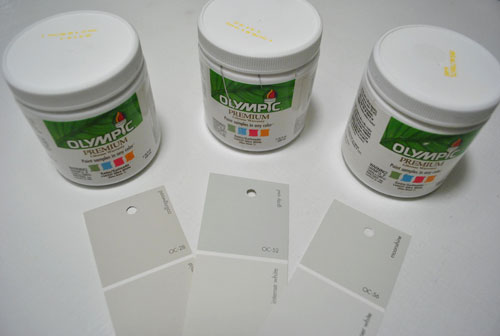
They are, from left to right: Collingwood, Grey Owl, and Moonshine (all Benjamin Moore colors mixed in Olympic Premium No-VOC samplers from Lowe’s – which are about $2.50 a pop). Of course, in an effort to prove her paint-psychic abilities, Sherry called her favorite before even breaking out the paintbrush. Can you guess which one it is? Hint: it rhymes with “spoon mine.”
Here they are in the future dining room, painted in that same order (with Collingwood on top and Moonshine on the bottom):
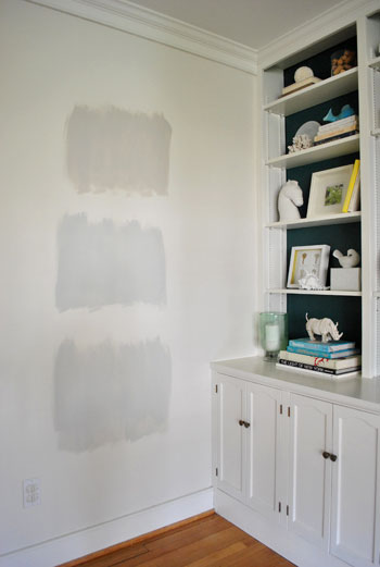
We just did one coat with a paintbrush (it had great coverage) doing our best to keep the edges feathered so when we eventually paint over everything we aren’t left with slightly raised squares where we tested (which is why we didn’t use painters tape to make perfect squares that also might be visible after we paint over them).
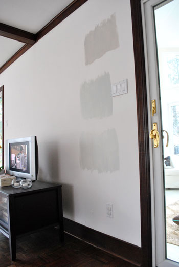
And ever the overachiever (or just someone who loves to paint), Sherry finally embraced the test square method and went ahead and painted big swatches in the family room too. One set near the TV…
…and another set next to the big window (since it gets a different amount of daylight).
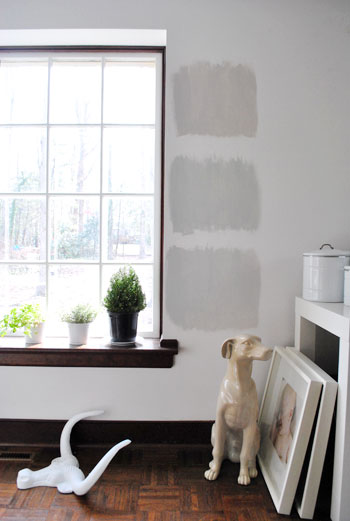
After all, one of the great things about these testers is that you get to see what certain colors look like throughout the day and in varying amounts of daylight and artificial light. We do this with the small paint swatches too, but it certainly was nice to judge a color from across the room for once.
Speaking of different lights, here are all of the colors again at night when things are much yellower from the artificial light (they’re all painted in the same order as listed above, by the way):
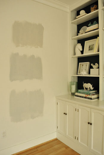
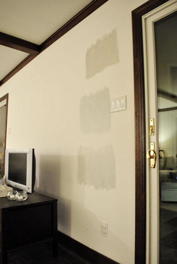
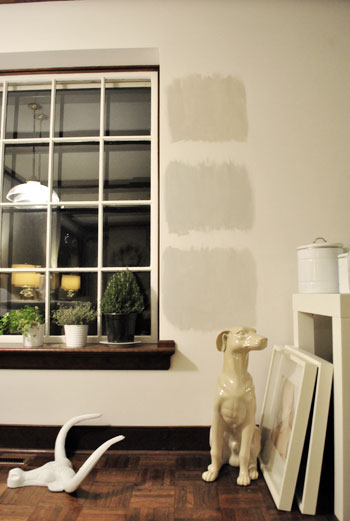
So after a couple of days I finally admitted that (say it with me) Sherry was right all along. Moonshine, the one on the bottom, is by far our favorite of the bunch. Collingwood (the top one) almost won us over, but it’s so warm/tan that it reminded us a lot of Glidden’s Sand White, which was in our first house’s living room and office. We love that color, but it’s not gray enough for what we want this time, so in the spirit of doing something fresh and new we crossed it off the list. And Grey Owl (the middle one) read as too green/blue in our house’s light, so we worried it too might not immediately read “gray” and instead might be “muddy blue-gray” which is what we had in our last house’s bedroom and kitchen.
Moonshine is probably the “purist” of the grays we tested, and it almost has a soft shimmery quality to it – like there’s some silver mixed in. We’re excited about it because it’s definitely dark enough to make the moldings pop (especially once we paint the ones in the living room white) but it’s not too bright or saturated to compete with bolder curtains, art, and accessories that we plan to introduce. Now we just have to cross our fingers that we can find the energy to paint the two largest rooms in our house… and the hallway that connects them. We actually started the job today- but with baby & blog duty going on at the same time, it might take us a few days to get ‘er done. We’ll share pics as soon as we’ve got ’em though!
Have any of you used the paint tester method to choose a color? Did it confirm your feelings or send you in a totally new direction? And dare we ask how long the test squares stayed up before the room finally got painted completely? Ours were up nearly a week, but we could totally see how that could turn into a month (or a year) if you still weren’t 100% sure which way to go…

Julia @ Hooked on Houses says
I’m digging the Moonshine, too. I think it’ll look great–can’t wait to see how it all turns out! :)
Jen @ The Decor Scene says
Great chose. Can’t wait to see the rooms completely painted with this color. I’m very into grey right now. I’m thinking about a grey couch in the LR with my tan walls. Then add punches of color with the neutrals. ;)
I have one question. Hope you might have an idea for me. I want to paint our LR/DR/Kitchen again (all open – Great Room), but our DR & Kitchen have catherdal ceilings. We can get to the DR side easily because there is nothing in the way, but the kitchen cabinets are now in our way to get to the catherdal ceiling part. Any ideas how to paint all the way up there and be able to cut-in by the ceiling? We were hoping not to hire a painter for this to save money, but we might have no choice in the matter this time. We painted everything the first time before the kitchen cabinets were installed. Thanks for any ideas you might have. :D
YoungHouseLove says
Hey Jen,
Maybe you can rent scaffolding or a ladder or two to get up there? And use an extender rod for your roller? Not sure how you’d cut in with a steady hand using an extender rod though. Have you considered painting the ceiling the same color as the walls? We often love that look in rooms with high pitched ceilings since it unifies things instead of chopping things up for a nice seamless lofty look. Good luck!
xo,
s
Jessica says
So I love the paint tester method, but I was wondering what you do in a room that’s already painted a vibrant color. Our den is a pretty bright light green and while it sounds like a nice color, it’s really grating on me. It just feels like an unsophisticated choice and I’m looking to move to something a little more subdued… like beige.
Do I really have to put some primer on first and then paint my test area? Just that one extra step might be enough to make me scrap the project all together!
Nice choice on the grey also. I was rooting for the middle one, but anything was better than the top. Happy painting.
Oh and PS – I know you’re busy, but I miss the mood boards!
YoungHouseLove says
Hey Jessica,
Yup, we’d recommend priming a square under your test spot or buying one of those huge swatches that Benjamin Moore sells (it’s a giant poster-board sized swatch that you can just tape up on the wall instead of painting a test square). Hope it helps!
xo,
s
Kim says
I just did this same method in my entryway last week. I wanted a VERY light gray because our entry gets little light. I’m doing a darker gray for the rest of the house so I’ll have to take a look at moonshine. I ended up using a Behr color and having them make it 25% lighter. I really like it so far.
mary W. says
Stop it. It never occured to me that you can ALSO color match sample pots at Lowes?! Ridiculous of me to think that…But that is fab to take a BM or whatever color swatch to the nice $2.50 price tag! Cannot wait to see your living spaces go gray! Color swatches definitely are making me go gray, literally! Good luck & I’m sure we will LOVE it!
Nicole says
Yeah, about those paint squares…
I wanted to paint the most used room in our house (a tiny 10×10 spare bedroom which we converted into our “hang room”) orange. Not pale orange, not kind-of orange. I’m talking slap-your-momma orange! With white 10″ base molding and white window moldings, I thought it would look great. I even got all Trading Spaces about it and decided to paint just two walls. Well, because I’m a novice (read: idiot), I painted my paint squares of three different WOW-that’s-orange colors on the two walls that were most easily accessible…and just happened to be the two I was going to leave white! The paint squares stayed up for three weeks before I finally decided on Melon as the one to choose. Luckily, after painting the walls my fiance came into the room the next morning and suggested we paint one of the other walls. So now we have one wall white. Are you following? After going over the one white wall with three coats of the paint-and-primer-in-one paint, you can STILL see the faint orange swatches. My step-sons love to comment how they can even see the letter I wrote above each paint square to indicate which one was which.
Yeah…lesson learned! Always make sure you’re going to paint over your squares with something other than white!!!
I love your blog and look forward to your posts every day! I’ve learned some really valuable lessons from you guys! Keep it up!
Carla says
My hubby was also very concerned when I brought home bluish grey swatches to paint our living room/foyer/upstairs hallway/office with. After painting some swatches on the walls we ended up going with Sherwin Williams Reflection and we absolutely love it! So happy you found a grey you can live with! It’s going to look beautiful!!
Ana says
I’m more like Sherry. After I put up a lot of paint chips for a few days and hold up things like bedding, my eye just keeps going to the right color for the room. The one I focus on is the one I pick.
I’ve only used paint sample sizes for smaller projects. When I sold my old house, I freshened up the front door with a pot of brick red. And I recently painted the wood-laminate top of a nightstand black to match the rest (Mickey Mouse Ears from the Disney paint line at Home Depot).
Shannon says
I always test paint swatches on the wall – even when I am 99.5% certain I know which color I like best. Particularly with grays, they can look so very different in the light. I think you picked the best color too. Can’t wait to see it painted.
Brittany says
Gray IS hard. Just finished our kitchen and it was impossible! Ended up lightening it three times.
Can I just say, I hope you don’t paint your trim. I love white trim, I painted all my house trim white, but it’s so overdone now and honestly looks cheaper. Your dark wood trim is in such good shape and looks so luxe and beautiful; it adds a great architectural, rich element to the room. Really pops against all your white/light furniture and walls.
Keeley says
I was wondering if you two every used paint testers (I always notice you taping up the tiny sample cards). I always use paint testers, but sometimes I’ve still made mistakes!
I was going for grey in a bedroom and it looked great on the wall until we finished the whole room and it started looking blue! I still like it, but it was disappointing. Now I actually read the paint formula or ask the person mixing the paint what colors are in it.
Micaela says
Youngsters… I’m going to have to call you out. When you first bought the house I seem to remember a post about how you were going to be more daring and risk taking when it came to the color schemes. At the risk of sounding too critical… I am bored with all pastel/light colors you’ve chosen so far. Maybe you have big plans for bringing color to the rooms in other ways than the wall paint but regardless… it looks to me like you guys are using light colors as a crutch. Show me something exciting! Something inspirational! Something new!
I still like you guys nonetheless. I just want to push you a little. So this is me… pushing.
YoungHouseLove says
Hey Micaela,
As we mentioned in the post we wanted a nice backdrop to bring in bold curtains, art, accessories, etc. Bright wall colors aren’t the only way to be bold! In fact we want to take chances with bright art and even some boldly painted furniture and textiles- so we don’t want the walls to compete! And we have big plans for bright bold blue walls in the hall bath and a rich deep color in the guest room. Stay tuned for that. And remember when we painted the backs of our future dining room built-ins dark greeny blue? That was just a few weeks ago! And we plan to bring that color in a few other ways (like adding it to an island in the kitchen, etc). Hope it helps!
xo,
s
Johnna says
I ask stupid questions, but what does Clara do while you paint?
YoungHouseLove says
Unless Clara’s napping or it’s after 8pm (when she’s in bed), one of us is watching her and the other one is blogging or projecting/painting!
xo,
s
Jennifer says
You ask if the paint tester method has been used…? Ask my poor husband! He’s been graciously and lovingly putting up with me selecting a pale gray for our kitchen. There are paint samples painted on all of the walls, including the backsplash area, and we’ve tested Benjamin Moore’s Early Morning Mist, April Showers, Moonshine, Morning Dew, Behr’s Polished and Guesthouse, and finally Glidden’s Silver Birch. None of them were the ONE.
I’ve got two more Benjamin Moore colors to try and I have a gut feeling it will be one of them. It’s hard, but when you love your house and want it to be perfect, you do what you have to do!
Amanda @ Our Humble A{Bowe}d says
The Collingwood sample looks like it’s a greige. I like Moonshine, though. I’ve been searching for a warm grey for our living room. I too don’t want it to read as a cool grey-blue. Thanks for your selections!
Beth-BTW says
Have I tried the test swatch method? Boy, have I. There are *so many* little tester cans in my basement that I could probably paint your living room in a patchwork paint job. Haha! In our kitchen and family room, they steered us in a completely different direction…and I’m so glad they did. If I’d just “gone with it” on instinct, our main living room would have been a gold color. For about the day it would have taken me to repaint it, anyway.
Rachel says
I picked that one too, it will look loverly. Your house is really coming together, loved what you did in the master bedroom….especially after painting the mirror. I have never actually tried the paint on the wall test patch thing. Maybe I will next time, sometimes I find myself with painting regrets.
Clarissa says
Congrats on curing your paint paralysis!
I actually went through John’s “like it / hate it” mentality before realizing how much time I lost and switched to Sherry’s “just go for it” one. I ended up with BM’s Grey Owl (your 2nd in the line color — and used BM Regal paint) and also felt that it read a little greenish with indoor lighting after it went up (in case you ever wondered if color match could have been psuedo responsible). Two coats helped a little but wish I saw Moonshine when I was paint shopping to see what true grey could have looked like!
Kristy says
I always use the paint tester method! I feel its truer to the color than a paint chip. I did this same thing when we painted our kitchen gray, and it took me about 6 swatches to get it right! Admittedly, there are still rooms in our house that STILL have the little color blocks left on them… someday, someday.
Ami @ beyondpeasandcarrots says
def agree Moonshine is the way to go! Can’t wait to see it done :). I have always been too lazy to try out the painted square thing first… I am always a grab the color I like and hope for the best girl.
Sarah says
We had our house painted last summer, and before we picked a color, I bought 13 paint samples and painted them on the back of the house. I started with five, and wasn’t really satisfied, so I kept going back for more. And I’m so glad I did! My initial choices would have given me a peach-ish house, and I’m loving the basket beige from Sherwin Williams that we ended up picking. While my husband was initially annoyed with my indecisiveness and the need to go back to the paint store, I told him $50 in samples is better than a peach house you spent several thousand for :)
MS says
I am on test cans 4, 5 & 6 in my kitchen. Been trying to find the right color for about 6 months now, which is totally not my style. John, we call it analysis paralysis.
I am looking for a gray as well and so far have landed on the exact color of the grout, a mauve gray, a purple gray and what I can only imagine resembles your childhood color of cannon something.
I am going to get a tester of Moonshine on my way home, cuz I’ll try any gray at this point! And it sounds better than the swatch I’ve been considering, “Moth Gray” by Porter. Ugh….horrible name.
Jenn says
OMG John I’m cracking up! My husband turns every q&a into a rhyming game and it’s always something ridiculous. Spoon shine had me laughing for sure =) My husband watched too much “Knocked Up” and now everything starts with shmush___ in his rhymes. bahaha!
Love the color! picking a grey is hard work!
xoXOxo
Jenn @ Peas & Crayons
Mrs. Inspired says
We’ve also been on a gray kick recently! Although, I have to admit that the gray we decided on in Boy’s nursery (edd 3/7)is way darker than moonshine…I love the moonshine, though! Maybe we’ll look at it for our living room…
And I definitely can’t do the paint test method–I still have approximately 10 different swatch cards taped all over my house in almost every room…that have been there since Sept. Oops!
Melissa says
Love the new color!! Do you guys recommend picking furniture first and then picking paint or painting first and then picking furniture? Trying to decide if we need to get a couch set first and then paint or vice versa.
YoungHouseLove says
Hey Melissa,
We’ve done it both ways. Either order works!
xo,
s
Beth-BTW says
By the way, I color-matched a lot of colors from BM to Lowe’s when we painted our entire house, as well. At the time, I was told by the paint desk associate that the color matching is not always exact. Not only that, but the color may differ from a color-matched tester, quart and gallon. Don’t be surprised if your gallons don’t always come out the same exact hue as your tester showed…and take the lids back for more paint. They can duplicate the exact shade from the numbers on the lid.
You probably already knew this, but maybe that helps someone!
YoungHouseLove says
Hey Beth-BTW,
We painted little squares next to our test squares before we started rolling the walls this morning- just to be sure. Funny enough, they’re exactly the same. Can’t tell where the original square ends and the newly painted one from our gallons begins. We’re thanking our lucky stars! Of course they actually looked up the formula for the BM paint for both the testers and the gallons so that had to help too!
xo,
s
Tiffany says
Are you painting the trim white?
ps- love the gray color.
YoungHouseLove says
Hey Tiffany,
Yes, and it’s going to take FOREVER! Send help! Haha.
xo,
s
Jennifer says
In the words of Elain, “Get out!”
I’m in the process of picking out gray for my main space as well. I also have blotches of paint absorbing and reflecting every light of day and night. I hope mine turns out as well as I’m sure yours will.
D says
Moonshine def gets my vote!
Sadie says
Can’t wait to see what you decide on furniture and window treatments! Our living room is gray (Olympic’s Secret Passage) and I’m having the hardest time deciding on pillows and other accessories. I’m sure I’ll be inspired by what you create. :)
amy good house says
I used this method a few times – I love getting the Benjamin Moore pint sized cans when I am unsure – they are a few more dollars than the tiny testers, but well worth it. I recently had to decide on a navy color for our guest room and since it is so dramatically dark I needed to be sure before painting all the walls!
One pint can cover a nice sized wall quickly with a paint brush.
Once I see the colors in place for a day or so, I definitely take the plunge and quickly get the paint action going!
Wendy says
Ever since I’ve discovered the testers, I haven’t been able to buy paint without trying it out first. My friends and family laugh because I almost always have at least one room with several “squares” painted on the wall. And yes, they’ve been known to stay for quite a while, the longest I think being 6 months. The moonshine would have been my choice as well and I think I might have to try it myself. I’ve been looking for the perfect gray for my playroom/guest room and haven’t had much luck so far. Thanks for the inspiration to try again!
Angela N says
Yes, I have done this method. And just like you painted swatches all over my house (when looking for our main house color.) It definitely helped. And the colors I thought would be perfect on the swatch, were not my favorites once up on the wall. I was SO thankful I did the tests! Now, my question for you…What to do with al of the random colors that are left over from testing?? I have a bunch that I don’t know what to do with. Happy painting!! It’s one my favorite home improvement projects.
And thanks for the post on grays. I am trying to decide on a light gray color for my LR/DR. I will take a look at the colors you tried.
YoungHouseLove says
Hey Angela,
We just keep them on hand for little projects, like painting frames, Goodwill finds, or even art!
xo,
s
Reenie says
OMG….that’s funny!! I just bought 3 of the lil samples at Home Depot for my dining room. I have always picked my paint colors like you guys do ~ hang several of the cards on the wall and take down the ones that I know I don’t like. But I’m going with yellow in my dining room…..and for some reason I’m nervous about it. I think it’s because my “new to me” vintage oval yellow-top table with chrome legs….and yellow chairs w/chrome legs ~ and I don’t want the yellows to clash!! I’m going 4′ up with beadboard (white) and the top will be yellow. I haven’t painted them on the wall yet to see which I like best….I’ve got 3 great friends coming over tomorrow to help scrape the 4 layers of wallpaper off ~ the top layer is bumpy and paint over it!! :O
I like the Moonshine too…..or maybe it’s just the name ;)
Catherine says
My parents’ guest bedroom has had nearly identical gray test squares on the walls for about two months. We had so much trouble picking a paint (I had pretty much settled on Grey Owl but there were lots of strong opinions), the curtains we’d planned on buying from C&B sold out. Oops! So now I’ve decided to DIY the curtains (using your tutorial of course). My mom and I think we’ve picked out the fabric. We ordered a sample and assuming we like it in person, we’re going to move forward before it’s too late. Only problem is now the gray won’t go… so I’m in search of a new paint color. I’m leaning towards BM’s Azores or Atmospheric but I’ll have to see the fabric first. Hopefully the test squares won’t be up for much longer!
Your Moonshine shade looks great by the way! Can’t wait to see the finished product!
Lauren H. says
Grey’s totally the “in” color right now, huh?
So I discovered your blog a few weeks ago, and have subsequently been reading it backwards. Now, I sit around my house and think about how much I would love to repaint EVERYTHING, but then I remember how much work that would be. We’ve only done a bathroom (poorly) since we moved in, and that took a whole weekend! Maybe some day…
Carrie says
I just went through this! I posted about it here:
http://makinglemonadeblog.blogspot.com/2011/01/post-where-you-help-decide-my-future.html
I have a bunch of photos of my choices along with a poll about which color to choose. We are just a day away from getting the chosen color on the walls… wish us luck that the one we have works! {I’m so happy to see you going gray as well, I have to say it’s a lot less safe– and more scary– to me than tan!}
Emily says
I’ll always pick a ton of swatches from whatever Home Depot/Lowes has to offer, then I’ll narrow it down to three after bring them home. From those, I usually still cant find the perfect color, so I do this: Write on each swatch “greyer than this”, or “darker than this”, or “more blue than this”. Then I bring those back to Home Depot where I can compare them to the colors in the 10+ swatch books that they have. I always find one color that satisfies ALL of my criteria : )
Erica says
I did this with a grey in our living room and a apple green in the kitchen. It made a world of difference to so the slight variations, even if no one else could tell. But now I love the colors in my house instead of finding them a little funky.
Alayne says
I had to laugh when I read this post. I have been trying to pick the right blue-gray-green color for our reading room, kitchen and hallway (Since they all connect). I have had THE. HARDEST. TIME finding something I like. I have put up the swatches, let them sit there for a week or so, narrowed down the choices and then painted samples. So far I’m not liking them at all once they are on the wall. They look too country blue (like my parents’ 80’s Corelle blue kitchen), or too muddy green, or just flat out gray.
Anyway, our sample sqaures have been on the wall for an embarassingly long amount of time.
What would you do?
YoungHouseLove says
Hey Alayne,
We’d get more and put more on the wall. We wouldn’t have pulled the trigger if we hadn’t loved Moonshine!
xo,
s
Jen says
We’ve definitely used this method. We currently have about 30+ tester jars in our basement. When we bought our new house and moved in in June, I got gung-ho about painting, even though we knew we wouldn’t be painting for a full year to allow the house to settle and fix cracks first. The 15 or so samples were up in about 12 different places in the house for about 4 months before I decided to go to our builder and ask them for some matching paint to go over them. (I wanted the walls back to normal before I decorated for Christmas) We got so many opinions in those 4 months, though, and now we’re just as stuck as before!
Carrie says
If you are ever looking for a lighter gray, I love Toasted White by Glidden. I have it all over my house! It might compliment your darker gray…in my house it is not at all brown, blue, or purple–just very light gray. It took me forever (and lots of sample paints!) to find.
Tammy says
I wish we’d used this method when we painted our living room and hallway this past weekend. We bought 9 gallons of paint for that area, plus ceilings and our dining room in slightly different but coordinating shades, and when we started painting I couldn’t tell much of a difference. We let it dry and then got the paint cards out again, and realized that somehow we’d managed to buy the almost identical color that was already on the walls. :-( Fortunately, we just used the darker shade that was going to be in the dining room, and Lowe’s will add tint at no charge to the other gallons so we can use it in different rooms in the house. It was a good learning experience, LOL.
T says
Test squares in my living room. For TWO YEARS. Sad thing is I went with a completely different color by the time I got around to painting.
Irina@CanDoGal says
I can see how it’s easy to get stuck. Those paint swatches can be so close in color, it’s hard to really get a feel for them. I’m trying to choose a dark gray right now, and I really don’t want it to read the wrong way. I guess I’ll have to do exactly what you did and get a few right on the wall. And it’s funny, the color name does seem to “color” my judgement.
Chicago Cuisine Critique says
Can’t wait to see how it turns out!
courtneyoutloud says
I love testers. I have about 7 in my garage now. I find they are an investment since it saves me money down the road and I use the testers that don’t make the cut normally in craft projects.
lauryn says
yay for gray! its my favorite! I have benjamin moore’s stonington gray in my office. and we did the sample thing. just wanted to watch it for a few days on the wall in the different lights as well. But it won me over pretty quickly. I wish I could paint all the walls with it!
Kate says
I went through an obscene amount of testers of gray paint when it came to painting all the rooms in our new (to us) house this summer/fall. Trying to find the right one for each room, not too blue, not too green, not too purple, was tough.
With the over a dozen and a half testers (told you, obscene)we have, I plan on painting small square canvases with each color and then hang them on the wall as an installation of sorts.
Lynn says
I spent more than a YEAR picking the perfect grey for our living dining room, but my search was thwarted by the fact that sample pots are almost impossible to obtain in the Netherlands (I gave in once and bought a 250 ml pot of a promising colour – €8! – and it was totally not what the chip had promised) and the chips delude. A4 size “true” chips were pricey and useless. I purchased some sample tubes and pots in England in a DIY shop a year ago, and none fit the bill. During my last visit to the U.K. in October, though, in a wee ironmogers in Clare, Suffolk, I happened upon sample pots of paint by The Little Greene – and knew the moment I brushed swatches of “Pearl Colour” onto the walls that it was what I had been holding out for: a soft, very matte, richly pigmented grey-tending-to-green, the colour of dunegrass: gorgeous!