We usually feel pretty confident in our ability to pick a paint color. But something about choosing the perfect gray color for two major living areas in our house made me extra nervous (we’re going to use the same color in the future dining room, main hallway, and living room for some nice continuity). Sherry had a field day ribbing me about my paint paralysis. I was literally second-guessing every swatch we looked at. “Sure, I like it… no I don’t, I hate it.” Yeah, that was me.
I blame my neurosis on having selected a hideous gray tone to paint my middle school bedroom (I picked it because I liked the name – Cannonball or Cannon Smoke or something else that sounded like blowing stuff up). In retrospect it was too dark, cold, and prison-like. Fortunately I warmed it up with a bright red Looney Tunes rug and Tasmanian Devil throw pillows (don’t be jealous). But somehow I don’t think that’s an acceptable solution this time around.
So I convinced Sherry (who was a lot less gun-shy than I was, she kept saying “let’s just pick one and DO IT!”) that we should buy paint testers and try out a few colors before committing. She recommends this option all the time to nervous-about-painting readers, so it wasn’t too hard to convince her that we should give it a whirl at least once. So we narrowed it down to our top three similar-but-different-enough-to-help-us-make-a-decision contenders:
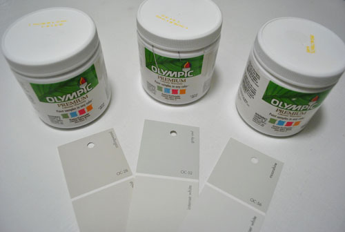
They are, from left to right: Collingwood, Grey Owl, and Moonshine (all Benjamin Moore colors mixed in Olympic Premium No-VOC samplers from Lowe’s – which are about $2.50 a pop). Of course, in an effort to prove her paint-psychic abilities, Sherry called her favorite before even breaking out the paintbrush. Can you guess which one it is? Hint: it rhymes with “spoon mine.”
Here they are in the future dining room, painted in that same order (with Collingwood on top and Moonshine on the bottom):
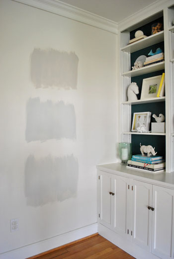
We just did one coat with a paintbrush (it had great coverage) doing our best to keep the edges feathered so when we eventually paint over everything we aren’t left with slightly raised squares where we tested (which is why we didn’t use painters tape to make perfect squares that also might be visible after we paint over them).
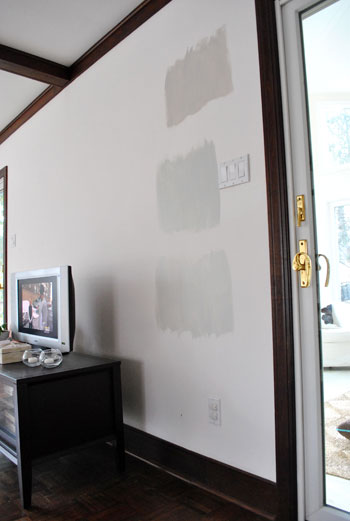
And ever the overachiever (or just someone who loves to paint), Sherry finally embraced the test square method and went ahead and painted big swatches in the family room too. One set near the TV…
…and another set next to the big window (since it gets a different amount of daylight).
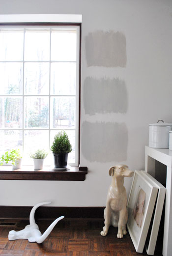
After all, one of the great things about these testers is that you get to see what certain colors look like throughout the day and in varying amounts of daylight and artificial light. We do this with the small paint swatches too, but it certainly was nice to judge a color from across the room for once.
Speaking of different lights, here are all of the colors again at night when things are much yellower from the artificial light (they’re all painted in the same order as listed above, by the way):
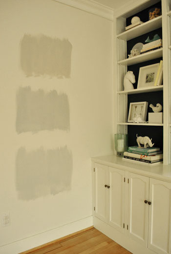
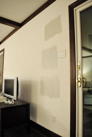
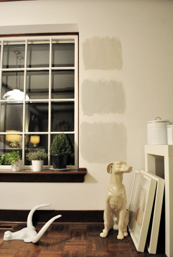
So after a couple of days I finally admitted that (say it with me) Sherry was right all along. Moonshine, the one on the bottom, is by far our favorite of the bunch. Collingwood (the top one) almost won us over, but it’s so warm/tan that it reminded us a lot of Glidden’s Sand White, which was in our first house’s living room and office. We love that color, but it’s not gray enough for what we want this time, so in the spirit of doing something fresh and new we crossed it off the list. And Grey Owl (the middle one) read as too green/blue in our house’s light, so we worried it too might not immediately read “gray” and instead might be “muddy blue-gray” which is what we had in our last house’s bedroom and kitchen.
Moonshine is probably the “purist” of the grays we tested, and it almost has a soft shimmery quality to it – like there’s some silver mixed in. We’re excited about it because it’s definitely dark enough to make the moldings pop (especially once we paint the ones in the living room white) but it’s not too bright or saturated to compete with bolder curtains, art, and accessories that we plan to introduce. Now we just have to cross our fingers that we can find the energy to paint the two largest rooms in our house… and the hallway that connects them. We actually started the job today- but with baby & blog duty going on at the same time, it might take us a few days to get ‘er done. We’ll share pics as soon as we’ve got ’em though!
Have any of you used the paint tester method to choose a color? Did it confirm your feelings or send you in a totally new direction? And dare we ask how long the test squares stayed up before the room finally got painted completely? Ours were up nearly a week, but we could totally see how that could turn into a month (or a year) if you still weren’t 100% sure which way to go…

Jess says
Love those grays! I’m hunting for 2 shades of gray that will match with bright pink accents. It’s tough finding a gray that doesn’t read too lavendar or too grean. I’ll have to check out these shades!
Jen @ The Decor Scene says
Hey Jen,
Maybe you can rent scaffolding or a ladder or two to get up there? And use an extender rod for your roller? Not sure how you’d cut in with a steady hand using an extender rod though. Have you considered painting the ceiling the same color as the walls? We often love that look in rooms with high pitched ceilings since it unifies things instead of chopping things up for a nice seamless lofty look. Good luck!
xo,
s
I hadn’t thought about painting the ceiling the same color, but that would be the easy way out for sure. ;)
sarah (sarah learns) says
i’ve never tried painting on the wall. i’m pretty gutsy when it comes to stuff like that. i just pick out my favorite sample and go for it! (not that i’ve ever really painted much except my bedroom at my mom’s house – i had one purple wall, one aqua wall, one lime green, and one bright orange, lol.) yay for deciding on a color, though! that one was my fave from your pictures, too. :)
Amy E. says
glad you went with Sherry’s initial feeling! can’t wait to see the results!
we used the swatch method for our master bedroom walls, or at least all of them except the accent wall behind the headboard. and of course that’s the one that we dislike the most. we were going for a light blue/green (like the caribbean) with the accent wall as a bolder sandy tone. but the sand turned into pumpkin… WAY orange, and now it looks like we’re Miami Hurricanes fans in every light except dusk or after dark!
oh well, if at first you don’t succeed… buy another sampler!
Heidi S says
I also have a habit of mixing the tester sample together if I am not happy with any of them, and then having the paint store do a custom mix for me. I also have often taken the samples and added some black pigment (also available at most paint stores) to tone it down slightly. I find that I tend to pick brighter color in the swatches but it will be too bright for a whole wall.
Jacee says
Awww, I love moonshine! I actually painted a few rooms in my house that color, and I love it…how it changes with the light, and that it’s a gray that still manages to feel warm. It’s in my dining room, front room, and a bedroom, and it’s adapted to every space. I also did a lot of sampling before we settled on that one. I figured that was better than painting and then hating it…I’m glad I did, because initially I picked another color! I also repeated the process when selecting a ceiling color…unfortunately I must have gone through about ten samples before I found the right one (colors look totally different when you put them on the ceiling, haha). Good luck to you, it’s going to be beautiful.
Blanca says
Absolutely agree. It’s the only color that doesn’t compete with the bold color on the bookshelves but complements it. You just want some warmth on the walls but not enough that make them a feature.
Kymberli says
Coincidentally, today my husband went to pick up the three paint colors that we narrowed down last night. Furthermore, two were a similar shades of grey. The other two were our accent colors, which are two similar shades of aqua.
Elizabeth says
Grey is the HARDEST color to pick out. I took me 3 weeks and 6 paint testers and over 20 swatches to find one that didn’t have too much of a blue undertone or too much of a brown undertone.
Best of luck – I was finally able to find the perfect grey with plenty of white in it. I wish I remembered the color to share.
Erin @ WriteTasty says
Kudos on having the patience to paint tester squares before going for it! We gave little to no thought before purchasing and painting our kitchen a deep brick red without thought to how that might work with the rest of our house. It took so much effort to get it the right color that we now feel bad re-painting it! So, again, congrats on your forethought! The gray is beautiful!
Claudie says
I hate to say it, but we did test swatches in the bathroom right after we bought the house and a year and a half later, we still haven’t painted. Really, we’re waiting because eventually we’re going to give that bathroom a complete overhaul and I just really don’t want to paint it and then have to paint it again. Until then we get to live with the dark blue with some kind of sponge faux treatment (the people who owned this house before did “interesting” things with paint) and a few swatches of different colors. It’s definitely a conversation starter.
orangesugar says
I wish that paint samples were cheaper. I would gladly take less paint for say $1 considering I never use the whole sample. And I’m sure that would increase the amount of samples purchased so it’s a win win for everyone. I have bought them a few times and really dodged a bullet for what would have been a flourescent yellow kitchen but try to avoid it as much as possible. It just adds to the paint expense which as far as I’m concerned isn’t all that cheap either.
Jessica says
I am feeling a Benjamin Moore trend going on… ;) I know you guys have tons and tons of paint decks, but how do you decide what line to go with usually? There is SO MUCH to choose from I usually leave Lowes or Home Depot with my head spinning!
YoungHouseLove says
Hey Jessica,
We look at all of our swatches and just pick the colors we love the best and have them color matched to Olympic No-VOC paint. It’s funny that Ben Moore seems to win out a lot lately!
xo,
s
Kate Ediger says
Well, let’s see mine have been up for a few months now (I think going on 4). The color has been deciced, but probably won’t pait until November. We have decided to wait to paint until we can do afford to finish the kitchen remodel which will require some new drywall/texturing and I don’t want to have to paint twice. I think they are driving my hubby nuts, though! :)
Andrea of Care to Eat says
Bought our house in Nov, 2009 – last month, we finally painted over paint swatches in our downstairs hallway and master bedroom.
One thing that became apparent to us when we painted other areas of our house was how different paint color on a wall can change if you repaint the trim. Luckily, the paint we chose turned out even better after we spruced up the old yellowy trim to a nice soft white.
AJ says
Oooh yeah, gray is hard. We just bought a house and I ended up doing a lot of different grays in it and the only one that will have to be redone is the kitchen. So I feel pretty lucky! (The tile we chose ended up having way more of a warm creamy base to it, and it clashes with the cooler gray I had already used for the walls. Bummer!) Anyhoo – I painted large squares of color on huge white poster board paper using painter’s tape to get nice neat lines and then I hung them everywhere – even the ceiling! My husband thought I was nuts.
I had one comment – take it or leave it. We have a lot of original mahogany wood trim in our house and I had to make some very hard decisions whether to paint it out or not. People go crazy over this one with different opinions, my husband included. :) I ended up just painting the top crown molding and leaving the rest, and while I *think* I made the right decision there’s a part of me that wishes I hadn’t even painted out the top, especially in the dining room. My advice is to do the walls, live with it for awhile, and then make a decision on the molding.
I’d be happy to send you before/after pics of our house so you can see what I mean. You have a lot more different types of wood going on in your house, so I can see where unifying the molding might be nice, but I also think your living room looks really lovely as-is.
carolinaheartstrings says
Never used that method, but will in the future. So cheap. I love the choice. Moonshine is what I would have picked too. The perfect gray.
Kate Ediger says
Ugh…typos above. Sorry!!!
sonya says
I have used that method several times and it really helps for me to see the colors on more of a large scale. Sometimes it confirms what I already think, but the last time I did it, I ended up deciding against the color I thought I wanted and went in a whole other direction, so in that case, it really provided some clarity.
I’d also suggest “Edgecomb Grey” by Benjamin Moore… it does have a touch of tan so it’s possible that it’s not “grey” enough for you, but I love it because it’s not a cold grey and I have been able to put virtually any pop of color in the room and it looks awesome. Grey is hard because sometimes it can look too blue or too cold.
Julie says
I really like the one you decided on. I LOVE testers! We did it for two of our rooms (including our two-toned grey dining room). As of this weekend, we have SIX samples on two different walls of our soon to be nursery. I’m even doing a poll on my blog to try to sway my husband towards my choice (it isn’t working – I’m LOSING!) I had no idea turquoise would be so difficult!
Michelle says
I don’t know if anyone else has mentioned this, but I’ve been doing a lot of thinking and looking at different colors in the attempt to pick the perfect gray for my bedroom, and I’ve learned that when choosing a gray it’s almost imperative to paint a test swatch. Most grays have some sort of undertone, and the swatch doesn’t give a good enough idea of how strong the undertone will be. My sister-in-law just painted her dining room a color that appeared straight-up gray on the card and appears blue 90% of the time on the room. The same thing happened to us with one of the early test swatches we painted…I’m so glad we didn’t just go for it, as it was much bluer than we were hoping. So I can totally identify with John’s paralysis.
On a different not, I appreciate your perspective on those BM shades because I’m considering a couple of those myself…
emily @ the happy home says
we’re taking the plunge and painting our bedroom grey… glad to see this post!
we’re going for behr’s billowy down, though. it’s the purest grey we could find!
Joanna says
Are you going to paint the built-ins in the dining room gray too?
YoungHouseLove says
Hey Joanna,
Nope, those will stay white like the trim. Hope it helps!
xo,
s
Stacey says
Okay, so I was geekily (is that a word?!?) hoping that you had chosen Collingwood since it’s name is so close to the name of the town I live in, CollingSwood, but then I saw Moonshine in the first pic of the paint on the walls and i knew that Sherry was right and that you guys were going to decide upon that color!
That being said, I, too, am currently searching for the perfect gray for our living room (possibly the dining room too since they open into one another through french doors) and I’m definitely going to check out Collingwood and Moonshine. We have white trim and a dark brown leather sofa, so I think a gray will be the perfect not-boring neutral.
I’m a HUGE fan of the sample paint pots! I just went through SIX different ones for our bathroom only to then consider a complete change of direction. Thank goodness they’re only $2.50 a pop, right?!?
Can’t wait to see the finished rooms!
Amy says
OMG, I feel you guys! The hubs and I just had about 15 different paint “squares” on our walls for about 2 weeks! I was so indecisive because ours too was going to be in 3 major parts of the house (the family room, kitchen, & breakfast nook). I finally decided on a color called “Ghost Gray” and it’s very similar to the one you guys chose. But, it was a mission to paint. We spent our 3 day weekend this past weekend painting. But I’m so glad it’s done! Good luck!
Noel says
The critical comments bug me and I’ve read a few on your last few posts…don’t listen to them! It’s YOUR house and YOUR blog! I love your blog philosophy and how you don’t try to please anyone. I love how “down to earth” you guys are and think it’s awesome that you take the time to respond to so many questions and comments.
I love everything you’ve done to your new house and enjoy watching you make it your own. You’re doing an awesome job on both the house AND the blog, so keep on doing what you’re doing! You guys have been such an inspiration to me to work on my own house, especially since you do everything on a budget. I’m so thankful to know that you don’t need to have or spend a lot of money to have a beautiful house!
YoungHouseLove says
Hey Noel,
Aw, thanks so much! We definitely do our best to let things roll off our backs and try to remember that it’s our house and our blog after all. Haha. Just gotta do what we love and share it and remember that we can’t please 100% of the people 100% of the time. Thanks again for the kind words!
xo,
s
J&JHome says
I had never done tested paint before. I did back when I redid my family room and it was the best decision I could have made. The lighting and angles of the room totally affected the colors. I love your choice by the way.
Jennifer says
This past summer we moved into our first home and I failed to do the “test squares” method. The livng room, which I wanted to be that trendy blusih/greenish/grayish color did not come out to what I wanted and here I sit with a colonial/sky blue room. Same thing for the buttery/creamy soft yellow I wanted in my kithcen. I really should have gotten samples, but I thought I could tell from the paint chips at the store. And now, when I tell my husabdn that I want to repaint both the living room and kitchen, he barks about “wasting money” to which I reply “It’s not the right shade.” BTW, I am thinking of losing the yellow in the kitchen anyway and going with sage green.
Meanwhile, a few months later, when it came time to paint our office, which is a bedroom sized sitting room off of our master bedroom, I went to Lowe’s and HD and bought sample after sample. I have 10 sample cans in our garage of different shades of green. I finally found the shade I wanted “Gloaming Green”/Valspar, others were too dark, too yellow, too olive……I will never go without using testers again.
BTW. Since out office is visable from the bed. I have to admit that every morning when I wake up, I smile whenever I see the green walls. Months later it still makes me happy. Now, if only I oculd decide what color to paint the Master Bedroom. The previous owners painted it a baby blue. With our added spackle over the nailholes, it’s really not a good look.
Casey says
Ooo! Good to see ya’ll are painting today. I’m spending my day off painting as well (finally, after having blue/gray/green paint squares on our master bedroom wall for months). I may or may not (more like may) be using Carolina Inn Club Aqua (groupie/stalker alert). Love gray and love your gray choice. Can’t wait to see the finished rooms!
Gina says
For future testing: paint a piece of white poster board with two coats of paint to create a generous ‘swatch’ that can be moved from wall-to-wall/room-to-room in a snap, saved for later and even passed along to friends to try in their own spaces.
Benefits include, one-time painting, no edges to try to paint over, and if you have company before you get your decision made, you can tuck them away and avoid explaining the big color blocks on the wall.
jenn says
I currently have 8 paint colors on my dining room wall, but I’m looking for a slate gray, not a light one. It is so frustrating. I was trying to match something, and Lowe’s and Home Depot won’t scan an image anymore.
I finally found it on Pottery Barn’s website (I have a tearout from their holidy catalog). I cannot wait to get off work and go get (hopefully) my last sample.
chelsey says
I swear by the “tag board” method. When we bought our house I had hesitations of painting samples on the walls for fear of seeing them through the final paint job. I typically narrow down my colors to the top 3-4 and then paint samples on pieces of tag board. Once they are dry I hang them up around the room, moving to different spots during the day to make the best decision. To this day I do not regret any of the colors I have chosen!
Stephanie says
I’m also in the process of choosing a gray for our master bathroom. We have about 50 paint chips hanging around the sink. I have no doubt these three are among the contenders. Everytime I think I’ve chosen a favorite, the light changes and I like a different one better! I’ve never been a test pot kinda girl, but I think I will for this color choice. One question, though. Our walls are currently tan. Is testing out a color hard to do when you’re painting over another color? I imagine the adjacent tan will effect the way the grays look.
YoungHouseLove says
Hey Stephanie,
We would paint a test swatch right next to your white (or wood) trim and evaluate it against that instead of the tan. It might not be foolproof but it should hopefully help!
xo,
s
Amy says
This is probably a silly question, but can Benjamin Moore colors be mixed into any different base paint?
YoungHouseLove says
Hey Amy,
Any paint brand base (Behr, Valspar, etc) can be color matched to Ben Moore colors (since they have most of the formulas in the computer and can recreate them with other bases). Hope it helps!
xo,
s
Haley says
I was obsessed with the idea of repainting my dining room. So, I picked up what I thought were two great samples and went to town with huge squares in the middle of the wall. The next day, I decided they both looked horrible and the original color was far better. It made me really glad I considered the samples before getting so excited with the swatch and diving in completely.
Carrie says
I tend to be too indecisive to pick a paint color without doing test swatches, and literally 100% of the time I end up picking the color that was my favorite to begin with! I guess I should go with my gut!
kellie says
love your choice! I’m in love with the color gray and can’t wait to see how it turns out!
Jessica says
Have you given any thought to using Benjamin Moore’s Natura line? It’s Zero VOC and totally odorless. We used it to paint recently, and had guests over that night and they were none the wiser. The coverage is amazing.
Anyway, just a thought, since you seem to really like the Benjamin Moore color decks.
YoungHouseLove says
Hey Jessica,
We’ve heard nothing but great things about it! We’re just closer to Home Depot and the Olympic No-VOC stuff is super cheap (around 20 bucks)!
xo,
s
Hanna says
I am totally in the misdt of grey paralysis myself. Grey is so hard because you can get a really beautiful/airy/peaceful effect… or you can get the color of depressing February skies — cold and bleak.
I was actually too paralyzed to even paint patches on my wall. I went to AC Moore and picked up some cheap 8.5×11 canvas boards and painted those.I think I have 8 of them painted, 5 of which are still in the running. I’ve been moving them around from room to room and making a matrix of our likes and dislikes. >.<
We went with Valspar colors: Bonsai, Tranquil, Notre Dame, Comet Dust, and Weathered Fossil are the ones that made it.
I think you chose a beautiful color by the way! I am resisting the urge to run out and paint another canvas. :)
L says
Why such a light shade of grey? Seems like you have great light in your house and you said you were going with more bold choices in this house. A darker/bolder shade of grey would not compete with color pops in a room or bold patterned curtains… it would be a nice change from what you have always done! I also think it would balance the bookshelves a bit more so that color is not so stark compared to the pastel grey.
YoungHouseLove says
Hey L,
As we mentioned in the post we wanted a nice backdrop to bring in bold curtains, art, accessories, etc. Bright wall colors aren’t the only way to be bold! In fact we want to take chances with bright art and even some boldly painted furniture and textiles- so we don’t want the walls to compete! And we have big plans for bright bold blue walls in the hall bath and a rich deep color in the guest room. Stay tuned for that. And remember when we painted the backs of our future dining room built-ins dark greeny blue? That was just a few weeks ago! And we plan to bring that color in a few other ways (like adding it to an island in the kitchen, etc). Hope it helps!
xo,
s
annie says
It took us 2 months to pick a shade of grey for our walls! There are SO many! We painted the big test swatches, but behind artwork we had up so we could stare and debate, but when people came over we could hide our test spots. We ended up nixing all the colors we tried out on the walls and just picked one at while at Lowe’s one day. During the day I wish it was a shade darker since our very sunny living room makes it almost look white, but in the evening it is perfect.
Michelle says
You guys are too funny! Sometimes you just start demolishing things at 9:00pm and other times you leave paint samples up for a week! I love it haha. And I LOVE the color–it was what I wanted you to pick, too! You know, now that I’m thinking about it, I really like the gray color of your blog body! On my monitor it reads sort of like Collingwood. Is there any way to color-match paint to hex codes?
YoungHouseLove says
Hey Michelle,
Haha, someone needs to invent that!
xo,
s
Malissa says
I’m with you, I usually pick a paint off the swatches, however, when we decided to paint the trim and doors on our house I decided we needed to use the samples. Outdoor paint colors are always difficult if you’re doing anything other than white. I found that to get the dark navy color I wanted I had to go at least one shade darker than I thought. It was a life lesson, haha.
Jessica O says
Unfortunately I do not have the patience to go the testing method – when I’m ready to change a room I’m ready RIGHT then. Luckily, this worked out OK 2 weekends ago. I decided to paint our living/dining room combo gray, and went with Martha Stewart “chinchilla”. It looks GREAT with the white trim, we love it!!
But now the dilemma – I’m making 2 upholstered valances in a pretty bold yellow & white pattern, & hanging white curtains underneath. I already recovered a lampshade in a different yellow & white pattern, & it looks great. We need 2 chairs for the room, but WHAT COLOR?? White would obviously look great, but with our 3 four-legged babies that’s not an option. I’m planning on bringing a few turqouise and lime accents in on the bookshelves in there…
YoungHouseLove says
Hey Jessica,
We’d just go to the fabric store and see what grabs us. You can bring home fabric samples (just like painting test swatches on the wall) and compare them to see what you like. Plus they’re free! Something soft lime or even bold and turquoise sounds fun. Good luck!
xo,
s
Melody says
I love the lighter grays! They are beautiful! I love Collingwood because it’s so warm, but Moonshine looks a bit airier. I love it!
Maryanne says
saw these today and thought of u guys instantly! love ur blog!!!!!
http://www.hautelook.com/event/goldcoastfurniture5417hf
Pamela says
You think gray is difficult, try red or yellow. I had red swatches all over my walls and couldn’t find the right color for two years! For the yellow, I bought a big piece of foam core and painted three yellows on each side. Then I just had to carry the foam core around from wall to wall. Only took me two weeks to decide.
Missy says
I had a patchwork quilt of shades of BEIGE on the outside of my house a couple summers ago. You wouldn’t think beige would be a difficult color to choose, but turns out it is!
sarah b says
we did that with a dark chocolate brown for an accent wall. it looked so much like we smeared poo on the walls, we scratched the accent wall idea entirely and just went with Valspars Sautéed Mushroom for the whole living room, dining and kitchen area…much better!
Kate S. says
My husband and I test painted 17 different squares in our dinning room and had them up for several weeks so that different people could weigh an opinion. In the end I ended up hating all of them and bought a whole gallon of a completely different color off a paint swatch at Sherwin Williams. It turned out to be the perfect fit, but the crazy person that I turned into during the decision making process was nuts!