We usually feel pretty confident in our ability to pick a paint color. But something about choosing the perfect gray color for two major living areas in our house made me extra nervous (we’re going to use the same color in the future dining room, main hallway, and living room for some nice continuity). Sherry had a field day ribbing me about my paint paralysis. I was literally second-guessing every swatch we looked at. “Sure, I like it… no I don’t, I hate it.” Yeah, that was me.
I blame my neurosis on having selected a hideous gray tone to paint my middle school bedroom (I picked it because I liked the name – Cannonball or Cannon Smoke or something else that sounded like blowing stuff up). In retrospect it was too dark, cold, and prison-like. Fortunately I warmed it up with a bright red Looney Tunes rug and Tasmanian Devil throw pillows (don’t be jealous). But somehow I don’t think that’s an acceptable solution this time around.
So I convinced Sherry (who was a lot less gun-shy than I was, she kept saying “let’s just pick one and DO IT!”) that we should buy paint testers and try out a few colors before committing. She recommends this option all the time to nervous-about-painting readers, so it wasn’t too hard to convince her that we should give it a whirl at least once. So we narrowed it down to our top three similar-but-different-enough-to-help-us-make-a-decision contenders:
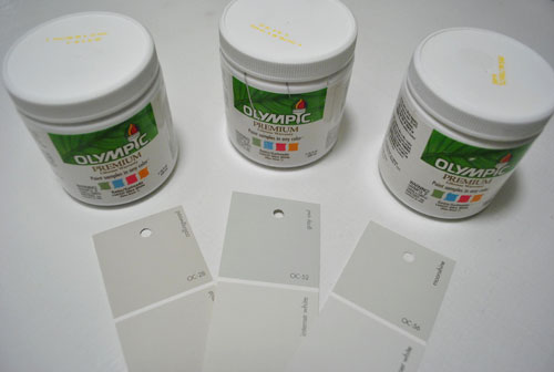
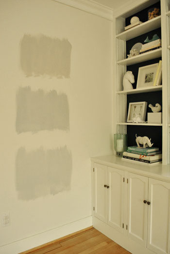
They are, from left to right: Collingwood, Grey Owl, and Moonshine (all Benjamin Moore colors mixed in Olympic Premium No-VOC samplers from Lowe’s – which are about $2.50 a pop). Of course, in an effort to prove her paint-psychic abilities, Sherry called her favorite before even breaking out the paintbrush. Can you guess which one it is? Hint: it rhymes with “spoon mine.”
Here they are in the future dining room, painted in that same order (with Collingwood on top and Moonshine on the bottom):
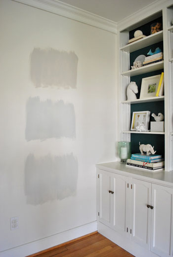
We just did one coat with a paintbrush (it had great coverage) doing our best to keep the edges feathered so when we eventually paint over everything we aren’t left with slightly raised squares where we tested (which is why we didn’t use painters tape to make perfect squares that also might be visible after we paint over them).
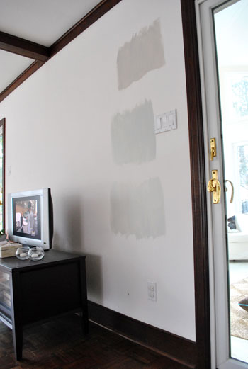
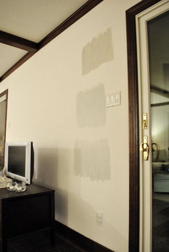
And ever the overachiever (or just someone who loves to paint), Sherry finally embraced the test square method and went ahead and painted big swatches in the family room too. One set near the TV…
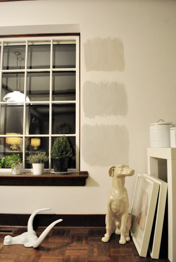
…and another set next to the big window (since it gets a different amount of daylight).
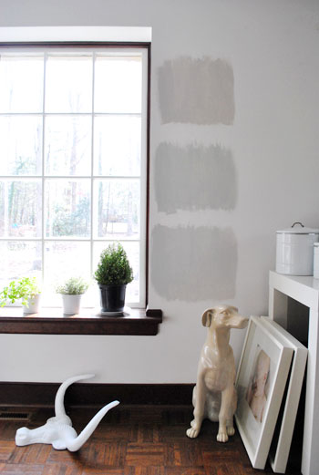
After all, one of the great things about these testers is that you get to see what certain colors look like throughout the day and in varying amounts of daylight and artificial light. We do this with the small paint swatches too, but it certainly was nice to judge a color from across the room for once.
Speaking of different lights, here are all of the colors again at night when things are much yellower from the artificial light (they’re all painted in the same order as listed above, by the way):
So after a couple of days I finally admitted that (say it with me) Sherry was right all along. Moonshine, the one on the bottom, is by far our favorite of the bunch. Collingwood (the top one) almost won us over, but it’s so warm/tan that it reminded us a lot of Glidden’s Sand White, which was in our first house’s living room and office. We love that color, but it’s not gray enough for what we want this time, so in the spirit of doing something fresh and new we crossed it off the list. And Grey Owl (the middle one) read as too green/blue in our house’s light, so we worried it too might not immediately read “gray” and instead might be “muddy blue-gray” which is what we had in our last house’s bedroom and kitchen.
Moonshine is probably the “purist” of the grays we tested, and it almost has a soft shimmery quality to it – like there’s some silver mixed in. We’re excited about it because it’s definitely dark enough to make the moldings pop (especially once we paint the ones in the living room white) but it’s not too bright or saturated to compete with bolder curtains, art, and accessories that we plan to introduce. Now we just have to cross our fingers that we can find the energy to paint the two largest rooms in our house… and the hallway that connects them. We actually started the job today- but with baby & blog duty going on at the same time, it might take us a few days to get ‘er done. We’ll share pics as soon as we’ve got ’em though!
Have any of you used the paint tester method to choose a color? Did it confirm your feelings or send you in a totally new direction? And dare we ask how long the test squares stayed up before the room finally got painted completely? Ours were up nearly a week, but we could totally see how that could turn into a month (or a year) if you still weren’t 100% sure which way to go…

Amanda says
I am 100% for the tester method! I’ve used it in our living room, dining room, and kitchen and I swear by it! I LOVE being able to pick up several colors and test them out to see how they work with the light throughout the day.
I know you didn’t ask, but if you’re looking for a medium gray, I highly recommend Glidden’s Wood Smoke. That’s the color in our dining room and it looks fantastic! The room has white trim and lighter, oak-ish floors and the color just pops against them. During the day, there’s lots of light, so it looks mellow, but it also looks lovely at night (casual, but kind of dramatic?).
I’m the worst flip-flopper when it comes to paint colors, so we generally leave samples up for months. Partly because I am never quite sure, but partly because I start to paint and end up getting busy with other things (I’m in school and things can get hectic).
Amusingly, we did samples of paint for the living room, dining room, and kitchen around the same time (around last Feb). The living and dining rooms got painted by October, but I literally just painted the kitchen last week. And after having that wall color up for almost a year, I absolutely FREAKED when I finished the first coat. I was going bold in the kitchen, after living with the blandest kitchen ever (a sea of off white and the lightest tan) and was taking the chance on a weird color scheme, so I had several days of panic. But I love it now and can tell it’s going to look fantastic!
Hee, I so want to send you pics of our makeovers, but I don’t want to be lame!
YoungHouseLove says
Hey Amanda,
Post them on our Facebook page… so we can all check them out!
xo,
s
Rosalyn says
I love this post – and yes, I totally do the paint test method first! Especially with grays it always seems tricky to find a ‘pure’ gray and not one that looks kinda brown in some lights or blue in others. I went to IKEA armed with a handful of paint swatches once to match them to the gray I loved on their walls so I could paint my own living room that colour! worked like a dream!
Gina says
Oh, and according to the sherwin williams guy who told me about this method, as long as you are using white poster board, and get two good coats on (maybe three for dark colors to be safe?), you’ll get a true- representation of the color. Just don’t forget to label your swatches :) Sorry, I’ll be quiet now!
Abby N says
Thank you for this! We are currently searching for a grey for our bedroom!
Julia M says
In your best Chandler voice, say it with me “Could I BE any more right with this gray?” Love it!
http://chrislovesjulia.blogspot.com/
jen says
We did 3 in our kitchen. But in our case we had 2 darks and one light. In the end we painted them elsewhere to see which of the darks went best with the light, and we did our entire downstairs in a coffee (with creamer ;) )/khaki combo and I love it!
I am looking for a nice gray/blue for my bath and laundry rooms but fear it might be too much with the warm browns. Thoughts?
YoungHouseLove says
Hey Jen,
We love Benjamin Moore’s Quiet Moments.
xo,
s
Melissa says
I love using the paint testers…added bonus with them is that when you need to touchup anything down the road its nice to have a small container of your paint.
One tip though that a painter friend told me: Once you have the sample mixed into the gallon size..take the top of the gallon with you to get another can if you need it. Apparently there can be slight differences in the colors (if not a standard color for that brand) when they make the sample size and the full gallon.
Mike @HA says
We’ve been doing the exact same thing! Multiple shades of gray on our dining room wall. We’re glad we bought the $4.99 sample color this time because we totally didn’t like the first color we chose and we’d be bummed to have a gallon of it sitting around!
Tracey says
This post is really helpful because I want to use a light warm grey throughout the first floor of our possible home to be. My favorite was moonshine as well. I’ve used tester pots in every room i’ve painted and it’s definitely helped make a final decision. Without them I could have been painting the same wall over and over and over again.
Sarah Strom says
Looks good to me! Can’t wait to see the result.
Nicole says
I’m sure you hear this every now and then from readers, but I love reading your blog and yet have never felt the urge to comment. Until this post! The photos you posted of the living room showing the chunky window sill really spoke to me! I know you plan to paint the trim white (I’m totally with you on that!) but have you considered leaving the sills as is? They look so beautiful against the light grey. It reminds me of houses in Tuscany…rustic and organic. I know sometimes things look a little different in person than they do in a photo so they may not be as romantic in person. The pictures took me back to my trip to Italy for a minute and I couldn’t resist saying something about them! If you kept them as is perhaps you could incorporate a similar wood tone in some of the furniture and/ or floors to pull it all together?
YoungHouseLove says
Hey Nicole,
We’re definitely painting the walls first to see how the trim looks au naturale next to them. Our fear is that without white trim the walls with just look white without that color comparison next to them to make them pop, but we’ll definitely give the sill a chance. The more we think about it we might even leave the beams unpainted, at least for a while. And might even paint them a deep color instead of white. Who knows where we’ll end up!
xo,
s
Kristi says
Just wanted to say that the whole time I was reading this post and looking at the painted squares I kept thinking “I hope they choose Moonshine!” It is by far the “grayest” looking of all of them and I think it will be perfect!! Great choice!
Rebecca Foxworth says
Before I read any of the text, I glanced at the first photo of paint swatches on the wall and thought, “Wow. The bottom one is GOOD.” The top one was too beige-y, the middle one too cold.
Yes, I’ve painted large swatches on the wall. The Hubs didn’t want to, but we actually bought three GALLONS of paint (no samplers where we went…7 years ago when we painted) and painted swatches in our direct-sunlight entry, in the dark corner of the great room, near the brick fireplace, and in the sunny kitchen. Wow, were we ever glad we did! The color we were so SURE we wanted read very yellow-ey (like…um…urine?) near the bricks and in the dark corner. We chose an oatmeal color instead. The second-place color (very sand-y) ended up in our garage, where the back side of our brick fireplace was painted an awful, girly pink (can you imagine?). The bricks are now a lovely sand color. And the yellow-ish paint? We painted a sample of the color on the lid, and set it out front with a FREE sign on it. Apparently, it was someone else’s dream color, because it disappeared quite quickly.
With sample sizes available, I would say I HIGHLY RECOMMEND painting swatches in different lighting, and near different materials (brick? wood? stone? trim?). This one step could save you time, money, and arguments later!
Cheri @ I Heart Old Houses says
Paint samples are a must for indecisive people like me! Usually they confirm what I already know, but they give me the confidence to stop second-guessing myself and just move forward.
You definitely picked the best gray for the job, but I’m kind of sad that Gray Owl didn’t work out because it was such a cute name!
Rachel Long says
I love gray too! We went with Behr’s Silver Sateen with Ultra Pure White trim and we love it!
Grays are hard because you don’t want it to look muddy or like auto primer.
We’ve also though about using Antique Tin for an accent wall or the back of built-ins.
Yay for gray! Good luck!
Jenna says
I didn’t use a paint tester, when I should have, for gray. I ended up painting my brand new house a gray, later to find out that it was more blue-ish than anything. My dad came over and said “why’d you paint your walls purple”. I have to admit, I almost cried. I spent the next week painting over my dark blue-ish, purple-ish, gray walls!
Lindsey Rinehart says
Oh my gosh. I just finished putting up my 4th round of paint samples. It took me forever to even figure out what I wanted. Now I have some direction and have it narrowed down to a couple of combos. I am normally not so indecisive, but like you I’m covering a large area and need it to be something I’ll be happy with in a lot of space for a long period of time. Good luck with your grey. I’m going with a hot coca/chocolate bar kind of look. I think I’m either going with some combination of New Chestnut, Sweet Georgia Brown, and Breakfast Blend. Or Cliff Rock with Warm Earth. All colors by Behr.
Amy Jo says
Can’t believe how different those shades look on the wall! I love the one you chose. I just painted my bathroom gray without testing it first. It turned out a lot more blue than I expected it to, but I like it, so it turned out OK!
Aimee@ the Functional Space says
We painted the dining room gray in the townhouse before it sold last year. Just walked into Lowes, picked out a swatch and painted it (I NEVER do that!) It looked great. We decided to paint our living room at the new house the same color since we liked it so much so I painted a test swatch. It looked HORRIBLE! Lighting makes a world of difference. I liked swatching before, now I won’t paint without it. Sometimes when I swatch I paint them on foam core so that it can be moved around the room to see how light effects it and I don’t have to worry about painting over it.
Beth says
I’m a sampler. The chips are too small, and often just a little bit off. I have a box of samples in the basement (often several in similar shades, as I try to find just the right yellow, or gray, or whatever). The investment in samples adds up, but it pays off every time I realize that my front-runner color is the wrong one!
They don’t go to waste: I have fun mixing them to get JUST the right shade for smaller projects that I don’t want to buy a whole quart for. (Like the inside of my kitchen hutch.)
karen @ our slo house says
I definitely do the color swatch method, because I’m such a visual person. Like you, I paint the swatches in different parts of the room because of the varying sunlight.
I just did a different kind of “swatch” method in my son’s room. We’re going to paint a couple (several?) horizontal stripes around the middle of his room, but I wanted to play with placement and such (without painting and repainting, etc.) so I taped paper to the wall. The paper method worked out really well.
To see what I mean, here’s the link: http://ourslohouse.blogspot.com/2011/01/boys-room-painted-walls.html
p.s. I love-love-love your dark wood window sill in the living room. The contrast of the dark with the grey paint is going to be gorgeous!
kimberly says
so interesting that you are afraid of grey and don’t (seem to) bat an eye at other color choices…i have three shades of grey in my house (two medium tones & one dark ‘accent wall’) and LOVE each one of them…i have color in my bedroom and kitchen and every time i look at the walls, i sigh with disappointment…not hate, just disappointment ;) can’t wait to see the color up in real-life!
Nitza says
A cool little tip we learned while painting our house…paint any room that doesn’t get as much light (i.e. a hallway) 1-2 shades lighter than the main room. This will give the appearance of a uniform color. Using one color throughout will make the shaded rooms appear darker.
aaroohii says
noooooooo don’t paint ur walls gray.. it is the most boring color in this world (or space)!! u guys were about ‘bright’ and ‘airy’ feel… gray will make ur place dull believe me.. one should choose a color that makes them happy… pleaseeeeee do anything else but gray and beige
Colleen says
Looks good! I don’t usually comment but I had to on this one! I currently have eight different varieties of blue/gray testers on my bedroom wall spread around in different areas. Eight!!! I started out with only 3 but they just weren’t quite right! So I tried 1 more, and then… well, you know. They’ve only been up there for a few days though! Blues are tricky! Thanks for sharing all of your adventures!
ellice says
love YHL, and i also love gray…i just painted the majority of our house gray. i agonized for weeks and then decided the gray in my head didn’t exist! then i found it…cape hatteras sand by ben moore. it’s in a totally obscure location in the fan deck in my opinion, and not easily included when comparing grays…check it out! every sinlge person who comes over gushes over the beauty of it ; )
Liz says
Choosing a paint color always gives me major anxiety. In our last house we painted the great room only to discover after completion that it was “too green” so we repainted. Now we NEVER choose a paint color until we’ve painted a test on our walls. Not after the “repainting the great-room debacle.”
In our current great room we have BM Light Pewter (lightened a little with white) and it’s gorgeous. The undertones change a lot depending on the lighting/time of day, though. I can see how someone might think it’s too warm, though sometimes it has a blue cast. Go figure! But it kinda goes with everything!
candace @ thecandace.com says
Love the gray you chose! Can’t wait to see it on the walls and I hope you don’t mind but I’m totally going gray (in more ways than one?) in my next house!!
Jessica says
Love the grey. I think it’s underrated. Although, I’ve read that grey is the new beige. Whatever that means.
Talk about painter’s paralysis. I had 13 (yes you read that right) swatches on my bedroom wall before finally deciding on SW Rainwashed. It’s gorgeous and everything I was looking for in a bedroom paint color (cheery, yet serene). It took me 2 months to choose a color and 2 days to paint the whole room.
Bekah says
Shout out for Martha Stewart’s Sharkey Gray (from her Home Depot line). I used it in my family room, and I would love to use it to re-paint my hall, foyer, and living room, which are Water Chestnut (Glidden), which reads very green on my walls. (I love the modern yet soft gray in my 1960s California ranch house.) Imagine my joy when I checked out Martha’s new cabinetry line at HD and saw that she used Sharkey Gray as the gray in that line. I feel like I picked a winner!
Alyson says
Are you guys painting all the trim which is dark brownish now, white? On the ceiling too? Are you painting the ceilings of the two rooms gray as well?
YoungHouseLove says
Hey Alyson,
For now we’re painting the trim but leaving the beams (with the intention of probably going back and painting them too- maybe white, maybe something else…). Ceiling will stay white for now.
xo,
s
lainey says
There are 11 little containers of paint sitting on the table behind me as I type. Every one is a shade of gray! I usually slap the paint on separate pieces of fiber-core and stick them to the wall. Cheap, removable, and reusable!
Taylor says
I love the color grey on walls, but unfortunately I am a renter so no painting for me. Hopefully I will have a place of my own in a year or two… and the first color up will most certainly be grey.
lisa says
Too late since you’ve started painting, but I found, after covering an inordinate amount of oddly colored woodwork, that painting the trim first, happily slopping paint onto the wall, and then painting the walls, was the best and fastest way to get a good finish…..that woodwork is going to take 2 if not 3 coats!
Terri T says
My entire great room and kitchen are painted in moonshine! Love it in all the spaces!
Jen says
Will you snap a ‘during’ picture of the walls, before the trim is painted? Pretty please? (I assume you paint the trim after the walls?) From my moniter, I think that the stain on our natural wood trim is similar shade to your trim. As it’s a rental, we cannot paint the trim, so selfishly, I would love to see what it might look like with grey walls (I love grey, but I do not love the antique white which is all over and over and over our apartment :)
YoungHouseLove says
Hey Jen,
Yes, we will, once we get there. Big rooms take a looong time- especially when juggling bambino and blog q’s on the side. Haha.
xo,
s
Stephanie says
I love that you are adding warm grey tones-I’m sure it will look fabulous!
have a question regarding wood trim. My place has dark wood trim (slightly lighter than yours, but not much) all over the entire house and all of the doors are dark wood as well. I can’t paint the trim (since I am ranting) so I need to work with colors that complement the wood-any suggestions on greys? It’s hard to find decorating images with wood trim.
YoungHouseLove says
Hey Stephanie,
Soft celery and sage tones look really good with rich wood trim. And wheaty gold colors. Hope it helps!
xo,
s
Sydney says
Just to throw another gray into the mix, we went with “Essential Gray” by Sherwin Williams in our living/dining/kitchen. Since then, several friends have used the same color.
I love yall’s final choice, though!
Diana says
Mmmm…loving your choices! While reading, I was definitely torn between Collingwood and Moonshine as well. Collingwood likely would have won for me because of the warmer brownish tone to it, but I totally get the direction you guys are headed with the new place. Hubby and I are currently on the search for a new home after 6 years in our starter home that we completely “re-did” as well…these posts are making me even hungrier!! lol
Ashley says
Hi guys! I have a question totally unrelated to your post. I have a cockatiel named Titus who lives in the corner of my living room in a cage that really does not pair well with the rest of the decor in there. I was wondering if you guys had any suggestions for stylish ways to integrate pet habitats (birdcage in my case!) with decor. I have perused many design magazines and blogs and have seen maybe just one example of how this might be accomplished. Curious to hear your thoughts!
YoungHouseLove says
Hey Ashley,
We’ve seen bird cages draped with pretty fabric (with it open on one or two sides of course) so that might be a fun way to tie in some color and make it looks swanky. You also might be able to spray paint the cage with something pet-safe and VOC-free. Hope it helps!
xo,
s
Lori says
We did grey in our living room… and we did it twice. The first lighter grey looked good until it covered the entire room, then it looked more purple than grey. And, since I had a purple bedroom growing up, I developed a nasty hatred for purple…. IDK why. We ended up repainting with a darker grey that had no color hues to it. Looks great now, and I love it. :)
CR says
I look forward to seeing the results of your painting. What paint finish are you going with?
YoungHouseLove says
Hey CR,
Satin everywhere but bathrooms and kitchen (which are getting semi-gloss). We used to do flat but tried satin in Clara’s old bedroom and realized it looked nearly identical to flat but it was much easier to wipe down and a lot more durable in general.
xo,
s
Katie says
I’ve got 3 different colors on my kitchen & dining room walls as I type, in 3 different spots no less! They’ve been up for about a week. I too am trying to find the perfect gray, one with a hint of blue but everything is reading BLUE, BLUE, BLUE on the walls! It’s actually been quite frustrating. I’m afraid that if I can’t get it right, I may find myself reverting back to…beige. :(
Sonia says
Yes! Moonshine was my favorite from the first wall painted swatch picture. It does have a silvery look to it. Can’t wait to see the finished product.
Alotta Lettuce says
I love grey! We used Behr’s ‘Ashes’ in our living room and one guest room, and it is just the perfect neutral light grey. It doesn’t read as warm or cool – just a very pure color.
Our bedroom is currently a deep plum-grey, which I LOVED when I put it on the walls last year, but I’m already jonesing to change it, preferably to something a little lighter.
Leslie C. says
YAY For Gray!
I think Gray is a hard color to pick.
Unfortunately, our first round of gray ended up having this lavender undertone in it. It wasn’t noticeable with the swatch, but once it was ALL OVER the dining room and living room, it became very apparent. We also had used a gray that was color matched to the Olympic No VOC paint. For some reason though, the paint did not hold up well on my walls. With our Great Dane we are constantly cleaning drool off of the walls and every time we would wipe the walls with a damp rag, it would dry with a dark spot on the wall.
We ended up repainting with a different brand (Behr, I think) because of all of the spots from wiping the walls. The gray we have now is lovely and much more what I had envisioned in the first place!
Laura says
We’ve used paint samples a lot. I recently wanted to paint our bedroom a soothing blue so I bought some samples. At the same time I knew my husband wasn’t quite ready to motivate and paint the entire room (neither was I), so I actually painted squares of the colors I liked where picture frames hang. In the event that we couldn’t paint for a while (which happened to be the case), we could just rehang the frames and hide our paint squares so no one had to know our little secret! I’m embarrassed to say we still haven’t painted the room, and until I read your post today I forgot that we’ve got blue squares hiding in our bedroom!
Jessy says
I have had 7 gray swatches on my master bedroom wall for almost a year. I think I have settled on Sherwin Williams Mindful Gray. I know gray is hot right now, but I like it because it is neutral, sophisticated and still bright and airy, and not beige. Question, what other colors would you consider neutral? I want to neutralize my walls and punch up the colors in furniture and accessories (my home is currently opposite, neutral furniture and accessories/ colorful walls), but don’t want all beige and gray.
YoungHouseLove says
Hey Jessy,
We think blue-gray is surprisingly neutral. And of course there’s cream and tan and mocha and beige and sand. We also like a soft celery green. It’s just like the gray-blue… a nice backdrop for almost anything!
xo,
s
Jana says
We live dangerously. We go into the store with a basic idea of what we want (i.e. brown, green, red, etc.) pick a shade then take it home and slap it on the walls. We’ve done four rooms this way in our fixer-upper home. So far the results have been perfect, but it makes me nervous every time.
Our only regret: using flat. It shows every little scratch!
Jaimie@AtHome says
I just used paint samples to test a cream colour in my living room and I’m so glad I did because my original choice would have been too dark! I love the moonshine and I’m so excited to see it all painted! It will look fabulous!