We usually feel pretty confident in our ability to pick a paint color. But something about choosing the perfect gray color for two major living areas in our house made me extra nervous (we’re going to use the same color in the future dining room, main hallway, and living room for some nice continuity). Sherry had a field day ribbing me about my paint paralysis. I was literally second-guessing every swatch we looked at. “Sure, I like it… no I don’t, I hate it.” Yeah, that was me.
I blame my neurosis on having selected a hideous gray tone to paint my middle school bedroom (I picked it because I liked the name – Cannonball or Cannon Smoke or something else that sounded like blowing stuff up). In retrospect it was too dark, cold, and prison-like. Fortunately I warmed it up with a bright red Looney Tunes rug and Tasmanian Devil throw pillows (don’t be jealous). But somehow I don’t think that’s an acceptable solution this time around.
So I convinced Sherry (who was a lot less gun-shy than I was, she kept saying “let’s just pick one and DO IT!”) that we should buy paint testers and try out a few colors before committing. She recommends this option all the time to nervous-about-painting readers, so it wasn’t too hard to convince her that we should give it a whirl at least once. So we narrowed it down to our top three similar-but-different-enough-to-help-us-make-a-decision contenders:
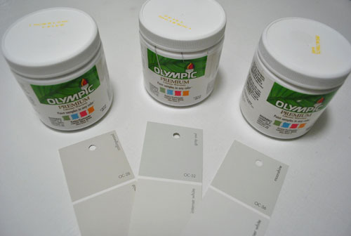
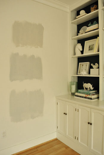
They are, from left to right: Collingwood, Grey Owl, and Moonshine (all Benjamin Moore colors mixed in Olympic Premium No-VOC samplers from Lowe’s – which are about $2.50 a pop). Of course, in an effort to prove her paint-psychic abilities, Sherry called her favorite before even breaking out the paintbrush. Can you guess which one it is? Hint: it rhymes with “spoon mine.”
Here they are in the future dining room, painted in that same order (with Collingwood on top and Moonshine on the bottom):
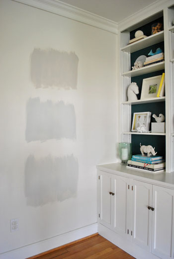
We just did one coat with a paintbrush (it had great coverage) doing our best to keep the edges feathered so when we eventually paint over everything we aren’t left with slightly raised squares where we tested (which is why we didn’t use painters tape to make perfect squares that also might be visible after we paint over them).
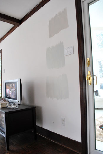
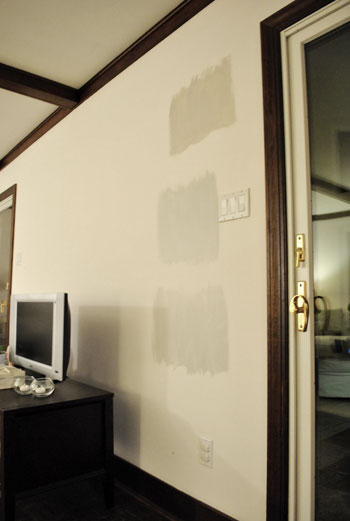
And ever the overachiever (or just someone who loves to paint), Sherry finally embraced the test square method and went ahead and painted big swatches in the family room too. One set near the TV…
…and another set next to the big window (since it gets a different amount of daylight).
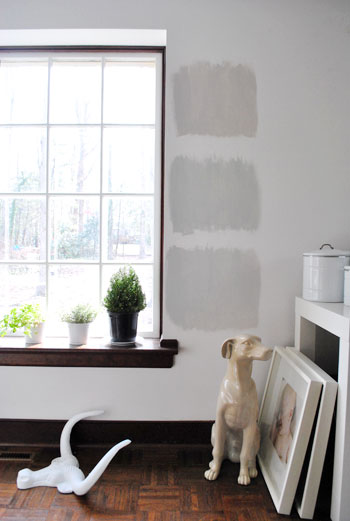
After all, one of the great things about these testers is that you get to see what certain colors look like throughout the day and in varying amounts of daylight and artificial light. We do this with the small paint swatches too, but it certainly was nice to judge a color from across the room for once.
Speaking of different lights, here are all of the colors again at night when things are much yellower from the artificial light (they’re all painted in the same order as listed above, by the way):
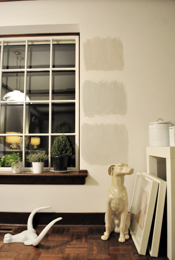
So after a couple of days I finally admitted that (say it with me) Sherry was right all along. Moonshine, the one on the bottom, is by far our favorite of the bunch. Collingwood (the top one) almost won us over, but it’s so warm/tan that it reminded us a lot of Glidden’s Sand White, which was in our first house’s living room and office. We love that color, but it’s not gray enough for what we want this time, so in the spirit of doing something fresh and new we crossed it off the list. And Grey Owl (the middle one) read as too green/blue in our house’s light, so we worried it too might not immediately read “gray” and instead might be “muddy blue-gray” which is what we had in our last house’s bedroom and kitchen.
Moonshine is probably the “purist” of the grays we tested, and it almost has a soft shimmery quality to it – like there’s some silver mixed in. We’re excited about it because it’s definitely dark enough to make the moldings pop (especially once we paint the ones in the living room white) but it’s not too bright or saturated to compete with bolder curtains, art, and accessories that we plan to introduce. Now we just have to cross our fingers that we can find the energy to paint the two largest rooms in our house… and the hallway that connects them. We actually started the job today- but with baby & blog duty going on at the same time, it might take us a few days to get ‘er done. We’ll share pics as soon as we’ve got ’em though!
Have any of you used the paint tester method to choose a color? Did it confirm your feelings or send you in a totally new direction? And dare we ask how long the test squares stayed up before the room finally got painted completely? Ours were up nearly a week, but we could totally see how that could turn into a month (or a year) if you still weren’t 100% sure which way to go…

paige parkhill says
Greys are SOOOO hard to find!! I just painted most of the walls in my new house with Grey Owl and had them lighten it up a bit and I absolutely LOVE it!! Grey is the best color ever, two thumbs up on your paint choice!!!
windylou says
I have paint squares in my bedroom, in shades of gray. I don’t like a single one, and if I hadn’t put them on all the walls, I would be happily enjoying the original color while deciding what to do next. :(
They have been there for at least 6 months with no paint date in sight. Now that I am suitably embarrassed, I may have to run to the store and get some more sample pots.
Here’s what our family did with the previous 20+ sample pots of paint we had lying around this summer:
http://windylou.typepad.com/windy_mayes_photo/2010/07/home-improvement-project-10-inspired-art.html
- Sarah :-) says
Oh my word – we had varying orange swatches up on our wall for over a MONTH!! I’d fall in love with one or two, but McStudly would be against them, then the opposite would happen. It took FOREVER and a looot of compromise befoer we finally decided. It was scaring us when we started painting the whole wall – forgetting how bright the swatch was when originally painted, but then calmed down a bit after it dried. *Whew! It was quite the process, but SO worth it in the end! :-)
Mrs. Plank (formly known as Big Boops) says
Oh the torture! I used to work for Sherwin Williams during grad school and I can’t tell you how many freakin’ sample quarts I used to mix. One lady had no less than 30 different shades of tan. What is so funny is that after mixing so much paint, almost everyone went with one of the same 3 or 4 colors every single time, no fail. I can still tell you the formula for Kilim Beige :)
Ashley says
I vote for Collingwood. 7th House on the Left just painted their office and master bedroom a dark-without-being-depressing grey and it looks great with their white molding and wood floors.
Kirsty says
Ooh the grey is going to look great!! We have a similar colour in our living areas and hallway and it’s lovely. When we painted our master bedroom we totally did the swatch on the wall thing, expcept we kept changing our minds and had about 6 of them (okay, more like 8!) LOL it took us about two weeks to choose so you did well in my books! Can’t wait to see it all finished!!
terra says
I’m a just go for it sort of girl and a big, big fan of gray. The foyer and hall areas of my house are gray – a bit darker than that moonshine shade and with a slight, slight touch of purple. I LOVE it! My husband was so worried that it would be drab, but he’s a convert to the beauty of shades of gray.
Beacon Bits says
Wow – we are on the same journey again, first our yellow tile bathrooms and now our gray living rooms!
We painted our living room “Gray Owl” matched by Olympic a few months ago. IT’S BABY BLUE! The color samples are such a good idea (we didn’t do this – wish we had) because even though Lowes says they can match any color, the Olympic version of BM’s Gray Owl is not quite the same. I have BM’s 8×8 color swatch and it is obviously grayer when held up to our now Olympic Gray Owl. It’s a nice color, but definitely blue!
I think we’ll start again when everything else in the house is painted – hah! It’s kind of like a color merry-go-round at our place. The living room will just has to wait its turn :)
Beacon Bits says
Our Benjamin Moore “Gray Owl” (matched in Olympic paint) living room:
http://beaconbits.blogspot.com/2011/01/living-it-up.html
“Blue Owl”?
Sarah@grownupnow says
I was thinking about painting my bedroom I light gray like that, but unfortunately I live in an apartment and so I’d have to paint over it when I move. Nice choice though!
Sarah W. in Oregon says
I paint samples on poster board. I like to test colors out in all parts of the room and the boards make it easy.
I’m quite indecisive, so those boards often stay stuck to the wall for a week or two. I keep the color boards on file so I can take the wall color shopping and maybe I’ll use them to test future painting projects.
Alyssa @ Perpetual Blind Date says
Love the grey color! I’m obsessed with grey and pops of color! I do want to ask what NO-VOC stands for in your paint color? I’m pretty uneducated when it comes to paint!
YoungHouseLove says
Hey Alyssa,
That stands for no “volatile organic compounds,” which are fumes and chemicals that are present in most paints (which are bad for babies, the earth, and most other things in general). It’s the green way to paint, especially with a baby and a pooch around!
xo,
s
Lacey says
Not too relevant, but I love using those sample sized paint portions for crafts. You get waaay more color flexibility than just using what the craft store has!
Diana says
We put small swatches like that up everywhere in our place when we moved in this past May. In many, many places we’re still living with them, but thank goodness we did it because we have changed our minds I don’t know how many times since then. For our main color, a light yellow, I think we have 15 swatches up on our wall – but we finally did pick, we just have to do the painting now!
Kirsten D says
That is the method I use, however it’s a month before we paint. I need to do this in the bedroom/bathroom to see if the color will be the right one.
Kelly says
I will never go back to painting without using sample cans first. I love them! And I love gray walls :)
erica p. says
Grey is a really tough color to get right! We painted our bedroom grey last year – here’s a pic before we had any art on the walls: http://www.eksquisitedesign.com/blog/wp-content/uploads/2009/11/DIY_button_pillow_03.jpg, and I absolutely love it (can’t remember the color offhand, but it was Behr’s paint + primer). Now I want to paint several more of the rooms in our house grey! Loving the shade you guys chose!
Corinne says
I keep the Home Depot paint department in business with the amount of paint samples I’ve purchased from them! I had 17 colors on my bedroom wall before settling on two. One dark focal wall and the other three a much lighter version of the same color. I haven’t covered the wall that has the huge amounts of swatches on it though. Maybe I’ll do that before I have visitors this weekend! I’m painting my office gray and my guest room a green-gray, so I know the pain! I go with the samples because it’s easier, for me at least, to get a sense of what the color will truly look like on my walls.
Ciara says
when we moved into our new home, our guestroom was a hideous blue color and our room was a dark green. both felt like caves. we decided to go with grays for both rooms. i wanted a more brown gray for the guest room and a more modern blue gray for our room. i too agonize over paint colors. i get every type of gray swatch from the store, come home, narrow it down to 5 or so, go get mini paint samples, then never want to fully commit. as you can see from my blog, i painted brown samples on our kitchen walls in september…they are still there! i just can’t commit. (http://willisandciara.blogspot.com/2010/09/paint.html).
but i DID finally commit to grays. we ended up with Valspar’s “weathered fossil” and “rocky bluffs.” I LOVE the weathered fossil, which ended up in the guest room. And i’m not sure how i feel about the rocky bluffs…it’s a bit too purple for me.
Gabbie says
Guys, new reader of your blog, but l simply had to log in and comment…PLEASE don’t paint your walls gray!
My new partner has a completely gray house, and it is terrible, we can’t wait to paint over it. The entire house is so, so flat and depressing and lifeless. Mind you, the carpet, tiles, window trims, laminate & everything else is gray too, l suppose that makes it so much worse. He thinks it contributed to the demise of his second marriage, as it is a colour that literally sucked the life out of all the inhabitants in the house, and is so depressing to live with.
I never used to ‘get it’, but after spending a few days in his house, l woke up one morning and realised it…l couldn’t wait to get home to my sweet little apartment painted in loud tones of cheery yellow with lots of mismatched coloured cushions. A repaint is definitely in order when we have got the time, and l wouldn’t paint anything gray if you paid me!
Love your blog, and especially enjoyed your wedding posts, fantastic!
YoungHouseLove says
Hey Gabbie,
Too late! We’re already halfway done with the living room! But we love how it looks. Light and silvery, like the underside of a cloud on a sunny day with light steaming through it. Almost glowing. So pretty!
xo,
s
Jenn says
I used testers in deciding which grays to use in my house.
For the dining room I wanted a dramatic dark gray that wouldn’t feel cold. I tried BM Dior Gray and BM Chelsea Gray and went with Chelsea Gray, since Dior was too purple in my lighting. The kitchen, which is on the south side of the house with lots of windows, I had done in BM Stonington Gray, and loved it. So I tried it out in the formal living room on the north side of the house and it didn’t work at all, so more testers. I finally went with Behr Granite Boulder, which I didn’t think I would like, but Loved it once it was on the walls. The hint of green that would have been obvious in a sunny room warmed up the dark room enough and complimented the brick fireplace, that it truly reads a flat warm gray, not green in this room. It’s now a great modern AND classic backdrop for dramatic artwork. Love your new house!!!!! It’s coming together nicely :)
Emy says
Omg! it’s funny because about 1 year ago I was trying to choose paint colors exactly like your previous home (loved all your paint choices) but instead I decided to paint our living room light grey it’s so lovely! I love it with our white crown molding… so go for it it looks very modern and feels soothing… my master-bedroom has a similar color to the one you currently have and It also has an open master-bath and decided to also paint it the same color to make it blend in .. I am learning a lot from you guys!!! I didn’t even know about paint swatches before painting until I read it on your blog! I seriously had 4-5 swatches in every room before committing to one Thank you so much I wake up everyday and can’t wait to see your blog and be inspired … you guys ROCK!
Kristin says
I’m painting my dining room gray and did the exact same thing with testers, though my three choices were very different shades from each other. In the end, though, it confirmed that I wanted a dark, dramatic gray. We just bought the paint and will be putting it on the walls this weekend! Here is my post about the testers: bit.ly/fgJzuI
Amanda@allthingscreativeaz says
I painted test swatches in every bathroom before we moved in a little over a year ago. I just covered up one bathroom’s paint sample a couple months ago. The master bath still has yellow samples on the walls though!
I like your choice of the bottom gray too. It was my favorite.
tanya says
the new old place is looking beautiful! although the other place was lovely, there seems to be a bit more character in this one? really enjoying watching the transformation…
we also used testers for out main living area & hallway colours but in order to avoid painting on the actual walls i used really large pieces of white cardstock (this acurately reflected my current walls as they were just white plaster) painted them and then blu-tacked to the wall. this allowed me to move the card to different corners of the room at different times and then the kids used the coloured cards for craft projects! its also less nervewracking to paint on the card for those experiencing paint paralysis/anxiety!
Rebecca says
Three cheers for gray!! I had the day off from work yesterday (hooray for snow days) and painted our master bedroom Behr’s Gentle Rain. It’s a gorgeous light gray with blue-ish undertones. I came home from Home Depot with enough sample cards to make my husband give me the “you’ve got to be kidding” look. We taped them to the wall, narrowed it down from about 20 to 3 and then decided in a couple days after moving the chips around and considering different light (my hubby knew right away though and picked it “because the color sounds relaxing”). I also recently painted a bathroom Behr’s Coliseum Marble, a chameleon of a color that reminds me of our honeymoon in Greece–I think the name alone sold me on the color. :)
One more thing, I really appreciate how much time and effort you invest in your blog. I love checking in daily to see what you guys are up to–and I’m impressed by how gracefully you handle the sometimes rude comments of posters. Kudos to you both!!
Brooke says
I’ve had huge swatches up for about a week.
We’ve always had a white living room due to the fact the our furnishings were bright and all over the place, the kitchen is cyan, and the next room visible is yellow…. until recently I had no clue what to do with the living room so it wouldn’t look like a circus. But six months ago we got a new, gray velvet, sofa. Now we’re slowing going through a transformation and the living room and kitchen will be painted the same color, BM Pale Oak. Can’t wait to break out the brushes..well, uh I actually can’t wait to PUT AWAY the brushes and enjoy it when we’re done.
Alissa says
We used the paint-the-posterboard tester method. We got samples sizes of the Benjamin Moore colors we were thinking about (the most popular colors come in tiny cups, others you need to get in a “tester” quart), then painted pieces of white posterboard with 2 coats of each test color. Once each gigantic paint swatch was dry, I hung them up with painters tape in different places of each room and even ended up taking a downstairs color upstairs to try since I had the swatch already painted. This method ended up working really well for us since we were painting over Coke red, bright baby blue, dijon yellow, and sky blue. We needed a large swatch to figure out colors since the background colors were so overwhelming. I recommend this method for first time painters (like we were- I was choosing 6 colors to repaint our new house) and/or those who don’t want to commit to painting on walls when choosing a color.
eye see pretty says
I painted my bedroom Moonshine about two years ago and I.Love.It! It is a gorgeous grey colour which doesn’t read as too cold (and definitely not jail-like at all!) It really changes throughout the day and has a warmth at night which makes my bedroom extra cozy. Great colour choice!
Rebecca @ the lil house that could says
I currently have a ‘tester’ blob on my bedroom wall from a can of paint we already had. It is much darker than we want, so I’m hoping it’s not a pain to cover! I picked up some swatches, but I think I know which one I want without the tester :)
I was totally rooting for the top color until you mentioned that you wanted a more true gray. In that case, I agree with your choice!
todd says
we live by the sample paint on the wall first. Sometimes, we just can’t trust the swatch. I know if you think there’s a color category in which it’s hardest to find ‘the one’ (you know the one that’s in you’re head that you’re trying to find out there), but for us it is blues. It took us 7 attempts of sample testers to find the right greenish, grayish blue for our bedroom. We have an embaressing amount of tester cans in the garage, but they’ve come in handy for other painting actually.
Mandy of Kini Style says
So glad you picked the 3rd paint swatch! I was routing for that one through the whole post :) My brother painted his room gray over the summer and it completely looks light blue on the wall…he should have used your paint sample approach. Cant wait to see the end result!
maggie says
I need a little help guys! what is your thought on brown and black furniture tongether? i just bought this brown sofa from ikea
http://www.ikea.com/us/en/catalog/products/S99877671
and dont know what color coffee table and end tables to get.
Do you think black picture frames would look good over the sofa? Thanks!
YoungHouseLove says
Hey Maggie,
We love brown and black mixed. As long as you use a few different instances of each (ex: a few black things and a few brown things as opposed to ten black things and one brown thing) it’ll look layered and intentional so nothing will look mismatched. Black frames would look awesome over the sofa with black iron end tables and a wood coffee table and media cabinet. Hope it helps!
xo,
s
Sandra Blackburn says
Loving the softer grey! And Moonlight ! I am sure the name would have influenced me.
We did color swatches for our exterior, and it was super helpful. Pictures and colors here: http://samma.typepad.com/blog/2010/07/going-green.html But I was amazed at the difference once the whole house was painted. In hind sight, the mid green color would have been better than the very light green we went with on the stucco. Still WAY better than the red & white we started with though!
Jessica says
I just went grey, too! And I love it so much… I’m going grey room by room! And to answer your question… I’m more of a paint the whole room and risk painting it over, after all… It is when my mind is most clear. Good luck!
Nicky at Not My Mother says
I’ve been wanting to ask you about painting. You’ve said in the past that you just paint over whatever colour is already on the walls without priming. But recently I wanted to paint our games room grey (!) and put a few tester pots on the walls, which were painted in a sort of yellowish off white. They all came out really blue or purple looking. I thought maybe the swatches were inaccurate so I painted the same colours on blank white canvases from the $2 shop, and sure enough they matched the swatches. It was the yellow underpaint.
We ended up doing two coats of ceiling white before we applied the grey (2 coats) and it’s still a tiny bit blueish though I’m pretending I can’t see it. So what did we do wrong? Is the coverage of the paint poor (British Paints, in Australia, chosen simply because that’s what the swatch was from) and I need to try something better, or should we have used proper primer? Please help, I’ve got a whole house full of this stupid yellowy white that I want to change to a softer oatmealy off white, and I have enough trouble picking colours without it changing them on me!
Thanks, and love your blog :-)
YoungHouseLove says
Hey Nicky,
Bummer! So sorry to hear about your troubles. We’re guessing that your best bet would be to prime with water based primer before painting just to get a really true undertone going on so things don’t seem skewed. You could also try adding another coat of paint to the walls that you already painted (since every coat will decrease the amount of paint that “shows through” underneath and alters the top color). Hope it helps!
xo,
s
Amy says
I have a long saga with gray and sample pots of paint. Bought about 10, picked the one I liked the most, bought enough paint for the whole living room, and after one wall discovered it was really more blue than gray. Back to the drawing board. Finally ended up with almost the same color as you, it was a custom mix in Behr. The whole ordeal took over 6 months!
Nicky at Not My Mother says
it’s hard to believe I left anything out of that last comment, but I forgot to mention my husband learned to paint from working at his uncle’s housepainting business, so he did thin the white paint down and the first coat of the grey before he noticed how you could still see everything through it. So I assume *not* thinning the white would have helped, but it doesn’t explain how you don’t have to prime at all when you paint! :-)
Shana says
Nooooo! Oh, fer cripes’ sake. If I see another gray room on another decorating blog….
Cheryl Balmas says
This is more exciting than anything on tv. Have to say, HGTV has been a bit of a bore lately. (Not loving some of the new shows or the sickining repetition of the shows and the ads for the shows; very disappointing!). But, I digress. When you posted above that you were halfway done with the walls I was so excited! haha That means we’ll get to see a reveal soon. Can’t wait. Sounds like you made the right choice. From my perspective, the top sample looked more brown and the Owl was definitley blue-in fact I’ve read about the BM Grey Owl being sort of a blue/green/gray. Sounds like, as always, you’re instincts were right on. Yes, I have so much money invested in paint samples…I think I had 6 or 8 of them in my den at one time…haha. Good luck!
Samantha says
I’m so glad you decided to go with gray. I just repainted my bedroom, but I was going for the muddled blue-gray. I ended up going with Valspars Seaside Villa, and I love it. Shockingly, it took me a while to get there. As in, 12 paint samples from Home Depot, Lowes, Sherwin Williams and Ben Moore! Gray can be warm and hip (once you find the right one!)
Jane says
LOVE IT! My mom just told me the other day that she was listening to a home stager on TV and she said that she always goes with Grey Owl because it is liked by everyone. I forgot she told me that until I just read your post. I do like the bottom one best too. I might have to copy. I have Bonsai in my livingroom and it readys someone tanish at different times of the day.
Aimee says
How weird! Just today I decided that gray might work in my bathroom and bedroom. Then I took a look here and whaddaya know! Moonshine was my fave, too, from the pics. Glad to hear you are loving it on the walls. I might check it out (I’m definitely a big test swatch painter!) How would Moonshine look with tan-ish (think cafe con leche color) travertine tile? Terracotta saltillo tile? Terracotta, aqua, and leaf green accessories? Uh, oh, I’m getting inspired! Your house is looking great guys!
Cheryl Balmas says
OMG I am stupido! I knew Moonshine sounded familiar! I used it last year on an armoire! I just went downstairs to check out the can because I have a list on my computer of all paints used in the house but for some reason I hadn’t recorded that one. Yes, yes…its lovely! Of course, I used a satin finish for the armoire and its standing against chocolate brown walls. Sounds weird, I know, but its not. In my room, the moonshine looks very light against the dark brown and I didn’t want to use white on the armoire–too stark. I remember painting a sample of moonshine and loving it so much I was determined to use it somehow. You’re gonna love it…
Kristine says
Ah, the ever elusive grey! I tested over 8 different greys, plus I actually bought 2 gallon sized cans (big mistake), then tried to alter one of the grey cans at Home Depot by adding 2x more pigment (even bigger mistake), then I hired a color consultant and went with the colors she chose, and I’m still not 100% liking the results 3 months later. The grey looks like baby blue at certain times of the day, and I wanted a truer grey. I wish I had your eyes to pick colors so easily. Sigh. :/
Jessica says
We also opted for a gray color in our living room but we ended up reducing the pigmentation to 75% because we couldn’t find the exact right fit out of the can. Doing this worked tremendously and gave us the exact shade we were looking for. Have you all ever thought of reducing your pigment? If a shade is just a little too bold for you it may be a great option to try!!
FYI the paint mixer at lowes/home depot can decrease pigments in 25% increments.
YoungHouseLove says
Hey Jessica,
We love that they do this and actually plan to use that trick for some of the ceilings in our house! Thanks for sharing the 20% increment fact, we always thought it was 50% or nothing!
xo,
s
penny says
Hey Guys!
I dont comment often but just wanted to say you’ll love your choice. The hubby and I recently painted our living room Silver Chain in October. It came out a little bluer (is that a word?) than we thought it would but had it adjusted a smidge and it looks great! One of our accent colors is orange (i know that sounds crazy) but its a very happy color especially on sunny days. Love the blog, keep up the good work! :)
p.s. I always read the comments too and I’m always surprised at the negative ones.. I mean did they even see Sue (la napkin?) What a crazy fun pattern! xoxo!
Lonely Wife Project says
I’ve never been patient enough to actually buy testers, but I didn’t hesitate for a second when it came to choosing a gray color. We were deciding between Benjamin Moore’s Silver Fox and Stonington Gray and ultimately went with the Stonington, although now I’m wishing I had gone with Moonshine ;)
Shauna Clark says
You mentioned that you used Benjamin Moore paint color but put the color in Olympic Brand sample size. Did Lowes just do that for you? My paint guy at home depot said that I cannot pick a color sample from one company and mix it with a different paint companies base paint because each color setting in their system will not work to give you the right color. How did you get them to do it? Have you had any issues??
YoungHouseLove says
Hey Shauna,
They definitely didn’t do anything special that they don’t do for other people at our Lowe’s (the paint guy had no idea who I was). I just asked if they had Collingwood and Moonshine and Gray Owl by BM in their computer and he looked and said they did and I requested that they make me three small sample pots with Olympic’s No-VOC base. Of course they said it might not be exactly the same, but it was so close to the swatches it was scary. They were dead on. Hope it helps!
xo,
s
Liz says
I have used the paint tester method! I sampled Behr’s Harvest Brown and Behr’s Flint Smoke. When I sampled Harvest Brown I was like, “Meh…”, but decided to use it anyways and I really like it now!
LOVE the greys! Do you think grey paint would go with a brown carpet?
YoungHouseLove says
Hey Liz,
Brown and gray can definitely work together since they’re both “neutrals.” Our advice would just be to let one be dominant, so keep the tone of the gray light if the carpet is a semi-dark brown. Hope it helps!
xo,
s