We usually feel pretty confident in our ability to pick a paint color. But something about choosing the perfect gray color for two major living areas in our house made me extra nervous (we’re going to use the same color in the future dining room, main hallway, and living room for some nice continuity). Sherry had a field day ribbing me about my paint paralysis. I was literally second-guessing every swatch we looked at. “Sure, I like it… no I don’t, I hate it.” Yeah, that was me.
I blame my neurosis on having selected a hideous gray tone to paint my middle school bedroom (I picked it because I liked the name – Cannonball or Cannon Smoke or something else that sounded like blowing stuff up). In retrospect it was too dark, cold, and prison-like. Fortunately I warmed it up with a bright red Looney Tunes rug and Tasmanian Devil throw pillows (don’t be jealous). But somehow I don’t think that’s an acceptable solution this time around.
So I convinced Sherry (who was a lot less gun-shy than I was, she kept saying “let’s just pick one and DO IT!”) that we should buy paint testers and try out a few colors before committing. She recommends this option all the time to nervous-about-painting readers, so it wasn’t too hard to convince her that we should give it a whirl at least once. So we narrowed it down to our top three similar-but-different-enough-to-help-us-make-a-decision contenders:
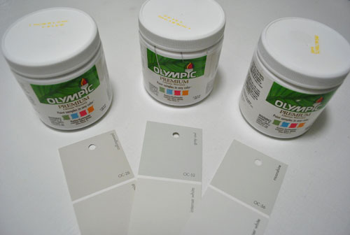
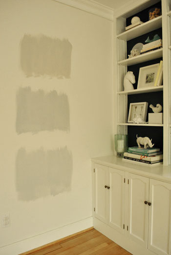
They are, from left to right: Collingwood, Grey Owl, and Moonshine (all Benjamin Moore colors mixed in Olympic Premium No-VOC samplers from Lowe’s – which are about $2.50 a pop). Of course, in an effort to prove her paint-psychic abilities, Sherry called her favorite before even breaking out the paintbrush. Can you guess which one it is? Hint: it rhymes with “spoon mine.”
Here they are in the future dining room, painted in that same order (with Collingwood on top and Moonshine on the bottom):
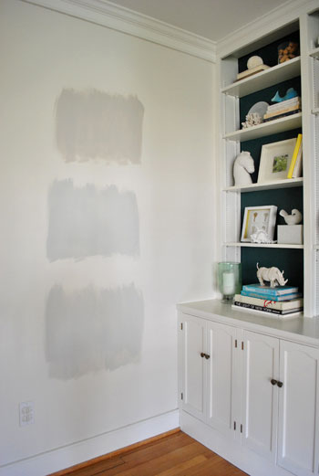
We just did one coat with a paintbrush (it had great coverage) doing our best to keep the edges feathered so when we eventually paint over everything we aren’t left with slightly raised squares where we tested (which is why we didn’t use painters tape to make perfect squares that also might be visible after we paint over them).
And ever the overachiever (or just someone who loves to paint), Sherry finally embraced the test square method and went ahead and painted big swatches in the family room too. One set near the TV…
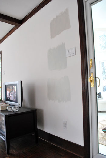
…and another set next to the big window (since it gets a different amount of daylight).
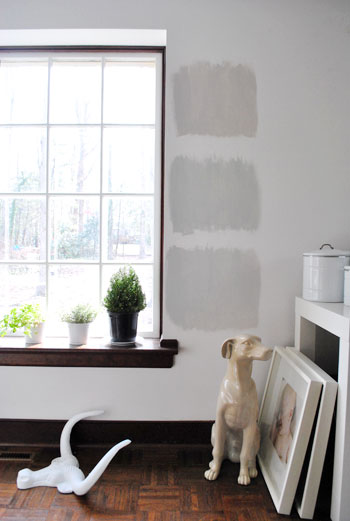
After all, one of the great things about these testers is that you get to see what certain colors look like throughout the day and in varying amounts of daylight and artificial light. We do this with the small paint swatches too, but it certainly was nice to judge a color from across the room for once.
Speaking of different lights, here are all of the colors again at night when things are much yellower from the artificial light (they’re all painted in the same order as listed above, by the way):
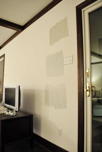
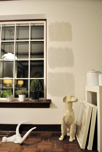
So after a couple of days I finally admitted that (say it with me) Sherry was right all along. Moonshine, the one on the bottom, is by far our favorite of the bunch. Collingwood (the top one) almost won us over, but it’s so warm/tan that it reminded us a lot of Glidden’s Sand White, which was in our first house’s living room and office. We love that color, but it’s not gray enough for what we want this time, so in the spirit of doing something fresh and new we crossed it off the list. And Grey Owl (the middle one) read as too green/blue in our house’s light, so we worried it too might not immediately read “gray” and instead might be “muddy blue-gray” which is what we had in our last house’s bedroom and kitchen.
Moonshine is probably the “purist” of the grays we tested, and it almost has a soft shimmery quality to it – like there’s some silver mixed in. We’re excited about it because it’s definitely dark enough to make the moldings pop (especially once we paint the ones in the living room white) but it’s not too bright or saturated to compete with bolder curtains, art, and accessories that we plan to introduce. Now we just have to cross our fingers that we can find the energy to paint the two largest rooms in our house… and the hallway that connects them. We actually started the job today- but with baby & blog duty going on at the same time, it might take us a few days to get ‘er done. We’ll share pics as soon as we’ve got ’em though!
Have any of you used the paint tester method to choose a color? Did it confirm your feelings or send you in a totally new direction? And dare we ask how long the test squares stayed up before the room finally got painted completely? Ours were up nearly a week, but we could totally see how that could turn into a month (or a year) if you still weren’t 100% sure which way to go…

Melissa says
Is it my imagination, or did you spray paint the dog statue? Looks good! Melissa
YoungHouseLove says
Hey Melissa,
That white dog used to live in our sunroom (he’s from HomeGoods and has been white since we got him). You must be thinking of my concrete greyhound (who is still grey). You know I have an animal issue when there are two dog statues to confuse with each other! Haha.
xo,
s
Courtney says
We just painted our guest bathroom crested wave-it is a great grey. By Valspar.
Alison K says
I am a huge fan of the paint tester as I can never seem to make up my mind without seeing it on the walls. When I first went to paint my bedroom I thought I wanted to go blue and tested about 4 different colors to realize that I loved them on the swatches, but on the walls they just looked too cold. I ended up going with Restoration Hardware’s silver sage and love it.
Skye says
I am considering painting my living room grey (is it gray or grey or does it really matter?)and add punches of color but it is scary for me to just dive in and do it. So… I think I am going to take the YHL route and get some samples and paint some swatches. I can’t wait to see how you guys accessorize and what colors you will use with it. I think the dark blue of the back of the built-ins will really pop against the grey walls! Thanks for the lovely posts – I always look forward to see what you two (and Clara and Burger too – so so so cute!) are up to!
Julia says
greys are so hard to choose from! We are trying to pick a “greige” for our bedroom and it is really hard to narrow it down. I have 4 colors on the wall now and none of them seem just right. I may try collingwood. Gotta paint the ceiling before we paint the walls anyway, so I still have some time!
Gina @ Temporary Nest says
I had the most beautiful gray bedroom in an old apartment… I was so sad to leave it. It was wonderfully soothing! And they totally go with all color schemes! I am jealous of your gray walls!
Candice says
We did the exact same thing when we moved and were looking for the perfect shade of gray for our master suite. It’s amazing how green or purple certain shades looked once they were up on the wall. We went with Benjamin Moore’s Silver Fox and LOVE it! But, it’s darker than you wanted. We wanted a warm, moody gray since I like bedrooms either light and breezy or dark and cozy :)
Erica says
This is not about the grey although I love any colors with hints of grey in them. I was wondering if you still had links to other design blogs on your site? I used to love to check them out and see who had new cool ideas? Are they on a page and I’m missing them? I should’ve saved them!
YoungHouseLove says
Hey Erica,
See the button on the sidebar with our faces on it? There’s a tab that says Link Love where you can find all of those links. Hope it helps!
xo,
s
Jessica says
QUESTION: How do you all come up with your incredibly tasteful & creative “visions” of how you want each room to look? It’s like you can take a horribly depressing room and make it AMAZING!!! So, what are your “brainstorming” steps…or does it just come to you? :)
YoungHouseLove says
Hey Jessica,
First of all, you’re too kind! We just think about things for a little bit and try not to wait too long and get all scared and intimidated so we dive in and take things one step at a time. Of course collecting “inspiration images” from magazines and blogs definitely helps. And even things like the cloth napkin that we found and recently blogged about (which has a color palette that we love, so we’re basing a lot of the rooms in our house off of it) can come in handy when it comes to picking a direction and running with it! Hope it helps!
xo,
s
Dawn Burgess says
My husband and I are currently in the process of re-doing our half bathroom downstairs and we also were going for a silvery-gray look. It took 5 paint samples for us to pick the perfect color and I love it! It’s warm yet neutral so really anything will go with it. Love the color you two picked!!
Dawn
Paige B. says
For our kitchen that we completely gutted and renovated ourselves, I wanted the PERFECT warm, yellowish-gold. I had a hard time visualizing them on the swatches so we did the test paint method….with 7 colors! We found the prefect color and I am so happy with it. Without the testing, I’m sure I wouldn’t have picked the one we used.
On another note, we’ve had samples painted in our home office for over a year. We just painted last weekend and ended up not using either of the paint samples we tested. We went with totally different colors without the paint test and are super happy with our results.
Dani says
That’s funny – we are in the process of putting grey swatches up on our living room! We too wanted something that wasn’t too taupe. I think we have decided on BM River Reflections for ours. I like the Moonshine too!
monica says
i’ve certainly learned my lesson when it comes to picking the wrong grey. i painted the entire kitchen and dining room only to later realize the pure grey looked BLUE in certain light. this was a problem because it majorly clashed with the otherwise warm tones in the room. i think you did the right thing by testing them even though you already knew more or less which one you liked going into it. i will use this method next time i use grey!!
LittleMissEclectic says
Um… we’re not patient enough to test colors. Once we painted our living room (ceiling and all- because we had round edges- no corners) a color called Nacho Chip. I’m gonna letcha guess how that one turned out.
Helen says
HAHAHAHAHA
My husband and I *JUST* got back from Lowes (as in, 45 minutes ago) with eight sample testers! I’m just like John in that I was second guessing everything, and also like Sherry in that I would flip over to “let’s just DO it!” I’m happy to say that it’s turned out great. The only turn was that I was expecting to do a horizontal stripe focus wall (a la the half bath in your old house) in my library. And now? mmmm notsomuch.
Kelly C. says
Not that I matter but I like #2 and #3 best just from pics. Can’t wait to see the results.
Directions Not Included says
We did the same thing while testing the gray we ended up using in the guestrooms, dining room and living area. I wanted a neutral and didn’t want to do sandy/beige colors so we opted for a cool gray. Gray was definitely a hard one to narrow down we went through tons of samples as well.
Jessica says
We just went through this in 3 rooms in our house. I thought I’d picked the perfect 3 coordinating colors, but omGosh, I didn’t like any of them once they were actually on the wall, and after 3 or 4 days, I knew I had to scrap the original plan. Six new samples and 2 weeks later, I went with a totally different color that we hadn’t tried, and then coordinated the other two rooms from that point. I like it, but the real test will be this weekend, when my mother comes to visit… *insert Twilight Zone music HERE*
Steph @ BirdHouse Family says
I love the gray you chose! I just painted some teal samples on the wall this weekend. I’m so glad I did, but I am still struggling with the decision.
http://birdhousefamily.blogspot.com/2011/01/decisions-decisions.html
Your choice seems so obvious even from the photos. I can’t wait to see how it turns out!
Alisa says
Last year we primed over our wall paneling and because our schedules were so crazy, it stayed white for a while. I got sick of it, so I painted a test block of purple on a couple of the walls. Let’s just say the hubs didn’t like that and the room was completely painted a greyish blue within a week ;)
Tanya says
Actually, rather than paint on the wall I buy poster board and paint on the flat side of it. I have found that this way I can move the paint swatches around the different spots of the room at different times of the day without actually painting my walls.
Interesting though, I narrowed it down to six greys for my bedroom, immediately discounted three of them, waffled on the fourth, and then chose between the two (all Benjamin Moore). Grey is tough!
Holly Austin says
I have to say, in every picture that you showed the samples I loved the Moonshine. I have to get testers ALL THE TIME because I’m perfectly horrible at picking out paint colors. My family teases me about it all the time, because it’s nothing for me to announce that I’m tired of one paint color and ready for another! I finally just painted the living room a neutral color so I could change out the accessories as I changed my mind :)
Stephanie says
Great choice!!!! And I looooove paint testers! It helped me finally get over 7 years (yes, years) of indecision. Can’t wait to see the rooms painted!
Samantha says
I have a love/hate relationship with paint testers. They allow me to stay undecided and procrastinate as seen here: http://unsuperb.blogspot.com/2011/01/craft-room-beginning.html
However, because of it, I’ve veered on a new color path and soon to be more test patches.
I love the grey you chose; I’m aiming for something like Collingwood in my master bedroom (it needs the warm hue).
IBL says
We painted our bedroom “Puritan Grey”-it’s really dark, and looks pretty cool with our white crown mouldings…We have a 14 month old boy, and the hubby is not AT ALL handy or a “diy” type-not even wanting to try! I am in the process of painting the inside of a closet in our basement that I bought new shelves for. I am painting it white but it’s super hard! I give you guys credit-painting looks much easier than it is-plus with an active lil guy finding the time is next to none! Would love some input on time managing while doing it yourself!
dana828 says
Greys are tough! This past summer we painted our entire main floor area (family/dining/kitchen/halls). I wanted the largest wall a dark grey, and everything else a pale grey. Ended up with about 5 different light grey samples all over the walls, just like you did, so I could see it in different lights/shadows, etc. One ended up having a purple tint in certain light, another looked too blue, another had a greenish tint…on and on. We ended up with a grey-beige that I call “mushroom”, but I think is really “antique beige”. I’m SO glad I did all those sample colors! I had learned my lesson when we had our basement finished about 5 years ago. I just picked a color, the contractors picked up a 5-gallon bucket of the paint, and went to town. I went down there when they were about half done with the first room, and HATED the color! I felt awful having to have them start all over, and we had to eat the cost of the re-do…and I still have 9/10 of a bucket of flesh-colored paint sitting in the storeroom…
Deborah says
I’m just wondering how much prep work do you need to do before you paint? I am in the process of spackling nail pops, hairline cracks & uneven wall surfaces. Then I prime with Kilz before my 2 coats of color. So when I paint it is quite an involved process. (type A personality for sure)
YoungHouseLove says
Hey Deborah,
We have a post all about that here: https://www.younghouselove.com/2010/09/email-answer-how-to-paint-a-room-yhl-style/
Hope it helps!
xo,
s
veronika says
we used the paint test method as well and found our prefect grays that way. They are “functional gray” by sherwin williams and “smoked oyster” (a darker gray) by benjamin moore. Love both colors so much. Gray is the best neutral, IMO.
Sarah says
The hubs and I tried the paint tester method when we painted the first room in our house…we ended up with 9 different samples on the wall and myself in the corner pulling my hair out. As much as I wanted the samples to help, they ended up just confusing/second guessing myself so much that I completely rebelled (after pulling myself together), marched to the closest Home Depot, picked a paint chip off the wall and made the decision. I *love* how it turned out and it was nowhere close to where we started.
I think they were all on the wall about 3 weeks before I had enough of my impromptu wall mural.
Melanie says
Hey Guys
It’s so exciting to be following you in the new house and watching you start from scratch again! Seeing what you’ve done with your previous home, I’m sure this one will be stunning when “done”.
I can’t wait to see what Moonshine looks like big-scale !
When we painted our apartment, my boyfriend and I totally used the little sample size containers from B.Moore to figure out what color to use.
Our color range to choose from was a bit wider in some romms, as you can see on the link:
http://groovinthecouv.blogspot.com/2009/06/house-in-progess.html
We went with the second from left for the white wall (“Linen”), and beleive it or not, this is the same paint as the bottom right sample on the blue wall ! ( we didn’t feel like priming, so it’s a good thing we tried a sampe first, and realized the result over the blue). We went with the bottom left one on the blue wall (our bedroom), which is a lot more grey than brown in real life.
Using these amples is really a great way to see how the color varies throughout the day. You can also get 2×2 heavy paper from Ben Moore to paint your samples on and paste on the wall if you don’t want to paint directly on the wall…
Rhiannon says
I’m so glad you guys finally did it,tested paint on the walls instead of using the small paper swatches that is! When choosing the color for the main and connected living areas in out new house, we painted big swatches on poster board and tack them up on the walls. The only reason we didn’t paint directly on the wall was because we didn’t own the house yet!! We were very bad and a day before closing we snuck in and tacked all the painted poster boards on the wall! Thankfully everything went as planned and we got the house! And now I always use the poster board method when choosing paint colors!
Terri says
I love the color you chose…it’s soft and ethereal. Grey is such a difficult color to predict that it’s almost a given that you test it on the walls before painting. We have painted both of our homes several times and have always painted test samples first. We usually paint a piece of tagboard (about 18″ x 24″) with each color we’re contemplating and then tape each one to the wall. We move them daily so we can see how the color will be affected by the differing amounts (and directions) of light. It’s fun actually, and has saved us from making more than one drastic mistake!
Aliannoz says
I love grey – which explains the grey car, monochromatic closet, and grey living room. We ended up picking CIL’s Whiter Shade for our living room, which is a muted silvery grey, not unlike the paint colour you guys decided on. I totally understand the difficulty in picking a livable grey though. After debating paint chips at Lowes for over an hour, we recently painted our guest bedroom a “charcoal” which really ended up looking like plain old black. Should have bought a tester for that one…
Kera says
We bought our house in June. We bought paint samples right away because I couldn’t stand the banana yellow every room in the house was painted. I think we have a collection of about 15 paint samples on the shelf now. We painted samples on the walls in each of the rooms.
Just before Christmas I painted over the swatches in the great room with primer because my kids were calling the house ‘spotted.’
:)
We have decided on a color, but just haven’t gotten to that room yet. I am happy to say that everything else is painted except the dining room. I have 3 greys on the wall right now in the dining room, but can’t make up my mind if I want go grey or not.
BTW- We still don’t have curtains up in the dining room or great room or pictures on the walls…
Ugh!
Elizabeth says
I love samples! It’s a lot less expensive and time consuming to throw a few swatches on the wall then blindly start painting. I’m glad they started making the little sample size.
Stacy says
I like Grey Owl, but I can see what you mean about it looking blue.
Grey is a hard color. I grabbed a bunch of Martha Stewart’s swatches over the weekend from Home Depot. I have enough painting projects going on, so I don’t want to deal with paint I don’t like on the wall, but I digress.
I grabbed a swatch called “Chinchilla”. Since I have a chinchilla ( he’s a black velvet) I thought it might make for a interesting paint color. Come to find out, Martha has it all wrong. I don’t know what kind of chinchillas she has been looking at, but they do not naturally have purple undertones. I’ve had a grey chichilla and there was nothing purple about him.
Nicky at Not My Mother says
Thanks Sherry! I’ll try the primer, and if the hubby complains then I’ll do it myself. He doesn’t usually let me because I use “A ridiculous amount of paint” and he claims our kitchen ceiling is actually lower because I painted it that time. Ha! what can I say, there were no streaks showing through there…
Maryanne says
We had a big cafe-au-lait colored splotch on our dining room wall for what had to be at least most of a year. It looked great with the bubble-gum pink and lavender that were already there, along with some bright red with gold flecks that we found when we removed the (knee-height) chair rail. It was really bad. Even though we had a ripped open wall still in part of the room, my mom convinced me to paint the rest of the room on one of her visits (we ended up doing something totally different, a buttery color) and it was such a breath of fresh air, I almost didn’t notice the jagged plaster and drywall still exposed in part of the room.
Lynn says
The decorator on the cover of Better Homes and Gardens of the April 2010 issue used moonshine throughout her whole home. I know this b/c I try to make my home look like hers (and yours too!). :) Thanks for all the inspiration!
michelle says
I think you all should develop your own paint line…in your free time. :P
karen says
The yellow book in your shelves looks so nice with the greys. I like Moonshine too. That window is lovely!
Heather Jo says
We painted two spaces in our home gray. Both rooms are very different but look awesome- I’m sure you’ll love your gray, too. We painted our bathroom a medium/ light gray and we painted the dining room a very dark gray. The dining room was Sherwin Williams “Peppercorn.” It’s very dark but AMAZING!
Champe says
Ok Y’all…this is exactly why we created My Design Guide.com
I’ve painted swatch after swatch on the wall, year after year and couldn’t take it anymore. So, we have real interior designers select paint colors for you.
Check us out – sponsors of YHL – to help all 306 of you who commented before me with the same problem:)
Lori says
I think I remember that when you did a baby room for John’s sister, you used Glidden’s Polished Limestone, a lovely light gray. It’s in my bedroom and I adore it. So I was surprised that wasn’t one of your possibilities. Or maybe it would make you think of your nephew’s room all the time :)
Andrea B says
Oh, you’ve totally won me over. Sherry is right. The bottom gray is the best, in all rooms and lighting.
I’m so convinced, I kinda want to use it myself. Copy cat, that I am. ;)
Megan says
I am SO glad you guys posted this, such great timing, as we are moving next week and choosing our grey/blue colour within the next few days. We are looking for something similar to what you were describing so I’m glad you chose this week to paint. I’m definitely going to see if any of those swatches work for us.
Also, (and I asked this on another post as well but perhaps you didn’t see it…) we have french doors (2 sets) in our new living room and I remember a post where someone had painted their doors a dark colour… what’s your take on this? we were thinking of a dark slate colour…could you point me in the direction of this post?
thanks and can’t wait to see the final look!
YoungHouseLove says
Hey Megan,
That was Matt & Kristen’s house that we crashed. It looked amazing! Here’s that link: https://www.younghouselove.com/2010/03/house-crashing-a-brilliant-bungalow-take-two/
xo,
s
Caitlin says
Most of our walls are painted Amazing Gray by sherwin williams (in their zero VOC line, Harmony). I knew I loved it right away but we still did the wall patch thing!
Emily Z says
Clover mirror $20 at target! Just saw it today at the store and it’s online! Woohoo! Now to where to place one in my house :)
Nicole says
My Hubby and I used a paint tester a couple summers ago when we renovated our bathrooms. It is hard for me to see the look beyond what color the wall is and see the sample. Guess I’m too much of a big picture person? :) After a couple years of living with the color I have to admit I’m not a huge fan but luckily a new coat of paint will be an easy fix. I plan to test out different paints when I’m ready to pick up the brush again!
K Russell says
We used paint swatches for our daughter’s nursery to help us choose our primary and accent colors. We only had the swatches up for about a day before picking our favorite ones and then getting busy painting the room.