We usually feel pretty confident in our ability to pick a paint color. But something about choosing the perfect gray color for two major living areas in our house made me extra nervous (we’re going to use the same color in the future dining room, main hallway, and living room for some nice continuity). Sherry had a field day ribbing me about my paint paralysis. I was literally second-guessing every swatch we looked at. “Sure, I like it… no I don’t, I hate it.” Yeah, that was me.
I blame my neurosis on having selected a hideous gray tone to paint my middle school bedroom (I picked it because I liked the name – Cannonball or Cannon Smoke or something else that sounded like blowing stuff up). In retrospect it was too dark, cold, and prison-like. Fortunately I warmed it up with a bright red Looney Tunes rug and Tasmanian Devil throw pillows (don’t be jealous). But somehow I don’t think that’s an acceptable solution this time around.
So I convinced Sherry (who was a lot less gun-shy than I was, she kept saying “let’s just pick one and DO IT!”) that we should buy paint testers and try out a few colors before committing. She recommends this option all the time to nervous-about-painting readers, so it wasn’t too hard to convince her that we should give it a whirl at least once. So we narrowed it down to our top three similar-but-different-enough-to-help-us-make-a-decision contenders:
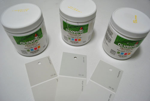
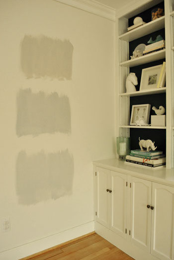
They are, from left to right: Collingwood, Grey Owl, and Moonshine (all Benjamin Moore colors mixed in Olympic Premium No-VOC samplers from Lowe’s – which are about $2.50 a pop). Of course, in an effort to prove her paint-psychic abilities, Sherry called her favorite before even breaking out the paintbrush. Can you guess which one it is? Hint: it rhymes with “spoon mine.”
Here they are in the future dining room, painted in that same order (with Collingwood on top and Moonshine on the bottom):
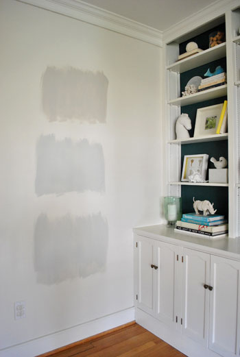
We just did one coat with a paintbrush (it had great coverage) doing our best to keep the edges feathered so when we eventually paint over everything we aren’t left with slightly raised squares where we tested (which is why we didn’t use painters tape to make perfect squares that also might be visible after we paint over them).
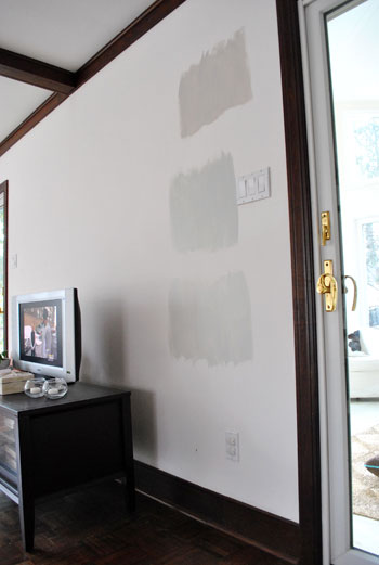
And ever the overachiever (or just someone who loves to paint), Sherry finally embraced the test square method and went ahead and painted big swatches in the family room too. One set near the TV…
…and another set next to the big window (since it gets a different amount of daylight).
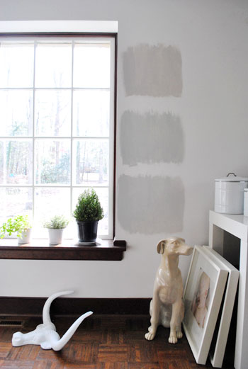
After all, one of the great things about these testers is that you get to see what certain colors look like throughout the day and in varying amounts of daylight and artificial light. We do this with the small paint swatches too, but it certainly was nice to judge a color from across the room for once.
Speaking of different lights, here are all of the colors again at night when things are much yellower from the artificial light (they’re all painted in the same order as listed above, by the way):
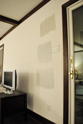
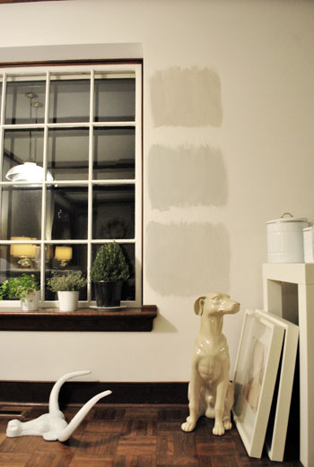
So after a couple of days I finally admitted that (say it with me) Sherry was right all along. Moonshine, the one on the bottom, is by far our favorite of the bunch. Collingwood (the top one) almost won us over, but it’s so warm/tan that it reminded us a lot of Glidden’s Sand White, which was in our first house’s living room and office. We love that color, but it’s not gray enough for what we want this time, so in the spirit of doing something fresh and new we crossed it off the list. And Grey Owl (the middle one) read as too green/blue in our house’s light, so we worried it too might not immediately read “gray” and instead might be “muddy blue-gray” which is what we had in our last house’s bedroom and kitchen.
Moonshine is probably the “purist” of the grays we tested, and it almost has a soft shimmery quality to it – like there’s some silver mixed in. We’re excited about it because it’s definitely dark enough to make the moldings pop (especially once we paint the ones in the living room white) but it’s not too bright or saturated to compete with bolder curtains, art, and accessories that we plan to introduce. Now we just have to cross our fingers that we can find the energy to paint the two largest rooms in our house… and the hallway that connects them. We actually started the job today- but with baby & blog duty going on at the same time, it might take us a few days to get ‘er done. We’ll share pics as soon as we’ve got ’em though!
Have any of you used the paint tester method to choose a color? Did it confirm your feelings or send you in a totally new direction? And dare we ask how long the test squares stayed up before the room finally got painted completely? Ours were up nearly a week, but we could totally see how that could turn into a month (or a year) if you still weren’t 100% sure which way to go…

Adam A says
Grey! My absolute favorite color. The perfect gray can make, break, or destroy a room. Too many people assume gray is dull and boring, but in reality, every shade or hue of gray has an amazing amount of color in it. I am impressed with your color analyzing in different rooms and at different times of day. Looking forward to the reveal of your Going Gray adventure!
Kristy says
We actually just put two grey Ben Moore swatches up in our living room today! I didn’t get to paint them until the evening so I’m waiting until it’s light in the room tomorrow to make my decision (hopefully it will be made within the next week/month!) I think you guys made the right choice though…love that color. Can’t wait to see the finished product pictures!
Jenny says
OH do I know it! My kitchen is a lovely gray pearl color from Pratt & Lambert (5 years old & still kickin’strong)- don’t know the name off the top of my head but my dining room had been primed for weeks on end. FINALLY chose Silver Gray by Ben Moore and I hope its nothing short of fab. My chandy will be a glossy coral! Happy Painting!
Renae Kim says
I’ve been trying to find a green/blue/gray for our bedroom and was wondering if you remember the name of the paint you used in your last master bedroom… I just realized that’s the color I’m going for when I was flipping through the pictures of your last house! Btw, you guys are so inspiring! I’ve got test paint on the walls now… but haven’t found the right shade yet :)
YoungHouseLove says
Hey Renae,
It’s Glidden’s Gentle Tide. They’ve discontinued it but they have the formula in the computer.
xo,
s
tosha says
awesome!!! I love the Moonshine! And I LOVE gray paint!! We used testers too – I was so nervous that I told myself that we had to live with the squares on the walls for at least 2 weeks before we committed – it ended up being months (and several testers) before we took the leap, but we LOVE the results something fierce!
Kristi says
After 14 samples of gray, yes…14, and three weeks later, I decided on BM’s “Silver Chain” for our 1/2 bath. I ended up using the losing sample colors as part of an art project I did for the bathroom wall using door shims and wood glue to create my masterpiece I titled “Homage to Indecision”. My patient husband giggles everytime he sees it.
Karla says
It’s going to look so crisp, fresh and clean! I can’t wait to see the finished result.
Bobbi says
I picked 5 colors for our main living space and I’m so sad to say all 5 colors are still showing above my couch over 5 months later! I laugh about it all the time, but haven’t broke down and finished the painting yet….not so much my fault, HD mixed our second batch of paint wrong, so I had to redo 2 rooms….then ran out of steam!!
stacy says
LOVE Moonshine! We’ve been trying to find the perfect grey for months and needless to say picking up a tester is on my list tomorrow. One question…right now all our walls/ceilings are the same tan color (previous owners!!), we’re planning on using a few colors throughout the house but want to keep the ceilings uniform…what BM color would you go with next to Moonshine with white trim alongside as well?
YoungHouseLove says
Hey Stacy,
We’d probably get Moonshine mixed at 50% (which means they add 50% more white to the formula to make it lighter) and put that everywhere. It would be even more subtle and silvery and should go with nearly every other color you could choose!
xo,
s
Emmy says
STOP STOP! How about you stop your home renovation and wait while we petition HGTV to give you guys your own show so we can watch the transformation, that would be awesome! You guys are so inspiring! young chic and cool! but then the down side would be that it wouldn’t seem as real maybe start like a vlog? You guys are truly entertaining it’s true what someone else commented HGTV is a bit boring! (right now) I currently just watch Sarah’s House, anything with Candice Olsen “) and Genevieve Gorder! My faves “) I can’t wait for the living room reveal
YoungHouseLove says
Hey Emmy,
Haha, you’re so sweet. We actually have been approached by a few production companies (for Bravo, TLC, HGTV, DIY) but have decided that Jon and Kate-ing ourselves isn’t something we’re keen on. It might sound harsh, but we’re much more comfortable with the safety and anonymity that being behind the computer screen brings- and just don’t want to open ourselves to the public scrutiny that television seems to carry with it these days. Especially when every network wants you to sign contracts that say “we can defame you” and “we can edit things so they appear out of context.” Really, I kid you not! I know it sounds chicken, but we love our blog so much that devoting time to a TV venture just doesn’t feel authentic to us. We’re just so at home doing what we’ve been doing here on YHL for the past 3+ years – and we know that if we chose to take on a TV show the blog would have to stop for 6-10 weeks at a time each time we filmed. We do add videos as much as possible – and post photos 1-2 times a day. So hopefully that’s a great peek into our lives! Oh and about the shows you mentioned as your favs- those are our faves too!
xoxo,
s
susan says
I used the slap it on the walls to “preview” the color in my tiny little bathroom. Our Porter Paint Store, don’t know if this is sold nation wide, only sold quart samples!!! We tried 3 different colors and left them on for several days. Yep,one was gray. Ended up picking a yellow. Now what to do with all that extra sample paint. Next time it is off to Lowes…..susan
Rita says
My nice soft grey looked a beautiful powder blue on the wall but since I wasn’t painting a nursery I have decided to something else. I think I will try a silvery color instead of cloudy. There’s lots of comments and suggested grey paint names on internet – just do a search.
Hana says
I love the moonshine gray! Great choice. I’m in the process of picking out the right gray to paint my little girls’ room so I might have to look at this one. Choosing a gray is hard…so many different variations. They all start to blend together once you stare at them awhile! Can’t wait to see photos once the paint is up!
Nicole says
I work in a paint store and always suggest this method to test your colours at home first. Since the colour will more then likely look completely different in you home.
Another tip I give to our customers is to try not test multiple chooses near each other since the original colour and your new chooses will affect how your colours will read.
tarynkay says
Love the Moonshine! We painted most of our house in BM’s Smoke Embers, in pearl finish. It’s the perfect grey-grey- most greys are grey-green, or grey-beige, or grey-blue.
Anna says
My husband and I did the exactly same thing in our living room. But we ruled out only one color and ended up painting two walls one color and two walls (plus the hall) another. They were creams, just a shade or two apart.
annabelvita says
Can’t wait to see how this works out! I love it in the swatch. I read up above that you’re planning to leave the beams au naturel to see how it looks once you’ve done the trim. I’d like to echo the person who said to leave that gorgeous window sill, but say that I think you could paint the frame white and leave the sill without it looking weird. My mum has lots of windows like that! Then depending on how it looks you could either paint it white, leave it natural or paint it some other colour that you’ve painted the beams.
Anyway, I know all our suggestions must be annoying, but hey… you’re probably used to it by now!
YoungHouseLove says
Haha, you guys are never annoying! We’ll have to see what we end up going with, but we definitely give thought to every single suggestion!
xo,
s
Andrea says
Just went through the same process for our living room a few months back. Gray is the hardest! I narrowed it down to 4 Sherwin Williams samples and had swatches painted on multiple walls for a couple of weeks. I even went as far as to switch up the order of the squares to ensure that my husband wasn’t just picking the last one. haha, yeah I’m crazy. In the end, the color (Silver Strand) looks light blue on the walls. Waa waa, it’s still nice but definitely not the gray I was going for.
Jordan@the2seasons says
You will love your gray color. We painted a room in our house gray after taking some time to think about it. Now that is on the walls we love the crisp look and how it looks different throughout the day. Great choice!
jana says
After nearly a year(!)of sampling grays, I finally decided on BM Apparition half-strength. My husband wondered if the many blocks of gray on the walls was some sort of homage to my rapidly graying hair. He just doesn’t understand the intricacy of gray. Can’t wait to see your results-Moonshine looks to be a lovely choice…hmmm, I wonder.
Jimmy says
Do you think paint samples could work when trying to decide on a kitchen cabinet color?
I showed you this picture on your painting cabinets post
http://www.flickr.com/photos/58198070@N04/5347424730/ and my wife has held up lots of swatches and has narrowed down to a couple but says its still so tough to decide. Also, I know that you are going on a photo alone, but in your humble opinion do you think that Decorator’s White would be too stark for this kitchen? We don’t have a BM around here and my wife thought about picking up a sample pot of it and the two other choices she found. She read somewhere on your site that Decorator’s white is usually not too stark or too creamy but we have no way of getting hold of a swatch to put against our cabinets/countertops. The two she narrowed it down to was Valspar’s Ultra White and the other was Behr Polar Bear. She is so worried that we are going to screw this up! LOL!
YoungHouseLove says
Hey Jimmy,
We’d definitely paint different white tones on posterboard and hold them up to the cabinets (so you’re not painting them without priming, which will mess with adhesion). We wouldn’t just go with Decorators White, because while it’s a nice balance of warm-and-not-too-stark, next to your tile it could still look waaaay too bright. It’s amazing how colors can change depending what they’re next to. Good luck!
xo,
s
gia says
I love the color you chose! We also did a gray in our living room, hallway and entry way. We had about 5 different samples on the wall, before reverting back to my first choice, “Gull wing gray” by Benjamin Moore. I received a lot of “raised eyebrows” when I said I was painting the room gray, but it’s the color that I get most complimented on now! Can’t wait to see your rooms painted!!
Kara says
I’ve compulsively done a three-color test for every room I’ve painted in our house, though in every single instance I have chosen the one I thought I liked best from the samples. I’d like to see a study on the topic. I’ve spent a fortune on tiny jars of paint.
Jana says
Not sure if anyone else asked this, but what are you plans for the wood trim. Will you be keeping it as is or painting it?
YoungHouseLove says
Hey Jana,
We’re painting the trim but keeping the beams au naturale- at least for a little while.
xo,
s
katie says
I did exactly the same thing when I painted our guest room gray. I wanted something dark and striking, but I was totally scared of painting a room a dark color! So I got 3 gray samples and painted them near the door, and near the window, to see the different light (just like yours…it looked so much the same!) And they were up for 3 or 4 days…I only had a long weekend to do the whole room, so I couldn’t second-guess myself too much. I ended up picking the darkest of the bunch (dont remember the color name) which surprised me. But I l-o-v-e the way it turned out! I have bright yellow accents and white bedding…it looks nice and crisp. I am gray obsessed now. Love the color you picked, can’t wait to see the finished room!
Ann says
A few years ago I decided to paint my living room new shade of yellow — not a nursery yellow but a more saturated color. I painted 8 or 10 blocks on the wall before I found the right one. Some were too much like brown mustard and others were more of an OSHA yellow. Unfortunately, the mid-range color I chose did not cover some of the darker samples, and I had to go back and prime over those samples and then paint with my new color. Next time I will paint the samples on a large piece of sheet rock rather than directly on the wall.
alicia says
For painting the wood trim, are you planning to prime it first? If so, which primer will you use — a zero or low VOC primer; latex or oil based? Thanks.
YoungHouseLove says
Hey Alicia,
Not sure yet. We’re planning to check out our options at the home improvement store asap. Then we’ll share what we chose (and why) – along with how it worked – in our trim painting post!
xo,
s
Patti says
I went with a gray for my dining room (Sherwin Williams Fleur de Sel) but painted at least 8 blocks of color on each of the 4 walls before deciding. The light was so different on every wall so it made it difficult to choose but in the end I love it. I love your color pick (even at night it looks good!) and can’t wait to see it!
Ash says
I painted my partner’s office in Grey Owl and I really love it. We have white trim and it looks really crisp and quite bright. Moonshine looks great, but I’d also recommend Grey Owl to anyone looking for a nice grey.
Bethany says
I had a question, just wondering, why did you guys decide to paint over the brick instead of drywalling over the parts you could and then painting? Was it just a personal taste thing. I just thought it would be easier then trying to paint in the cracks. But then again i guess cutting drywall is about just as hard (if not harder) to cut and put up then painting the cracks in brick.
YoungHouseLove says
Hey Bethany,
Yup, it’s just easier for us to work with what we have. We painted brick in our last house and loved how it looked. It sort of adds character and texture and charm. Someday we might drywall but for now we don’t mind the painted brick look at all!
xo,
s
Bethany says
I think it looks great. love the color by the way. my husband and i were debating on which gray you would paint. We both said moonshine. lol. and your right, it does add charm. Hope you both can get some rest from all the crazy work. it sure does pay off though. it looks great.
Tanya says
Back before I went all-white with the walls (and I mean, all white: doors, trim, walls, ceiling), I used to use little paint testers for every paint choice. And I’m glad I did – I avoided some very ugly choices! (Burnt pumpkin, anyone?) It was a smart move to use the little testers. Even for peace of mind. I’m excited to see those rooms bathed in pale grey.
~Tanya
dans-le-townhouse.blogspot.com
Ivey says
It took me 12 paint testers to find the perfect shade of brown! I had a color in my head that I just couldn’t find and the paint swatches never ended up being the same color as when they were painted on the wall. I bought 9 testers from Home Depot and 3 from Sherwin Williams and it started to get a bit expensive so I had to suck it up and pick a color. I think I made the right choice!
Amanda says
We use paint testers all the time. I’m to a point where I won’t paint without them. Sometimes they confirm what we suspected, but sometimes we’ve been really surprised! We also paint squares in different locations in the room to see how it looks near different light sources in the room.
Our most recent paint job was a light gray as well – a real color departure for us. We’ve loved it, and I think it’ll look great in your house!!!
Brooke Honore says
I just painted 2 rooms in my house Moonshine in December, and I’m in love with it too! I smile everytime I see it. I think it looks amazing against the white trim (chantilly lace, in my case). I also tested grey owl and about 4 other BM colors. I have an open floor plan and you can see into the living room from where the dining room is painted in moonshine- I painted the living room London Fog and I love it. It looks great when you see both colors.
JoDi says
I used the paint tester method in our family room not only to pick the color but also to give me the incentive to actually paint it! I’d been wanting to do it for a couple of years, but until I put those big swatches on the wall right behind the couch, I kept putting it off. A few weeks after painting the test swatches, we painted the room. Living with the swatches up there also helped us get brave enough to go with the boldest color of the 4, and we are SO happy we did!
Debbie says
YAY! I picked Moonshine all along. I can’t wait to see the end result. You guys are so inspiring and have given me so many ideas. Love the blog!
DDay says
Question about paint and lighting. Just bought a house and want to paint the master bedroom a dramatic grey that would go with our “antiquey teal” bedspread and white trim. Was planning on doing some sample testing this weekend, but I haven’t quite figure out what I’m doing as far as lighting in the room (have something that works for now but will probably change it in the future). Should I wait until we figure out the lighting situation before deciding on paint color?
YoungHouseLove says
Hey DDay,
Nah, we’d probably paint first. But it’s up to you. Probably can’t go wrong either way. Natural light and the direction your house faces will most likely make the most difference and those things don’t really change. But you could wait just to be safe!
xo,
s
Reese says
We’re renting the house we’re in now, but we’d like to buy it and I’m already thinking about colors for every room (they have let us paint the nursery, yea!). I would have to use those samples for the living room as it has some interesting tile to deal with, right now two walls are a terrible shade of beige, one white, and one mauve.
Mary says
John and Sherry,
My hubby and I can so relate to choosing colors. It’s funny how different a whole wall full of color can look in comparison to just a small square patch on the wall. When you spread out the paint, that’s when the true colors come through – the pinks or yellows or blues or greens. I like your color choice. We have a gray master bath and it rocks! Every color looks good against it. Thank you!
Stacy says
@ Tanya- Seriously? Burnt pumpkin? Ewww! LOL
Marge says
I ended up with 7 different gray samples on walls throughout my house when I was trying to find the “perfect” gray for my place (Behr Ashwood). It’s amazing how different gray can look with different flooring, too–I ended up using another in my bathrooms (Behr Wheat Bread) because it looked better with the more ruddy-gray tile.
It’s so exciting when you find the right shade!
http://monochromaticdynamic.blogspot.com/2010/01/perfect-gray.html
Elisabeth says
We always use the paint swatch method as well, and it ALWAYS changes my mind on the paint. This fall, we went through three colors of cream and ivory (http://growinghomeonline.blogspot.com/2010/10/picking-paint-color.html) before coming up with the right thing, and I’m working on mints/teals for a ceiling now. Sloppy squares of paint all over the wall tends to drive me bonkers and get the job done quickly!
Kristin F says
Looks great! I have a question for you that I hope you find time to answer. I, too, used to have Lowe’s color match BM paints for me when I resided in Richmond. Here in Columbia SC they they told me they weren’t allowed to do that anymore! I don’t even see that little machine that “reads” the swatch. Have you run into any issues and just smooth talked them? Or is perhaps a regional thing?
BTW: the Home Depot down the street however does color match! May be switching to the Behr paint and primer in one for future projects. Any news on that particular type of paint?
YoungHouseLove says
Hey Kristin,
I think it might be a regional thing. We heard others mention this but didn’t have any issues at all. We’ve heard nothing but good things about Behr’s paint & primer in one, so that’s definitely a good alternative!
xo,
s
kim says
It’s funny how people will dismiss a color entirely like “all grays are cold”. Sure, some grays are cold, but not all of them. Just like not all browns have a pink undertone, but some do. My mom hates gray because she used to have a gray house and said it was “depressing” so everything in her house is brown…brown floors, brown trim, brown walls, brown cabinets, brown granite, etc. Somehow that’s not too much for her. To each their own. I love gray and I believe there are a lot of great grays out there that are not cold.
Emeth Hesed says
I just found your blog and read it religiously. I recommend to all my friends, too. I’ve been wanting a perfect shade of grey for my bedroom and I think Moonshine just might be it!
However, when I went to Lowe’s today and asked them to match Benjamin Moore’s Moonshine, they had TWO colours with the same name. Which one did you use? The guy at the counter said they were not the same colour and that one is darker than the other.
Benjamin Moore™ OC-56 Moonshine
http://www.myperfectcolor.com/Benjamin-Moore-OC-56-Moonshine-p/mpc_bm_oc-56.htm
Benjamin Moore™ 2140-60 Moonshine
http://www.myperfectcolor.com/Benjamin-Moore-2140-60-Moonshine-p/mpc0005003.htm
YoungHouseLove says
Hey Emeth,
We actually called Benjamin Moore and they said they were the exact same color (just with two different codes since they’re part of two different “color collections”). We painted our walls with the one that stars with OC, but our test pot started with 2140 and they’re exactly the same. We even painted a square on the wall next to our original test square when we got home with the paint gallons just to be sure…
xo,
s
Tracy says
You know I think it was really smart to use testers with the color gray. I actually think it is quite difficult to get it just right…we messed up in our bathroom and thought we might have even messed up with our dinning room/hall ways when we choose gray. The funny thing is that we actually had bought testers for the dining room and picked out our favorite, but after it was put on the walls it almost looked purple. Neither of us liked it, but for whatever reason I really felt it was the color of the trim (an ugly tan color) that made it look purple. Once we painted the trim a crisp white, it looked great. I think I even heard on HGTV once that gray is a difficult color to get just right on the walls because he carries many different hues with it. I’m glad you found one that you like. We are in the process of putting mustard yellows as the accent color to go with our gray…it is so exciting!
reyanna says
Umm… yes. LOL. I painted a big ole off-white swatch in our bathroom. That swatch has been there a year now. *sigh* It’s currently a sage green (came that way), but I thought an off-white would look so nice and warm with our bamboo/cream/tan/shades of smoky blue accents.
But when I told my sister about my paint choice, she freaked out… telling me I was super-boring and should NEVER paint a bathroom a shade of white (umm… I could do white in every room and be a happy camper. LOL). She said I needed to live a little and keep the bathroom in a COLOR. So… it’s still green with a huge off-white swatch. LOL. And now, I’d love to have it a light smoky-blue color. So… now I have to paint on THOSE swatches. Hopefully, they’ll only be there a week. ;-)
Love the grey you chose, by the way! :-D
Lori says
Love it and wish you much luck in painting those large rooms!
We tried 20 swatches before settling on our exterior paint colors!
Lori
carey says
Oops! Didn’t mean to submit so soon.
OK – another room is a few shades darker & we went with Valspar’s artichoke (darker gray with a hint of green).
* Our bedroom (going for a more true gray/almost industrial look) – Valspar’s “Wet Pavement” – – soooo in love with this shade!