We usually feel pretty confident in our ability to pick a paint color. But something about choosing the perfect gray color for two major living areas in our house made me extra nervous (we’re going to use the same color in the future dining room, main hallway, and living room for some nice continuity). Sherry had a field day ribbing me about my paint paralysis. I was literally second-guessing every swatch we looked at. “Sure, I like it… no I don’t, I hate it.” Yeah, that was me.
I blame my neurosis on having selected a hideous gray tone to paint my middle school bedroom (I picked it because I liked the name – Cannonball or Cannon Smoke or something else that sounded like blowing stuff up). In retrospect it was too dark, cold, and prison-like. Fortunately I warmed it up with a bright red Looney Tunes rug and Tasmanian Devil throw pillows (don’t be jealous). But somehow I don’t think that’s an acceptable solution this time around.
So I convinced Sherry (who was a lot less gun-shy than I was, she kept saying “let’s just pick one and DO IT!”) that we should buy paint testers and try out a few colors before committing. She recommends this option all the time to nervous-about-painting readers, so it wasn’t too hard to convince her that we should give it a whirl at least once. So we narrowed it down to our top three similar-but-different-enough-to-help-us-make-a-decision contenders:
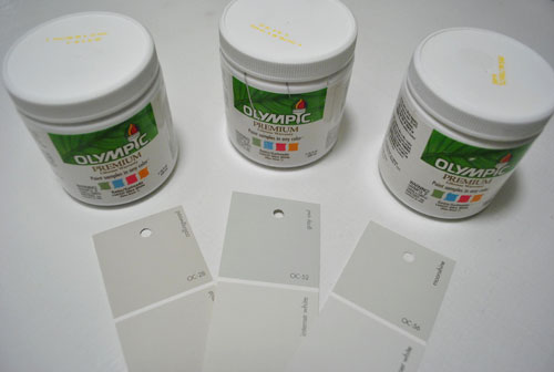
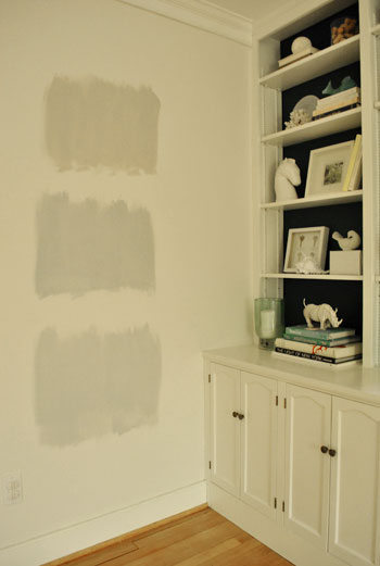
They are, from left to right: Collingwood, Grey Owl, and Moonshine (all Benjamin Moore colors mixed in Olympic Premium No-VOC samplers from Lowe’s – which are about $2.50 a pop). Of course, in an effort to prove her paint-psychic abilities, Sherry called her favorite before even breaking out the paintbrush. Can you guess which one it is? Hint: it rhymes with “spoon mine.”
Here they are in the future dining room, painted in that same order (with Collingwood on top and Moonshine on the bottom):
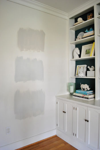
We just did one coat with a paintbrush (it had great coverage) doing our best to keep the edges feathered so when we eventually paint over everything we aren’t left with slightly raised squares where we tested (which is why we didn’t use painters tape to make perfect squares that also might be visible after we paint over them).
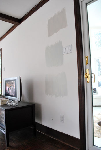
And ever the overachiever (or just someone who loves to paint), Sherry finally embraced the test square method and went ahead and painted big swatches in the family room too. One set near the TV…
…and another set next to the big window (since it gets a different amount of daylight).
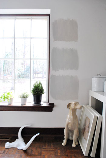
After all, one of the great things about these testers is that you get to see what certain colors look like throughout the day and in varying amounts of daylight and artificial light. We do this with the small paint swatches too, but it certainly was nice to judge a color from across the room for once.
Speaking of different lights, here are all of the colors again at night when things are much yellower from the artificial light (they’re all painted in the same order as listed above, by the way):
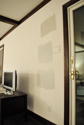
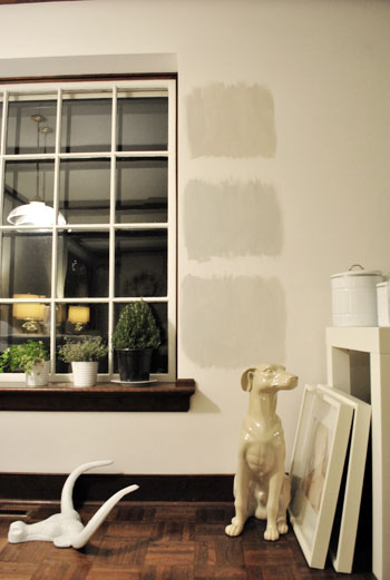
So after a couple of days I finally admitted that (say it with me) Sherry was right all along. Moonshine, the one on the bottom, is by far our favorite of the bunch. Collingwood (the top one) almost won us over, but it’s so warm/tan that it reminded us a lot of Glidden’s Sand White, which was in our first house’s living room and office. We love that color, but it’s not gray enough for what we want this time, so in the spirit of doing something fresh and new we crossed it off the list. And Grey Owl (the middle one) read as too green/blue in our house’s light, so we worried it too might not immediately read “gray” and instead might be “muddy blue-gray” which is what we had in our last house’s bedroom and kitchen.
Moonshine is probably the “purist” of the grays we tested, and it almost has a soft shimmery quality to it – like there’s some silver mixed in. We’re excited about it because it’s definitely dark enough to make the moldings pop (especially once we paint the ones in the living room white) but it’s not too bright or saturated to compete with bolder curtains, art, and accessories that we plan to introduce. Now we just have to cross our fingers that we can find the energy to paint the two largest rooms in our house… and the hallway that connects them. We actually started the job today- but with baby & blog duty going on at the same time, it might take us a few days to get ‘er done. We’ll share pics as soon as we’ve got ’em though!
Have any of you used the paint tester method to choose a color? Did it confirm your feelings or send you in a totally new direction? And dare we ask how long the test squares stayed up before the room finally got painted completely? Ours were up nearly a week, but we could totally see how that could turn into a month (or a year) if you still weren’t 100% sure which way to go…

Sarah M. says
Youngsters, I was so happy when I saw that you guys were ‘going gray!’ We painted our LR a fabulous green/gray/blue color, Seafoam Storm (Valspar Signature), and have been trying to figure out what to do with the rest of the rooms. (We have an open floorplan, so when you walk in the front door, you can see all the way to the back of the house. There’s a small ‘hall’ and then it opens up to the kitchen, dining, and living room.) Anyway, guess what color idea I pitched to my husband about a month ago: GRAY!! I’m in gray love. We usually tape a few chips to the wall, let those sit in the room for a while (like up to a year sometimes!!) and then when we think we’ve decided, pick up a test can and paint a huuuge section (like 6×6). I can’t imagine painting an entire room w/out living w/ a large sample on the wall for a while. I’m too chicken, and too lazy! Haha! Anyway, I just saw your post with the results, and I’m loving the way Moonshine works w/ your rooms!! Good job! (and btw, that’s way faster than we would’ve been able to do it. I think it took us like 5 days to paint our LR, no joke!)
Laura says
Um, yeah…I have paint swatch colors painted in my hallway/stairway/landing right now in about five different spots to test them in different lights. And a big ole’ piece of foam board with what i think is my fav sitting on the sideboard in the dining room to see if I REALLY like it.
Only problem: they’ve been like that for um…about 4 months. {sigh} One of these days…
And I just bought 3 testers for our master bedroom this week to do the same thing. I think I have decorator’s ADD. :)
Jan says
So we just went through a year-plus long complete renovation on our home (living with my in-laws the whole time, but that’s a whole other Oprah show…) and had to choose paint colors for every wall. Oy. Since there were no walls – literally – in our home on which to hang swatches, I sat in the Benjamin Moore store for about 3 hours one day with samples of tile, flooring, etc. that we had already chosen to help guide my paint decisions. With NO help from the lazy staff (again, another Oprah episode) I chose most all of the colors we needed. Funny – Collingwood was my choice for our master bedroom, but after it was painted I found it too light and opted for my original choice of Sherwin Williams Morris Room Grey (I’d seen it in an Ethan Allen store – GORGEOUS). All the colors in my home have some grey in them (Benjamin Moore Sag Harbor Gray, Richmond Gray, Kinsport Gray, Ashely Gray, Whitall Brown, Annapolis Gray, Nantucket Fog – wow – I hadn’t realized how many names had the word ‘gray’ or ‘grey’ in them. And BTW – what’s up with 2 different spellings of that color anyway? As a teacher, that drives me crazy. But I digress….. The colors are so calming, and everyone who comes over always mentions that. We did the color tester on the outside of the house – I think I had about 8 different colors up on the clapboards and another 8 on the stucco. My neighbors were not happy, as the house was beginning to look pixilated…. All said and done, I am really happy with all of the colors I chose. I was incredibly indecisive with the hundreds of decisions I had to make regarding the renovation – paralyzed is more like it. Too many choices = analysis paralysis. So you two, I LOVE reading your blog, and am inspired by your passion, your sense of humor, your decisiveness, and the fact that you just DO IT instead of procrastinating. You are a beautiful family. Happy family = happy home = well adjusted munchkins = happy life. It’s all good. (My apologies on the blog-like length……….) Happy Friday :)
Shannon says
You know what? I have painted a million rooms, and I have never been patient enough to to do squares on the wall to test in different light, etc. And to be honest I am never really happy with my decisions. Painting is so much work,so I am never willing to re-do it. I am so inspired by the time and effort you put into all your projects. It makes me want to be a better DIY-er.
carey says
PS – GOOD FOR YOU both for deciding to stick to a blog and ditch the potential problems of reality TV. LOVE it and love your blog. :D
Sarah W says
We have Grey Owl in our bedroom,it doesn’t read blue or green, but I wish it was a little darker. One test spot against a white primed room made it seem dark enough, but on the whole wall it is very light. We did two coats and I am keeping with it. We hope adding crown molding, fresh ceiling paint in a crisp white, and fresh trim paint will make it look a little grayer
Andee says
Hi!
I do not live near a BM paint store but I’d like to see how this color may look in my home. Can you please share the mixing formula for the Olympic Premium No-VOC that was used for ‘moonshine’.
Thanks.
YoungHouseLove says
Hey Andee,
Not sure if this will work since we got it color matched to Olympic Premium paint (base 2) but here’s what the label says:
Premium #1 72101
101-16, 107-13
Good luck!
xo,
s
Yezenia says
I have a grey fetish myself. Like my niece says, I need another grey room like I need a whole in the head. But whatevs. I actually painted my bedroom a charcoal grey (vs dark teal) based on your advice a long time ago when I asked you and your readers on facebook. Behr’s Dark Granite. LOVE it btw so thanks for that.
When I bought my house last year, the previous owner had painted the living room, dining area, and hallway salmon. On purpose. To sell the house. Well, being the sucker that I am I bought it despite the hideous color. I took your advice and got 4 samples of different greys, and chose a khaki grey that looked good in a small square on the wall, Behr’s Burnished Clay. However, despite using the paint+primer stuff, now in certain light my walls look lavendar. I’m thinking the salmon is still showing through. But I am too cheap at the mo to have my painter come back and do it all over again. I really like Behr’s Silver Tradition, which I used in the little rental I have attached to my house. It’s very light and bright, but grey enough so the moldings and trim pop nicely. Still, I’d love a warm grey with a little khaki thrown in.
Heather says
Love the color you chose!
We’re in escrow on our first house and are trying to pick paint for the entire house- kinda overwhelming! The whole place has to be painted before we move in so we were wanting to put color on the walls to begin with since we’ll be painting everything anyway, but we can’t exactly put up paint samples for a long period or even get to see the colors in the different lights/time of day.
Any tips or advice?
YoungHouseLove says
Hey Heather,
We’d get a bunch of sample pots in colors that you want to “try” and paint big squares of each one on poster board. Then when you’re in the house for a walk-through or something before closing you can hold them up and at least get an idea of what they’ll look like in the space. Good luck!
xo,
s
Vicki says
Hey guys!
So, we recently painted our main hallway BM “Sterling” (which is a similar grey) with BM “Winter Snow” (a glossy bright white). We’re having some trouble painting the bedroom doors that are in that hallway. First I thought it was classic procrastination rearing its head, but now I think it’s a different issue. I don’t think I’m sold on painting the doors white to match the trim. We have lots of pops in the same bright yellow that you guys love (we are planning to paint our front door that color :). My question is, would it look too shocking to paint the hallway doors that bright yellow? Do you have any other suggestions?
Thanks for the help!
YoungHouseLove says
Do it!!!! It would look so cheerful and fun! We actually have a plan to paint all the doors in our house a deep rich color (someday!) so we’re all for it!
xo,
s
Janet says
We’ve used the paint swatch method a few times. Usually we paint a large piece of bristol board and move it around the room to see the colour in different light. Last time we did that and painted a spot between two windows at a corner. We changed our colour choice as a result. It has definitely been worth the effort (and the expense of test pots).
JessP says
Dear YHL,
Do you have time to answer yet another “gray paint” question? I painted swatches all around the bedroom but my eye keeps comparing the swatch colors to the current wall color which is a not-so-pleasing ecru. I’m convinced this is throwing off my color-choosing mojo so I painted the swatches again – this time over crisp, white primer. The difference is staggering.
Do you recommend choosing paint on a white background, or does it not matter and this is simply another hurdle I’ve created for myself?! Thank you.
YoungHouseLove says
Hey JessP,
It definitely helps to see swatches on white! So try painting them next to white trim if you have that – or even hanging white poster board next to them so you can compare the swatches to that tone. Good luck!
xo,
s
Katie says
We always use the paint swatch method. At one point we had a wall in our house painted with 6 completely different colors (green! no, yellow! blue! lighter green! muddier green!). We went with the first color, of course.
Although one time i inadvertently tortured my husband with paint swatches. I painted the same color on several different walls in one room (because it had really weird lighting). A couple days later I asked him about it and he admitted he kept looking at them and he couldn’t see the difference…he’d thought that they were all different and he was supposed to be choosing. Oops. Communication fail.
Trinity says
I am loving the gray! We repainted our bathroom and I wanted a nice classy gray to contrast with the white countertop and fixtures. Took me forever to decide since everything looks so different once it is on the walls! Finally settled on Behr’s Dolphin Fin, but 25% lighter. That over a coat of primer gave me the gray I was after!
Will says
Yay moonshine! After many testers in our master bath reno a year ago we went with Moonshine too! Love the color!!
Margie says
Hi John and Sherry, Im hoping you can help me. I want to paint my basement the same color as your livingroom/diningroom. When you went to lowes how did you get them to color match? did you just have to tell the BM moonshine or are there numbers? also do you have any suggestions if my lowes doesnt have the info in their computer?
Thank you so much!!!
Margie
YoungHouseLove says
If you know the brand and name of the paint they can usually look it up in the computer these days. If not, you might have to scrape off some of the paint or take a little wall chunk with you and have them scan it (or bring home a ton of swatches and hold them up to see if one matches exactly).
xo,
s
Lauren says
I just painted our bedroom this color. Thanks for the color inspiration:)
Lyn Colton says
We are remodeling our master bathroom in our new house. Put slate grey floor tile, and tiled the wall above the shower enclosure. Used 6″ grey marble tile and accented with 1″ glass tiles in various shades of blue. We used grey thinset and grout, which makes the blue tiles seem blue green. I love it! I’m trying to stay neutral on the walls, so I picked Tinsel Baum and Gray Mist for the ceiling. These are grey paints with blue hues. But I didn’t notice when I got the paint, that the colors on the cans were not an exact match with the chip color! I wasn’t there when the bathroom was painted or I would have stopped and taken the paint back to Lowe’s. The lighter color had too much purple, and the darker grey was too light, so there wasn’t the contrast that I’d wanted. I’m thinking that before the toilet is installed tomorrow, I’d better go back to Lowe’s and either get a sample of the “right” grey to paint on the wall behind the toilet or try to get them to add tint to the original paint to make it grey and not lavendar grey. It’s just enough off that it really doesn’t compliment the slate floor. Will Lowe’s correct the problem or do I have to try and do it myself by mixing paint samples into the original paint? Actually I couldn’t do any worse than they did! At least I know to be VERY careful with the red! Am I right in thinking that to get back to a neutral grey I need to add a little yellow or yellow-green as well as black and white? I’m going to paint the guest bathroom this weekend, but ONLY if I can get the original paint neutralized or subdued to a light shade of grey without blue, red, green or purple hues!I like Behr’s Grey Frost or the Moonshine.
YoungHouseLove says
Oh man, so sorry for that trouble! I think if you bring it back and tell them it’s off they’ll try to match it correctly free of charge – they usually are happy to do that if it’s their error! As for your plans, they sound lovely! Good luck!
xo,
s
Lyn Colton says
Thanks. We just got back from Lowe’s and you were right, they did what they could free of charge. I felt kind of bad ‘cuz the girl at the paint desk tried her best to change the color to what I wanted but the paint can exploded in the mixer and made a mess for her to clean up!She couldn’t put the second one in the mixer, so she mixed it by hand, and from what I can tell it looks great. She said that she couldn’t put anymore tint into the paint because then the paint wouldn’t dry. I think she did great and I can’t wait to try it out. I guess it’s a good thing that both the rooms we are painting are small, cuz there’s no way to match the paint if we run out! Definitely will do it right and use a good primer first. I’ll post pics when it’s done.
YoungHouseLove says
Aw, good luck! So glad they helped you out!
xo,
s
Lisa says
Early morning mist by BM is a light nice beige/gray color that I used in my older son’s room. It changes nicely in early morning and afternnoon. I recently had a realtor walk through my home (potentially selling) and she loved this color! I have Shaker’s Beige in the hallway (previous owner used this color throughout home) so this light grayish color blended nicely. Hope this helps!
Alyssa says
Hi! Sorry to ask a question on such an old post, and I’m sure you’ve blogged about this before but I can’t find it: I’m about to start painting the rooms in a new place, and am curious why you usually color match to the Olympic paint? Is it the no-VOCs, a budget thing, a quality thing, or a combination off these factors? Thanks!
YoungHouseLove says
It’s budget-friendly and has no VOCs. It’s really all about what you’re looking for (a faster job with probably only one coat instead of two = pay for Ben Moore, if you don’t mind doing two coats and you’re more into saving money than time = Olympic). Hope it helps!
xo,
s
Ted Baxter says
# 3 – moonshine is the best out of these 3!!!!!
Alicia says
Ha.. I just clicked through from today’s post while watching my fiance roll Gray Owl on the living room walls. We actually sampled Gray Owl, Moonshine, and Harbor Gray.. so weird! It was actually Moonshine that read as too green in our lighting, so we are going with Gray Owl.
I wish that I would have found this post a couple weeks ago… I usually just pick a color and go, but gray was sooo hard to pick.
Shawna says
Help! I’m trying to select paint colours for my living room. It has cherry-stained bamboo floors, which looks like a red-brown – like old-fashioned mahogany. I’m trying to find a calming neutral. We spent a weekend painting a month ago, trying out a light grey, which turned to light blue! Now, I’m paralyzed trying to pick a new colour. These red floors are quite dark so we’re looking for something light but not white. Thanks for any ideas! :)
YoungHouseLove says
Ooh a soft celery color like Nantucket Breeze by BEn Moore would be pretty.
xo,
s
Joan of Arc says
Loe moonshine! Which white trim did you go with and, what did you paint the adjacent entry hall?
YoungHouseLove says
We like Benjamin Moore’s Decorators White for all the trim in our house, and that adjacent entry hall is also Moonshine.
xo
s
randel says
i’m going with smoke embers (BM 1466) for my daughters bedroom, which is a little darker than this. i’m wondering if this would compliment that color and look good on her ceiling?? do you think it’s pale enough to be a silvery grey but not too dark for that? would love to know your thoughts! thanks!
YoungHouseLove says
It sounds gorgeous! I would tape the swatch on the ceiling and see how it reads, but I bet it’ll be great!
xo
s
Kristi says
I love the BM Moonshine Color, is there any way to get the color code for color matching? My Lowe’s does not have that in their database. They gave me their Valspar Moonshine which is a yellow, NO WAY JOSE! Thanks in advance!
YoungHouseLove says
Weird! Anyone have the code? We don’t see it on our desk or in our posts, but maybe try benjaminmoore.com and look up Moonshine? Or call a local BM store and ask them?
xo
s
Amy P says
I just painted test samples of Ben Moore’s Metropolitan (too green), Gray Timber Wolf (too blue), and Eternity (looked gray!) Painted the whole living room Eternity and boom…looks like a baby blue nursery. Trying to decide if I should change it or just paint the rest of the house and get it over with.
YoungHouseLove says
Oh man! I’d try putting the room together a little more (hang curtains and some art to break up the walls) and even try changing the light bulbs in there (something cooler instead of a warm white might make the walls look more gray?) and then decide. Good luck Amy!
xo
s
Camille McBride says
These comments are too funny. I too are in the same predicament. Been stewing for 5 months now on what grey to go with in my open concept trad house. I have 50 shades of grey swatches going on throughout my entire first floor. Painter coming in 2 days and still cant decide! All too green or too blue. White is starting to look like an option!