We finally got around to painting the area under the chair rail in the office a shade darker than the stenciled wall above it so it feels more balanced (as mentioned here). It was a little top heavy with the stencil going on above the chair rail and nada happening underneath, so I slid one square down on the Benjamin Moore paint swatch with the wall color on it (which is Moonshine by the way) and landed on Gray Horse (which we also had color matched to Olympic No-VOC paint in satin). Total spent: $10 for the quart of paint. Das it.
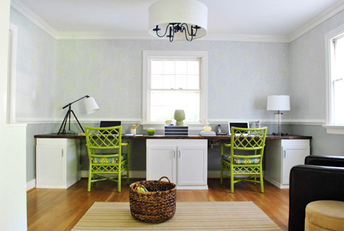
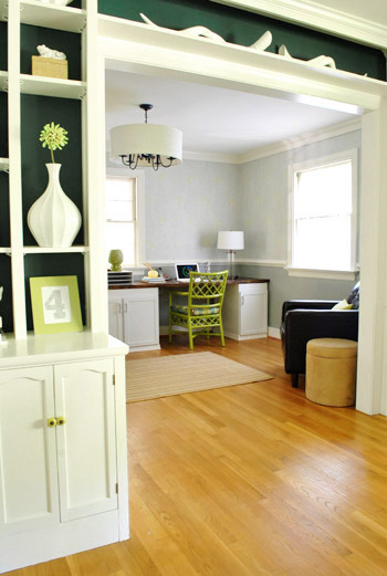
Doesn’t it look more grounded now? Hence the title.
You might notice that we returned the matching metallic-y gold gourd lamps that we used to have in favor of these two that were also from HomeGoods (one’s a tripod desk lamp in ORB with a white shade and the other is a glass based lamp in ORB with a white shade). They don’t match but they definitely go, and it’s nice to break up all the symmetry just a little (mirror image desk + centered window + two matching chairs =über balanced, so we thought it could take a little imperfection).
The not-matching lamps might bother you without any art on those walls (yes, mom I’m talking to you) but I promise once we hang art there won’t be quite as much focus on the lamps and they’ll fall into the room and be just another layered element that will make more sense as the whole picture comes together. Or you’ll still hate them but will still love me as a daughter (also for mom).
Oh and we brought in the dark leather chair from the bedroom since the dark wood top of the desk looks pretty nice with that guy nearby (it just held mounds of clothes in the bedroom but actually gets used in here). And a bright green lumbar pillow that we already had (you know pillows are like nomads around here) tied in the new green desk chairs that we painted a few weeks back.
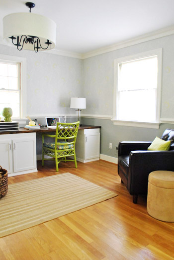
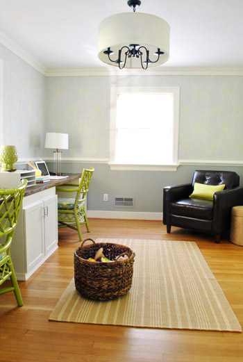
For some reason I’m especially enamored with the file cabinet thanks to the colorful accessories. Gray walls + white desk & cabinet + brown chair & desktop = a craving for color (hence the addition of the green chairs and a few other punchy accents).
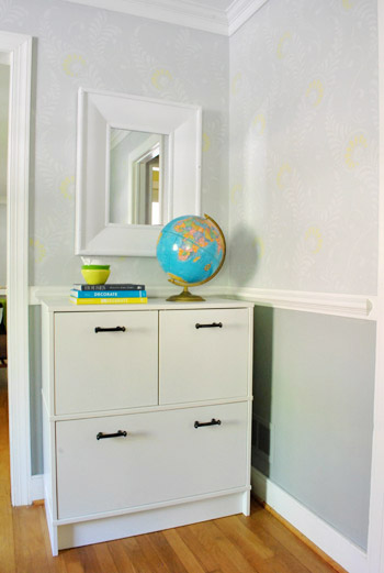
I tossed these books down with some stacked bowls and a ceramic pear and said out loud (yes I talk out loud to myself all day) “oh man, someone should base a room on these colors.”
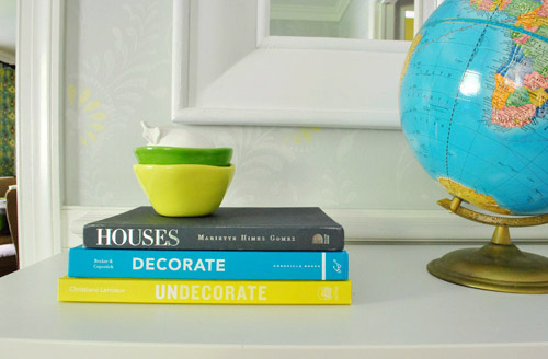
Then I realized that:
- the yellow tones in the bowl and bottom book are in the chairs’ upholstery and the wall stencil
- the green bowl mimics the color of the desk chairs
- the dark gray book on top is just a shade or two darker than the darker gray that we just added under the chair rail
- the turquoise in the globe and middle book are also in our desk chairs’ upholstery fabric
- the glossy white from the ceramic pear relates to the white trim, desk, and file cabinet
Duh, we sort of did base a room around these colors. Purely by accident. Gotta love when you back into things like that (trial + error = not a bad way to go). So I highly recommend white + green + yellow + gray + turquoise. Oh yeah and some chocolate brown too (maybe someday I’ll ORB the globe base to represent that color, you know when I’m just sitting around twiddling my thumbs).
Much like every other room in our house the office is nowhere close to “done” (as in, it’ll probably take us a few more years of tweaking like our first house)…

… but it’s definitely feeling more finished than it did a few months back when it looked like this:
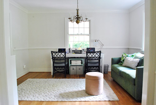
So far we’ve:
- built the wall-to-wall desk (more on that here, here, here, here, here, and here)
- brought in an Ikea file cabinet (more on that here and here)
- added a toy basket for Clara (function = the most important thing)
- painted the walls soft gray (BM’s Moonshine – more on that here)
- painted the chandelier indigo & added a huge drum shade (more on that here)
- stenciled the walls (more on that here and here)
- painted and reupholstered the desk chairs (more on that here and here)
- painted the bottom half of the room darker gray (BM’s Gray Horse)
- brought in a chair for the corner (Clara demands storytime in nearly every room)
Still gotta:
- hang art
- add some window treatments
- figure out a rug (the existing one is too wide and not long enough)
- add a floor lamp to the chair corner (for some height) along with a proper side table
- tweak a ton of stuff (we’ve learned it’s par for the course for us… stuff evolves as we go!)
What have you guys been up to? Any other fellow WP’s (weekend painters) out there? It was a nice weekend for outdoor stuff too. Anyone seeding or weeding or transplanting? We definitely have the outside itch to tackle some of that stuff before it gets too cold…
P.S. Want to see our favorite neutral wall color that we’ve used in a number of rooms?

Emma says
Looks great! I’m keen to see your artwork choice because I want to stencil my entry way and still have art but I’m skeerrd. It’s kind of intimidating to hang art on a wall with an allover stencil – even cool slightly muted ones like yours (and hopefully mine).
Helena says
I LOVE the colors! The bright green chairs look so good with the dark green from the other room (as you look through to the room you adjusted).
Morgan says
Was there a discussion on who got what lamp?
YoungHouseLove says
Yup, here’s how we landed where we are now: we’re both righties, so we use the space to the right of our computers most when it comes to sketching and taking notes. Since the globe on John’s side takes up less of that space, it made sense to put the tripod one on my side (since it’s to my left, where I never write – but takes up a decent amount of space there).
xo,
s
Traci says
I love the globe! Have yall ever considered starting a globe collection? Mixing and matching all shades and sizes?
We did spend part of the weekend painting – just our halloween costumes though! Only a few more weeks left until the 31st!
YoungHouseLove says
Yes- I’d love that! I have a few rooms pinned on pinterest with a ton of globes grouped in masse. Amazingly cool- and John loves them (and maps) so much that he’s be into it too!
xo,
s
Erin S says
I love the Gray Horse color, although I simply cannot read it or say it aloud without channeling the “Dark Horse” singers from Dr. Horrible’s Sing-along Blog. And if you’ve never seen DHSB, please open a new tab immediately and do so. You’re welcome in advance. =)
YoungHouseLove says
Haha- off to check it out!
xo,
s
Beth W. says
Yay for DHSB! I LOVE Nathan Fillion and Neil Patrick Harris! I always get “Caring Hands” stuck in my head. Also, have you two seen Firefly? You should definitely check it out if you like DHSB or either of those actors. It’s AMAZING.
YoungHouseLove says
Thanks for the tip! We’ll have to check it out.
xo,
s
Chrissie says
“I just want to be an achiever… like Bad Horse.”
“The Thoroughbred of Sin?”
“… I meant Ghandi”
Paige @ Final Clothes-Out says
I read the title and thought you guys bought a rug. Ha ha.
But this is cool, too! I hadn’t really thought about the bottom half of the walls, but it *does* look better this way. Good call!
Cara says
Now I’m really hoping the retail fairies send a rug in that colorway your way….
Kaylyn says
I was a WP this weekend too! Well, thanks to my mom. A few weeks ago, we painted my room orange, but it was totally the wrong color. So (by myself) I bought new paint, painted over it, and it was a splotchy mess. Sigh. So I called my mom, she came, painted, and it is miraculously better! Instead of being tangerine orange, it is now a beautiful “Spiced Pumpkin” orange. So happy!
YoungHouseLove says
Sounds delicious and perfect for fall!
xo
s
Erin says
love how its coming together!!
I too have a fixation with globes and my collection has grown to be 5 large ones (two light up oldstyle!) and 5 medium to small ones. I also want to spray paint the base on some of mine taht have seen better days. I saw a trick to wrap the globe in foil for an easier spray paint job. :o)
YoungHouseLove says
Love it!
xo,
s
Meredith @ La Buena Vida says
It’s coming together so well!
I laughed at the Decorate/Undecorate pairing :)
YoungHouseLove says
Haha, isn’t that funny?
xo,
s
Kate A says
Where did you get that basket? I love it!
YoungHouseLove says
Target! $25.
xo,
s
Kaytie @ GardenKitchenHome says
Definitely use some ORB on the globe base! I actually covered an entire globe in ORB, and painted the continents in copper. Then I pushed pins into the places my fiancee and I have visited. (Inspired by your map.) It’s super cute, but be warned… If you do this, it’s kinda hard to figure out exactly where the land masses are. Globes do have some relief for mountains, etc, but not enough to follow entirely as a guide.
Maybe one of these days I’ll post pictures. But I don’t have any yet. I’ll let you know if that changes.
YoungHouseLove says
Haha- that’s so cool!
xo,
s
Blair says
I love the grounded effect! Sadly, I haven’t done anything too big this weekend but I did make some super cute pumpkins because I was in the mood. http://thefirstapartment.blogspot.com/2011/10/halloween-mini-pumpkins.html
Also, I love the titles of the books “decorate” and “undecorate” hahahaha
~Blair
YoungHouseLove says
Cute!
xo,
s
partyofsix says
The room is really coming together! What do you think about using a cow-skin rug for the floor covering? (Maybe one in ebony tones??) And, if not the real thing, I betcha y’all could stencil a cool one. For some reason I’m seeing the post title that day as “Needs more cowbell…” (an old SNL skit)
YoungHouseLove says
Haha, a faux cowskin would be so much fun!
xo,
s
Maureen K. says
I sanded a little clover leaf table to prep it to paint a deep, dark purple (Glidden’s Black Tulip). We are working on making a couple of photo walls (a la YHL!) and this will go in the corner between them. It’s my first solo DIY project, I’m so proud!
YoungHouseLove says
Ooh sounds awesome! Send pics when you’re done!
xo,
s
Maria says
I finished painting my own office this weekend. I went bold. A dark blue with contrasting white shelves and a white door as a desk. Still have lots to do but your projects have inspired many here and my house is becoming a home. So thank you.
I think a plant or some flowers, real or in art, would be a good addition to your office.
Ami says
Well, even though I said I wasn’t speaking to you guys because of the horrible, hate-it-but-cannot-get-it-out-of-my-head spider pictures, that office is looking so good I just had to comment. I know some said they didn’t think the green chairs went but I could not disagree more. That pic from the dining room (where you can see the chair, leather chair and deep colors in the built-in) would have sold me if I wasn’t already. That looks gorgeous. Now maybe I can get that blasted spider picture outta my head.
YoungHouseLove says
Haha, so glad to redeem ourselves after scaring you with our photo of Charlotte (we named her so she’s less scary).
xo,
s
Crystal says
I like the darker paint color you chose and am so loving that stencil.
I finished up our home office, too. Like you, there are a few more tweaks I’d like to make but for now I’m calling it done.
http://theweekendhomemaker.com/youve-come-long-way-baby
YoungHouseLove says
Looks gorgeous! I love that we have matching curtains! Haha.
xo,
s
Kim at Yellow Brick Home says
I agree with your color combo – it’s so fun and fresh and airy and beautimus.
Also, the mis-matched lamps = love!
Jane says
Really like your office it’s coming together beautifully.
I think open shelves like as in this pic(link below) would look very neat in your office and balance the bottom heaviness from the table and everything down on that wall.
http://casualhome.ca/files/20__guilford_office_335x360.jpg
YoungHouseLove says
We definitely talked about some open shelves but weren’t sure with the built-ins behind it (in the adjoined dining room) if it would be too many shelves in one view.
xo,
s
LaMadre says
Love the new lamps. I totally see your point of too much balance and it really gives the space a collected over time look – which I think is so important for a house to really feel like a home. Once again, well-done!
Brittany says
We did a little painting outside…working on finishing a project that’s been brewing for almost two years. Still have one more coat to go! Oh well, at least we’re not bored on the weekends :-)
YoungHouseLove says
Ooh send pics when you’re done!
xo,
s
Jos says
i absolutely love that tripod lamp. my need for order and symmetry wishes you would have bought two, but i will trust your judgment!
by the way, i had my first YHL dream last night. i came over to check out your bathroom for design ideas and then spent the entire day trying to talk you out of hanging heavy chains on the walls in your dining room. super weird.
YoungHouseLove says
Hahahah, hilarious!
xo,
s
Jamie@NoPlaceLikeVermontHome says
Oooohhh!! Love, love, love the darker color on the bottom. It not only makes the office look a little more formal (not sure if that is the right word I am looking for, but it looks less whimsical with a darker base), but it also complements the dark green in the dining room quite nicely. Well done!
heather says
hi sherry –
thinking of using a citron in a room in our home..do you have a shade that you like? i am not the best at picking paint colors…
i love the greys you used in this room!
thank you!
YoungHouseLove says
We love the color of our kitchen (Benjamin Moore’s Sesame). Hope it helps!
xo,
s
Teresa says
Wow…. what an amazing transformation. I bet you guys are enjoying spending all your time in this room now huh?
What about a bean bag in there for Clara? So she can hang out and “work/read” with you guys?
YoungHouseLove says
Lately she has been pulling herself up on the brown armchair and reading. It’s kind of hilarious to watch. We’ll ave to catch it on video. There’s lots of grunting.
xo,
s
Teresa says
LOL!! love it. That will be one of those videos you pull out when she is older..
Pip says
Love how all the tweaks are coming together – a home office should be grounded and still creative / heads in the clouds. Had to laugh at your comments to your mom. You move out, pay your own way, make your home lovely and moms STILL have an opinion ;) or ten. But only because they want it just right for you. I feel sorry for my son in advance.
seriouslysassymama says
I just bought some pansies to plant, and I have a dresser to redo.
Amy says
What about a strip of Harper or Lolita O’verlay on the blank panel at the top of each desk base unit? I feel like the bases need a little something there.
YoungHouseLove says
Always a possibility! We’re waiting to add art and window treatments to make sure whatever we do there isn’t too much once the blank walls are gone!
xo,
s
Whitney Dupuis says
Love it! What a difference a shade makes!!!
Tiffany Morrison says
Lovely!
mp says
I’ve backed into a lot of color-matching too — it’s a wonderful thing!
Tiffanee says
The chairs look fabulous in green. I’m partial to the color since I had used that same color on my patio furniture this summer to take it from boring tan to a bright pop of green. It made all the difference in the world. We added some new throw pillows as well.
As for the rug, it would be fun to do a FLOR rug in the room.
YoungHouseLove says
That’s definitely something we’re thinking about since we could build it longer and less wide!
xo,
s
Heather says
That is such a pretty room. LOVE everything about it. My least fave is the chairs, and I even adore those!
This weekend I painted trim. Fun! I finally finished my entry way over the week (striped walls, fun contact paper window treatment and crisp white trim) and I am SO in love with it!
http://heatherlynnnabers.blogspot.com/2011/10/my-entry-way-makes-me-smile.html
YoungHouseLove says
So pretty! Love the contact paper window design!
xo,
s
heather says
We painted and relaid our our pantry/laundry area and it is already so much better. I’m building a reclaimed wood shelf to go above the washer/dryer to help give it a rustic look. Our color pallet to our house is pretty simple – take a handful of natural crushed stone from a walkway and you pretty much have it. Whites, grays, tans, browns but with pops of color throughout. It might all change when we redo the house, but for now I’m liking it. Farmhousey but still crisp and clean.
This weekend though I also rehab’d a rehabed barn window. I originally made it into a chalkboard and now turned it into a chalkboard/corkboard.
http://www.likeacupoftea.com/reclaimed-barn-window-household-organizer
YoungHouseLove says
Love it!!
xo,
s
Meagan says
I love the mismatched lamps! Totally keeps things interesting. And I love the more grounded color and adding in the leather chair. This room is looking so fabulous!!
Ravenna says
This article on Treehugger reminded me of y ou two! http://www.treehugger.com/files/2011/10/oud-now-reclaimed-cabinets-splice-old-new-styles.php Y’all ought to look into partnering with them in some way; sustainability and all :)
YoungHouseLove says
So cool!
xo,
s
Penny says
This weekend we worked on painting a huge built-in outdoor bench my husband made. Still painting today! Sitting here now with paint-stained fingers – I had to take a snack break and read your blog to get motivated again!
YoungHouseLove says
Aw thanks Penny! Go get ’em!
xo,
s
Penny says
Aww, that made my day $herdog. That was just the boost I needed!
YoungHouseLove says
So glad!
xo,
s
Wrenaria says
The darker wall was a good call! If you get really stuck on finding a rug the right size, you could probably get one custom cut to the size you need and have the edges bound at a carpet place. I think I saw Emily Henderson do that once on her show.
I’m looking forward to see what kind of art you decide on. Hopefully that’s coming soon? :D
YoungHouseLove says
That’s a great idea if we can’t find the right size! As for soon, not sure we can promise that! We’re in the middle of lots of kitchen stuff and want to tackle some outside stuff before it gets too cold. Haha.
xo,
s
Wrenaria says
Fair enough! I am equally as excited about more progress on your kitchen! :D
YoungHouseLove says
Haha- yeah, that room is a doozy! We’re hoping to be done by Christmas…
xo,
s
Brynn says
*sigh* Gray Horse is totally my jam!! My husband and I painted our bedroom that color in our last apartment, and in our new house (yay!) we missed it so much that we now have a Gray Horse family room. The color does this amazing transformation from morning to night as the light changes. It has a crazy depth to it that you can probably really only appreciate in person. I hope you’re loving it! The office looks amazing, btw. Great job :)
YoungHouseLove says
Amen- it’s the coolest color ever! We love the color of our bedroom already but we’ve already mentioned that it sure would look awesome with some Gray Horse in there…
xo,
s
Jen_nifer says
Your “To Do” list on the mirror is empty!?!
YoungHouseLove says
It got too crazy so I snapped a photo of it and wiped it down, just have to get it back up there in a more organized fashion. Haha.
xo,
s
Angela says
I love this. I love how you are pulling it together when all of the elements seemed unrelated at first. It is amazing.
Debbie says
after a crappy week dealing with county zoning issues at one of our homes, we decided to treat ourselves for the weekend. so at the last minute tuesday afternoon we hopped in the plane & headed for vegas. won big, saw a couple good shows, shopped, ate amazing food & drank vintage bottles of wine. then on the way home we lost one of the engines in the plane over colorado (dont worry, the plane has more than one so we just limped it to the nearest metro GA airport–no crashing into mountains, we gotz skills). amount won in vegas = $38,420. price of a new engine = $160,000 + having one of our planes down for probably two months. i guess sometimes you just can’t win without losing….
YoungHouseLove says
Wow- so glad you’re ok! And seriously, winning that much money is insaaaaane to a cheap-o afriad-of-gambling girl like me!
xo,
s
Ruth says
#firstworldproblems
linda says
gorgeous (i seem to use that word a lot around your blog!)
i noticed the lamps first thing… before i even read… fell in LOVE with them! the darker grey on the bottom is perfect!
angel p says
Your room is looking fantastic! I also painted this weekend. I bought an awesome 2nd hand wrought iron bed and I primed it and painted it this weekend. Of course, I ran out of paint so I have to go get more for the 2nd coat but it already looks soooo much better. I’m hoping that after a few days the fumes smell will ease up enough to bring it back in the house. (I used Rustoleum spray paint).
YoungHouseLove says
Sounds like such a fun project!
xo,
s
Laurel says
take out the green and you’ve got my wedding colors! white + gray + yellow + turquoise = <3
YoungHouseLove says
Such an awesome combo!
xo,
s
Erin says
I love it when a room evolves and comes together so perfectly! The steps in this transformation have seemed so beautifully steady & organic that I’d almost forgotten how far it’s come. That before-and-after comparison at the end? A.ma.zing!
I broke out my graphic design skills this weekend and created some DIY artwork (+ free printable to share) of my favorite fall quote, and though it’s not as big as an office makeover, I’m pretty proud of it!!
YoungHouseLove says
Love it!!
xo
s
Maria @ Orchard Bloom says
It’s looking great!
Nessa@{CasaBraaflat} says
Wow, what a difference the darker color makes. It looks great. & I am still obsessed with those green chairs!
Loves Moose says
The darker bottom on the walls looks much better. You’ve done a great job with the stenciling and those chairs, but I’m not quite sure why things are feeling busy/heavy with the chairs and desk. I love the chairs and told you so last week, but I’m thinking the pattern and color together (especially the pattern, though) is feeling very busy and that the chairs seem too spindly and small. Something with a solid back and that’s more substantial would help balance the heaviness of that desk, and the chair rail seems to be pushing things down somewhat. But you always give me so much to think about and consider with my own home. I really love your design process and openness with sharing everything.