We finally got around to painting the area under the chair rail in the office a shade darker than the stenciled wall above it so it feels more balanced (as mentioned here). It was a little top heavy with the stencil going on above the chair rail and nada happening underneath, so I slid one square down on the Benjamin Moore paint swatch with the wall color on it (which is Moonshine by the way) and landed on Gray Horse (which we also had color matched to Olympic No-VOC paint in satin). Total spent: $10 for the quart of paint. Das it.
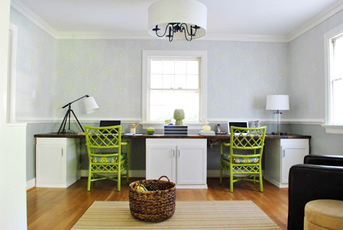
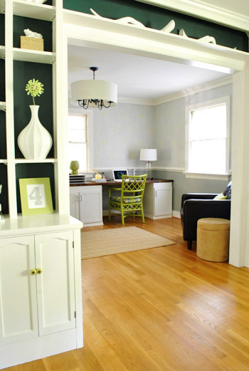
Doesn’t it look more grounded now? Hence the title.
You might notice that we returned the matching metallic-y gold gourd lamps that we used to have in favor of these two that were also from HomeGoods (one’s a tripod desk lamp in ORB with a white shade and the other is a glass based lamp in ORB with a white shade). They don’t match but they definitely go, and it’s nice to break up all the symmetry just a little (mirror image desk + centered window + two matching chairs =über balanced, so we thought it could take a little imperfection).
The not-matching lamps might bother you without any art on those walls (yes, mom I’m talking to you) but I promise once we hang art there won’t be quite as much focus on the lamps and they’ll fall into the room and be just another layered element that will make more sense as the whole picture comes together. Or you’ll still hate them but will still love me as a daughter (also for mom).
Oh and we brought in the dark leather chair from the bedroom since the dark wood top of the desk looks pretty nice with that guy nearby (it just held mounds of clothes in the bedroom but actually gets used in here). And a bright green lumbar pillow that we already had (you know pillows are like nomads around here) tied in the new green desk chairs that we painted a few weeks back.
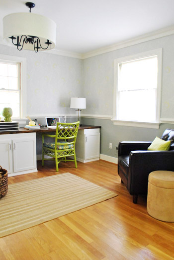
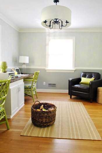
For some reason I’m especially enamored with the file cabinet thanks to the colorful accessories. Gray walls + white desk & cabinet + brown chair & desktop = a craving for color (hence the addition of the green chairs and a few other punchy accents).
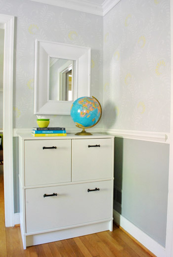
I tossed these books down with some stacked bowls and a ceramic pear and said out loud (yes I talk out loud to myself all day) “oh man, someone should base a room on these colors.”
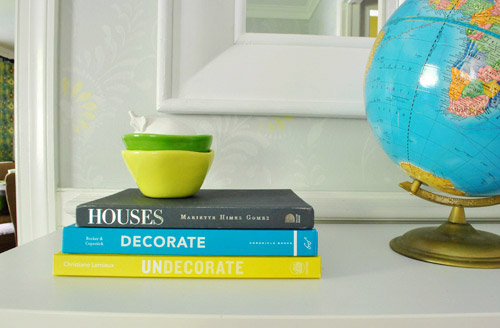
Then I realized that:
- the yellow tones in the bowl and bottom book are in the chairs’ upholstery and the wall stencil
- the green bowl mimics the color of the desk chairs
- the dark gray book on top is just a shade or two darker than the darker gray that we just added under the chair rail
- the turquoise in the globe and middle book are also in our desk chairs’ upholstery fabric
- the glossy white from the ceramic pear relates to the white trim, desk, and file cabinet
Duh, we sort of did base a room around these colors. Purely by accident. Gotta love when you back into things like that (trial + error = not a bad way to go). So I highly recommend white + green + yellow + gray + turquoise. Oh yeah and some chocolate brown too (maybe someday I’ll ORB the globe base to represent that color, you know when I’m just sitting around twiddling my thumbs).
Much like every other room in our house the office is nowhere close to “done” (as in, it’ll probably take us a few more years of tweaking like our first house)…

… but it’s definitely feeling more finished than it did a few months back when it looked like this:
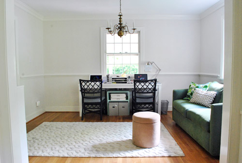
So far we’ve:
- built the wall-to-wall desk (more on that here, here, here, here, here, and here)
- brought in an Ikea file cabinet (more on that here and here)
- added a toy basket for Clara (function = the most important thing)
- painted the walls soft gray (BM’s Moonshine – more on that here)
- painted the chandelier indigo & added a huge drum shade (more on that here)
- stenciled the walls (more on that here and here)
- painted and reupholstered the desk chairs (more on that here and here)
- painted the bottom half of the room darker gray (BM’s Gray Horse)
- brought in a chair for the corner (Clara demands storytime in nearly every room)
Still gotta:
- hang art
- add some window treatments
- figure out a rug (the existing one is too wide and not long enough)
- add a floor lamp to the chair corner (for some height) along with a proper side table
- tweak a ton of stuff (we’ve learned it’s par for the course for us… stuff evolves as we go!)
What have you guys been up to? Any other fellow WP’s (weekend painters) out there? It was a nice weekend for outdoor stuff too. Anyone seeding or weeding or transplanting? We definitely have the outside itch to tackle some of that stuff before it gets too cold…
P.S. Want to see our favorite neutral wall color that we’ve used in a number of rooms?

Sheryl J says
Definitely loving the new darker color below the rail.
SN: Happened to spot this rug with a very familiar print!
http://www.amazon.com/Hand-Tufted-Wool-Carpet-Light-Antique/dp/B0057II624/ref=sr_1_58?s=home-garden&ie=UTF8&qid=1318889256&sr=1-58
YoungHouseLove says
Haha- no way! Love it!
xo,
s
Suzanne says
I think I agree that the room (still) needs “grounding”. It still feels like it’s floating to me, although the darker paint has helped, as well as the chairs. I think maybe it’s going to take some saturated color – I’d love to see some deep orange in there ;) – up higher, art/shades. But it’s looking good!
YoungHouseLove says
Oh yeah still have to deal with the rug and eventually stain the floors darker which should help- along with adding art and window treatments up high. Love the idea of deep orange!
xo,
s
Marina says
I MADE PILLOWS!!! Okay, maybe I should clarify the excitement. I needed something other than the bed pillows (in pillow cases no less) on my sofa. So I decided to make sofa pillows since I couldn’t find anything I liked at a price I could afford (seems to be the theme of all my projects). Anyway, I found some fabric I liked and I found 100% Hawaii made pillow inserts (part of my 10% local commitment) and went for it (it’s not something I’ve ever done before). Well, they came out fantastic thanks to a LOT of help from my friend who has a sewing machine and some mad sewing skills, 6’4″ macho guy who actually knows how to thread the machine. :o) He is also my carpenter for the furniture I needed to make, the complete package that one!
It’s was a great weekend!
P.S. Price = $11 each
YoungHouseLove says
Amazing! And I love that you got help from a 6’4″ macho guy!
xo,
s
Tammy O says
Wow, didn’t think just painting the bottom half of the wall a slightly darker color would make such a difference but I love it! I have to admit, the non-matching lamps are throwing me a bit, but I know it’s true that once you get art up on the walls, they will be much less noticeable. I can’t help it, I like everything super symmetrical. I should probably work on that. So excited to see what you come up with in your kitchen too!
bfish says
Thank you, thank you, thank you for moving the dark brown chair into your office! It suits SO much better there than it did in your bedroom. I also like the unmatched lamps a lot better than the former pair of lamps (which also looked a little too big and un-officelike). Sorry, Sherry’s mom —-
All of your various items are coming together nicely and it certainly is functional as well.
Priscilla says
http://quinbyhardware.com/Products/SKU/4724290/SS-CONTOUR-GAUGE-PINS/HAND-TOOLS/MEASURING-and-MARKING/GENERAL-TOOLS
If you wanted to finish off the sides of the cabinets, this tool would help you get the contour of the molding.
YoungHouseLove says
Thanks for the link!
xo,
s
Kahlia says
Yep! My three brothers, my husband and I were weekend painters! My parents house has needed a desperate jolt into the 21st century so we spent all weekend painting window and door frames, skirting boards and doors white – they were dark dark brown (1970’s!). Still need at least two more coats so we’ll be weekend and weeknight painters for a while yet! I swoon at your light, bright happy office. Your hard work and vision in this room has inspired us!
Chrissie says
Did you have to sand first? Our place was built in ’69 (giggity) and it’s had at least 3 layers of paint that are peeling off. There’s dark brown at the moment, under that is a sort of insipid green, and under that a sugary pink – that’s as far as we’ve seen so far!
I’ve been putting off taking that job on, because sanding all of that paint will make such a mess.
YoungHouseLove says
Eeks – be careful of lead paint! You’re not supposed to sand any peeling paint in homes that old without a lead specialist. I would head to Lowe’s or Home Depot and buy a cheap lead tester kit and test everything (so if it’s not lead paint you can do it yourself and save money). But if it is, I would get in an expert to do that for you!
xo,
s
Chrissie says
Thanks for the tip! I will make sure to check that out. Sadly I’m in Perth, so no Lowes or Home Depot, but hopefully Bunnings might have something similar! (I’m still trying to find some ORB paint around here too! I’m on a mission)
YoungHouseLove says
Good luck!
xo,
s
Dee says
I’m loving the office guys (first time poster, long time ‘lurker’ :)). I’m constantly amazed at the ideas you come up with and wish that we had (in Australia) some of the awesome stores you mention – jealous!
I feel like I’ve been painting my home for 10 years or more; so for something different on the weekend I spray painted some old tea light holders with glass frosting paint. Added some stars and spot stickers to them before I painted and voila! (It was certainly more fun than painting another exposed ceiling beam!)
YoungHouseLove says
Such a fun idea! Love it.
xo,
s
MsC says
Did that very same thing of backing into a color scheme. Picked colors that just made me go “YES!” when we picked out paint colors for our new (but old, midcentury) house. Then started looking at rugs and lo and behold, the chocolate, grellow, burnt orange, and pale blue color combo was everywhere I looked. Now seeing it in drapes, too. Guess I was on to something!
Kathy says
I love how the long desk makes the room look SO much bigger compared to the small desk you had before. It’s a good example about how large furniture in a small space is sometimes a great idea–like using the whole canvas when you’re painting.
YoungHouseLove says
It really is true! One of the biggest mistakes we made with our first house before realizing it was a bad move was lots of smaller pieces in small rooms- a few big things definitely help it feel more expansive!
xo,
s
james malone says
Completely off the DIY (well for furnishing/decor) vibe.. You said in earlier posts, and yes I’ll admit hopping from one link to the next thanks to the “if you like this” anyways what about posting recipe’s that you’s guys makes? I just did a shrimp scampi type thing today completely that turned out great!! (honesty clause: I’m looking for new ideas and I “might” just be a little to lazy to troll the inter-webs) P.S. got curtains up today (thanks MOM!!!) that go with the Joss and Main cushion from your collection!!
james malone says
proof reading before posting isn’t one of my strong suits :-/
YoungHouseLove says
Haha- no worries! We would love to post recipes if we were any good at food. Haha. We like keeping it home and decor focused because we’re not very chef-y (we mess things up all the time). Haha. I guess we mess up home decor all the time too, but somehow we feel more “at home” chatting about it. But a few great sites for recipes are smittenkitchen.com and thepioneerwoman.com. Hope it helps!
xo,
s
Chrissie says
I also love http://www.exclusivelyfood.com.au – it’s an Australian site. I’ve never had a single thing turn out badly from there, and I am horrible at following instructions.
Tammy says
Looks great! Have any extra of the amazing ikat curtain fabric? I think it would look great on the hanging lampshade!
YoungHouseLove says
We do have more of that but we’re holding back. Don’t want it to get too matchy-matchy since it’s in the adjoined dining room too (in the form of huge curtain panels).
xo,
s
Amber says
That room keeps looking better and better. I love it!
Ariel says
That looks great. I like the double desk option.
Kate says
Well I think it looks fabulous!!! I’m so inspired/intimidated…. xx
kelly says
No wonder I like the color of your office. We just had the outside of our house painted in Grey Horse! With cotton ball (white) trim and hawthorne yellow on the front door. Looks great as an interior or exterior color!
Megan says
It’s looking great! :)
Par says
What about a round rug or a cow hide rug? (faux cow hide – in white and brown to sorta match the leather chair / the desk top and the cabinets?)
Just a thought!
YoungHouseLove says
Either could definitely work!
xo,
s
Chrissie says
I love how this turned out. It did feel a little too light before, the darker grey makes a huge difference!
Jackie says
Why is that basket in the middle of the floor? S
YoungHouseLove says
It’s down there because it’s where Clara plays. It’s full of kids toys… story of our life. Haha.
xo,
s
amymargaretc says
Love the darker colour! It’s funny how such a small change can make the biggest impact.
I wasn’t a weekend painter, but I did strip some wallpaper! It only took me 2 years…haha.
Jessica says
Where did you purchase your club chair? It looks like perfect in the corner!
Jessica says
didn’t mean “like perfect”. ha! but it is! =)
YoungHouseLove says
Thanks! It’s from Target a while back.
xo,
s
Jen @ The Decor Scene says
I love the contrast in color. Definitely grounded now. Question, is Gray Horse by BM true gray or is it more of a blue/gray? I’ve been looking for a gray color and haven’t pick this one up yet. Thanks! :)
YoungHouseLove says
It’s one of those colors that changes (and sometimes has blue and green in it- but is mostly gray). Hope it helps!
xo,
s
Jen @ The Decor Scene says
Thanks Sherry! I’ll have to pick up a swatch and see how it looks in our home. :)
Ashley says
I didn’t even notice that the lamps didn’t match until you pointed it out. You have done a great job puting the room together. Love your blog! Thanks for sharing all the work you do!
Celia says
I forgot to mention that in addition to painting the book shelf and the little side tables we took a risk with painting our kitchen wall with blackboard paint! The paint is on it’s third day of curing but we will try it out tomorrow. The kids are looking forward to drawing on it and it should be useful for shopping lists and notes.
Cheryl says
Hey! When did you get new lamps? Looks great!
YoungHouseLove says
We actually mentioned those in the post! Just this week.
xo,
s
michaela says
It looks so good! I adore the pops of color!
Samantha T says
HI GUYS!!! I have something exciting to shar with you that ties in to this room but more so your dining room. Today I was watching one of my fave shows Divine Design with Candice Olsen and youll never guess what she used!! The same exact material you guys used in your dining room for your curtains and also as the cushion in your office AHHHHH!!! how cool ….here is a link to some pictures of the space http://www.homefurnishings.com/category/discover/design-challenges/family-friendly-design/article/candice-olson-on-family-friendly-design
and the episode will also air again on November 19th, 2011 if you want to check it out…the finished look is actually kind of something I could see you guys using as inspiration and the episode title was “Secrets to Indestrcutible Design” because EVERYTHING was kid safe so it would work for Little Miss Clara too =) hope you guys enjoy!!!
YoungHouseLove says
No way- can’t wait to check it out!
xo,
s
Shannon Rosan says
Most beautifull-est office ever! The stencil…the soft gray tones and the bold green and yellow accents are perfect :) Thanks for always inspiring me with your gorgeous yet doable ideas!
AC Abbott says
I love y’alls office! The small scale laptops and bright wicker-like chairs help bring home the fact that y’all are not accountants but enjoy a creative profession. What a fun work in progress. Above each of your work stations it might be nice to add some large scale original prints. this recent DIY post might be a cool idea for under 5$!
http://pinterest.com/pin/210332245068167420/