Update: We brought in a few of the items on our to-do list below and it changed everything! Well, not everything, but a few things came out (the brown blanket is history, at least in this room) and a few other things moved around. Gotta love those last minute tweaks. Check out the whole shebang here.
Here’s what things are looking like right now (well, as of an hour ago when we snapped these pics and uploaded them):
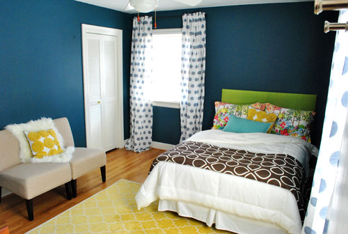
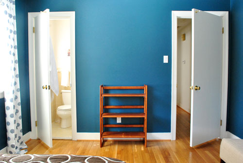
Which is definitely an improvement on Monday’s more spartan look…
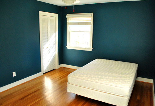
… but we still have lots to do (an quite a few things aren’t in their “final resting place”) but here’s what we’ve checked off so far:
- Get all of the junk out of there (thanks to a Habitat for Humanity ReStore pickup & moving stuff into the playroom)
- Buy a mattress & boxsping along with a cheap-o bed frame
- Dress said bed with already-owned bedding
- Add shower curtain & other bathroom essentials (towels, new toilet seat cover, etc)
- Paint the room
- Hang curtains
And here’s our outstanding to do list:
- Hang something above the bed to balance out the big window to the left (probably a large round mirror to soften the harsh angles)
- Add a nightstand & table lamp (here’s hoping we actually get around to this one)
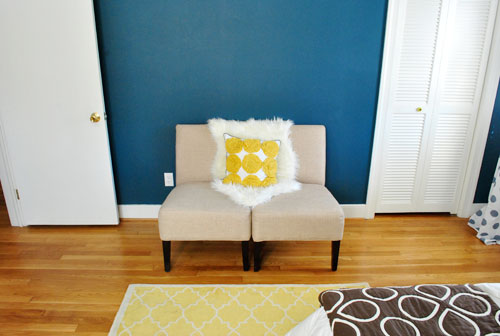
- Put something on the empty bookcase between the bathroom door and the bedroom door (which will eventually be switched out for a proper dresser that we can use to store a ton of stuff)
- Wash and hem the curtains
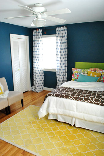
As for the room’s layout, we tried about a million different things (bed placed diagonally in the corner, bed on the other window wall, bed centered on the back wall, etc) and this is the configuration that we loved most. Especially once we added in things that we knew we’d be including, like our green headboard (see how we DIYed that here) and our old yellow Pottery Barn rug from the living room (since we’re due to get a rug much bigger than 5 x 8 in there for Karl).
The off-centered, foot-of-the-bed rug placement wasn’t exactly intuitive, but we loved the rug so much with the walls and the bedding that we vowed to make it work. Bringing in those two slipper chairs that used to live in the living room (and squishing them together like a loveseat) helped to make sense of the rug placement and add balance to that side of the room. And once we introduce a night table to the left of the bed we think it’ll look even more balanced and make more sense in the space. Speaking of balance, we can’t wait to hang something above the headboard as we mentioned up in our little bulleted list. It’ll help balance out the window to the left of the bed, and a large round mirror is at the top of our list (for the nice curves it’ll add to a room with so many rectangles and squares).
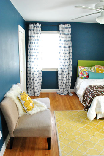
We also added a $10 white bedskirt from Target to complement all of the existing bedding that we already had from our old guest room (the brown and white blanket is from Bed Bath & Beyond back in the day, the white comforter is from Ikea, the printed pillow cases are from Pottery Barn, the yellow pinwheel pillow is from Target, and the long blue pillow is from TJ Maxx a while back). The bedding isn’t 100% finalized, we just threw everything that we already had on and though it looked kinda fun. Who knows where we’ll end up tomorrow after we finish those last few to-do list items though…
Psst- There’s already been an update and a few of the bedding items have been switched out – check out this post for the room as it looked when our guests arrived.
Oh and the curtains are from Ikea.
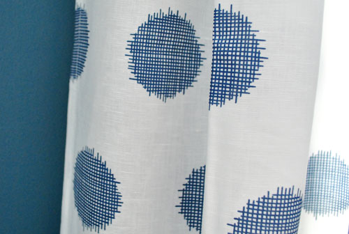
They were $39 for two, which makes them $19 a pop. Not bad for extra long 95″ curtains (86″ ones never quite do it for me since I like them hung extra high to make standard ceilings like ours feel taller). Of course I still have to wash and hem them. Ack. And add crown molding above them – but that’ll have to wait a while.
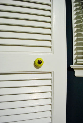
When it comes to the little things, we even switched out the hardware on the closet door from this basic brass pull…
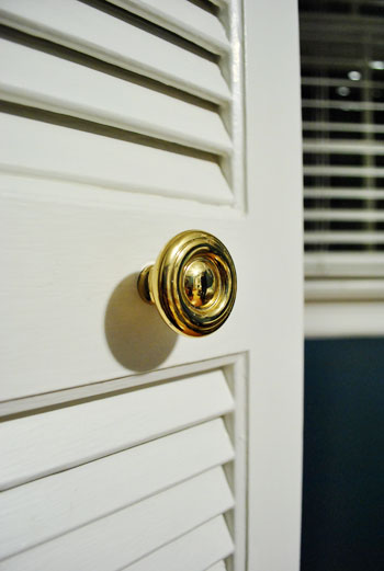
…to this cute lime greeny-yellow one (with oil-rubbed bronze hardware to match our curtain rods) for $1.25 at Hobby Lobby. Oh and speaking of those curtain rods, they’re from Target for just $9.99 a pop.
I’m off to finish those last few items on our to do list (and move things around for the 100th time), but I’ll leave you with this pic of what the room looked like just eight short days ago:
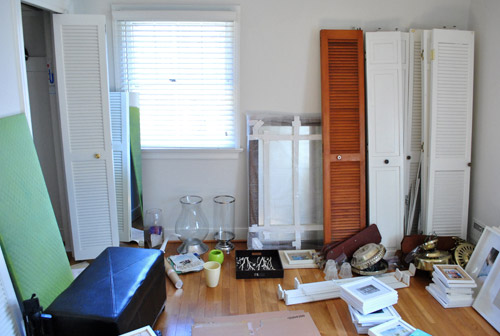
How crazy is that? You’ve come a long way baby.

Sayward says
This room looks fantastic! It’s playful, bright, cozy, and welcoming. I love your vision for mixing and matching colors and patterns, and I am surprised and disappointed at the people who are openly criticizing the room. Just because something is not your style doesn’t mean it’s not stylish. The way you guys worked to make this room comfortable and inviting in time for your parents’ visit is a wonderfully loving gesture. I’m sure they’ll be so touched to be your first official house guests.
Katrina says
Looks Amazing!!!! I just love all the colors in the room and the curtains are so much fun!!!
Melanie says
So impressed !
Your guests won’t want to leave.
Jenna says
Nice work! The room looks so jazzy and fun. A guest room is the perfect space to experiment with.
I think I need to introduce some fun color and pattern to my house.
caitlin says
i am so glad you guys are embracing bold colors in this house… i always wanted to see more of that in the old place :D
Ann says
LOVE IT! I adore the curtains and the pops of color. And Im so smitten over the fact that you used everything you already had! FAB!
Katie says
I just read your last comment about trays..I saw on another blog someone mentioned the dollar spot at Target had some and they spray painted theirs..I am going to go check it out tonight or tomorrow to see if they have any!
As far as your room..I think it all works well, and will once you add your finishing touches. As with your last house, your style will evolve in this room too. Having a home now for three years myself has taught me that too. If you have nice pieces and put them all together and mix and match and change things around you are bound to come up with something wonderful. I always feel rushed when company is coming over to try nd finish a space, but then when I have more time to digest it I may make some changes, so who knows what this space will look like two months from now! I think you guys did a great job, and am very impressed!
On a side note, I love the yellow tiles in your bathroom floor! They are so great! I have similar tiles in my bathroom but are more turquoise…Gotta love that 50’s style! ; )
georgia says
2 hours from ikea!!! damn i thought me living an hour away was bad enough… :)
One thing i forgot to say was – i love the Guest Shower room!!! its soooo cute – please dont ever get rid of the yellow tiles i think its so vintage and cute :) ?
So jealous would love a shower room like that – loving what you did in there, such a simple thing has made a huge transformation in there!
TN Mimi says
The room looks great! Love the two chairs together – so simple & so clever! Re: the new mattress – count me in the half of the population that thinks Tempur-pedic mattresses are the most uncomfortable thing I have ever slept on. It is soft on top for a few inches – then hard as a rock underneath!
HB says
Oye. I have to agree- the combo of the drapes and bedspread look quite bad…lose the bedspread stat! :)
Angela says
I LOVE color and I love that you’ve done most of this with stuff you already have. That being said, I think the room would look fabulous if you replaced the brown comforter with a red or hot pink quilt. It would tie together the fan hangy things and the flowers on the pillowcase, and it would boost the fun factor a little more!
YoungHouseLove says
The brown quilt is dead to us. We removed it a while back (just mentioned it in the comments though, haha). We did bring something else in at the foot of the bed. Pics tomorrow morning!
xo,
s
ellis says
Haha. Funny response, Sherry. Kudos to yall for keeping it real and updating us on your progress along the way- many of us totally understand that rooms progress. You’ll never land on the EXACT right combination the first time (and who would want to?? Live a little!). Can’t wait to see what you’ve added- love it so far!
Jennifer says
It came out so cute!!!!!! Great guest room :D
HB says
Ugh! I just read that you removed it! Good move grasshoppah…can’t wait to see what you post manana!
YoungHouseLove says
Haha, well we actually brought in a few other items and everything changed. Well not everything, but some things. Haha. Gotta love when that happens at the 11th hour!
xo,
s
Tiffany hall says
whoo la la that is so pretty. That shows me that dark colors on the wall doesn’t have to make your room feel heavy. All the light furnishings and accessories make it feel hip and fun. Good job guys. I wish you could come to Indiana and fix me up.
Stephanie H. says
I think everything is great. Blanket, curtains and all. Very cheery. I also think your empty bookcase would look great painted white or bright green like the headboard. Just my opinion, though!
Dawn says
I love the colors! I’m a scrapbooker, and the room totally brought one of my favorite layouts to mind (https://picasaweb.google.com/106524611699969461553/Layouts#5497292743877598594). Fun color = happy place.
Also, I find it amusing reading the comment about how small the bed is. My husband and I inherited an antique bedroom set, complete with full bed, when we married almost 11 years ago. We’ve discussed buying a larger bed, but in the end, we love the coziness of the smaller one. To each his own!
Carrye says
Love it! I can’t wait to see without the brown blanket in the after pics. I really love that brown blanket, but I think removing it will allow the curtains (which I love) to really pop–as well as the rug–creating a great balance in the room.
mya says
Fun room…The only thing i dont think works is the brown blanket and green headboard..But i am totally into working with what we have at the moment and you guys have done great!!
On another note,Pls follow and read my blog cos i value ur opinion :) and you might find something you like on my blog.
ps: Clara is growing up with such a great personality and i regularly check for more photos and videos. :)
Mya
http://inlieuif.blogspot.com/
YoungHouseLove says
Brown blanket’s already gone-zo! We just brought in some new things (which changed everything, well not everything, but some things) and took out some old stuff while we went. Gotta love those last minute changes. Can’t wait to share the results tomorrow morning!
xo,
s
JR says
Well I think it’s just swell.
Love the bold colour. Love the ‘use what we have’ mantra. Love the drapery (it was the first thing my eye went to).
I felt the ode to Sarah Richardson, by the way: colour, adding architectural elements, layering patterns and prints… nice work :)
YoungHouseLove says
Aw thanks! Gotta love SR!
xo,
s
J says
I can certainly understand working with what you got but it’s definitely not working in this space. The problem is that all of the patterns are on the same scale and all different colors (blue + white drapes, rainbow floral pillows, chocolate brown quilt and yellow rug). There really isn’t any cohesiveness to pull the room together. Everything is competing. It is a big improvement from a few days ago and no doubt your guests will be very comfortable. Hopefully when they leave you will be able to take a fresh look and edit. Love the wall color, the green headboard and the new knob. Not a fan of the cheap drapes (unless everything else in the room was white). If it were me I would the chairs apart and angle slightly with a small round table in between (like a little conversation area). The sheepskin just doesn’t make sense in there. I think it is much harder to decorate with color and multiple patterns. This of course is just my opinion and it is your house! You have come such a long way and I can tell you have worked hard. All the best!
YoungHouseLove says
Thanks J! If you check out the update at the bottom of the post, a lot of things have already changed in the final hour (the chairs, the brown blanket, the pillows, etc- just to name a few) thanks to bringing in a few things on our to-do list. We can’t wait to share the whole shebang tomorrow morning!
xo,
s
Alexa says
Coming along great! I’m thinking a Craigs List dresser that you can paint a fun color would be a good addition.
Rosemary M says
It’s the first thing I don’t love out of the 9,089,987 things you’ve done to your houses so far. I think the curtains and blanket at the edge of the bed are just not well coordinated even though they aren’t meant to match.
Great job on getting this room feeling like it’s been decorated and waiting for a guest for a long time now!
YoungHouseLove says
Mr Brown Blanket is already gone! Pics tomorrow of all the changes and the new updates thanks to finishing off our to-do list! Woot!
xo,
s
Jana says
I love that it is fun and eclectic, not all matchy matchy.
Not sure if it would be big enough but the Ikea Grundtal mirror is SO well priced as is the larger albeit unframed Kolja mirror (the Grundtal has a metal rim around the outside)
Can’t wait to see all the finishing touches!
Melanie says
While I think a few things need editing (for MY tastes), it’s an excellent job for using things you had around and putting it together so quickly.
One thing that I would definitely consider addressing is the green. It’s a gorgeous color and pops wonderfully in this room, but all your green is on the head of the bed (that spot is color/pattern heavy compared to other zones). Adding a few pops of that in other spots around the room could help a lot with the visual flow. But again, it’s great for now and I know you have further ideas to develop it.
I’m glad you’ve swapped that brown and white blankie out too – lovely on its own, but it does seem to have a tense relationship with the curtains. ;p
Hmm… you know, this might not be your thing, but I’m betting those chairs would look pretty nice with one big slipcover in the green uniting them and the again bringing the eyes around the room more (instead of just stuck on the bed).
Fab job and I’m sure your incoming guests will be pleased!
Megan says
Wow! There sure are some mixed reactions here. I think you’ve done a great job putting together a room in little time with little money. I was so happy (is that sad) that you’ve nixed the brown blanket. It wasn’t right compeating with the curtains and wall color. Didn’t read all the comments but would the fantastic luggage rack work for a quirky, fun side table? I think try it! So great job and I can’t wait to see how it evolves! That’s what you did in your first house. I’ve been reading your blog since it was a wee little baby after your kitchen remodel and it changed a lot in the few years you were there. It’s all about the evolution isn’t it?
YoungHouseLove says
Luggage rack side table project in progress! Details soon!
xo,
s
Ames says
I think it looks really fun and different! Everyone has different tastes, and I can see why people who loved the lighter colors in your old house would not get this. But I think it is unique, and really cool!
Becky says
I LOVE it!! LOVE! Especially the curtains! It’s so bright and inspirational! And I love the green headboard against the blue wall! I would so love to stay in your guest room! *ahem* so, I’m expecting my invite any day now! :P
Mona Alicia says
It looks great, I love the mixture of the fun colors and patterns!
ERIN says
LOVE. SERIOUSLY. THE PLAYFULNESS OF THIS ROOM WOULD CERTAINLY MAKE ME SMILE IF I WAS A GUEST. NOT TO MENTION I FIND IT A LIIIIIITTLE IRRITATING THAT YOU TWO CAN PUT TOGETHER SOMETHING SO FUN AND PLAYFUL SO QUICKLY USING PRETTY MUCH WHAT YOU HAVE!
EW. EXCUSE ALL THE CAPS.
Traci says
It’s a happy space. :-) It’s also very nice for guests to have their own bathroom.
sophie says
it’s a very happy space. That’s why I’m so taken aback by all the negativity!
Holly says
I think it is great but… don’t really think the brown and white blanket goes…too blah for all those great colors!
YoungHouseLove says
It’s already gone! Read back for more info. We’re burning him as we speak. Just kidding, he’s in the playroom with all of the other “leftovers.” Hah.
xo,
s
Misty says
Hahaha! I seriously am loving your humor about the brown blanket “burning him”, “he is dead to us”…
I suppose you need to have a sense of humor when putting yourselves out there everyday…
Eva says
I love the wall colour, and think it matches the bathroom perfectly. Teal and yellow is a good combo in my view. But I think you are overdoing it a bit with all these colours… I am all about colours so I took a good look at your pictures to find out what was bothering me and I think you need to pick either yellow or green to go with the teal, not both… all the other colours are fine… maybe its just the headboard that annoys me… And I think the room also needs some nature… something wooden perhaps.
But of course the room isn’t completely finished, and it is a lovely guest-room, so good job on having it ready in time ;)
Lisa in Seattle says
Good heavens, this Seattleite had to go lie down for a few minutes in the face of all the rude comments. I guess that’s the downside of this new, real-time blogging mode – you don’t get a moment’s peace to live with the room for a day and make changes and then blog later. I for one appreciate getting to see your design-editing process unfold as it happens, as my design ideas never work out the first time. Your guests will love it!
Tanya says
I completely agree Lisa. I love to see their design editing process, what makes the final cut and what gets edited in the process. It helps the “design challenged” like myself learn and is the reason I love this blog so much.
Emma says
I felt the same way after reading all of the “critiques”. Lawd have mercy!
sophie says
fully agree; most of the comments are obnoxious. folks, you don’t *have* to like it; after all, it’s not your house. and if you don’t, you can be polite about it.
Michelle says
I find it hilarious that people are giving design advice to a couple that makes their living from a design blog…
I would love to pull off a room like this…brown blanket and all. :P
Care says
Wholeheartedly agree with Lisa!
First of all, I love the room!! Not that you two were on the edge of your seats waiting for my reaction – haha!
My second thought on this post ( that fueled so many ahem “constructive” comments) was – I really hope this *doesn’t* motivate them to not share stuff with us that may go through design editing :(
Your blog, you ( as I’m sure you do ) do with it as you see fit.
Have a great visit with your family!
YoungHouseLove says
No way! We try not to take ourselves too seriously, so when people share a ton of suggestions or opinions we’re just happy to remember that it’s all one big journey for us (and so not about the “after” or the destintation). Although it seems like people took this post as a “big reveal” when it’s most definitely a progress update with items that were still being moved in and out after a week of playing around with things that we already have, we just have to smile knowing that it’s all going to change a million times in the next month or so anyway! And we love that part- the evolution is my favorite part of making a house a home.
xo,
s
Kristen says
I completely agree. If there is a project of Sherry and John’s that I don’t love, I simply don’t comment on it. My opinion is just that – my opinion. I don’t live in their house (although I would love to!) and I love reading their blog, whether I personally like the project’s outcome or not.
Robyn says
That looks amazing. I LOVE lime green with blue, one of my favourite colour combo’s!
Lena says
I actually really liked the brown blanket. I think it worked really well with the rug, who also has white lines on a solid ground. The only thing I don’t like are the flowered cushions. I think everythign else works really well together, but they are too much. If you just replaced them with more simple ones, maybe in a solid colour (some kind of blue?) it would look really good.
Heather says
Sorry to agree with the trend that is developing, but I don’t like the curtains. They compete with the shapes on the brown quilt and the shapes in the carpet. Also the furniture placement seems awkward.
With that being said, I’m sure that your guests will love to work and love you put into their visit!
Emma says
It’s kind of funky and fun – Guest rooms are just the place for this kind of vibe! I say go with what you love!
Lindsay says
Wow! I love it! And I love the curtains too!
laura says
I love the colors on the walls! Really well done. It’s amazing what you put together with a blank slate.
Charmaine says
Adding a contrasting fabric on the leading edge of those curtains would look fantastic. Ala Sarah Richardson http://www.sarahrichardsondesign.com/tips/tip/dining-room-drama
Just a suggestion, I don’t know if you guys have ever done that type of sewing DIY, but it would be interesting to see, maybe in a vibrant green like the headboard?
YoungHouseLove says
That would be super fun! I’m a huge fan of that idea! Someday I’d love to tackle that!
xo,
s
Karla says
I really love the pop of green from the headboard!! I think the brown throw is throwing (ha ha) me a little. Overall though, just gorgeous!
Jennie says
LOVE the color you have going on here. It’s new, but still you (at least, the “you” I know from the blog).
Penny says
This room started out strong with a lot of potential (love the wall color), however I think you guys really missed the mark here. The room is way too busy and doesn’t have a cohesive feel. I know you have been saying you love it, but I find that hard to believe, this was a rush job and looks like a rush job. Everyone would love to create a room using only things they have in the house, but you have now proved why that doesn’t work.
I truly enjoy your blog and love your spirit and ideas however lately it seems you guys have way too much going on and the blog just isn’t the same :(
YoungHouseLove says
Just check out the previous comments and the update at the end of this post! You may be happy to learn that the brown blanket is dead. Haha. A few more things came in and a few things came out – and we’re still tweaking as we speak. Gotta love those last minute changes. Can’t wait to share what we end up with! And of course tomorrow it won’t really be “finished” either – heck we’re never really done, so a house is all about evolution to us!
xo,
s
Andrea says
I wholeheartedly disagree with Penny; and this might be the rudest comment ever!
S & J, I commend you for putting your efforts out there for all to see… and for responding to these jerk-y comments so graciously!
I’d like to remind people of the old adage: If you don’t have anything nice to say, don’t say anything at all… Why is that so hard for some?
sophie says
penny, that was unconscionably rude. You don’t have to like it, but it’s not your house. it may not work for you, but it works really well for others – and more importantly, it’s something being explored and played with by J and S.
Your comment is condescending in the extreme. It didn’t even ‘start out strong with a lot of potential’.
Danielle says
The beauty of “real time” blogging is that we get to see the process of putting a room together. While before and afters are great, they certainly don’t teach us unsophisticated folks anything about design. In case you are wondering, the reason S&J have been so successful, is because they keep it real and they always look on the bright side of things. How real would it be if (in a matter of several days) they managed to put together a magazine ready room.
The reason this comment is so rude is not because you don’t particularly care for the room, but because you basically call them liars. There is so much to love about this room… they certainly don’t need to pretend to like it if they don’t. Real design doesn’t happen overnight (even in t.v. land were we see rooms transform in 30 minutes). It is a PROCESS and one I am happy to watch unfold in real time.
jbhat says
Well, I’m eager to see the pictures of what you have tweaked, but in the meantime I wanted to say that I thought the first version made for the sunniest, happiest guest bedroom I have ever seen. Adorable!
Part of the joy of reading YHL is knowing that your new home is a work in progress. And that as time marches on, you guys will do more and more as you can. Readers who are expecting a “finished” room on a tight timeline and real-life budget are just being unrealistic. I wholeheartedly admire the fact that you are working with what you have on hand for the most part, and that you are making such a welcoming space for your guests.
jbhat
Sara says
I love how you re-purposed things from other rooms. Love all the colors and prints and layers! This is so fun. Can’t wait to see what you thought needed tweaking tomorrow morning!
Celeste says
Hello! I love your website, decor style, and videos ever since I’ve stumbled on it a few months ago. I’ve been coming back to keep up with your posts. I even saw you on the Nate Berkus show while I was at work! LOl I was trying to watch while I was working, but it was kind of hard.
Anyway, I need some design help. My bedroom is small and has no personality, no color, no curtains. The walls have some nail sized holes in them. I’ve already bought some stuff to patch them up.
I’m not sure how to style things myself, but I like the way you have everything so simple, inviting, and crisp looking in your designs. The flow in each bedroom follows through the whole house and you do all this on a budget which makes the design sweeter!
I want that too, but with my own twist to make it more personal.
I just have no idea where to start other than I’ve chosen a neutral paint color which is a light grey and I have a cheetah print blanket. So any tips or suggestions? Inspiration websites?
Would be really appreciated.
Thank you! and may God continue to bless you, your designs, and your family.
P.s. I loved your Halloween centerpiece ideas. Please do more holiday inspiration centerpieces.
YoungHouseLove says
Check out our Projects page (see that tab up near our blog header) and use our Where To Start category to get going. Just bringing home paint swatches and picking a color you love can get you going, and then finding curtains or bedding that you love can help you build momentum from there (the colors in the bedding or curtains can help you with what colored accessories and accents you might want to add). Hope it helps! Good luck with everything!
xo,
s
karen says
Hey, what would you guy think of hemming the curtains to the bottom of the window sills?
YoungHouseLove says
We like ’em floor to ceiling, but it’s really a personal preference thing!
xo,
s
Kristen in Hawaii says
That wall color is…splendiferous. LOVE it! I’m especially loving it with the rug and pillows, which almost make the yellow bathroom look it it’s yellow on purpose and not just by circumstance. And brava to you for not waiting to share the room until it was final-final-FINAL. Personally, I love seeing the work in progress, the tweaks, and the evolution. No one really ever gets it exactly the way they want on the first try, anyway, right? (I sure don’t.) The journey is the best part! Can’t wait to see the update tomorrow. XO
Ashlye Bickston says
Was getting tired of all of the blue in the house, but this room is ROCKIN! way to go!
Lee says
Wow, you guys have done a great job!! I can also certainly sympathise with trying to make a bedroom work with oddly placed windows. Our master bedroom is so similar, and I can tell you it has caused no end of headaches – I still don’t know where to start! :) Well done