Update: We brought in a few of the items on our to-do list below and it changed everything! Well, not everything, but a few things came out (the brown blanket is history, at least in this room) and a few other things moved around. Gotta love those last minute tweaks. Check out the whole shebang here.
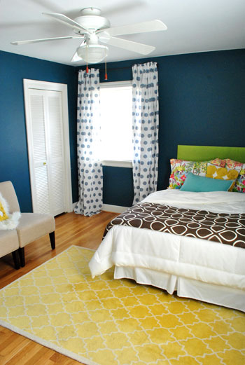
Here’s what things are looking like right now (well, as of an hour ago when we snapped these pics and uploaded them):
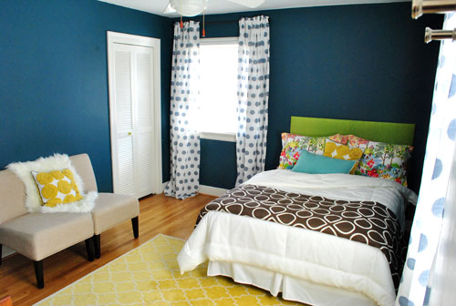
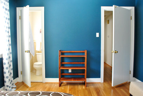
Which is definitely an improvement on Monday’s more spartan look…
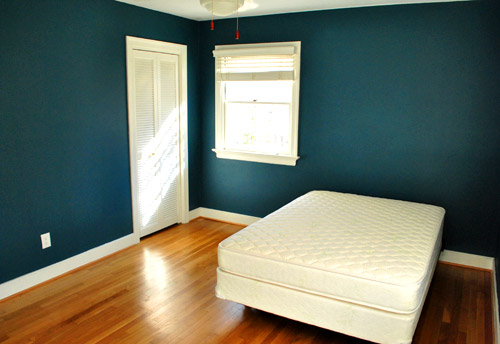
… but we still have lots to do (an quite a few things aren’t in their “final resting place”) but here’s what we’ve checked off so far:
- Get all of the junk out of there (thanks to a Habitat for Humanity ReStore pickup & moving stuff into the playroom)
- Buy a mattress & boxsping along with a cheap-o bed frame
- Dress said bed with already-owned bedding
- Add shower curtain & other bathroom essentials (towels, new toilet seat cover, etc)
- Paint the room
- Hang curtains
And here’s our outstanding to do list:
- Hang something above the bed to balance out the big window to the left (probably a large round mirror to soften the harsh angles)
- Add a nightstand & table lamp (here’s hoping we actually get around to this one)
- Put something on the empty bookcase between the bathroom door and the bedroom door (which will eventually be switched out for a proper dresser that we can use to store a ton of stuff)
- Wash and hem the curtains
As for the room’s layout, we tried about a million different things (bed placed diagonally in the corner, bed on the other window wall, bed centered on the back wall, etc) and this is the configuration that we loved most. Especially once we added in things that we knew we’d be including, like our green headboard (see how we DIYed that here) and our old yellow Pottery Barn rug from the living room (since we’re due to get a rug much bigger than 5 x 8 in there for Karl).
The off-centered, foot-of-the-bed rug placement wasn’t exactly intuitive, but we loved the rug so much with the walls and the bedding that we vowed to make it work. Bringing in those two slipper chairs that used to live in the living room (and squishing them together like a loveseat) helped to make sense of the rug placement and add balance to that side of the room. And once we introduce a night table to the left of the bed we think it’ll look even more balanced and make more sense in the space. Speaking of balance, we can’t wait to hang something above the headboard as we mentioned up in our little bulleted list. It’ll help balance out the window to the left of the bed, and a large round mirror is at the top of our list (for the nice curves it’ll add to a room with so many rectangles and squares).
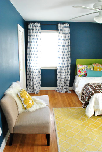
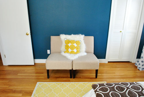
We also added a $10 white bedskirt from Target to complement all of the existing bedding that we already had from our old guest room (the brown and white blanket is from Bed Bath & Beyond back in the day, the white comforter is from Ikea, the printed pillow cases are from Pottery Barn, the yellow pinwheel pillow is from Target, and the long blue pillow is from TJ Maxx a while back). The bedding isn’t 100% finalized, we just threw everything that we already had on and though it looked kinda fun. Who knows where we’ll end up tomorrow after we finish those last few to-do list items though…
Psst- There’s already been an update and a few of the bedding items have been switched out – check out this post for the room as it looked when our guests arrived.
Oh and the curtains are from Ikea.
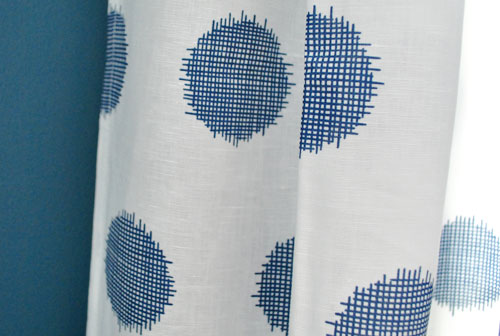
They were $39 for two, which makes them $19 a pop. Not bad for extra long 95″ curtains (86″ ones never quite do it for me since I like them hung extra high to make standard ceilings like ours feel taller). Of course I still have to wash and hem them. Ack. And add crown molding above them – but that’ll have to wait a while.
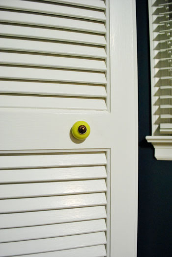
When it comes to the little things, we even switched out the hardware on the closet door from this basic brass pull…
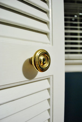
…to this cute lime greeny-yellow one (with oil-rubbed bronze hardware to match our curtain rods) for $1.25 at Hobby Lobby. Oh and speaking of those curtain rods, they’re from Target for just $9.99 a pop.
I’m off to finish those last few items on our to do list (and move things around for the 100th time), but I’ll leave you with this pic of what the room looked like just eight short days ago:
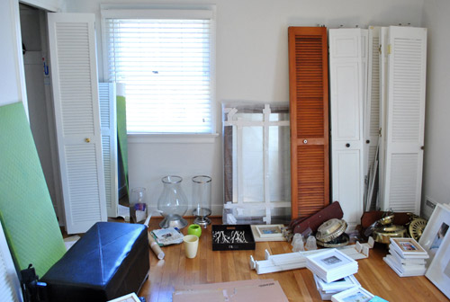
How crazy is that? You’ve come a long way baby.

RA says
A most excellent first try. I really like the headboard and patterned pillows; what a lovely pop of colors. It’s the extremely rare decorator who doesn’t tweak a design, so you’re in good company. Thanks for keeping it real.
tricia says
I think your guest room makeover is amazing!!! It is a fresh space for your guests to enjoy….I am sure they will love it:)
Lea says
I personally LOVE this room! I want! I’m probably a little kooky but I even loved the brown blanket too. Excited for the new reveal tomorrow :)
Erin @ The Grass Skirt says
The room looks amazing! Can I be your guest? :) I love how all of the colors come together.
Jen says
I know you guys don’t have time to take on a craft project prior to your vistors arriving but this sunburst/starburst mirror project from Stephanie Lynn (Under The Table and Dreaming) would look great between the entrance and bathroom doors!
http://www.bystephanielynn.com/2011/01/starburst-mirror-overload-but-i-couldnt.html
I just made one to put in the same between door spots in my bedroom. Really easy, inexpensive and totally cute!!!
YoungHouseLove says
GORGEOUS. Love those!
xo,
s
penny says
I just had to comment bc
1.) I love that you guys keep it real and work with what youve got. Love love you guys!
2.) I saw an (ugly) comment from someone named Penny and had a mini freakout (omg will sherry and john think thats me?!) Haha… maybe thats crazy of me but my name is rare so just wanted to say that this Penny (point thumbs at self) loves all the progress you’ve made! The wall color & yellow is to die for! :D
XOXO!
YoungHouseLove says
Haha Penny, not to worry! You’re too sweet to clarify! We love you.
xo,
s
Brenna says
I already replied that I love the room… The more I look at it the brown throw is the only little thing I’d change (minus your list of to-dos)…and I think it looks great, but I think it could look even better. And I see we’ll have a new pic tomorrow with what you’ve replaced the brown with. And I can’t wait to see when you bring in a dresser – I vote to paint it to match the headboard with and aged/distressed look.
abriana says
I love it! I know a lot of people are saying they don’t, but I think it’s typical YHL for things to change and morph into the final product.
tanyad says
Wow! Negative comment overload! Well done guys on being so gracious and always replying so nicely…I know I could not do such a great job of keeping myself in check!
I find it funny though that for ages people have been calling you out for not being ‘bold’ enough, yet here you are doing just that and they all have a freak out because it’s ‘too colourful’ or not ‘matchy’ enough? Yikes.
Great work guys! I love all that you do and can definitely see where you are going with this room!
xox
TheCarolinaHousewife says
I have to admit, I was very excited to see what you guys were going to do after I saw the bold wall color. The patterns just aren’t cohesive to me. It seems like a very fun teenage girl’s room and not a guest room… :-/
YoungHouseLove says
Good news for ya! Check out the update at the top of this post. This is just an in-progress pic sharing, so nothing is in its “final resting place” and we switched some stuff in and out and can’t wait to share the updated pics tomorrow. Gotta love those last minute tweaks!
xo,
s
Christina says
OH my GOODNESS!!! Let me tell you, I wasn’t crazy about that teal at first, but with everything in there it is just beautiful. The room looks so fun and colorful and everything matches in a totally non matchy way. I just love love looove it! Way to go :)
leslie says
I love the shams!! They add a lot of interest! I love to add color. My house is lots of white stuff with very colorful art. This is just my style!
Melissa @ Sassy Mommy says
I actually really like this room. Very fun and cheery and I like the colors, textures, etc. I wish I could pair prints like this together… I think what really trips me up is the old bathroom tile. But hey- what can you do about that. It’s not going to be there forever and the yellow is in the bedding. I actually even liked the brown blanket but excited to see guest room edition part two tomorrow…
Lacey says
I absolutely love this room! It reminds me of Jonathan Adler and KFD Designs blog. Good work!
Can’t wait to see it after you ‘revise’ it.
DJ says
OK, so I’m willing to go against the grain. I love the way the room is coming together so far. Can’t wait to see pics of the changes you’ve made!
Karen says
Sorry… I popped back in to see what else had been said and I can’t help but laugh. I don’t recall ever seeing such a controversial discussion on here before.
Y’all are so nice and easy going. Who would have thought your latest decorating adventure would stir everyone up so much! LOL
D says
Great to see that you guys took the critics comment in a positive way!
Also now you know the compliments you have been getting in your other posts were honest and not sugar coated! You guys should be proud that your 99.99% posts have always been a crowd-pleaser!
Christi says
okay, I know my job is so exciting to wake up to {hehe}, but i am so excited to see the changes in the morning! I have to say, you are my coffee {diet coke actually} and I am looking forward to see the room sans brown blanket… I am hoping for the Rams Head to make an appearance… thanks!
Shannon Lambert says
I think a lot of readers haven’t adjusted to the fact that: A. you’re doing a more “diary” style blog now, where you update more often about all the big and small changes which means we watch rooms evolve and B. that you’re working with what you got.
Just as with writing, designing is all about three things; Edit, edit, edit! Personally, regardless of how I feel about the room, I like that reading your blog about your new house is a constant work in progress. Things don’t look beautiful over night. This is a more realistic approach (instead of hiding the ugly rooms until they get their make over), I think readers will learn more about your own design process.
My two cents.
I will say, I am glad to hear that the brown blanket is gone. Love the blanket itself, but it’s not meant in that room. Looking forward to seeing what replaced it!
Christi says
BTW – the drama cracks me up – you both are so honest and admit when you change your minds. I LOVE your blog and hope one day you have a TV show like Sonny & Cher or Jessica and Nick (pre-divorce) or the Richmond Shore…
Stephanie says
I have to say that I am so impressed with your graceful responses under fire. I guess when you blog, you know you are going to get opinions with it. It’s a great thing to be able to handle it the way you do in your responses. I love all the ideas I get from ya’ll and often frequent the same thrifts so maybe I’ll run into you one of these days! Can’t wait to see the finished room.
DeeAnn says
I will be buying a new mattress set for my daughter soon (she’s 33 months). I will do a twin size due to the small size of her room. We have TOMF here in MN. How much should I spend on a mattress for her??? Cheap, mid, or expensive??? Just not sure if the more expensive mattresses make that much difference. What do you think?
YoungHouseLove says
I would just ask them to show you what they recommend for a child. Many people on that post mentioned that the salesmen were really honest and actually told them to buy a more basic and affordable bed than they were looking at. Hope it helps!
xo,
s
DeeAnn says
BTW, my dining room and an upstairs sitting room are very similar in color. I’ve loved the color, but am ready after 6 years for something lighter and brighter. I think you’ve brought in the lighter and brighter with other elements in the room.
Vic says
I absolutely adore this room!!! I love all of the bright cheery colors, I can’t help but smile! I also love that you have stepped outside of your decorating comfort zone. But to me it still totally reads Young House Love style. And, even though you’ve been getting some negative feedback on your curtain choice, I can honestly say those Henny curtains have never looked better! What an awesome pairing with your wall color, I think the curtains look just divine in this room, and so fun and fresh.
Vicki says
Hey guys,
This img (don’t worry, sfc-safe for Clara) is for all the grief you’re getting over your color selections, especially as you scramble on a deadline:
http://imgur.com/xg8BB?full
I think it looks fab and fresh.
D says
Funny image..however I don’t think that those who didn’t like the color choices were haters.. they were just being honest. Instead of sugar coating just to be nice, its actually nice to provide honest opinion so that the person you adore can improvise.
Jennifer says
Is that a double bed? We have one in our guest room but I always feel like couples who sleep there are too smooshed. Did you consider a queen? What made you go with the double?
Also, it seems that a lot of people are happy to tell you what they don’t love about your room, but it’s YOUR room! It’s not my cup of tea, but I love that you love it. Also, it might be a little too much color or pattern for most folks on a day-to-day basis, but it’s a guest room! Might as well make it fun & interesting.
As always, I love your blog!
YoungHouseLove says
Hey Jennifer,
Check out the post two posts back (from yesterday morning) with all of our mattress hunting details – we based the mattress size on the size of our room, and the size of guest beds in our family and friends’ guest rooms (nearly every room we stay in has a full sized bed, so we figure ours fits right in).
xo,
s
MaryAnn says
I love it! Just sayin’ :)
Nikki says
It’s a great accomplishment in such a short time but I think you’ve struck out in the design dept. I think if you lose the brown throw at the end of the bed and nix those curtains (they make it look like a dorm room) it would be improved 100%.
Rachel @ Healthy Teacher says
Love that deep color. it’s fabulous!
Mackie says
I think this room had great potential with the lovely paint job and the curtains look great with the walls! But then way too many patterns and colours later it kind of turned into a circus of drunken colours. I gotta admit. Usually I LOVE me some YHL and I think that repurposing is great. Maybe it would be better without the brown blanket (yikes!) and also without the yellow rug/yellow dot cushions. It is just my eye has nowhere to land. xoxo
YoungHouseLove says
Good news! Mr. Blanket was banished. Check out the update at the top of the post (bringing in some new things on our to-do list meant editing out some old ones and making a few more general tweaks). Pics in the morning!
xo,
s
Gina says
I wasn’t sure about that wall color but like it now that I see all the other colors you’ve brought in. I think it’s great to have such a fun guest room. I think the chairs pushed together are a great idea. I love having a place to put my suitcase (off the floor) when there’s no option to put clothes in a drawer. Don’t forget to add a few things in the room that will accommodate your guests like an alarm clock and a night light but don’t overdo–I love having some “free” space to put my jewelry, eye glasses, & reading materials. Keep tweaking–that’s half the fun!
Virginia says
I love you guys so much, but I agree with those who don’t love the curtains. I think you should just go with plain white curtains. I admire your bold color commitment though! Also, love those PB pillow covers. You inspired me to get it to fold at the bottom of my bed. It makes me happy every morning and night! Also (because of you), I did my first home improvement project! Hung a lighting fixture. Electrical work makes me nervous, but it was SOOOO worth it!!! Ikea Maskros light. It’s amazing and it’s beauty is tripled by the satisfaction that we hung it ourselves!!
emily says
confession: just found your blog a month ago, and as of yesterday, have read through all the archives. mildly obsessed, to say the least!
love seeing these ‘in progress’ shots. making tweaks to a room, trying new accessories, mixing and matching and switching things up is half the fun! (of course the other half is oogling over how great it looks when it’s ‘complete’!)
can’t wait to see what you’ve come up with in the morning! i’ll admit, i’m having somewhat of a hard time adjusting to reading posts in real time!
Lovers Lane says
I have to say that I loved everything you did in the first house and I’m just not enamored by much in the new house so far, in particular the guest bedroom. I think I have an open mind for colors, patterns and ideas even if it wouldn’t be what I would have chosen, but this just looks unappealing and incongruous to me. I appreciate that to keep things fresh you are taking a bold approach in this home, but it seems like it’s against the grain. To be honest, I don’t much care for the color scheme in ‘Sue the Napkin’, so I guess I could find myself disappointed through the whole re-do.
Sheena says
You guys are seriously killing me!!! The hubs and I are trying to buy our first home & I am soo freaking anxious to make it our own (err, like yours ;)!!!! I love love love how your home is all turning out & it’s helping us soo soo much when we see fixer houses. when before we might have completely ixnayed a house, now we say, “Oh we can do it like… (reference to YHL)” Yes, even the hubs is addicted! :) Love you guys!!!
steph says
just wanted to comment on your guest bathroom – i think that shower curtain works really well with the yellow, and the new bathmat looks great too!
for me, the components of a Varsity level bathroom:
fancy little soaps (i have dozens of l’occitane soaps squirreled away from whenever i’m lucky enough to stay at nice hotels), nice towels, and a clean bathroom. yours looks super clean so you’re good to go!
i love your blog, btw, keep up the great work ;)
Stefanie says
I saw you mention that the nearest Ikea is 2 hours away…do you guys go to the Ikea in Woodbridge/Potomac Mills?
I’m only about 25 South of that Ikea if so and you can usually find me there at least once a week. It’s such a guilty pleasure.
YoungHouseLove says
Haha, yup that’s the one!
xo,
s
Mandi R says
I can’t wait to see the pictures of the finished room. I’m with everyone else, in the pictures in this post it makes my head hurt a little. It’s just too busy. The patterns don’t seem to work well together. I’m generally a person who likes a bunch of mixed patterns and colors. Not sure why this makes me want to close my eyes. Just not relaxing like y’all were going for IMO.
I LOVE the teal on the walls though. Awesome color!
Stephanie Creekmur says
I absolutely love this room! The bold wall color and the PATTERNS are to die for! I am all for layering textures/patterns. Can’t wait to see what changes you guys have made since these photos were taken! The suspense is killing me! :)
rashmi says
Wow the room looks amazing! I know you guys have mentioned that some things have been tweaked since the picture…and you might have done what i am suggesting.
The Upholstered rectangular storage ottoman( i am guessing)that was in the room could be placed at the foot of the bed or is it already in your master bed room?
As much as i love the love seat, don’t you think it would be a good idea angle them into a seating arrangement with a table? For the table itself may be you could use the tables that were there at the either end of the old sofa before Karl replaced it.
Sherry i know you love to stare at the lamp (https://www.younghouselove.com/2011/02/sherrys-lamp-watching-chair/) May be it would look pretty besides the bed?
If you have some spare chairs they could become a bed side table for now or even a stack of books bound by belt.
The Luggage rack that you recently purchased can become a table with a large tray placed on it ?
I know some of these might be repeats with 500+ comments !
Love the color of the room !
Great going .. have fun with your visitors!
Katie P. says
The wall color is absolutely gorgeous. My personal preference would be to keep most of the bedding/accessories white, with maybe one accent color, just to keep the attention on the stunning paint selection. But it’s definitely a fun and cozy room. Can’t wait to see some of the updates!
Lindsay L says
Sherry I don’t know how you and Katie B handle all the feedback and criticism some days! Please tell me you call each other and say “whatever, it’s just a blog!” somedays…love to you and both of your sweet families and your willingness to put yourselves out there.
p.s. I have been working on our baby girl’s nursery (due in a few weeks), aqua/turquoise walls with lots of white, pink and some brown. Y’all inspire me to be bold and it’s turning out to be adorable! My husband is deployed and your blog and decorating our house have been such fun distractions, thank you!
YoungHouseLove says
That’s too funny! Katie and I did have a 3 hour phone date last night, but we mostly chat about our kiddos and life outside of blogging (her impending move, my mom coming to visit). We definitely both try not to take ourselves too seriously though, so when people offer suggestions or ideas we usually just smile because our house is always changing anyway, so when we toss a room together using things that we already have in a week, we know it’ll continue to evolve as we go!
xo,
s
Tanya from dans-le-townhouse.blogspot.com says
Wow – you sure work fast! Love how you reused some things from elsewhere. Love people who repurpose (I’m a huge fan, at least until they call my lottery numbers!). That wall colour looks even more perfect with the bed set up and decorated. Can’t wait to see the other changes you’ve made. Oooo, the suspense :)
Connie says
Wow the room looks great! I wish I could get my rooms together that fast. Its been nearly four years and I’m still at square 1.5. I noticed that you hung your curtains rather high above the window. On the Nate Berkus show he recommended the same concept. Now my ceilings are not that high. My question is….What’s the number of inches the rod should be between the ceiling and the rod?
YoungHouseLove says
There’s not a set rule (at least that we know of) but we like to put them a few inches from the ceiling (maybe 4?). In this case we left room for crown molding which we hope to someday add! Just try playing around by holding the rod at different heights and see what you like!
xo,
s
Robert says
Amazing bedroom and nice color matching. It looks neat and pleasing to the eye. I like the design of your bedroom. Overall, nice arrangement!
Kathy says
I LOVE it and can’t wait to see what you’ve added. I’m glad that you’ve posted pics of the decorating IN PROCESS…because that’s how most of us put together our rooms. We have to try things out and keep editing, right? That’s what makes it so fun, I think. :-)
Man, you two have done a LOT in the last week!
Maya says
I LOVE the brown blanket and all the pattern in this room… I think with a look like this you have to go all the way, which you guys did. But that’s me! Haha obviously you won’t make everyone happy here, which isn’t even your goal…
Charisma says
Love the curtains guys! Polka dots are totally my fav! I just bought sheer cream colored fabric with small grass green polka dots a couple weeks ago to make curtains for my 10 month old’s bedroom window.
Samara says
This reminds me of the movie Amelie a little, all you need is a framed portrait of your dog!
Sammy says
I actually liked the poor abandoned blanket, haha, but I’m excited about your new choice.
The color of the walls seems much more blue-ish in the newer pics (which is also very nice). I wonder whether it’s in reality as blue as in the first photo or as green as in the second or somewhere in-between?
YoungHouseLove says
It’s really best described as a deep teal. The picture that we shared after we painted with a close up of the wall and trim really is the best “capture” of the color. But one of the fun things about it is that it’s moody and sort of ever-changing (depending on the time of day, angle, what you see it next to, etc).
xo,
s