BEHOLD! The new & improved middle bedroom at the beach house (*crowd goes wild, people do The Hype, battle rap horns sound, DJ Khaled shouts “DJ KAHLEDDDDD”, maybe Cardi B. is there with one of those t-shirt cannons?*). I hope you enjoyed that mental image as much as I did.
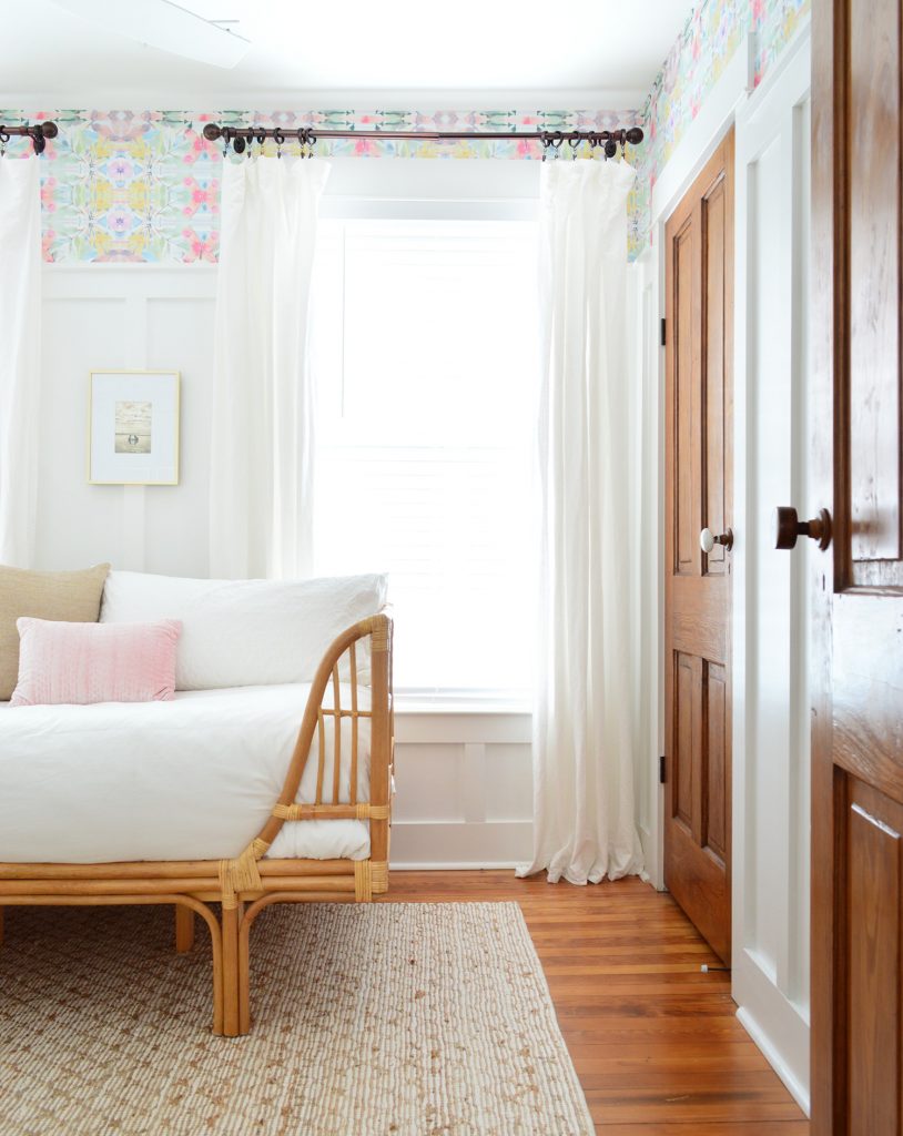
ANYWAY, the beach house middle bedroom update is done, and I can’t get over how sweet the board & batten and the wallpaper look together – especially with the old heart pine floors and doors. Those are 115 years old, and the wallpaper and the wall treatment are brand new, but they feel so good together – especially in person. My biggest pet peeve with this wallpaper is that it’s much more beautiful in person and it photographs brighter and busier (in real life it’s muted and soft like a blurry subtle watercolor). Oh well. I guess I’d rather have something look better in real life than better on the internet and crappier in real life so I’m at peace with it ;)
As a reminder, this is what the middle bedroom looked like for the last two and a half years since we furnished the beach house. It bears mentioning that I loved how this room looked before! It just bugged us that it went unused 99.5% of the time (the queen bed took up so much of the room and never got used by more than one person in over two and a half years). We basically never stepped foot in it except to randomly get a tool or some paint from the closet (that room’s closet is where we stash that stuff). And even if a room’s pretty, if nobody uses it… in the illustrious words of Randy from American Idol, “it’s a no for me dawg.”
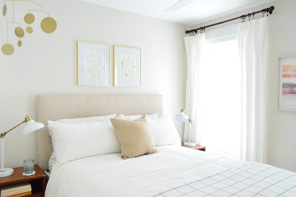
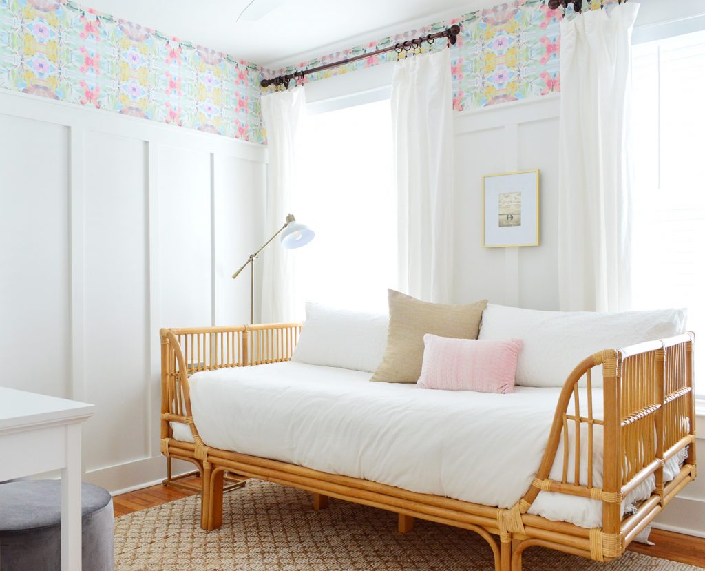
Enter a smaller daybed and SO MUCH ROOM FOR ACTIVITIES (name that movie). Here’s a similar angle now:
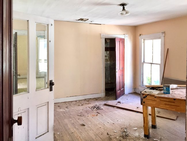
And just for fun, here’s where we started with this room. Taking it waaaay back to when we didn’t have a hallway and you had to walk through this room to get to the back bedroom. We added a central hallway during our big renovation, and it made all the difference (you can see more before & after photos here).
We talked a lot more about the goals of this change here, and we actually finished it a few months ago but got sidetracked by The Bathroom Reno That Would Never End (still hasn’t!) so we didn’t get around to taking after photos & sharing it until now. But a fun thing about reporting on a room after enjoying it for a while is that you can attest to it actually working instead of saying things like “I hope this will be good and get used – it seems like it should…”
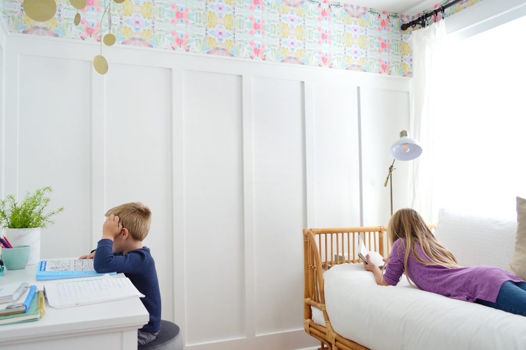
As for what we did, it was a good example of a few affordable-and-not-giant projects that took a few weekends worth of time when you add them all together. Injecting architecture & charm with a board & batten wall treatment to the tune of $194… check! Adding color & fun with wallpaper (total cost: $85!)… check! Working in a rattan daybed because that was on my bucket list & was half price last fall (just $275!)… big ol’ check! Affordable desk from Target to solve a paper clutter issue downstairs… check! More on that last one in a second.
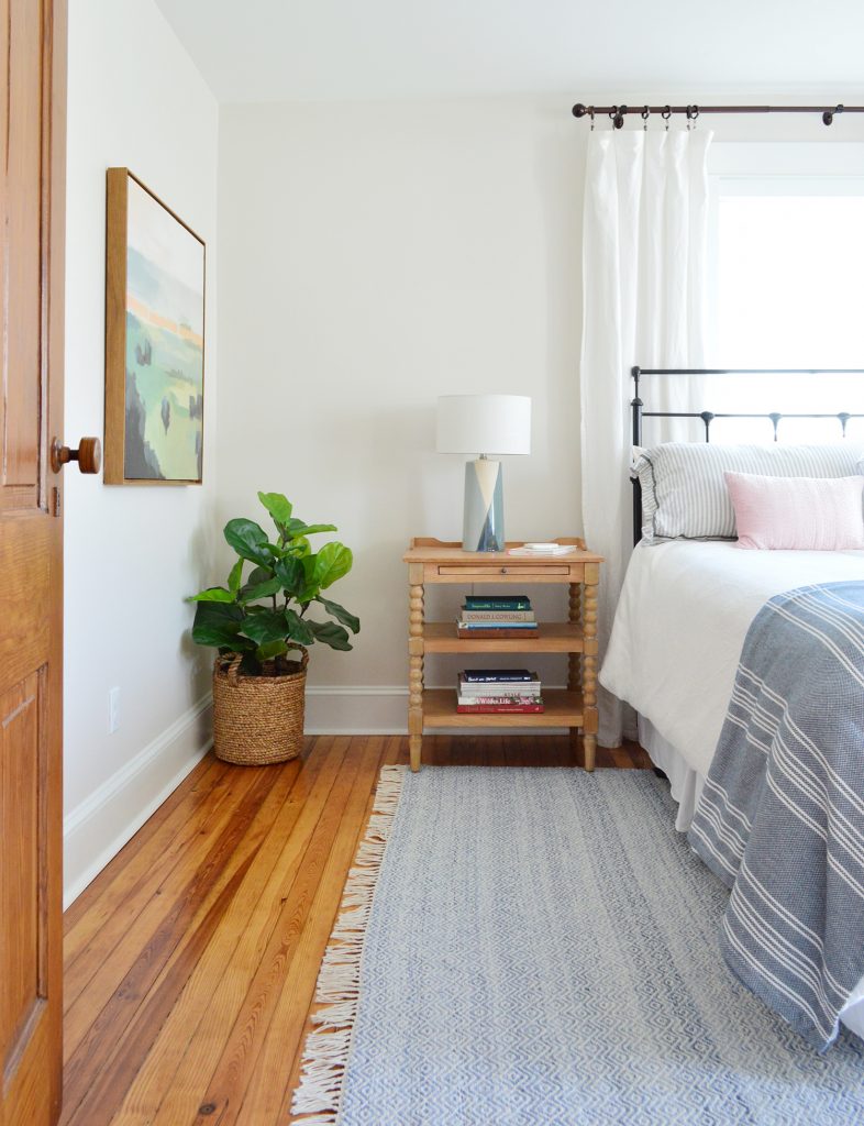
Recognizing that a single bed was a much better choice for the single overflow guest that we occasionally have hosted over the last 2.5 years was an important turning point for this room. As a reminder, we have a bonafide guest room with a queen bed in the room right next to the middle bedroom that also has plenty of space for a pack & play, air mattress, sleeping bag on the floor, etc). Here’s that front bedroom for reference:
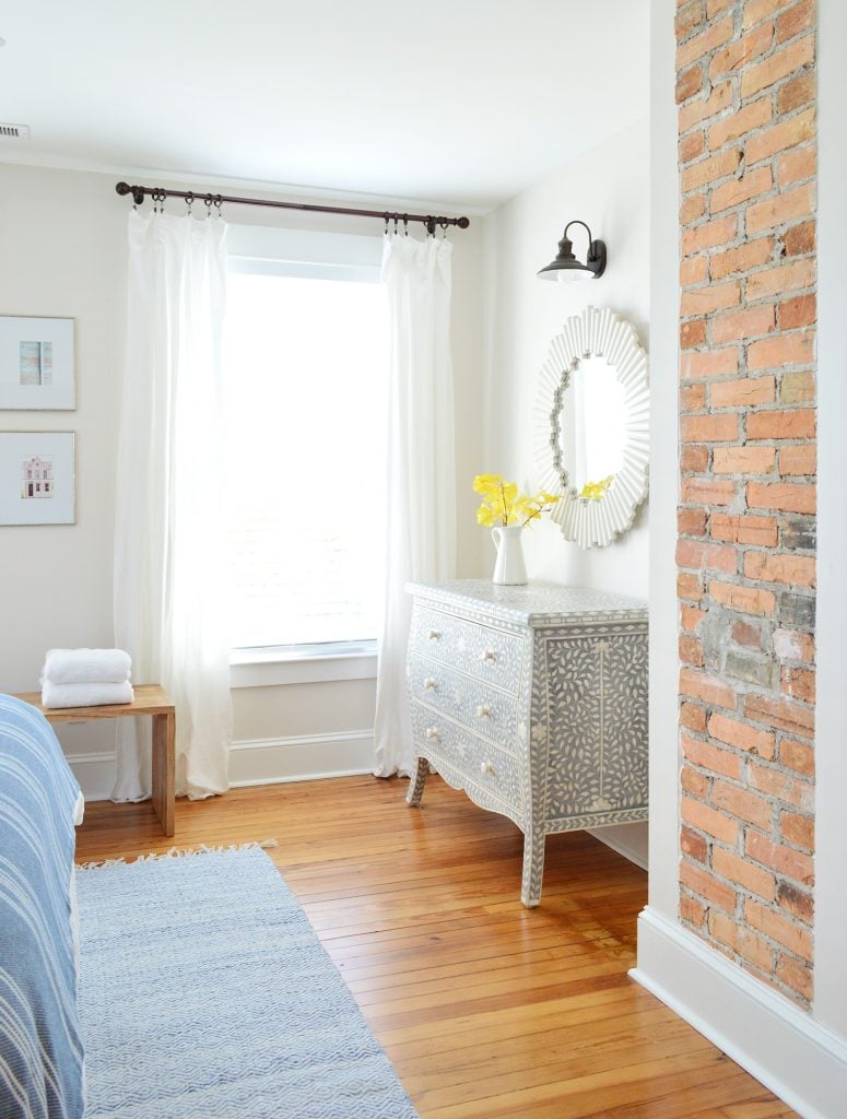
And here’s another angle just because this is my favorite dresser of all time (remember this?!?) and I love it with that raw original brick chimney that we exposed. Sometimes our guests with small kids do a pack & play or an air mattress on the floor in here since there’s plenty of space and then sleep an older kid in the bed in the middle bedroom.
As for the room-filling queen bed that we’ve had for almost 10 years in the middle bedroom, it was Ed The Bed from our second house! Remember him?! This is our post about getting him & here’s where we gave him a haircut. Anyway, we sold it to our friend who has a much bigger room for it (Ed lives on!) and downsizing the bed to just what we needed also earned us a crafting / writing / drawing desk that our family actually uses! YES, MULTIPLE PEOPLE ACTUALLY GO IN THERE NOW AND SPEND TIME IN THAT ROOM! EVERY TIME WE GO!
It’s mostly our kids doing crafts at the desk, but we’ve also had three of their friends over and seen this room full of 5 kids using the heck out of it! Two on the bed reading graphic novels, two at the desk making a flip book with glitter pens, and one on the floor making a cardboard box creation while singing Hakuna Matata (yes, it was as cute as it sounds). AND IT WAS SO SATISFYING to see a room that was formerly a ghost town being USED after 2.5 years of zero action!
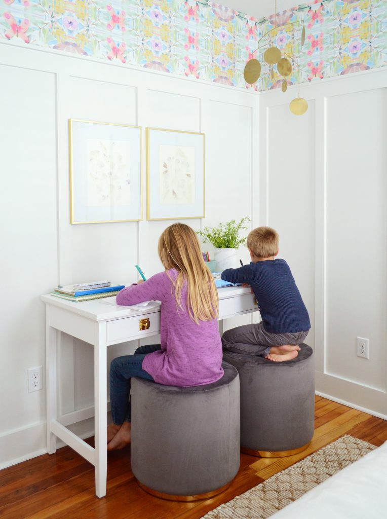
Plus it has effectively solved our biggest sticking point which was getting a lot of the art mess off of our kitchen table downstairs (we like to not be covered in ALL THE THINGS so we can do practical things on it, like eat there and play epic tournaments of Exploding Kittens). So having this upstairs room for papers and cardboard and tape and all of the crafting stuff has been great.
We definitely loved working with a lot of what we had in here already. The framed art, brass mobile, rug, and curtains / curtain rods / window blinds were all in the middle bedroom from back when we furnished it. It was nice to work with so much existing stuff instead of throwing the baby out with the bathwater (where did that expression come from? was it a common parenting mistake back in the day?).
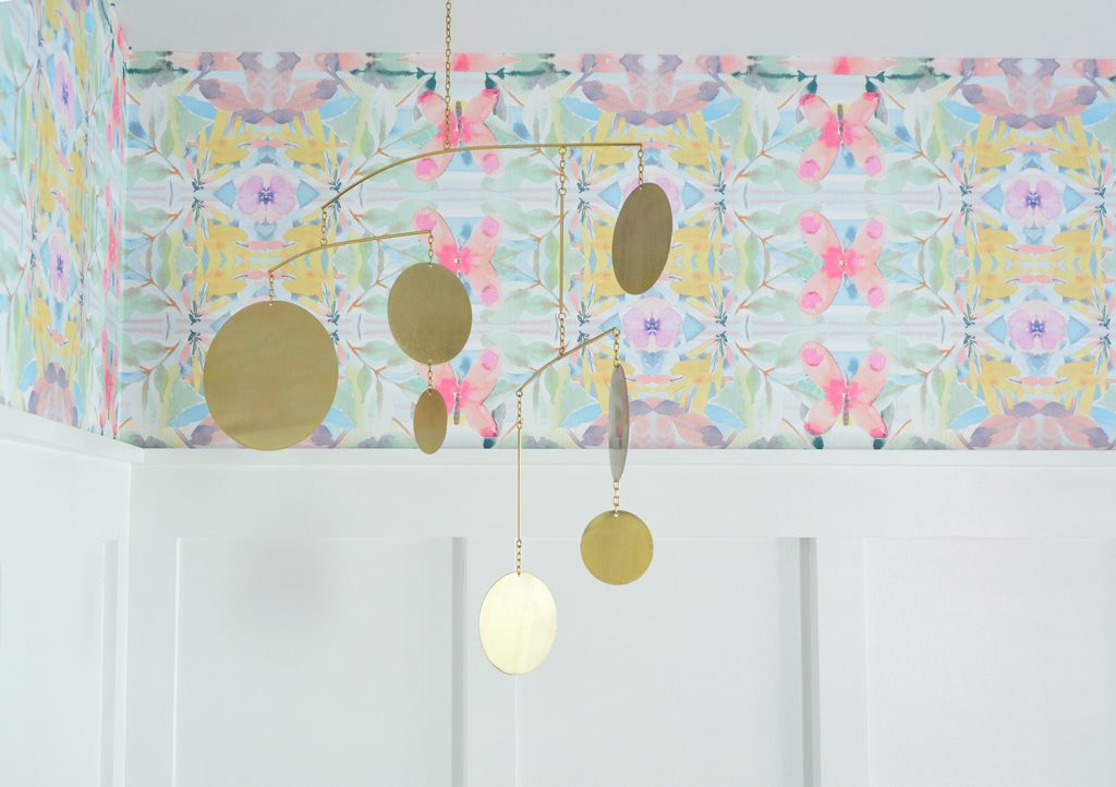
So hooray for flexible classics and neutral items like a woven rug, some touches of brass, muted art, and breezy white window curtains. Plus the twin mattress on the daybed was a hand-me-down from John’s sister so imagine me doing an end zone dance on it after we got the linens on it (I’m not saying that’s what I did, but I’m not not saying it).
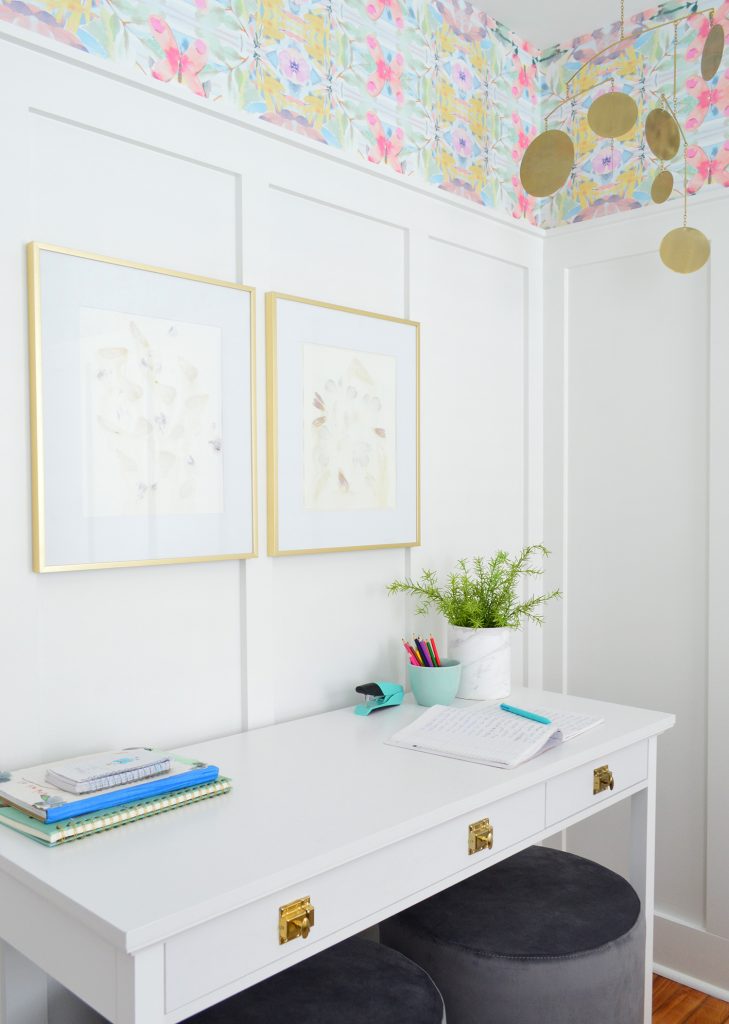
The pouf ottomans are great flexible items in the room (they can serve as a coffee table of sorts for the daybed – or even as little side tables depending on where you place them). They also tuck right under the desk if we ever need the floor space (for a second kiddo in a sleeping bag for example), and they’re the right height and nice & cushy for our kids to sit on when they draw and craft. The old art area (aka: the dining room) had a wooden bench seat where they sat and worked, so although the cushy ottomans don’t have a back to recline against (you can read more on why we didn’t want chairs with a back here in this post) they’re not used to having a back anyway, and seem to love spending time in here on these cushy stools.

Here’s the same art that used to hang over the bed (it’s pressed flowers that we got at a local art fair years ago in my fav gold frames from Target). I just hung them both over the desk to define that area, and added some writing utensils and craft supplies to the tabletop and the drawers of the desk. Oh and that “marble vase” is actually a utensil holder from Target. I love the clean cylindrical shape.
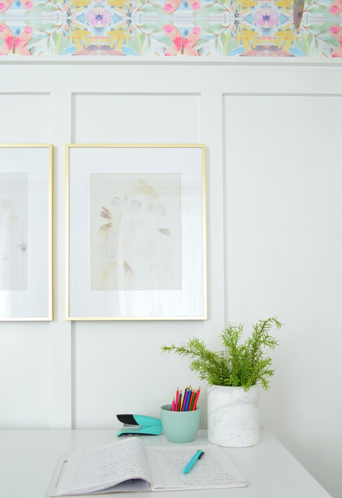
Speaking of the drawers of the desk, if you get our newsletter a while back you saw how I changed up the hardware, which elevated the look and tied it into the other brass things around the room. (You can see that old newsletter here and sign up to get them here – it’s free and we only send a few a month, so we promise not to spam you).

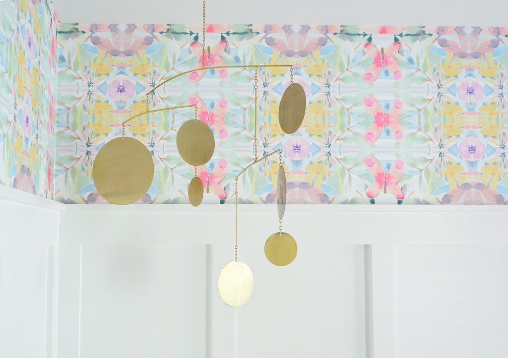
Speaking of the hardware tying into the mobile, I really wish Target still sold this pretty brass circle one. BOO. Here’s a similar one.
The room is working out nicely because not only will the kids use the desk, we also notice that the daybed also works like a couch/lounge space for reading or snuggling Burger (he also has worked this room into his routine now – isn’t that funny?!). It’s nice because zero people/chihuahuas used to hang out and read on the bigger bed when that was the only thing in this room but something about the daybed and having another area that we use (the desk) makes the whole room more usable. Oh and that floor lamp over the daybed is a super affordable one from Target, but I changed the glass cap out for a white one from the old Target side table lamps that used to live in this room.

It really is a very small room, but it feels a lot more open than when it was filled with a bed – thanks in part to taking that big object out – but also thanks to the wall treatment and the colorful wallpaper above it that draw the eye up (taller feeling spaces = more airy).
I’ll show you the before picture again so you can see what I mean. See how one big solid wall above the bed doesn’t make it feel squat or closed in or anything…

… but do you notice how it feels taller and more vertical now that we have the wallpaper running around the top of the room and those long battens running vertically and leading your eye right to it? I often get questions if molding treatments can make spaces feel more closed in, but that has never been our experience. We added $57 board & batten to the hallway of our second house and it made it feel so much more vertical and expansive in there too! Kinda magical if you ask me.

If you stand with your back to the closet this is the view of the room facing back towards the door that you use to come in:
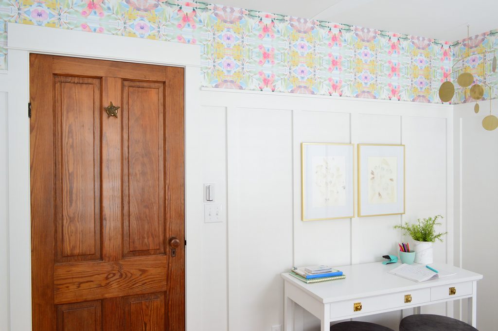
That gold starfish towel hook on the door was a gift from my friend Carey (she found it at Anthropologie) right after we bought the beach house in 2015 and I remember being so happy to hang that on a finished door (like 2 years later when we had finished our renovation!). You’ve seen Carey’s awesome makeovers here & here, by the way.
So that’s how our beach house middle bedroom is looking these days! Hope you had fun seeing how the room turned out. And to read about how we planned this update (figuring out where we wanted our wall treatment and what spacing we liked best, picking our wallpaper, and going from wanting chairs to realizing that stools would be a lot smarter) this is the post about that. Reading a post about planning a room might not sound as fun as the before & after or a big reveal, but honestly, I think that’s where you can really get some actionable ideas and make some headway on a challenging room that you might have at home. So I hope it helps!
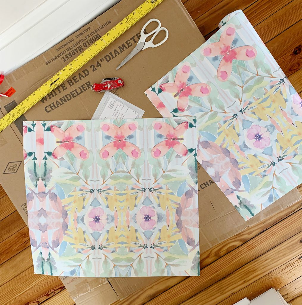
And as for some DIY details, here’s a post about installing the board & batten and a tutorial for hanging the wallpaper (it’s simple! You can totally do it!). Plus to see a full page of beach house before & afters, we have all of those dramatic comparison photos right here for ya.
*This post contains affiliate links, so we may earn a small commission when you make a purchase through links on our site at no additional cost to you.
