We spent the weekend checking off a bunch of hands-on projects for the girls room in the showhouse. It’s definitely still looking sparse, and is far from done, so I’m sure it’ll keep evolving right up until our deadline.
- The bed needs to be raised and we have a colorful throw to add
- Linens need to be ironed and we have a custom bolster that we’ll layer in there too
- Colorful fabric window treatments will be hung as soon as they’re in
- We might switch out the end table – not sure yet…
- We have a soft blue lamp and a bunch of other accessories to add to tie things together
But we did manage to significantly shrink the to-do list this weekend.
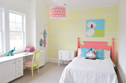
We got the wall stenciled, the headboard painted, hung some art (that awesome chicken painting was done by a friend of ours named Lesli DeVito), and then we painted/upholstered two secondhand chairs – and even had some fun with a few wall hooks.
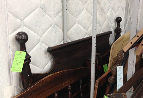
You might remember this old full-sized headboard find of ours (it was $9.98 at a local place called Family Thrift Center).
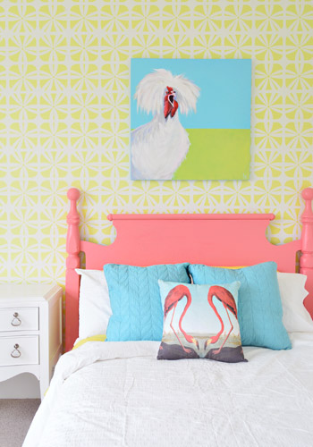
Now it’s sporting a fresh coat of paint (Hydrangea Flowers by Benjamin Moore) along with that freshly stenciled wall behind the bed. Both of them were done by Parker, one of the builder’s right hand men – who apparently is a stenciling expert among all of his other talents.
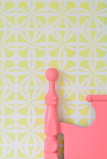
It definitely felt foreign not to be up there on ladders doing the walls ourselves (along with priming and painting that headboard) – but with 3,500 square feet of house to furnish & accessorize, it was also pretty amazing to be able to tackle a bunch of other tasks while those got checked off the list. The stencil was donated by Royal Design Studios, and the room is painted Simply White with Hibiscus by Ben Moore layered on for the stencil.
It’s another example of wanting to take some risks to keep the show interesting (we love how it mixes with the pop of color in the headboard) and it’s nice that it can just be painted over if someone moves in and wants to change the look of the room – so it’s one of the more flexible choices.
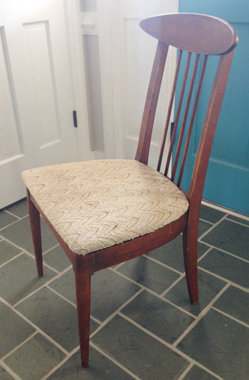
We did get to roll up our sleeves and refinish some furniture ourselves, like these two chairs that we found for $16 each at another favorite thrift store (Love of Jesus on Midlothian).
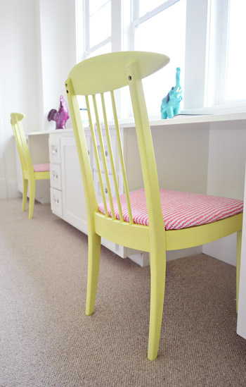
Here’s what they looked like when we found them.
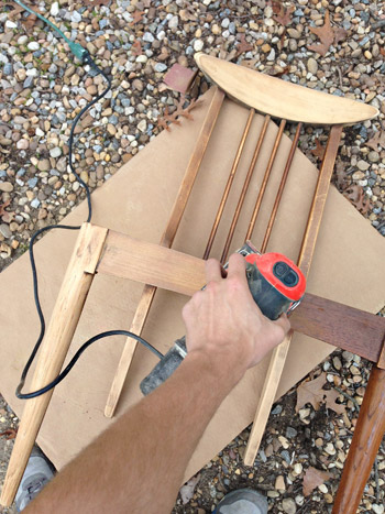
We actually debated staining them, so John sanded them all the way down to the raw wood, but the more we stared at the girls’ room, the more convinced we were that paint was the way to go (there’s carpeting in there instead of hardwoods since the builder said most of his buyers prefer that in a kids room – and with other painted furniture going on, we thought wood stain might feel like the odd main out). I’m sure we could have stained them and made them work, but a little more fun color in a kids room was too hard to resist…
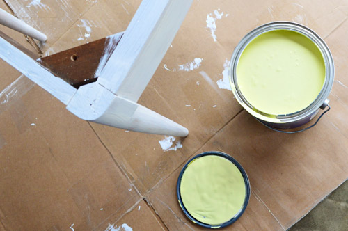
So we primed them with two coats of Kilz Premium (rolled on with a foam roller in most spots and with a brush to get into the nooks and crannies) and then we gave them two coats of Hibiscus paint, which was leftover from the stenciled wall (once again, applied with a small foam roller and a brush to get into those tighter spots).
While those were drying in the garage, I recovered the seats with extra loft batting (you can grab that at any craft store like JoAnn) and used a manual staple gun to pull that firmly around the front of the seat, and staple it around the perimeter in the back.
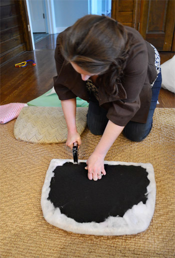
Then it was time for some playful fabric called Candy Floss that we found at U-Fab (they kindly donated a yard of it, which was enough to cover both seats). Here’s a shot of how I deal with corners. If you fold them sort of like when you wrap a present you get a nice clean look in the front.
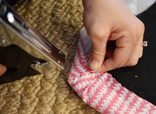
One tip for working with a pattern is just to make sure to keep it straight as you staple (I occasionally flip it over to check, and you can pop out staples and redo things if your patterns migrates and it looks wonky). The other pattern tip would be to make sure if you’re doing more than one chair that you’re keeping the fabric running in the same direction (assuming you want your chairs to match). So since the white arrows seem to be pointing down on this cushion, I made sure they went the same direction for the second chair.
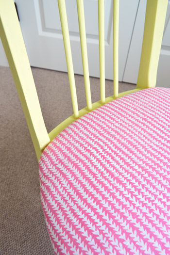
Then you just screw the seat cushions back into the chairs once they’re dry and you’re done. Boom – new chairs. Except they’re old. But they look new, so… huzzah!
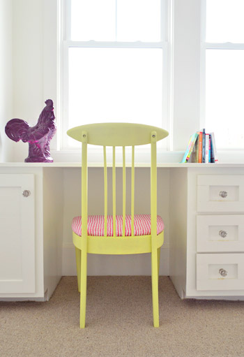
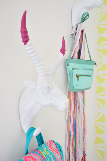
You’ll notice some ceramic animal friends on the wall behind this chair, so let’s get a little closer…
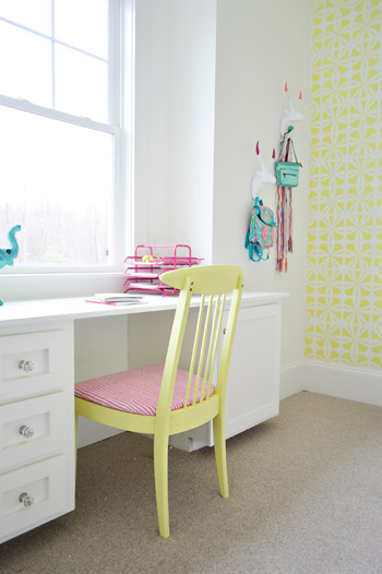
They’re HomeGoods finds that we grabbed to hang up a few colorful imaginary daughter items like a purse, a mini backpack, and a scarf.
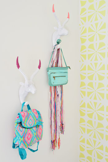
Here’s what they looked like when we bought them. Going onto a white wall we worried they might be a little flat, so we dipped their antlers just to add some interest. We didn’t want them to look too matchy or perfect, so we went with two different colors (Hydrangea Flowers and Berry Fizz).

We didn’t tape them off and paint them – we literally dipped them right into the cans.
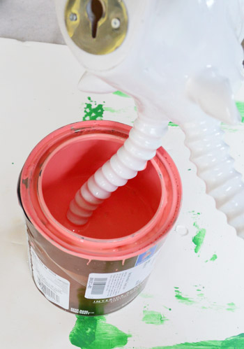
They were a little drippy…
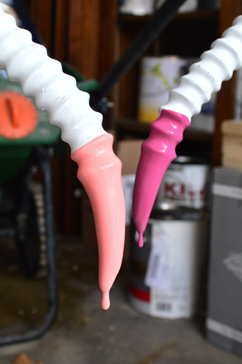
… so we hung them from our grass seed spreader with some old foam core under them to catch the splatters.
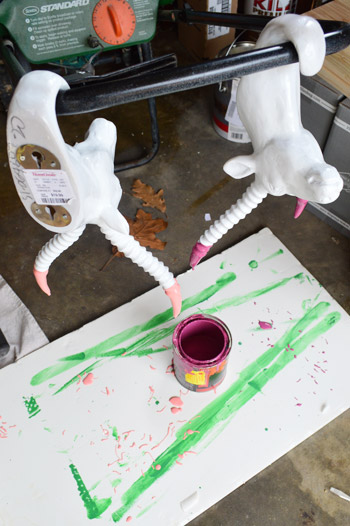
It was crazy easy, and the dipped tips look awesome – sort of like powder coated resin since it’s so thick and glossy. I love that they’re imperfect and angled too. For some reason it seems more interesting than if the paint followed the ridges perfectly. Nothing like a little rebellious outside-of-the-lines coloring.
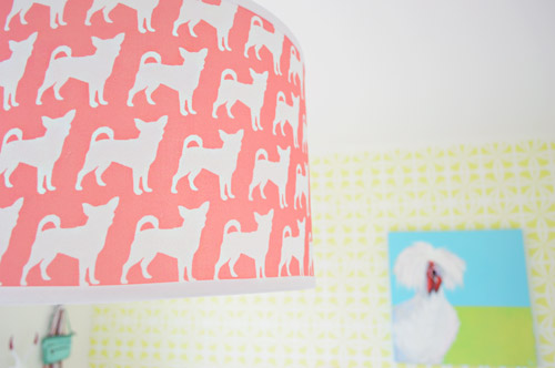
And you may have noticed our Burger pendant light. We couldn’t resist. Just don’t tell Burger or his ego won’t fit through the door anymore…
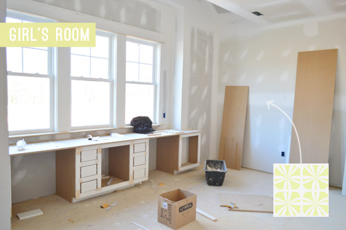
The room’s definitely looking a lot more finished than the view that greeted us about a month ago.
Now we just have about a half-dozen other changes/additions to make in here… and 24 other spaces to finish in the next 14 days or so.

Update: There have been a few questions about having a double desk for a single kids room. John actually grew up with two desk areas in his room (one for a computer and one for homework/writing/drawing) so our team figured since two chairs fit easily along that wall it could end up being really practical.
Update #2: A few others have asked if these furnishings/accessories need to be universally appealing for whoever buys this house. The answer is that they’re just for the show (where we’ve been encouraged to take risks, have fun, and do different things so each house feels set apart). Once the show’s over, the homeowner has the option to buy a few items of furniture or art if they’d like – but will mostly be furnishing/decorating this house so it works for their family.
As John mentioned on Friday, things are going to be super showhouse heavy for us throughout this week and next week, so forgive us in advance if we’re behind or off schedule (or slow on comments). We’ve somehow managed to squeeze in some our-house projects among the chaos (like some nursery updates), so we can’t wait to share those whenever we can.
What did you guys do this weekend? Any art hanging, headboard painting, chair makeover-ing, or ceramic animal dipping?
Psst – Wanna see more showhouse info & photos? Click here for Our Full Showhouse Tour, which includes final pictures of every room, the floor plan, budget info, a video walk-through, and shoppable showhouse furniture & accessories.

Anele @ Success Along the Weighn says
Those chairs are TOOOOO cute! Love ’em! Of course the Burger lamp as well.
I don’t know how you guys are doing this along with your own place and getting ready for Barnacle at the same time.
Jenny B. says
Totally agree! I think some people are just more productive than others. I am not one of those people. I admire them so much, though! Go John & Sherry, Go! :)
Katie says
Because its their full time job, and that’s not meant to be snarky at all. Just don’t put yourself down or think you aren’t doing enough… You probably decorate your house, work 40 hours a week and take care of your kids. No different then them.
sew says
This is beautiful…light and airy and colorful without appearing to try too hard or going overboard. Wonderful.
Meredith says
It looks lovely and I like everything, but with that post title I’m a little sad that the opportunity to post a gratuitous Ryan Gosling photo was missed…. :)
YoungHouseLove says
Hahahah!
xo
s
Diane says
Hey Girl ~ you think Ryan Gosling, & I think Donny Osmond. #justtoldmyage #generationgapftw
YoungHouseLove says
Hilarious!
xo
s
Alina says
Opportunity taken: Ryan Gosling goes DIY ;)
http://www.revolutionariesblog.com/2013/04/10-tips-on-datingmarrying-diy-blogger.html
YoungHouseLove says
Hahaha!
xo
s
VICKI C says
Love the colors!
Where did the flamingo pillow come from?
YoungHouseLove says
That was from HomeGoods a while back.
xo
s
Sarah @ Sarah's Daybook says
That is so sweet! I love that chair color!! Burger’s shade is too cute in there.
Sarah
http://Www.sarahsdaybook.wordpress.com
Liz says
I love the headboard!
Why didn’t you use some YHL hooks??
YoungHouseLove says
There are a few of those going on too – with some getting hacked a little before going in ;)
xo
s
Lisa says
I don’t get the whole antler thing. My kids would be frightened of those. Why not let kids be kids and do something simple? This is an example of a room that is suited to an adult’s taste for a child. I like a lot of stuff that you all do, but I’m not impressed by this. It’s cold and sterile.
YoungHouseLove says
Oh yes, I’m sure we’ll make 1,000 decisions that some people like and some people don’t as we fill this house up for the show. Clara helped us dip these animal hooks and loved them so much she wanted to keep them for herself – but some kids might hate ’em. We’re just decorating this house for charity with a pretend family in mind (so we envisioned this as a space for a 10 to 13-ish year old girl) but whoever buys the house will get to put whatever they love on the walls :)
xo
s
erica says
This room is FAR from cold and sterile! Just because it isn’t covered in characters and/or butterflies and flowers doesn’t mean it isn’t suited for a child’s taste – especially a young preteen. JMO.
rachel says
If you truly want this to look like a room for a 10-13 year old girl, at the very least you should replace the rooster with that yellow speaker from your second house’s kitchen and hang something different from those hooks. Those little tote bags look like they are for a much younger child.
Rachel says
Ouch…that’s a little harsh before noon on a monday morning….
and…um… why would your kids would be frightened of antelope?
JennP says
Children frightened by antlers?! That got a legit “LOL” from me. Don’t Rudolph, Comet and Blitzen have antlers too?
jenn says
definitely cannot imagine a 10-13 year old girl being afraid of a deer head. haha its not like its real and stuffed, now that might be terrifying. im 24 and i think that bag is cute, its very fun and spring. i love it and bags like that are really popular right now.
Brigitte says
My 14 yo loves the bags btw. And the fact that the room has pink “but not too much!” Winning.
Samantha says
Actually, if it is supposed to be a pre-teen/teen room, you need to throw clothes on the floor and spill some nail polish on the desk. LOL
The one thing I’d add is some color to the night stand. I think it might want to be that bright blue color from the wall art. Really, it told me. ;-)
rachael says
So cheerful! I would’ve loved a room like that when I was a young girl!
Karen says
I love the color in this room! I did a little project this weekend that I stole from your friend Katie @BowerPower. I love to borrow all you guys ideas!
http://www.flimsypi.com/wordpress/2014/03/31/under-15-shelving-unit/
Keep those posts coming. Love them!
YoungHouseLove says
So cute!
xo
s
Heather says
I like the stencil and headboard but sadly the rest of the room looks so disjointed that I am not a fan of the overall design. It looks like an animal parade in here.
Mary says
I can’t help but agree. The room is like Zoolander meets Back at the Barnyard for me. I would have loved to see more color as well. I love the flamingo pillows and the color of the bed. More of those pinks with light blues would have been gorgeous.
The stenciled wall is too neon with the white and hurts my eyes. Not sure how it looks in person but I wish they had picked a different color or had no stencil at all and just painted all the walls a nice soft color. The built-ins would have really popped against the walls, too.
I also feel like they played it too safe with the white bedding. So much white in the room, I would have loved to see a paisley duvet, throw or quilt to break up the white.
YoungHouseLove says
Oh yes, we have a throw going in at the foot of the bed to break up all that white as well as a ton of other accessories to be loaded in (many in pink, light blue, and beyond). I’m not sure I can stress how “not finished” this room is. Lots more to come!
xo
s
betty says
LOVE this! and all the ceramic animals, even tho the showhouse décor is cutting into my own ceramic obsession, since I think we share the same homegoods. haha this is so cute tho!! cant wait to see it all come together in real life!
Diane says
Please iron the bedspread!
YoungHouseLove says
That’s on the list! (Check out that first paragraph ;)
xo
s
Meghan says
This is one of my all-time favorite YHL posts! Adorable!
YoungHouseLove says
Thanks Meghan!
xo
s
Andrea Enright says
What a whimsical room! And the stenciled wall is fabulous!
Amanda says
I would have LOVED this room as a teenager! It’s fantastic!
Maureen says
It may look a little sparse, but people realize that the family that moves in will have their own things to add, right? Anyway, it looks cute and airy and ready for a young girl to add her own personal touches!
Stephan says
Actually, if this is a show room it is not suppose to be sparse.
Erica Baker says
I LOVE the shape of those chairs!! Great lines. Stenciling a wall is such a good idea and seems like less of a commitment that wall paper with the safe effect. Why haven’t I thought of this??
Krista says
Well…I am offically jealous of a pretend 13 year old! I think my favortie thing is how many colors and patterns are going but the white on everything else leaves it so bright and clean.
Samantha @ Fabulous Fabris says
Love the chairs :)The yellow on them looks a lot less bright than it does on the walls, which I like.
Brigitte says
Ditto! I didn’t have any idea they were the same color, and that’s actually a good thing. They don’t blend in with the walls at all but they coordinate perfectly.
Ami says
Hey there, this post gives me a chance to share something with you that has been on my mind for a while now. It is in regards to your paint sprayer. I have the same paint sprayer and have actually gotten some advice on how to maintain it from John. I know that you are having a love/hate relationship with it and I know you don’t use it for furniture. I’ve even read where you have advised others not to use a sprayer on furniture. That is almost exclusively how I use mine as I paint a lot of furniture. I just love rehabbing old, beautiful pieces of furniture. I do it for fun and quite often donate the things I have brought back to life. OK, this is taking too long. Where am I going with this? I kept thinking what is it that makes it easy for me? Then I remembered my discovery. I use latex paint conditioner. Wagner Paint Easy to be specific. Made/makes all the difference in the world. Good bye sputtering and spattering. Hello, super smooth amazing finish. Those chairs and the headboard for instance would have been perfect candidates. Maybe you’ve tried it, I don’t know but if not, give it a go. It’s cheap and one bottle goes a long way. Hate to see you give up on that sprayer.
YoungHouseLove says
Thanks so much for that tip Ami! SO HELPFUL!
xo
s
Brigitte says
Ami I’m really gonna need you to stop being so helpful. Now my future home is going to need a shed devoted as a spray studio so that I can rehab my furniture the way I want it! The thought of doing it by hand was overwhelming but if there’s a way to make the sprayer work on furniture, TRY AND STOP ME!!
Oh who am I kidding, I probably already knew I needed a shed for that anyway lol. That future home is a ways off besides. Cheers!
Maha says
Lovely room. I am awaiting the imminent arrival of baby girl #3 and these colors are really speaking to me right now, lol. This room is such a nice mix of fun and not too serious, but also sophisticated for a girl.
YoungHouseLove says
Thanks Maha! Good luck with your little girl on the way!
xo
s
Rachel @ The Sunny Disposition Home says
I LOVE the roosters in the room. So bright and cheery. We spent the weekend point and tucking our brick foundation. It was nice weekend to be outside again, sad to see the weekend go.
Crystal says
Such a fun room! We got a closet painted reusing some old paint and will be adding shelves soon using adjustable tracks but shelves cut and painted with leftover wood. Trying to be frugal!
laura says
hi YHL,
i still love reading your blog but this room just makes me sad. it’s so white and plain. you realize you have white walls, white trim, a huge built in white desk, and white bedding. nothing comes together and the colors are burning my eyes. definitely a misstep.
YoungHouseLove says
Hmm, maybe I need to bold something at the front of this post that says this is far from done (I tried underlining it, haha!). For example, we have a colorful throw that’s getting layered onto the bed along with an entire trunk-load of colorful accessories, lamps, possibly a new side table, a colorful fabric window treatment that’s going in, a custom made bolster to add to the bed, etc. We tried to call that out at the the post, but I guess it’s hard to see this room as in-progress for some reason? I’d call it a half-baked cake at this point ;)
xo
s
Carrie says
I think the main reason you are getting a lot of “holy cow so light and sterile” feedback is becuase
1) It’s ovbiously not done quite yet
2) Everything is currently in the same tone of bright, it’s possible that if you add something darker, like a warm toned night stand or something to give levels of colors. I’m sure someone who studied color theory could give you better way to word it, but there you go.
Sara says
and the gooey middle never makes any sense :)
Danielle says
I think even though this room is far from done, as you put it, it is adorable! I don’t really understand why people don’t realize that you are adding in color in other ways, that will make it easy for the family that buys the house to change. The things that are white would be much more work to change- like the desk and trim. I think the room is lovely and I cannot wait to see the finished result in every room in this house. Im sure hearing all this critic is hard, even though it comes with putting yourselves out there in the blogosphere. You guys are amazing and doing such a great thing with this house!
Monica says
I am in love with this room, it is the perfect inspiration I need for my girls room. They have pink walls (per request), white bedding, and I’ve been trying to figure out what other colors to add to break up the pink a little bit. I have a white accent wall, but the yellow and the blue you added in this room will give their room that extra pop of color as well! Thank you!
P.S. I’ve been reading the comments and maybe you should change your post title to, “Hey, girl, this is half-baked!” It might help :)
Britt says
Looks great, guys! Its funny that someone said it looks cold/sterile, because I feel that way a lot with your rooms since you seem to shy away from warm colors, but I actually didn’t think that at all looking at this one. I think the stenciled wall and pink headboard & accessories add plenty of warmth to the space (and I’m sure the accessories still to come will too) and it looks colorful and fun and exactly the kind of room that 13 year old me would have loved. Good work!
YoungHouseLove says
Thanks Britt!
xo
s
Mary Beth says
That room is so perfect! It’s feminine without being too girly and it’s so bright and cheerful… I just love it.
My two-year-old girl and my little boy who is almost 4 are sharing a rewrite now and I can’t wait until they have their own rooms in our next house so that I can have a room like that for her!
This is the space but they’re sharing right now, it’s pretty cute but it’s hard to tie boy and girl stuff in together!
http://hystericallyeverafter.com/2014/03/28/brothersister-room-sharing-part-2/
xoMB
Tiffany says
The shared space is sooo cute!
Stephan says
Yes, it is a good room for a two year old girl or a little boy.
caroline [the diy nurse] says
Holy Moly I love that stencil! And the color scheme is so cheery. I love that you didnt tape off the the antlers and that it runs so slightly.
I suddenly want to be 12 again!
Sarah M says
So funny the range of opinions. I think it’s a great room to visualize the space for the buyer. Someone above mentioned the buyers would add their own things to the space, but the furniture is not permanent, right? You mentioned lots of it is just loaned. So other than the paint colors and fixtures, the decoration is just to get the value of the house up for selling so it makes more money for charity… I may be way off but I’m picturing the buyer bringing in all their own furniture and accessories…
YoungHouseLove says
Oh yes, the buyer gets an empty painted room (the walls stay, the carpet stays, the window treatments stay, and the light fixture stays). They might have the option to buy some of the furnishings like the sofa downstairs or the big woven bed in the master (in here I think they could buy the bed if they’d like – but it’s just a basic full sized mattress on a frame).
xo
s
Kerry says
Why do I have Pharrell’s “Happy” in my head?! What a fun, fun, fun room!
Will you add window treatments?
I wonder, do you have a uniform blinds theme throughout the house? If I built a house, I’d do white wooden blinds like these (http://tinyurl.com/klox8zy) throughout — and keep the window treatments spare.
YoungHouseLove says
Aw thanks Kerry! Yes, we have some patterned fabric window treatments coming that we can’t wait to hang. They should be ready this week, fingers crossed…
xo
s
Lisa | Winter Heights says
I love the direction this room is going in, I love the bold mix of color choices and totally think that any little girl would LOVE this room!
Jeanette says
This is one of my favorite rooms that you’ve done – I really love how the show house as a whole is shaping up. It’s fun to see all of the risks that you’re taking and how everything is coming together. I would have loved to call this room my own…oh, say 20 years ago, lol. I can’t wait to see the rest of the house!
YoungHouseLove says
Thanks so much Jeanette!
xo
s
lisa says
I love it, guys! (I do think it is a little funny that some folks think it isn’t colorful enough – what? It is so bright and cheery!)
I think I’ve just gotten some major inspiration from your stencil wall… Though I’m thinking maybe something ombre – start darker at the bottom and warm up as it goes to the ceiling? Like a sunset almost; but not 1980’s living room sand painting “sunset.” Thanks, guys! Again; another awesome job!
YoungHouseLove says
That sounds really cool Lisa! Send us a pic when you’re done!
xo
s
Rosie S says
Super cute color combos! Can’t wait to see all your touches in there!
Elizabeth says
Loving all the bright pops of color. The built-in is awesome! Did you guys think of putting bunk beds in that room? With the built-in having space for two chairs it seems little odd for one bed.
YoungHouseLove says
We did a built-in bed in the boy’s room so we opted for a long desk in the window in here, and for the layout (since that wall was so long) two openings seemed to make sense. We figure if one of them is where she puts her computer, the other one could be left open for drawing or writing stuff by hand – so we hoped it would be practical.
xo
s
A says
I also picture it with like, one homework spot and one make up / hair do spot, since it does seem like the room is designed for a “tween”/teen.
I was going to say the same thing to the person who said her daughter would be scared of the antlers – my son might be too (he is three), but this room does not look like it was designed for a toddler/preschooler.
I also disagree with the people saying it isn’t colorful enough. I know you have things to layer in, but since you are essentially “staging” this house, I think leaving as much to the buyers imagination as possible is actually smart. And the colors in there are so intense, you really only need them in small doses.
The only thing I am not “seeing” yet, is there are a LOT of different animals going on in there, and there doesn’t seem to be any theme at all. Unless the theme is Animal Menagerie! In which case I am sure it will look awesome when it is done. Trusting that “the middle makes no sense” – can’t wait to see the finished product!
Sorry this was so long!
Jocelyn says
One of the sides of the desk could be used as a vanity too when she gets into doing hair and makeup. That way she could have her space to do that instead of being in the bathroom with brother.
Jaimee says
I LOVE the idea of staging one of the desk areas as a make-up nook – it would certainly be fitting for that imaginary 13 year old! And maybe you could find a vintage Caboodle to go with all the awesome colors! (ooops, did I just age myself ;))
YoungHouseLove says
Such a fun idea!
xo
s
Jazmin says
LOOOOOOVEEEEE! and I need to find a similar headboard!!! WOW, so pretty!
Jazmin
Shelley @ Calypso in the Country says
Love it! Now I really want to paint a headboard a fun color! And the Burger light makes the room!
-Shelley
Nancy says
My favorites are the stenciled wall and painted chairs.
P says
So can the bed be moved to any other location in the room? And does only a twin fit? I’m confused that there are 2 built-in desks; 1 will be wasted unless you have 2 kids sharing the room.
Recovered chairs look cute; my daughters all vote NO on the rooster picture & ram heads; that’s not really kid style at all. And they are also lobbying for a printed bed linen; the white is too “either little girl or mom-picked”. So there you go, straight from some budding girl designers :)
YoungHouseLove says
Thanks P! That’s a full sized bed in there, but as for the desk, John actually grew up with two desk areas (one for a computer and one for homework/writing/drawing) so we figured since two chairs fit easily along that wall it would be practical. If someone moves in and wants a bunk bed in there it could fit though. This furniture is just for the show, so the homeowner will furnish/decorate this house so it works for their family :)
xo
s
P says
OK, that was my point so let me try again. I never look at existing furnishings when buying a house; the only reason I commented on the decor is this for a SHOWHOME.
Given the permanent choices that have already been made for this room 1. long window wall taken up by 2 built-in desk areas in a room for only 1 child, (truly sharing a room, vast majority would want 2 twin beds, not to sleep together in a full) 2.door to the J&J bathroom on another wall 3.door to the hallway on a wall 4.I assume a closet door somewhere
– there are NO other choices for furniture placement in this room. One of the best parts for all my girls has been the ability to grow with the room, move things around, turn a bed completely away from the windows to avoid zombies, trade furniture in & out. 1 uses a (one) desk maybe 10% of the time, the other 2 don’t ever and would want a window seat, (big)floor space to play, and a craft table (NOT desk they can’t reach).
That won’t be possible here. I always have thought it was too bad when builders make choices for how THEY would live in a house rather than making it easy easy for the BUYER to decide how to live in the house.
YoungHouseLove says
I completely agree that others might put stuff in other spots or prefer other more flexible layouts. Thankfully these homes tend to sell pretty fast, so as long as one family prefers this layout for their family, it works out for the builder and that family. Many of these builders make very open/basic floor plans for the other 20+ homes a year that they build, but like to be more experimental with the showhouse, which makes for a fun show since they get to showcase carpentry and finishings and layouts that feel less safe and more specific.
xo
s
bridget b. says
the room is so bright and pretty. love it! i’m planning a makeover for my daughters’ room and that headboard color might be just the shade of coral that i’ve been looking for. i also like the stencil.
thanks for the tip on painting furniture. i’ll be painting their big girl beds myself, so that helps.
Audrey says
LOVE the ceramic hooks. I am definitely going to steal the dipping idea. ;-)
Does the desk do double duty as a dresser also? If no, where is dresser storage? Closet built-ins? (me being all nosy. LOL)
YoungHouseLove says
There’s a dresser area to the right of the door as you come in (along with a big double closet with built-ins). We didn’t shoot those areas yet, but we’ll be sure to share them when everything’s done!
xo
s
celia says
Looks awesome! When you say it needs finishing touches, I think you’re just comparing it to Clara’s amazingly personalized room.
Cat @ MaryMarthaMama says
I love the headboard transformation… Do you know how he painted it? Was it with a paint sprayer? I would love to do something like that but we don’t have a paint sprayer so I would worry about the finish looking imperfect if I tried to do it myself.
We got away this weekend and had fun browsing at some antique places and flea markets. It was fun to gather a little inspiration.
YoungHouseLove says
I believe he painted it with a roller and a brush. Primed first, and then painted.
xo
s
Jenni says
I just love this room, especially that gorgeous headboard. Fantastic!
Josie says
Love the room! Quick question – where did the elephant on the desk come from? Is that a Home Goods buy? Thx P’s!
YoungHouseLove says
Yes, he’s from HomeGoods!
xo
s
Instants de Louise says
This room looks so bright with all those pops of color ! What I prefer is the headboard and I will definitely use your advices for recovering chairs.
As for our week-end, we spent it working on our kitchen remodel… Right now, it’s the phase where it looks far uglier than it was before, but I know, deeply, that one day it will look good !
I just hope this day is not too far away !
Melanie says
I like certain elements in the room, like the headboard – but the room looks unfinished. Is it completely done?
YoungHouseLove says
Not even close ;) We have a bulleted list of stuff to do in the beginning of the post if that helps!
xo
s
kristen says
the readers get an F in reading comprehension today!
Jocelyn says
Ha, I agree with Kristen. Do people only look at the pictures?
Alison says
Ugh, seriously! I always browse through the first page of comments because there are usually great questions, but this is ridiculous. I feel like the minority of readers ACTUALLY read!
erica says
Seriously Kristen! READ folks!!!
JenB says
Thanks for saying that Kristen. I was thinking the same thing. It’s such pet peeve of mine that when I submit a question, I reread the post several times to make sure they haven’t already answered my question! As always, YHL handles is with style and grace:)
The room is very cool..perfect for a tween girl. And I love the double desk idea. Now that most kids have a computer, it totally makes sense.
Hillary says
I really love hearing about the show house!!! It is such an interesting and fast-paced project. I’m GLAD you’re talking more about it! Wish I could figure out a way to justify a road trip from Atlanta up to see Homearama!!!
Jackie says
Are the desk cabinets actually drawers for clothing storage? Just wondering where a dresser would go in this room. I like the color-combo. It reminds me of tropical Starburst candy. :)
Best,
Jackie
YoungHouseLove says
Thanks Jackie! There is a dresser area to the right of the door (sorry, that’s not pictured yet) along with a big double closet with build-in shelves.
xo
s
Jackie says
Thanks for the reply! Didn’t realize there was more wall at the foot of the bed! It looks like the floor plans changed slightly from the final version you posted? This is Bedroom 3 – I think… (I also don’t know how to read floor plans LOL).
http://images.younghouselove.com.s3.amazonaws.com/2013/09/FloorPlans-1-Final-LARGE.jpg
Best,
Jackie
YoungHouseLove says
See that space on the floor plan between the bathroom door and the door to the room? That’s a dresser spot. I don’t think anything has changed, although adding the built-in shelves to the corner of the closet was a nice surprise.
xo
s
Jackie says
Oh So it’s Bedroom 2 not Bedroom 3? I gotcha now.
Best,
Jackie
YoungHouseLove says
Yes it’s bedroom 2 :)
xo
s
Jackie says
Also – thanks! :)
Caren says
Thank you for sharing the room even though it’s still a work in progress!!
It gives us a chance to hear you explain one set of projects/decisions at a time, which is so nice! Also, it’s great to see how each set of changes affects the space – so helpful for rooms evolving at a non-showhouse pace :)
Constance says
I kind of don’t get (or connect with?) this one – I like the overall color palatte, but something about the pattern mix or the chicken painting and/or flamingo pillow (or those two together?) or something else I can’t put my finger on left me with the “maybe this looks better in person” impression. That said, if I was in the area I would be already holding pair of tickets for the home tour!
Lanen says
I agree. I don’t “get it” either. I see a mashup of a toddlers room, an 80s teenager’s room, and a Midwestern kitchen (roosters!). It will probably look better when it is finished in a few days, so why not blog about it then?