We spent the weekend checking off a bunch of hands-on projects for the girls room in the showhouse. It’s definitely still looking sparse, and is far from done, so I’m sure it’ll keep evolving right up until our deadline.
- The bed needs to be raised and we have a colorful throw to add
- Linens need to be ironed and we have a custom bolster that we’ll layer in there too
- Colorful fabric window treatments will be hung as soon as they’re in
- We might switch out the end table – not sure yet…
- We have a soft blue lamp and a bunch of other accessories to add to tie things together
But we did manage to significantly shrink the to-do list this weekend.
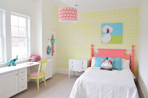
We got the wall stenciled, the headboard painted, hung some art (that awesome chicken painting was done by a friend of ours named Lesli DeVito), and then we painted/upholstered two secondhand chairs – and even had some fun with a few wall hooks.
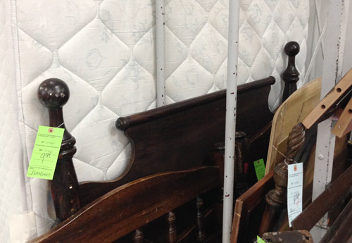
You might remember this old full-sized headboard find of ours (it was $9.98 at a local place called Family Thrift Center).
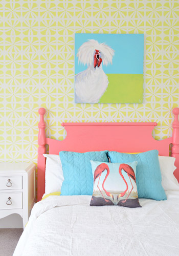
Now it’s sporting a fresh coat of paint (Hydrangea Flowers by Benjamin Moore) along with that freshly stenciled wall behind the bed. Both of them were done by Parker, one of the builder’s right hand men – who apparently is a stenciling expert among all of his other talents.
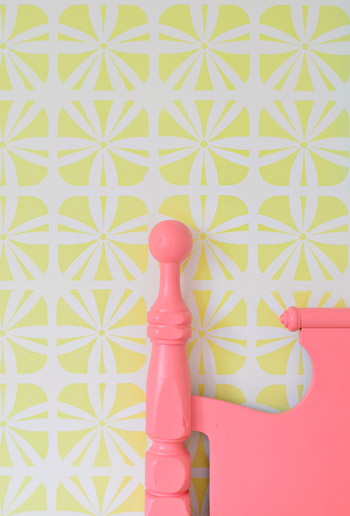
It definitely felt foreign not to be up there on ladders doing the walls ourselves (along with priming and painting that headboard) – but with 3,500 square feet of house to furnish & accessorize, it was also pretty amazing to be able to tackle a bunch of other tasks while those got checked off the list. The stencil was donated by Royal Design Studios, and the room is painted Simply White with Hibiscus by Ben Moore layered on for the stencil.
It’s another example of wanting to take some risks to keep the show interesting (we love how it mixes with the pop of color in the headboard) and it’s nice that it can just be painted over if someone moves in and wants to change the look of the room – so it’s one of the more flexible choices.
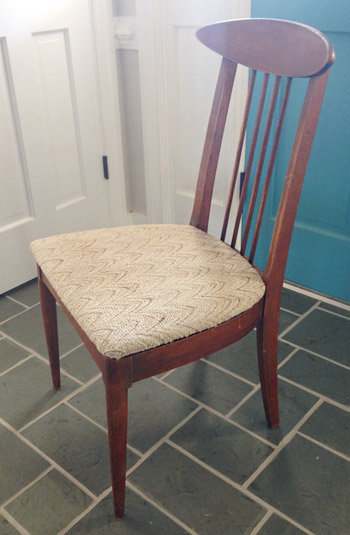
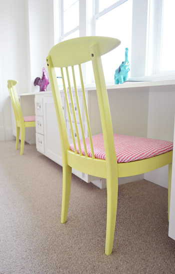
We did get to roll up our sleeves and refinish some furniture ourselves, like these two chairs that we found for $16 each at another favorite thrift store (Love of Jesus on Midlothian).
Here’s what they looked like when we found them.
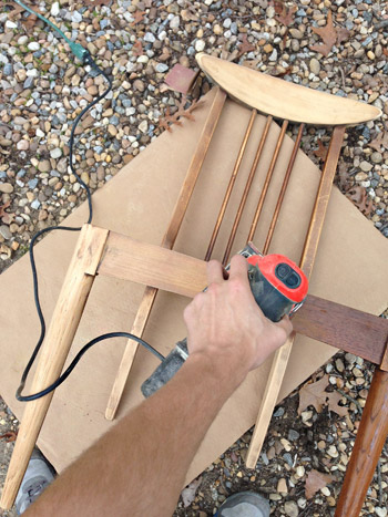
We actually debated staining them, so John sanded them all the way down to the raw wood, but the more we stared at the girls’ room, the more convinced we were that paint was the way to go (there’s carpeting in there instead of hardwoods since the builder said most of his buyers prefer that in a kids room – and with other painted furniture going on, we thought wood stain might feel like the odd main out). I’m sure we could have stained them and made them work, but a little more fun color in a kids room was too hard to resist…
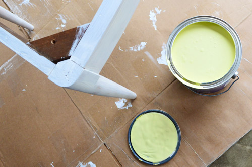
So we primed them with two coats of Kilz Premium (rolled on with a foam roller in most spots and with a brush to get into the nooks and crannies) and then we gave them two coats of Hibiscus paint, which was leftover from the stenciled wall (once again, applied with a small foam roller and a brush to get into those tighter spots).
While those were drying in the garage, I recovered the seats with extra loft batting (you can grab that at any craft store like JoAnn) and used a manual staple gun to pull that firmly around the front of the seat, and staple it around the perimeter in the back.
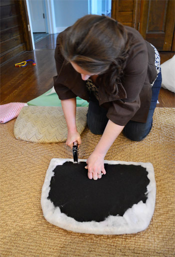
Then it was time for some playful fabric called Candy Floss that we found at U-Fab (they kindly donated a yard of it, which was enough to cover both seats). Here’s a shot of how I deal with corners. If you fold them sort of like when you wrap a present you get a nice clean look in the front.
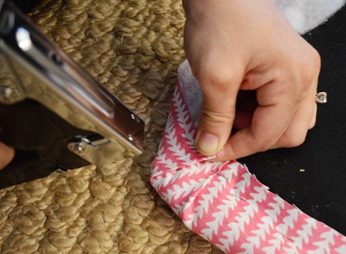
One tip for working with a pattern is just to make sure to keep it straight as you staple (I occasionally flip it over to check, and you can pop out staples and redo things if your patterns migrates and it looks wonky). The other pattern tip would be to make sure if you’re doing more than one chair that you’re keeping the fabric running in the same direction (assuming you want your chairs to match). So since the white arrows seem to be pointing down on this cushion, I made sure they went the same direction for the second chair.
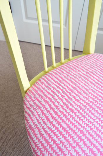
Then you just screw the seat cushions back into the chairs once they’re dry and you’re done. Boom – new chairs. Except they’re old. But they look new, so… huzzah!
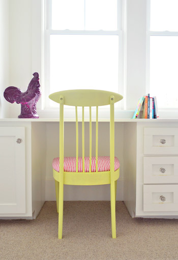
You’ll notice some ceramic animal friends on the wall behind this chair, so let’s get a little closer…
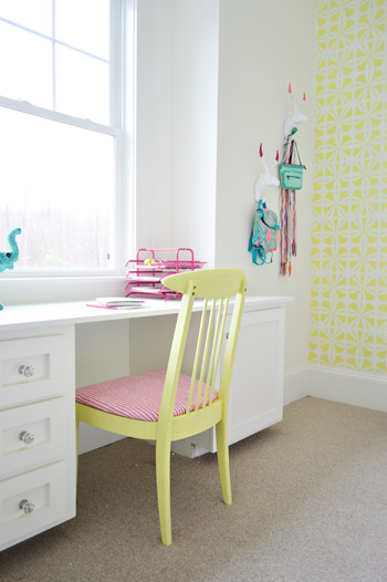
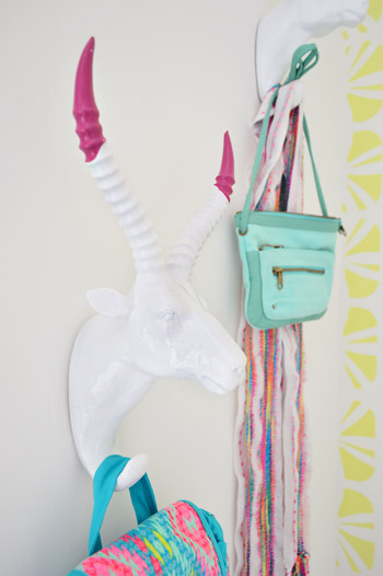
They’re HomeGoods finds that we grabbed to hang up a few colorful imaginary daughter items like a purse, a mini backpack, and a scarf.
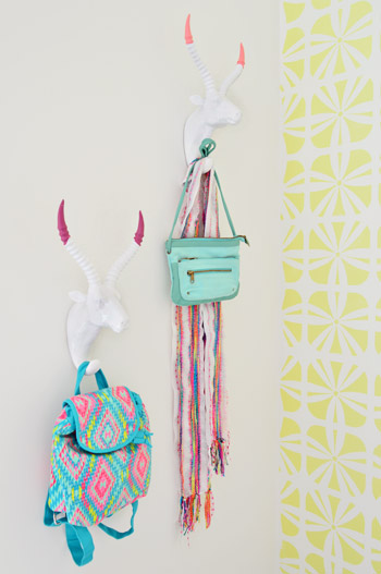
Here’s what they looked like when we bought them. Going onto a white wall we worried they might be a little flat, so we dipped their antlers just to add some interest. We didn’t want them to look too matchy or perfect, so we went with two different colors (Hydrangea Flowers and Berry Fizz).
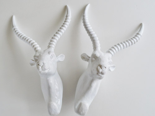
We didn’t tape them off and paint them – we literally dipped them right into the cans.
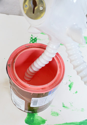
They were a little drippy…
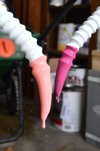
… so we hung them from our grass seed spreader with some old foam core under them to catch the splatters.
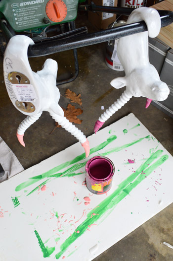
It was crazy easy, and the dipped tips look awesome – sort of like powder coated resin since it’s so thick and glossy. I love that they’re imperfect and angled too. For some reason it seems more interesting than if the paint followed the ridges perfectly. Nothing like a little rebellious outside-of-the-lines coloring.
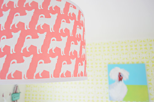
And you may have noticed our Burger pendant light. We couldn’t resist. Just don’t tell Burger or his ego won’t fit through the door anymore…
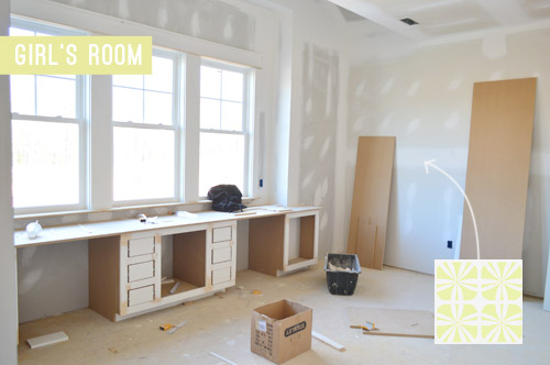
The room’s definitely looking a lot more finished than the view that greeted us about a month ago.
Now we just have about a half-dozen other changes/additions to make in here… and 24 other spaces to finish in the next 14 days or so.

Update: There have been a few questions about having a double desk for a single kids room. John actually grew up with two desk areas in his room (one for a computer and one for homework/writing/drawing) so our team figured since two chairs fit easily along that wall it could end up being really practical.
Update #2: A few others have asked if these furnishings/accessories need to be universally appealing for whoever buys this house. The answer is that they’re just for the show (where we’ve been encouraged to take risks, have fun, and do different things so each house feels set apart). Once the show’s over, the homeowner has the option to buy a few items of furniture or art if they’d like – but will mostly be furnishing/decorating this house so it works for their family.
As John mentioned on Friday, things are going to be super showhouse heavy for us throughout this week and next week, so forgive us in advance if we’re behind or off schedule (or slow on comments). We’ve somehow managed to squeeze in some our-house projects among the chaos (like some nursery updates), so we can’t wait to share those whenever we can.
What did you guys do this weekend? Any art hanging, headboard painting, chair makeover-ing, or ceramic animal dipping?
Psst – Wanna see more showhouse info & photos? Click here for Our Full Showhouse Tour, which includes final pictures of every room, the floor plan, budget info, a video walk-through, and shoppable showhouse furniture & accessories.

Chelsey says
I was a little confused by the double chairs/single bed thing too, until I realized that one would be so fun as a vanity space while the other could be more of a desk. At that age, I think I would have loved feeling all fancy and sitting down at a table to do my “make-up.” The buyer could just add a little stand-alone mirror and maybe a few girly trays for perfumes and stuff. Love the room! So fun and cheery!
Elizabeth says
It’s coming along splendidly! I can’t wait to see the finished results with all the other color added in. Oh and I love the chair makeover!
Erin says
So creative and cute! Was wondering when you said you used a manual staple gun for the chair, have you changed your opinion about the Bostitch electric stapler you’d mentioned before? Have heard good and bad comments about it. Main criticism seems to be that the bottom plate is plastic and breaks a lot. Would love an electric one, but don’t want to spend a lot on it. I think you’d said you got yours for about $30. Just wondering. The chairs look so great.
YoungHouseLove says
I loved using that one on the stair project, but I think I’m still a manual girl for smaller things like chair seat upholstery. I like being untethered (not having to plug in) and it seems simple enough to just pop down on the floor and bang it out – literally. Haha!
xo
s
Danielle says
The ceramic rooster and elephant would make fun necklace or bracelet holders to stage it for a teen girl. Love the fun pops of color, the stencil and the flamingo pillow. Very fresh! Can’t wait to see it all finished!
Heather says
The show house posts are my favorite! I just love the direction you’re taking this one. This little girl’s room is so bright and cheery, can’t wait to see where it ends up. I agree with a commenter above that you need to have Pharell’s “Happy” on a loop playing in this room ;-)
Kendra C says
You guys are off to a great start! I love the stenciled wall and bright pink bed! I personally love the white backdrop. As the mother of 3 girls I can appreciate the practicality of changing out a few accessories as color preferences change over the years (and they will!) instead of changing out bedding/repainting the whole room!
Addie says
I think this is so cute! I love the yellow, blue and pink together. And as much as I love the shape of the side table, I think that there needs to be something more punch-y there. Perhaps a painted table in blue to coordinate with the throws and rooster? or maybe a smaller white table with an accent chair/ reading nook in the corner? I know you’re not done yet, but I am SO EXCITED to see where this is headed!
YoungHouseLove says
That’s what we’re thinking too! We tried a yellow table but it was too yellow with the wall. Blue would be fun though! Will keep you posted for sure :)
xo
s
Meghan says
I think if you painted the side table another bright color – turq. or the blue, it would just add to the awesomeness of this room! A girls delight!
Kay says
I think this room is fabulous! How in the world it could be read as “sterile” confuses me . . . but to each his or her own, for sure. I’d be hard-pressed to find a little girl who didn’t think it was AWESOME, though. I love the brights and whites and tasteful simplicity very, very much. It is sophisticated and whimsical. I think you nailed it. Love it!
Heather says
The room is meant to be for a teenage girl not a ‘little girl.’ It reads young to me with the abundance of random animals and would be fitting for anyone under the age of eight – not for the demographic that they claim to have designed for. I personally would have hated this room (minus the white bedding and walls) when I was a teenager. I would have wanted a single desk and a window seat to curl up on to read.
Emily says
Heather– I had a window seat growing up and never sat on it. I would have much preferred a double desk, so it just depends on the person.
Lisa E says
Thankfully Heather the majority of us love and appreciate it. Please don’t forget it’s just staged and temporary, whether you appreciate the decor or not.
Jess says
Normally I don’t like pink, girly, kid-focused things, but I LOVE this. The recurring use of yellow and pink in fun ways, and the horns. I’ll love you forever for those paint dipped horns. Giving me ideas…
Mary Beth says
Haha why isn’t anyone READING before they comment?
Poor Sherry… I should go back and count the number of times you’ve had to clarify that it’s NOT DONE YET!
You’re so cheery in your replies, definitely an inspiration to me in my writing.
: )
As for the two desk spaces – why do people have such narrow minds? My daughter is 10, and I got her a fabulous long table as a desk – it’s 6 feet! – so that not only does she have room to do all her crafting but when she has a friend over there’s room for both of them to get working!
I think it’s an awesome idea.
MB
Ashley Donald says
Oh I love this!! Such a fun mix of colors.
Michelle says
So much fun, guys!!! I personally love the improbable mix of animals. Flamingos, chihuahuas, antlered dudes, rooster and one helluva handsome chicken. It’s a party!
YoungHouseLove says
Haha!
xo
s
Frances says
I’ve been dying to see the headboard – it turned out beautifully! I love how the room is coming along so far. Perfect for a tween girl.
Michelle says
Not as colorful but a cute alternative option for those asking about the flamingo pillow http://www.kohls.com/product/prd-1590173/flamingo-tapestry-decorative-pillow.jsp. And it’s even marked down :)
YoungHouseLove says
Great find!
xo
s
Christine says
You guys’ schedule just blows my mind! You are ninjas! How do you get all this done, while 8 months pregnant, to boot? Wow. I wish we could come to the showhouse in person! Maybe you could do a video tour?
YoungHouseLove says
Aw thanks Christine! We’re planning to make a big old video tour for you guys to share after the show ends. Can’t wait!
xo
s
lauren says
WHY did you have to paint those pretty mid century chairs. They would have been so much better with just refinished wood. Please stop ruining good furniture with trendy paint jobs.
Ashley says
Cool thing about real wood furniture .. it can always be brought back down to the bare wood. :)
Megan says
To each their own? As a young pre-teen, I certainly would have wanted something colorful like this as opposed to the wood tone. Yes, as an adult I would want it in wood tones. But remember that they’re doing this for an 11-13 year old, right? Keep that in mind.
Shelby says
I thought the same thing. There’s like a million junky chairs that look great with a paint job but it’s a shame to ruin these chairs that have value in the wood tone. I guess I’m just sore from cruising craigslist and seeing all of the furniture “makeovers” AKA gorgeous mid century pieces painted aqua.
Jessica says
I really like how this is coming along! I can’t stop staring at the built-in desk, though. I keep thinking about how it might look really good with some color in the inset panels in the doors/drawers.
You guys are doing an excellent job with this show house. I wish I could move in — or at least have you come design my house. Ha!
Jess says
So I saw the picture and I was like “IT’S SO CUTE!!” and then you guys were like “We’re far from done!” and my brain exploded.
I would feel so accomplished if any rooms in my house looked this finished … but to find out that there’s more to do … man. You guys are crazy awesome. I’m so excited to see it when it’s done!!
Katie says
Looks great! Did you find a bed frame that worked with the headboard you got? Or did you secure the headboard against the wall and then just push the bed up against it?
YoungHouseLove says
Right now we just have the headboard leaning against the wall on lifts (we want to mount it) and then we’ll raise the bed (it’s oddly low due to a half-height box spring) and push that whole frame up against the headboard.
xo
s
Alysia says
So bright and cheery! And I love those chairs. I actually found a set of 6 of them that I am planning to re-stain/recover for our dining room. Thanks for the tips! Probably a long shot of a question, but any idea who made them?
YoungHouseLove says
No idea! Anyone recognize them?
xo
s
Ashley says
Love this!
I have to say, not only are you two (obviously) very talented, but you guys are also strong in the patience department! ;) I am sure constructive criticism is something you expect and probably welcome with your career, but man . . some of these comments just make me think, ‘If you don’t have anything nice to say, say nothing at all.’ Of course, not everything you do can be everyone’s cup of tea. That would make you dull. You stand out because you are creating rooms that not everyone can have the eye for!
In regards to this room, I think the white of the room is what allows the neon & bold accents to be fun instead of tacky! I think any preteen girl would be in serious heaven with this room. I don’t think many children will be ruined with fear by pink dipped antlers. My kids would love them for sure! The coral you chose for the bed frame is gorgeous! Even though you have repeatedly said that this room is far from complete, I don’t think it looks half baked. It looks youthful and fresh! Great job on this one, in my opinion. :)
Elizabeth T says
I love the room so far. I can’t wait to see the finished product! There are so many great elements, I can’t decide which is my favorite.
I’m sure you’ve answered this questions a million times but I can’t seem to find it. What happens to the decorated house when you’re finished? I think you said somewhere that it’s a habitat house. The houses around here that are build by habitat are much smaller!
YoungHouseLove says
The Homearama show benefits Habitat (we are donating our fee, the builder is donating a chunk of change, and the show itself is donating as well) but the house is for any buyer in the area who wants to purchase it, along with the other six houses in the show. A lot of the furniture is on loan and will go back, some will get donated, and some can be reused in other models or can be purchased by the homeowner if they’d like.
xo
s
Elizabeth T says
Ahhh, that makes so much sense! Love the house even more now!
Lisa Sharp says
I totally dig this. Love the palette choices, the stenciling looks amazing and overall it looks fresh and modern. It’s coming along beautifully. xo!
Sarah says
LOVE the chairs! And the painted antlers! Too cute! I started painting my bathroom this weekend and managed to ruin my manicure with latex paint! Oops! Any tips to stop this from happening? Or am I just going to have to sacrifice my nails for a prettier bathroom?
YoungHouseLove says
I bet thin latex gloves would work!
xo
s
Leanne says
I never comment but had to say I love reading your blog. I hit refresh daily at 7:30 to see if anything has been posted. This room is super cute!!! So fun. I always wanted a room with bright colors as a kid!!
I’m so sorry people feel the need to take their Monday morning blues on you. I hope people remember your donating your time and talent and if they are not a fan of the design that’s ok- keep it to yourself! You don’t have to buy the house. Please keep sharing your awesome designs and thank you for inspiring us and letting us be apart of all your doing!
Kate says
I agree about the end table. It’s not bad, but it just feels a little off. Maybe paint it a soft color other than white. Blue? Or perhaps it just needs something on it to break up the expanse.
c says
curious about the carpet…loved the boys room hex…wondering why the choice in the girls room…too much going on?
YoungHouseLove says
A lot of choices had to do with budget and other finishes we picked, so knowing we would have a patterned window treatment going in with a stenciled wall and a painted headbaord we went basic. Figured a neutral berber would be a nice timeless choice.
xo
s
Michelle says
I love how it is looking so far – can’t wait to see it all finsihed up!
Can I just say, I totally dig that chicken painting?!
Stephanie says
Oh my gosh I love this room! Especially the colors that you chose!
Susan says
Luv it… I almost bought the same type of headboard this weekend. But no where to put it. Do you ever buy a piece not mowing it,s use?
YoungHouseLove says
Very occasionally if we love love love something, but we usually like to imagine a few possible uses just to make sure we’re not hoarding.
xo
s
Emily says
I love the double desks because it makes the house a lot more appealing. If only one child has that room, there’s room for her little friends to play school too! If the family has children that will share the room, they’ll each get their own desk!
Will any Clara art be making an appearance in the house? (even if it is a drawing with some crayons set aside on that desk for show staging?)
YoungHouseLove says
I’d love to work in some Clara art somewhere!
xo
s
angela says
I most likely missed it but are you being compensated for the design work on this house? Is there a budget you have to stay under? Just curious since you are putting so much work into it.
YoungHouseLove says
Every design team gets a fee for the ten months they work on the project but we are donating our entire fee to Habitat for Humanity. As for the decorating budget, we do get one from the builder which breaks down to about $500 to spend on each space (which can get busted by just one rug or item of furniture) so each team hustles to get things donated or borrows them from a local furniture place, etc. It’s lots of fun!
xo
s
Kimberly says
Oh my goodness I LOVE those thrift-store chairs you guys found and they look so pretty re-painted! Random question…are you going to Scotch-Guard the upholstery you put on? Or do you feel that it’s not necessary since they’re in a bedroom, not a kitchen?
YoungHouseLove says
No plans to scotch guard since they’re just for the show, but if you have a messy kid I bet it couldn’t hurt! Haha!
xo
s
Jerrika says
I think this room looks fantastic and I love it already, can’t wait to see how it evolves!
Tanya says
Adorable! I spent the weekend ORBing and assembling some new bookcases. (The Helix bookcase from CB2) Now I think I need to work in some paint dipped ceramic animals on the shelves.
Catherine says
Ah, you can never please all of the people all of the time. :) I think this is a great start in this room! Can’t wait to see how it all comes together. I am seriously crushing on that flamingo pillow.
Hannah Wallace says
If my husband would allow me do decorate our whole house like this I would. I see where it’s going, guys! Love it!
Jen @ The Decor Scene says
Love all the great colors in this room. What a fun & bright room. Can’t wait to see it finished, since it looks pretty awesome already!!! :)
Nicole says
Hi there, long time reader, first time poster.
I am just curious – what was the thought process on eliminating the window seat that was on the original plan and instead putting two desks? As a teenager, I would have loved a place to hang out by the window. It seems like the built-ins make it impossible to have any furniture (like a vanity or, probably more functional: a dresser). It also seems to limit where the bed can go and even how big it can be (for a growing teen who will most likely have friends sleeping over).
YoungHouseLove says
Our whole team thought a double desk with room for a computer and a homework spot and lots of cabinet storage was more functional than a long window seat, so we leaned that way :)
xo
s
Susan says
Everything is looking great! You guys seem a little stressed out though; don’t worry, us readers aren’t going anywhere and we won’t be bothered if you need to take things slower for the next little while.
Tania // Run to Radiance says
So colorful and fun. I absolutely love that pink headboard! :)
Esti says
Hi guys!
I just wanted to state that I am in AWE of how patient and nice you guys are, despite some people on the comments being…. How do I put this… A little rough around the edges! :-)
Whilst every single thing in this room (or the house or anyone’s house for that matter) is not entirely my taste, I admire your design aesthetic and it is cool to see how you are growing in this regard and taking more risks.
Keep up the good work and don’t even think twice about some of the snarky comments on here!
Lori L says
I love these room and my favorite part are the paint dipped antlers! Awesome job!
Paige @ The Room Kit says
Um, LOVE IT. The pop of color the headboard brings against the stenciled wall! And the rooster painting! Please tell me you’re naming him. He seems very sassy.
YoungHouseLove says
She has a name by the artist: Princess Truthful. Is that hilarious it what?!
xo
s
Paige @ The Room Kit says
Oh, SHE?! Whoops! I totally got a rooster vibe. Pardon me, your majesty. ;-)
Ashley says
This makes me smile! Great way to brighten up a Monday.
Also, I only skimmed the comments but today’s readers get a C- in reading comprehension! It’s so obvi, you aren’t done with this room because you don’t even have curtains up. Everyone knows how they complete a room! ;)
Rebecca says
I’m so surprised at some of these responses! I think it’s bright and cheery, and I LOVE kids’ rooms that are fun and quirky and don’t scream ‘kid’. Mine would love the antlers, love the patterns and colors. It doesn’t need to be plastered in Disney to be kid-friendly. This grows with a kid, and it appeal to adults and fits into the esthetic of the house overall, while being colorful and fun for a little person. I guess, though, that does explain the many kids rooms out there with bubblegum walls and Dora bedspreads – everyone views kids rooms differently, it seems.
Anyway – love it! Very well done and appealing and I can’t wait to see it finished. My 8 year old would like to move in (except, she already has a very similar bed frame, white ruffly bedspread and layers of color and pattern so she’s biased)!
Caroline says
Please don’t let the naysayers get you down! If you don’t have anything nice to say don’t say it at all :)
And don’t let them affect your posts. I love seeing the stages of a room and totally appreciate that you aren’t just doing before and afters! Clearly anyone whose been around here long enough knows that rooms don’t just come together in a snap and I’m sure the speed you are having to do this house is a bit overwhelming. Keep up the awesome work and thanks for taking the time to fill us in along the way! I’m sure there are other things you could be doing besides responding to negative comments :p
Ashley says
Geez, some of these comments are so harsh and lacking fundamental understanding that people have different tastes. So weird to me. The fun of reading blogs like yours is that you get a sneak peek of everything – things you love and things you don’t! Because if I loved every single thing, then you wouldn’t be doing your jobs as designers and writers to be diverse and appeal to the most possible people. I can’t count the number of times I’ve seen something on your blog that I would never think to choose for myself in real life and then said, “Hey, I’ve never thought of that. And it could totally be the missing thing in my bedroom!” So I guess the point of my rant-y comment is just to say GOOD JOB, and don’t take some of these negative comments to heart. You guys are so talented, and your PR skills when responding to people are beyond impressive.
Lauren says
Couldn’t have said it better myself!!! What happened to “If you don’t have anything nice to say don’t say anything at all!” ??
I don’t even love everything I have going on in MY OWN home! Much less do I expect to like EVERYTHING in someone else’s home! Haha
Evelina says
“What did you guys do this weekend? Any art hanging, headboard painting, chair makeover-ing, or ceramic animal dipping?”
I hung my two YHL Burger hooks! Wahooooo!!
YoungHouseLove says
Wahooo!
xo
s