We spent the weekend checking off a bunch of hands-on projects for the girls room in the showhouse. It’s definitely still looking sparse, and is far from done, so I’m sure it’ll keep evolving right up until our deadline.
- The bed needs to be raised and we have a colorful throw to add
- Linens need to be ironed and we have a custom bolster that we’ll layer in there too
- Colorful fabric window treatments will be hung as soon as they’re in
- We might switch out the end table – not sure yet…
- We have a soft blue lamp and a bunch of other accessories to add to tie things together
But we did manage to significantly shrink the to-do list this weekend.
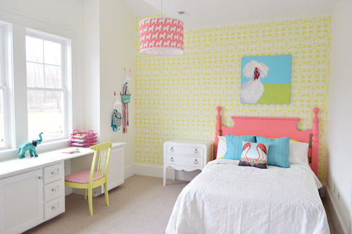
We got the wall stenciled, the headboard painted, hung some art (that awesome chicken painting was done by a friend of ours named Lesli DeVito), and then we painted/upholstered two secondhand chairs – and even had some fun with a few wall hooks.
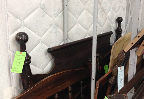
You might remember this old full-sized headboard find of ours (it was $9.98 at a local place called Family Thrift Center).
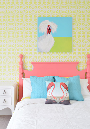
Now it’s sporting a fresh coat of paint (Hydrangea Flowers by Benjamin Moore) along with that freshly stenciled wall behind the bed. Both of them were done by Parker, one of the builder’s right hand men – who apparently is a stenciling expert among all of his other talents.
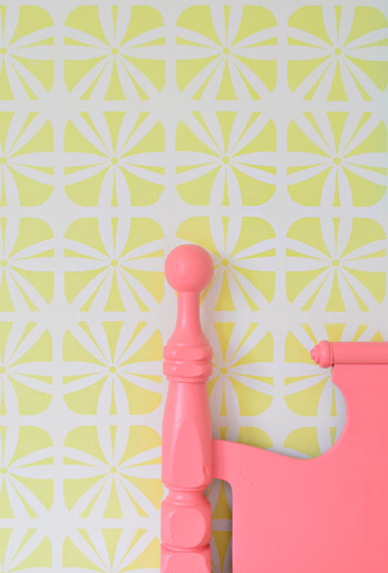
It definitely felt foreign not to be up there on ladders doing the walls ourselves (along with priming and painting that headboard) – but with 3,500 square feet of house to furnish & accessorize, it was also pretty amazing to be able to tackle a bunch of other tasks while those got checked off the list. The stencil was donated by Royal Design Studios, and the room is painted Simply White with Hibiscus by Ben Moore layered on for the stencil.
It’s another example of wanting to take some risks to keep the show interesting (we love how it mixes with the pop of color in the headboard) and it’s nice that it can just be painted over if someone moves in and wants to change the look of the room – so it’s one of the more flexible choices.
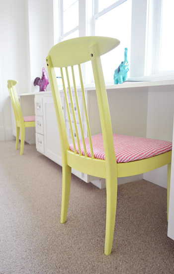
We did get to roll up our sleeves and refinish some furniture ourselves, like these two chairs that we found for $16 each at another favorite thrift store (Love of Jesus on Midlothian).
Here’s what they looked like when we found them.
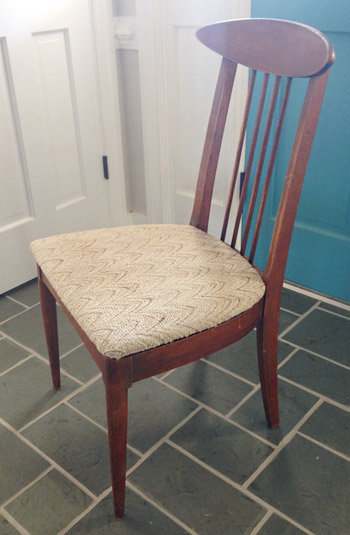
We actually debated staining them, so John sanded them all the way down to the raw wood, but the more we stared at the girls’ room, the more convinced we were that paint was the way to go (there’s carpeting in there instead of hardwoods since the builder said most of his buyers prefer that in a kids room – and with other painted furniture going on, we thought wood stain might feel like the odd main out). I’m sure we could have stained them and made them work, but a little more fun color in a kids room was too hard to resist…
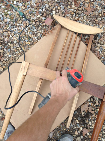
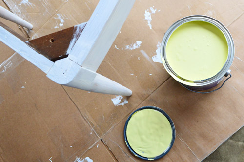
So we primed them with two coats of Kilz Premium (rolled on with a foam roller in most spots and with a brush to get into the nooks and crannies) and then we gave them two coats of Hibiscus paint, which was leftover from the stenciled wall (once again, applied with a small foam roller and a brush to get into those tighter spots).
While those were drying in the garage, I recovered the seats with extra loft batting (you can grab that at any craft store like JoAnn) and used a manual staple gun to pull that firmly around the front of the seat, and staple it around the perimeter in the back.
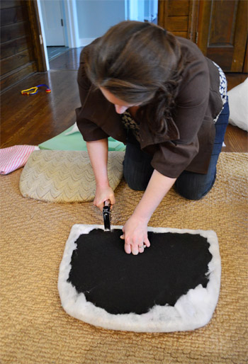
Then it was time for some playful fabric called Candy Floss that we found at U-Fab (they kindly donated a yard of it, which was enough to cover both seats). Here’s a shot of how I deal with corners. If you fold them sort of like when you wrap a present you get a nice clean look in the front.
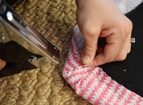
One tip for working with a pattern is just to make sure to keep it straight as you staple (I occasionally flip it over to check, and you can pop out staples and redo things if your patterns migrates and it looks wonky). The other pattern tip would be to make sure if you’re doing more than one chair that you’re keeping the fabric running in the same direction (assuming you want your chairs to match). So since the white arrows seem to be pointing down on this cushion, I made sure they went the same direction for the second chair.
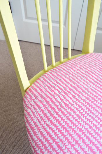
Then you just screw the seat cushions back into the chairs once they’re dry and you’re done. Boom – new chairs. Except they’re old. But they look new, so… huzzah!
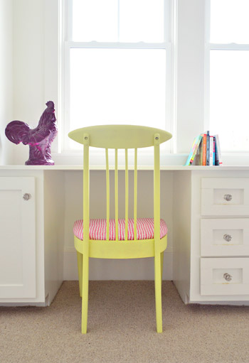
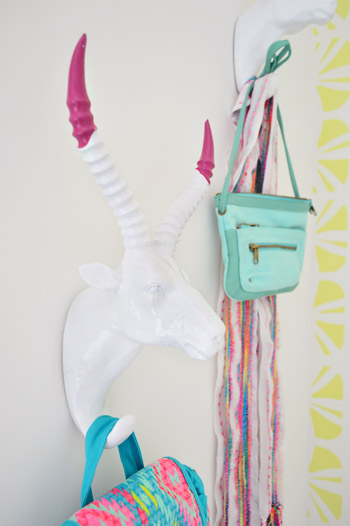
You’ll notice some ceramic animal friends on the wall behind this chair, so let’s get a little closer…
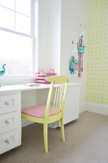
They’re HomeGoods finds that we grabbed to hang up a few colorful imaginary daughter items like a purse, a mini backpack, and a scarf.
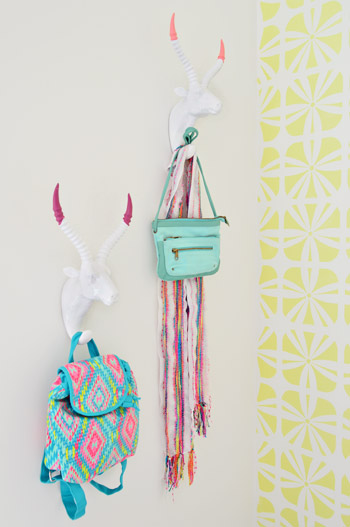
Here’s what they looked like when we bought them. Going onto a white wall we worried they might be a little flat, so we dipped their antlers just to add some interest. We didn’t want them to look too matchy or perfect, so we went with two different colors (Hydrangea Flowers and Berry Fizz).
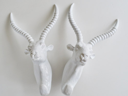
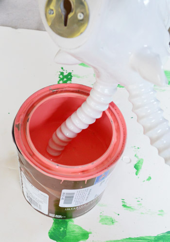
We didn’t tape them off and paint them – we literally dipped them right into the cans.
They were a little drippy…
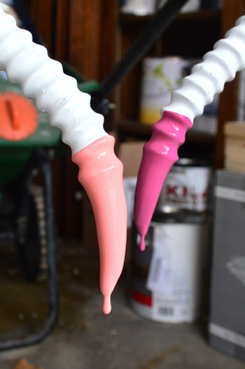
… so we hung them from our grass seed spreader with some old foam core under them to catch the splatters.
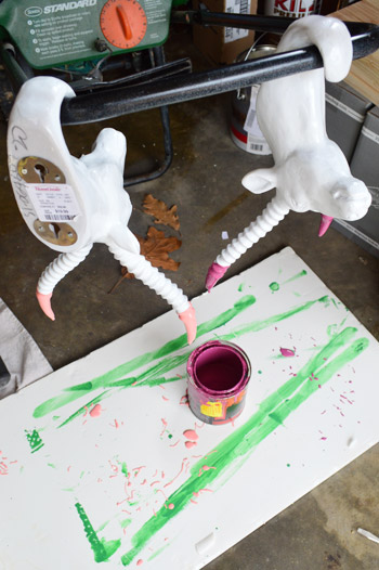
It was crazy easy, and the dipped tips look awesome – sort of like powder coated resin since it’s so thick and glossy. I love that they’re imperfect and angled too. For some reason it seems more interesting than if the paint followed the ridges perfectly. Nothing like a little rebellious outside-of-the-lines coloring.
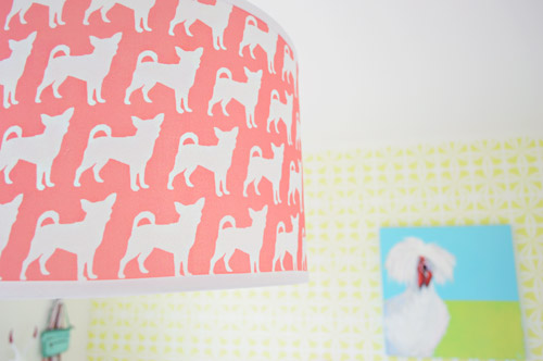
And you may have noticed our Burger pendant light. We couldn’t resist. Just don’t tell Burger or his ego won’t fit through the door anymore…
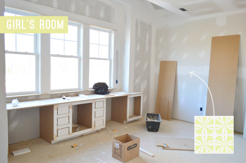
The room’s definitely looking a lot more finished than the view that greeted us about a month ago.
Now we just have about a half-dozen other changes/additions to make in here… and 24 other spaces to finish in the next 14 days or so.

Update: There have been a few questions about having a double desk for a single kids room. John actually grew up with two desk areas in his room (one for a computer and one for homework/writing/drawing) so our team figured since two chairs fit easily along that wall it could end up being really practical.
Update #2: A few others have asked if these furnishings/accessories need to be universally appealing for whoever buys this house. The answer is that they’re just for the show (where we’ve been encouraged to take risks, have fun, and do different things so each house feels set apart). Once the show’s over, the homeowner has the option to buy a few items of furniture or art if they’d like – but will mostly be furnishing/decorating this house so it works for their family.
As John mentioned on Friday, things are going to be super showhouse heavy for us throughout this week and next week, so forgive us in advance if we’re behind or off schedule (or slow on comments). We’ve somehow managed to squeeze in some our-house projects among the chaos (like some nursery updates), so we can’t wait to share those whenever we can.
What did you guys do this weekend? Any art hanging, headboard painting, chair makeover-ing, or ceramic animal dipping?
Psst – Wanna see more showhouse info & photos? Click here for Our Full Showhouse Tour, which includes final pictures of every room, the floor plan, budget info, a video walk-through, and shoppable showhouse furniture & accessories.

Lisa says
I love the bright colors. So fun and cheery! It does bring up a question that I’ve had in the past and that is mixing painted furniture and stained furniture. How do you find a balance in the room? How do you decide what to paint? I have some antiques that I don’t want to cover, but I love painted furniture, too. I just don’t know how to mix them!
YoungHouseLove says
I like to resist painting things until I’m sure, so just layer things in and live with them and slowly over time you might want to try painting some things and just percolate and see where you end up. Totally vague answer, but we just think a while and make small changes over time. Also looking at inspiration images/rooms can help!
xo
s
Eileen says
Those chairs are to die for! So very mid-century! Love them.
lana says
I think the room looks great! Although you’re designing for a girl, the family that actually buys the house might only have boys, and this room can be easily transformed into a boys room. The stencil is neutral, and so is the desk. I think it’s great! I’m surprised so many have commented on the room being too white. For me, it’s perfect, fun and colorful. I think it might get too overwhelming if you paint the walls also.
Good job! Can’t wait to see it when it’s all done!
Kari says
Just wanted to say I LOVE that you share your rooms in progress, half baked or not. :) It always takes me forever to get a room all figured out so it’s nice to see someone else’s process too. I also love the two stations in the built in. That would have been a dream come true at 13!
What happens to all the accessories after the show?
YoungHouseLove says
Some get returned, some get donated, and some can be purchased by the homeowner or reused in other models. Lots of moving parts, haha!
xo
s
Sarah says
I love it! I love the stenciled wall, the bed frame, the ceramic animals…love it all! I sometimes wonder if people even read the whole post before they comment. It couldn’t have been more clear that THIS ROOM IS NOT COMPLETLY DONE!! They list the many things that still need to be added. I appreciate the “not complete” posts that let us see the progress. And all the somewhat harsh criticism of the room is pathetic…when you get hired to decorate a home show house, YOU can make all the decisions…until then, keeping the rude comments to yourself would be nice. Everyone has different taste…no one decorates their home the same. Geesh!
Karly says
Amen Sarah!! Can people please READ the entire post before they ask questions? If you skim and get confused, that’s your own problem. Also, this house is not being built for a specific family. People buy houses all the time that weren’t designed by them/built to their specifications. If a family desperately needs/can afford certain things in their house they will probably build one, not buy one. Blerg.
Jessica G. says
You guys, this is looking amazing! I can’t wait to see the whole thing finished! Have you felt like it is easier getting to pick out everything at once vs waiting and saving for things like you normally do? Or has that been more overwhelming?
YoungHouseLove says
It’s so much harder for us to make ten million choices all at once instead of getting to buy (and course correct) as we go. But it’s an awesome learning experience!
xo
s
Jenny N. says
I love this room! I like how it manages to be girly without being too old or too young. It would be easy for anyone to imagine putting their daughter of any age in this room.
SM says
I love a little unexpected whimsy in home decor but you’ve got waaaaay too many animals in this tiny room!! You’ve got 2 rooters (painting and statue), flamingos, antelope, elephant and dogs. I think you guys need to edit. Maybe a couple of these can be moved over to other rooms.
YoungHouseLove says
Oh yes, things are definitely in flux!
xo
s
Shana says
Yeah I have to agree – there are a heck of a lot of animals in there and they don’t really go together.
Especially the roosters – I think the painting would be better suited for another room.
Sorry.
I am glad to see you using some of your Shades of Light lights in the showhouse – I especially like the Metal Strap Drum Shade in gold – sadly shipping them to Canada is about the same cost of the light but I am plotting how to get one – going to be in NYC in June and wondering if I could ship one ahead to our hotel!
Valerie says
Judging by the comments, I think since everyone is used to seeing you guys start from a dark & dated room, and slowly DIYing the happy/clean/bright updates one by one, everyone has forgotten what it’s like to start with a blank canvas! Great job guys! (and a reminder to readers: when it’s new construction, you start with white, and build from there!) My YHL love affair continues…
Cathie says
I think everything is looking great! I suppose you all must have a thick skin by now from some of the negative comments but yikes. Good work!
I appreciated reading some of your thoughts last week about the differences between decorating the showhome (more $$$, carpenters, builders, etc) and doing your home with more modest resources. I’d love to see a post about what you learned from the showhome and how you’ll apply that to your own home in the future.
I think it’s easy for so many of us to see showhomes and magazines and feel like failures for not being able to make our own home look that way. That’s why I appreciate your blog because I feel like the projects and improvements that you do are accessible. Thanks!
YoungHouseLove says
That would be a fun post!
xo
s
Kim says
I second this request.
I also really love the pink and blue combo. Feminine without being princess-y which is a lot of what you see now. Agree with too many animals but that is a matter of taste and not a federal crime as some are making it out to be. I like this room as it is, good job
Lily says
I love the color scheme in here — bright and cheerful, but not OVERLY girlie. Really smart!
xo Lily
http://whilemyboyfriendsaway.blogspot.com/
Karly says
I can’t wait to see how you finish the rest of the rooms! Looks great!
Katja @ Shift Ctrl Art says
I love how the dipped antlers look and the headboard against the stenciling is just amazing. What a find on those chairs. I am excited to see this room with the finishing touches you mention.
We were busy completing a built-in bench and storage tower in our master bath this weekend. I am really happy with how it turned out.
http://shiftctrlart.com/Blogpost/unfv/Master-bath-progress-Shortened-builtin-IKEA-seating-bench-and-cabinet-tower
YoungHouseLove says
Love that!
xo
s
Sarah says
I’m just wondering but are there now different carpets in the two kids rooms? I thought the other photos showed more of a octagon design but I don’t see it on the above photos?
YoungHouseLove says
Yes, they’re not connected so there’s a different carpet choice for the girl and boy. Just made sense for the budget and our plans for each room :)
xo
s
Brooke says
Lovely as usual guys. Except the dipped antler animal heads (what are those, gazelles?)…they look a little devil-ish. And the rooster…I would think a dog, horse, even a monkey, would be more appropriate.
:/
Katie says
You keep mentioning taking risks in the show home but to me it looks like a lot of the same things you do in your own home… painted furniture, built ins, ceramic animals, white and pastels, lots of pillows etc… Where are the risks?
YoungHouseLove says
I think they definitely hired us hoping the house would look “like us”, but Friday’s post (and other previous showhouse posts) might help with seeing more of those risks. We have things like a bold green vanity, a wall mounted double faucet, a trough sink, gold accordion-like lights in the kitchen, a navy kitchen island, a patterned carpet in the boy’s room, custom wainscoting in the dining room, a navy fireplace column, a bold colored exterior with rough hewn wood beams, etc.
xo
s
Cindy says
one of the CLASSIEST girls rooms I’ve ever seen. love the colors, and fun whimsy without being, well, ho-hum girls room. and predictable. LOVE IT, and you guys should be so proud!
YoungHouseLove says
Thanks so much Cindy!
xo
s
Jenny says
Nice work so far, it looks great! I think a lot of the not-sure feedback is because for most of us, a room this pulled together would be “done.” Not so for you guys, so you see this as still part of the middle, whereas this is much more coordinated than my own room, for example, so hard to see as a work in progress.
Anyway, looks great!
Rachel says
I think the people who think this room is cold or lacks colour need to get their eyes checked- it’s got a coral headboard, a yellow stencilled wall, 2 bright yellow chairs with pink patterned seats, a giant blue chicken (which I love btw and so would every kid I know), a flamingo pillow and a pink Chihuahua light fixture. Did you want the walls to be orange on top of all of that?!? I love all the white, I think it really helps balance the colours. Plus you people need to remember that a child needs to be able to fall asleep in this room…
Brittany says
You last sentence slayed me. Thanks for the laugh!
Joy says
I’ve been wondering about this for a while – I thought the whole point of primer was that it’s an imperfect coat but helps the paint on top stick. Why do you guys often do two coats of primer? (I love you guys btw!!!)
YoungHouseLove says
It helps with coverage for us and is typically cheaper than paint, so sometimes two coats of primer means we only need two coats of paint instead of three.
xo
s
Amanda says
Beautiful! The contrast of the headboard with the stenciled walls is awesome. The rooster print just cracks me up!
My husband and I also adore Love of Jesus Thrift. The Midlothian location has the best stuff! We have scored so many wonderful finds there. Your chair makeover makes me want to hunt around some more over there myself!
YoungHouseLove says
It’s the best, right?!
xo
s
Helen says
I think a cool midcentury end table would look great next to the bed, and play into the chairs! I think wood would be excellent to add some warmth to the space, and maybe do some dip dyed legs that coordinate with the pinks on the antlers! I love having wood in a space to add depth and warmth, I call it my “Emily Henderson rule”. Absolutely love the way this room is going, can’t wait to see it finished!
YoungHouseLove says
That’s a fun idea too!
xo
s
Jonia says
Oooh, I’m now going to find legs to dip something into :D Great idea! I haven’t thought of that for awhile, but I’m suddenly inspired. My husband will be thrilled ;)
Olivia says
Hi Sherry & John,
Here’s a question I’ve been wondering about for awhile. Is it helpful for us to point out typos or is it just annoying? Typos are rare & don’t really bother me, but on the other hand I love proofreading. So if I was helping you out by being a volunteer proofer, I will point then out, but if is too annoying/negative, I’ll keep a lid on it. I love your blog and am so impressed with how much you accomplish. Also, so excited to “meet” your son soon.Sending my best wishes for a safe & beautiful birthing experience!
YoungHouseLove says
Oh yes, I love typo tips!
xo
s
Olivia says
Ok, cool! The only one I noticed today was, “we thought wood stain might feel like the odd main out” (man instead of main :)
YoungHouseLove says
Thanks so much!
xo
s
Jackie says
Sorry for more questions! Can you give a sneak peak or hint about the colorful fabric for the curtains you have planned? I’m so curious about if it’s multi-color or if coral is the key-color,etc. Would love a hint!
Also, did you consider two small side tables to flank the bed?
Hope you continue the flamingo theme!
Best,
Jackie
YoungHouseLove says
We hope to share those window treatments as soon as they’re in, and definitely are open to switching out the side tables! Is share a link to the window fabric but we’re at the house right now so it’s hard to embed a link right now. Maybe in the next showhouse update?
xo
s
mary says
I love it. My daughter would love it.
Tara @ Sock Monkey Smiles says
Love it! I have an older girl (age 19), and just finished re-doing her room. It is a different kind of color scheme for us, and not everyone might like it, but we do!
http://nicolemichaelcrochet.blogspot.com/2014/03/off-subjectroom-makeover.html
Amy Button says
I could not love this room any more than I do! Love the color combo! I’d change a couple of things to suit my youngest daughter (she’s not really into ram heads) but I think she’d love it.
Cassi says
OMG! Is that a “Fluffy Chicken” painting?!!? I LOVE IT! I was having a crummy Monday morning until I saw that! Looks great guys!! Keep up the great work! I am huge fan and I’m an O.G. reader from back in the day! I’ve never commented before, I guess I just needed a fluffy chicken to gush over… wow, I’m a nerd! ;)
YoungHouseLove says
Haha, thanks Cassi! Love to the O.G.s
xo
s
Jenny says
Omg! I have a bolt of candy floss waiting for my mom to get here this week to help me reupholster the antique settee in our foyer! It all looks great guys. xox
YoungHouseLove says
So funny! It’s such a sweet pattern.
xo
s
Ruthie says
Wonderful beginning! Love the great balance of brights against the white. I say you’ve nailed it. (Color Design was my favorite design class.)
ashley @ sunnysideshlee.com says
love those tipped animal horns!
Caroline says
I wish the window seat from the original floor plan was used instead of 2 desks, esp for a room not large enough to accommodate 2 beds!
YoungHouseLove says
Our whole team thought a desk would add a lot more function and storage than a window seat since kids have their beds to read/lounge on, but that certainly could have been fun too!
xo
s
Kaesey says
Nice! I like the bed, and I know my daughter would be begging for it if she could see it. I was going to ask about the double desk but see that you’ve already added an update about that. (I saw those windows and thought “window seat!” but a desk makes sense.)
I did a little furniture painting this weekend, too. Here’s to *bright* colors! My old hall dresser is going bold. =) It’s not done yet but it was too gray a weekend not to post a sneak peak of the bright red paint job: http://kaesey.wordpress.com/2014/03/31/rain-rain/
YoungHouseLove says
Bright red is so much fun!
xo
s
Annie T says
For “not finished” room this looks great! I love the colors. Bright and playful, but contemporary. This could work for a little girl or a big girl.
I think chickens might be the next fox…just saying. I LOVE Lesli’s painting! your use of color is very Lesi Devito! I think as you bring in more layers people will fall in love with this room. I imagine it having a simplified Jonathan Adler vibe. Great work on the chairs and headboards.
I’m curious why you chose wall to wall carpet in there.It makes the room feel very cozy. Will you layer it with throw rugs?
xo
Annie
YoungHouseLove says
The builder said his clients prefer wall to wall carpets in kids rooms so we went with his recommendation. The master, playroom, and upstairs hallway are hardwood though. Not sure if we’ll later a rug, it’ll depend what we find :)
xo
s
Julie says
I was wondering about the paint used on the chairs and the stenciled wall. I assume it would be a latex, maybe in an eggshell finish…just wonder if it is suitable for furniture, or if there is a poly over it. When you use test pots of paint for a quick project I always wonder how they hold up since the test pots are always flat latex (or at least they are here in Canada!)
YoungHouseLove says
Good question! The finish is eggshell, so brushing on poly would add protection and gloss things up. We love Safecoat Acrylacq for that.
xo
s
Brit | House Updated says
Seriously, so cute! Love the girly ideas and bright colors! Good luck with pulling together all the other stuff for the house…
Sharon says
I love all the little details. The pink on that headboard is so perfect. But all the room stuff aside, I want that purse hanging on the antlers! It may be for a child and I may be 41, but I still want it! Where’s it from? :)
Sharon
YoungHouseLove says
It’s from Target. So cute right? Our 13 year old niece was eying it like she was going to steal it. Haha!
xo
s
Andrea says
LOVE IT!!! The stencil is so pretty up close and looks so neat with the pink headboard. I also love that you included the Burger light!!
Erin says
So, I don’t get why anyone would say this room looks sterile? It is just too sweet beyond words. Great job. It looks happy. I would have never thought to use those colors together and I love that you did. Love the picture above the bed. Where is that from. Great job.
Marianne in Mo. says
I haven’t read every comment,just pg.#1, but I didn’t think some ppl get the point of a showhouse. They are meant to be creatively over the top, not average homeowner safe. You should be wowed, good or bad, when touring these homes. I’ve been to several here in my area, and whether I loved or hated the decor, I was always impressed with the thought that the decorators used to stimulate conversation. Think of it as an art gallery, not a typical family home. BTW, I was the least impressed with the well known designers – too expected, too magazine perfection! And so cookie cutter! Bravo to you both for no fear! Takes a tremendous amount of brain work to pull together an entire house that size! So far, I get it, and can’t wait for the finale!
Stephanie B. says
Love you guys share the “awkward in-between” and can’t wait to see how you add/change/explore/risk with the rest of it! So fun!
Cindy says
Oh my Lord, Sherry. I don’t know how you can take such mean spirited opinions, especially being 15 months pregnant. YHL is obviously successful because of your and John’s great eye for design. Just because someone doesn’t like the design choices doesn’t mean they should hit you over the head with a shovel of not so kind comments. Of course not every room that ya’ll design is going to appeal to the masses. That is what makes each persons home unique. I love this room, and I can’t wait to see how the rest of the show home comes together! Keep up the good work. I’m sure the “four” of you are exhausted!
Sarah says
Wow 15 months pregnant??? I thought it only took 9!! Haha only kidding
Jackie says
I don’t know how anyone could take anything being 15 months pregnant ;)
Becky C says
Hi guys,
I have no words for just how fabulous the tipped antlers are. Great idea. I can’t wait to see more.
Thanks for sharing.
Jennie says
Hi! I love this space so far! The colors are so fun and, of course, it’s only temporary so there’s no reason to stress about if the bed is too bright (it’s not) or if there are too many animals (never)! I hope you’re just shaking your heads and laughing at these comments today, and that having to repeat “IT’S NOT FINISHED YET” 1,000 times won’t deter you from posting mid-stage updates in the future!
Also, our YHL Burger hook arrived on Friday!!! :) :) I can’t wait to finally have a spot to hang our Chihuahua’s leash!
Elizabeth says
I love the path this room is taking, fully aware that it’s a work in progress. With regards to the side table- if it’s one you can paint, have you thought about just painting it Hibiscus to tie it into the wall and chairs and to let the headboard pop more? If you wanted to go crazy, adding some soft blue or pink hardware or dipped legs could keep it spunky… That might start getting too matchy-matchy, though. I do think that right now the fact it’s a big block of white against the stencil competes with the headboard. Another solution might just be to get a more spindly/open table, rather than something with the closed storage.
All things I’m sure you’ve thought of already :) Again, love the colors and can’t wait to see it all finished!
YoungHouseLove says
Love all those ideas!
xo
s
Eirn says
I love this room! I love the painted bed. I wish I had done that instead of white growing up!
Brittany @ Brittany's Joy Blog says
Love the bright colors! Not sure if this is a typo, but you said that the wall color in the stencil is Ben Moore’s Hibiscus, which was the same as the headboard…! Just FYI (and curious what the yellow shade is!).
Brittany @ Brittany's Joy Blog says
Whoops, if I had read more carefully, hibiscus and hydrangea are actually different flowers.. DUH. Sorry!
YoungHouseLove says
No worries at all!
xo
s
Jamie D says
For the Love of Jesus on Midlothian… I see Jarvis the Rooster!!! YESSSS (I’ve been a reader for many many years)
https://www.younghouselove.com/2012/01/a-giant-rooster-who-does-that/
Love!
YoungHouseLove says
Hahahahahaha!
xo
s
Emily says
I have been wondering about him! Too funny!
Mary-Carolyn says
I’m also in the “window seat” camp. I could understand having a two separate desks, one designated for a computer, if big desktop computers were still primarily what people used, but I think a laptop would be much more common. (The portability is great for school, friends houses, etc. and the price point on many laptops is less than a desktop, so perfect choice for a teen.) And since those can be put away, I just do see the need for it to have its own separate place. I am a fan of a double desk, I have one in my house so my husband and I can have our own work areas, but I’m not sold on it here. I guess the two desks would make more sense to me if the room were sized and staged to be for two kids.
I’m a fan of the stencil, and ADORE the blue pillows (are the cable knit or embroidered?). I do think this room really needs some wood tones; I know you aren’t finished yet, so I’m hoping to see some of those elements in the finished product!
Suzy says
So love all the colors you chose. The room is so bright & cheery. I guess some of the commenters have not been to show houses lately. It is perfect with just the right touches of freshness & energy. Love you guys….so excited for your growing family in the coming weeks. You are so inspiring to many….still fav blog…first one I read!