We spent the weekend checking off a bunch of hands-on projects for the girls room in the showhouse. It’s definitely still looking sparse, and is far from done, so I’m sure it’ll keep evolving right up until our deadline.
- The bed needs to be raised and we have a colorful throw to add
- Linens need to be ironed and we have a custom bolster that we’ll layer in there too
- Colorful fabric window treatments will be hung as soon as they’re in
- We might switch out the end table – not sure yet…
- We have a soft blue lamp and a bunch of other accessories to add to tie things together
But we did manage to significantly shrink the to-do list this weekend.
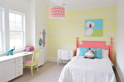
We got the wall stenciled, the headboard painted, hung some art (that awesome chicken painting was done by a friend of ours named Lesli DeVito), and then we painted/upholstered two secondhand chairs – and even had some fun with a few wall hooks.
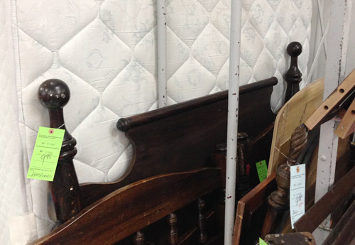
You might remember this old full-sized headboard find of ours (it was $9.98 at a local place called Family Thrift Center).
Now it’s sporting a fresh coat of paint (Hydrangea Flowers by Benjamin Moore) along with that freshly stenciled wall behind the bed. Both of them were done by Parker, one of the builder’s right hand men – who apparently is a stenciling expert among all of his other talents.
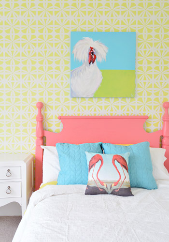
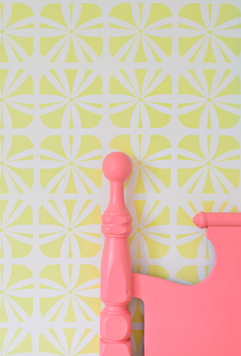
It definitely felt foreign not to be up there on ladders doing the walls ourselves (along with priming and painting that headboard) – but with 3,500 square feet of house to furnish & accessorize, it was also pretty amazing to be able to tackle a bunch of other tasks while those got checked off the list. The stencil was donated by Royal Design Studios, and the room is painted Simply White with Hibiscus by Ben Moore layered on for the stencil.
It’s another example of wanting to take some risks to keep the show interesting (we love how it mixes with the pop of color in the headboard) and it’s nice that it can just be painted over if someone moves in and wants to change the look of the room – so it’s one of the more flexible choices.
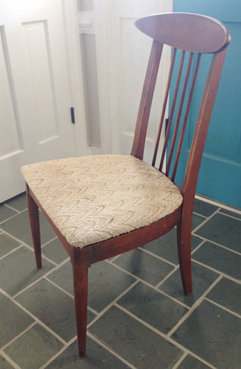
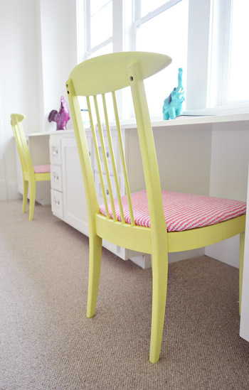
We did get to roll up our sleeves and refinish some furniture ourselves, like these two chairs that we found for $16 each at another favorite thrift store (Love of Jesus on Midlothian).
Here’s what they looked like when we found them.
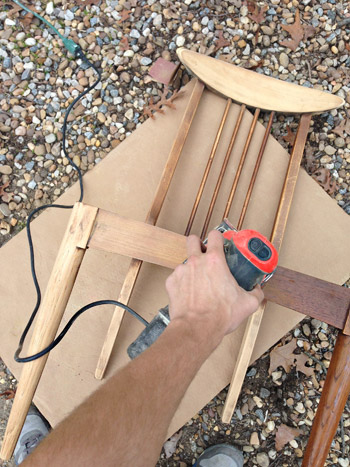
We actually debated staining them, so John sanded them all the way down to the raw wood, but the more we stared at the girls’ room, the more convinced we were that paint was the way to go (there’s carpeting in there instead of hardwoods since the builder said most of his buyers prefer that in a kids room – and with other painted furniture going on, we thought wood stain might feel like the odd main out). I’m sure we could have stained them and made them work, but a little more fun color in a kids room was too hard to resist…
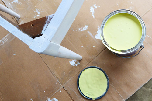
So we primed them with two coats of Kilz Premium (rolled on with a foam roller in most spots and with a brush to get into the nooks and crannies) and then we gave them two coats of Hibiscus paint, which was leftover from the stenciled wall (once again, applied with a small foam roller and a brush to get into those tighter spots).
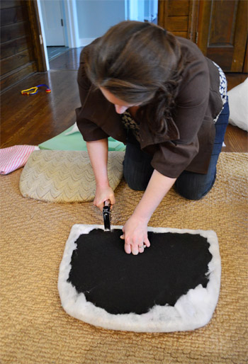
While those were drying in the garage, I recovered the seats with extra loft batting (you can grab that at any craft store like JoAnn) and used a manual staple gun to pull that firmly around the front of the seat, and staple it around the perimeter in the back.
Then it was time for some playful fabric called Candy Floss that we found at U-Fab (they kindly donated a yard of it, which was enough to cover both seats). Here’s a shot of how I deal with corners. If you fold them sort of like when you wrap a present you get a nice clean look in the front.
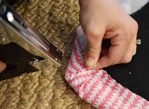
One tip for working with a pattern is just to make sure to keep it straight as you staple (I occasionally flip it over to check, and you can pop out staples and redo things if your patterns migrates and it looks wonky). The other pattern tip would be to make sure if you’re doing more than one chair that you’re keeping the fabric running in the same direction (assuming you want your chairs to match). So since the white arrows seem to be pointing down on this cushion, I made sure they went the same direction for the second chair.
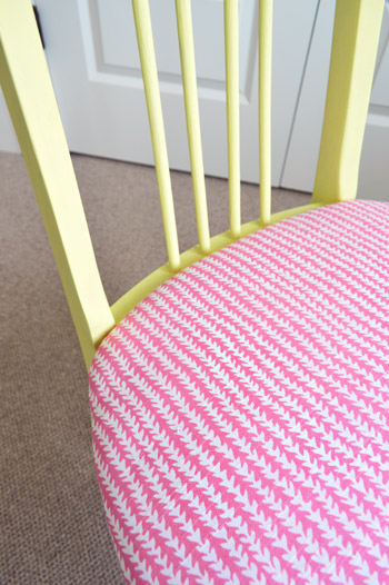
Then you just screw the seat cushions back into the chairs once they’re dry and you’re done. Boom – new chairs. Except they’re old. But they look new, so… huzzah!
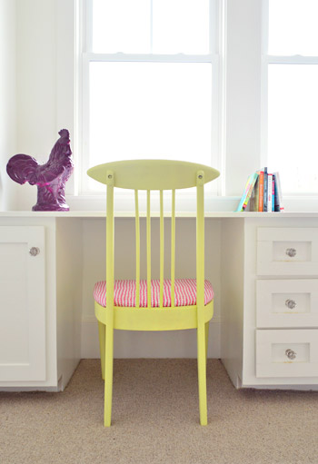
You’ll notice some ceramic animal friends on the wall behind this chair, so let’s get a little closer…
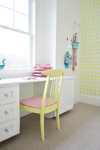
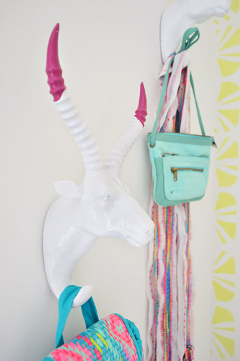
They’re HomeGoods finds that we grabbed to hang up a few colorful imaginary daughter items like a purse, a mini backpack, and a scarf.
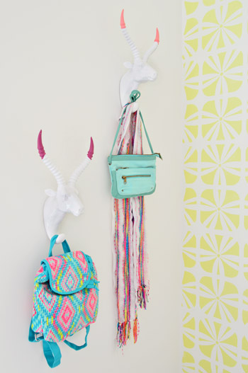
Here’s what they looked like when we bought them. Going onto a white wall we worried they might be a little flat, so we dipped their antlers just to add some interest. We didn’t want them to look too matchy or perfect, so we went with two different colors (Hydrangea Flowers and Berry Fizz).

We didn’t tape them off and paint them – we literally dipped them right into the cans.
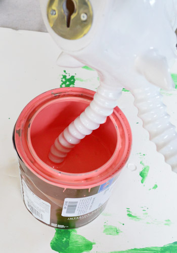
They were a little drippy…
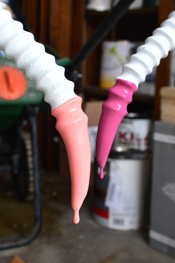
… so we hung them from our grass seed spreader with some old foam core under them to catch the splatters.
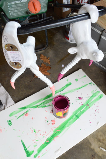
It was crazy easy, and the dipped tips look awesome – sort of like powder coated resin since it’s so thick and glossy. I love that they’re imperfect and angled too. For some reason it seems more interesting than if the paint followed the ridges perfectly. Nothing like a little rebellious outside-of-the-lines coloring.
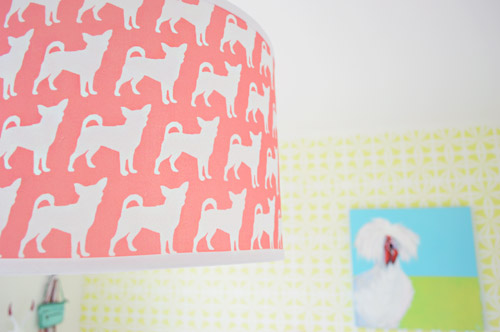
And you may have noticed our Burger pendant light. We couldn’t resist. Just don’t tell Burger or his ego won’t fit through the door anymore…
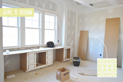
The room’s definitely looking a lot more finished than the view that greeted us about a month ago.
Now we just have about a half-dozen other changes/additions to make in here… and 24 other spaces to finish in the next 14 days or so.

Update: There have been a few questions about having a double desk for a single kids room. John actually grew up with two desk areas in his room (one for a computer and one for homework/writing/drawing) so our team figured since two chairs fit easily along that wall it could end up being really practical.
Update #2: A few others have asked if these furnishings/accessories need to be universally appealing for whoever buys this house. The answer is that they’re just for the show (where we’ve been encouraged to take risks, have fun, and do different things so each house feels set apart). Once the show’s over, the homeowner has the option to buy a few items of furniture or art if they’d like – but will mostly be furnishing/decorating this house so it works for their family.
As John mentioned on Friday, things are going to be super showhouse heavy for us throughout this week and next week, so forgive us in advance if we’re behind or off schedule (or slow on comments). We’ve somehow managed to squeeze in some our-house projects among the chaos (like some nursery updates), so we can’t wait to share those whenever we can.
What did you guys do this weekend? Any art hanging, headboard painting, chair makeover-ing, or ceramic animal dipping?
Psst – Wanna see more showhouse info & photos? Click here for Our Full Showhouse Tour, which includes final pictures of every room, the floor plan, budget info, a video walk-through, and shoppable showhouse furniture & accessories.

kathyg says
It looks Great! Very sweet. More like a 8-10 year old than a 13 year old. Cute and sweet. Good Job.
Erin says
I love how bright and free this room feels!!! That is going to be one lucky girl! They are so lucky to have you decorate this beautiful home!
I think a round nightstand would help breakdown all the lines in the room. Maybe even one cut in half and attached to the wall so it doesn’t take up as much space. And maybe paint a bright color or color dip the legs like you did the wall hooks!
Love this house! Y’all are doing an awesome job and can’t wait to see it finished.
Gwen says
I love it! What method do you use for hanging artwork above the head of the bed? I want to hang some above my daughter’s bed, but I’m terrified it could fall on her. We have old plaster walls and a girl who likes to jump on the bed, so I don’t trust just a finishing nail.
YoungHouseLove says
We just discovered Ook hooks, and they’re awesome! They hold 30 lbs and are so easy to hang. I think they’d be great for plaster too.
xo
s
nadine says
A teen or tween girls room NEEDS a full length mirror. That should be priority number 1 from here on out.
YoungHouseLove says
Thanks Nadine!
xo
s
Jonia says
Awesome! You guys totally do not need to apologize. I’m in awe of what you accomplish! As for this weekend, nothing so fun as chair painting. Taxes and cooking :) Homeschooling, renovations (mostly planning at this part of the year) and running a day care in my home means I have to get some cooking done on Sunday just to make sure the week runs a little more smoothly. The Easter break will be a few days of a spring bunch of projects. Soooo excited to see all you are doing in the show house!
Jenn says
Love the dipped antlers! Love them.My 2yo Daughter has a white giraffe hook in her room. She likes it and talks to it sometimes ;-)
I’m a little on the fence with this one (lots of white still), but I’ll wait to make that call until it’s finished!
Mary says
This room, as well as the whole house, is coming together beautifully. Although I won’t make it for the home tour I am anxious to see your posts on the completed home. I especially liked the walls of the laundry room you shared a few days ago and the stenciled wall in this girl’s room. You think of ways of putting things together that wouldn’t have occurred to me. Thanks.
Megan says
Am I crazy? People keep asking where this piece of furniture or that piece of furniture is going to go because you’ve taken all the wall space with other things. Are we forgetting there’s an entire wall we haven’t seen yet, as well as by the door at the end of the bed? I also think people are forgetting you are designing for a fictional 11-13 year old girl. Yeah, they like color! And animals! I would’ve freaked out over the awesomeness in this room, and it’s not even done! (Something else readers seem to have forgotten. I promise some of us do read everything before commenting!!) Good work, guys :)
Amanda says
I think what’s missing in the room is a bit of natural material and texture. I would have loved to see the chairs stained and with maybe just the legs painted?!!??
YoungHouseLove says
That could have been fun too!
xo
s
Stacy says
I think that headboard is fantastic. I wish i could find things like that at our local thrift shops for as cheap as you have. Sadly living as close to Boston as I do it’s just ridiculous price wise. I’m better off going to Ikea, Target or some other furniture store and buying new pieces. That said, you guys as always are truly doing a great job and don’t let the haters get you down. I love that you guys are always willing to try something new – even in your own home. Makes me want to be braver.
Amy says
Hi Stacy- I am not sure where you live, but this place has some good deals: http://www.yelp.com/biz/remarkable-cleanouts-norwood also I find CL to be pretty good (I am also in BOS).
Stacy says
Thanks! I’m on the North Shore. Sadly most stuff in our area is just ridiculous price wise but I’ll definitely be checking out this place. Appreciate the information!
Melissa says
I wonder at the comments by some folks. It’s not their project. Why say things in such a rude manner? I was thinking the nightstand might need something, but because I took the time to read what you wrote I’m gonna just enjoy the ride and wait and see what it looks like DONE. Heck I think not loving every single thing someone else does is a great way to teach yourself what you do like. I think you did an excellent job responding to those really negative comments. It would drive me nuts to say the same thing over and over again simply because some people don’t take the time to read the explanation that goes with the project. You do a great job explaining where the project is at, what you might change, and what else is coming. Keep up the great work!
Amanda M. says
I am sorry YHL but I am not sure too many girls could relate to this room. My almost 12 year old would never approve of the animal figurines and hooks. I know Sherry you have a strong love for animal anything and while I think that’s great for your home I really think you should rethink the girls room while you still have the chance. But the lamp shade? It’s perfect! All three of my girls would approve.
karen says
thanks amanda m. now that we know what all three of your girls like and dislike, john and sherry will change it up for ya!
Jill says
I wish I could buy this house… but a serious question. I get that the big items like furniture are on loan. What happens to all the small things, like pillows, bedding, hooks, dishes, etc that you use to stage this house? I assume either you guys or the builders are spending a decent chunk of change on this stuff. Do you guys keep it, are they donated to a thrift shop, etc? The logistics of this project are very interesting to me.
YoungHouseLove says
Many of those items will be donated, reused by the builder in other models, or returned. There’s lots to keep track of, that’s for sure!
xo
s
Emily says
Love this not-yet-finished space :) thanks for sharing…and sorry for all the flack you are getting! Wish I lived several hundred miles closer so I could come see the final product!
Andrea says
Yikes! Some of the feedback could be worded a little more… softly.
So I will start by saying Happy Monday! I like most of the choices in this room — I think the colors are really nice, bright and cheerful. I like the Burger pendant, and those chairs are super sweet.
You mentioned not being sure about the side table? I have to agree that it might not be right for this space. Maybe something in a wood tone to warm up the space? And definitely smaller. I think something like this table at Target would be great (but obviously paint the top a different color):
http://www.target.com/p/threshold-round-cross-legged-wooden-accent-table-black-and-natural/-/A-14715810#prodSlot=medium_2_14
Also, I have to agree that the two-desks/one bed setup looks a little unbalanced. I’m not even sure if it’s an option, but would it be possible to put two twin beds in there? If not, then I think you just make it work the way it is and don’t worry about it!
Lastly, I don’t want to pile on, but yes, probably deleting a couple of the animal details (not the gazelles! I love those!) would be a good idea. My vote is nix the rooster and the bird pillows.
Oh my gosh, I hope your morning hasn’t been too rough. You guys are so incredibly talented, and this house (when its finished) is going to turn out stunning, I can already tell. Your “permanent” risky choices (the green vanity, the brass kitchen fixtures… I die a thousand times from envy) have been SO good, so don’t let these little details get you down.
YoungHouseLove says
Love all those ideas! And thanks for the link to the table!
xo
s
Steph Reiner says
Okay, first of all, I was debating painting my daughter’s toddler bed white because I like the clean look, but this just might change my mind! I love the pop of color! I’m also seriously debating convincing my husband to do a stencil on her wall since he has strictly forbidden wallpaper ever.
On a second note… I loved the ram heads! I mean, I already kind of gush at ceramic animals, but the dipped antlers was a great idea! I’ve seen a lot of comments about not liking all the white or too much color or whatever but I think it has just the right amount of white, especially when you add in all the other things you have listed.
I actually agree with the others about half the desk being a make-up/getting ready area because that was my first thought! And I’m not even a tween… But a cool jewelry stand and maybe a vintage mirror stand (both painted awesome colors of course) would be so great!
So I guess I’m saying you guys can style my imaginary house any day. :D Can’t wait to see it finished!
Olive J says
In the 5 years I have been reading your blog, I have never commented. I usually read your blog after I wake up in the morning to give me some pep (you are unbelievably inspirational.)After scrolling through the comments today, I felt like I needed to roll out of bed, grab my laptop, and input my two cents.
This room is AMAZING. My 10-13 year old self would have loved it. I was the kid/teenager that painted a bright lime green accent wall in my room because I wanted that bright splash of color. That accent wall stayed until after I got my BA and moved out when I was 20 because it was so versatile.
And as for all the white in the room, I love it. My aforementioned lime green room (with other accents of sky blue and bright orange) had all white furniture as well. It helped tone down all the bright colors in the room. I’m sure once you add the curtains, throw, and other accessories that the white will look completely balanced.
Thanks for such a great post! (Side note: I need to read your blog on my laptop more often. My phone does not do any of your pictures justice!)
Andrea says
Ahhhh…I forgot one more thing! You mentioned that you are going to do a colorful window treatment?? This room already has SO much color, would you consider bamboo blinds, like you did in this post:
https://www.younghouselove.com/2013/04/its-gettin-hot-in-hur-so-add-some-bamboo-blinds/
I think that would also help warm up the room =)
Alright, I’m done!
YoungHouseLove says
That would be fun too! We just thought with the white walls, trim, and desk it could handle some happy window treatments, but warm wood sounds awesome too!
xo
s
Lesli DeVito says
first LOVE THE ROOM!
second – LOVE THE PAINTING!!!
third – LOVE YOU!
YoungHouseLove says
Sending love right back Lesli! Princess Truthful is gawwwwwgeous ;)
xo
s
Brittany says
When I was 10-14 I would have loved this room as well! When I was about 13-14, I redecorated my room on my own. Browns and bright shades of green. Eventually I started adding slight hints of light blue in there as well. Needless to say nothing in that room screamed “kids room” and it also didn’t scream “teens room” but I loved it! Now that I’m 25, married, and have a home of my own, I’ve transferred all of that color scheme just about into our guest bedroom because I reused a lot of the furniture. It is definitely a room that grew with me–and I still love it.
So on the note of this room maybe not feeling so “teen” or “kids” like to some people, I’m not sure what they feel is missing, but I feel like this is a room that can be changed and altered easily to fit a child as they grow up. It’s a grown up teen’s room, which is EXACTLY what I wanted when I was a teen.
Love it! Seriously, I’ve loved everything you’ve done in this home, but seeing a room close to completion or halfway there–I think I’ve loved this room the most!
To each his own!
Shannon says
I think it’s adorable. Can’t wait to see the finished project.
Pamela Bertone says
Love it-quirky, colorful, fun, fresh. Only you guys could pull of a room that allows me to utilize alliteration so well!! Great job and keep rockin’ the home decor with that preggo tummy, woman!!!
Carla says
I love the individual elements in the girl’s room, and the stencil looks great. I just feel the room is not anchored yet. It’s too light and airy and needs a heavier piece to create some balance.
Have you considered a large area rug with some nice pile to it? It’s probably not an option at this point, but I’d also love to see some color on the white walls. I think any child would have problems sitting still in there unless something warmer is added and the bright and stark energy calmed down a bit.
The double desk idea could be fun, but I probably would have added a comfy chair and ottoman in the back left corner, a non-traditional side table to the bed with a lamp that can rotate toward the chair or bed, and some nice built-in bookshelves under the windows, with the desk up front staying in place.
YoungHouseLove says
That all sounds awesome too!
xo
s
Carla says
You always show lots of grace and love. Any kid would be blessed to have you guys as parents.
Melissa says
So wait, is the room finished then? Kidding. It’s looking great Petersiks. I oohed and aahed all the way through the post.
Koliti says
Thanks for giving us a peek at what’s going on so far.
I totally vote for the second desk showcasing what this teen girl’s hobby is: drawing, painting, sewing, etc – something creative. (Please don’t send the old society message of “a girls’s gotta wear make-up”.)
YoungHouseLove says
That’s a fun idea too!
xo
s
Jennie says
Agree! Even though I also mentioned makeup as a possibility in my other comment, I see it as a great art spot!
A says
I third this!
I commented earlier about it being a vanity area on one side too (gives a purpose to the second chair that so many people seem to be needlessly worried about), but now that you say that, I LOVE the idea of putting a laptop & pencil cup or whatever at one end, and a sewing machine at the other!
Koliti you are right – it does send a better message and still showcases all the uses for that beautiful desk!
Jenny says
I think having two desk spaces and two chairs in the room was a smart idea! Many families have more than two children and plenty of kids share rooms. Just swap out the bed with bunk beds and you are set. Since its hard to remove a built-in, it was really smart to put in 2 desks. The room can fit two, or one child can have some extra space!
Lillian says
The showhouse is coming together so well!!! What a dream to be able to decorate a house in a really fun, risky way with no actual risks involved!
You may have answered this is another post, but what happens to all of the furnishings and everything that have been donated or purchased for the show house but don’t get purchased buy the new home owners? Are y’all going to do another charity yard sale (a la book projects)?
YoungHouseLove says
Many will be donated to Habitat, returned to certain companies, and things that came from the builder’s budget (not donated) might be reused in other models of his :)
xo
s
Carla says
And I love the chicken painting! :o)
But it’s hard to relate to in this room and feels kind of cold and unwelcoming.
I’ve browsed a few comments and wanted to say that it’s okay some of us are openly expressing our opinions. They wouldn’t have comments on this blog post open if they didn’t want to hear our feedback.
Molly says
Looking great! So fun to see the progress of this project. This question may have been asked already (my apologies if so), but what happens to the decorations and furniture from the show house that the buyer of the house doesn’t want to purchase? Will those items get auctioned off? Donated? And do you two have any plans to purchase items from your show house afterward? If so what?
YoungHouseLove says
Many things will be donated to Habitat or returned to certain companies, and things that came from the builder’s budget (not donated) might be reused in other models of his. We also have been bringing a few items from our own house in that we’ll take back home after the show. So far I’m not sure if we’ll buy anything but we might get attached…
xo
s
alexis says
I like that stencil on the wall! If Clara ever wanted more raindrops on her wall, it would look great if you did a whole accent wall with a stencil of the multi-colored rain drops.
Nicoka says
I feel like too many people haven’t bothered to even read this post properly before commenting which is a shame. It wastes your time having to keep explaining this you have already said!
I love this room! As a teen/twin I would have loved a double desk like this I never had enough desk space! I think it works well for a young girl I don’t think it’s been overly designed by an adult at all. I think you also have to remember that teenage girls love to decorate their room with posters and pictures so having a strong design that isn’t too busy behind those posters is important.
Sorry to waffle but I’m from the UK and I love it!
Nicoka says
So many mistakes sorry!
*things
*teen/tween
*even my name was wrong *Nicola haha
Nicola says
Oh and I love all of the animal details too… Please don’t change that. If the new owners don’t like it they can obviously change things like the hooks but I would have loved them in my room.
OK I’m done now…
Zohreh says
OMG! Looks a lot like how I designed my daughter’s room at my old house! Just scroll down, you can’t miss it.
http://www.zdalydesigns.com/index/#/house-tour/
YoungHouseLove says
Really cute!
xo
s
Megan says
Love the colors in your house Zohreh! Very nice!
Tricia S. says
I love the room so far and totally see the logic in having two work areas. I can’t wait to see the window treatments to see how they break up the wall. I know it looks really really white simply because of the way the light coming into the windows reads. The only thing I would not have done was paint those gorgeous MCM chairs. I question putting a painted chair in a kids room because of all of the abuse they take. It’s a lot easier to hide dings and scratches on a finished wood surface than on a painted surface. If there’s any way possible to get them after the house closes, I’d be absolutely delighted to take them off your hands so I can strip the paint and refinish them. They are exactly what I’ve been looking for for my dining room.
Lissa says
Sherry and John, I see that the Rooster from House 2’s Kitchen made it into the room (at least I think I remember it when you painted him before). Bless your hearts for everyone and their disagreement of the room. Like my Momma taught me, if you don’t have something nice to say, don’t say anything at all. Also, everyone needs to keep in mind that if we all liked the exact same things, this world would be one boring place. Keep on doing what you love and loving what you do (that is the most important thing to remember).
P.S. I told Riley (she was at your Cincinnati Ohio Book Tour stop and is the one that gave Clara the book) that you all were having another child and she told me that she needed to go to the book store and find a baby book for the newest Petersik. I love that girl!! Do you all have a P.O. Box I can mail it to once I take her out to purchase one?
YoungHouseLove says
Riley is so sweet! Clara still has and loves that book! It made me tear up :)
xo
s
Lissa says
Do you all have a P.O. Box I could send the book too?
YoungHouseLove says
We do, you’re so sweet! I’ll email it to you.
xo
s
Lissa says
Thanks Sherry! I look forward to shopping with Riley for Baby Petersik!!
Thais Bessa says
I’m loving it so far, especially the stenciled wall. Having two desks and the room being dressed for a young girl, how about puting some cool hair gear and jewlery storage in one of them??? Maybe a nice standing desk mirror?
Btw, nit sure if you already have done it – at least I can’t find it – but a page on the top banner or somewhere else gathering all posts about the showhouse would be really useful. And matbe the floor plan on top (a bit like the house tours for your houses really).
Thanks!
YoungHouseLove says
We’d love to add a showhouse house tour (with links to all the old posts) when it’s done!
xo
s
Casey says
I can’t wait to see the finished product!
However, what amazes me most is the energy you still have to do all this, Sherry! I am at 36 weeks in my pregnancy and spent the weekend on the couch or in bed, or eating. I only had the energy to grow a baby, nothing more.
YoungHouseLove says
That sounds awesome! I keep telling John that after this baby is born I’m parking it on the couch/bed and hibernating for a while ;)
xo
s
Julia @ Hooked on Houses says
What a happy looking room! I love that there are two chairs and work spaces. My daughter Lily has a similar setup in her playroom and it’s perfect when she has friends over. They sit side by side and work on crafts, homework, stories, etc.
I helped decorate a Homearama house years ago and it was a lot of fun, but SO much work. I remember how crazy-stressful it got towards the end, trying to pull everything together. Hang in there. It’s looking great, and I can’t wait to see how it all turns out! xo
Sadie says
I love this post! I’m planning on painting/updating our kids rooms this summer & this has given me some refreshed inspiration!
Teresa @ wherelovemeetslife says
Wow, this post is catching a lot of heat. I guess this is the chances that you take going out of your comfort zone. Oh well, haters gonna hate. ;) I like it. It’s fun and different. I can’t wait to see the whole place finished and wish I could talk my DH into the 3.45 hr drive to come see it!
I worked on a bedroom this weekend myself. And even if it isn’t quite yhl caliber..I like it. :)
http://wherelovemeetslife.wordpress.com/2014/03/31/master-bedroom-reveal-almost-4-years-in-the-making/
YoungHouseLove says
Looks awesome!
xo
s
Elizabeth says
Aww, I understand you all aren’t finished with this room, but I’m bummed to say that this isn’t my favorite (even with accessories pending). Painting headboards and doing my own upholstery for chairs is totally up my ally, but when I go to a show home I want to see stuff that is usually not in my price bracket or usual big box stores. That’s part of the fun – seeing the “dream” room! With all of the other nice finishes in the home, I was hoping to see something a little more high end and avant-garde with the furniture and overall concept. I’m a bit perplexed by the animal combination as other readers have mentioned. The horned animals seem a bit sinister to me, despite the color. But I’m a scaredy cat!
Caitlin says
Agreed on wanting to see the”dream” room
Lauren says
Maybe one desk could have a mirror and be used for hair/makeup area esp. as sharing a bathroom!
YoungHouseLove says
A few others said that. I’d totally park it there with my caboodles full of eyeshadow. Haha!
xo
s
Nikki says
The roosters in this room crack me up! My fiancé’s family friend calls him “rooster” as a holdover nickname from childhood. Anyway, when he moved into his house they all bought him roosters as a gag and now we have them all over!
Gabriella says
I understand this room is still a work in progress. We have three kids (ages 11, 10 and 4.5). They definitely all prefer a window seat as opposed to a built in workstation. Especially our daughter who loves to sit their with her girlfriends and hang out chatting. Our older two always complete homework at our dining room table, especially larger projects that really need our assistance. It is also a way for us as parents to stay connected and to know what they are working on in school. Each of our kids has a smaller desk for art projects etc. in their room.
I understand the builder guided you to carpet in the bedroom. Our experience has been with slumber parties, play dates, nail polish parties (seriously) that wood floors are much more practical (we use natural area rugs that we can take out and clean outside in the summer) and easier to maintain.
I love the different animals (we have so many urban farms where we live in the city)! It’s a creative way to add some different textures, splashes of color and interest.
I also like keeping the walls white so the future homeowner can easily paint whatever colors they want with ease. I can’t wait to see how the final room turns out!
Rebecca says
I love the room. Looks very cool and fresh. I love the colors. Just an idea to help you with these busy weeks when you don’t have time to do a full post. What about a Wordless Wednesday post where you just put a bunch of pictures from the Show House without captions? It could be like a teaser.
YoungHouseLove says
That’s a fun idea!
xo
s
Rebecca says
If you do a Wordless Wednesday post, you could say no questions allowed–that you will explain everything in other posts leading up to the Show House. Not that it’d matter. Based on a lot of the comments today, it doesn’t appear that many of your “readers” actually read your posts anyway. By the way, is this room finished? And why two desks? Just kidding–I actually read the words that you wrote. ;)
dee says
Just got home from a Target shopping trip. And guess what was on one of the end-caps??? Young House Love books and hooks :)))))) I even talked to one of the managers who happened to come up to me and told him he better keep this stocked because these items were going to go fast! He told me he had never heard of YHL and told him he will!
Congrats again!
YoungHouseLove says
Ahhh that’s so exciting! We haven’t seen it yet!
xo
s
Jessica says
Love the chairs! When you re-upholster a chair like this, do you try to find a certain type of fabric? I do not know much about fabrics, but want to re-upholster my kitchen chairs but don’t want to buy a fabric that’s too thin or won’t stand up to daily use.
Thanks!!
YoungHouseLove says
Good question! We love using upholstery grade fabric for that stuff, it’s awesome! Thicker and durable than some of the lighter weight stuff.
xo
s
Steph Nelson says
Great job! Can’t wait to see the window treatments, I think that will be the cherry on top of the rainbow cake. Everything else looks bright and cheery so far. I like the white side table but the scale looks a little too big, maybe?
I think your first page commentators want to comment first, then read. It always amazes me the questions people ask that are already in the post. Your patience is amazing to me.
Good luck with everything these last few weeks!!
Jill says
This is off-topic but related to showhouse/ upscale homes. I live in a neighborhood where they’re tearing down ramblers & building McMansions. The other day I drove by one getting its expensive shingle siding — and the color was (I swear!) Harvest Gold. It actually looked fine outside because the house is a bungalow style with natural wood trim. But I can’t wait to see the kitchen!
Pat S says
I love the painted headboard and chairs. They look terrific.
Travis says
You guys have done another great job. My wife, who is an O.G. reader, got me hooked on your blog and now I’ve read most of your book and have watched most of your YouTube videos. The work you guys do is absolutely amazing and has inspired us to start remodeling every room in our house. Thank you for sharing all these wonderful projects with everyone and keep up the great work.