We spent the weekend checking off a bunch of hands-on projects for the girls room in the showhouse. It’s definitely still looking sparse, and is far from done, so I’m sure it’ll keep evolving right up until our deadline.
- The bed needs to be raised and we have a colorful throw to add
- Linens need to be ironed and we have a custom bolster that we’ll layer in there too
- Colorful fabric window treatments will be hung as soon as they’re in
- We might switch out the end table – not sure yet…
- We have a soft blue lamp and a bunch of other accessories to add to tie things together
But we did manage to significantly shrink the to-do list this weekend.
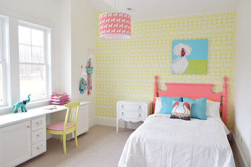
We got the wall stenciled, the headboard painted, hung some art (that awesome chicken painting was done by a friend of ours named Lesli DeVito), and then we painted/upholstered two secondhand chairs – and even had some fun with a few wall hooks.
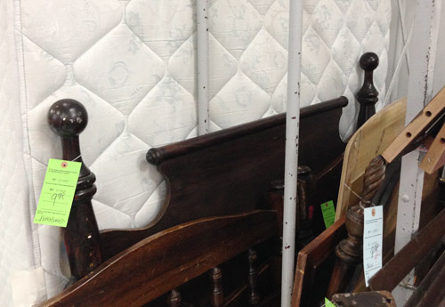
You might remember this old full-sized headboard find of ours (it was $9.98 at a local place called Family Thrift Center).
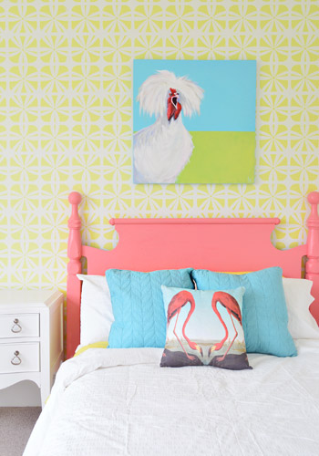
Now it’s sporting a fresh coat of paint (Hydrangea Flowers by Benjamin Moore) along with that freshly stenciled wall behind the bed. Both of them were done by Parker, one of the builder’s right hand men – who apparently is a stenciling expert among all of his other talents.
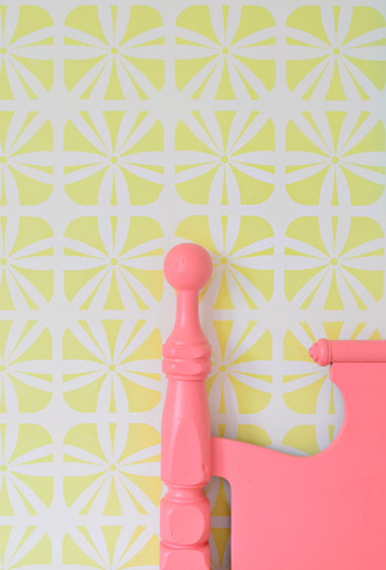
It definitely felt foreign not to be up there on ladders doing the walls ourselves (along with priming and painting that headboard) – but with 3,500 square feet of house to furnish & accessorize, it was also pretty amazing to be able to tackle a bunch of other tasks while those got checked off the list. The stencil was donated by Royal Design Studios, and the room is painted Simply White with Hibiscus by Ben Moore layered on for the stencil.
It’s another example of wanting to take some risks to keep the show interesting (we love how it mixes with the pop of color in the headboard) and it’s nice that it can just be painted over if someone moves in and wants to change the look of the room – so it’s one of the more flexible choices.
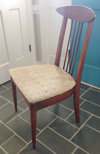
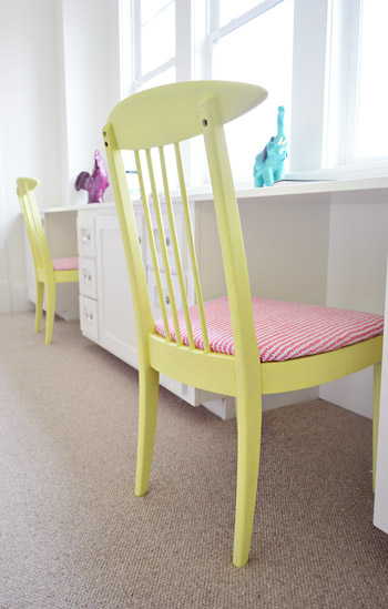
We did get to roll up our sleeves and refinish some furniture ourselves, like these two chairs that we found for $16 each at another favorite thrift store (Love of Jesus on Midlothian).
Here’s what they looked like when we found them.
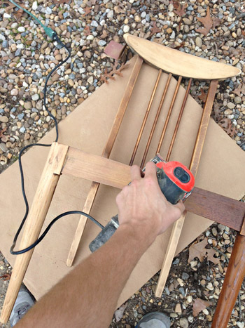
We actually debated staining them, so John sanded them all the way down to the raw wood, but the more we stared at the girls’ room, the more convinced we were that paint was the way to go (there’s carpeting in there instead of hardwoods since the builder said most of his buyers prefer that in a kids room – and with other painted furniture going on, we thought wood stain might feel like the odd main out). I’m sure we could have stained them and made them work, but a little more fun color in a kids room was too hard to resist…
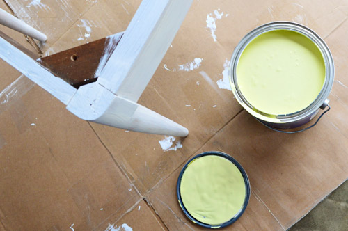
So we primed them with two coats of Kilz Premium (rolled on with a foam roller in most spots and with a brush to get into the nooks and crannies) and then we gave them two coats of Hibiscus paint, which was leftover from the stenciled wall (once again, applied with a small foam roller and a brush to get into those tighter spots).
While those were drying in the garage, I recovered the seats with extra loft batting (you can grab that at any craft store like JoAnn) and used a manual staple gun to pull that firmly around the front of the seat, and staple it around the perimeter in the back.
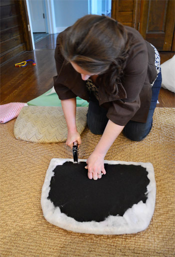
Then it was time for some playful fabric called Candy Floss that we found at U-Fab (they kindly donated a yard of it, which was enough to cover both seats). Here’s a shot of how I deal with corners. If you fold them sort of like when you wrap a present you get a nice clean look in the front.
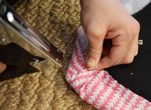
One tip for working with a pattern is just to make sure to keep it straight as you staple (I occasionally flip it over to check, and you can pop out staples and redo things if your patterns migrates and it looks wonky). The other pattern tip would be to make sure if you’re doing more than one chair that you’re keeping the fabric running in the same direction (assuming you want your chairs to match). So since the white arrows seem to be pointing down on this cushion, I made sure they went the same direction for the second chair.
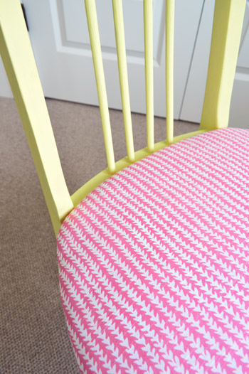
Then you just screw the seat cushions back into the chairs once they’re dry and you’re done. Boom – new chairs. Except they’re old. But they look new, so… huzzah!
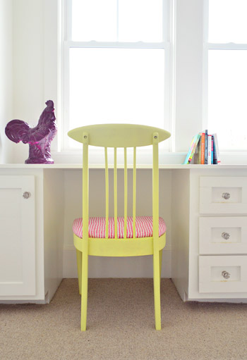
You’ll notice some ceramic animal friends on the wall behind this chair, so let’s get a little closer…
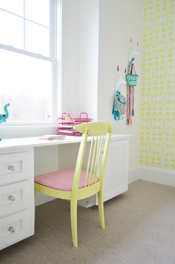
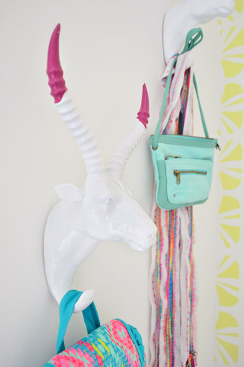
They’re HomeGoods finds that we grabbed to hang up a few colorful imaginary daughter items like a purse, a mini backpack, and a scarf.
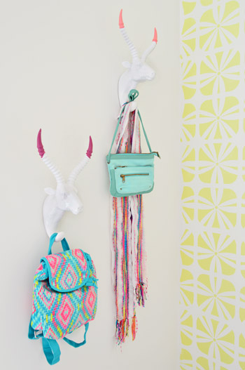
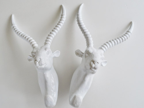
Here’s what they looked like when we bought them. Going onto a white wall we worried they might be a little flat, so we dipped their antlers just to add some interest. We didn’t want them to look too matchy or perfect, so we went with two different colors (Hydrangea Flowers and Berry Fizz).
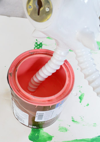
We didn’t tape them off and paint them – we literally dipped them right into the cans.
They were a little drippy…
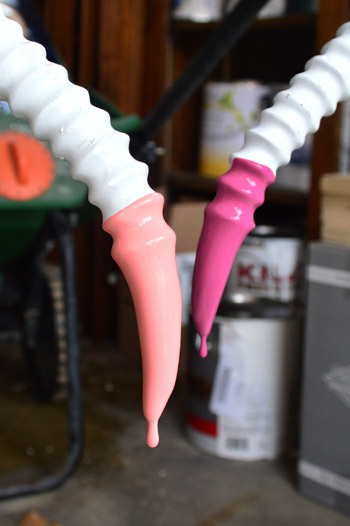
… so we hung them from our grass seed spreader with some old foam core under them to catch the splatters.
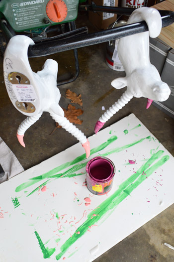
It was crazy easy, and the dipped tips look awesome – sort of like powder coated resin since it’s so thick and glossy. I love that they’re imperfect and angled too. For some reason it seems more interesting than if the paint followed the ridges perfectly. Nothing like a little rebellious outside-of-the-lines coloring.
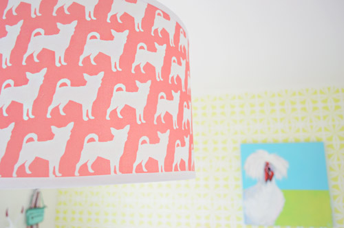
And you may have noticed our Burger pendant light. We couldn’t resist. Just don’t tell Burger or his ego won’t fit through the door anymore…
The room’s definitely looking a lot more finished than the view that greeted us about a month ago.
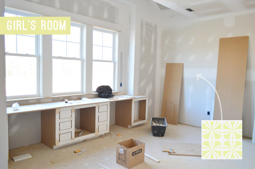
Now we just have about a half-dozen other changes/additions to make in here… and 24 other spaces to finish in the next 14 days or so.

Update: There have been a few questions about having a double desk for a single kids room. John actually grew up with two desk areas in his room (one for a computer and one for homework/writing/drawing) so our team figured since two chairs fit easily along that wall it could end up being really practical.
Update #2: A few others have asked if these furnishings/accessories need to be universally appealing for whoever buys this house. The answer is that they’re just for the show (where we’ve been encouraged to take risks, have fun, and do different things so each house feels set apart). Once the show’s over, the homeowner has the option to buy a few items of furniture or art if they’d like – but will mostly be furnishing/decorating this house so it works for their family.
As John mentioned on Friday, things are going to be super showhouse heavy for us throughout this week and next week, so forgive us in advance if we’re behind or off schedule (or slow on comments). We’ve somehow managed to squeeze in some our-house projects among the chaos (like some nursery updates), so we can’t wait to share those whenever we can.
What did you guys do this weekend? Any art hanging, headboard painting, chair makeover-ing, or ceramic animal dipping?
Psst – Wanna see more showhouse info & photos? Click here for Our Full Showhouse Tour, which includes final pictures of every room, the floor plan, budget info, a video walk-through, and shoppable showhouse furniture & accessories.

Briseidy says
AMAZING! LOVE THE CHAIRS, GREAT COLORS!
Ski says
What brand and model of carpet did you go with for this room? Sorry if I missed it somewhere. Thank you!! Love the pink with yellow so sweet
YoungHouseLove says
It’s just a basic berber carpet (100% wool) from ProSource here in Richmond.
xo
s
courtney says
Once this showhouse is done, will you be moving in??
YoungHouseLove says
Nope, but we definitely plan on begging the new owners to let us house crash ;)
xo
s
Jennie says
Love this room, you guys! It is young, fun, and colorful. I can’t wait to see it when it is finished! I personally love the desk, and would have loved it as a kid too. It is perfect for homework, art, play, makeup, music stuff, etc. I like the overall vibe of the house, and I feel like you are headed in a great direction. Excited to see more! :)
Jennifer I says
I like this room so far, and I like that you are getting such strong and different reactions — shows you took some risks, doing what you wanted with the show house!
Kathleen says
Looks so beautiful! A 13 year old me would DIE for this room, but I think it would fit a lot of demographics. Congrats on a job well done! I am in awe of your talents and selflessness in doing this project. Can’t wait until it’s done so we can see it all finished and you can finally kick your feet up. Again, congrats! And thanks for taking us on the journey!
YoungHouseLove says
Thanks Kathleen!
xo
s
Jennifer says
I spent 35 hours stenciling a feature wall in my son’s room. It was my first and practicing on a cardboard box was so simple and easy but our walls aren’t super smooth due to the concrete used for the walls here. I love the result but would be over the moon if the master stenciler had any tips as I’m sure it didn’t take him anywhere near as long.
YoungHouseLove says
I was watching him go and he used a small foam roller, stencil adhesive, and he wiped the back of it periodically. Felt pretty proud since that’s what I did the last time we stenciled and it seemed to work out well. He was much faster on the ladder than I would have been though. Haha!
xo
s
Jennifer says
I think I was misadvised by my paint store. The instructions said foam roller but they said that would take forever and gave me one with short nubs. :-/ Either way it’s done and I love it! http://www.pinterest.com/pin/327636941613668935/
YoungHouseLove says
HOLY COW IT LOOKS AMAZING! Thanks for sharing the pic!
xo
s
Emily says
I think would be cute to set up the double desk with one side as a vanity station with a mirror and jewelry holder and the other side more for homework and projects. Just an idea :)
I love that pink/coral color. I have been looking for a good one.
YoungHouseLove says
That’s a fun idea too!
xo
s
Jessica Leonard says
Can’t wait to see the finished product!
So sorry about all the negative feedback you’re getting. Constructive criticism is one thing, but being rude is another.
Anyway, my only comment is about the end table. I know you said you may switch it out. I think some sort of wood would look nice. Whether it be a medium brown you see in a lot of mid-century modern furniture, or a gray wash. Either way, I just think it’ll help to break up the white. That being said , I know you still have a lot of accessorizing to do. Seriously. Can’t wait.
Elizabeth says
I love this room, but then again I love everything you do and that you add such fun quirky touches that aren’t SO expected!! Where is the side table from?
YoungHouseLove says
Thanks Elizabeth! It’s from Green Front furniture in VA.
xo
s
Anya says
Wow, Sherry and John! I’m so impressed with all the work that you’re doing to design and decorate and stage this space.. and you’re giving your designers fee away to Habitat! Impressive. :) Hope things continue to fall into place and thanks so much for sharing a peek of one of the rooms with us. It must be hard having us all as back-seat designers ;) thanks for your patience!
Sam says
I like the chairs, it shows what a little paint and fabric can do.I’m not feeling this room for a tween though, looks like a toddlers room. All those bright, primary crayon colors look a little daycare to me. And I just showed it to my nieces and they all said it was too babyish and uncool. Coming straight from the horses mouth :)
Sarah says
Okay, so I have to tell you the “Hey Girl” had me hoping for a Ryan Gosling meme, but the killer room compensated for the moment of disappointment. I love the actual dipped antlers, those adorable chairs, and all the color. The painted headboard is looking so fabulous! Good luck pulling it all together. Can’t wait to see more!
Cheerful Homemaker says
We bought the lumber to build our son a platform bed this weekend. He’s 2.5 and possesses Hulk-like strength and has been tossing his toddler mattress around the room.
I love all of the fun colors and patterns you use! We should be BFFs and you could help with my house. I can pay you in baked goods. :D
YoungHouseLove says
“Mmmmm, I accept!” says the pregnant lady.
xo
s
Jamison says
Hey you guys, just wanted to let you know I just stumbled upon your blog and you guys are crushing it! Great job. As a new DIY blogger its great to see sites like this. Very motivating.
Any chance you guys are going to the Haven conference? I’d love to me you both. And as a male DIY blogger it would be nice to have another guy there.
YoungHouseLove says
Aw man, we have gone every year but we’ll have a newborn so I’m afraid we can’t make the 8 hour drive this year. It’s a lot of fun though!
xo
s
Jamison says
Well congrats, and I totally understand! We just had a little girl and with a 3yr boy running around already there was no way I could convince my wife to come.
Good luck, and hopefully we cross paths in the future!
Tyler Anne says
Love, love, LOVE that stencil! I’ve been wanting to do statement wall in the bathroom and I think you’ve convinced me that a stencil may be the best idea for that!
Again, just love!
Karen says
I love the room!! You are doing such an amazing job of this house. I am so proud of you two!
You are always so sweet with your responses to negative comments. I really don’t know how you do it.
Can’t wait to see the progress on this room!
Caitlin says
It’s cute but I agree with a few others, that stencil in those colors don’t work…it hurts the eyes. Maybe add in some pops of darker pinks, teal blue, and limes??
Good luck!
jenn says
i definitely would have loved this room as a teenager, its grown up without being too grown up, fun and whimsical but still calming. it definitely can appeal to girls from 10-17
Hillary says
I couldnt find the answer to this anywhere. Where is the side table from? I love it!
YoungHouseLove says
That’s from Green Front in VA.
xo
s
rachelle says
You guys have a REALLY fantastic eye for color. I’ve followed the blog for a few years now and I am continually super impressed by the way you bring color and pattern together. It feels like I’ve watched your color sense and ideas becoming more sophisticated and daring and it’s just such a wonderfully fun – and INSPIRING! – thing to witness evolve over time.
WHEN CAN I MOVE IN?? :>
YoungHouseLove says
Thanks so much Rachelle!
xo
s
jenn says
guys you all have to remember they are not building this house for YOU or your children. so regardless of whether your kids prefer a window seat to a desk or dont like a rooster picture it’s not your decision. they are doing this themselves and its suppose to represent them and their style. they’re fun and whimsical and calming all mixed together.
most of things your all upset about are design elements that are not being sold with the house. if they want to have 15 flamingos in the room that’s up to them.
remember trading spaces? sand on the floor? scarves stapled to the walls? it could be a lot worse.
Carla says
Ha!
I totally remember Trading Spaces. :o)))
Jess says
Gotta laugh at the people who say this room isn’t geared toward a tween girl. Although I don’t have my own tween-girl yet (she’s only 3), I work with girls aged 12-14 on a daily basis. Antlers & bright neon colors are HOT. All of them would love this room!
Great job guys. Haters gonna hate, they’re behind the times it seems.
rachelle says
hi, two minutes later. I’m back.
Just skimmed over some comments.
Would now like to nominate you for knighthood for medals of patience, compassion and total courage for putting yourselves out there day after day in this space. I come here every single day to admire and ooh and ahh and actually get inspired by what you’ve done and I’ve never felt it makes a difference if what you’ve created is something I’d do or not do in my own home – it’s your blog and I’m aware of that (it says it in pretty big letters at the top).
Thus, I was shocked by the bluntness and just plain rudeness of so many people here who treat this like a forum for them to criticize your ideas and your hard work and then boastfully push their own agendas and ideas onto your blog. Kinda riled me up. I know you have your people who take up for you but I seriously cannot get over the attitude of certain posters.
I’m sure you’re used to it or have coping mechanisms but I just wanted to give you a big, virtual hug for being so awesome. Also, thank you for sharing yourselves with us. YOU. ARE. BRAVE. AND. AWESOME-SAUCE!
Also incredibly freaking talented!
Caity says
Amen, Rachelle! Get it girl.
Stef says
I think things are headed in a good direction, but agree that it feels very “bright” right now. Since the room is still in progress, is it too late to put a color on the walls? I actually think a navy or dark teal (your old guest room??) is the perfect backdrop for the pink, white, and chartreuse. Leave the accent wall, of course! Then some white roman shades with trim in the same color as the wall to pull it together.
YoungHouseLove says
We still have room for paint tweaks but have some dark colors in a few other rooms so I think we’re planning to stay the course in here with the walls and see where we end up :)
xo
s
Kristen says
You are color geniuses. For real. I like want to eat all that bedroom furniture, that’s how pretty it is. Thank you for sharing the gorgeous progress!!
YoungHouseLove says
Haha, thanks Kristen!
xo
s
Julia@Cuckoo4Design says
oh so pretty, not far from done!
Courtney says
Great job guys!! I love the bright colors and the headboard and chairs! It must be tough putting yourselves out there and everyone not loving it…I wouldn’t want to do it, so I admire you guys a lot. I have a seven year old niece who would love this room. She is a huge animal lover and would like all the different types in there!
Natalie Stachon says
What an awesome girl’s bedroom! I love it – especially the headboard and updated desk chairs.
Emma says
Man – only now am I getting a full appreciation of just.how.much work this show house is for you guys! I mean it usually takes a year or two to fill up a house enough to make it look & feel ‘lived in’. You guys have a few weeks to do it ALL, with a baby thrown in for added excitement. And you’re doing it for FREE. Is is just you two? Do you have any help (not financially but just to move stuff in and buy stuff, etc.)? I know the end product will be great and it looks lovely so far. Hang in there!
YoungHouseLove says
John the builder has an awesome team of electricians and painters and plumbers who are diving in to lend a hand with things like hanging big mirrors and moving big items of furniture. It sounds crazy but it’s actually a lot of fun!
xo
s
Sadie says
Where is the side table from?
YoungHouseLove says
It’s from Green Front in VA.
xo
s
Kasey@AllThingsMamma says
HI! I read through all the comments but I didn’t see if you said where you got the desk or how you made it. Would love this for our kid’s playroom!
thanks!
YoungHouseLove says
That was made by our builder’s awesome carpenter John Longo.
xo
s
Pat says
I love the antelope, but I might have gone one step further just for fun, by painting their noses to match their horn tips. LOL
Pat says
Love the whole room actually. Just a lovely ‘spring and sunshine room!
Kim says
Where is the white side table from?
YoungHouseLove says
It’s from Green Front in Virginia.
xo
s
Jackie says
Hi,
As an alternative to a vanity, another option for styling this space for a tween could be setting up one of the desks as a craft area with a sewing machine and going the more fashion design theme route. I think that would appeal to buyers that want a dedicated space for crafting in their guest room too. The cabinets seem ideal for fabric or general craft storage.
Hopefully this doesn’t come across as a rude suggestion? I’m sort of confused with all of the comments saying the feedback on this post is rude because although many dislike what you’ve done so far – I just interpreted it as more about personal preference and not as a personal attack.
I apologize if the suggested idea is offensive though – definitely not my intention. I just think a sewing area with a fashion theme to the room might display the custom construction better and read less ‘young’ like some have indicated in their comments.
Can’t wait to see the finished product!
Best,
Jackie
YoungHouseLove says
That’s a fun idea too! Thanks Jackie!
xo
s
Monique says
I love this! That bed is to die for! The two seat desk is perfect for girls, one side for make-up and hair, the other for study. I think the bed side table will fit in more when the window furnishings are up. Good work guys! Cant wait to see the rest! P.s Please start a decorating TV show! Only if it’s available in Australia obviously!
Lauren says
oh wow this bedroom is stunning! i wish i had a room like this!
Lauren | OhHay Blogs!
xxx
N Shirley says
I appreciate you showing the design process as you go along. Please don’t start second guessing yourself! I think the rooms are coming along nicely and can’t wait to see the end result! I especially like the girl’s room. I hope Sherrie is continuing to feel well and you are both enjoying the process! I enjoy going to design houses, though the ones I have been have a different designer doing each room so the styles do not always coalesce! Though I still remember cool ideas I saw years ago. One was a stairway to an attic playroom that had little bears being carried along by balloons on each step with a number on each balloon.So cute! Anyway! Hang in there!
Rosy Lehman says
Absolutely love your blog and you guys are doing a great job on the showhouse and your house! How do you guys do it all?!
YoungHouseLove says
Aw thanks Rosy! We are just hammering away at as much as we can knowing this baby is coming and we’ll probably have a lot of forced down time when he’s here. So when we feel like sitting down and saying “we’ll just do that tomorrow” having a baby’s-coming deadline seems to keep us trucking along!
xo
s
Jessica says
I’m surprised by all of the comments about this room being sterile. I think it is so cheerful and fun! It will be interesting to see if the buyer is (or becomes!) a YHL fan!
Maybe one day you can do a post on how the whole Homearama thing works, like how they sell the homes, what is included with the sale, what happens to the things you bought for the house that aren’t included in the sale, what kind of neighborhood the homes are in, how designers and contractors are chosen… Or maybe I’m the only person who is interested in that stuff!
YoungHouseLove says
We have actually been getting a lot of questions about that, so it would be a fun post!
xo
s
Kelly says
Why are people so mean! You all did a great job! You are the designers asked to create this show house, and you did just that in your own creative way. Be proud, those negative comments are very inappropriate.
Shary says
I’m so excited to see the whole house! Just purchased our tickets. Hubby and I are coming down from NoVA to see the houses. You’re doing a great job!
karen says
some people just don’t read! next time if you do an ‘in the middle’ design post..i would put star bursts on the images of what you intend to do/change. lol. or just not post an ‘in the middle’ design..seems like the comment section is a waste of energy for you guys.
Becca says
Did you guys ever consider adding a dipped look to the redone chairs? Just the bottom few inches of the legs… Thought it might be a fun detail to corridinate with the antilope hooks. ;) -becca in mn
YoungHouseLove says
That would be really fun! When we debated leaving them wood we thought we could dip the bottoms but ended up going with the solid chair color + the colorful fabric. Love a dipped look though!
xo
s
Christina says
Guys, this looks so cute!! Can’t wait to see the FINISHED ;) room and how you bring it all together.
I am by no means an interior designer, but what I do know is when a room/home has been designed/styled to be lived in and when it has been designed/styled to be looked at…..and I just love that you all are mixing the two, quite successfully, with this awesome opportunity!! I can’t imagine how tired you both are and wish you the very best health and hope it all comes together seamlessly.
Jen says
Haven’t read all the comments, so sorry if this is something you’ve already responded to, but are there are plans to bring any wood and other natural tones/textures into the room? Remember in your last kitchen how things really started to come together once you backed off some of the painted stuff and started bringing in things like the wooden bar stools, wood framed mirror, and basket lamp shade)? I sort of feel like this room needs the same touch. It looks a little…saccharine to me right now, I guess.
YoungHouseLove says
A few others said some wood elements would be fun in here too, so we’re definitely open to seeing how it evolves! A lot depends on this crazy deadline of ours and what we find, but we’ll keep you guys posted every step of the way :)
xo
s
Emma says
Stumbled across this post by the beautiful lady Jesse Hyde who loves to DIY and her bedroom wall wood accent is beautiful and completely unique ! Thought you guys might enjoy !
http://imperfectlypolished.com/2012/05/10/our-house-tour-master-bedroom/
YoungHouseLove says
So pretty! Thanks for sharing the link Emma!
xo
s
TonyaM says
This room is really cute, but if you REALLY want it to look like a 10-13 year-old girl lives there, you’ve got it all wrong. You need a dozen articles of inside-out, dirty clothing scattered about, some drawers open, the bed unmade, that whole desk area piled with crap…….you get the idea? I am a very neat and clean mom to two girls falling in that age category. And I’m not resentful. At all. :)
YoungHouseLove says
Hahahaha!
xo
s
Yailen says
I love this room!!!! Everything about it, can’t wait to see the finished product.