We spent the weekend checking off a bunch of hands-on projects for the girls room in the showhouse. It’s definitely still looking sparse, and is far from done, so I’m sure it’ll keep evolving right up until our deadline.
- The bed needs to be raised and we have a colorful throw to add
- Linens need to be ironed and we have a custom bolster that we’ll layer in there too
- Colorful fabric window treatments will be hung as soon as they’re in
- We might switch out the end table – not sure yet…
- We have a soft blue lamp and a bunch of other accessories to add to tie things together
But we did manage to significantly shrink the to-do list this weekend.
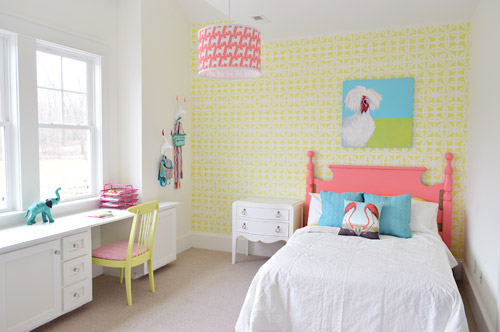
We got the wall stenciled, the headboard painted, hung some art (that awesome chicken painting was done by a friend of ours named Lesli DeVito), and then we painted/upholstered two secondhand chairs – and even had some fun with a few wall hooks.
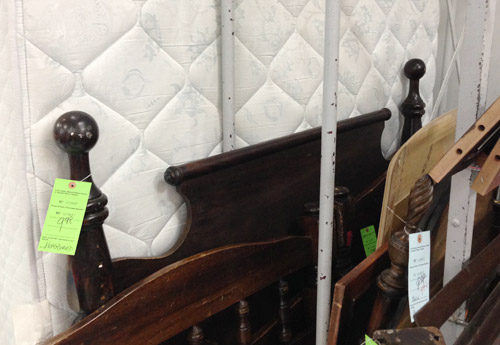
You might remember this old full-sized headboard find of ours (it was $9.98 at a local place called Family Thrift Center).
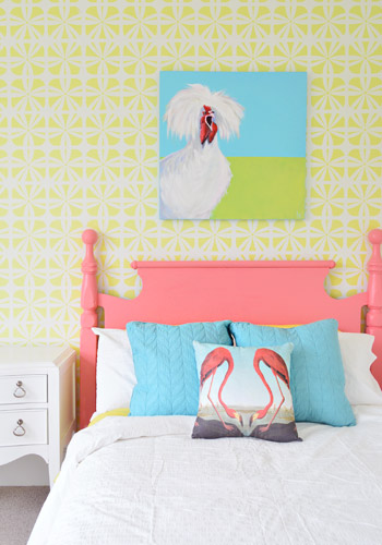
Now it’s sporting a fresh coat of paint (Hydrangea Flowers by Benjamin Moore) along with that freshly stenciled wall behind the bed. Both of them were done by Parker, one of the builder’s right hand men – who apparently is a stenciling expert among all of his other talents.
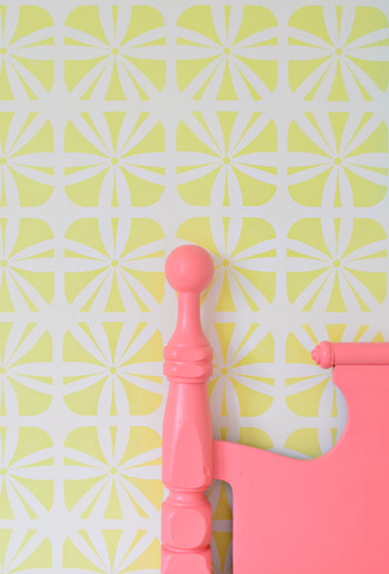
It definitely felt foreign not to be up there on ladders doing the walls ourselves (along with priming and painting that headboard) – but with 3,500 square feet of house to furnish & accessorize, it was also pretty amazing to be able to tackle a bunch of other tasks while those got checked off the list. The stencil was donated by Royal Design Studios, and the room is painted Simply White with Hibiscus by Ben Moore layered on for the stencil.
It’s another example of wanting to take some risks to keep the show interesting (we love how it mixes with the pop of color in the headboard) and it’s nice that it can just be painted over if someone moves in and wants to change the look of the room – so it’s one of the more flexible choices.
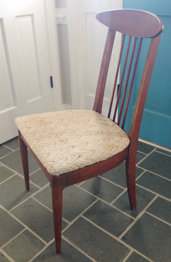
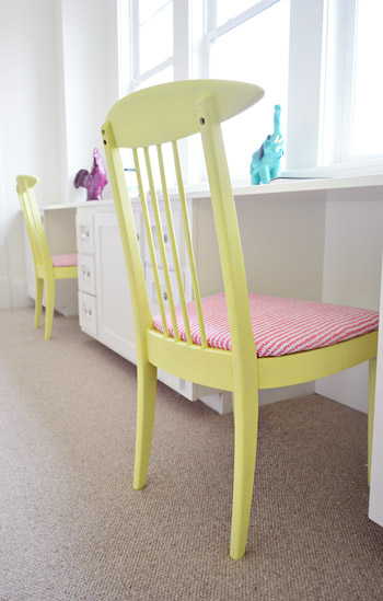
We did get to roll up our sleeves and refinish some furniture ourselves, like these two chairs that we found for $16 each at another favorite thrift store (Love of Jesus on Midlothian).
Here’s what they looked like when we found them.
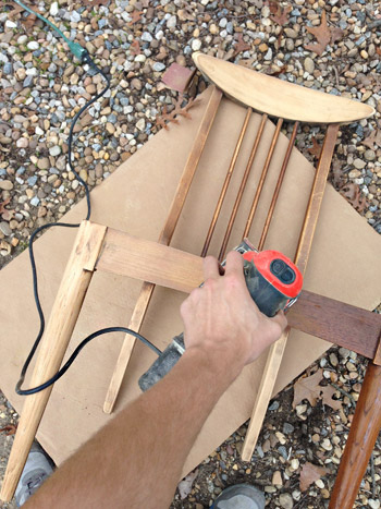
We actually debated staining them, so John sanded them all the way down to the raw wood, but the more we stared at the girls’ room, the more convinced we were that paint was the way to go (there’s carpeting in there instead of hardwoods since the builder said most of his buyers prefer that in a kids room – and with other painted furniture going on, we thought wood stain might feel like the odd main out). I’m sure we could have stained them and made them work, but a little more fun color in a kids room was too hard to resist…
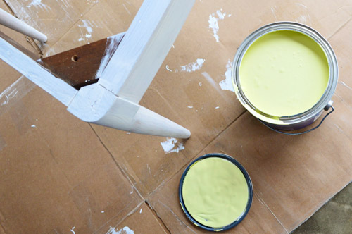
So we primed them with two coats of Kilz Premium (rolled on with a foam roller in most spots and with a brush to get into the nooks and crannies) and then we gave them two coats of Hibiscus paint, which was leftover from the stenciled wall (once again, applied with a small foam roller and a brush to get into those tighter spots).
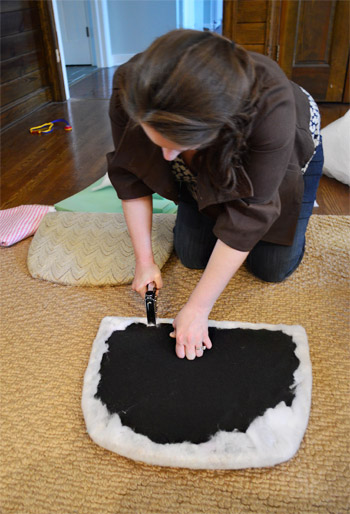
While those were drying in the garage, I recovered the seats with extra loft batting (you can grab that at any craft store like JoAnn) and used a manual staple gun to pull that firmly around the front of the seat, and staple it around the perimeter in the back.
Then it was time for some playful fabric called Candy Floss that we found at U-Fab (they kindly donated a yard of it, which was enough to cover both seats). Here’s a shot of how I deal with corners. If you fold them sort of like when you wrap a present you get a nice clean look in the front.
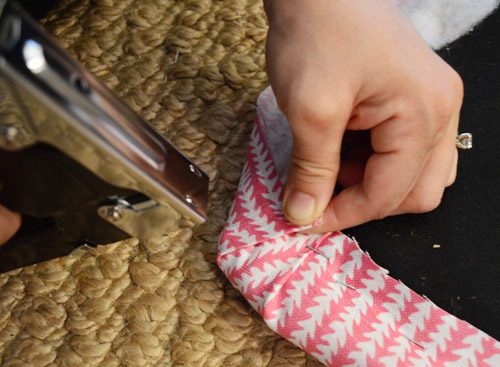
One tip for working with a pattern is just to make sure to keep it straight as you staple (I occasionally flip it over to check, and you can pop out staples and redo things if your patterns migrates and it looks wonky). The other pattern tip would be to make sure if you’re doing more than one chair that you’re keeping the fabric running in the same direction (assuming you want your chairs to match). So since the white arrows seem to be pointing down on this cushion, I made sure they went the same direction for the second chair.
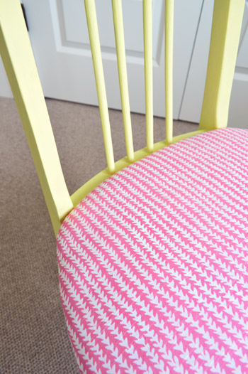
Then you just screw the seat cushions back into the chairs once they’re dry and you’re done. Boom – new chairs. Except they’re old. But they look new, so… huzzah!
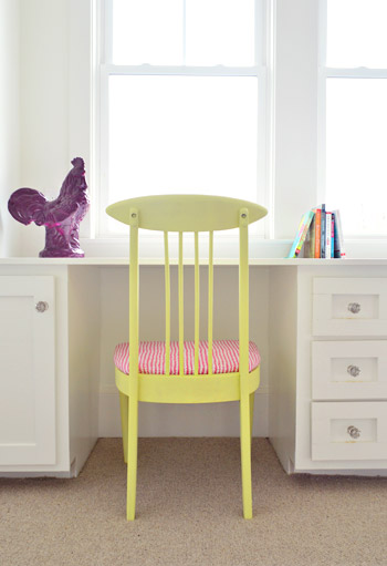
You’ll notice some ceramic animal friends on the wall behind this chair, so let’s get a little closer…
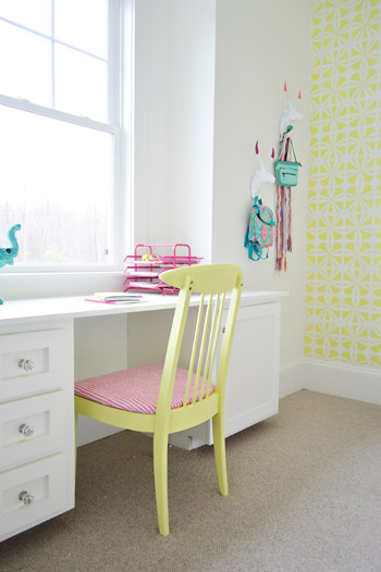
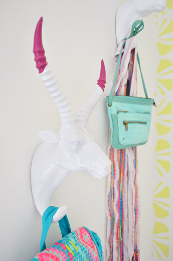
They’re HomeGoods finds that we grabbed to hang up a few colorful imaginary daughter items like a purse, a mini backpack, and a scarf.
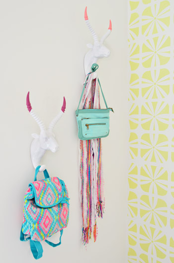
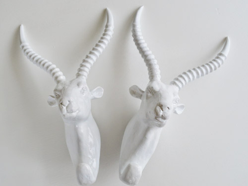
Here’s what they looked like when we bought them. Going onto a white wall we worried they might be a little flat, so we dipped their antlers just to add some interest. We didn’t want them to look too matchy or perfect, so we went with two different colors (Hydrangea Flowers and Berry Fizz).
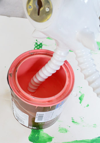
We didn’t tape them off and paint them – we literally dipped them right into the cans.
They were a little drippy…
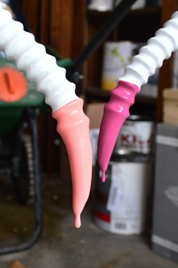
… so we hung them from our grass seed spreader with some old foam core under them to catch the splatters.
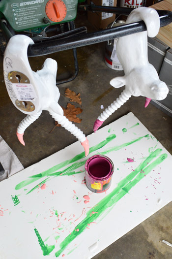
It was crazy easy, and the dipped tips look awesome – sort of like powder coated resin since it’s so thick and glossy. I love that they’re imperfect and angled too. For some reason it seems more interesting than if the paint followed the ridges perfectly. Nothing like a little rebellious outside-of-the-lines coloring.
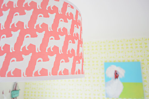
And you may have noticed our Burger pendant light. We couldn’t resist. Just don’t tell Burger or his ego won’t fit through the door anymore…
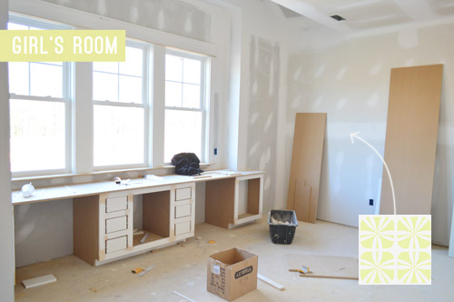
The room’s definitely looking a lot more finished than the view that greeted us about a month ago.
Now we just have about a half-dozen other changes/additions to make in here… and 24 other spaces to finish in the next 14 days or so.

Update: There have been a few questions about having a double desk for a single kids room. John actually grew up with two desk areas in his room (one for a computer and one for homework/writing/drawing) so our team figured since two chairs fit easily along that wall it could end up being really practical.
Update #2: A few others have asked if these furnishings/accessories need to be universally appealing for whoever buys this house. The answer is that they’re just for the show (where we’ve been encouraged to take risks, have fun, and do different things so each house feels set apart). Once the show’s over, the homeowner has the option to buy a few items of furniture or art if they’d like – but will mostly be furnishing/decorating this house so it works for their family.
As John mentioned on Friday, things are going to be super showhouse heavy for us throughout this week and next week, so forgive us in advance if we’re behind or off schedule (or slow on comments). We’ve somehow managed to squeeze in some our-house projects among the chaos (like some nursery updates), so we can’t wait to share those whenever we can.
What did you guys do this weekend? Any art hanging, headboard painting, chair makeover-ing, or ceramic animal dipping?
Psst – Wanna see more showhouse info & photos? Click here for Our Full Showhouse Tour, which includes final pictures of every room, the floor plan, budget info, a video walk-through, and shoppable showhouse furniture & accessories.

Heather says
I like the side table…instead of switching it out, what about some colorful knobs and a great tray to corral a girls lipgloss?
YoungHouseLove says
That could be cute too! We’re not sure if it works better in another spot (we have a lot of areas to fill) but we’re definitely open to adding new knobs or things on top of it!
xo
s
Pat says
Wow, tough crowd today! ;) (I have to say, it does seem that SOME people just look at the pictures and don’t read the info with them.) I enjoy seeing the process of putting a room together in your unique style and always learn something from it, which is why I read your blog, even though I’m probably a lot older than your typical reader. Good luck with the rest of the job, and keep taking risks!
Pat says
forgot to add – I LOVE those chairs!!!
Lucy S says
This is shaping up to be fabulous! My favorite part so far is the built in desk with the chairs you did. I’d have LOVED to have a desk like that as a little girl. Great job, guys!!
maggie says
Wow…a lot of controversy over a room that’s not even completed. I really like the happy feeling this room has going on.
My main reason for leaving a comment is to pass along a great tip. Don’t iron the bedding! Who wants to fool with that? Just grab a spray bottle of water and spray the wrinkly thing with a fine mist (not too wet) and smooth it out! This works for sheets and tablecloths, too.
YoungHouseLove says
Love that tip Maggie! Thanks!
xo
s
Alexis says
Hi busy family!
Great work on all your projects! I hope you are taking some “you” time before your baby comes… you are one momma who deserves it :) Where did those light blue pillows come from? I want them for my boy’s room!
Alexis
YoungHouseLove says
Aw thanks Alexis! Those are from HomeGoods. Really cheap too (like $19 for both – and they’re down filled!).
xo
s
Stahli says
LOVE the bedroom so far! Before I start my comment I have to say that I didn’t read all of the ones that came before. I was just reading along and noticed the “old foam core board” that you had the antlers drip drying on. That looks like it could be a piece of art hung in a frame somewhere! Might need a couple more projects to drip on it but it would be pretty cool (and also a way to remember the show house)! I so wish Kansas wasn’t so far I would love to see this in person!
YoungHouseLove says
Love that! You’re so sweet Stahli!
xo
s
ferguson says
I love this room! When I look at the room, I think of a cool, “Bindi Irwin” type of teenager…one who LOVES animals but doesn’t want to go the dark, leopard print route. Instead, like a lot of young teenage girls, she wants bright, cheery colors and a fun way to showcase her love of animals! My goddaugther wants to be a vet when she grows up (she’s 16) and I know she would LOVE this room (her room is pretty much neon already)! I think this room is perfect for that type of young teenager…
Theresa says
I am in love with you two! The show house has been wonderful to watch. You asked if we’ve done anything fun this weekend, and I had to let you know, since you’re the ones who’ve inspired me the most to take chances, is YES! I’ve painted two half circle tables, a desk and and chair. The desk is a light blue to match my daughter’s travel/maps themed room, and a red side table to accent the reds in maps. The chair is Sun Drop Yellow by Behr, my boldest move thus far, and will go in the master bed against a wall called Ocean Spray by Hallman Lindsay Paints.
Keep up the fantastic work!
YoungHouseLove says
That sounds amazing Theresa! Congrats on getting it done!
xo
s
Lesley says
I love this room, and maybe because I am a Richmonder, I get it’s aesthetic for a young girl. I think it’s airy and bright and just enough color to make it fun. LOVE the built ins.
Another way to get great furniture on the cheap…hit neighborhood yard sales as they end. Many things don’t go because folks want too much money for them. People are lazy, they can’t be bothered with waiting 2 weeks for a charity to pick the stuff up, so they discard! You can pick up some nice things at the curb or in the alleys. I’ve done it and even resold them at my own yard sale. People feel they are above doing such things, but it’s a way to find great stuff.
YoungHouseLove says
Great tip Lesley!
xo
s
Pam says
Any little girl would love that room! If you know chickens at all then you know that painting is of a silkie. We have other chickens and have been wanting some silkies. Must be a sign to go ahead and get some. Went to Target Saturday for a Burger hook and they didn’t have anything in the store. They said it never all gets “pushed out” in all areas at the same time so I will check back. Could order on-line but wanted to see display in store. You guys are so fun to follow.
Pam
Peggy says
I have to admit I LOVE this room! In fact I wouldn’t mind having it for myself! Okay, so maybe I would change out the desks for a chair or two but I love all the pops of color and the eclectic decor. A young girl would definitely LOVE this as their interests are typically so varied at that age. :-) Keep up the good work!!
JoDi says
This is my favorite room so far! Can’t wait to see the rest!
Sara says
Love this room. I guess I am just a little confused about where all the stuff goes if it’s just there for show? I understand that some of it’s on loan, but what about the DIY’s you guys are doing? What will happen to all that after the home sells?
YoungHouseLove says
A lot of items will be donated to Habitat For Humanity or if they came out of the builder’s budget he might reuse them for future models, etc.
xo
s
Taylor S says
Love the room! Very bright and cheery. The posts are all over the board with this one. Can you tell me where you got the sweet bedside table? I am sorry if you already answered but I couldn’t find it…
YoungHouseLove says
That’s from Green Front in VA.
xo
s
Christiana says
The reading comprehension on this post by the readers gets a big F.
It looks great so far and it will look even better once you finish furnishing and staging it. I love the antlers and I bet lots of kids would, too. Not all kids have the same taste.
Keep on keeping on.
Martina @ snapshotsandwhatnots says
Funnily enough you guys said when you started the showhouse that when you were thinking of the future family that would live here you pictured your own family just a few years older….that is exactly what I see when I look at this room (even though it’s not finished yet), it’s a 12 year old Clara room and it’s lovely!
Kirsten D says
Love all the color. Is it wrong that I would want that room!! I love the mis-match yet they all go together patterns. It makes me feel more at ease mixing patterns in my master.
Daniele Manjabosco says
Love where this room is going. So different! Where is the nightstand from? Do you have a link to it?
YoungHouseLove says
It’s from Green Front here in VA.
xo
s
John says
I see a number of problems here.
1. Each room seems to be its own island, with little continuity between rooms. For example, the boys room and the girls room have different carpeting. Why? Using the same carpeting in the bedrooms would create more flow between the rooms and unify the house. Another example: the green of the Jack and Jill vanity is nowhere to be found in the girl’s bedroom. At the very least, it should be included as an accent color. I’d have liked to see it used on the chairs.
2. The stenciled wall is poorly done. Look at the photo. The horizontal white lines between the rows of stenciling are plenty obvious. The wall should be repainted and then restenciled by an experienced stenciler.
3. It doesn’t matter that twenty years ago John had two desks in his room, one with a desktop computer and one for pencil and paper studying. Kids today don’t work that way! They have their laptops, tablets and phones and curl up on their beds, bean bags, futons or window seats to do all their homework, texting and Facebooking. They don’t use desks. One desk, probably used as a vanity, would have been enough, and a deep window seat with lots of cushions and pillows would have given another place—besides the bed—for a girl to settle in and do homework.
4. I can’t imagine a 10 to 13 year old girl wanting a room with a chicken painting, a giant purple rooster, and other ceramic animals hanging on the wall. Girls that age want some sophistication and bling. Look that this tween room for some of that http://www.simplifiedbee.com/2013/09/purple-girls-room.html
5. The room is the same old, same old: ceramic animals and “pops of color.” It’s tiresome. How about something new, like that ceiling in the link above?
6. The colors in the room are either white or super intense. It needs some softening in between those two extremes. Layering bedding like in this link can help with that. Make sure you scroll until you get to the closeup of the bedding. http://www.flowerpatchfarmgirl.com/2013/09/ruby-rivers-collage-wall.html
I’m a parent to three kids aged 17-23, so I have some experience behind what I’ve mentioned above.
I also have the means to buy a $500,000 home. I like the outside of the showhome, and I like some of what you’ve done inside. However, I wouldn’t buy it unless the builder fixed these things at his expense before I bought it:
1. The lights above the kitchen island don’t coordinated with the kitchen at all. They need replacing.
2. The butler’s pantry needs upper cabinets for barware and stemware; it needs a small sink; and that chalkboard wall has to go. Who wants chalk dust in a drink and food prep area?
3. The bedrooms need the same carpeting.
4. The kitchen cabinets need to reach all the way to the ceiling. That is such wasted space. People who buy $500,000 homes do a lot of entertaining, which means they have a lot of stuff for entertaining. Hence the need for more cabinets in the kitchen and butler’s pantry.
5. A double oven is a must.
6. The trough sink is cute but disgusting. Like I’d want someone else’s spittle, toothpaste and soap suds to wash down to my end of the sink. Yuck.
7. The laundry room wallpaper is great, and so is the countertop. However, they clash terribly. Choose one or the other, and change the light fixture color to navy.
Emily @ Life on Food says
I wish I had a double desk for me in my office. The chairs came out amazing. Love the yellows and pink.
Jane says
Simple gorgeous, as usual! Those dipped horns are awesome. Love the details like that.
Jackie says
Hi Sherrie…the girls room is wonderful! I was wondering where the sisal rug that you are kneeling on to staple the fabric to the chairs came from? I’ve been looking for a while for one like it. Thanks!
Jackie
YoungHouseLove says
That was from Pottery Barn a few years back.
xo
s
Jackie says
I’m so sorry I misspelled your name, Sherry! I had a good friend growing up who spelled it Sherrie. Sorry!
Jackie
YoungHouseLove says
No worries, I don’t even notice!
xo
s
Bailey says
I love love love love love the dipped tips of those hangers!! That was such a cool idea!
Dana says
Love the room – where is that cute white side table from?
YoungHouseLove says
That’s from Green Front in VA.
xo
s
Aubrey says
Wow! The neon colors of pink headboard and the blue pillows on the mattress really pop out against a light background. Nice combo!