Who’s ready for another house crashing adventure? This is a house in Roswell, Georgia that we dropped in on – and it’s a beaut. Julie, the owner, is also one of the ladies behind Milk & Honey Home, and it’s so inspiring to see how she pairs colors and patterns in her own home (while squeezing in some great budget-friendly ideas). We’re so thankful that she let us snoop around and share the pics! So without further ado… let’s barge in and make ourselves at home.
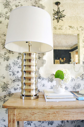
The foyer just beyond the front door was spectacular. I mean, isn’t this like living in a magical jewelry box or something? I was immediately smitten. She got the scalloped mirror on sale from Ballard Designs (I’ve been obsessed with it for ages) and the wallpaper is actually from Home Depot! The ceiling light is from Pottery Barn and the lamps on the table are from HomeGoods. Oh and the table itself is a secondhand find.
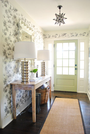
I’m telling you. I could have stood in the foyer all day.
But wait, I forgot to introduce you to Julie. She was so friendly and easy to talk to that Clara and Burger and I found ourselves sitting on the floor of her son’s room chatting for most of the crash (while John ran around like a madman taking photos).
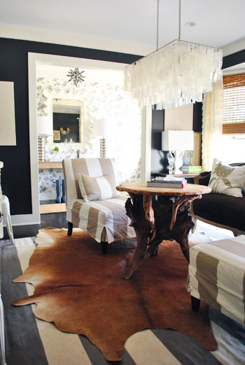
To the left of the foyer was a dramatic sitting room with black walls and tons of pretty layered texture. The slipper chairs are from Pottery Barn Outlet and the chandelier is from West Elm.
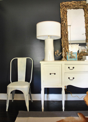
This driftwood mirror was actually a HomeGoods find!
The lofted living room was a project that Julie and her husband took on after moving in. The beams were already there, but they added tongue & groove to the ceiling and used 1 x 2″s on the walls to add a “faux board and batten look” on a budget. As for that giant pendant in the middle of the room, Julie can order it for you though Milk & Honey Home. The sofa is just an old one that Julie had slipcovered since it was completely functional but didn’t match the look she was going for.
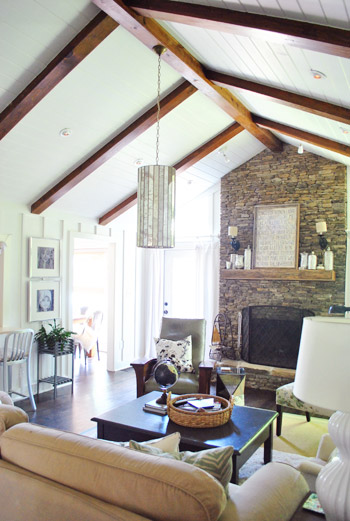
Once again there was that awesome mix of modern and rustic and blingy and neutral in here. Such a pretty layered look.
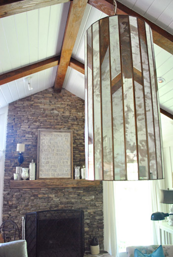
The pass-through to the kitchen was so much fun. Those frames with portraits of her kiddos are from Ikea and the stools are from Crate & Barrel.
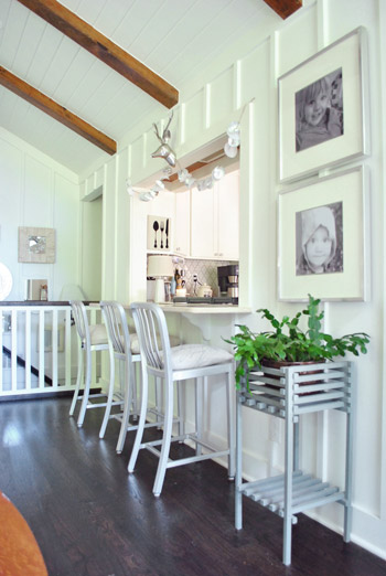
Here’s another shot of that awesome pass-through. I love how casually draped paper garlands and a silver deer head dress up the opening and draw your eye in towards the floating shelves beyond.
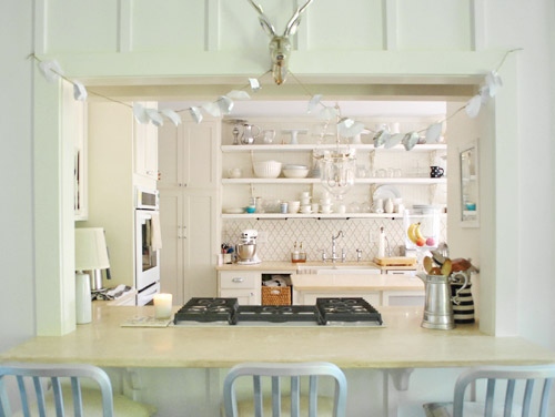
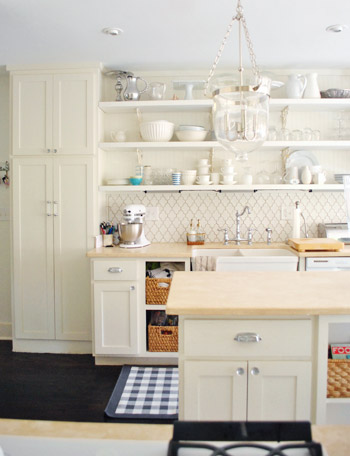
More kitchen loveliness. The large glass ceiling fixture is from Pottery Barn and the backsplash tile is by Walker Zanger. Julie has loved it forever and saved her pennies to make it hers (she was thankful it was a small area to tile, so it wasn’t as expensive). As for the counters, they’re actually limestone. They were amazing in person. So natural and textured.
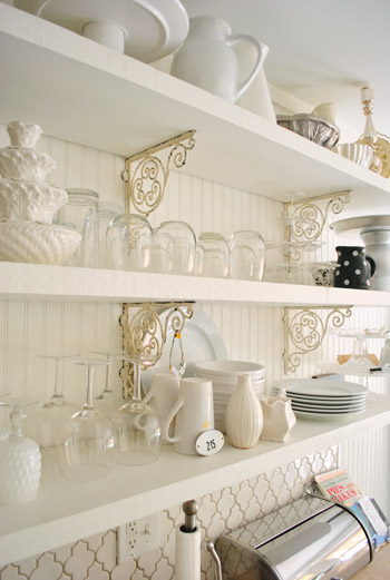
Aren’t those antique shelf brackets a nice mix with the clean and modern shaker-style cabinets and shelves?
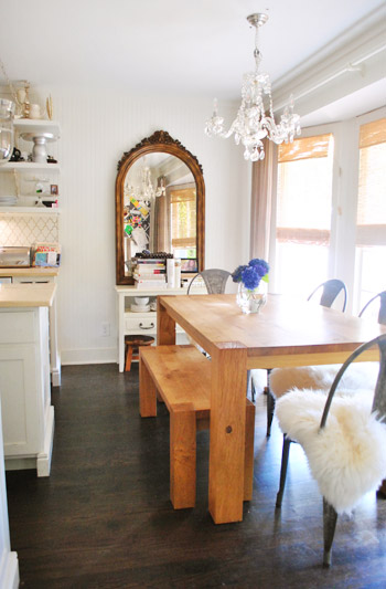
This table, bench, and chairs were from Crate & Barrel, and the chandelier over the table is from a secondhand store.
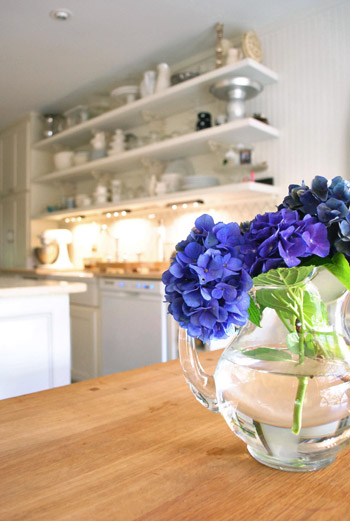
Can you tell we were in love with the kitchen? Seriously, we could have put ten more photos of that room in here.
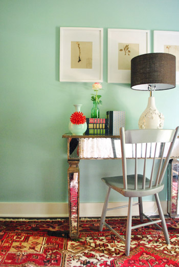
This is the guest room, which all began with a red rug that Julie already owned. She wanted the room to feel fresh and modern while incorporating that rug, so once she saw the teal and red vase on the desk (from Anthropologie) she knew that painting the walls a soft teal color (Pratt & Lambert Pacific) would work the rug into the room in a modern and fresh way. I loved the mix!
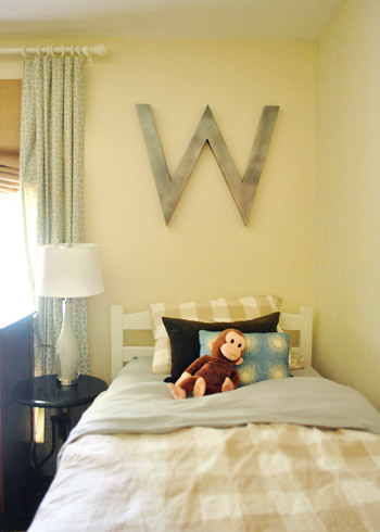
Julie’s two boys actually share a room (they love it!) so Julie brought in two twin sized beds and hung some awesome oversized initials from Ballard Design (on clearance) over their beds. This is the room that Clara and I hung out in most – the wall opposite the bed had a cabinet full of toys- and Clara totally made herself at home.
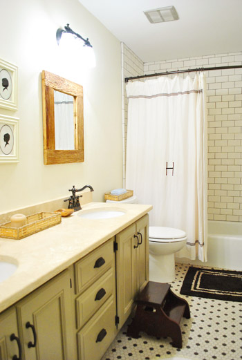
Here’s the hall bathroom, complete with basic white subway tile (from Lowe’s) and gray grout because “boys use this room!” – haha. Julie says it has held up really well to her two little men. I also loved that although this room looks totally redone, the vanity came with the house- she just painted it a soft knaki-gray-green color for a completely fresh look.
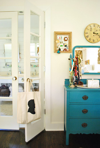
Some of the little details of the house totally won my heart- like all the old door knobs that Julie has collected over time. Here’s her bedroom beyond these pretty glass french doors that lead to her bathroom.
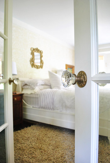
And here’s a shot looking back at those french doors to the bathroom from the bedroom. I love that pop of blue on the dresser to the right of the door. The bedroom was a really soft white-on-white space, so that hit of color was awesome.
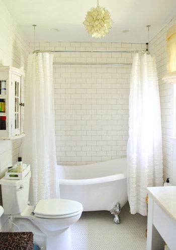
Here’s the bathroom. Isn’t that tub awesome? I totally wanted to crawl in with my clothes on and just bask in the glory of a gorgeous bathroom. Oh and the floor was white penny tile, so of course John and I oohed and aaahed. It was gorgeous. The subway tile is once again from Lowe’s and those ruffled shower curtains are actually from Target (sold as window curtains, not shower curtains, but Julie just added a shower curtain liner behind them). And that chandelier? Julie scored it for just $29 at a secondhand store called Queen Of Hearts Antiques.
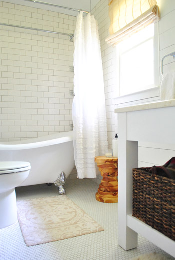
I really love how she mixes things, like this wood stool that she dropped into a white-on-white space for some awesome texture and a nice natural element to compliment all the bright and shiny stuff. Speaking of that wood stool, it was actually something that her friend’s dad made. I love that she has some handmade stuff along with some budget friendly stuff (like the subway tile from Lowe’s and those ruffled curtains from Target).
So that’s the tour of Julie’s amazing house. We’re so thankful that she let us drop by and shoot away! And you can read more about her and her beautiful home on her own little slice of the interweb. Now let’s play the what’s-your-favorite-part game. Anyone else gonna call that tub that I’m obsessed with? I also loved the giant rectangular capiz chandelier in the room with the black walls. And John’s calling the pass-through to the kitchen and the open shelves in there.

House extension architect @ GOAStudio London says
Great house with a mix of styles (where do I begin?)!
Ok, my very favourite parts:
a. the entrance hall (so light and elegant)
b. the transition from the hall to the “dramatic sitting room” (that room is pure theatre), and of course
c. the bathtub and subway tiles and THE stool(great idea, not something ones sees much around here anyway)
Well done to Julie and the …House Crashers of course!
BR says
Such a beautiful home! Any idea where the sheepskin covers on the metal chairs in the dining room are from? Ikea? Thanks!
YoungHouseLove says
Yes, I’d guess Ikea!
xo
s
michelle says
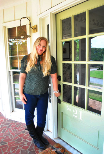
LOVE the front door? Do you happen to know the name of the light green paint she used?
YoungHouseLove says
Hope she drops in with that info! You might want to scroll back through the comments to see if she has shared that already :)
xo
s